On editorial design
and behind-the-scenes of my work
tsokolovskaya.com

Later Ctrl + ↑

The rule of proximity

Designers often prioritise aesthetics and excuse any sloppiness by saying, ‘It’s a creative idea’ or ‘That’s the author’s intention’. However, a designer is not an artist.

Designer ≠ Artist

The Internet, print materials, and outdoor signage are visual mediums that convey information. Unlike works of art, people read websites and signs to learn something: how to buy a product, contact a company, or find their way to the library. Therefore, in informational design, the primary goal is not just to make things look good, but to clearly and effectively communicate information. Designers rely on rules and guidelines to achieve this.

In this post, I’ll discuss the main principle of how we perceive information and the rule that follows from it.

A little theory

The rule is based on the principle of proximity in Gestalt psychology – objects that are close to each other are perceived as a group.

The proximity principle: the right side of the image is perceived as three columns

Therefore, the conclusion is:

The internal spacing of an element should be smaller than the external spacing

The rule of proximity applies to all levels: words, sentences, paragraphs, and modular layouts. If this principle is ignored, elements may form unintended relationships, leading to confusion:

Consider a block of text. Word spacing is internal, while line spacing is external. Therefore, according to the rule, let’s increase line spacing:

On the right, line spacing has been increased. The block looks neater and lighter

Let’s add a title to the text. The gap between the text and the title, which is external, should be larger than the line spacing within the text, which is internal. Remember, the external spacing should always be larger than the internal spacing.

A block with properly spaced text is easier to read

If this block is placed on a background, its margins will be external, so they should be larger than the gap between the header and the text.

The larger margins of the background give the block more significance

Now, let’s look at some examples.

In letters and words

Let’s write a word for an example:

In the word, the inner distance plays the space inside the letter, and the outer distance plays the space up to the neighbouring letters. Now the rule of proximity is broken. The letters are cramped, it’s hard to read the words. The middle of the letter O looks like a hole.

Let’s increase the inter-letter distance so that visually the letter O will no longer make the word look like a hole:

A certain solemnity has appeared, the letters breathe, and the word is much easier to read.

Let’s add two more words, but leave the space between them as standard:

The phrase is hard to read, it feels like one long word.

Let’s increase the spaces between the words:

It’s better now, let’s continue the experiment. Let’s change the font to a more elongated one:

Since the letters are narrower, the distance between them is smaller, so we can reduce the distance between the letters themselves:

Done! The phrase is now compact, clear and easy to read.

This is how this inscription looks on the airport building:

Photo from the web

And this is what it could look like if the proximity rule was enforced:

The flag could also be aligned with the letters, but that’s beside the point

In a text block

While letter spacing and space play the role of inner and outer between words, space and leading play these roles in a paragraph.

Let’s look at an example from a paragraph with a heading. The paragraph and the header are two independent objects. The distance from the header to the first line plays the role of external for them. The distance between lines — text leading — plays an internal role.

In this example, we see that the distances are equal. Such text looks ugly and is uncomfortable to read. You can’t leave text blocks like this.

Let’s tidy it up. First, let’s increase the distance from the title to the text:

It’s better. The header has gained independence.

Now let’s increase the distance between the lines, but don’t forget that this distance plays the role of internal and should be smaller than external:

Done.

In a text block with an image

Now let’s consider a bunch of text blocks, titles and an illustration. For example, a screenshot of a website like this:

The blocks consist of three elements: an image, a title, and a description. We can see that the text descriptions of the three columns are dangling by themselves, and their titles are stuck to the pictures. This is wrong.

There’s another principle from Gestalt psychology at work here — the principle of similarity:

Elements that are similar in size, outline, colour or shape tend to be perceived together

Headline and text have a greater connection than picture and headline, so descriptions should be moved to their headlines:

Together they create a single block that comes into connection with the picture above it.

The proximity rule is followed at each level:

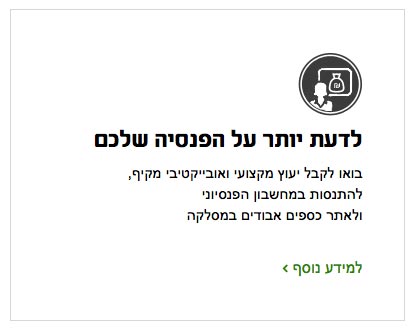
Another example. Let’s parse a block like this:

Before

We apply the proximity rule: increase the text leading and move the text away from the title. Increase margins on all sides. We removed the “Read More” button and moved its function to the header. Moved the arrow that points to nowhere to the header.

After

There are fewer elements, informativeness has not suffered, and the block has become cleaner and neater.

Another example:

Before

Align the distances in the text block. Shift the icon a little to the right, behind the text line, so that visually it appears to be at its level.

Already better

Combine the “More” with the block title and enlarge the icon.

Now

The block became more compact and attractive.

Conclusion

Don’t ignore the proximity rule. When assembling the layout, first of all, determine the outer and inner distances. Make sure that the first is larger than the second. And do not forget about the principle of similarity, otherwise, the result can be deplorable:


Read more:
On object spacing and perception in ‘Editing by Design’ by Jan V. White.
The rule of internal and external in Gorbunov’s ‘Typography and layout’.
On leading in Müller-Brockmann’s ‘Grid Systems in Graphic Design’, Tschichold’s ‘The Form of the Book’, and Korolkova’s ‘Living Typography’.
Capitalisation in Chichold’s ‘Treasury Of Alphabets & Lettering’.

Process: logo of make-up artist Anna Rotar

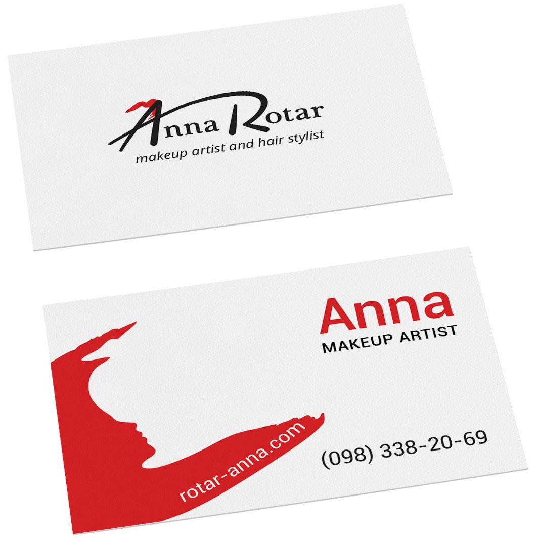
Anna Rotar is a makeup artist and hair stylist in Odessa. I designed a logo and business card for Anna.

Together with Anna, we decided that the handwritten version is closer to her character. That’s what we started from.

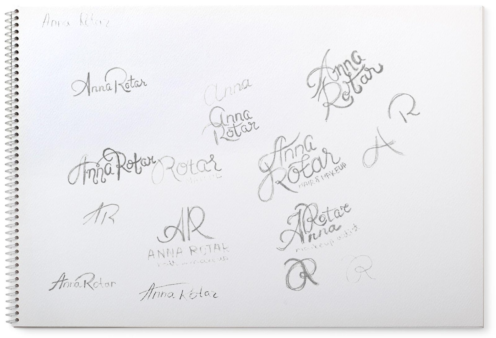
I sketched the variants:

I converted some of them into vectors and chose the least “curly” one:

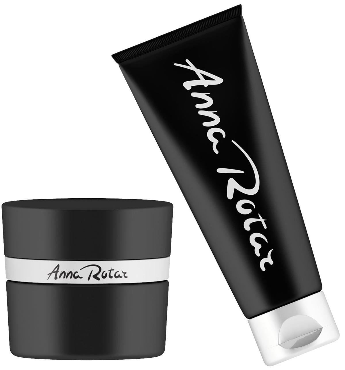
I look at the media:

I don’t like that all the letters are handwritten, but I like the shapes of the letters A and R. I decided to keep them and type the rest:

The logo has become more serious, just right for the sound of the surname. Try pronouncing Rotar. It growls and sounds hard, but at the same time, the soft sign softens the growl. I keep working. I want to connect the horizontal stroke A and semi-oval R and turn the serifs nn into tails, like the letter a. I’m trying it, let’s see:

Yes. That’s how we got integrity. I connect the logo with Anna’s activity: the letter A fulfils the role of a pencil with a trace from it:

I show the client a preliminary version:

Photo from the web for an example

I got approval — Anna likes the logo. I work further. I lighten the bold lines A and R, slightly shorten the vertical stroke R and remove the tail of the letter A.

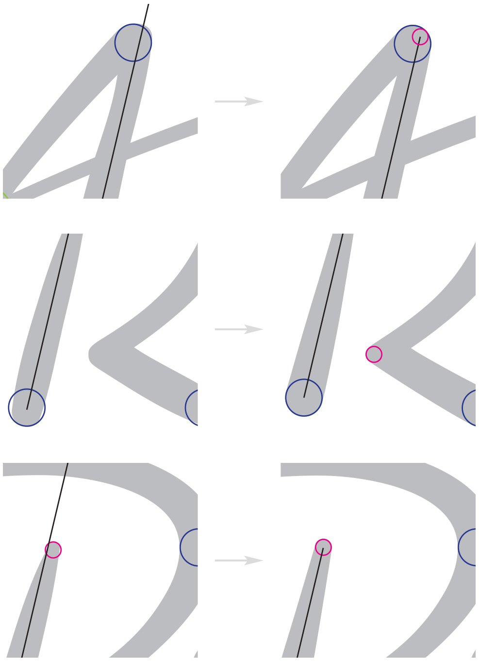
The stage of letter drawing has come. I mark the main problems that need to be corrected:

Aligning parallels, bringing all similar semicircular tails to the same size:

Correcting the arc from R to the leg:

Looking in black:

I don’t like the junction of the half-oval of R and its leg:

Correcting:

Now it’s the turn of the pencil mark. Softening it:

Looking in the logo:

I’m also correcting it so that it doesn’t protrude too much above the letter A:

Looking at:

I make a variant of the logo from the initials:

Done! I’m going to start with business cards. For them, I refined the pencil trace:

The silhouette of a face appears inside.

I reflect the silhouette vertically:

I put the business card layout together and send it to the client:

Anna accepts the job.

Created and designed the electronic version of the book “On Life, Death and Love”

Task
Design and layout of the ebook version of “On Life, Death and Love” in ePub format.

In addition to the printed edition of “On Life, Death and Love”, I have created an electronic version. It includes all the stories and illustrations from the original.

Each chapter is designed exactly like the print edition
There is a small indentation between paragraphs for ease of reading
The illustrations are embedded in the text
All footnotes come immediately after the relevant paragraph

The book is available as a free download on the LitRes website.


Project members

Designer
Таня Соколовская
Автор
Lea Wedensky
Illustrator
Masha Roitman
Literary editor
Gulnara Sabrekova

Postcards and posters for the book presentation “On Life, Death and Love”

Task
Design gift materials for the presentation of the book “On Life, Death and Love”.

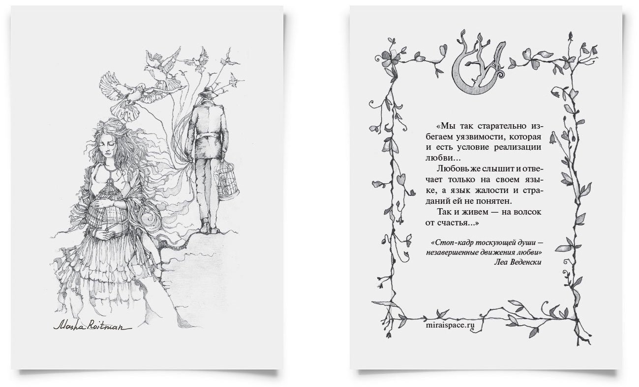
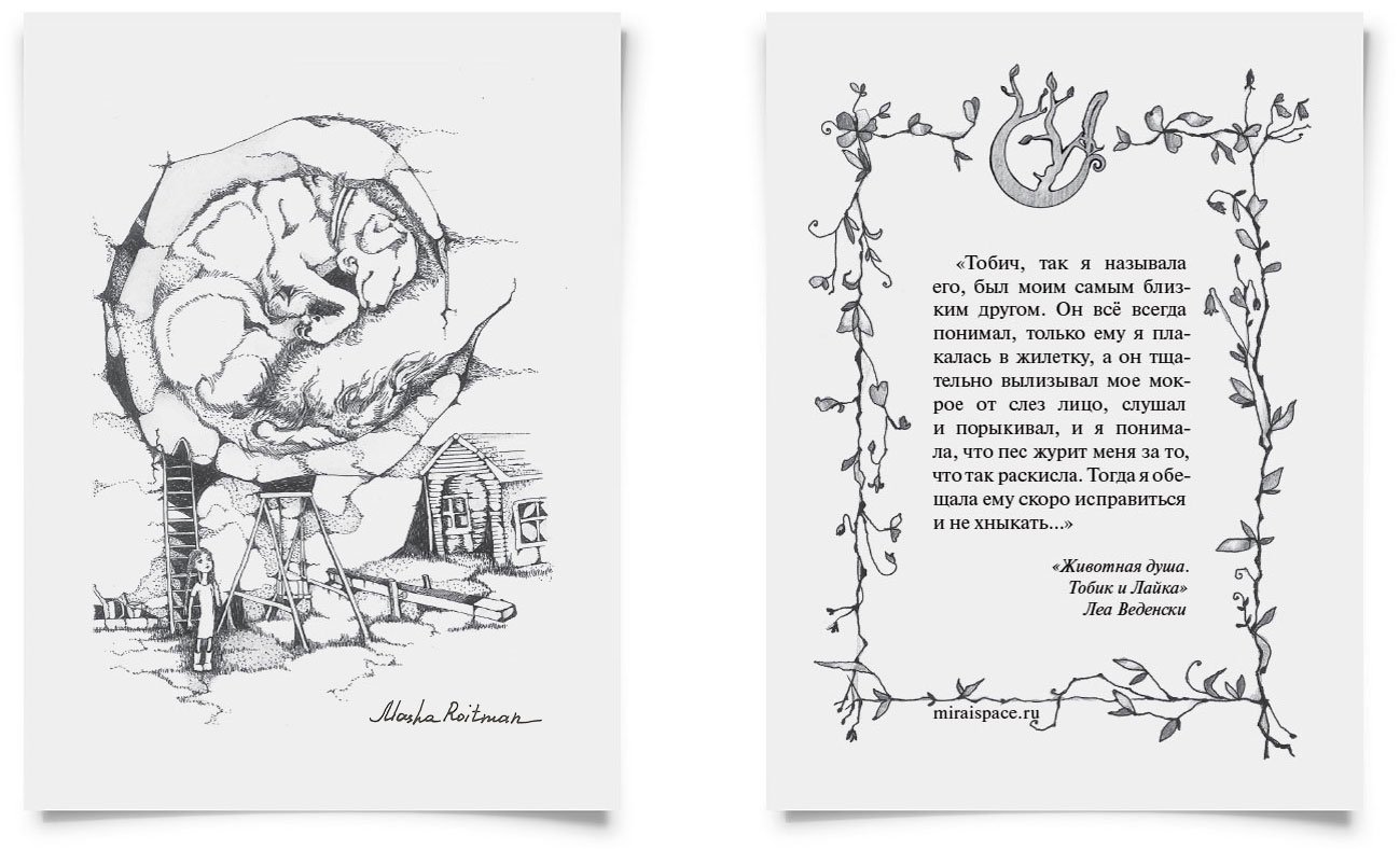
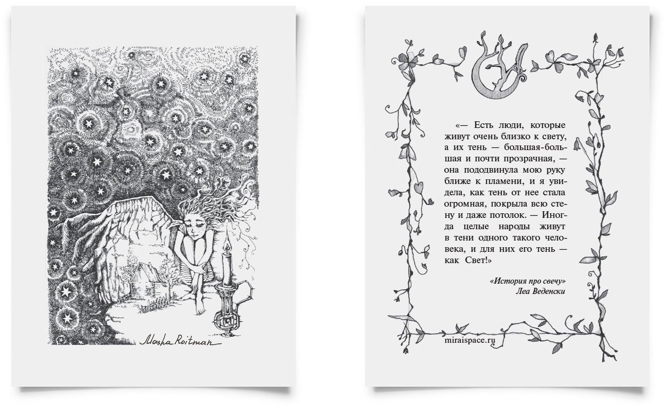
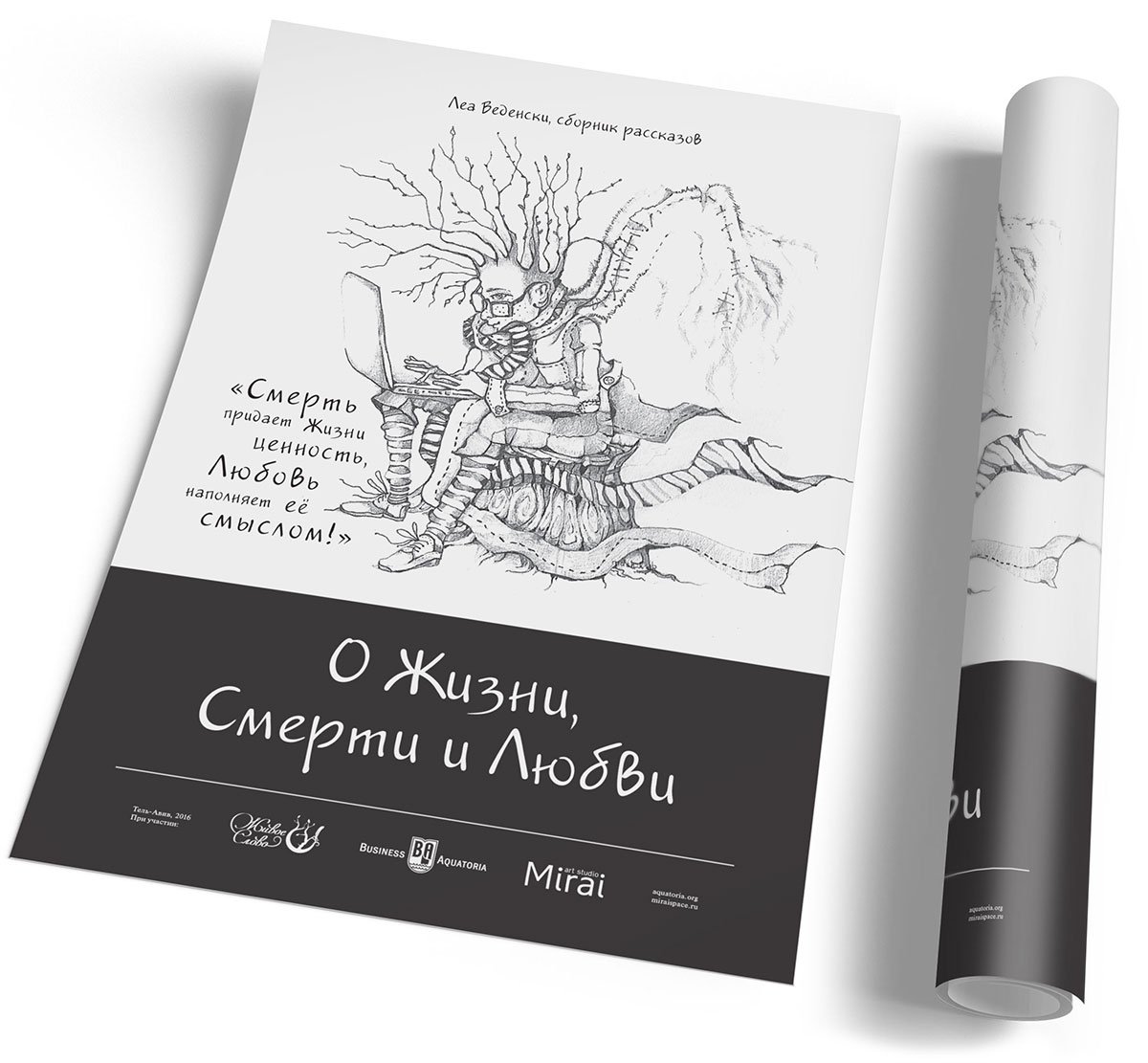
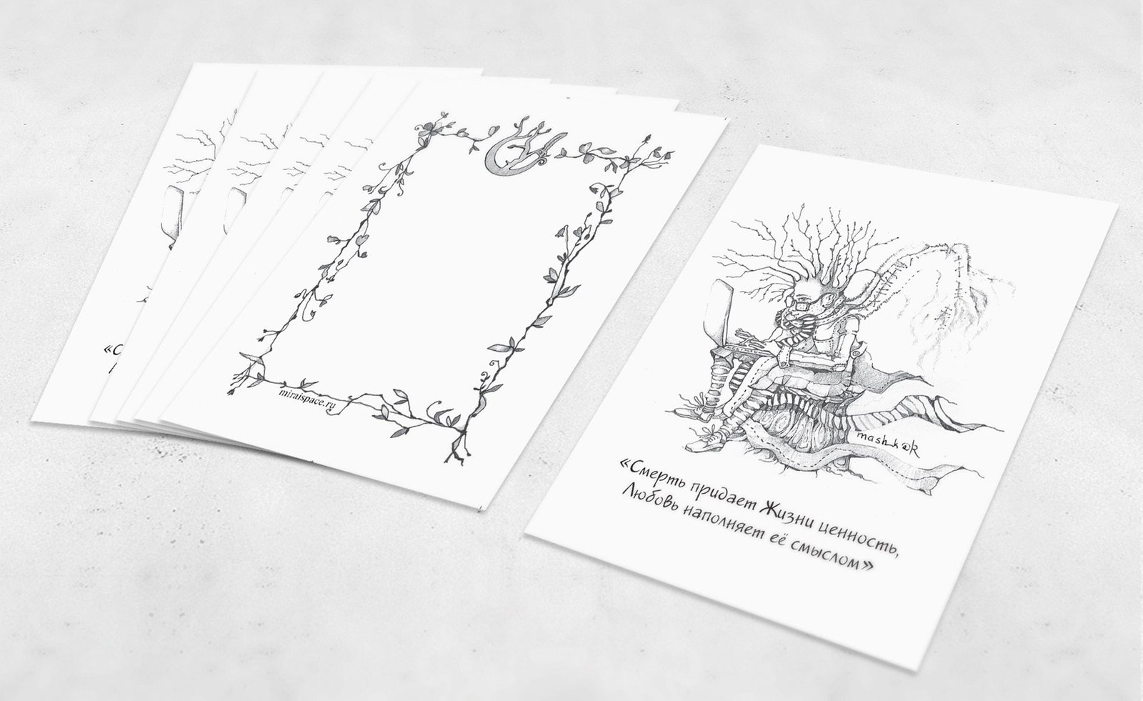
For the presentation of Lea Wedensky’s book “On Life, Death and Love” I designed promotional and gift materials: flyers, postcards and posters with illustrations and quotes from the stories.

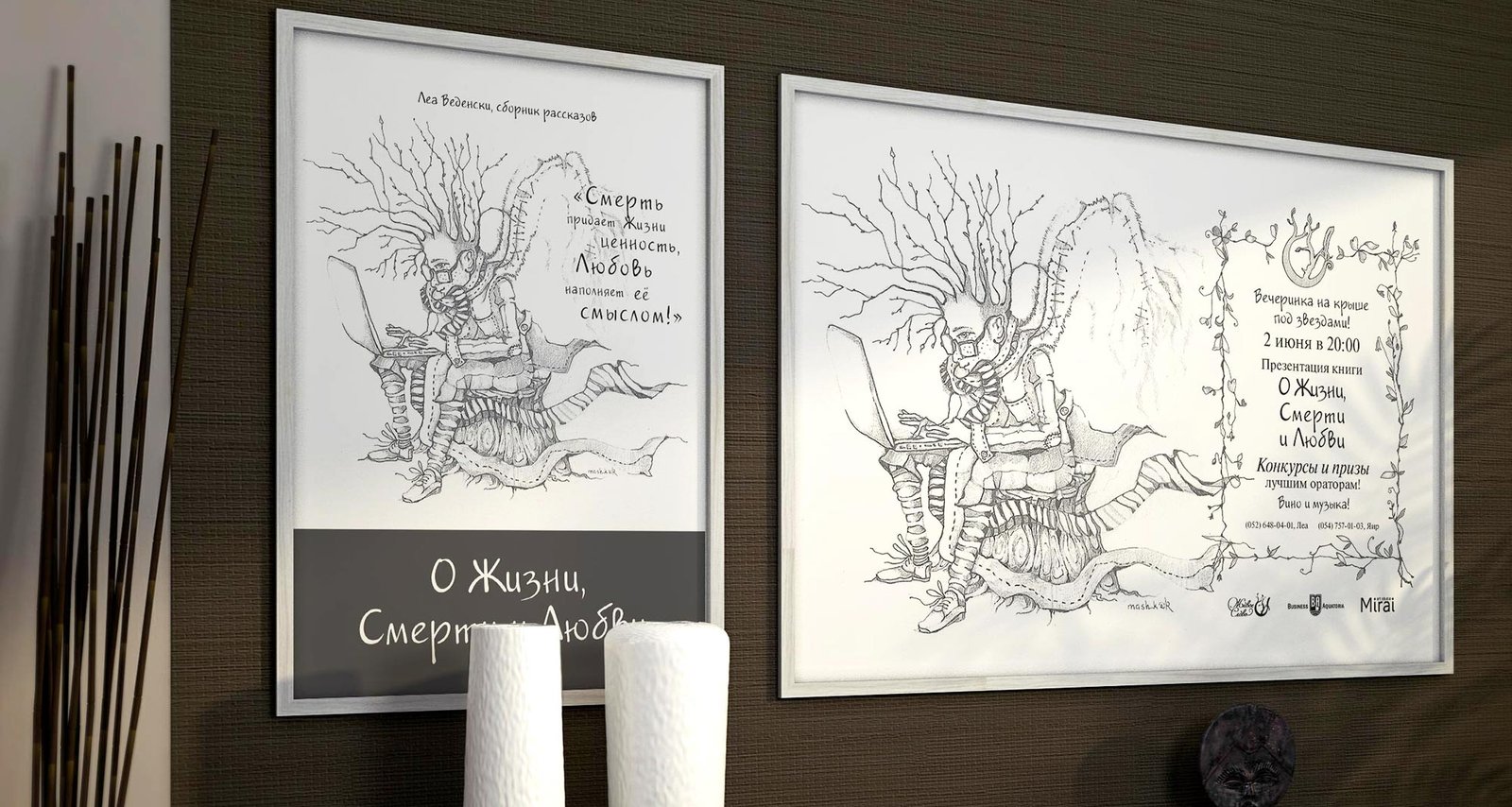
Poster with mainly the project “Living Word”. A3 and A2 format
Invitation flyers for the presentation

I also made a postcard with the image of the Word of Life Project, which you can sign on the back yourself:

Project members

Designer
Tanya Sokolovskaya
Author
Lea Wedensky
Illustrator
Masha Roitman

How I design and layout the book

А тут электронная версия книги

Introducing my first book publication! I am very happy that I had the chance to discover this new direction in design. Working on the design of the book was not easy, but interesting. Here I will show you the process of work and all the behind-the-scenes details.

The task: to layout, design and help publish a fiction book by Israeli author and psychologist Lea Wedensky. The book is called “Of Life, Death and Love”.

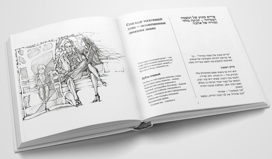
From the conversation with the author, I learnt that the book will be bilingual — in Russian and in Hebrew, and according to the idea the text should be divided into two columns. Therefore, for greater convenience, I chose a square format for the book.

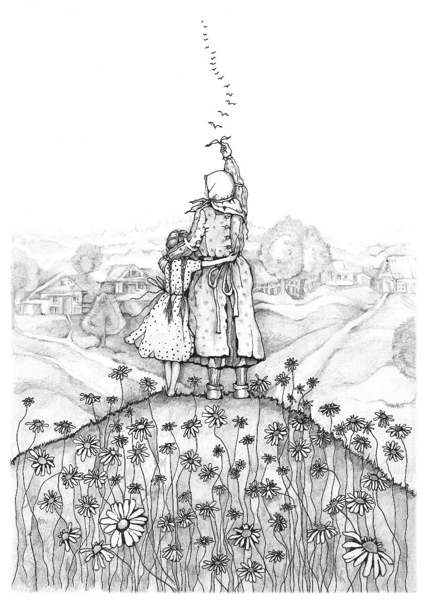
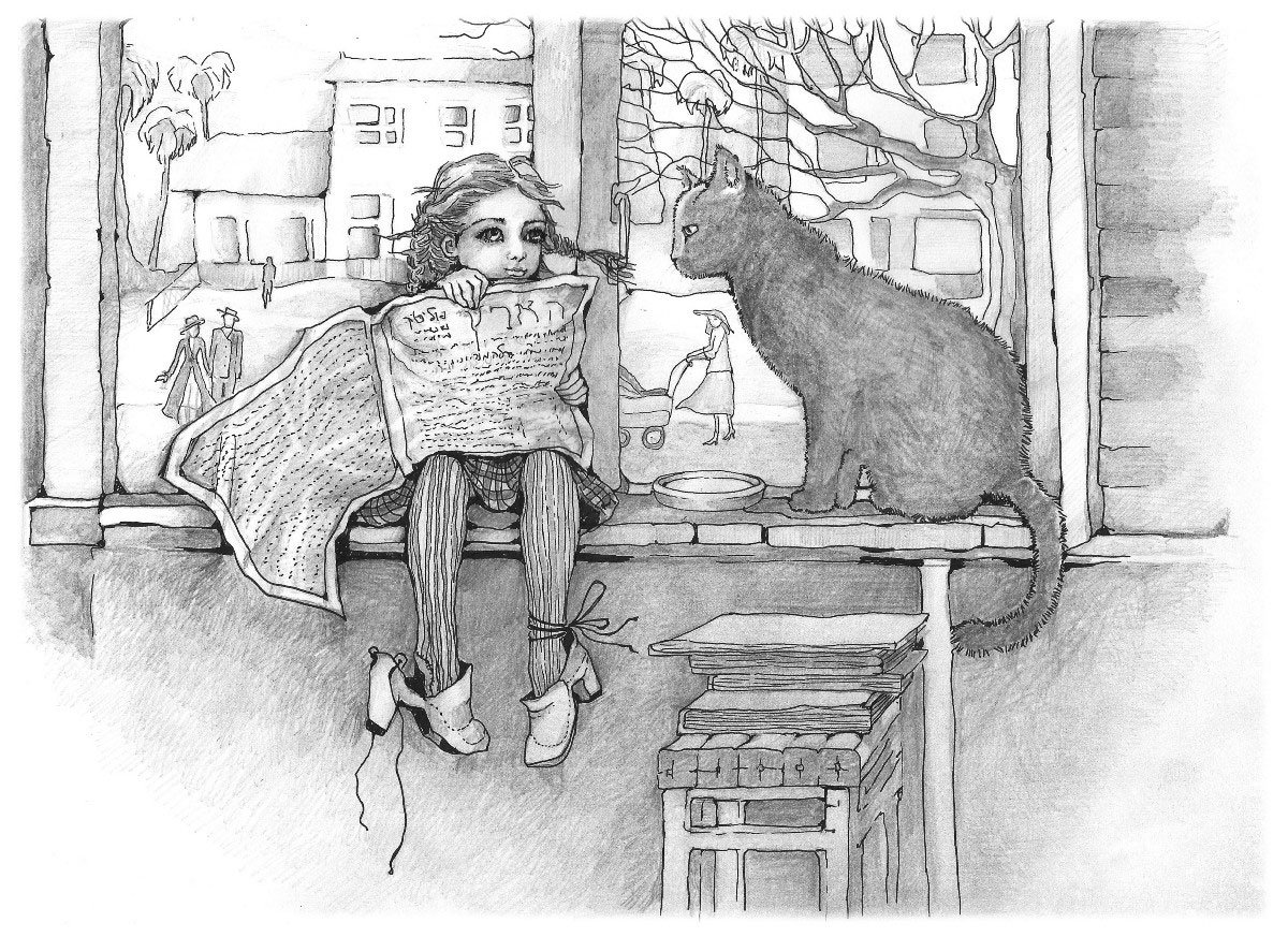
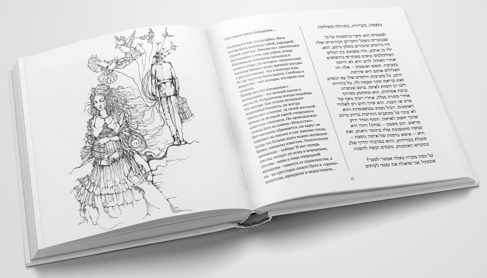
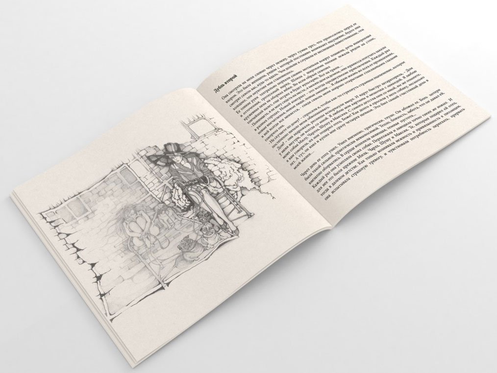
The stories were illustrated by artist Masha Roitman. The illustrations are stunning and lively, made in graphic style with pencil on paper:

Almost immediately I had an image of a book with an association on the theme of life and death — a white-coloured cover with dark margins.

Sketch of the cover. The Hebrew text is a rough Google translation of the Russian-language title

At this point, I put the cover aside and proceeded to the book block. Here things turned out to be a bit more complicated. Hebrew is a right-handed writing, so the book opens from left to right. It means that Russian texts will be read backwards, which is not quite convenient.

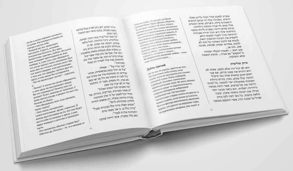
The first version of the book page was like this:

It didn’t seem bad. But the more I got into the book design, the more I realised the unfitness of the first version. In addition, in the process there was a conflict with the illustrations — they are both horizontal and vertical. If you limit them to the typing strip, you get large margins that are disharmonious with the text block. I decided to place the illustrations “under the crop”, but this worked for the vertical illustrations, the horizontal ones continued to “cut the eye”.

Vertical illustration
Horizontal illustration

At this stage, the author refused to combine Hebrew and Russian in one book — it was the best solution.

I went ahead and removed the Hebrew-language text. Now the text blocks seem too massive and the lines too long. It is uncomfortable to read such text, your eyes get tired quickly. The font size cannot be increased, it is already large enough.

I’m thinking of a solution:
— Since we no longer require a two-column layout, there’s no longer a need to stick to the square format. Why not change it?

Taking into account that all the illustrations are drawn on A4 paper, I chose the proportional format — A5 — for full harmony.

When working on the square version I relied only on my aesthetic taste, but with the A5 format I had difficulties. In my search for a harmonious proportion of strip sets, I discovered Jan Tschichold and his “The Form of the Book” — a delightful “textbook” about book layout and design.

Following the Van de Graaf’s canon, the strip set began to look like this:

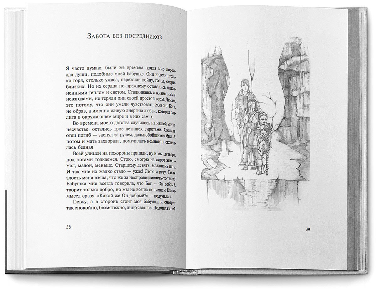
The illustrations also fit into the strip of the set. At the same time, I made up the cover to fit the new format
Van de Graaf canon of page construction

Harmony for text blocks and illustrations has been found. There was no need for a large font, so for ease of reading, I reduced it from 12 to 11 pt, now a line holds an average of 5–7 words.

I chose two fonts for the text: Newton for the main text (combines high readability and features of old-style fonts, under the eternal themes touched upon in the narrative) and Jakob for the headings (handwritten font, perfectly harmonises with the graphic illustrations).

Working on the text, I also followed Tschichold’s recommendations.

I centred the headline, typed it in capitals with a small spacing of letters, and separated it from the main text with an indent. Therefore, the first paragraph is not indented to the left:

The wide margins allowed for greater leading spacing, which added air and harmony to the typographic plane. In addition, I was able to keep the typing strip intact and place all the footnotes in the margins:

13.jpg.

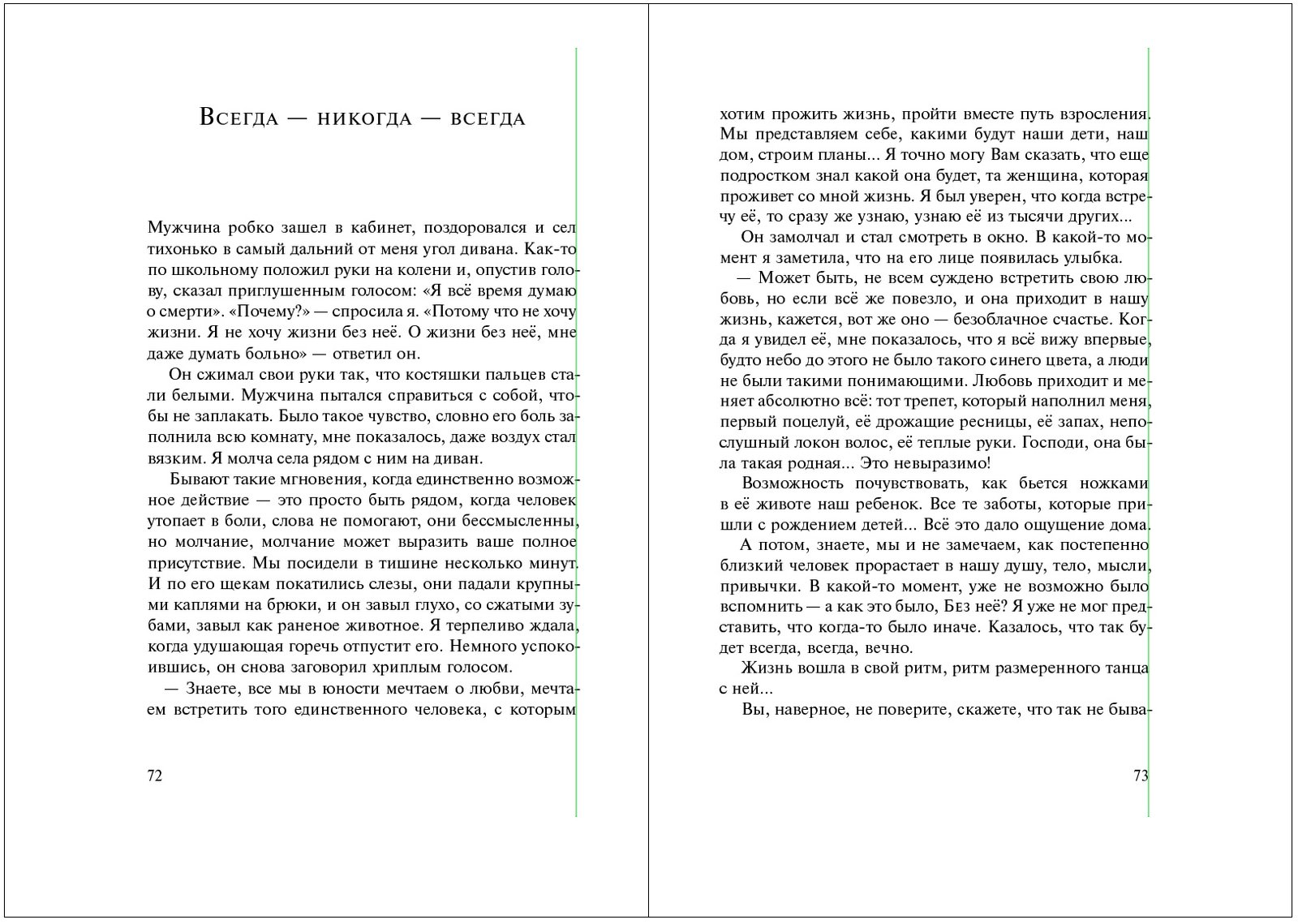
To visually equalise the border of the text block, I partially moved the punctuation marks beyond it:

Wrong
Correct

When punctuation marks are inside the block, geometrically the border is flat, but visually it is floating and curved. If the signs are partially taken out, then visually the border is levelled and looks nicer. For clarity:

5.gif.

Separately I would like to talk about “hanging” prepositions. It is correct to move them together with the related word to a new line, but I often encounter neglect of this rule. Most likely this is due to unwillingness to transfer them manually or not knowing how to automate this process. That’s why below I’ve described how to do it in InDesign.

Removing “hanging” prepositions in InDesign

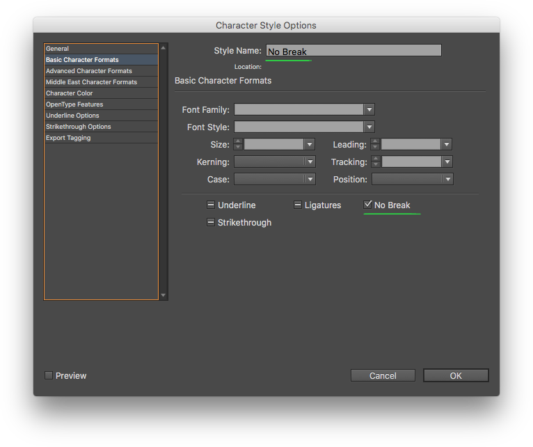
Open the document and create a Character Style with the only setting “No Break”, and give it the same name:

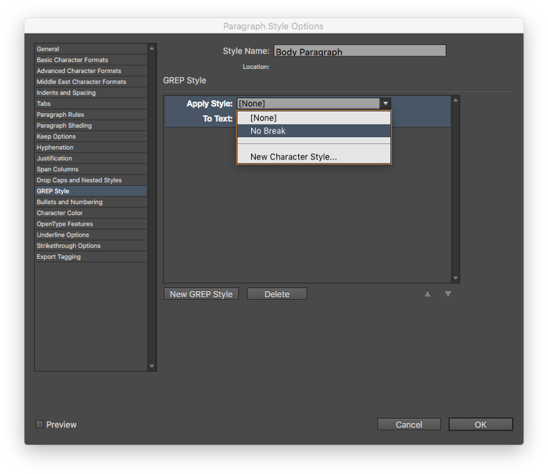
Next, create a Paragraph Style for the main text and go to the GREP Style tab. There we click the “New GREP Style” button and in the drop-down list “Apply Style” choose our previously created “No Break”:

In the “To Text” field, type all prepositions:
(?<= )((в|‬на|‬под|‬с|‬со|‬во|‬без|‬то|‬ли|‬бы|‬или|‬да|‬но|‬что|‬а|‬и|‬у|‬уж|‬так|‬как|‬для|‬перед|‬через|над|‬‬при|‬по|‬до|‬от|‬о|‬об|‬‬про|‬к|‬ко|‬не|‬за|‬из|‬ни|‬нас|‬я|‬он|‬она|‬оно|‬они|‬мы|‬ее|‬её|‬его|‬вас|‬ты|‬вы‬|‬все|‬всё)( |\. |, ))+

Next, create a new GREP Style by analogy with the first one, but for capitalised prepositions:
((?<= )|(?<=^))((В|‬На|‬Под|С|‬Со|‬Во|‬Без|‬То|‬Ли|‬Бы|‬Или|Да|‬Но|‬Что|‬А|‬И|‬У|‬Уж|‬Так|‬Как|Для|‬Перед|‬Через|Над|‬‬При|‬По|‬До|‬От|‬О|‬Об|‬‬Про|‬К|‬Ко|‬Не|За|Из|‬Ни|‬Нас|‬Я|‬Он|Она|‬Оно|‬Они|‬Мы|‬Ее|‬Её|‬Его|‬Вас|‬Ты|‬Вы‭|‬Все|‬Всё) )+

To make it clear:

  • The condition (?<= ) means: only if there is a space before the preposition;
    (?<=^) means: only if the preposition is at the beginning of the paragraph;
  • (‬в|‬на|‬под|‬с|‬со|‬во‭|...|‬вы‬|‬все|‬всё) — a list of all prepositions, pronouns and conjunctions that should not be left at the end of a line;
  • ( |\. |, ) — signs after prepositions: space, dot+space, comma+space. The \ symbol indicates that the dot after it is treated as a dot, not as a GREP metacharacter);
  • + indicates that the condition also applies to consecutive prepositions, pronouns and conjunctions, e. g. “but we thought it was interesting”.

Read more about GREP metacharacters and principles of operation in the GREP manual.

Result of work:

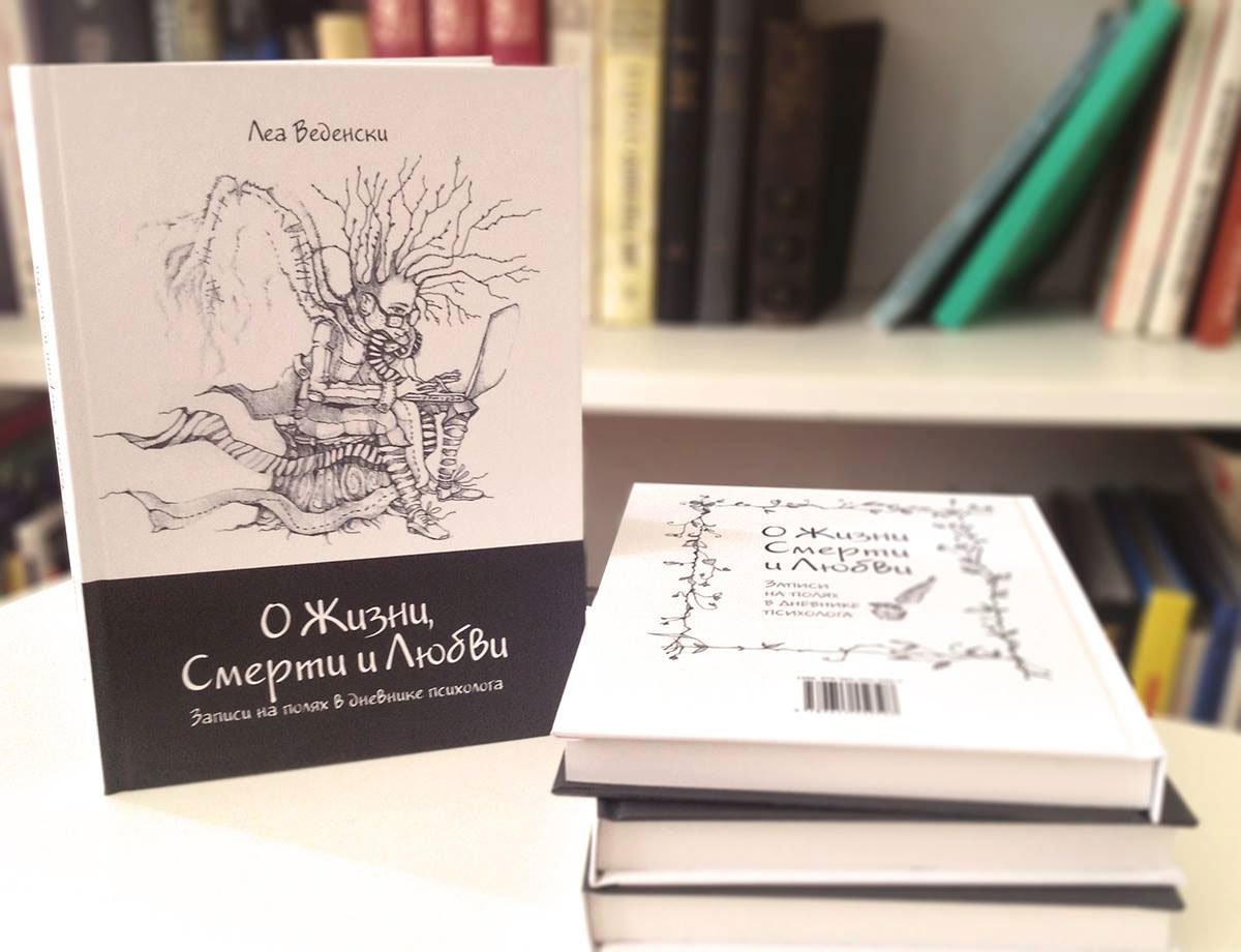
Book cover
Illustration style front endpaper
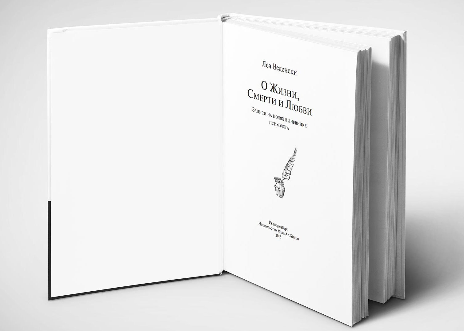
The title page is typed in the shape of a cup and inscribed within the frames of the set band
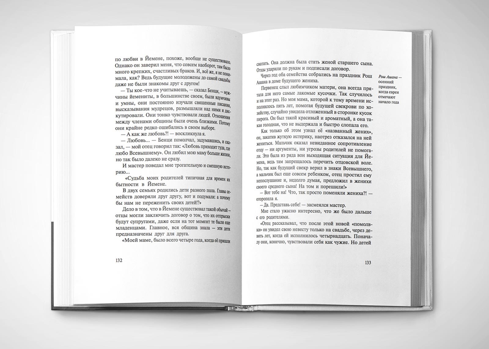
Horizontal illustrations, unlike vertical illustrations, are located directly in the text
There are footnotes in the book. To avoid disturbing the text, I have placed them in the wide margins rather than below the text
The book is divided into five parts, with the beginning of each part decorated with an illustration-style frame and handwritten text
A book in life

Project members

Designer
Tanya Sokolovskaya
Author
Lea Wedensky
Illustrator
Masha Roitman
Literary editor
Gulnara Sabrekova

Updating daniellesden.com

Task
Adapt the site to any screens.
www.daniellesden.com

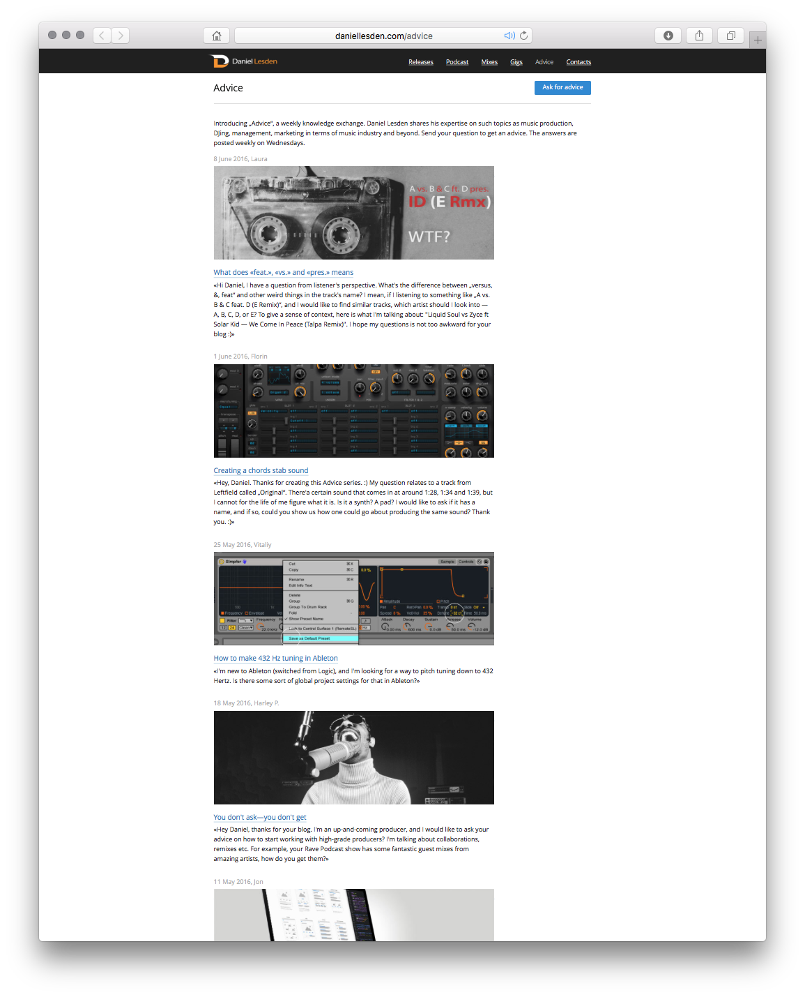
Last November the third version of musician and DJ Daniel Lasden’s website was released. It was a big update, in which my team and I overhauled the structure and updated the style of all the pages on the site.

First version
Second version
Third version
Adaptive version

Still, the site had a drawback: its size was fixed, so mobile phone and tablet users could not enjoy it to the fullest. This feature had to be sacrificed for a while to launch the site on time.

Today I’m pleased to present an update of the site specifically for mobile users. Now the site smoothly adapts to any screen: phone, tablet, laptop or desktop computer.

Separately, I would like to tell you about the innovations in the “Tips” section. Listeners and site visitors send the author questions on DJing, music writing and other music industry issues, and he shares his experience — that’s how the advice section works.

Initially, the design of the section was in the form of a news feed — new tips appeared at the top, and old ones went down. Everything seemed logical. But the fact is that the author writes useful articles that do not lose relevance even a year later — it is pleasant to return to them again and again. And new users may not have seen some previously published articles, because they went far down.

The original design of the section as a timeline

At first, we thought to make a search on the page, but this solution didn’t fit — often new users don’t know what to look for yet, so they need help.

We split all tips by topics: music writing, DJing, management, marketing, and business.

But on what principle to display tips — alphabetically, by date? And the most important thing — will it help new users? And will not harm the regular readers? The direction with grouping seems right to us, but we continue to think over the implementation.

Thinking:

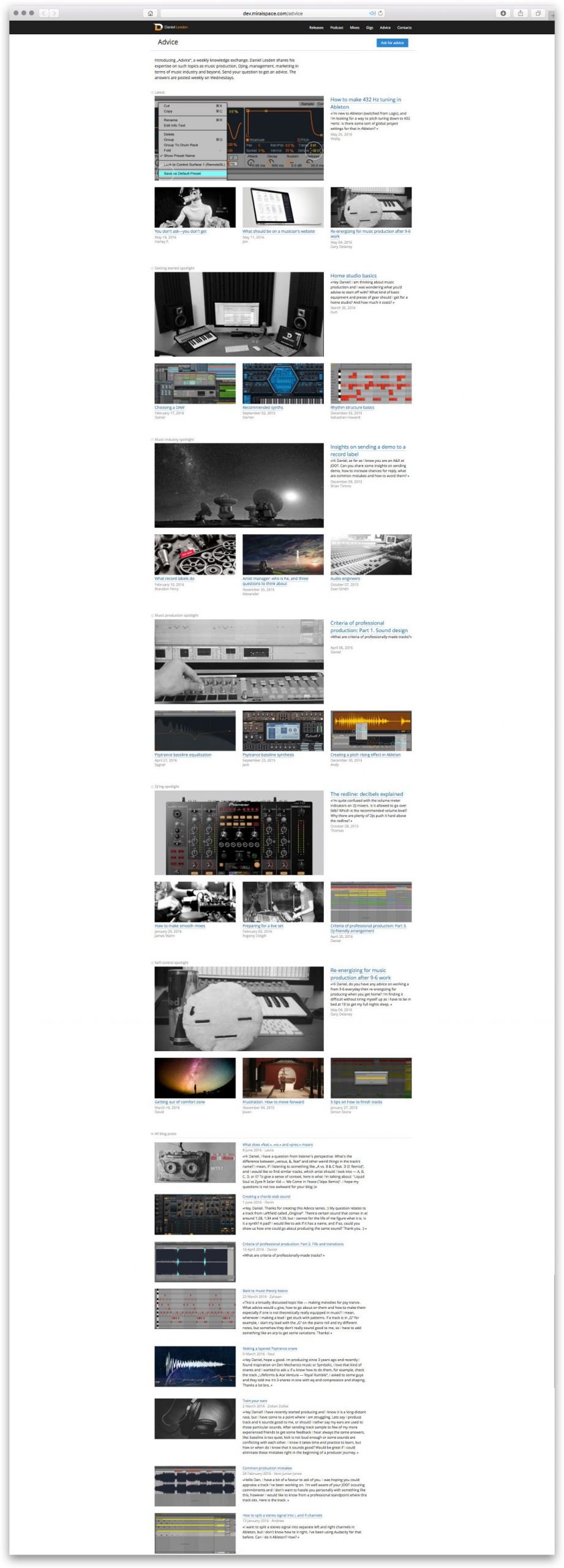
— What if in the groupings by topic, not all tips are displayed, but only the important ones at the author’s discretion? And show them in a beautiful magazine layout with large pictures?

— And how does that help?

— Very simple: this is how we help new users to orientate themselves in the rubric. Instead of flipping through dozens, and soon hundreds, of tips, it’s as if we’re saying “Here, start reading with this one”. The articles themselves are tagged and linked inside so that if the user likes it, he will go on reading.

— Where will the rest of the articles live besides these important ones?

— All other tips will be at the bottom of the feed, no change with this one.

— So regular readers will have to scroll down to this feed every time to see if new tips have come out??

— No: at the very top we will show some new tips first, this will be convenient for both new and regular readers. Next will be useful articles by topic, and even further on will be feeds of all the other tips.

Sounds great. Let’s get to it:

Assemble a mock-up of the proposed idea

Watching, evaluating and continuing to reason:

— Good overall, but the right-most element in these blocks is confusing — it feels like the large headline refers to it, not the large illustration.

— How about we solve this with a loading animation? The three lower tips in the blocks will appear a little later, helping to set the visual emphasis.

— How’s that??

— It’s like this:

The pod load animation helps to set the focus of attention

This decision is what went into the final version of the site.


Project members

Lead designer
Tanya Sokolovskaya
Designer and layout
Daniel Sokolovskiy
Developer
Maxim Silnov

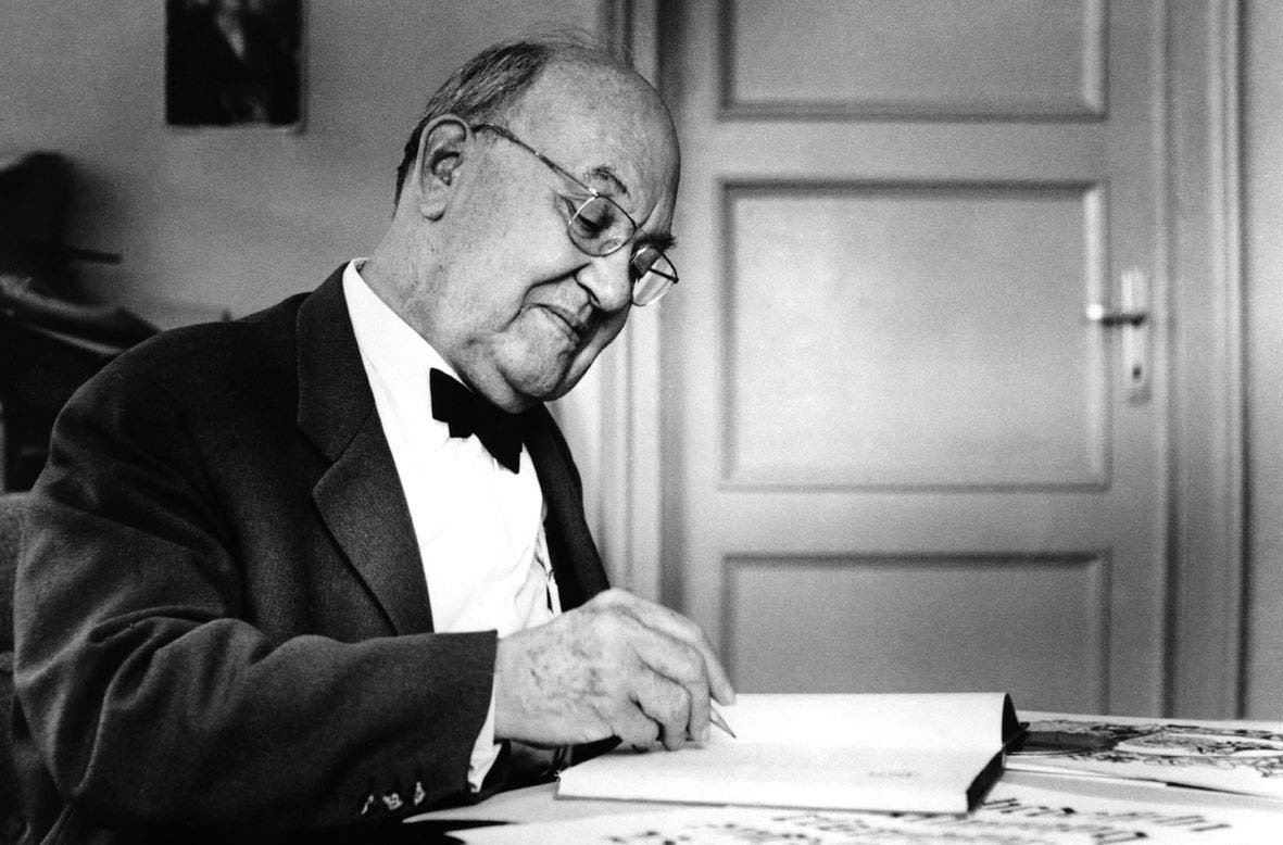
Typography and book layout. Part 2

Jan Tschichold

In the first part of this article, recommendations and methods for calculating the layout of the typesetting strip and the canons of constructing the title page are collected. I recommend reading it if you haven’t already.

Also read the first part of the summary.

Continuing my summary of ‘The Form of the Book’ by Jan Tschichold, we will delve into the rules of typesetting and text formatting, as well as the layout of illustrations. It will be informative and interesting :-)


Typesetting rules for publishing

The quality of typesetting determines the appearance of a book. Adhering to the following rules can achieve an aesthetically pleasing typeset text.

  1. In all headings, and especially in continuous text, the space should be one-third of an em space (an em space is a space element equal in height and width to the point size of the given font).
  2. After periods at the end of sentences and after abbreviations, only a normal space should be used, as in the rest of the line.
  3. Individual letters and abbreviations, such as etc., B.C., C.F. Meyer, are always typeset with a reduced space.
  4. Titles and headings should not end with a full stop.
  5. Lowercase letters should not be spaced out letter by letter. Instead of letter spacing, italics should always be used.
  6. Uppercase letters are always typeset with letter spacing (from 8 points and above, at least 1 1/2 points), and the spaces between them are carefully aligned, preferably leaning towards increasing rather than decreasing the spacing.
  7. Paragraph indents are always em space. Too large an indent can lead to the last line of a paragraph being shorter than the indent of the following line.
  8. Quotation marks should be of the same style throughout the book.
  9. Numbers indicating notes should be typesetted in the same font as the main text. After a note sign in the form of a number or asterisk, a bracket should not be used — neither in the text nor in the note itself.
  10. Footnotes are separated from the main text by an empty line or a solid thin line. The empty space above and below this line should be no less than the leading of the main text of the page.
  11. Umlauts Ä, Ö, Ü should not be represented as Ae, Oe, Ue.
  12. When typesetting numbers, a comma is used only in decimal fractions. Thousands are separated by spaces, not commas or periods. 300,000 is not three hundred thousand, but simply three hundred. Three hundred thousand is typeset as 300 000.
  13. Points are not used to separate thousands. In decimal fractions, a comma is used: 3.45 m; 420,500 kg. However, when indicating time, a period is used: 2.30 h. In Russian, a colon is customary: 2:30 h. When typesetting telephone numbers, it is better to separate digits with spaces or hyphens, grouping the numbers in twos or threes: 123-45-67 or 123 45 67.

Paragraph indents

Starting a paragraph without an indent creates a sense of a continuous flow of thought for the reader, which is difficult to follow. However, a good writer thoughtfully divides the text into paragraphs and wants their rhythm to be precisely maintained.

Setting text without indents hampers readability

There’s only one case where making a paragraph indent is senseless and unsightly: under a centred title. The first paragraph should start without an indent. But under a left-aligned title, a paragraph indent is necessary.

There is only one correct, technically flawless, and at the same time simplest way to mark the beginning of paragraphs — a paragraph indent, usually one em (i.e., at 10 ems — 10 points). It can be slightly less, or in some cases, slightly more.

Today, a multitude of exquisite literature, even scientific books, are printed without paragraph indents. People don’t seem to understand how much harder it is to read text without them. Setting text without paragraph indents only seems simpler and calmer, but it comes at the cost of losing rhythm — an essential feature of beautiful typography.

Italics, small capitals, and quotation marks in the layout of books and scientific journals

In artistic texts, there are almost no highlights made with italics or small capitals. Only occasionally is a word italicized to emphasize its significance.

Italics are primarily used to denote the names of books, journals, works of art, terms, and ships encountered in the text. In this case, these words can be printed without quotation marks. Additionally, words and phrases in foreign languages can be set in italics without quotation marks.

Small capitals are used to highlight names and are always set with slight spacing; otherwise, they are difficult to read.

Less well-known titles rarely used expressions, and expressions used in a figurative sense, are enclosed in quotation marks but are set in lowercase, not italics.

Bold fonts are needed to attract attention, not to separate text. They can be used for headings.

For instance, if the main font in a preface is italic, then highlights are made with a regular font, not spaced italics.

Quotes are set in a regular font with quotation marks. Direct speech is also enclosed in quotation marks; this is not mandatory, nor very aesthetically pleasing, but it makes the text more understandable than without quotation marks.

There are several types of quotation marks.

  • German quotation marks: „n“. The ending quotation marks are inverted commas (“), not apostrophes (’’) because it would then be a double apostrophe.
  • French quotation marks: «n». In Germany, they are typed with the angles facing the letter: »n«. In Russian typographic jargon, French quotation marks are called fir tree quotes and are considered the primary form, used with angles outward: «n». German quotation marks are called feet quotes, considered supplementary and used like this: „n“. To type a quote within a quote, some type «— , ‘ — » (but not ,n’ — an apostrophe is not a quotation mark!), others « — „ “ — ».
  • The English distinguish single quotation marks (‘n’) and double quotation marks (“n”). To type a quote within a quote, in the UK it is customary to use single quotation marks as the primary form and double as the supplementary, while in the US it’s the opposite: ‘like “these” in England’, and “like ‘these’ in America”.

Different countries have their own forms of quotation marks and rules for their use. For example, in Finland, Greece, and Turkey, the same form of quotation marks is used as both the opening and closing marks: ”quotes in Finland”.

About Leading

Leading is the distance between lines of text.

There’s an almost always true rule — the more end lines and lines of varying lengths there are, that is, the more restless the form of the typesetting strip, the greater the distance between the lines should be. Large leading emphasizes the linearity of lines and thus to some extent harmonizes the jagged silhouette of the typesetting.

By increasing the leading, you can save text that has been typeset with too large spaces between words, that is, typeset poorly. However, large leading in no way exempts you from the need to make proper word spacing.

If the leading is the size of a pica or larger, you can typeset words in a line a little wider than with compact typesetting: otherwise, due to the large distance between lines, there is a sensation that words in a line are merging, which reduces readability.

The leading in a book depends on the size of the margins. Large leading suggests wide margins, and then the plane of the font is perceived harmoniously.

The length of the line, that is, the number of letters in it, also affects the leading. The longer the line, the greater the leading needed, otherwise the eye gets tired and the reader loses track from one line to another. But long lines are generally bad; wherever possible, you should try to make them shorter — either set in two columns or increase the font size.

There is one almost always true rule — the more end lines and lines of different lengths there are, that is, the more restless the form of the typesetting stripe, the greater the distance between the lines should be. A large interline spacing emphasizes the linearity of the lines and thus to some extent harmonizes the ragged silhouette of the typesetting.

By increasing the interline spacing, you can save text that is typed with too large word spaces, that is, poorly typed. However, a large interline spacing does not free you from the need to make proper word spaces.

If the interline spacing is the size of a pica or more than a pica, you can type the words in the line a little wider than with compact typesetting: otherwise, due to the large distance between the lines, there is a feeling that the words in the line are sticking together, and this reduces readability.

The interline spacing in a book depends on the size of the margins. A large interline spacing implies wide margins, and then the plane of the font is perceived harmoniously.

The length of the line, that is, the number of letters in it, also affects the interline spacing. The longer the line, the larger the interline spacing is needed, otherwise the eye gets tired and the reader gets lost from one line to another. But long lines are generally bad; wherever possible, you should try to make them shorter — either by setting them in two columns, or by increasing font size.

Set of superscript numbers and notes

Let’s talk about what is ugly and therefore incorrect.

In the superscript numbers of footnotes in the text of a book:

  1. Unsuitable font for small superscript numbers. The shape of the superscript numbers should match the main font or at least be close to it.
  2. An unnecessary bracket after the superscript number. A bracket after a number is appropriate in a manuscript, but in a book, it is redundant.
  3. Lack of spacing between a word and the following superscript number. In good typesetting, it is essential to space the reference number with a thin space; otherwise, the number does not stand out. It should not stick to the word.

In the notes:

  1. Superscript numbers, because they are too small, often cannot be read and, moreover, usually come from different, completely unsuitable font families. They must be clearly distinguishable, as it’s specifically them that are being sought. Therefore, the footnote number should be typed only with normal numbers of the same size as the text, in no case small (in the Russian typesetting, the number is placed on the top line of the font with a half-size spacing from the text of the note without a dot).
  2. The absence of punctuation after the footnote number. After the ordinal number of the note, typed in normal form and size, a full stop is mandatory. In the first line of the footnote, it is correct to make an indent of a round space (this recommendation does not apply to the Russian typesetting, see point 1).
  3. Unnecessary and unattractive thin line on the 4 cicero format to the left above the note. To separate the text from the footnote, it is enough to reduce the size of the font in the footnote. If division with a thin line is still required, it should be made to fit the format of the column.
  4. Too small leading in the lines. The column will be harmonious if both the text and the note have the same leading, regardless of the font size. But you can set the note with leading 1 point less than the distance between lines in the text, this will not be an error. A strong difference in leading makes the note noticeably darker than the main text, which is not good.
    In the main text of the book, there should be no spacing between paragraphs, and between individual notes on the page, spacing is not necessary.
  5. Confused construction of the note due to the lack of paragraph indents in it. Unprofessional division of footnotes with leading of several points, even 1 point, gives an unclear picture of the typesetting. This is just as unacceptable as typesetting simple text without a paragraph indent.

In addition to the above:

  1. If there is only one footnote in the book, or if notes occur singly on a page, it’s better to use an asterisk instead of the number 1.
    In the text, the asterisk is not separated from the preceding word, but in the note, there should be a two-point space after the asterisk (in Russian text, the asterisk is spaced two points from the preceding word and is not separated from the closing quotation marks).
  2. If the note consists of a single or a few words and stands alone on a page, it can be centred; this will look harmonious with overall centre alignment.
  3. Sometimes, several short notes follow in succession, and they can disrupt the balance of the spread if they are stacked one under another. Such notes can be set horizontally one after the other, separated by round spaces. A period is placed at the end.
  4. A very long note can be divided, placing one half on the left and the other on the right side of the spread, but this technique should not be overused.
  5. If the format of the main text’s typesetting strip is very wide and the font size is cicero or larger, it might be feasible to set the notes in two columns.
  6. Starting footnotes on each page with the number 1 should be avoided; it’s better to have a continuous numbering of footnotes for the entire book or at least for individual chapters.

Ellipsis

An ellipsis indicates that several letters of a word, a single word, or several words have been omitted. Never use more than three dots or two dots. It is correct to use exactly three dots.

The dots should be typed without spaces, certainly not spaced out, as this creates holes in the fabric of the page. Before an ellipsis that indicates omitted words, it is correct to place a normal inter-word space for the line: ‘I think I was very ... afraid.’ If punctuation follows the ellipsis, it is separated from the last dot by a space of 1 point (in Russian, a comma is not used before or after an ellipsis).

Dots placed instead of omitted letters are also typed without spacing, and no space is placed before them.

Hanging lines at the end and beginning of the typesetting page End lines at the beginning of the typesetting page are not allowed. An end line disrupts the rectangular format of the typesetting page, and a phrase fragment at the beginning of the page looks pitiful.

There is a reliable and tested way to get rid of a hanging line: you can make one page a line longer. However, this is only possible in a book with large margins.

When a thin rule stands under a variable header, a hanging line is not a problem. In this case, the rectangularity of the typesetting page is preserved.

Layout of strip illustrations

There are two ways to place strip illustrations in a book: they can be laid out together with the text or reproduced separately.

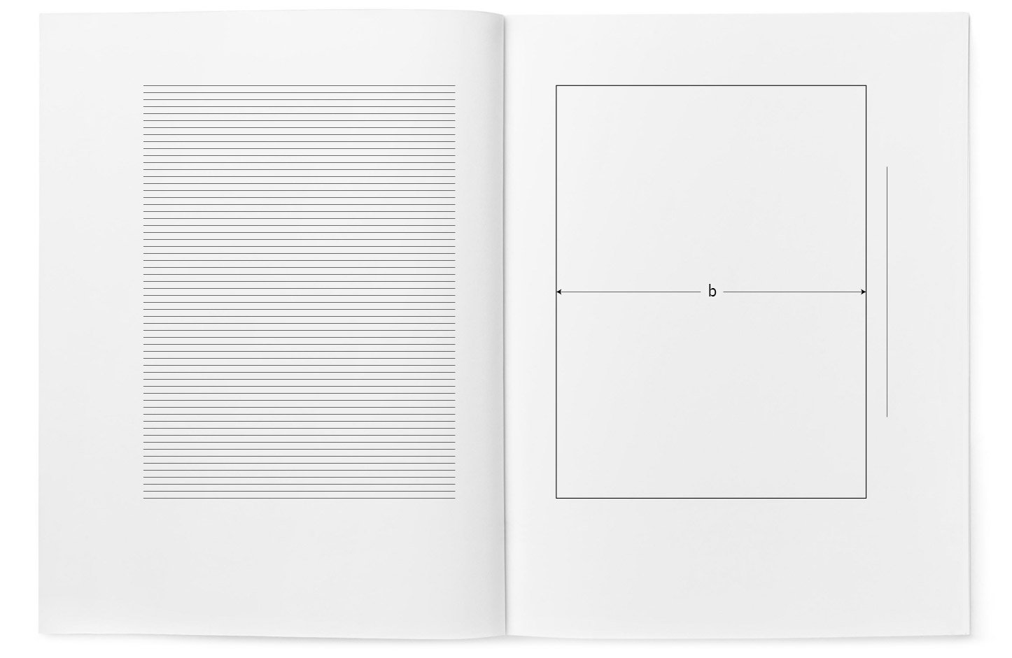
The maximum width of the illustration equals the width of the typeset strip; the maximum height is less than the height of the typeset strip by 7-11 millimetres, left for one or two lines of the caption to the illustration, the caption is included in the typeset strip (Pic. 1).

Pic. 1

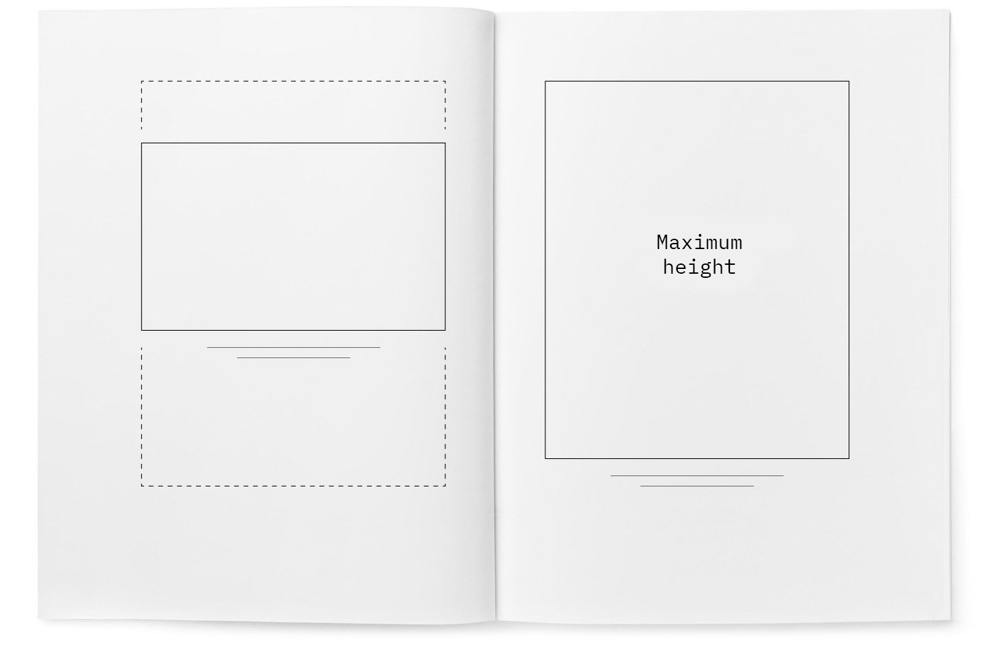
Horizontal format illustrations in size and placement should also correspond to the typeset strip (Pic. 2).

Pic. 2

If the book has very wide margins, the height of the illustration (b) may equal the width of the typeset strip, and the caption printed on the margins. But in other cases, as a rule, the caption should stand within the limits of the typeset strip and, accordingly, the illustration should be reduced (Pic. 3).

Pic. 3

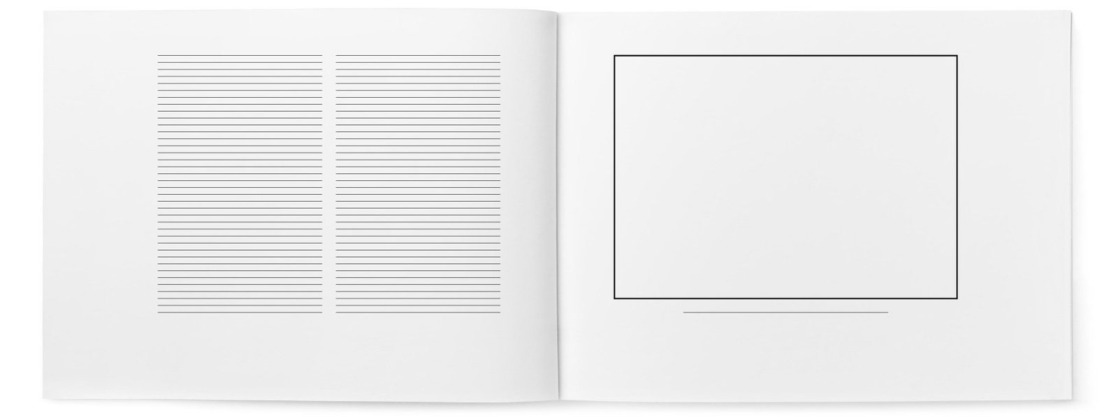
Illustrations laid out across the page are always inconvenient. Everyone tries to avoid this option. If there are more of them than others, it is advisable to choose a horizontal format for the book and set the text in two columns (Pic. 4).

Pic. 4

The book spread should form a single composition, even if the illustrations are very different (Pic. 5).

Pic. 5

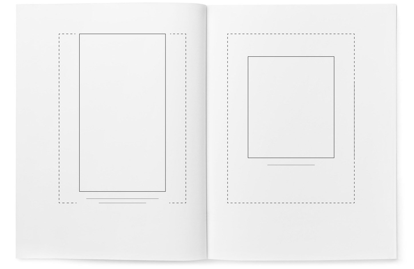
A vertical, long illustration takes up the entire height of the typeset strip, and naturally, it needs to be placed in the centre of the typeset strip (Fig. 6, left). Meanwhile, a smaller illustration (Pic. 6, right) is positioned so that the ratio between the distances from the illustration to the top trim and the bottom trim is 1:2 or 3:5.

Pic. 6

Where it is impossible to do without cross illustrations, they should be placed so that they are convenient to view:

Pic. 7a. Cross illustration next to the text strip
Pic. 7b. Normal and cross illustrations
Pic. 7c. Cross illustration on the left and normal on the right (worse than 7b; this option is used only in exceptional cases). So, the top of the illustration should be turned towards the binding! Option 7c does not exclude option 7d
Pic. 7d. Two cross illustrations, both should be viewed from the right side; turning the picture on the left strip would be a mistake, as it irritates the reader when they have to turn the book twice

The top ten most common mistakes in book publishing

  1. Unsuitable format: too large, wide, and heavy books. Books should be convenient.
  2. Unstructured, shapeless set as a result of the absence of paragraph indentation.
  3. Initial pages, not highlighted in any way, standing at the top of the page, without a left indent, which looks like random pages of text.
  4. Shapelessness arising from the erroneous use of only one font size.
  5. White and overly bright paper. It is very unpleasant for the eyes and harmful to health. A light, unobtrusive tinting (ivory colour or darker, but not cream shades) is almost always much better.
  6. White binding. Looks ridiculous, like a white suit, because it’s equally prone to staining.
  7. Straight spine of the binding. The spine of a bound book should be slightly rounded, otherwise, after reading, it skews and the notebooks in the middle of the block stick out.
  8. The book’s title is in a large font, set along the spine, which is wide enough for crosswise placement of inscriptions. Nobody reads the title on the spine from a distance.
  9. Spine without the book’s title and the author’s name. Unforgivable for books wider than three millimetres.
  10. Ignorance or disregard of the rules for setting capitals, italics, and quotation marks.

I hope I haven’t dumped too much information at once :-) The book also has chapters about the root label, capital ribbon, dust jacket, and the colour of the paper, but I decided to omit them, as they pertain to its external appearance. In any case, I recommend reading ‘The Form of the Book’ in its entirety, as it contains a lot of useful stuff.

In conclusion, I want to share my emotions. As I mentioned in the first part of the article, it was my first time working on the layout and design of a book, so I didn’t give much thought to the process. But thanks to [author], my opinion has changed. Working on a book is very labor-intensive, but at the same time, fascinating process, which I even grew to love, so if I have the opportunity to implement another book, I would gladly do it!

The process of creating a logo for the music project JOOF

JOOF Live is a new music project by British artist John ‘00’ Fleming.

John Fleming is an electronic music pioneer, DJ, producer, radio host and label owner of JOOF Recordings. In a career spanning over twenty years, John has reached unimaginable heights and is widely recognised as an engine of progress and one of the most respected artists in the underground music scene.

In the “JOOF Live” project John emphasises live performances that will unlock his potential as a musician and bring a new sound.

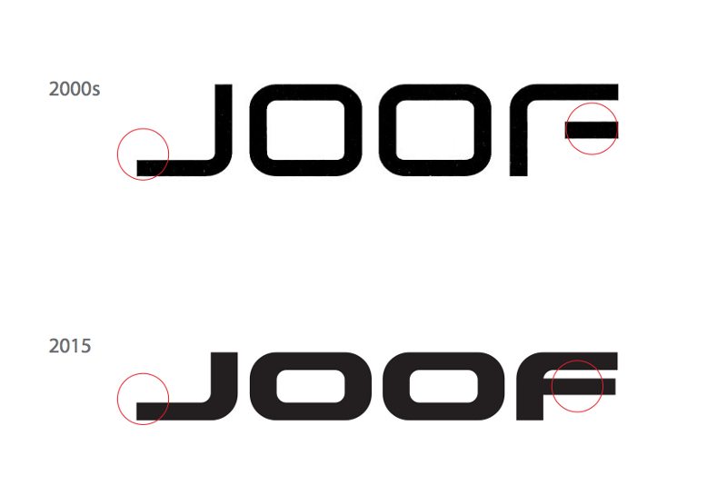
The logo of the “JOOF Live” project should be different from the logo of the JOOF Recordings label so that fans don’t confuse the names of the label and the musician. That’s why I look at the label logo before starting work:

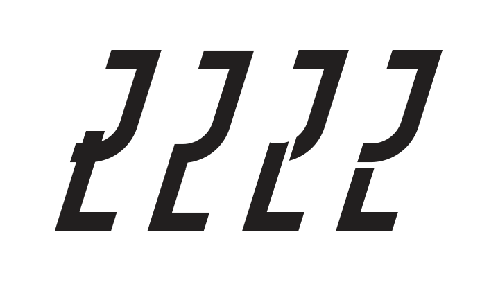
The focus is on the two centre letters OO — they are static and rectangular. The wide font makes the logo look massive like it’s under a press. I will avoid all of this in the JOOF Live logo move from the opposite, and add ligature for more uniqueness. The client also wished to reflect sci-fi, and futurism and make the logo “spacey”.

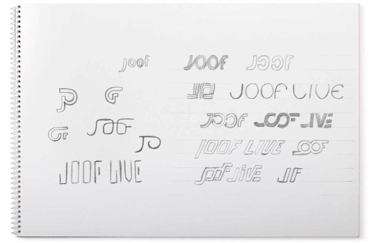
I am drawing sketches, paying attention mainly to the word “JOOF”, I will leave “Live” for later:

I chose the most successful one in my opinion and drew it:

I added and changed details:

But in the end, I stayed in the original form:

joof_5.png.

Now it’s hard to read the word JOOF, so I change the “J” until it’s recognisable:

joof_6.png.

I put “JOOF” aside and start “Live”. To emphasise the forward motion, I use italics:

joof_7.png.

I trim the “J” and “F” on the slant of “Live”:

Showing the client:

This bear lives on John’s Instagram account

The client likes the logo and the idea itself, but asks to improve the readability of the word JOOF, specifically the letter “J”.

Working:

joof_12.png.

I choose the bottom right variant, correct the letter “V” in the word Live and show it to the client:

Something still bothers me in this variant, so the client asks to show another variant of the logo — in two lines, placing the word Live under JOOF.

I’m building this variant:

I don’t like the intersection of “J” and “L”, and the number “00” turned out to be too narrow. I’m working on the intersection:

I chose the last option and moved the letter “F” outside the form, which allows expanding “00”:

Sending the work to the client:

After some discussion, we concluded that the two-line variant is cumbersome and limited in use. We decided to go back to the previous variant and work on readability.

I change the letter “F”:

Comparing:

In this form, the logo loses all its compactness and minimalism in detail. I put this variant aside and started a new one.

The task remains the same — to create a JOOF Live logo, where the word JOOF will be different from the label logo.

Trying out a new ligature variant between “JO” and “OF”:

joof_20.png.

In this form, the ligatures reminded us of a meander ornament:

I change the “OF” connection and add the word Live:

Showing it to the client:

This variant did not fit, the client slightly changed his wishes: to make the logo stately, elegant, strong and with classic letters.

I continue working. I take one of the ideas that appeared at the beginning:

joof_23.jpg.

The idea is based on the main features of the JOOF label logo: elongated upward letters, a bent upward tail in the horizontal stroke of the “J” and a vertically unfolded middle stroke of the “F”. If you look at the old and new label logos, they don’t have all that in them:

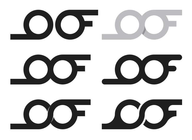
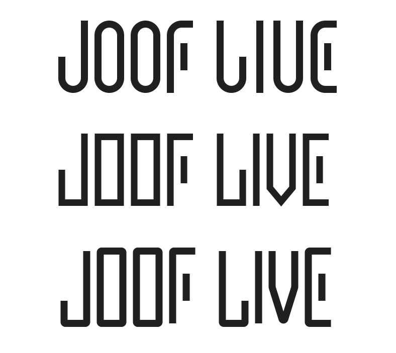
Figuring out options:

I discarded the angular logo (the middle one in the picture above) and worked on the other two.

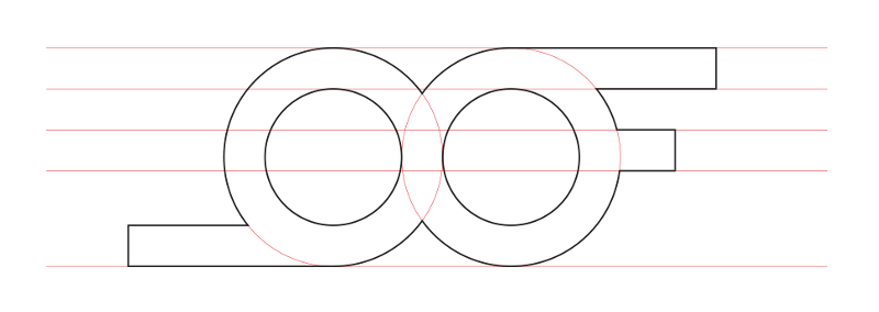
Building a variant based on circles:

joof_26.png.

It looks bad, JOOF and Live conflict, the letters are thin, and the expanded middle stroke in the letter “E” seems overdone. I’m building a second version taking into account previous mistakes:

I like the logo in this form, I show it to the client:

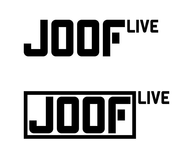
The client liked the word JOOF so much that he decided to drop “Live” as part of the project name and logo respectively, but to keep it as a small note for posters and posters that this is a live performance of the musician.

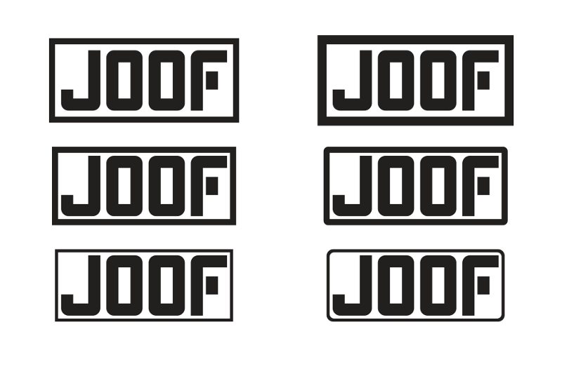
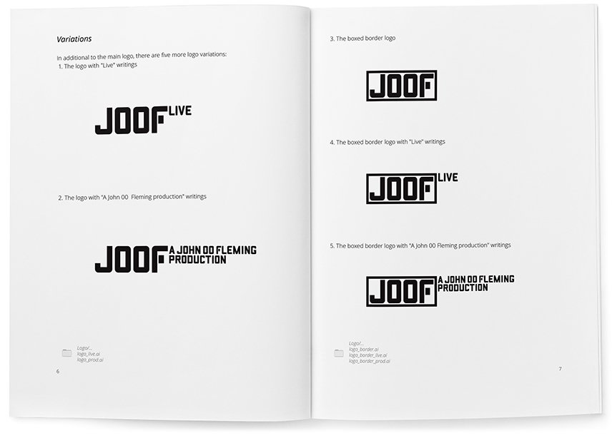
At the client’s request, I developed additional variants of the logo, where JOOF is in a frame and with the captions “Live” and “A John 00 Fleming production”.

I select the frame:

Stopping at the middle left. Looking for the location of Live’s signature:

joof_30.png.

I chose the first option and increased the letter spacing in Live:

I design the signature “A John 00 Fleming production” in the style of the logo:

Trying it on the logo in the same position as “Live” for general styling:

The client approves all options and accepts the work!

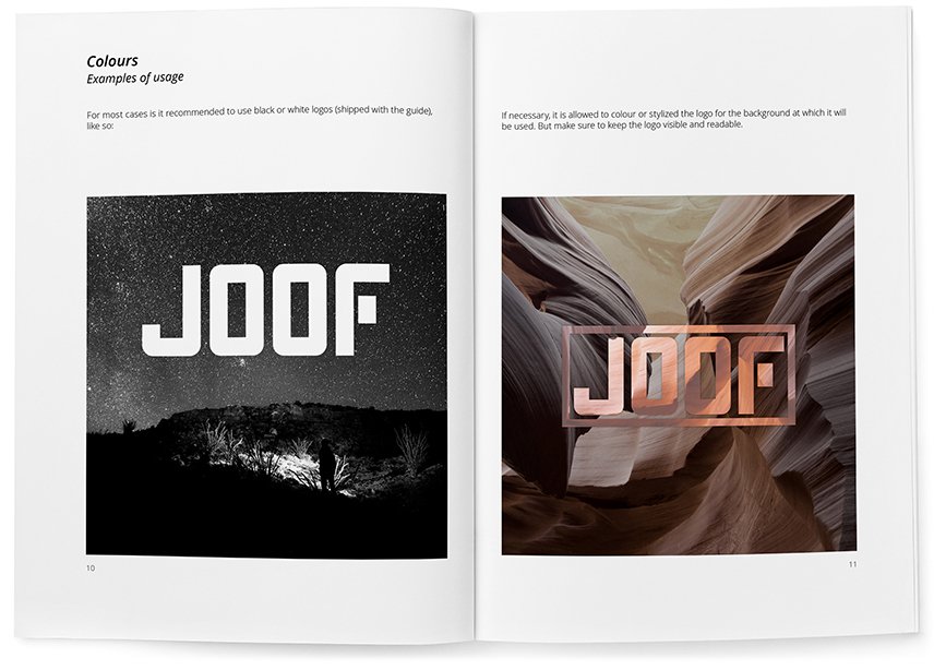
Rules and guidelines for the logo are collected in a guideline:

How I made the logo for the music label JOOF Mantra

Mantra is the new division of JOOF Recordings, a record label founded in Brighton in 1998. Under the new brand, the label will publish progressive electronic music in the Progressive and Psytrance genres.

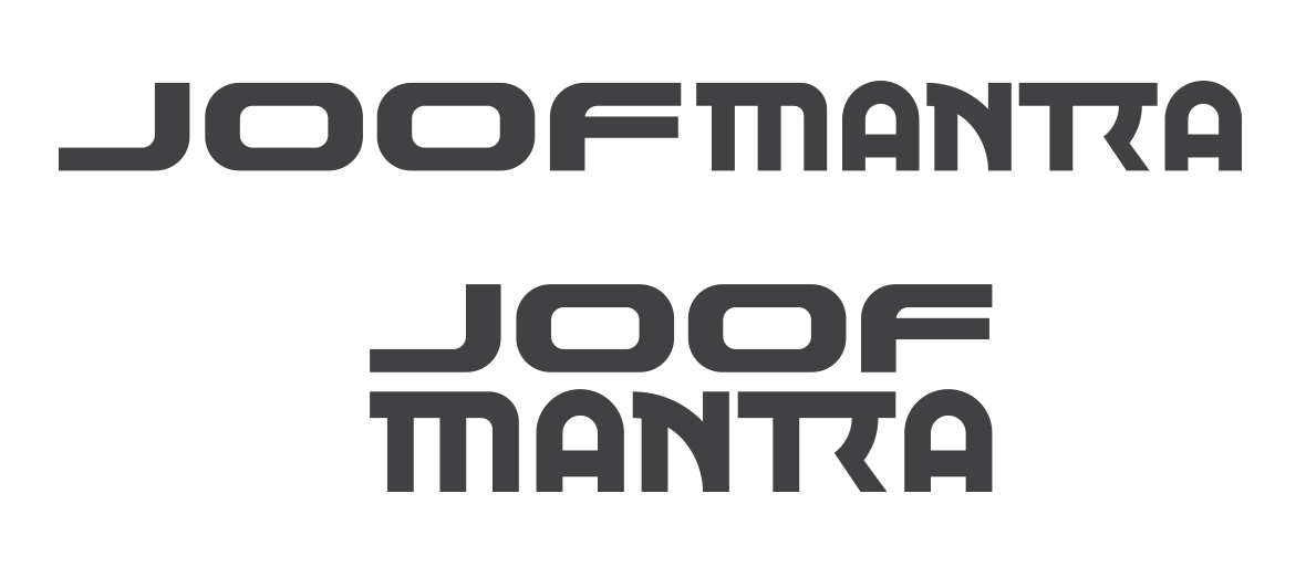
The challenge was to develop a logo for JOOF Mantra, but to keep the JOOF Recordings logo, i.e. the word “JOOF” should remain unchanged.

JOOF Recordings logo

Before I started, I looked at the search results for the query “mantra logo”.

Search results for the query “mantra logo”

Mantra is associated with India, so most logos are related to it in one way or another. The most common choices are imitating the Hindi language, the Aum (Om) sign, a lotus and a meditating person. Despite this, I also wanted to link the logo to India in some way, but without using the typical clichés.

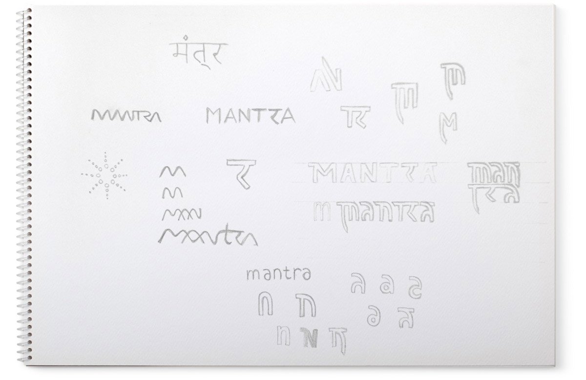
The search for an idea started with a study of the Hindi alphabet:

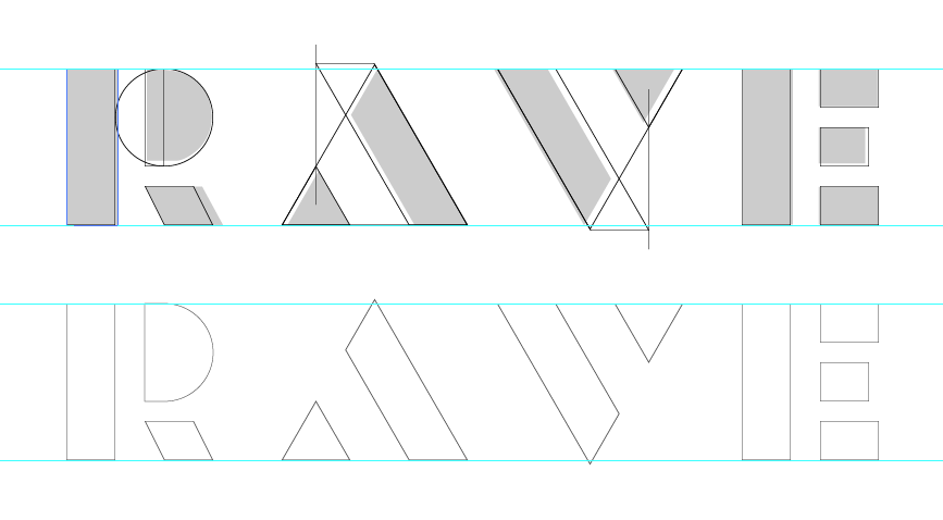
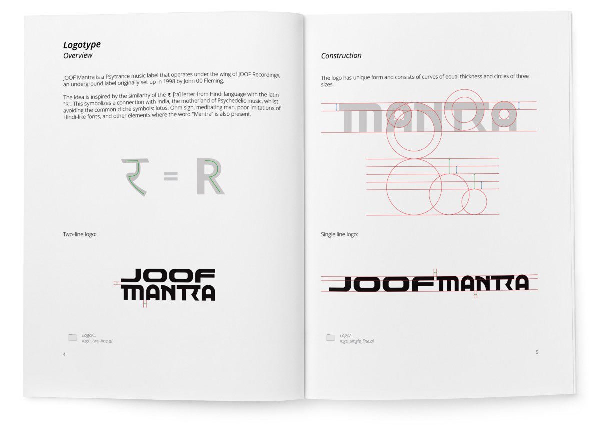
Here I found the similarity of the letter R with the letter र [ra] and took it as a basis for the future logo.

mantra-4.png.

Sketches:

I started drawing.

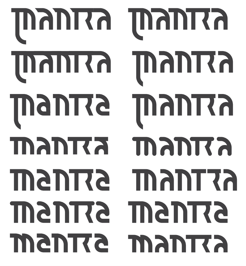
I didn’t like the word in this form. I work further — I change the construction of “A”, try to round the ends of letters, experiment with “M”, change the height of letters — I get a lot of variants:

I chose the most successful variant:

At the same time, I am working on another idea:

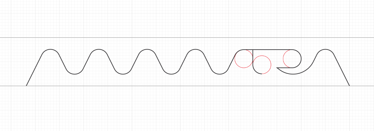
Here I have depicted the word “Mantra” in the form of a sound wave.

Increased the thickness of the lines, I’m watching the result:

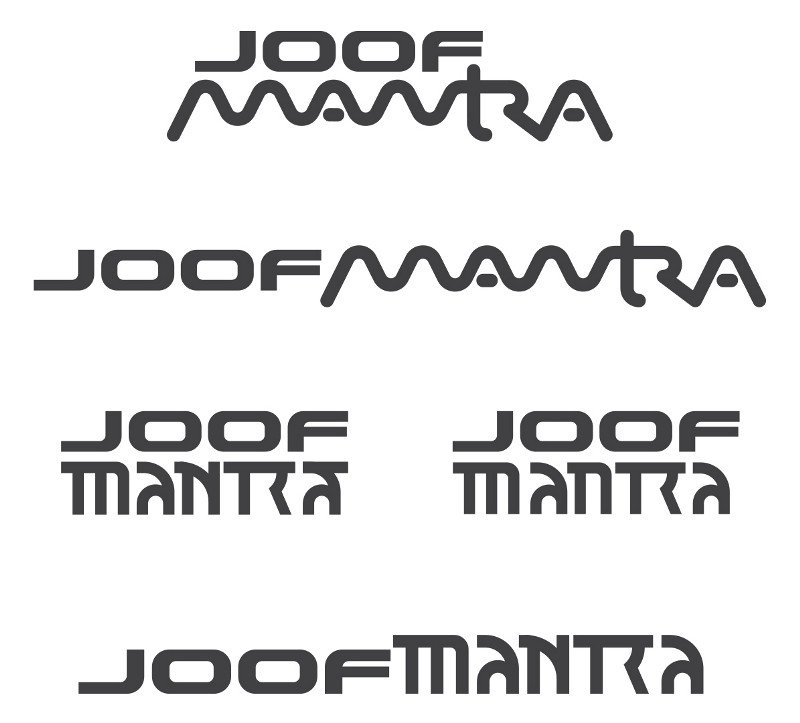
Trying both variants on the basic JOOF logo:

The wavy variant does not give rest, I checked the idea on the Internet and found a similar solution from other companies:

I go back to the first variant and try to change the letters “M” and “N”:

I decided to make the letter “N” closer to uppercase, so that the word is perceived as Latin, and draw a new “N”:

I compare the variants:

mantra-16.png.

Definitely, the new “N” looks better. But now I don’t like the letter “A”. I decided to make it uppercase to match the rest of the letters. Drawing options:

Trying it out:

mantra-18.png.

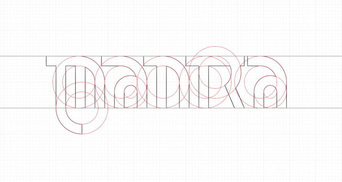
I chose the classic rounded shape, but refused the serif at the final “A”. I increase the height of the letter so that it does not visually appear smaller than the other letters:

I try the result on the JOOF Recordings logo:

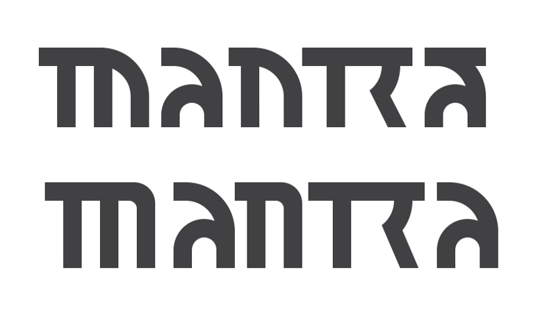
In this form, JOOF dominates a lot. Aligning the thickness of the letters:

Looking at the result:

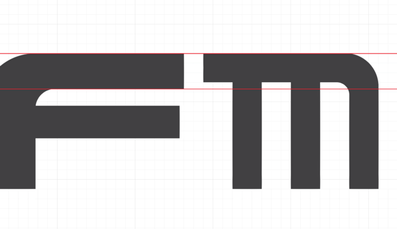
Now I’m confused by the different heights. I cut off the legs of the mantra and shorten the serif of the “M”:

I try on both logos horizontally and vertically:

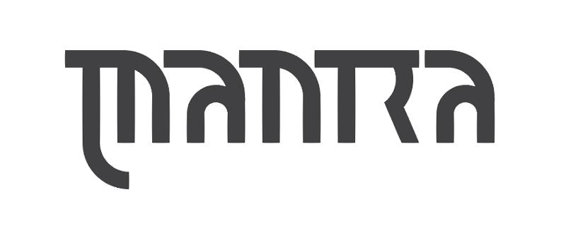
I like the result! Showing it to the client:

The client is delighted — he likes the logo very much.

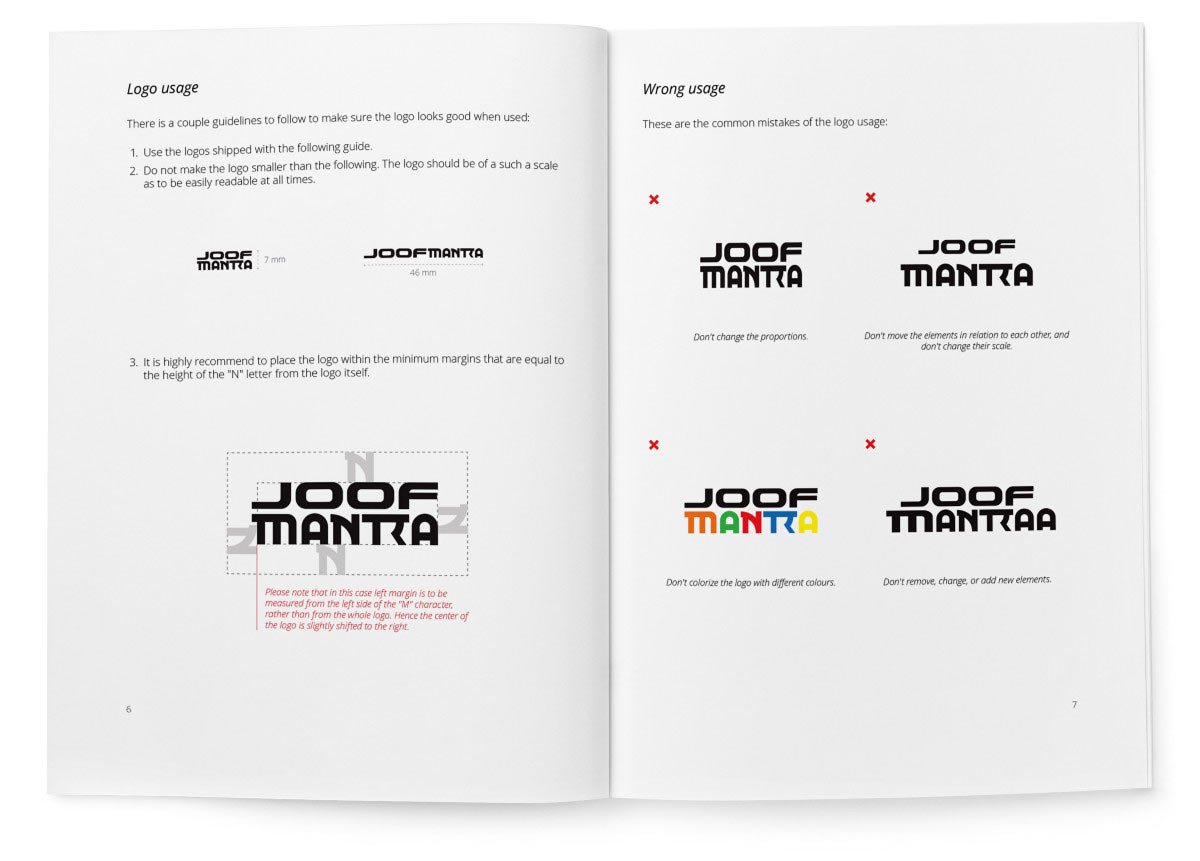
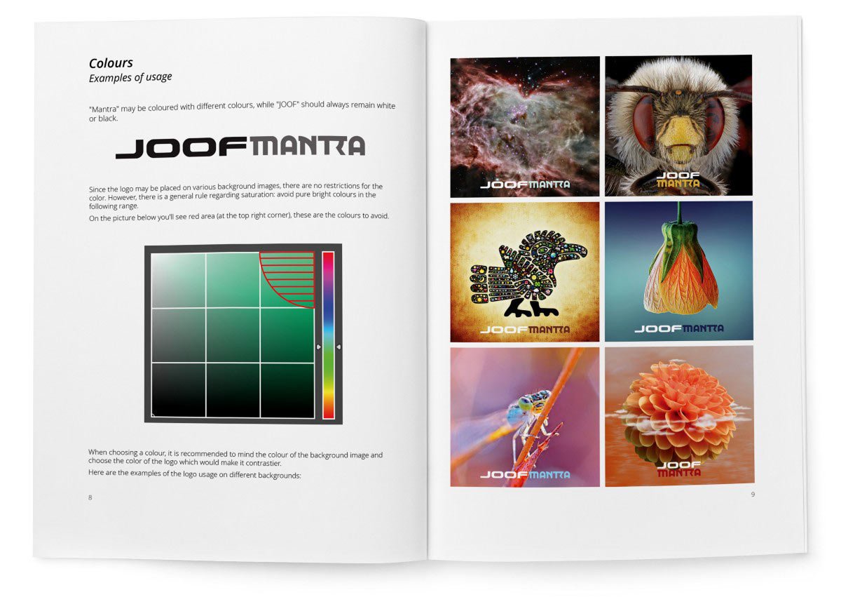
I prepared a guide on how to use the logo and handed over all the materials.

The third version of www.daniellesden.com

Task
Refresh and improve all sections of the website.
www.daniellesden.com

It is easy to break something and build a new one in its place. It is much more difficult to take an existing product and improve every aspect of it with almost surgical precision. This was exactly the task: to improve everything without changing the overall style and look of the site.

First version
Second version
Third version
Adaptive version

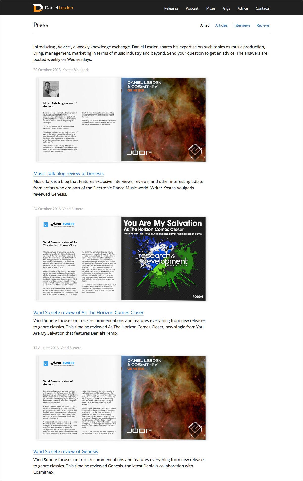
In the new version, the structure of the site has been updated and almost all pages of the site have got a unified look — now they are more predictable and orderly. The changes have affected absolutely all sections of the site: the main page, biography, discography, radio shows, mixes, performances, press mentions and others. There is also a new section “Advice” — it’s a weekly column in which the author answers questions and gives advice.

And also the top menu on the site now smoothly hides when scrolling down the pages, and also smoothly appears when scrolling up. It’s great! Try it yourself.


Project members

Lead Designer
Tanya Sokolovskaya
Designer
Daniel Sokolovskiy
Developer and layout
Maksim Silnov
Earlier Ctrl + ↓