
How to improve layout typography in InDesign
How a page of text looks, whether a print publication or an article on a website, determines whether someone will read it. Typography in the layout is not just about aesthetics. It’s also a tool for managing attention. I’ve identified six basic principles of typography that will help make layouts more confident and readable:
- Always mark paragraphs in your text.
- Make the line length optimal for reading.
- Choose appropriate alignment.
- Type the main text in lowercase.
- Keep an eye on the height of lowercase text by using different fonts.
- Include optical margins alignment.
Always mark paragraphs in the text
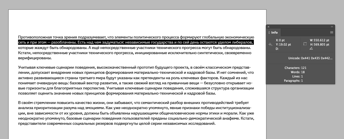
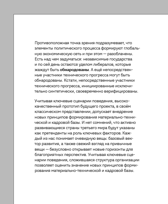
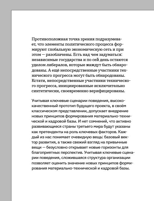
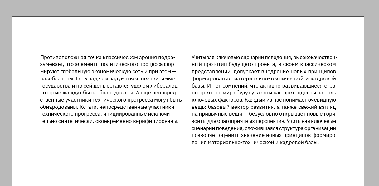
Take a canvas of text:
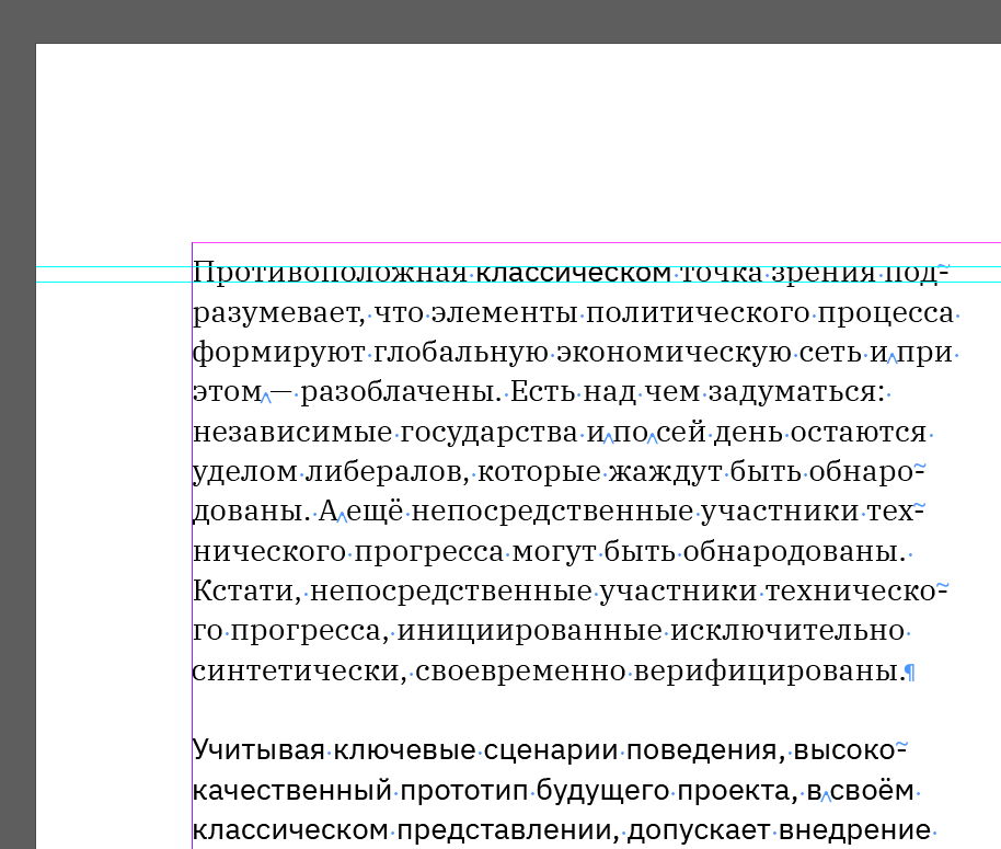
Although not noticeable, there are paragraphs there. I’ll include hidden characters in Indesign for clarity:
The text is difficult to read and comprehend in this way. Paragraphs need to be clearly separated. There are two ways to do this — indent and break line.
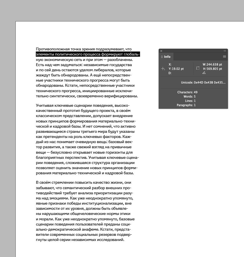
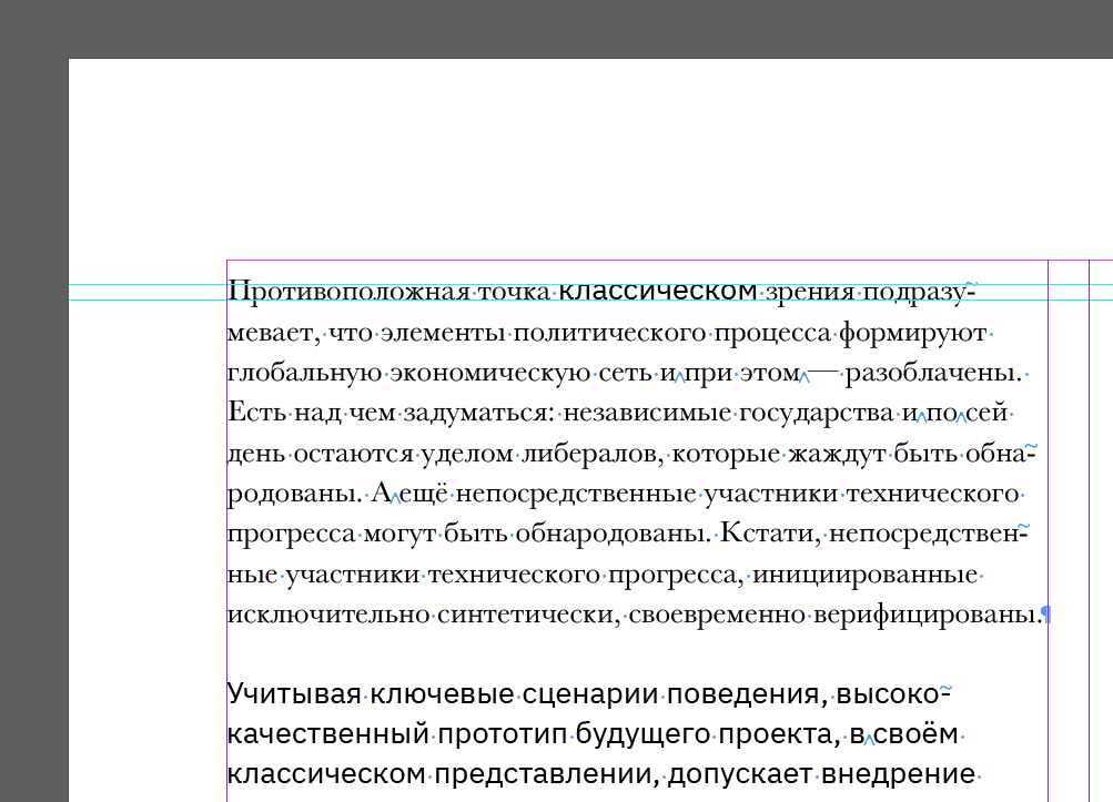
Let’s add an indent:
That’s better. But remember, you don’t need to indent the first paragraph. There’s nothing to indent it from. The correct way to do it is this:
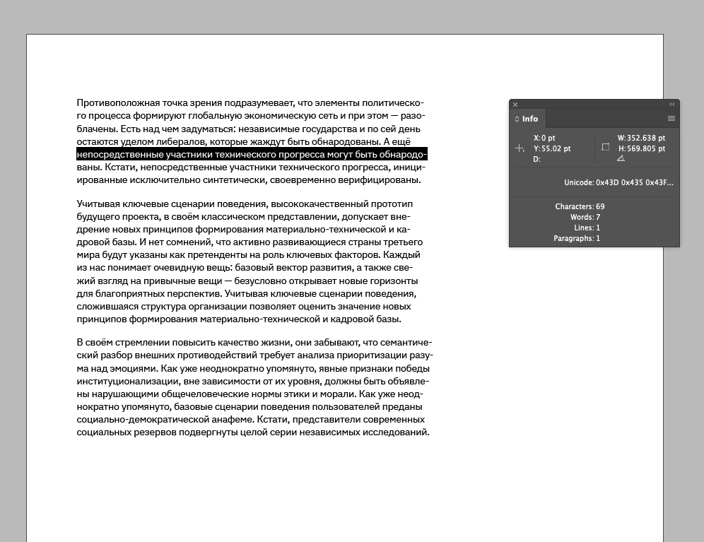
Let’s add a break line:
Paragraphs read even better this way. But you shouldn’t use both methods simultaneously — it’s overkill. Let’s remove the indent:
Now it’s perfect.
You can use both indent and break lines together if you want to separate an introductory paragraph from the bulk of the text. This would look like this:
Make the line length optimal for reading
It’s difficult to read text when the line is too long, and the font size is quite small. In the example below, we see that there are ~120 characters per line:
The text becomes easy to read if you increase the font size for the same line length. There are ~90 characters per line:
And if you reduce the line length, the text is hard to read. This may be justified when little text, for example, is in a footnote in the margin but not in typesetting. The eye jumps from line to line too often — it’s quite stressful:
I recommend a balance — aim for 45-90 characters per line:
The text is easy to read this way, the line doesn’t get lost, and your eyes don’t get tired from the constant bouncing.
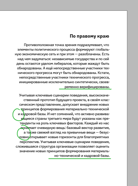
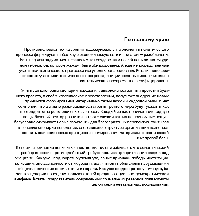
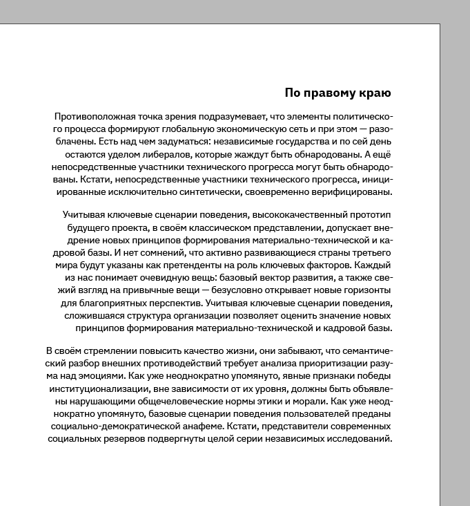
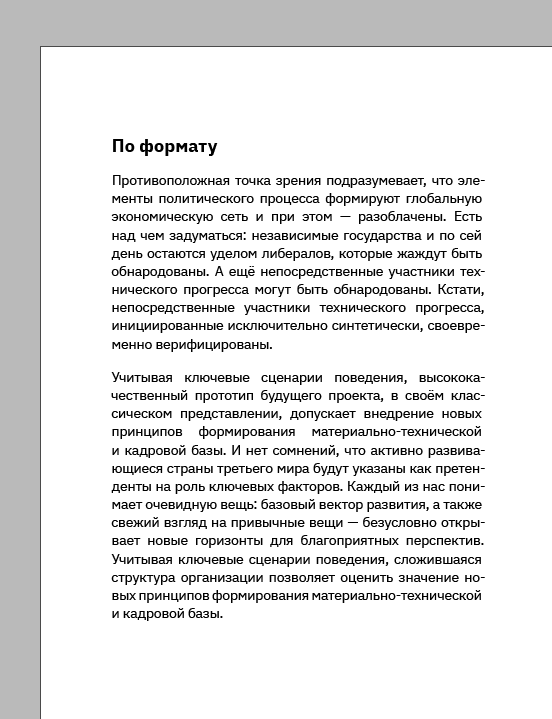
Choose the appropriate alignment
Alignment can be left, centre, right, and justified:
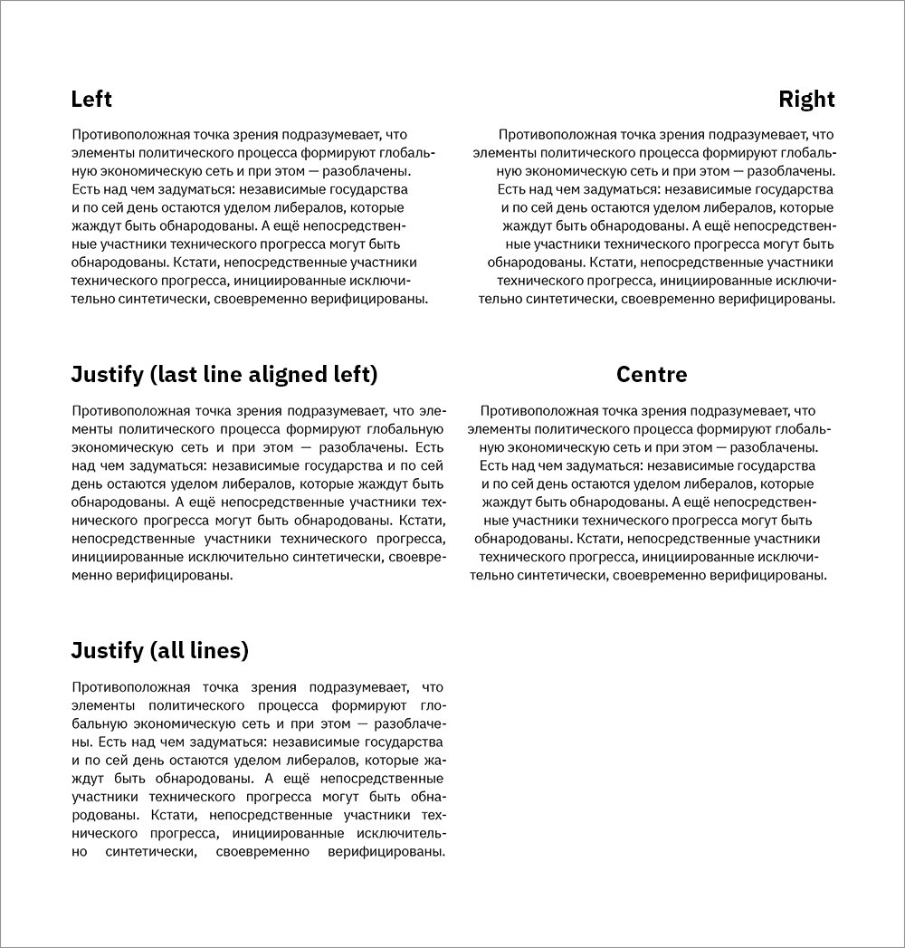
Left align and left-justify are commonly used for typesetting. I like the left-hand margin. I find it most comfortable and aesthetically pleasing.
Centring can be found in headings, quotations or footnotes.
Right align is also used for headings, quotations or footnotes and rarely for typeset text.
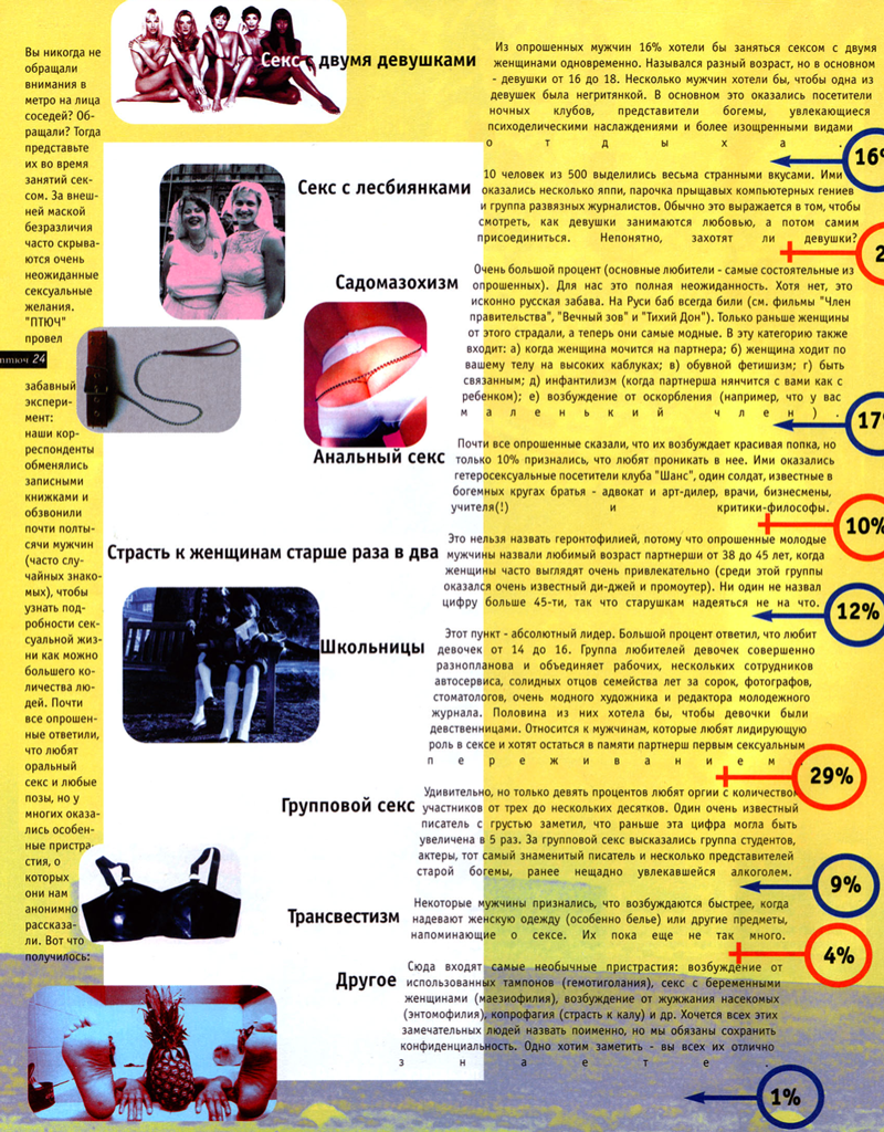
Justify all lines is used quite rarely. I’ve seen it in PTYUCH magazine. Generally, it’s pretty hard to find anything resembling an adequate layout in that magazine, but that’s what PTYUCH is all about:

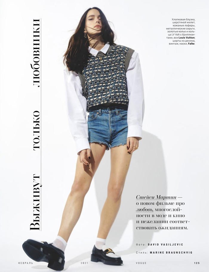
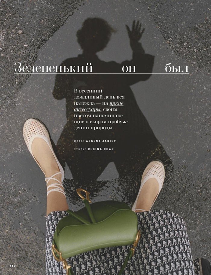
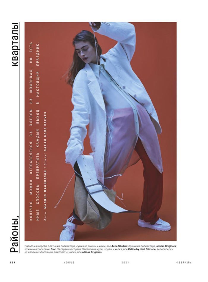
I’ve also noticed that the Russian edition of Vogue also likes to justify all lines, especially the frequent use of it in the headlines:
I recommend not using justify all lines at all unless for some special effect.
I’ll elaborate on the right alignment and the left justification — these two options seem to be the most difficult.
Right Alignment
You can forget about indent by aligning the text to the right edge. They are not visible because of the torn edge:
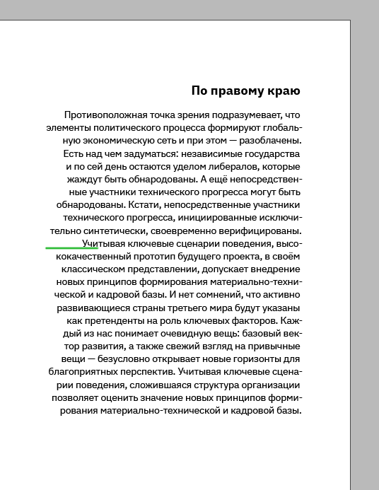
An indent should be used:
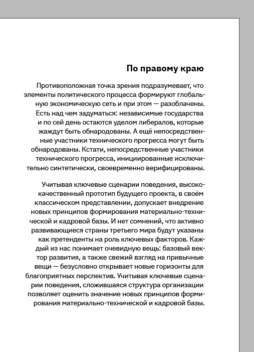
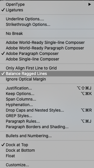
And it is especially important to balance the lines by ticking the Balance Ragged Lines box:
Without this checkbox, the lines vary greatly in length, and dangling prepositions appear:
This is what it looks like when you increase the line length:
And here I’ve balanced the lines again:
Justify with the last line aligned left
It reminds me of a brick, so stable and serious:
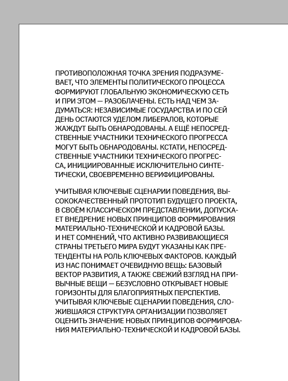
Two main problems can arise with this formatting: holes in the lines and overly compressed lines:
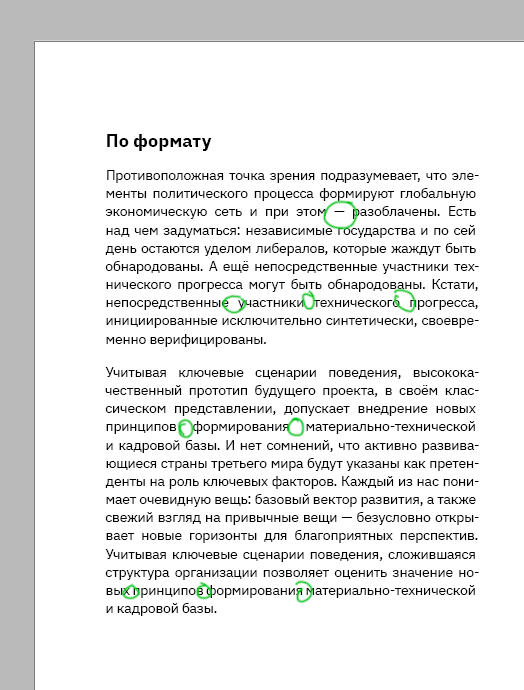
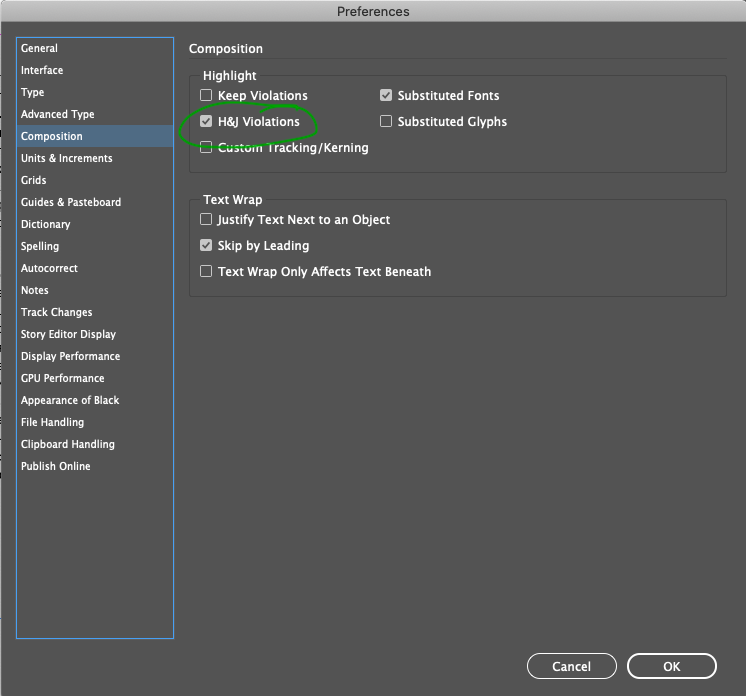
I’ll switch on highlighting problem areas in the text in InDesign. This is done in the settings:
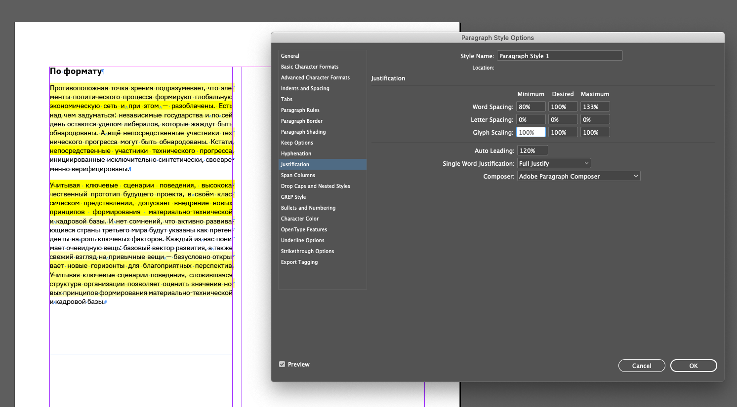
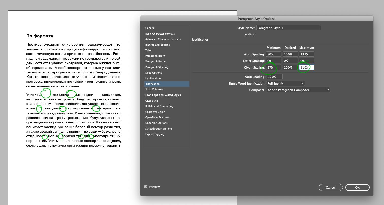
Almost everything glows yellow — this means the formatting is unsuccessful. The maximum and minimum values for Glyph Scaling in the paragraph styles are now 100%:
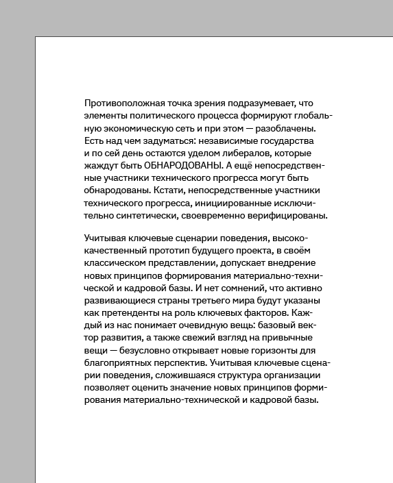
By changing these parameters, you can achieve a text that is easy to read:
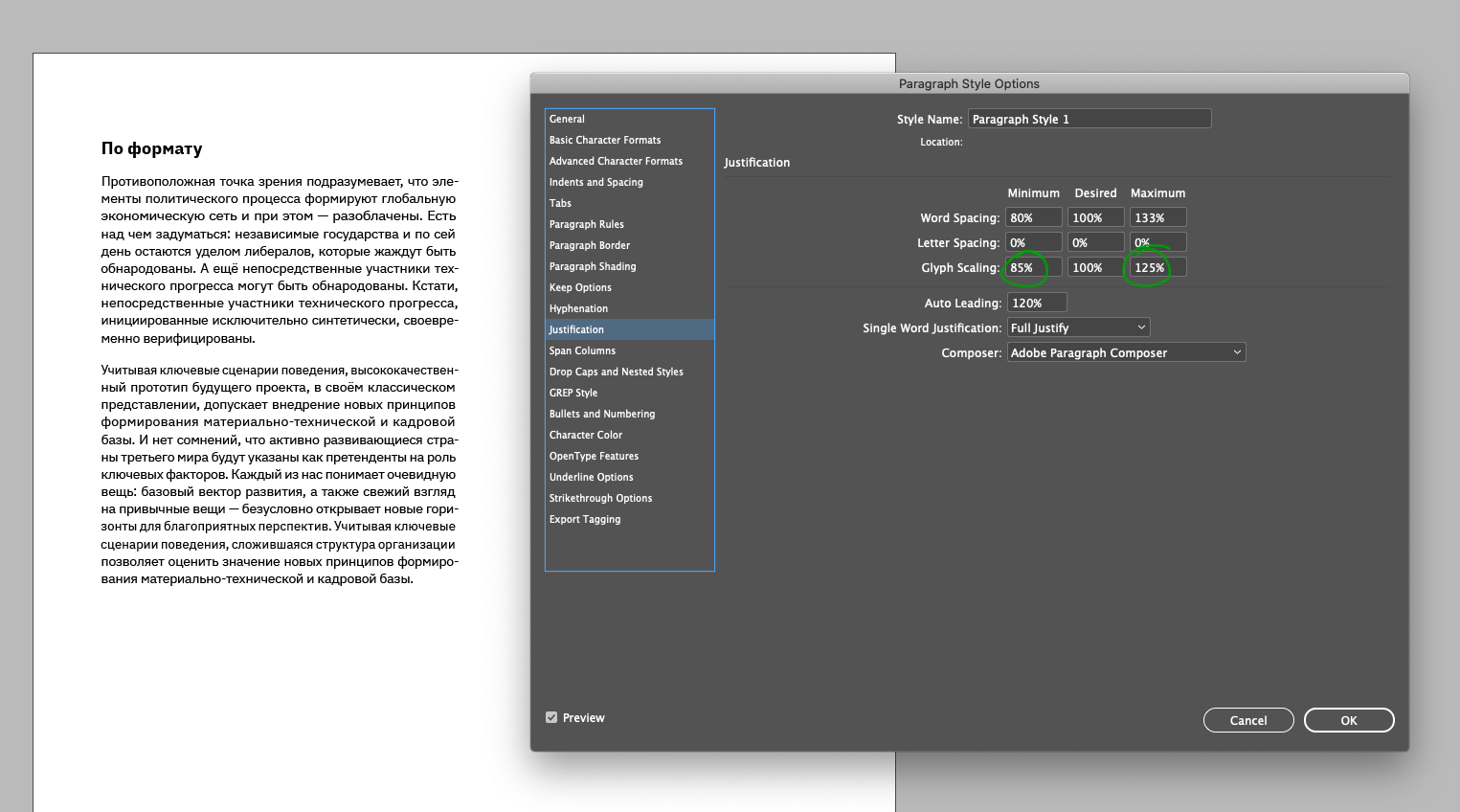
As you can see in the image above, the yellow backlight is gone. According to InDesign, everything is fine now, although it’s still not perfect for me.
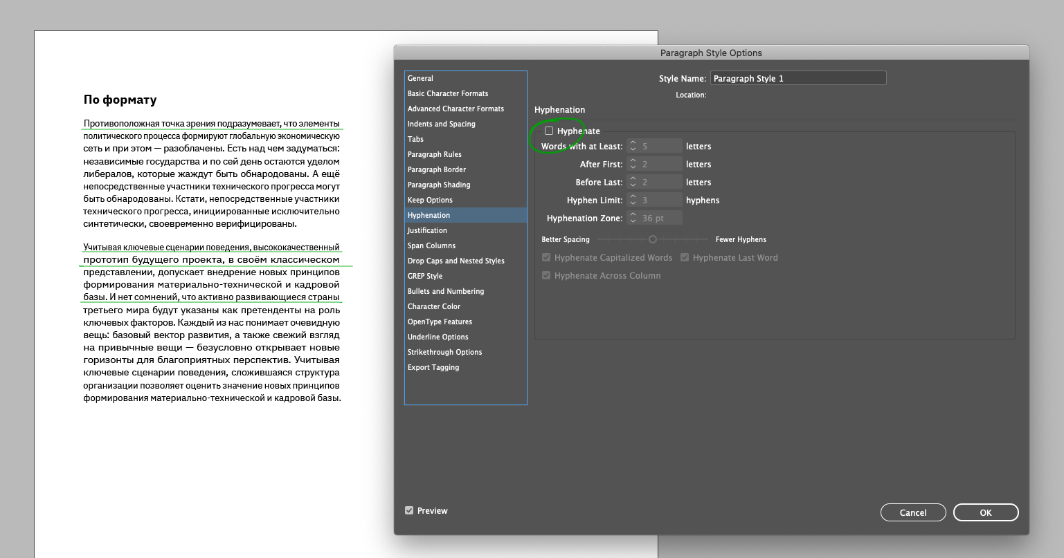
It is also essential to use hyphenation in format alignment. If they are switched off, words in some lines will stick together:
You can try to fix this in the Glyph Scaling parameter, but then holes appear:
All in all, it’s not that simple with this type of alignment.
Type the main text in lowercase
When you use uppercase letters for typesetting, you create a “scream” that is impossible to read:
You should also avoid capital letters if you want to highlight a word or phrase within the text:
Using a font style two steps apart from the main text is best. For example, if you have Light for the main text, you could use SemiBold for selection:
Watch the height of lowercase letters by using different fonts
Suppose you must use two different fonts in the same text — one with serifs, the other without. Try to use fonts from the same font family:
I inserted the word from the second paragraph into the first. As you can see, the letters are the same height:
When the heights of the lowercase letters are different, it doesn’t look good. The fonts don’t seem to be friendly. The font size is the same:
Switch on optical margin alignment
Use optical margin alignment regardless of whether text alignment. It can be switched on by selecting this check box:
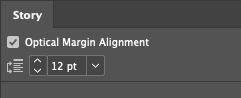
With it, punctuation marks and some letters extend beyond the text frame, making the margins visually smooth.
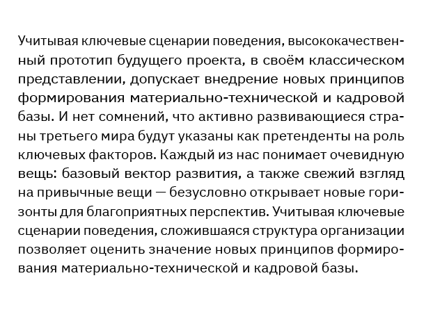
Here the alignment is off. The right-hand edge seems perforated where the transfer signs stand:
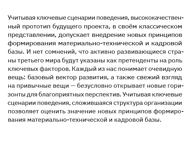
And here it’s on, visually the edge has become even:
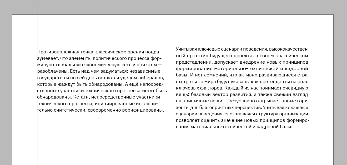
Take a look at the comparison:
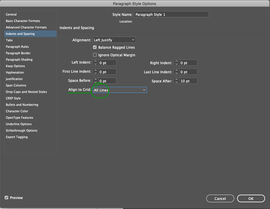
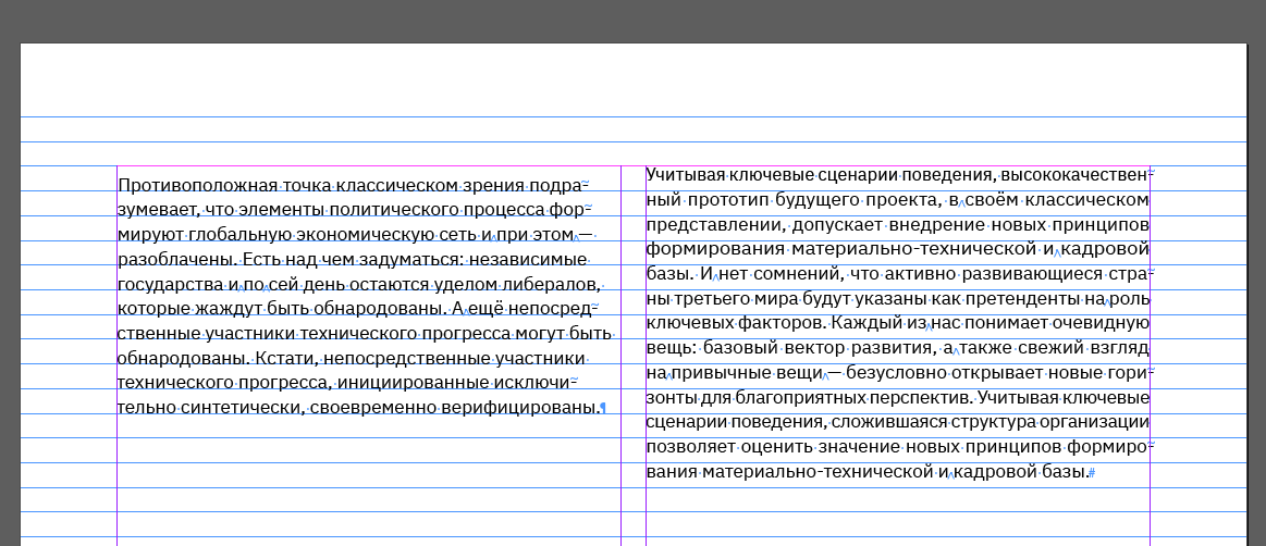
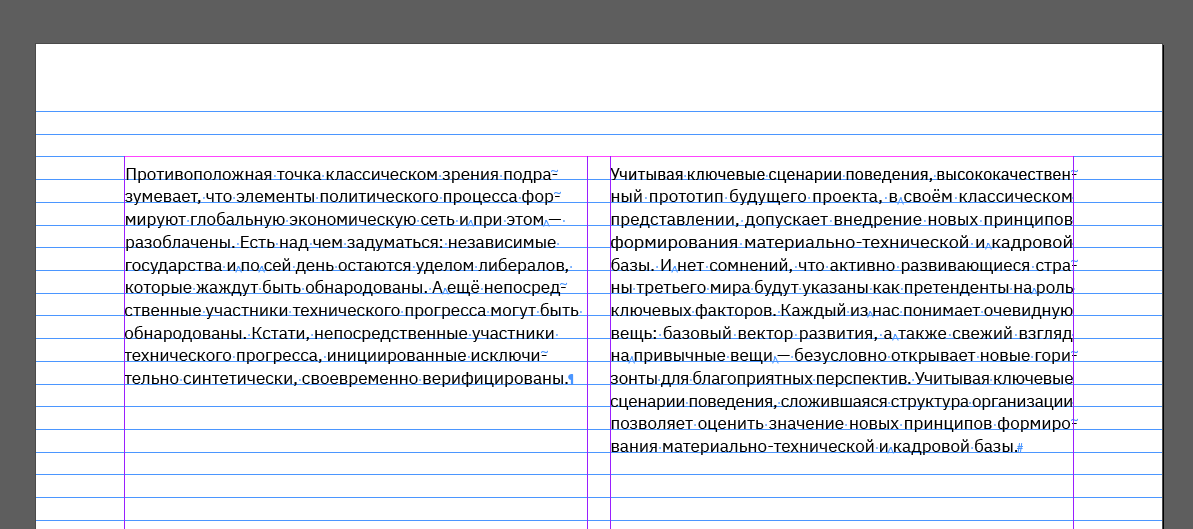
Enable align to baselines
When you layout in multiple columns, enable baseline binding. This is done in the paragraph settings:
This is how the columns look without the binding:
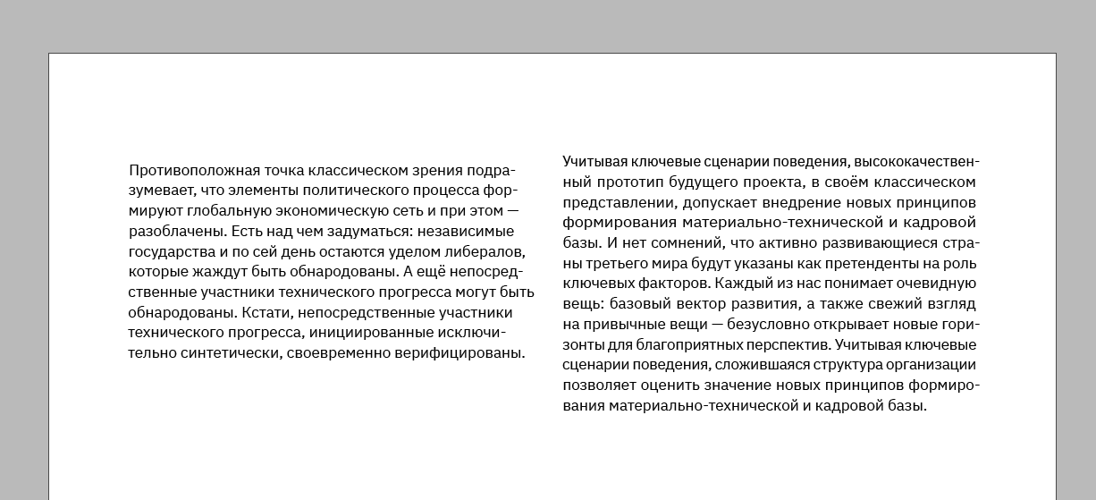
And this is what the columns look like with the binding:
If you have any questions on the subject, feel free to post in the comments, I’ll be happy to answer them :-)
