How I prepare magazine images for offset printing
This video contains updated and more relevant information on preparing images for offset printing. The post itself needs an update, so make sure to check out the video for the latest tips and techniques.
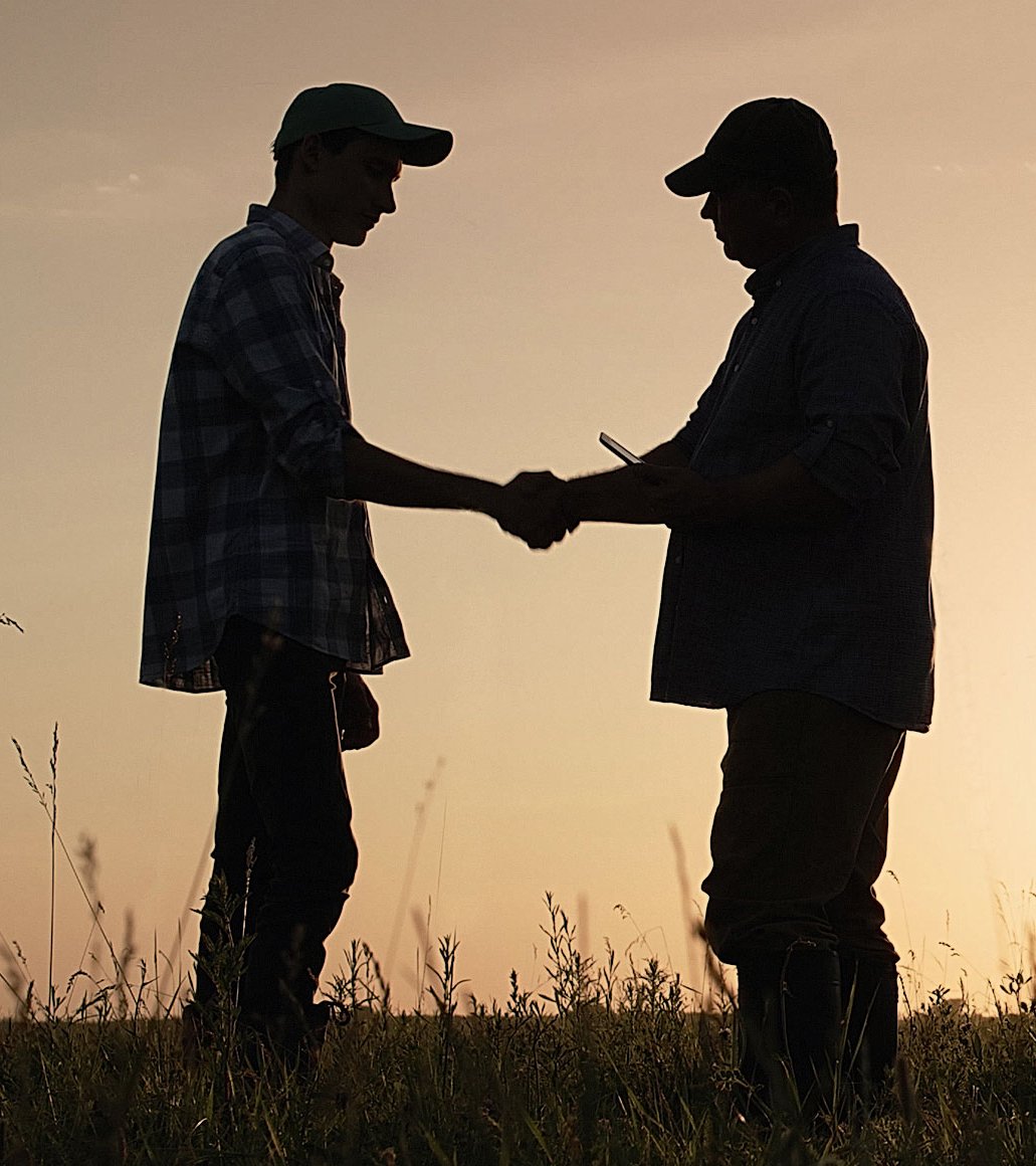
Images in a multi-page publication must be prepared to look good when printed. Typically, print shops have different requirements for offset printing, but the general principle of preparation is pretty much the same for all of them. I’ll give you an example of my work for Agroinvestor magazine so that the print shop accepts the layout for the first time and the images remain high quality.
There are four essential points in image preparation: the resolution (300 dpi), the colour model (CMYK), the colour profile (for our print shop, this is ISO Coated v2 300 % (ECI)) and the sum of the colours (no more than 300 %). At first glance, nothing complicated: take a picture of a suitable resolution, do colour separation in the right profile, and that’s it. However, apart from these points, there is an essential aspect of offset printing that I want to talk about, but let’s go through it one by one.
layout stage
During the layout stage, I use low-resolution photos. Most of them even have the watermarks of photobanks, and it doesn’t matter at this stage. This is what the linked files look like in the document:
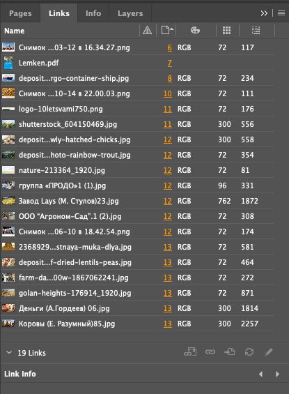
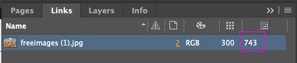
As you can see, all the images are in an RGB colour scheme, and most have a resolution of 72 dpi. This resolution is optimal for screens but very low for printing. And the effective resolution, in general, jumps around a lot. Let me explain, the actual resolution is the actual size of the picture, while the effective resolution is the size of the picture in the layout. If the actual resolution is 72 dpi and the effective one is 117, the layout picture is reduced by half. And vice versa, the picture is enlarged if the actual resolution is higher than the effective one. In the finished layout, their values should be the same.
Exporting images
I prefer to prepare the images for printing once the layout of the whole issue has been approved. That has its advantages:
- Things can change in the process: an article is replaced, strips are removed or added, pictures are sent in differently, ads are unexpectedly up, and so on.
- The original images are collected and sent to the photo editor, so it’s more convenient for me to get all the pictures at once rather than after each approved article. Also, if a photo from a photobank is suddenly replaced and has already been bought, then the money is spent for nothing.
- At any time, the chief editor can remove or add a piece of text within an article, which means that the size of an image will have to be changed because space on the page is limited. If the images were already ready to be printed, this work would have to be done again.
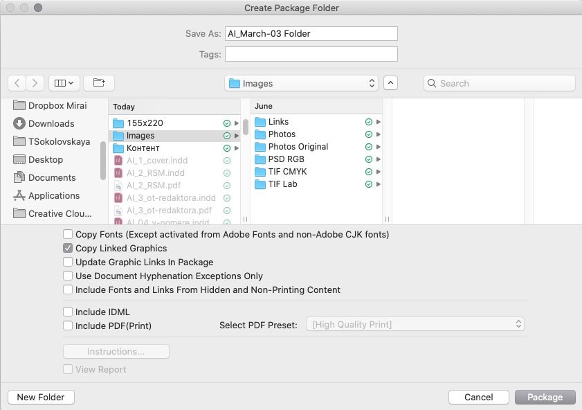
When all the articles are collapsed, I proceed to process the images. As you may remember, the images are of poor quality, and to send them to the photo editor for redemption, I need to gather all the images of the issue into one folder. To do this, I pack the files in print:
Next, check Copy Linked Graphics. No other checkboxes are needed:
The result is a Links folder with all the images, which I hand over to the photo editor, who sends me the original high-resolution images.
I also create three additional folders: PSD RGB, TIF Lab, and TIF CMYK.
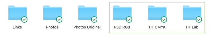
Links contain all the images in the issue; Photos — the images to be redeemed; Photos Original — their originals. The PSD RGB, TIF Lab and TIF CMYK folders are needed so that I can return to them at each stage of processing the photo and, if necessary, make changes. I’ll go into more detail about these stages next.
Resolution
Next, pay attention to the resolution. There are several sources of images: for example, pictures from photobanks are of high quality, but pictures from agro-companies or their websites are often in low resolution, and it’s almost impossible to get the originals.
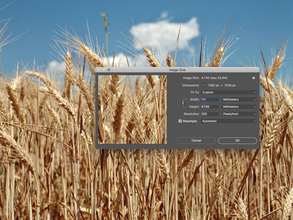
Let’s say I was sent a photo at 72 dpi, but the picture itself is quite large 67×38 cm:

I unchecked Resample and changed the resolution from 72 to 300. The image size is now considerably smaller — 16×9 cm:
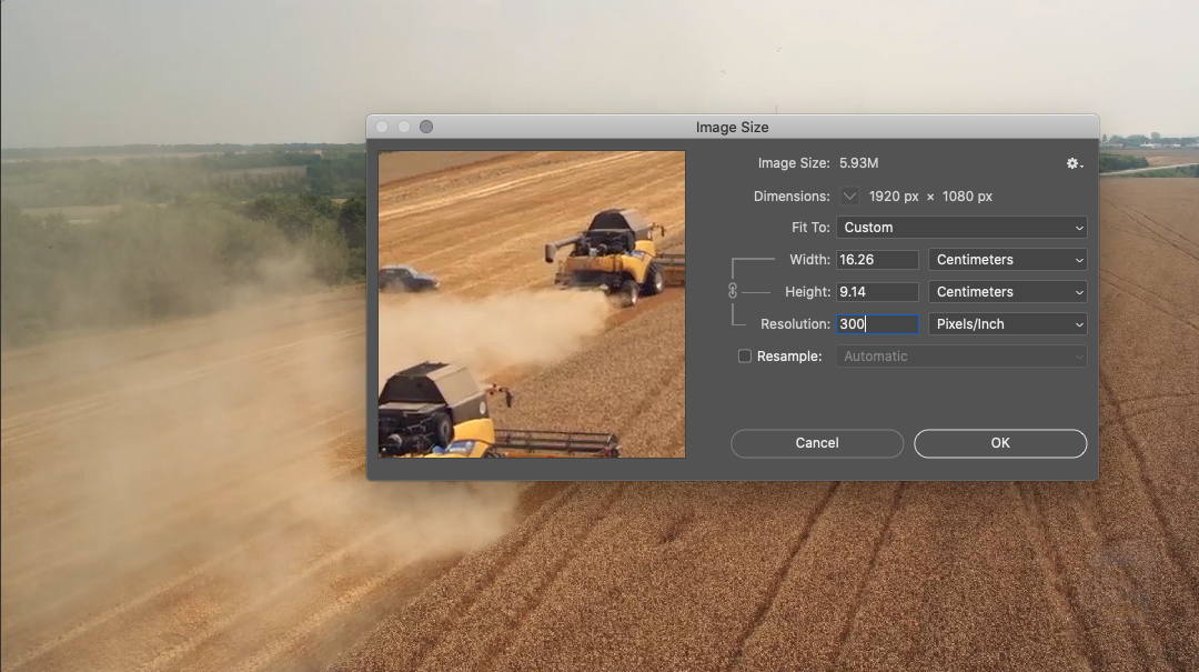
Ideally, this picture at 100% should be no larger than 16×9 cm in a layout. But what if I need it in a larger format? In such a situation, I enlarge the image by 15-20%. If an even larger format is required, the photo editor asks for the source, and if it’s not available, we look for a replacement image.
It may also be that an image is sent with a dpi value between 200 and 300. In that case, I increase the dpi value to 300, which will also not appear in the printout. When the dpi is less than 200, it’s not worth enlarging the picture, we will not see pixels in print, but there will be some graininess.
Colour profile and ink sum
Our print shop has a requirement to use the ISO Coated v2 300 % (ECI) colour profile. This profile makes my job easier: by running the images through it, the sum of the colours in the overprints automatically becomes less than 300 %. The ink sum is the amount of ink applied to the paper. The image will be pale if the value is less than 300%. If the ink sum exceeds 300%, the sheet risks soaking through and staining the adjacent pages.
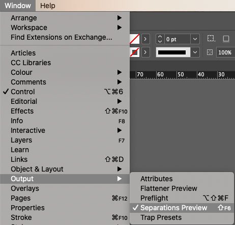
You can determine the amount of colour in an image in several ways in Photoshop, but I find it much more convenient to do it through Indesign. Go to Window → Output → Separations Preview:
And in Ink Limit mode, select the desired percentage:
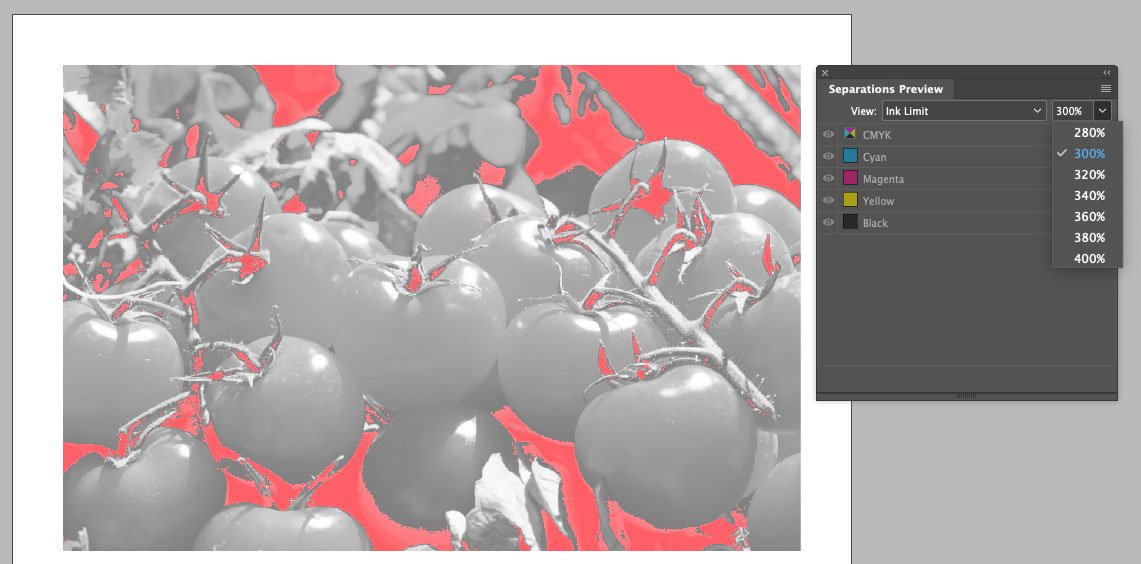
Red spots in the image indicate that the colour limit has been exceeded in these areas. This way, even at the layout stage, I can quickly check all the images in the article.
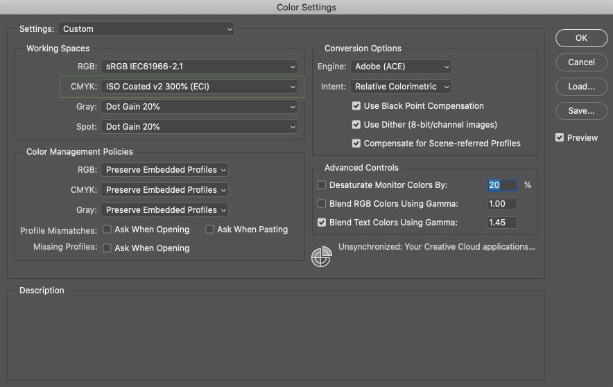
I have the required CMYK profile in Photoshop by default. This is done in the settings: Edit → Colour Settings:
From RGB to CMYK
All images can be divided into simple and complicated.
Simple— converts from RGB to CMYK with no problems:
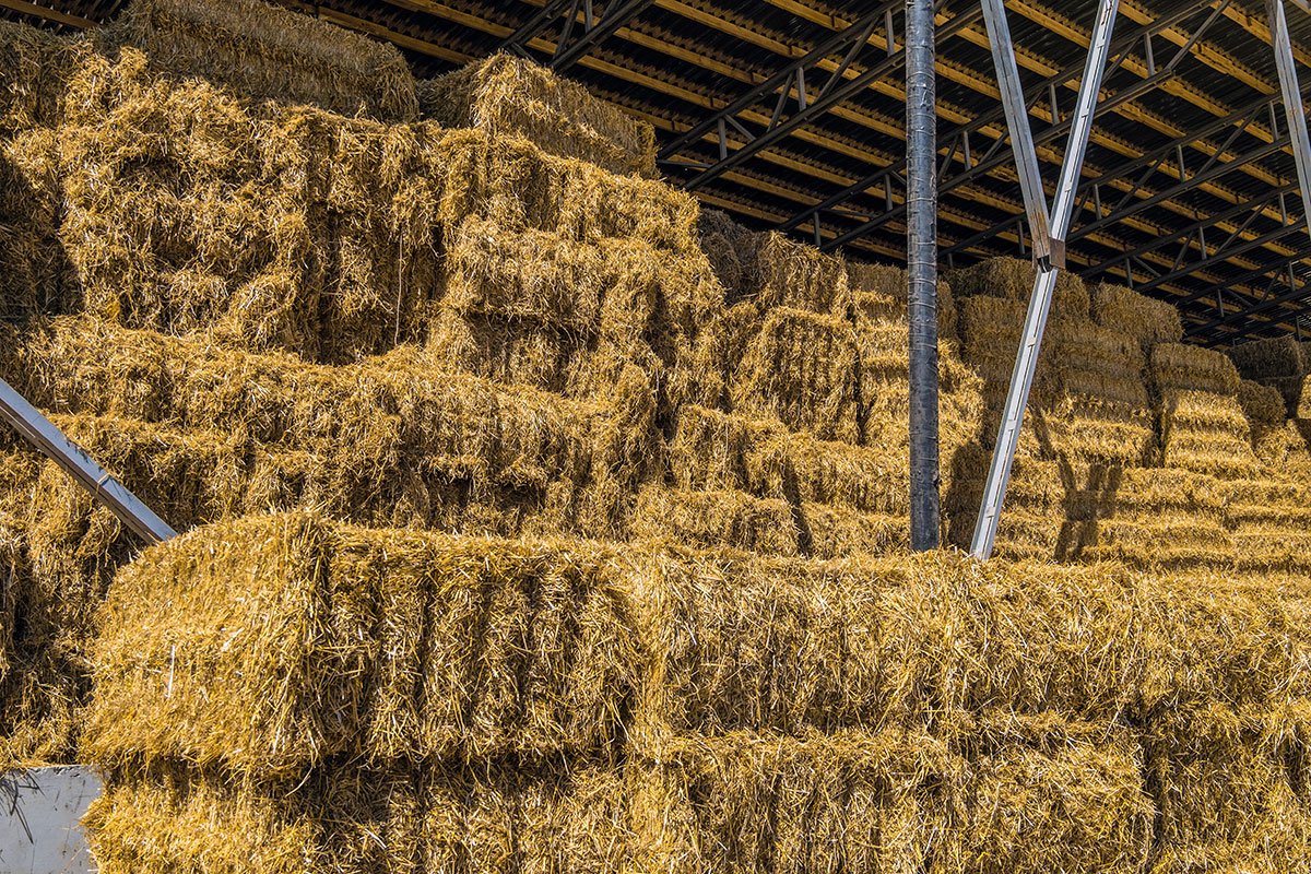
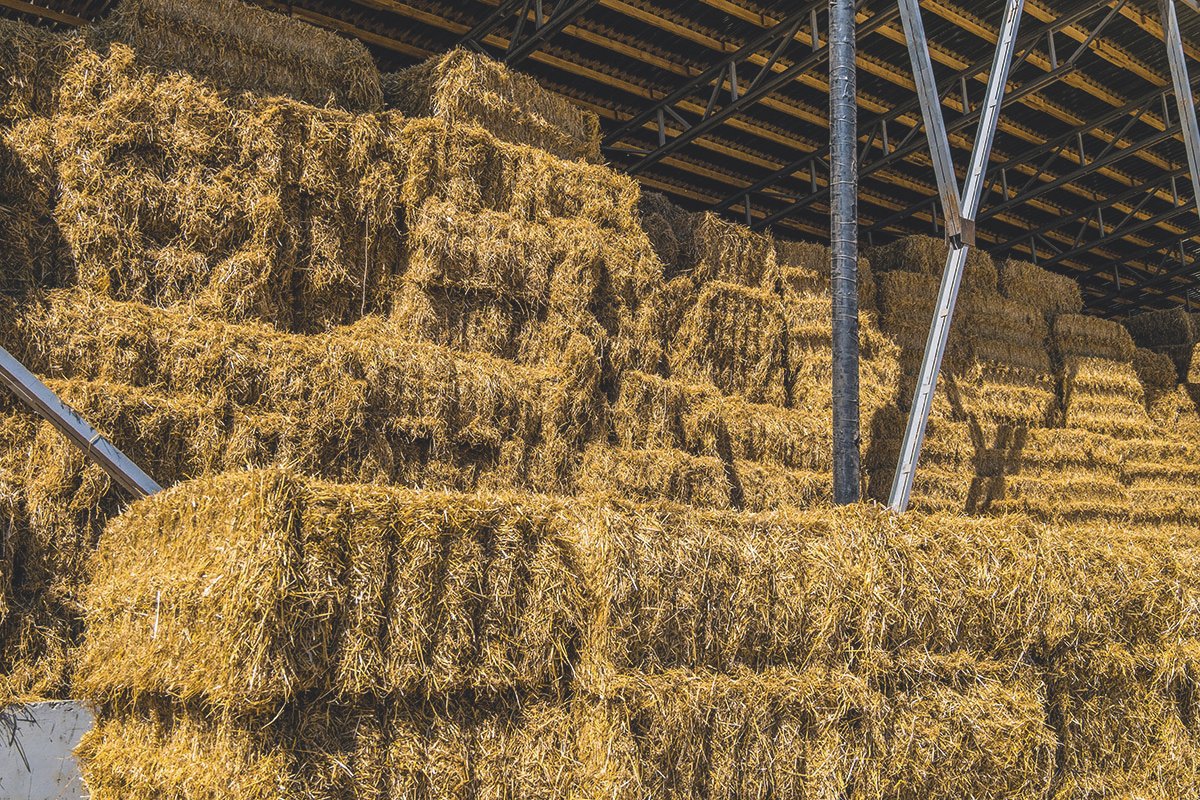
The first picture is RGB, and the second one is CMYK. There is practically no difference between them.
Complicated — includes unprintable colours that are lost in offset printing:
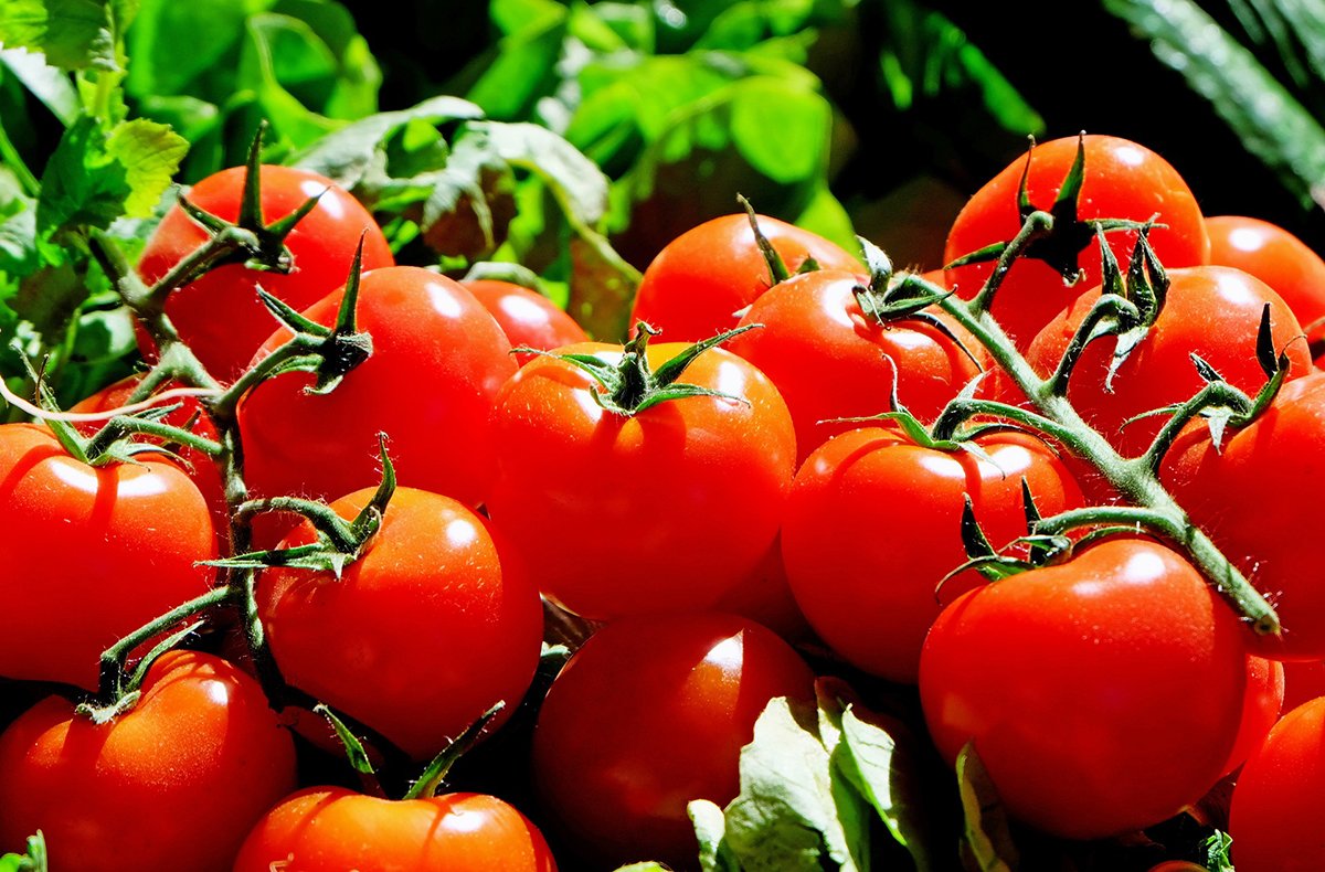
The first picture is RGB, and the second is CMYK. As you can see, the bright green and red are “eaten away” in the second one, and the detail and volume in these areas are lost. You can solve this problem by contaminating the colours.
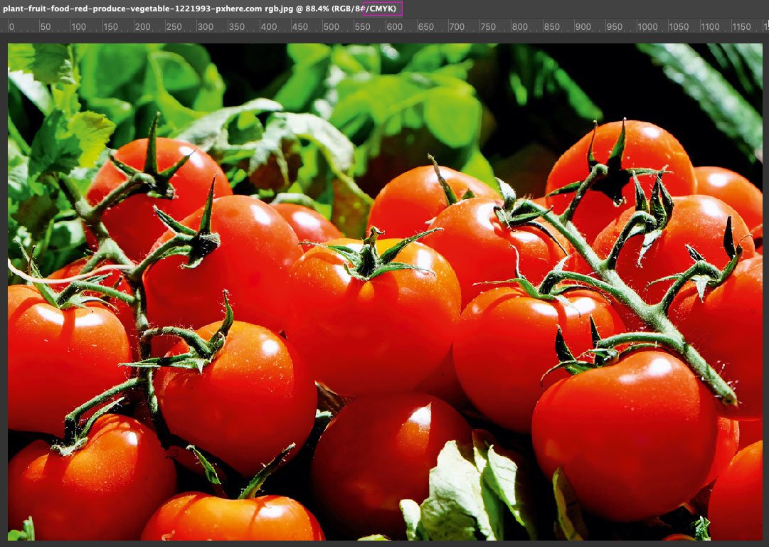
Open our photo in Photoshop and work in the RGB colour model. To quickly see if there are any unprintable colours in the picture, go to View → Proof Setup and select Working CMYK (you already have the right colour profile for it):
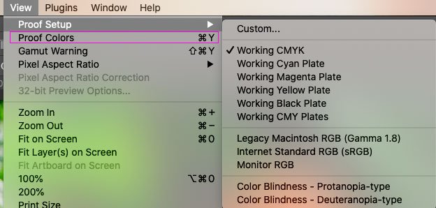
And with the Proof Colours command, we can switch between modes:
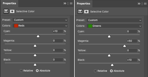
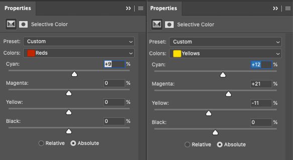
Reminder: work in RGB. To get rid of the unprintable colour, create a Selective Colour adjustment layer:
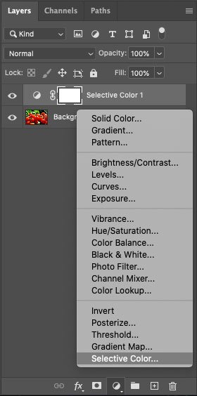
We have two unprintable colours — red and green, so it’s these that we will “pollute”. And we do it with opposite colours — for red, we raise Cyan, and in green, we increase Magenta:
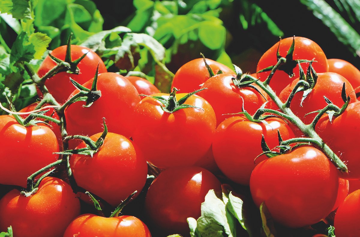
Let’s compare the three pictures now:
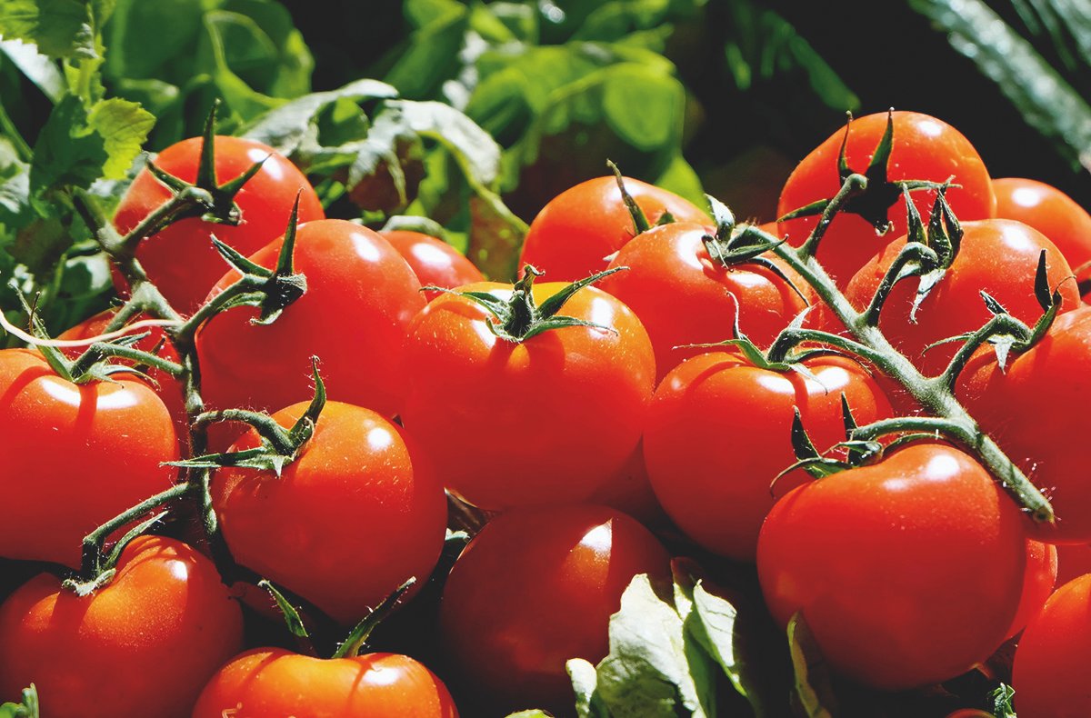
The first picture is RGB.
The second is direct conversion to CMYK.
The third one is converted to CMYK with an adjustment layer Selective Colour. Our picture is a bit darker, you can fix it if you want, but the tomatoes are still rich, and the leaves show details.
Let’s look at another example:
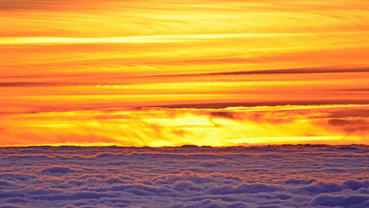
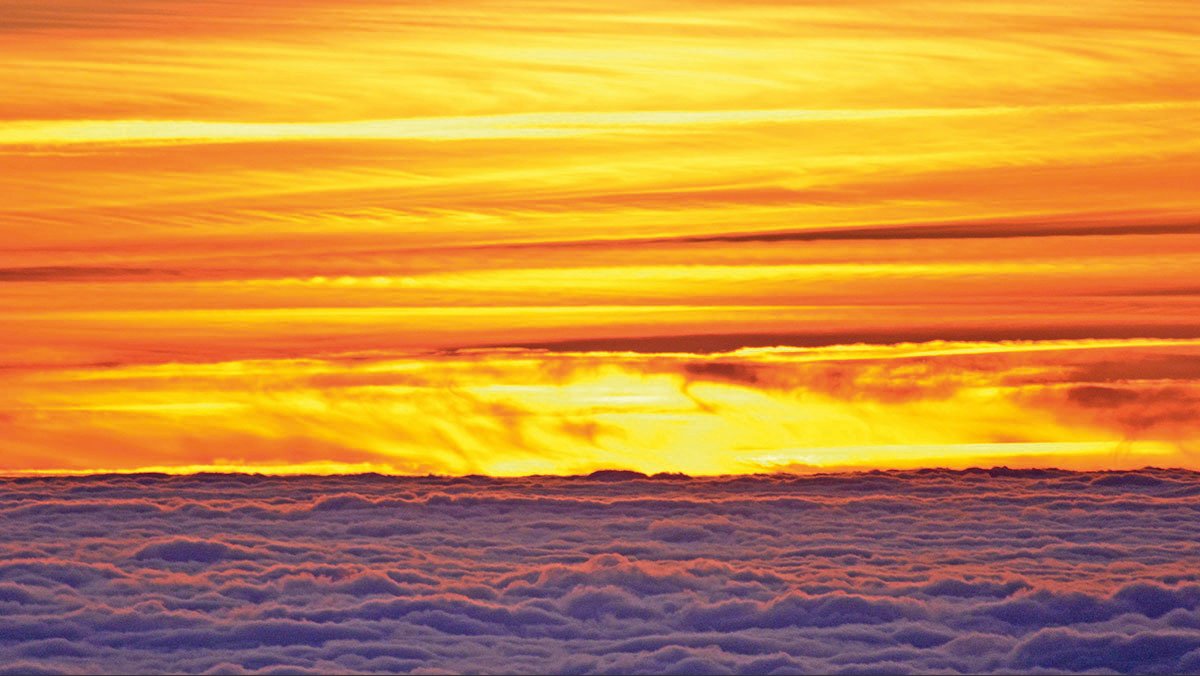
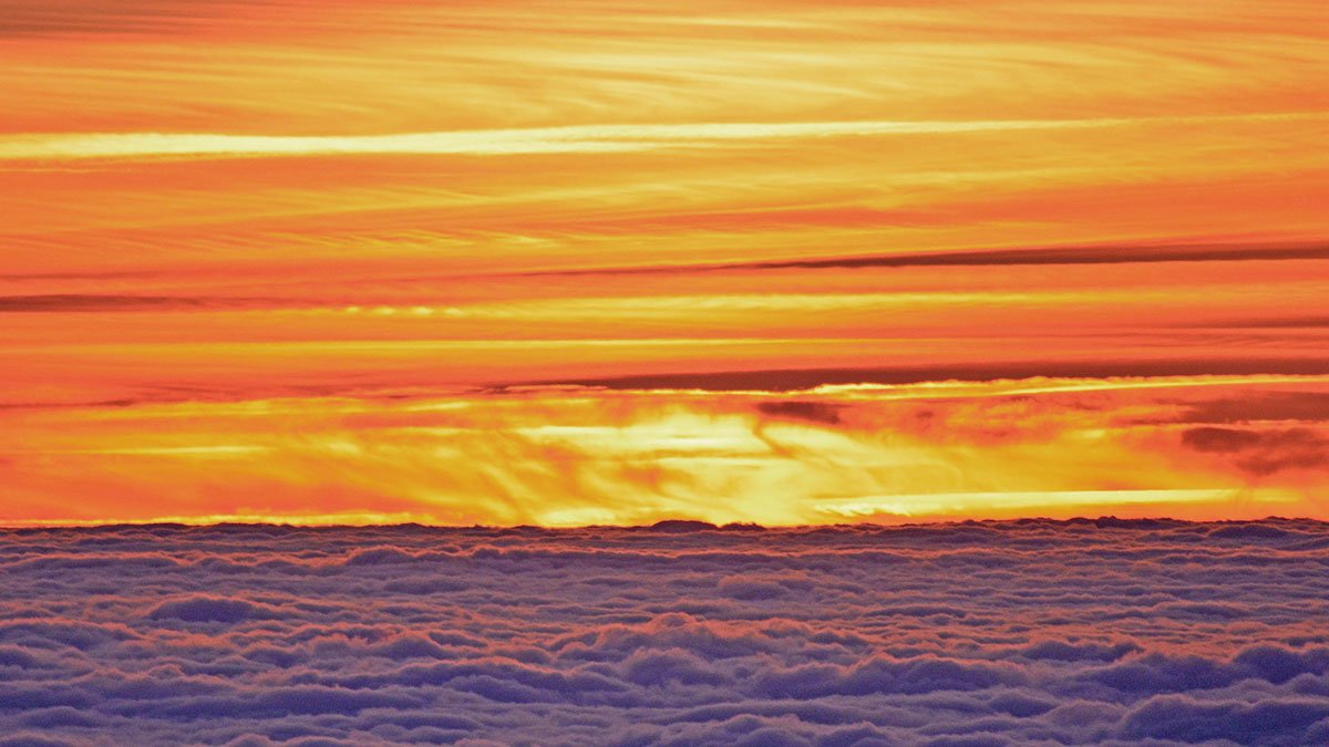
This is where I contaminated yellow and red:
The first picture is the original.
The second picture is the Proof Colours view. You can see how the brightest areas get soapy, and the smallest details disappear.
The third picture is corrected. It’s not as colourful and bright now, but printing such colours is impossible. I think it’s more critical to preserve details.
Feature of offset printing
The sharpness of offset printing decreases quite dramatically, which means it should be compensated technically. This is done in Photoshop with Unsharp Mask and must be done in several steps — separately in the Lab Lightness and CMYK Black channels.
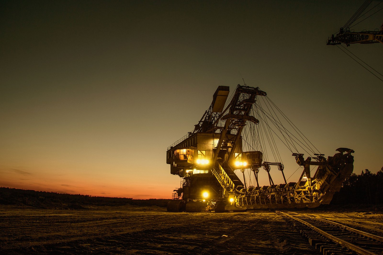
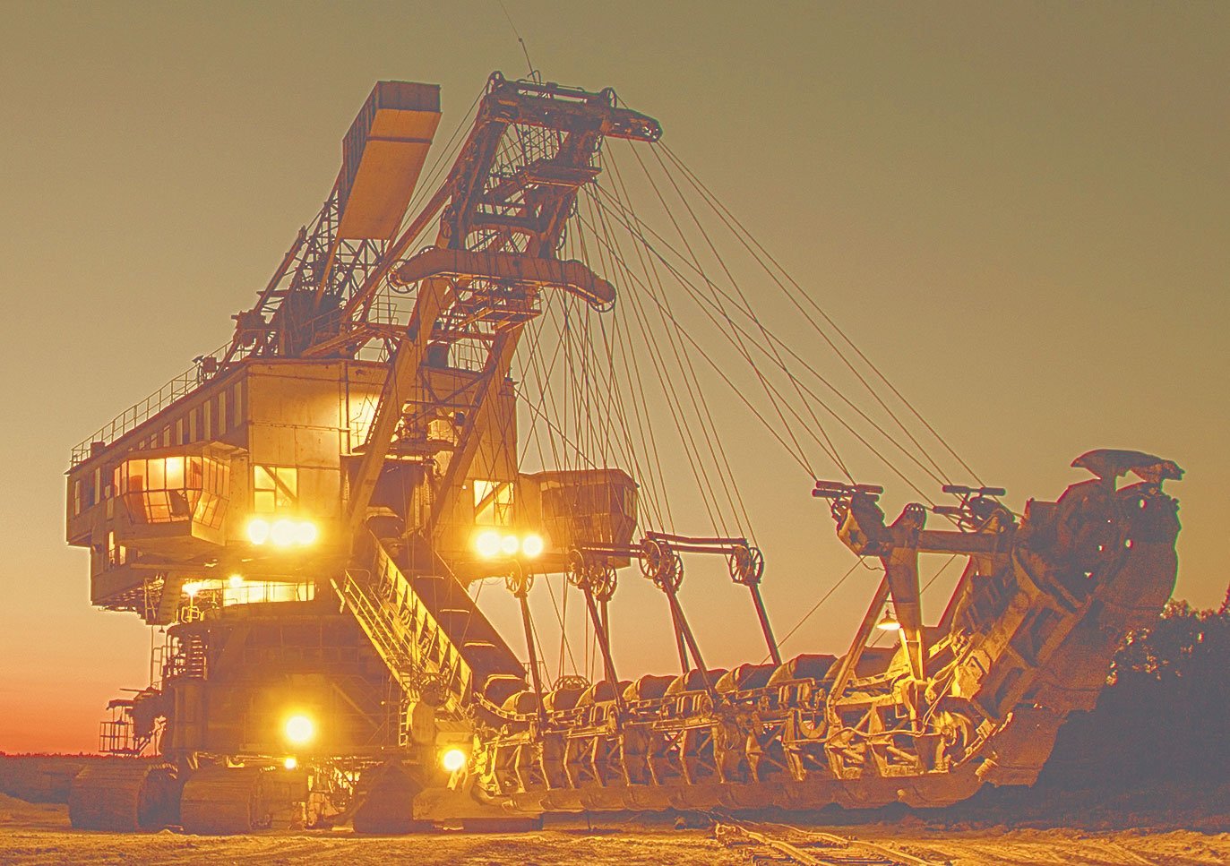
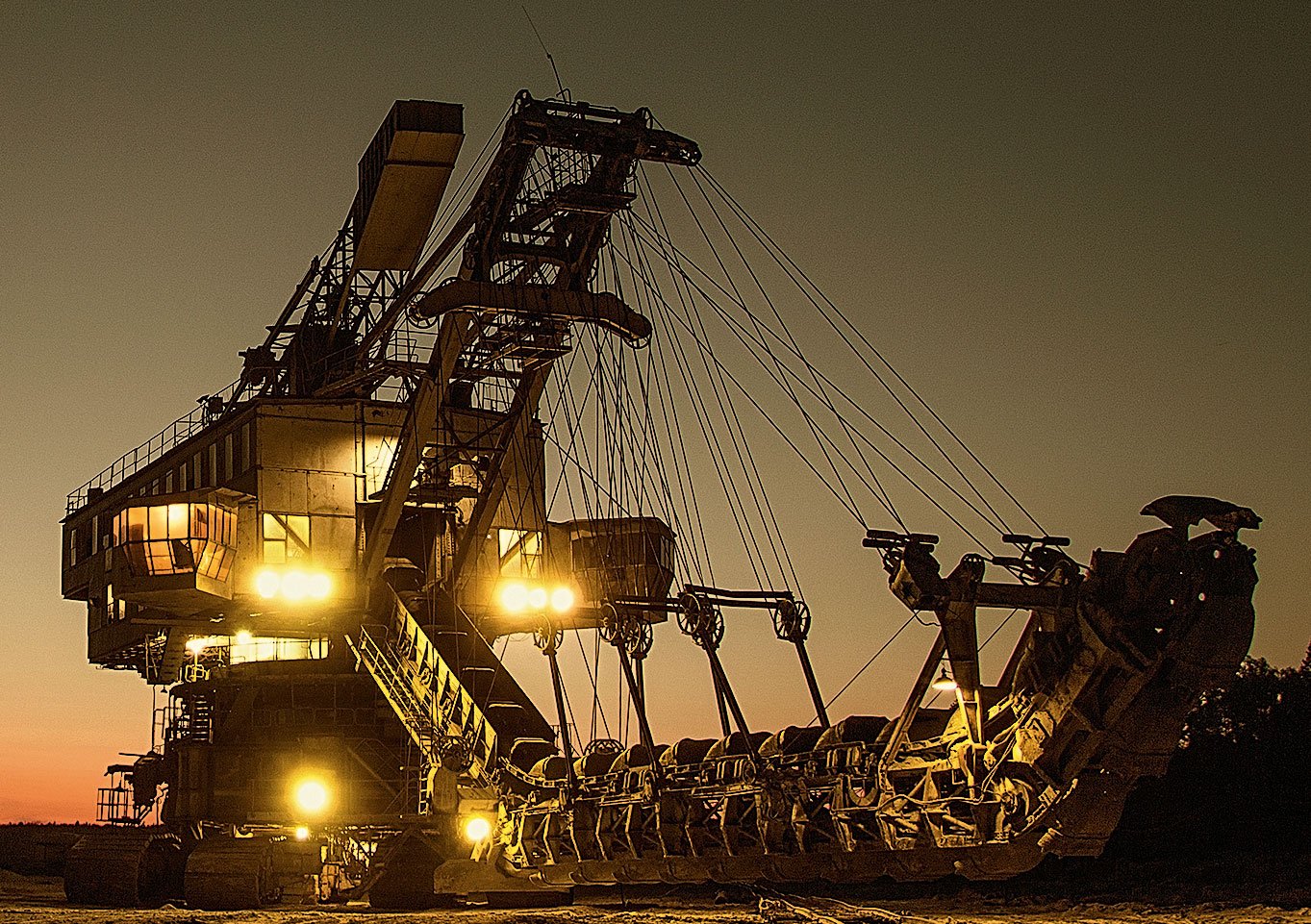
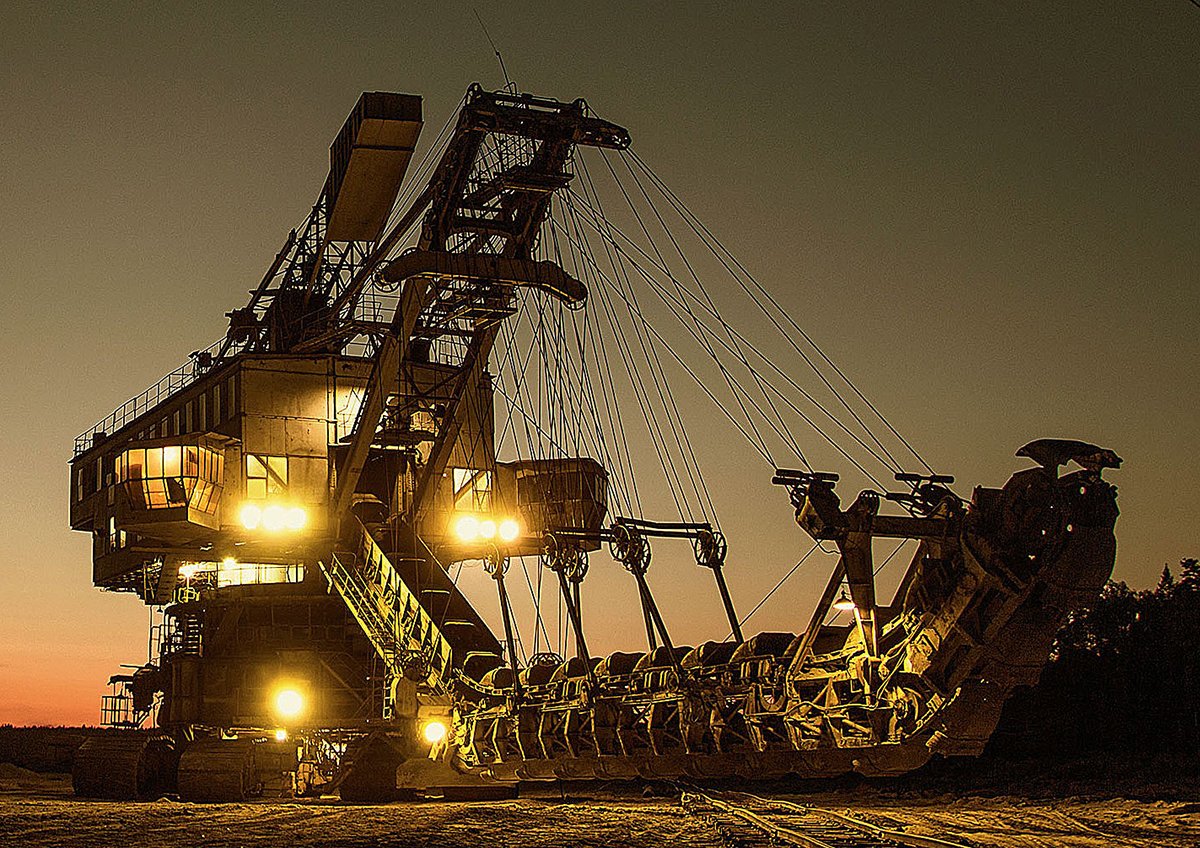
I’ve taken a rather dark picture with a black object to show the impact of the sharpening more clearly.
So, open the picture in Photoshop and create two duplicate layers:
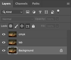
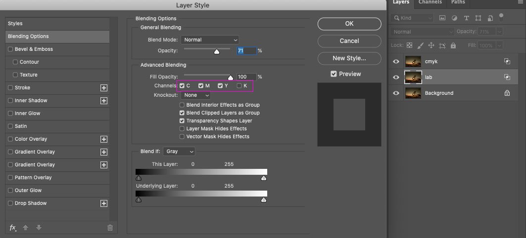
Convert the image from RGB to Lab without merging layers. Go to the Lightness channel, apply the Unsharp Mask filter with an impact strength of 100, radius 3 px:
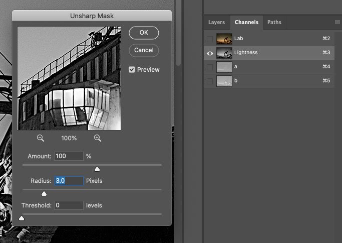
This is what we see:
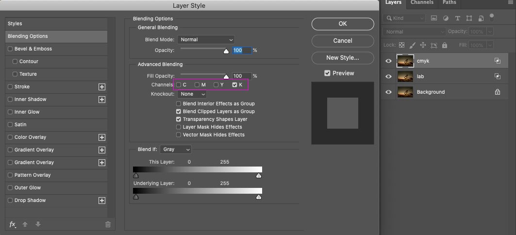
Next, convert the image from Lab to CMYK without merging the layers again. Go to the Black channel and apply the Unsharp Mask filter with a value of 300% and a radius of 1 px:
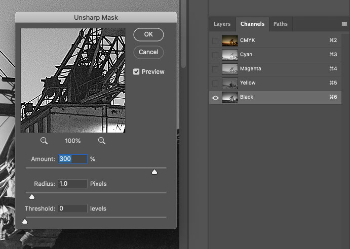
The values for Unsharp Mask in the Lightness and Black channels may differ. I have taken the average as an example.
The picture looks like this:
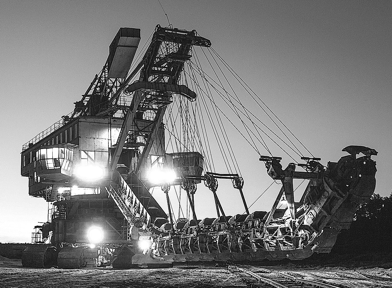
A bright white border surrounds the black details, but you don’t have to be afraid to sharpen the black channel. The triad colours will underlie this white border, and the result will be a soft glow that will accentuate the darker objects:
You can optionally enable the display for Lab layers in triad only and CMYK in black only:
You may think the picture is heavily sharpened, but in offset printing, the sharpness will drop a lot, and this sharpening will make the picture clear. Also, remember that on the screen, we see an image at 300 dpi, in reality, it will be three times smaller. You can move away from the screen by 1.5–2 metres and look at the image. Everything will be okay in print if it looks good from a distance.
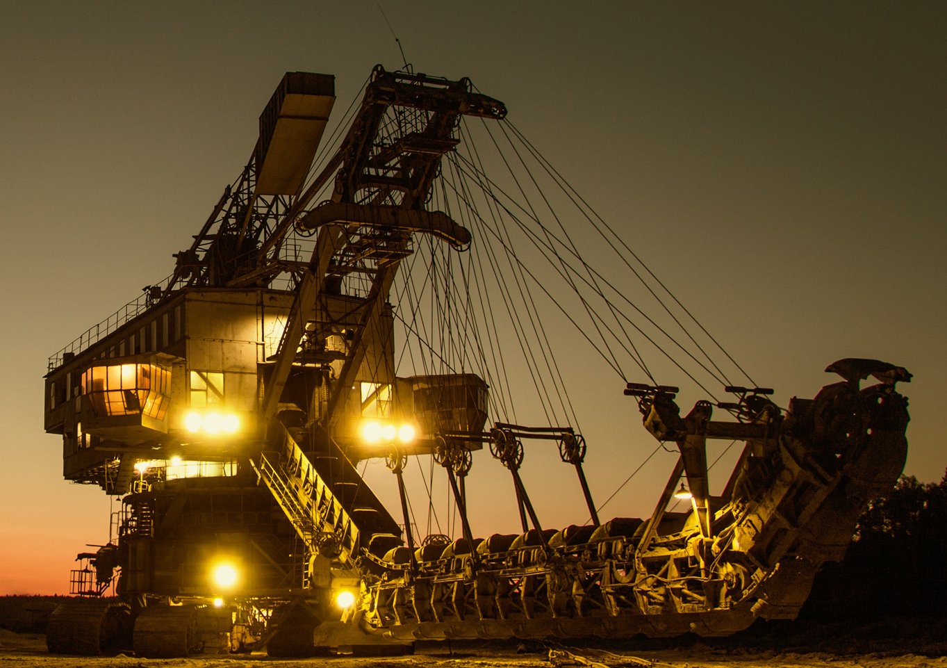
I’ll show you an example of a magazine photo that I processed. Here’s a sharpened photo:
And this is the photo in the magazine:

As another example, I’ll show you a piece of advertising that was sent in ready to print, and I can’t intrude on it:
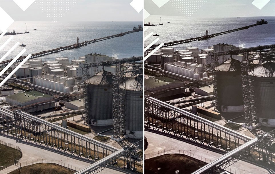
On the left is a fragment of advertising layout, and on the right is a photo from a magazine. As you can see, the layout was not sharpened, and the output was blurred.
Do not sharpen an RGB image. Otherwise, you risk having white ghosting around dark objects, which will not disappear when printed because there is no triadic backing:
Another thing I want to point out is the exposure. The printed image will always be darker than what we see on the screen. So if the picture seems dark, you need to lighten it up a bit. Otherwise, it might turn out to be a completely black nothing. For example, I sent the picture above to print like this:
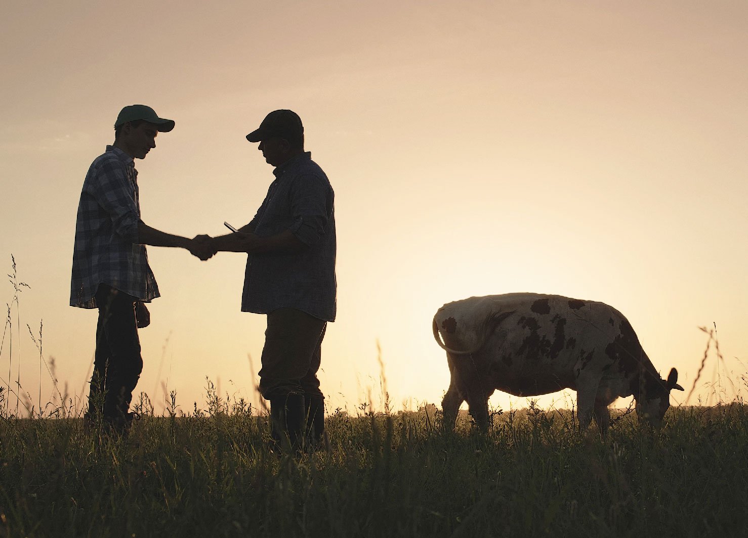
It’s darker in the magazine, but the grasses are still visible:
This is all about the basics of image preparation. There are nuances in converting monochrome images from RGB to CMYK, but we don’t see those in our magazine, so I’ve written about that separate post.
Stages of work and their automation
Now, point by point, what and in which order I do when I get the original photos from the photo editor, and the layout is approved.
1. Resolution and processing
I open my first image in Photoshop, check its resolution, correct it if needed and start processing. Processing can include anything: clipping, cleaning of unnecessary elements, sometimes I make a collage of several photos or changing the background, somewhere you want to pull the black point and correct the ragged horizon — in general, there are all the necessary aesthetics.
2. Unprintable Colours and Exposure
I use Proof Colours to check my image for unprintable colours and correct it with Selective Colours if necessary. I lighten the image a little. In my experience with our print shop, I prefer to lighten almost all images. Otherwise, even light images in print come out darker than the screen.
I save the Photoshop file in a PSD RGB folder when I am visually happy with everything. Now I have a finished image in full size that I can return to at any time.
3. Image size
In Indesign, I look at the actual size of the previously processed image within the layout:
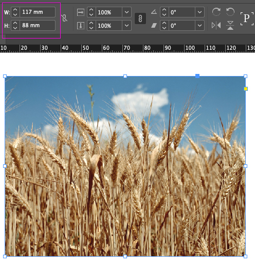
I go to Photoshop, crop the image and resize it according to the layout:
All the images in the print-ready file must be at 100% scale, and the effective resolution is 300 dpi. Right now, the effective resolution of my picture in Indesign is twice as high:
If you skip that step and leave the images at their original size, the resulting file will weigh a lot. It will be hard to work with, and the print shop will scold you :-)
And here is an important point, when the image size fits the layout, I create a new action in Photoshop and call it Sharp:
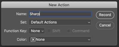
Now all my actions are recorded. I converted the picture from RGB to Lab, merged all the layers, and saved the file in TIF format in the TIF Lab folder.
4. Sharpness
I go to the Lab Lightness channel and sharpen the picture. Convert from Lab to CMYK, sharpen the black channel, and save the image in TIF format to the TIF CMYK folder. I closed the file and stopped the action recording. Now I have action, which I apply to all further images after their initial processing.
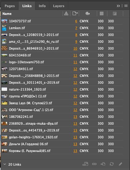
When all the images are ready, I go to Indesign and replace all the images with those in the TIF CMYK folder. At this stage, I review each image, and if I don’t like something, I can always go back to any stage of its processing and correct it. That’s why I save files separately in additional folders.
And this is what the linked files look like after their preparation for printing:
If you have any questions, let me know, I’ll try to help :-)