The rule of proximity
Designers often prioritise aesthetics and excuse any sloppiness by saying, ‘It’s a creative idea’ or ‘That’s the author’s intention’. However, a designer is not an artist.
Designer ≠ Artist
The Internet, print materials, and outdoor signage are visual mediums that convey information. Unlike works of art, people read websites and signs to learn something: how to buy a product, contact a company, or find their way to the library. Therefore, in informational design, the primary goal is not just to make things look good, but to clearly and effectively communicate information. Designers rely on rules and guidelines to achieve this.
In this post, I’ll discuss the main principle of how we perceive information and the rule that follows from it.
A little theory
The rule is based on the principle of proximity in Gestalt psychology – objects that are close to each other are perceived as a group.

Therefore, the conclusion is:
The internal spacing of an element should be smaller than the external spacing
The rule of proximity applies to all levels: words, sentences, paragraphs, and modular layouts. If this principle is ignored, elements may form unintended relationships, leading to confusion:


Consider a block of text. Word spacing is internal, while line spacing is external. Therefore, according to the rule, let’s increase line spacing:

Let’s add a title to the text. The gap between the text and the title, which is external, should be larger than the line spacing within the text, which is internal. Remember, the external spacing should always be larger than the internal spacing.

If this block is placed on a background, its margins will be external, so they should be larger than the gap between the header and the text.

Now, let’s look at some examples.
In letters and words
Let’s write a word for an example:
In the word, the inner distance plays the space inside the letter, and the outer distance plays the space up to the neighbouring letters. Now the rule of proximity is broken. The letters are cramped, it’s hard to read the words. The middle of the letter O looks like a hole.
Let’s increase the inter-letter distance so that visually the letter O will no longer make the word look like a hole:

A certain solemnity has appeared, the letters breathe, and the word is much easier to read.
Let’s add two more words, but leave the space between them as standard:

The phrase is hard to read, it feels like one long word.
Let’s increase the spaces between the words:

It’s better now, let’s continue the experiment. Let’s change the font to a more elongated one:

Since the letters are narrower, the distance between them is smaller, so we can reduce the distance between the letters themselves:

Done! The phrase is now compact, clear and easy to read.
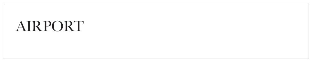
This is how this inscription looks on the airport building:

And this is what it could look like if the proximity rule was enforced:

In a text block
While letter spacing and space play the role of inner and outer between words, space and leading play these roles in a paragraph.
Let’s look at an example from a paragraph with a heading. The paragraph and the header are two independent objects. The distance from the header to the first line plays the role of external for them. The distance between lines — text leading — plays an internal role.

In this example, we see that the distances are equal. Such text looks ugly and is uncomfortable to read. You can’t leave text blocks like this.
Let’s tidy it up. First, let’s increase the distance from the title to the text:

It’s better. The header has gained independence.
Now let’s increase the distance between the lines, but don’t forget that this distance plays the role of internal and should be smaller than external:

Done.
In a text block with an image
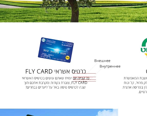
Now let’s consider a bunch of text blocks, titles and an illustration. For example, a screenshot of a website like this:
The blocks consist of three elements: an image, a title, and a description. We can see that the text descriptions of the three columns are dangling by themselves, and their titles are stuck to the pictures. This is wrong.
There’s another principle from Gestalt psychology at work here — the principle of similarity:
Elements that are similar in size, outline, colour or shape tend to be perceived together
Headline and text have a greater connection than picture and headline, so descriptions should be moved to their headlines:
Together they create a single block that comes into connection with the picture above it.
The proximity rule is followed at each level:
Another example. Let’s parse a block like this:

We apply the proximity rule: increase the text leading and move the text away from the title. Increase margins on all sides. We removed the “Read More” button and moved its function to the header. Moved the arrow that points to nowhere to the header.

There are fewer elements, informativeness has not suffered, and the block has become cleaner and neater.
Another example:
Align the distances in the text block. Shift the icon a little to the right, behind the text line, so that visually it appears to be at its level.

Combine the “More” with the block title and enlarge the icon.

The block became more compact and attractive.
Conclusion
Don’t ignore the proximity rule. When assembling the layout, first of all, determine the outer and inner distances. Make sure that the first is larger than the second. And do not forget about the principle of similarity, otherwise, the result can be deplorable:

Read more:
On object spacing and perception in ‘Editing by Design’ by Jan V. White.
The rule of internal and external in Gorbunov’s ‘Typography and layout’.
On leading in Müller-Brockmann’s ‘Grid Systems in Graphic Design’, Tschichold’s ‘The Form of the Book’, and Korolkova’s ‘Living Typography’.
Capitalisation in Chichold’s ‘Treasury Of Alphabets & Lettering’.