
Objects inside a module
Many designers build layouts according to the modular grid, but this approach gives a bad result — pages turn out boring and difficult to perceive. The modular grid consists of rectangular modules. To make clear layouts, first of all, it is worth distributing the elements within the modules, and then with the help of the grid systematise them. The modular grid organises the objects within the space, creates an impression of unity, and gives order and clarity to the layout. And sometimes the grid is not necessary at all.
The modular grid is a tool that must be used correctly and on time. After all, you can not take a ruler and immediately draw a house in perspective, first you need to take a pencil and outline the main lines and points, after which the ruler will help to align the lines and composition.
In this post, I’ll explain how to organise the objects within the module so that the layout doesn’t fall apart and is easy to read.

A module and the objects inside it
The role of objects inside a module is played by illustrations, titles, logos, quotes, factoids, text blocks, captions, footnotes, in short — everything that is located in the module.
To prevent the module from falling apart visually, significant objects within it should gravitate towards corners, sides or the visual centre

Rectangular objects are subject to the rule. If we talk about a circle, it can occupy any position inside the module. Circle is pleasant to the eye and easy to perceive, it contrasts with rectangles and attracts the viewer’s attention earlier.
Following this rule, the composition will always be balanced and easy to perceive. It is important that on the free sides, the object breathes. If the header stretches to the upper left corner, then there should be air to the right of it and below.
Air is negative space. The perception of the composition depends not only on the objects but also on the correct organisation of the air around them. In a layout you should try to minimise the amount of negative space, the less there is, the easier the composition is to perceive.
Take a look at the picture below:

There are two mistakes here:
1) There is unused space at the top and bottom — the сomposition is unstable:

2) The objects are scattered chaotically, as a consequence there are many blocks of negative space. The composition is falling apart:
To improve the module, we need to get rid of the first and minimise the second. This is where the rule of arrangement of objects in the module helps.

Objects are organised into rectangles and gravitate towards the corners and sides of the module. The negative space has taken a simpler form:

The composition has become organised, stable and easy to see.
Let’s add a circle to the module. Remember, it can occupy any position. A circle primarily attracts attention, so it can be used to direct the viewer’s gaze:

A circle is a very selfish figure, it should be one. If there are two or more of them in the layout, the viewer’s attention will be scattered, it will be hard for the eye to catch. It is undesirable to do it this way:

Let’s assume that all the objects in the module are equal:

Now we are looking at the layout and there is nothing to grab our attention. We can attract attention by using colour or lettering:
You can also use a different font or increase its size:

Add a meaningful object and air around it:

Structure in a module
It is customary to divide objects in a module by importance. The first place is always occupied by an illustration. It is it that the eye on the page clings to. Then we look at the headline, move our eyes to quotes or factoids, and if we are interested in all this, we pay attention to the text block.
In order to look at the page comfortably, the collection of the layout should always begin with the most significant objects and lead the reader’s eye from one to another. People tend to read information in the course of writing: from left to right, from top to bottom. In a Hebrew-speaking environment, the direction is reversed — right to left, top to bottom.

If the text is typed in two columns, we will start reading from the left column (or right column in Hebrew) from top to bottom, and continue at the top of the second column.

If there are more columns and rows, the distances between the objects by proximity rule will help to direct the eye:

The fact that the gaze moves from top to bottom remains unchanged. Therefore, objects should also be arranged in the module from top to bottom in descending order, starting with the most significant ones.
Modules in practice
Let’s break down an example:

The layout consists of a module, with another module inside it: the page itself and the white rectangle in it. See how the objects inside their modules behave:

There are two significant objects in the main module:
- The “Time” header — is located in the top right corner, with plenty of space to the left and bottom of it.
- White rectangle — in the bottom left corner, with opposite sides of it also breathing.
The second module is a white rectangle, with a text block of a large headline and subheading playing the role of a meaningful object. This block stretches to the left side of its module, with white space to its right to compensate for the unilateral gravity.
This free space around the objects allows them to breathe, increases their importance among other objects, and balances the composition.
Another example:

We see three key objects: large red characters in the upper right corner, a human figure along the left side of the module, and a text block on a black-grass patch at the bottom. All of them are located at the corners or sides.
Or here:

Significant objects are distributed at the corners and sides of their blocks, and the illustrations look harmonious.
Analyse the magazine spread:

The spread consists of two modules: the left page and the right page.
On the left page, a large headline rests in the upper left corner, while a column of text flows along the right side of the module. The headline, as the most significant object of the module, breathes on the right and below, the negative space giving it significance.
On the right page, the man in the black jacket is centred and gravitates downwards. If we consider the spread as a single unit, the headline and the figure, as the two brightest spots, pull towards the corners and balance the overall module. Note: the first thing we see on the spread is a face, i.e. a circle.
Another example with a circle:

Although in the layout there are two dark spots at the upper border of the module and the bottom left, first of all, we look at the circle, i.e. the girl’s face.
Often the circle is used for special offers, discounts, and promotions:

See how cleverly Jan Tschichold wields the composition:


He masterfully directs the reader’s eye from one object to another.
Here’s an example of a bad distribution of objects in a module:

Firstly, there are two circles here. Remember, a circle is selfish and should be one. Secondly — meaningful objects are arranged randomly. The layout is falling apart.
Another bad example:

Comments are unnecessary.
Placing meaningful objects at the top and bottom is common in operating systems:

Menus on many sites are tied to the top:
And here’s an example of a centre position:

But this kind of symmetry is good once, otherwise, you can’t avoid chaos:

Composition of modules
Now let’s look at how modules interact with each other on website pages.
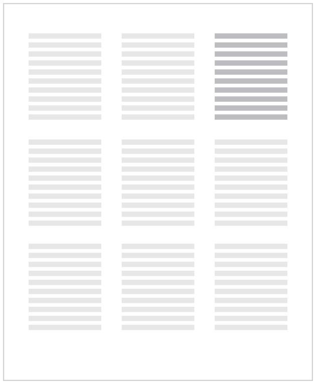
The layout should be present in the main objects and additional objects so that the reader’s eye follows from one to another. If you build a layout monotonous blocks, the view will be nothing to catch on, to look at such a page is uninteresting and tedious. Information sites often suffer from this:


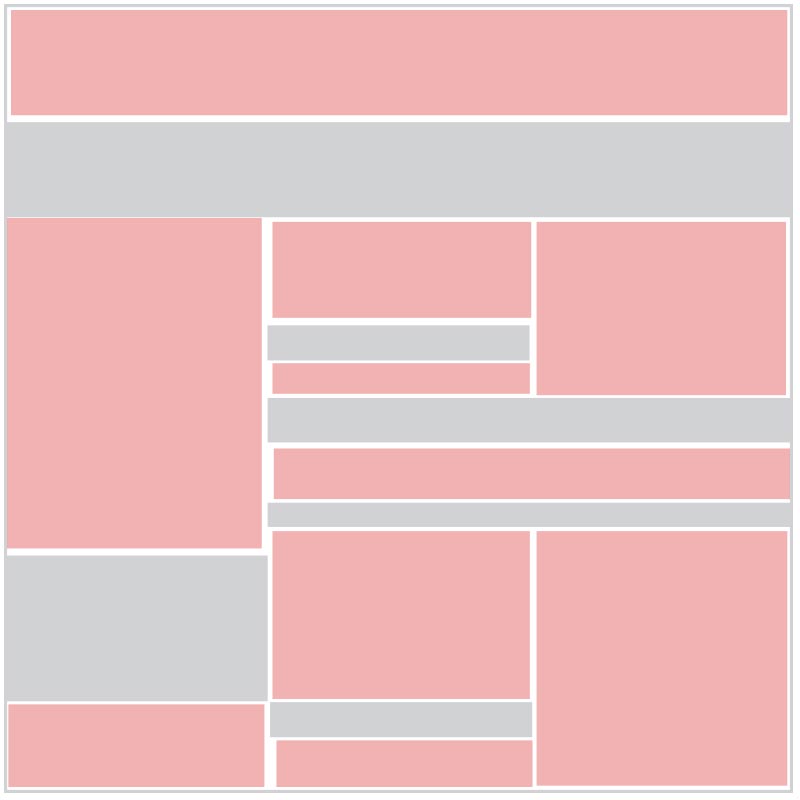
See how the BBC designers solved the problem. There’s an alternating rhythm along the page: different sizes of modules, illustrations and headlines. The reader’s attention is not scattered and it is interesting to explore the page:

As a rule, all layouts are built according to the “sandwich” principle, i.e. rectangular modules are arranged on floors one after another. Designers like to separate the floors by background colour, but this technique is dangerous, especially if the objects within the floor are equivalent and follow symmetry:

In layout, dynamics are important. At first glance, it may seem that the example above is very dynamic, but it isn’t. This pseudo-effect is obtained due to a large number of different shapes and styles: there are squares, circles, schemes, tables, lists, and many icons, each floor has its background colour, plus about ten different font solutions. The layout is heavily overloaded, with objects in modules arguing with each other.
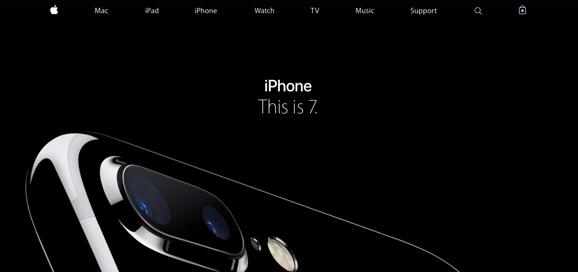
The simpler the layout, the easier it is to read. Dynamics is achieved by alternating rhythms. See how Apple handles a long page:

We see the floors: there’s both symmetry and asymmetry, and they alternate between them. Each module has a large illustration. The design of the floors is very simple, so we easily glide our eyes over them, and the long page is easily perceived.
