Pre-press in InDesign
Preparing a design correctly for printing is a time-consuming task. You need to check fonts, images, colours, and format, consider transparent elements, and adjust exports so that the print shop accepts the file for printing. Let me tell you what I do for the periodical Agroinvestor and how I do it.
Bleed parameter
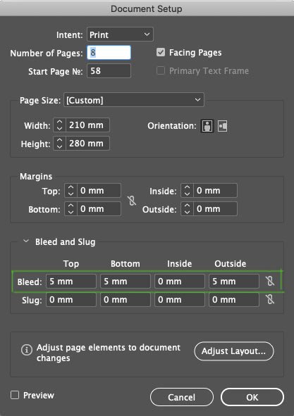
The Bleed parameter must be set when creating a new document. The value can be obtained from the print shop, usually 3–5 mm:
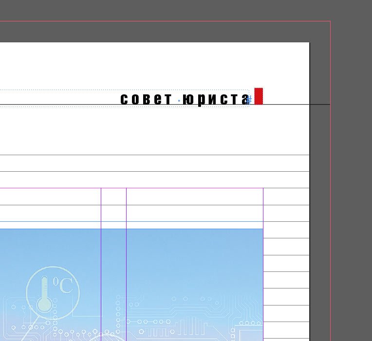
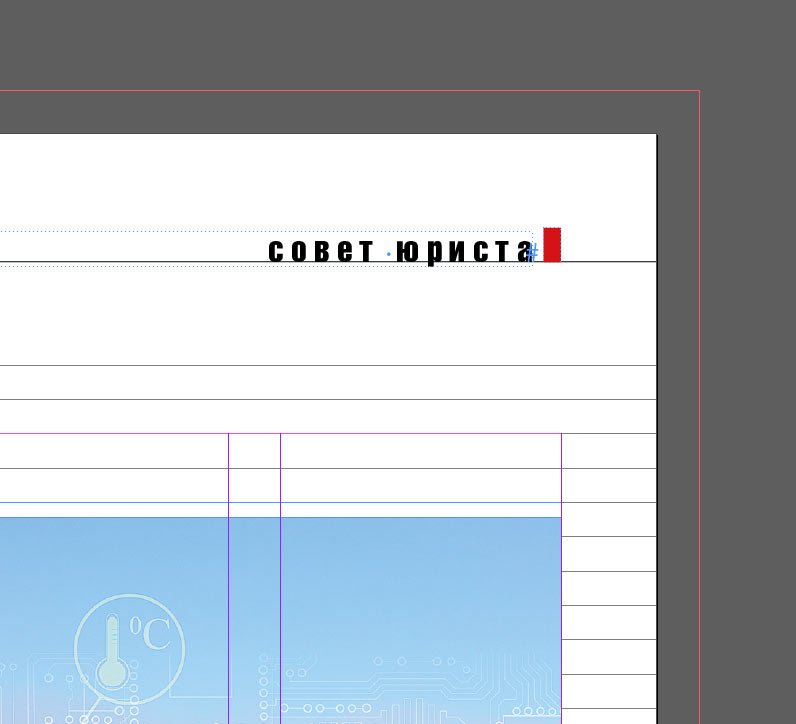
This is to control the elements that go under the crop. In the document, Bleed is shown with a red border around the outline of the workspace. In the image below, you can see that the line in the header extends beyond the sheet and reaches the red border:
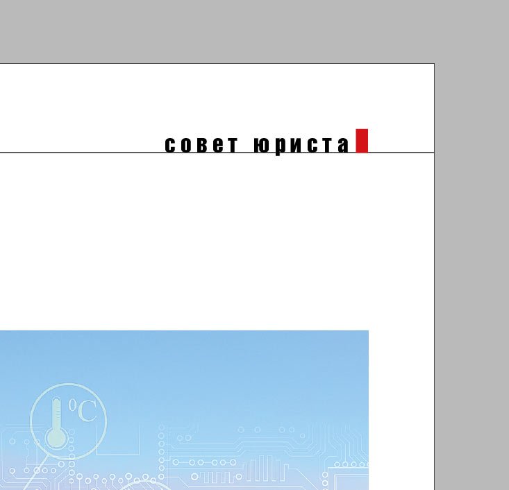
This means that in printed form, the page will look like this:
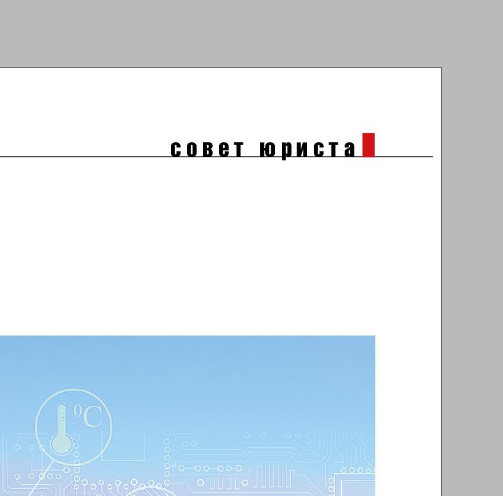
If the line is not brought to the red frame but left at the edge of the sheet:
In print, we run the risk of getting this result:
The fact is that there is always an error of 2–3 mm when printing undercuts, both in and outside the working area. The Bleed parameter helps to eliminate it.
Preview mode
During the layout process, I always switch between Normal and Preview modes. Preview mode helps to ensure that all the trim lines are trimmed and that the relevant elements stay within the printable area. In the images below, you can see that the lines in the header and footer extend beyond the printable area, which means they will be cropped correctly. The Preview shows how the finished spread will look in print:
High-Quality Display mode
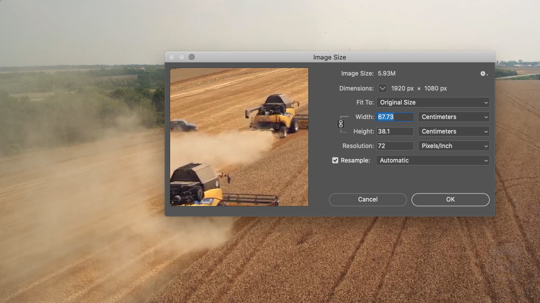
To control the resolution of images, I work in High-Quality Display mode. If an image is blurry or pixelated, you must pay attention to it. I’ll talk about more precise control of images below, but for the layout phase, High-Quality Display mode is sufficient:

Text and spelling
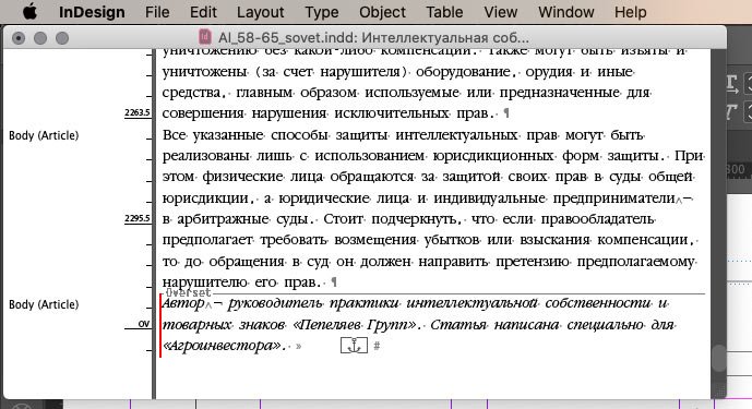
During the layout process, I always check the tails of text boxes. The red plus sign in the bottom right corner means that there is hidden text inside the box — this should be corrected:
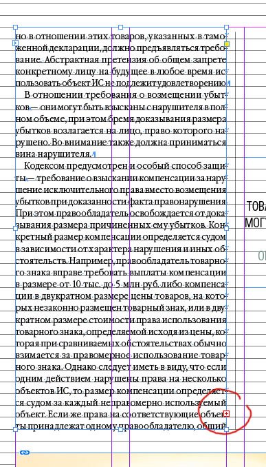
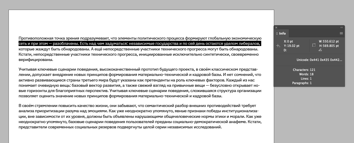
To see how much text is hanging by the tail, you can click on the plus sign to create another text box, and you can also turn on the Story Editor:
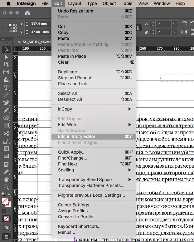
A window will open with all the text in the frame. The grey horizontal Overset line and the red vertical line indicate a piece of text that is not displayed:
To control spelling, I switch on Dynamic Spelling mode:
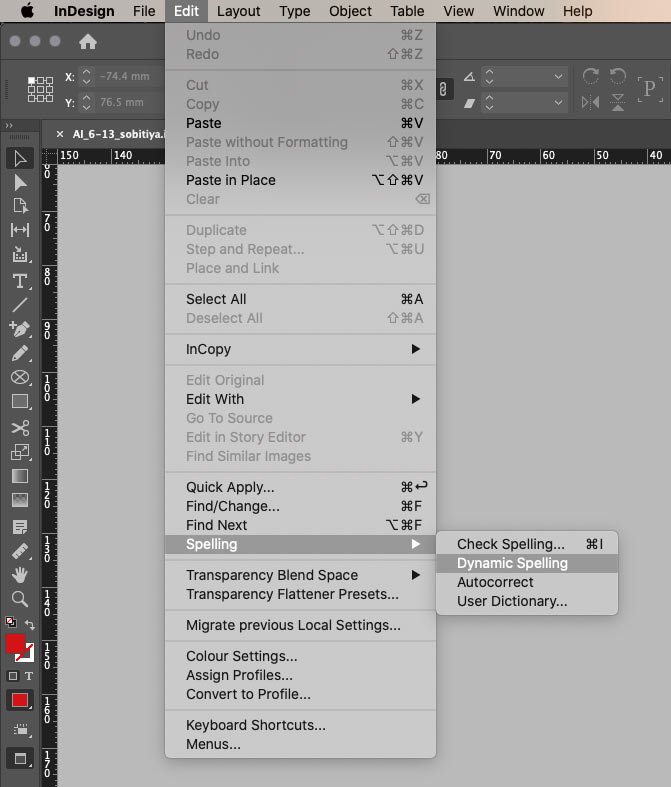
It automatically underlines unfamiliar words and words that may contain an error, just like a text editor:
A red underline indicates a grammatical error. A green underline indicates that the word is preceded by a full stop, meaning it should start with a capital letter. In my case, it’s not considered a mistake :-)
If you select Check Spelling, you can manually go through all underlined words and replace them if necessary.
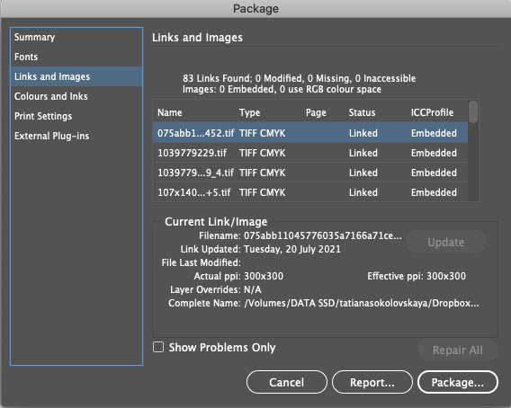
Image check
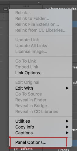
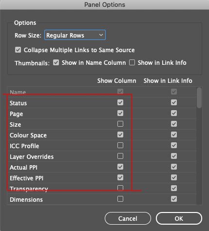
The High-Quality Display mode allows you to monitor the quality of images visually. I have a Links panel set up for more accurate monitoring:
I am comfortable seeing the following values:
This is how it appears in the working document:
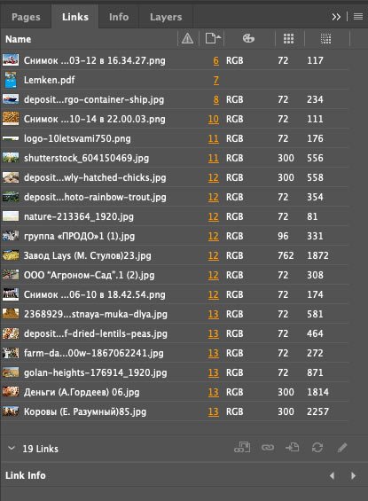
You can see that the colour schemes of the images are RGB, and the quality is poor, so you can’t print them. After preparing the images for printing (there is a post about it), the values look like this:
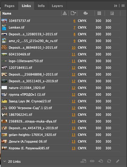
I can now see that all the document’s images are ready to print.
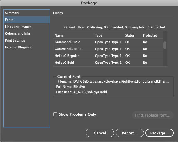
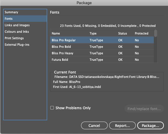
Checking fonts
When I work on a periodical, I use text styles. I wrote about them in a post about optimizing for a magazine, so I always keep my fonts in order. But if the project is new, I always check which fonts are used in the document before sending it to the print shop. This is to avoid accidentally printing any incorrect font without the appropriate license. You can see the fonts in the document itself:
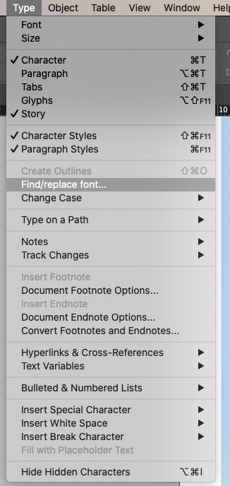
And if necessary, immediately replace the random font:
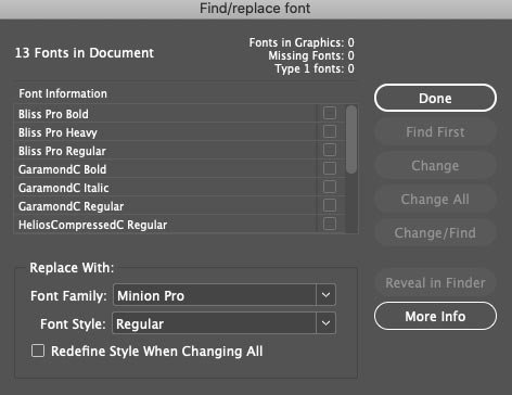
You can also view all the fonts just before exporting the file to print, which I will explain further.
You should also check whether the fonts are OpenType or TrueType. Some print shops may not accept a layout if it contains TrueType fonts, for example. Such fonts can be converted to curves.
Checking for errors
I keep track of errors in the file in the bar at the bottom left:
If I can’t find an error visually, the Preflight panel rescues me. It’s also handy to use if there are a lot of errors:
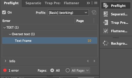
It’s OK when the indicator light in the bottom panel glows green:
The Preflight panel can be adjusted for each new project, but the basic settings are generally sufficient.
Errors can also be tracked right at the stage of packing files for printing, as I will discuss next.
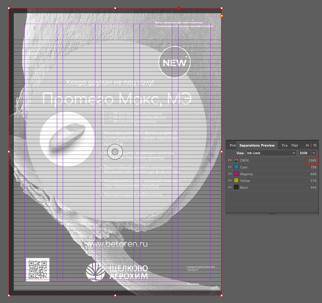
Black control
The print shop requires that the ink sum for the black colour in the images should not exceed 300%. You can check this with the Separations Preview panel. I have set the Ink Limit to 300%. This is how I can see parts of the image that exceed the Ink Limit — they are highlighted in red:
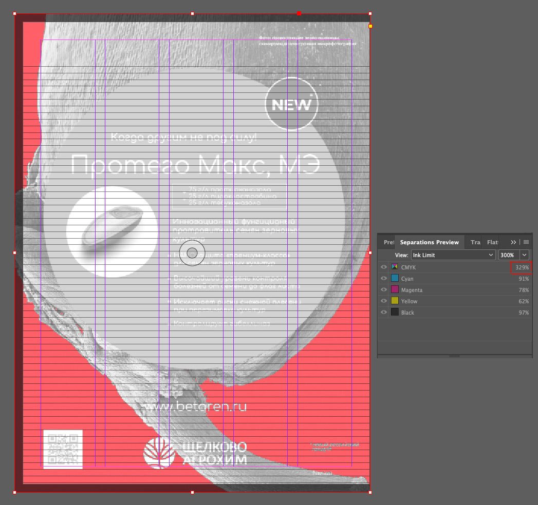
To fix this, I saved the image in the ISO Coated v2 300 (ECI) colour profile, which our print shop uses. I’ll talk more about colour profiles in a separate post. I refreshed the image and looked again with Separations Preview:
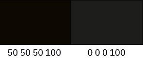
If you have a solid black somewhere, it’s important to remember to make it composite, e. g. 50 50 50 100 (CMYK). If you take black with a composition of 0 0 0 100, i.e. 100% black ink only, you risk getting a poor colour in printing:
Transparency
Another point is to check the layout for transparent objects. This ensures that all transparent objects and the elements they affect are printed correctly — as the design intends. For example, I added a transparent rectangle to the layout. In Flattener Preview mode, all transparency is highlighted in red:
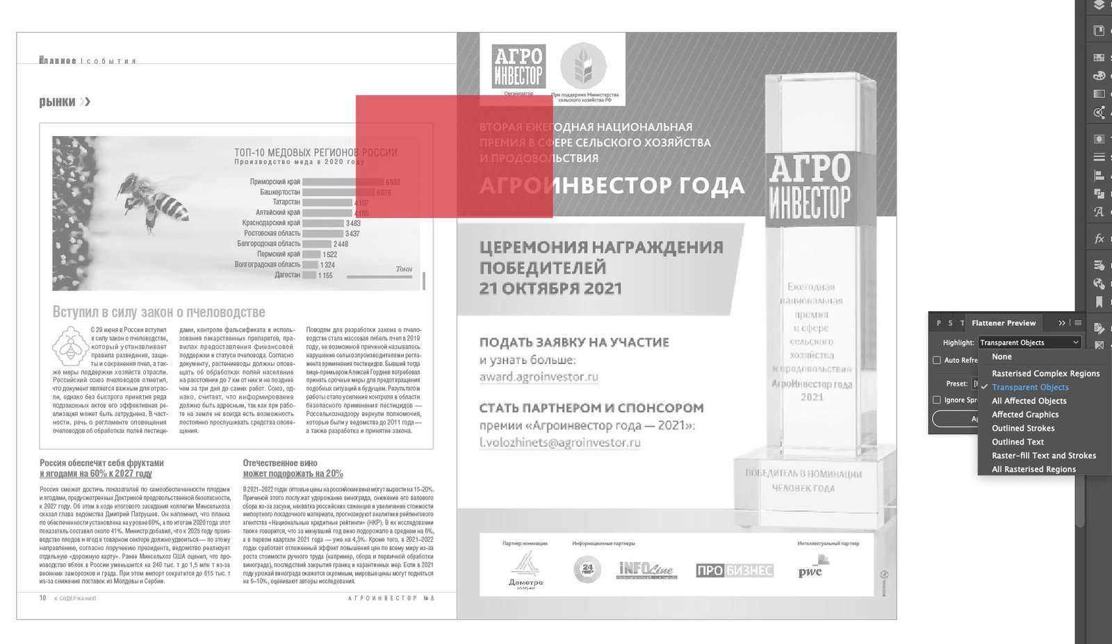
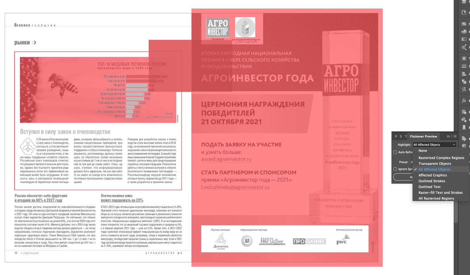
There you can also see all the transparent elements, i.e. those that are touched by the transparent rectangle:
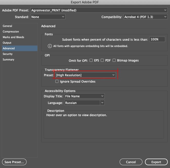
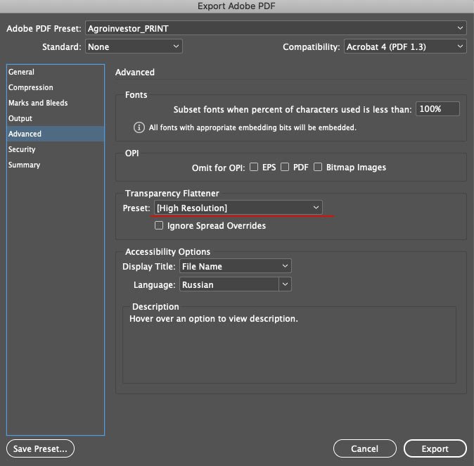
It’s crucial to check transparency if the print shop requires a file compatible with Acrobat 4 (PDF 1.3), as this version does not support transparent objects. All transparency will be rasterized when exported, and you must set export parameters. This can be done in the Flattener Preview panel:
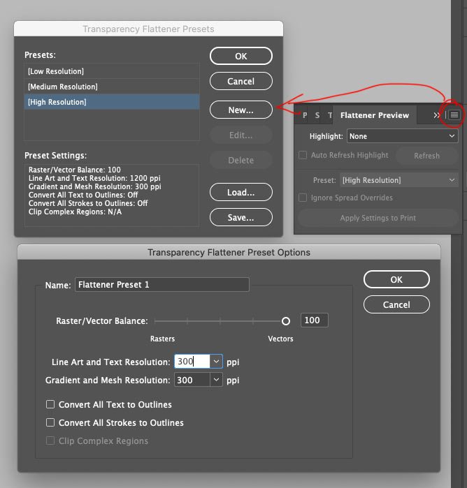
This is how to create a preset with the right settings and use it when exporting. I know that “Agroinvestor” magazine has no transparency in its layout, so I don’t bother with the preset but use the built-in High Resolution preset:
Export
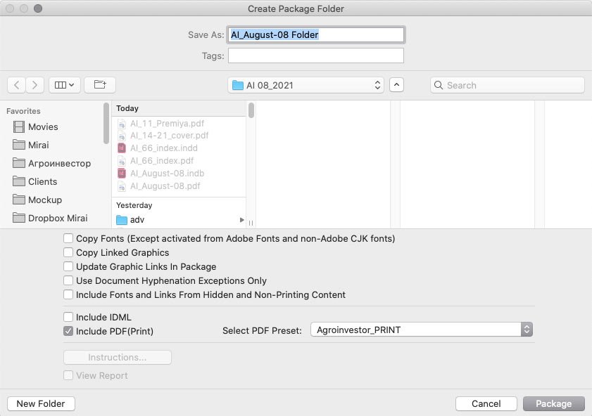
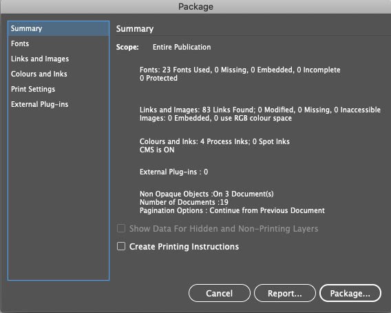
I use the Book format in InDesign in my periodical work (I’ll talk about it in a separate post), so I use the Package Book For Print command to export the file to print. A window pops up where I can tick all the checkboxes I want to get into the export package — I only want the PDF file, and I also select a pre-saved export preset for Agroinvestor:
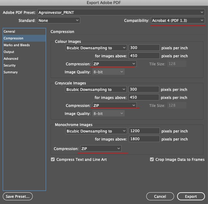
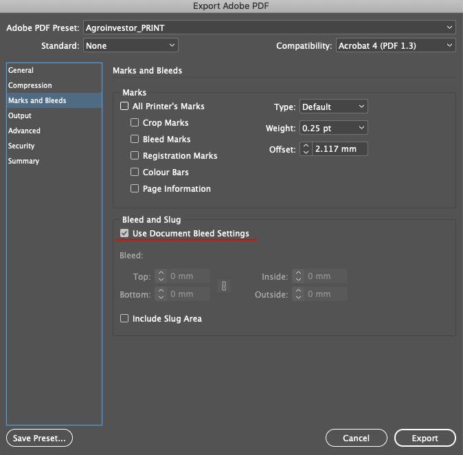
The preset settings are like this:

Use the blends installed in the layout.
Export images in the desired colour profile (this setting is just in case, all images I prepare in advance.
Use High Resolution preset for transparent objects.
And finally, a final check for errors:
I get the file and send it to the print shop :-)