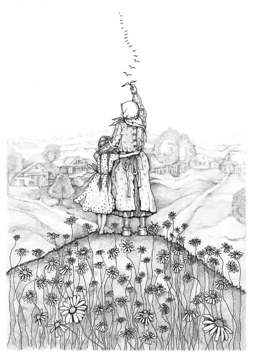
Text formatting: essential tips for everyone working with text
A well-formatted text is pleasing to the eye and easy to read. This post covers the basics of text formatting and when to apply different elements. It’s useful not only for designers but for anyone who works with text or writes regularly, whether it’s for emails, business correspondence, or documents.
Paragraphs
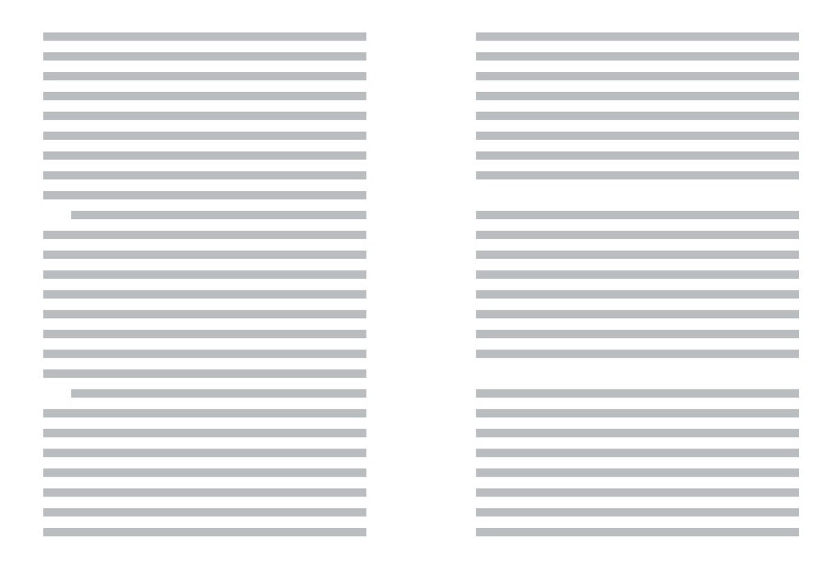
In print, paragraphs are typically indented on the first line to improve readability and conserve paper, a practice originating from typographers. In web formatting, where saving paper isn’t a concern, paragraphs are usually separated by spaces. It’s unnecessary to use both methods; one is sufficient.
For print: use indentations for the first line. But remember, you don’t need to indent the first paragraph. There’s nothing to indent it from.
For web: separate paragraphs with spaces.
Word breaks
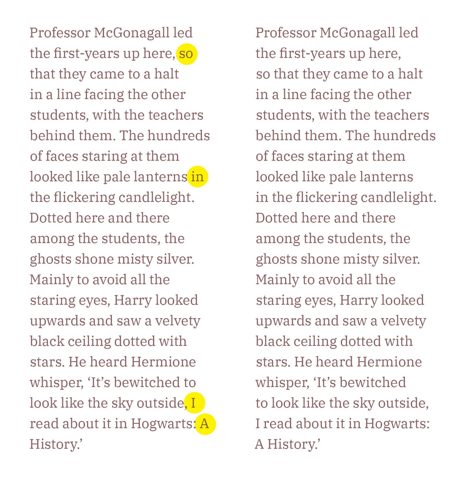
When breaking text onto a new line, prepositions, initials, phone numbers, dates, and units of measurement should be moved together.
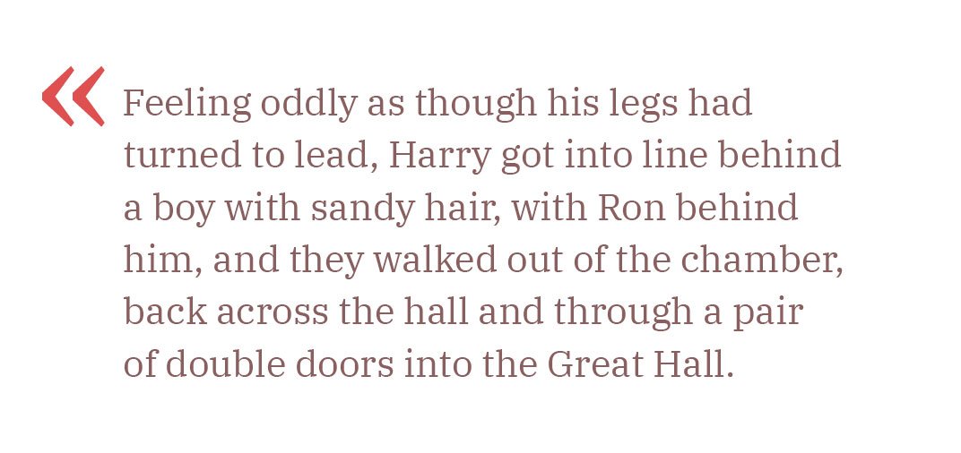
A non-breaking space keeps words linked – related words are carried to the next line as a single unit. Use non-breaking spaces to ensure prepositions or pronouns stay with the words they modify. Although there is no specific rule in English about orphaned prepositions, I believe they should not be left at the end of a line, as they disrupt the flow of reading and are visually unappealing.
Compare the two paragraphs, one with orphaned prepositions and one without:
Dashes, unlike prepositions, are not split across lines.
Correct:
The event –
a grand success.
Incorrect:
The event
– a grand success.
HTML:
Mac: ⌥ Option+Space
MS Word: Ctrl+⇧ Shift+Space
If you cannot use a non-breaking space, you can use a non-breaking range (nobr) as an alternative:
<nobr>123–4567</nobr>
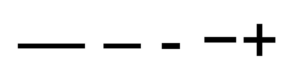
<nobr>New York–London</nobr>Dashes, hyphens, and minus signs
There are four commonly used horizontal line symbols:
Em Dash (—)
HTML: —
Mac: ⌥ Opt+⇧ Shift+-
MS Word: Ctrl+Alt+Num -
Windows: Alt+0151
En Dash (–)
HTML: –
Mac: ⌥ Opt+-
MS Word: Ctrl+Num -
Windows: Alt+0150
Hyphen (-)
HTML: ‐
Available on the keyboard.
Minus sign (−)
HTML: −
Windows: Alt+8722
These symbols differ in length and usage:
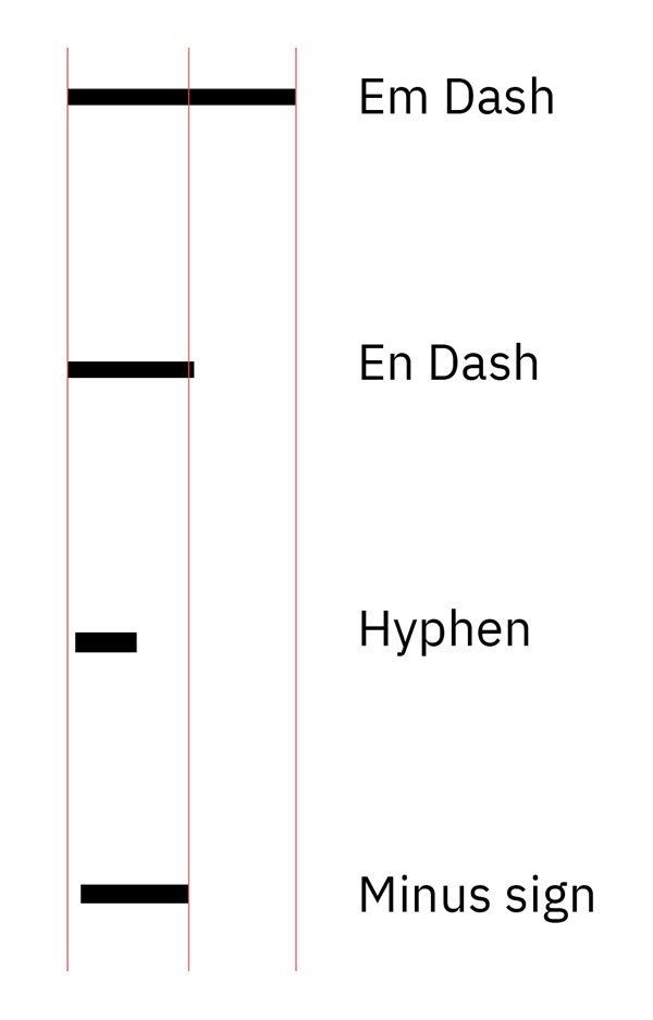
If you line up the symbols on a single line, you’ll notice that the minus sign, like the plus sign, sits slightly higher than the others. They’re aligned relative to uppercase letters and numbers:
The em dash is used to clarify sentence structure, to express a more pronounced break in sentence structure than commas, and to draw more attention to the enclosed phrase than parentheses:
The party lasted—we knew it would!—far longer than planned.
Going—going—gone!
There is nothing—absolutely nothing—half so much worth doing as simply messing about in boats.
The em dash may be used to introduce a phrase at the end of a sentence or replace an introductory colon:
She has but one hobby—chocolate.
In England, justice is open to all—like the Ritz Hotel.
Most British publishers instead of the em dash use the en dash with space on either side:
But he didn’t know any magic yet – what on earth would he have to do?
Also, the en dash is used to denote ranges (e. g., dates, times, numbers) and connections between words, especially in compound adjectives:
The train runs from London–Edinburgh.
The conference is scheduled for June 1–5.
The 9:00–11:00 meeting.
The New York–Los Angeles flight.
2015–2017.
Monday–Saturday.
The hyphen is used to join words in compound terms, split words at the end of a line, and connect parts of words:
A high-quality product.
A well-known author.
The fast-paced movie.
Use hyphens in spelt-out numbers from twenty-one to ninety-nine (twenty-three, four hundred and sixty-eight, fifty-three thousand), and in fractions, unless the numerator and denominator are already hyphenated (one-half, two-thirds, three thirty-seconds, four and five-eighth).
Hyphens may also be used in a sequence of non-inclusive numbers:
ISBN 0-123-45678-9
It’s important not to use an en dash when you need a hyphen and the other way around.
The minus sign is used in mathematical contexts to denote subtraction or negative values:
The result was −5°C.
The stock price dropped to −$20.
10 − 3 = 7
7 − 2 = 5
Ellipsis
An ellipsis indicates an omission in the text, an unfinished thought, or a pause, and is represented by three dots: …
An ellipsis is different from simply typing three dots in a row:

Sometimes, an ellipsis is used along with a question mark or an exclamation mark, in which case the ellipsis is before the question or exclamation mark: ...? or ...!
Are you really sure about this…?
You actually did it…!
It’s incorrect to write two dots (..) or more than three dots (…...) – this is considered poor grammar.
Ellipses can show the omission of one or more whole paragraphs of prose. This passage, for example, contains two ellipses:
The fact is, Lady Bracknell, I said I had lost my parents. It would be nearer the truth to say that my parents seem to have lost me... I don’t actually know who I am by birth. I was... well, I was found.
In the following extract, the square brackets make clear which are in the original and which have been added subsequently:
The fact is, Lady Bracknell, [...] my parents seem to have lost me... I don’t actually know who I am [...]. I was... well, I was found.
Brackets
Parentheses or round brackets ( )
Parentheses are used to include supplementary information, explanations, or clarifications that are not essential to the main text:
The project was completed on time (despite some minor delays).
She arrived late (after the meeting started).
Square brackets [ ]
Square brackets are used to insert editorial comments or clarifications into quoted text or to make changes to a quotation:
He said, ‘She [the manager] will handle the request.’
If both parentheses and square brackets are used in the same text, the parentheses are typically used inside the brackets for nested information:
The email [which I received last week (on Friday)] was quite detailed.
Angle brackets < > and curly brackets { }
These brackets are mainly used in technical, mathematical, and programming contexts. They are not commonly used in regular text.
Quotation marks
British English: ‘Single quotes’ for primary use, “double quotes” for quotes within quotes. Commas and full stops go inside only if they are part of the quoted material.
‘I can’t believe it’s raining,’ she said.
‘She said, “I can’t believe it’s raining.”’
Look at the letters ‘A’, ‘C’, and ‘M’.
American English: “Double quotes” for primary use, ‘single quotes’ for quotes within quotes. Commas and full stops go inside quotation marks.
“I can’t believe it’s raining,” she said.
“She said, ‘I can’t believe it’s raining.’”
Look at the letters "A," "C," and "M."
Question marks and exclamation marks are placed inside if they are part of the quoted material for both British and American English; otherwise, they go outside.
‘Are you coming?’ she asked.
Did he really say, ‘It’s raining’?
“Are you coming?” she asked.
Did he really say, “It’s raining”?
Single quotation marks:
‘ and ’Double quotation marks:
“ and ”Guillemets (« ») are used in several languages for quotations and direct speech. Their usage can vary, so it’s important to follow the conventions of the specific language or style guide you are using.
Russian: «Привет, как дела?»
French: « Bonjour, comment ça va ? »
-In French typography, the non-breaking space after the opening guillemet and before the closing guillemet is essential for maintaining the text’s visual balance and readability.
Quotes
When including quotations in your text, you typically use standard quotation marks to set them off from the rest of the content. However, to draw more attention or add a stylistic touch, you can use decorative quotation marks:
Feel free to experiment with decorative ones to fit your design needs.
Lettering
Uppercase letters are great for headings or short quotes, but they shouldn’t be used for body text. They tend to shout and grab attention, so use them sparingly. Make sure to add extra letter spacing to ensure they remain legible.

Lowercase letters should not be spaced out. Text with wide tracking is harder to read and looks untidy:
To highlight a word in lowercase, use italics or bold instead.
Italic type is used to indicate emphasis or heavy stress in speech; to style titles, headings, indexes, and cross-references generally; and to indicate foreign words and phrases.
I don’t care how you get here, just get here.
Such style, such grace, is astounding.
Bold is used to attract attention and is ideal for headings.
Small caps are perfect for abbreviations, Roman numerals, or highlighting names. Like uppercase letters, small caps should have extra spacing. They differ in height from regular uppercase and lowercase letters:
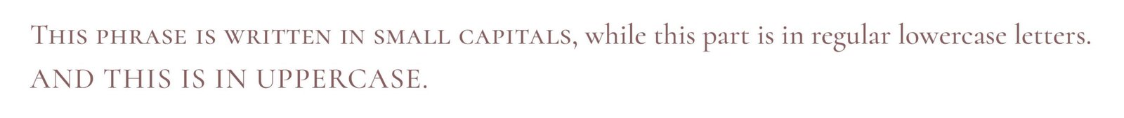
Avoid using small caps for body text, as they can be challenging to read.
Lists
A list is made of an introductory paragraph followed by a series of points. Here’s a quick guide to ordered and unordered list types.
Ordered lists
Use numbers or letters when the sequence is important, or when many items need referencing.
A numbered list is ideal when each item is a complete sentence.
To make a delicious eggs in three steps:
- Place a knob of butter in a pan on a high hit.
- Once the butter is melted, crack eggs into the pan and reduce the heat to medium.
- Wait until the white of the eggs is fully cooked. Enjoy!
You can also use Roman numerals (I, II, III) or capital letters if preferred (A, B, C).
Ordered lists with right parentheses are useful when the items are part of a single sentence. End each item with a comma or semicolon, and finish the last item with a full stop.
There are four terrestrial planets in our solar system:
1) Mercury,
2) Venus,
3) Earth,
4) Mars.
Before leaving the house, don’t forget to:
a) turn off all electrical devices;
b) take your phone and headphones;
c) close the door and take the keys out of the lock.
Unordered lists
Use bullet points when the order isn’t important. Items can end with a comma, semicolon, or full stop, depending on whether they are complete sentences. Traditionally, the black dot (•) is used as a marker in bullet point lists.
Apple produces and sells:
• laptops,
• phones,
• desktops,
• tablets,
• watches.
You can also omit the bullet symbol altogether and use indentation for a cleaner look:
Apple produces and sells:
- laptops,
- phones,
- desktops,
- tablets,
- watches.
Other symbols like dashes (–), circles (◦), squares (▪), or arrows (→) can be used, though it’s best to stick with traditional bullet points as other symbols can be distracting and clutter the text.
Numbers
In English text, numbers can be written in words or numerical form. Here’s how to choose the appropriate format:
Writing numbers in words
Write numbers in words when it makes the text easier to read or understand:
We bought four bottles of water for the hike. (Instead of: We bought 4 bottles...)
Write out simple numbers, especially when they are under ten or when clarity is important:
I saw seven birds.
Using numerical form
Use numerals for more complex numbers, particularly with units of measurement or monetary amounts:
The Christmas tree cost £345, but we got a 50% discount.
Separate thousands with a comma for clarity:
12,000
Decimal points and fractions
Use a decimal point to separate digits:
1.25
Fractions should be written with a horizontal line, or in some contexts, use a forward slash. Do not use the word ‘part’ or ‘fraction’:
½ of the area (or: 1/2 of the area)
Range of values
Use en dash (–) for ranges or spans, such as dates, numbers, or time periods, an en dash is commonly used:
The event runs from 1:00 p.m. – 3:00 p.m.
The years 2000–2017.
Use plus-minus (±) to show acceptable variation in measurements:
20±3 units (means the value is between 17 and 23 units, including the margin of error or tolerance).
Use ‘From’ and ‘To’ when writing ranges in full sentences or when clarity is needed:
The store is open from 9 a.m. to 5 p.m.
The temperature will be between 30 to 70 degrees.
Phone numbers
In phone numbers, hyphens and spaces are commonly used to enhance readability.
UK format:
Standard: 020 1234 5678
International: +44 20 1234 5678
US format:
Standard: 123-456-7890
With area code: (123) 456-7890
International: +1 123-456-7890
When a phone number includes a memorable or advantageous combination of digits, such as a repeating sequence or a pattern, it’s often highlighted for marketing or branding purposes:
0780 2222 444
Dates and times
British English date formats
Day-Month-Year:
4 August 2024
4/8/2024
Day of the Week, Day Month Year:
Saturday, 4 August 2024
In formal contexts, writing out the full month is preferred:
4th of August 2024 (not 4 August, 2024 or 4/8/2024)
American English date formats
Month-Day-Year:
August 4, 2024
8/4/2024
Day of the Week, Month Day, Year:
Saturday, August 4, 2024
In formal contexts, writing out the full month is preferred:
August 4, 2024 (not August 4th, 2024 or 8/4/2024)
When it comes to formatting decades and academic years, both British and American English have specific conventions:
the 1980s – the ‘80s
the 1990s – the Nineties
2023–2024 academic year
2023/24 tax year
Time formats are similar
12-Hour clock: Commonly used with ‘am’ and ‘pm’:
3:30 pm or 7:15 am
24-Hour clock: Less commonly used, except in certain contexts like timetables:
15:30 (3:30 pm) or 07:15 (7:15 am)
Use ‘o’clock’ when writing time in words:
The meeting is at three o’clock.
Symbols in text
Use the correct symbols in the text instead of letters with parentheses.
Incorrect:
(C) 2017 Tanya Sokolovskaya(R)
Correct:
© 2017 Tanya Sokolovskaya®
Links in text
When including links in the text, it’s a good idea to highlight them with colour and underlining. If colour isn’t suitable, just underline the links to make them stand out.
Currency formatting
The currency symbol is placed directly before the number without a space:
£100
$100
€100
Use a comma to separate thousands in large numbers for clarity:
£3,000
Use a point to separate the whole number from the decimal fraction:
£3.14
The currency code (e. g., GBP, USD, EUR) is placed before the amount, with a space in between.
GBP 3,000
Titles
In both British and American English, titles such as Mr, Mrs, Miss, and Ms are used to address individuals with respect.
Ms a neutral option used for women regardless of marital status:
Ms Sarah Johnson
Mr for men, regardless of marital status:
Mr John Smith
Mrs for married women:
Mrs Jane Smith
Miss for unmarried women:
Miss Emma Brown
Titles for professional use, related to a person’s profession or status:
Dr Robert Green
Prof. Helen Carter
Ph.D. Jane Doe
In British English, a full stop is used only if the abbreviation differs from the full word. For example, Dr (Doctor) has no full stop, but Prof. (Professor) does.
In American English, a full stop always follows abbreviations:
Miss. Emma Brown
Dr. Robert Green
Address formatting
In British English, write each part of the address on a new line: Name, House number and street name, County (if applicable), City, and Postcode:
Mr John Smith
123 High Street
Springfield
Essex
SS1 2AB
United Kingdom
When an address has additional details such as building names, blocks, or units, it should be placed before the building name or street name:
Mr John Smith
Flat 4, The Grand Building
123 High Street
Springfield
Essex
SS1 2AB
United Kingdom
American English
Name
Street address (including house number)
City, state, ZIP code
Mr John Smith
123 High Street
Springfield, IL 62704
United States
Sources
Oxford Guide to Style by R. M. Ritter: A comprehensive guide on style conventions, including those relevant to typography and publishing.
The Form of the Book and Treasury Of Alphabets & Lettering by Jan Tschichold: Essential works on book design and typographic lettering.


Introducing Catandala: cat-spirit mandalas

I’m excited to share my latest creation with you – a delightful adult colouring book featuring beautifully crafted mandalas, each adorned with charming cats. You can find it on Amazon.
A bit of backstory: I recently came across an old illustration of mine from over a decade ago:

And it sparked a wave of nostalgia. I was inspired to bring these feline friends to life once more. That’s when the idea came to me – why not create a unique adult colouring book that blends mandala patterns with the irresistible charm of cats? :-)
Here are some of the designs you’ll find in the book:


Designing label cover artwork series using AI: my step-by-step experience
In this blog post, I’ll share my experience using AI image generators to create release cover artwork for JOOF Recordings, a UK record label run by John 00 Fleming. I was approached by a JOOF manager with the task of creating a new artwork design by continuing the theme of the current covers. Unlike using dramatic changes and coming up with something entirely different, the challenge was to provide a fresh look while maintaining the previous style. The initial covers were hand-drawn by an illustrator, which was time-consuming and expensive. So, I proposed using AI as a cost-effective and quicker alternative.

I compared three AI image generators: Midjourney, Leonardo, and DALL·E. I chose Midjourney for its alignment with my project needs.
For those of you not familiar with Midjourney, let me quickly explain what it is. In a nutshell, Midjourney is a chatbot hosted on Discord servers, and you can operate it using chat commands called “prompts”. One of such prompts, for example, is “/imagine”, which makes Midjourney create an image based on the input parameters.
The process started with me uploading the original covers as references into Midjourney. My first attempt involved simply generating similar images. However, the results were far from what I expected:


I began with the original prompts but soon realized that a white background would make my task easier. The results, however, turned out quite different from the initial step:


I asked the bot to describe one of the original covers and generated images based on those descriptions:

The results varied widely:


I uploaded another cover for description and generated images with the new prompts:

But again, the outcomes were not as expected:


And I repeated the process with a third cover:

But the results still missed the mark:


Then I returned to the first prompt but excluded the colour pink and added “charcoal drawing” to the prompt, followed by “charcoal style, minimal, no faces, girl, man”:


I also tried “charcoal style, minimal, flat,” which brought back faces:

So I added “no faces” again:

And I included words like “silhouettes” and “abstract” in the prompt:


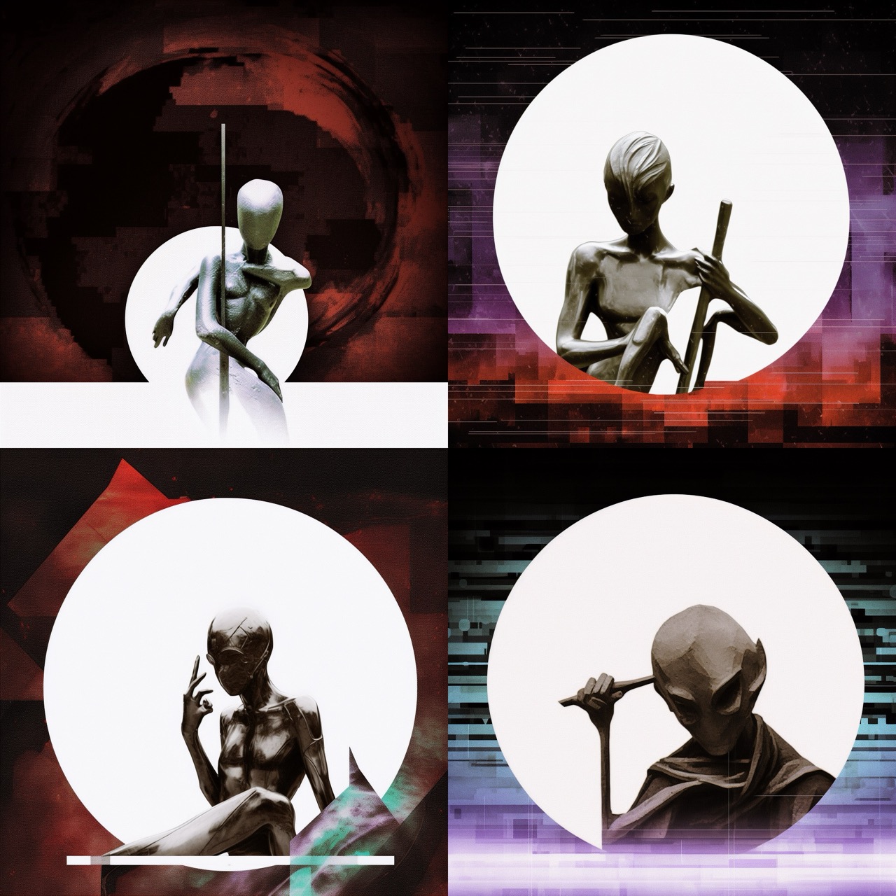
However, the silhouettes became too human-like, so I added “alien flat silhouette”:

Changing the order of words in the prompt influences the results: “charcoal style, minimal, alien flat silhouette, no faces” → “minimal, charcoal, abstract, alien flat silhouettes, no faces”. And the results are getting closer and closer to the desired ones:

I switched from “flat” to “blurred”:

And continued to tweak the prompt, which now looks like “link_image_1 link_image_2 link_image_3 link_image_4 minimalist, charcoal, abstract, alien blurred silhouette, flat, no faces”. Here are some of the covers in the links. I added the image weight parameter to the prompt to make the covers have more influence on the result and I got this:


I adjusted the influence of the original covers in the prompt and experimented with different parameters like “weird” with values of 2000 and 3000:


And added words like “dust” and “scratches”:


I replaced “alien” with “ghost” and generated more variants with the latest prompt:


Also I introduced the “chaos” parameter with varying values, leading to a range of intriguing images:


Some images caught my attention, so I generated variations and added “no faces, hands, legs” to the prompt:


Then I upscaled the most suitable images for further work:

Finally, I took these generated images into Photoshop to unify their style and appearance. The end result was a series of unique and stylistically consistent album covers, all created with the aid of AI technology:
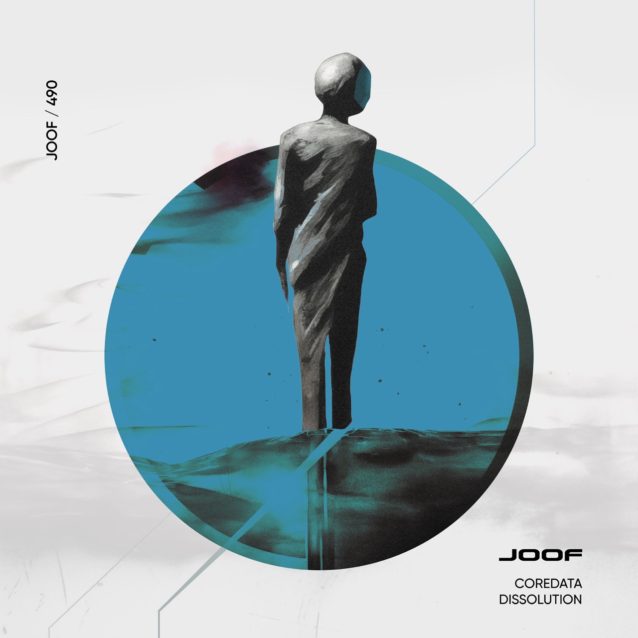


The client at JOOF loved the result so much so then they asked me to make a refresh artwork for their sub-label too called JOOF Aura.

With these design I went through pretty much the same process, so let fast-forward you to the final result:


My opinion about AI is that the future lies in this technology. However, it’s important to note that it’s not as simple as generating designs with a single click. It involves a substantial amount of work. Even for this artwork, it took me many hours across multiple days to control the visual output guided by my vision, master the prompts and get the result done right. Which is surely faster if I were drawing this by hand, but still not as easy as it might seem when someone hears the words “AI” being involved.
I believe that designers who master this technology will undoubtedly have an edge in the future. AI doesn’t just replace hours of manual labour; it becomes an invaluable tool in a designer’s arsenal. The era of relying solely on Photoshop is evolving into one where AI complements Photoshop.
Nevertheless, it’s crucial to understand that professional skills are still required to effectively use these tools. A manager, for instance, can’t just generate the needed images without a background in design and a trained eye. The role of the designer is not diminished but enhanced, requiring a blend of artistic sense and technical know-how to harness the full potential of AI in creative design.
My self-publishing experience on Amazon
I am delighted to share that I am now a self-published author on Amazon! I have published two children’s books — the counting book “One to Ten” and “ABC First Workbook”. Here is what this process looked like for me and what I have learned.
My journey began a decade ago when I wrote a children’s fairy tale. Rediscovering it recently sparked the idea to bring it to life with illustrations and share it with the world. That’s when I stumbled upon Amazon Kindle Direct Publishing (KDP). Illustrating the story presented its challenges, making the book “One to Ten” a sort of trial run.

KDP, the platform by Amazon, allows authors to publish and market their books, with Amazon handling order processing, printing, and delivery. This streamlined process captivated me. The dashboard is user-friendly, you fill in the information, upload files, wait for approval, and that is pretty much it!
One notable perk is Amazon’s provision of ISBN (The International Standard Book Number) at no cost, although with the caveat of exclusive selling on their platform. In the UK, obtaining an ISBN independently would come with a hefty £91 price tag, a significant consideration given my plans for multiple book releases.
I also liked the option to order a Proof of Print for proofreading and visual checks before publishing. However, my enthusiasm waned when I faced with the limited printing options offered by Amazon:

“One to Ten” is designed for shared reading with 2–3-year-olds, necessitating durability. Unfortunately, Amazon’s paper is notably thin, similar to office-grade paper. Additionally, the absence of options for glossy or matte pages is disappointing, with the choice only extending to the cover.
I ordered Proof of Print twice on separate occasions and also placed an order as a customer to see what the real copy would look like. Here is what I have got:

The first proof of print was pretty decent with precise trimming. However, the thin paper and the colour reproduction are something I didn’t quite expect. As I later found out, Amazon removes embedded colour profiles resulting in unpredictable hues.
Mindful of the colour profile removal, for the second proof of print I adjusted images for improved shades, yet the improvement turned out to be quite marginal. While the overall colour in the book remained vibrant, the illustration featuring the number 7 saw the deep dark blue of the night sky transform into a mundane black in print, which was upsetting.

I also noticed another drawback in the form of unevenly trimmed pages. Despite incorporating proper trim margins in the layout, it failed to rectify the issue, as echoed in customer complaints on Amazon.

Last but not least, the third copy I ordered after publishing the book as a customer came with well-trimmed pages, so it wasn’t too bad after all!

The sheer satisfaction of holding my 100% self-created product fueled my determination. Despite that Amazon’s print quality is lacking, I decided to pivot my approach. While influencing print quality might be beyond my control, shaping the content remains within reach.
This decision led to the creation of my second book, “ABC First Workbook” – a comprehensive workbook guiding children through the art of writing letters, honing hand control on designated lines, and offering a delightful colouring experience. As a rewarding conclusion, children are presented with a certificate!
So once again I ordered a proof of print followed by a customer copy to spot potential errors and compare the two. Just as with the first book, these came with white margins from trimming, though the customer copy was certainly cropped better:


Despite that, I really loved the book and it delighted me as a creation.
This experience made me conclude with the following:
- Steer clear of complete background fill for bleed areas.
- Develop content for books with an awareness of the characteristics of thin pages.
- Workbooks, colouring books and activity books (for children and adults alike) probably suit best for Amazon’s printing capabilities.
If you have any questions or thoughts, feel free to share them in the comments section :-)
ABCs workbook
I have made the best workbook for learning ABCs ;-) And this book is best because:
- There are big letters for the first writing.
- Inside letters are numbered arrows to show the correct way to write.
- The different tracing lines for each letter.
- Funny colouring illustration for relaxing between learning letters.
- Lined pages for more training.
- And the certificate for successfully learning ABCs.
The book is available on Amazon.


My first book “One to Ten”
I am happy to share that I designed and published my first real book “One to Ten: a Rhyming Journey”! It is a toddler’s book for learning numbers from one to ten. There are beautiful illustrations and a short poem for funny learning. The book is now available on Amazon.


How to prepare monochrome photos for print
Following the post about preparing images for offset printing, I want to show how to prepare monochrome photos to get a beautiful rich black colour in print.
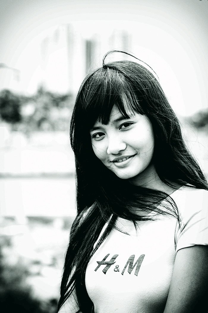
I have a picture in the RGB colour model:

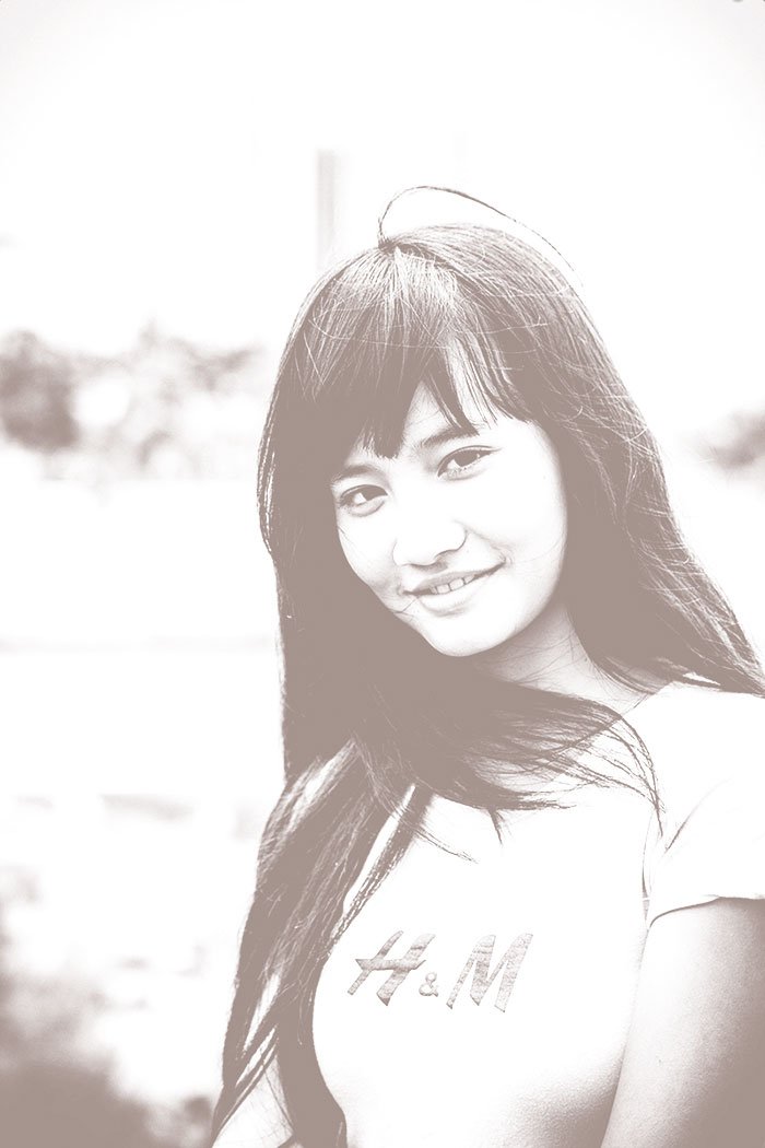
Let’s convert it from RGB to CMYK and compare:
Second — CMYK
We can see that the black colour has become paler, but it’s okay, the main problem lies in the channels.
Let’s look at the Triad and Black channels separately:
The problem here is that there is always the possibility of colour variations when printing, which will result in a corresponding shade. Let’s look at an example using curves. I moved the Cyan and Magenta curve up and down:
- More blue paint
- Less blue paint
- More purple paint
- Less purple paint
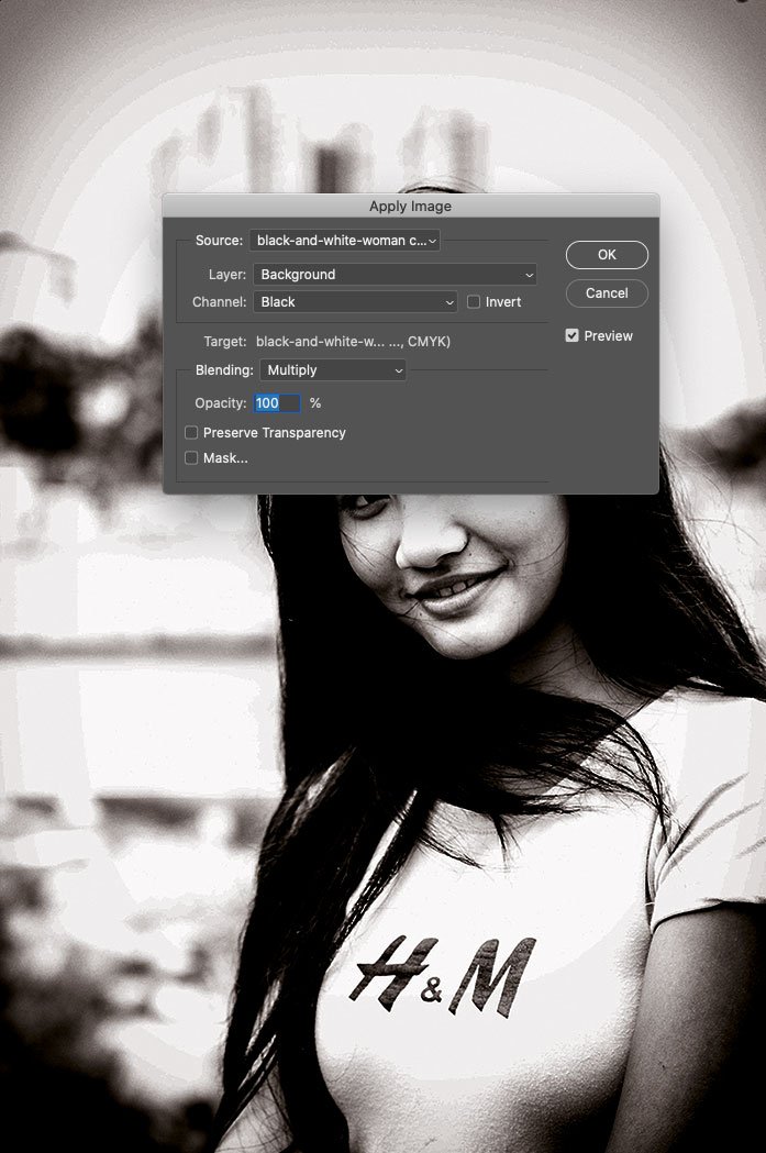
Any jump in colour will tint the picture, and to avoid this, you need to transfer most of the detail in the photo to the Black channel. To do this, go into Photoshop and duplicate the image, as we will perform colour separation twice in different channels and then merge them.
We’re working with the first copy now. Convert the picture to CMYK and create a Channel Mixer adjustment layer to move the Triad colours into the Black:
Turn off the Black channel and see what we get at the Triad:
The Triad underlay became lighter and less detailed.
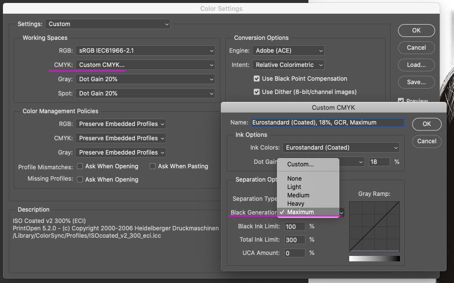
Open a second copy of the image and convert it to CMYK but with maximum black generation. To do this, you need to create an appropriate colour profile — go to Edit → Color Settings and create a new CMYK profile with the settings:
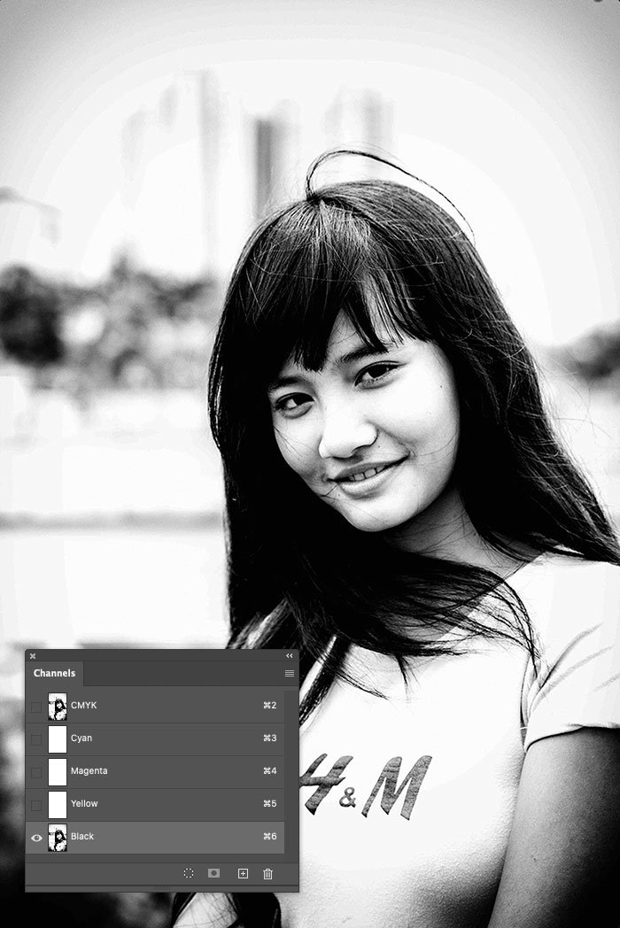
Convert the picture to CMYK with maximum black generation — Edit → Convert to Profile → select the created profile and look at the picture in the black channel:
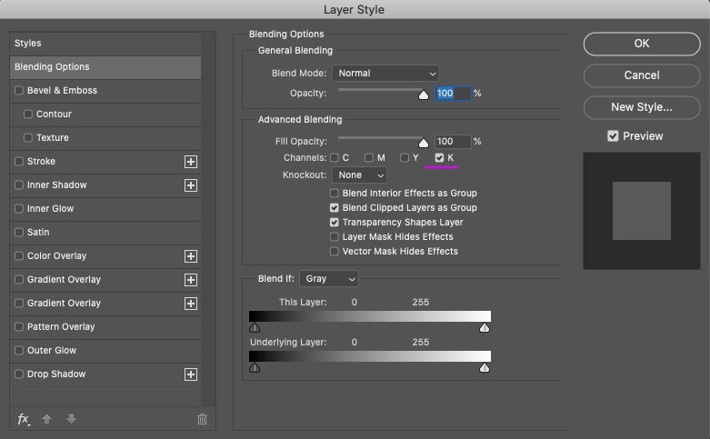
You can see that the entire picture has gone into the black channel. Now we need to merge it with the already prepared triad substrate. Open the first file and create a new layer there. Go to Image → Apply Image and copy only the black channel from the second file:
The result is a black mess, and to fix it, you have to enable this layer to be displayed in the black channel only:
Let’s compare the result with the RGB picture:
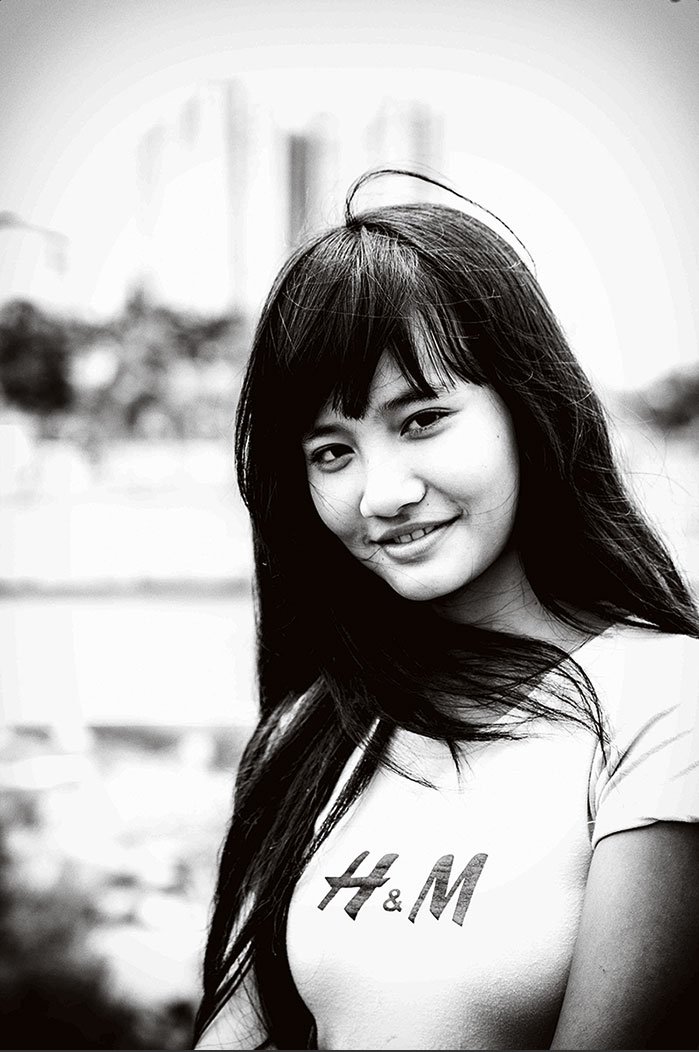
You can see that in CMYK, the picture has a brownish tint, but this can easily be corrected in the Channel Mixer adjustment layer that has already been created:
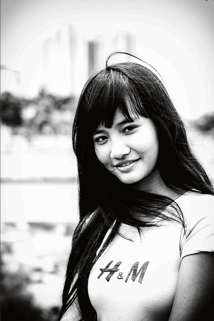
For interest, I move the curve to see how the picture changes with paint fluctuation:
So, you get an image with saturated black that looks as good in print as it does on the screen.
Some may decide to print monochrome in one colour with pure black but do not do so. The result will be a pale and most likely grainy image.
This treatment is appropriate for monochrome and mixed images with a colour part and a large monochrome area. In that case, combine the Channel Mixer adjustment layer and the Black Channel layer into a single folder and set it to only display a mask on the monochrome parts of the image.


How I prepare magazine images for offset printing
This video contains updated and more relevant information on preparing images for offset printing. The post itself needs an update, so make sure to check out the video for the latest tips and techniques.
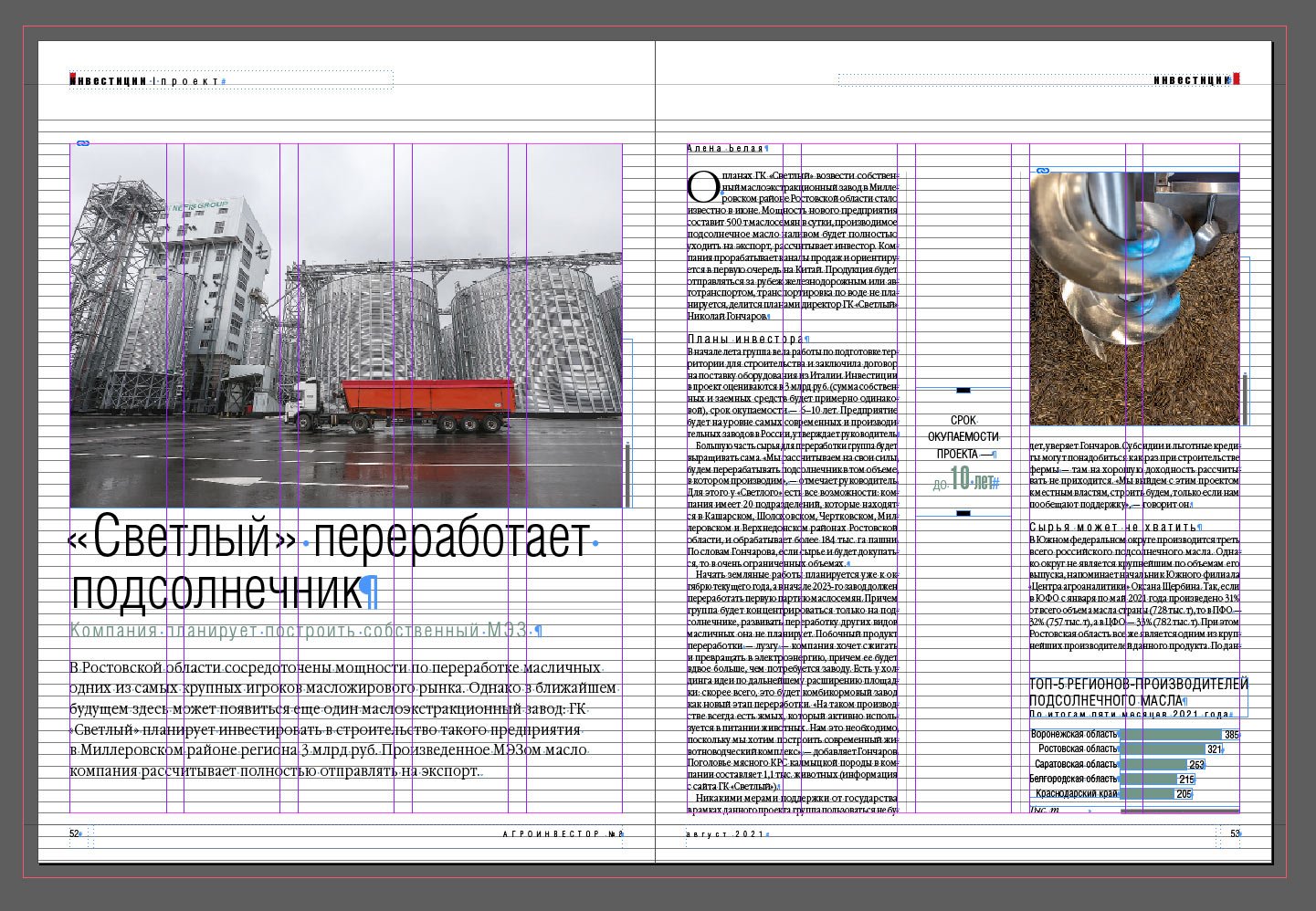
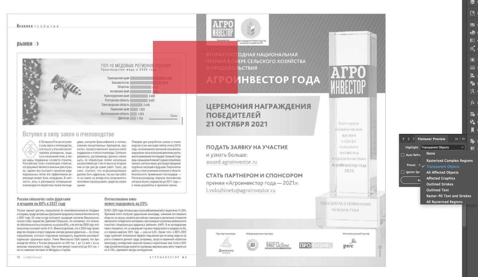
Images in a multi-page publication must be prepared to look good when printed. Typically, print shops have different requirements for offset printing, but the general principle of preparation is pretty much the same for all of them. I’ll give you an example of my work for Agroinvestor magazine so that the print shop accepts the layout for the first time and the images remain high quality.
There are four essential points in image preparation: the resolution (300 dpi), the colour model (CMYK), the colour profile (for our print shop, this is ISO Coated v2 300 % (ECI)) and the sum of the colours (no more than 300 %). At first glance, nothing complicated: take a picture of a suitable resolution, do colour separation in the right profile, and that’s it. However, apart from these points, there is an essential aspect of offset printing that I want to talk about, but let’s go through it one by one.
layout stage
During the layout stage, I use low-resolution photos. Most of them even have the watermarks of photobanks, and it doesn’t matter at this stage. This is what the linked files look like in the document:
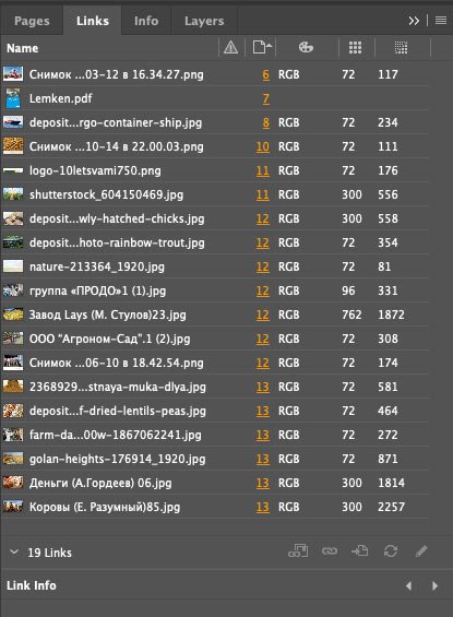
As you can see, all the images are in an RGB colour scheme, and most have a resolution of 72 dpi. This resolution is optimal for screens but very low for printing. And the effective resolution, in general, jumps around a lot. Let me explain, the actual resolution is the actual size of the picture, while the effective resolution is the size of the picture in the layout. If the actual resolution is 72 dpi and the effective one is 117, the layout picture is reduced by half. And vice versa, the picture is enlarged if the actual resolution is higher than the effective one. In the finished layout, their values should be the same.
Exporting images
I prefer to prepare the images for printing once the layout of the whole issue has been approved. That has its advantages:
- Things can change in the process: an article is replaced, strips are removed or added, pictures are sent in differently, ads are unexpectedly up, and so on.
- The original images are collected and sent to the photo editor, so it’s more convenient for me to get all the pictures at once rather than after each approved article. Also, if a photo from a photobank is suddenly replaced and has already been bought, then the money is spent for nothing.
- At any time, the chief editor can remove or add a piece of text within an article, which means that the size of an image will have to be changed because space on the page is limited. If the images were already ready to be printed, this work would have to be done again.
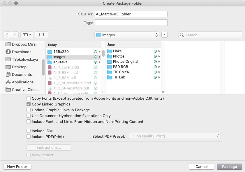
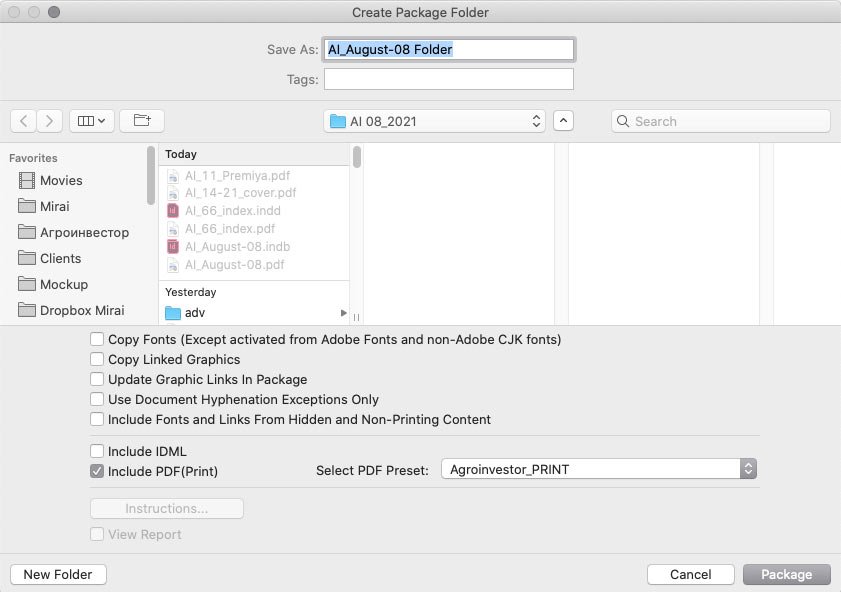
When all the articles are collapsed, I proceed to process the images. As you may remember, the images are of poor quality, and to send them to the photo editor for redemption, I need to gather all the images of the issue into one folder. To do this, I pack the files in print:
Next, check Copy Linked Graphics. No other checkboxes are needed:
The result is a Links folder with all the images, which I hand over to the photo editor, who sends me the original high-resolution images.
I also create three additional folders: PSD RGB, TIF Lab, and TIF CMYK.
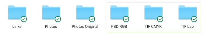
Links contain all the images in the issue; Photos — the images to be redeemed; Photos Original — their originals. The PSD RGB, TIF Lab and TIF CMYK folders are needed so that I can return to them at each stage of processing the photo and, if necessary, make changes. I’ll go into more detail about these stages next.
Resolution
Next, pay attention to the resolution. There are several sources of images: for example, pictures from photobanks are of high quality, but pictures from agro-companies or their websites are often in low resolution, and it’s almost impossible to get the originals.
Let’s say I was sent a photo at 72 dpi, but the picture itself is quite large 67×38 cm:

I unchecked Resample and changed the resolution from 72 to 300. The image size is now considerably smaller — 16×9 cm:
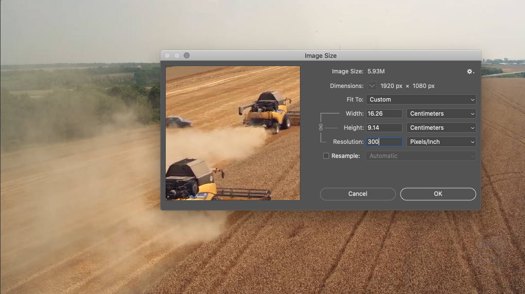
Ideally, this picture at 100% should be no larger than 16×9 cm in a layout. But what if I need it in a larger format? In such a situation, I enlarge the image by 15-20%. If an even larger format is required, the photo editor asks for the source, and if it’s not available, we look for a replacement image.
It may also be that an image is sent with a dpi value between 200 and 300. In that case, I increase the dpi value to 300, which will also not appear in the printout. When the dpi is less than 200, it’s not worth enlarging the picture, we will not see pixels in print, but there will be some graininess.
Colour profile and ink sum
Our print shop has a requirement to use the ISO Coated v2 300 % (ECI) colour profile. This profile makes my job easier: by running the images through it, the sum of the colours in the overprints automatically becomes less than 300 %. The ink sum is the amount of ink applied to the paper. The image will be pale if the value is less than 300%. If the ink sum exceeds 300%, the sheet risks soaking through and staining the adjacent pages.
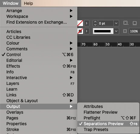
You can determine the amount of colour in an image in several ways in Photoshop, but I find it much more convenient to do it through Indesign. Go to Window → Output → Separations Preview:
And in Ink Limit mode, select the desired percentage:
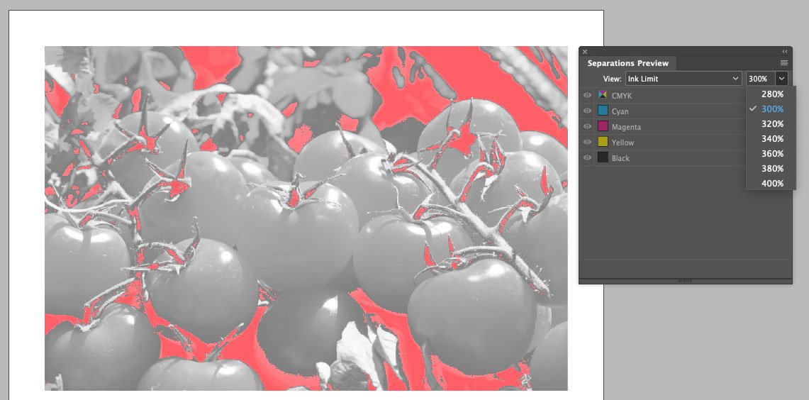
Red spots in the image indicate that the colour limit has been exceeded in these areas. This way, even at the layout stage, I can quickly check all the images in the article.
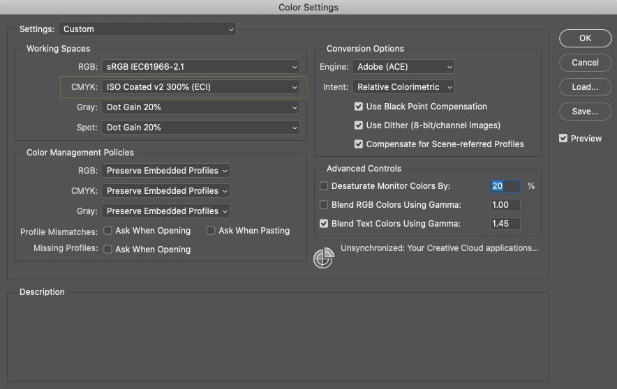
I have the required CMYK profile in Photoshop by default. This is done in the settings: Edit → Colour Settings:
From RGB to CMYK
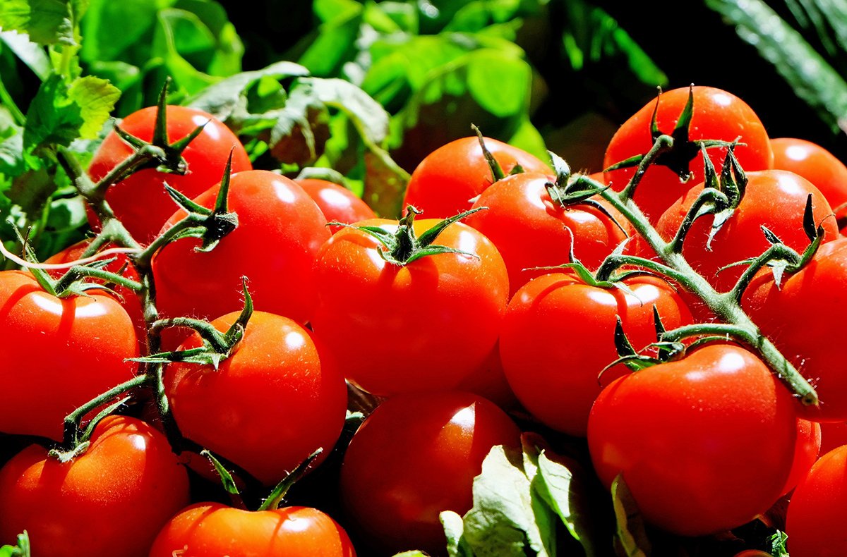
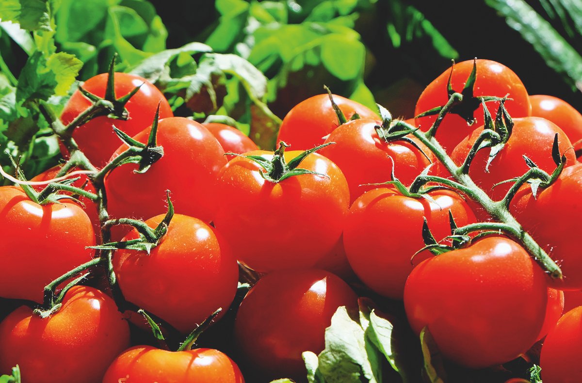
All images can be divided into simple and complicated.
Simple— converts from RGB to CMYK with no problems:
The first picture is RGB, and the second one is CMYK. There is practically no difference between them.
Complicated — includes unprintable colours that are lost in offset printing:
The first picture is RGB, and the second is CMYK. As you can see, the bright green and red are “eaten away” in the second one, and the detail and volume in these areas are lost. You can solve this problem by contaminating the colours.
Open our photo in Photoshop and work in the RGB colour model. To quickly see if there are any unprintable colours in the picture, go to View → Proof Setup and select Working CMYK (you already have the right colour profile for it):
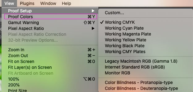
And with the Proof Colours command, we can switch between modes:
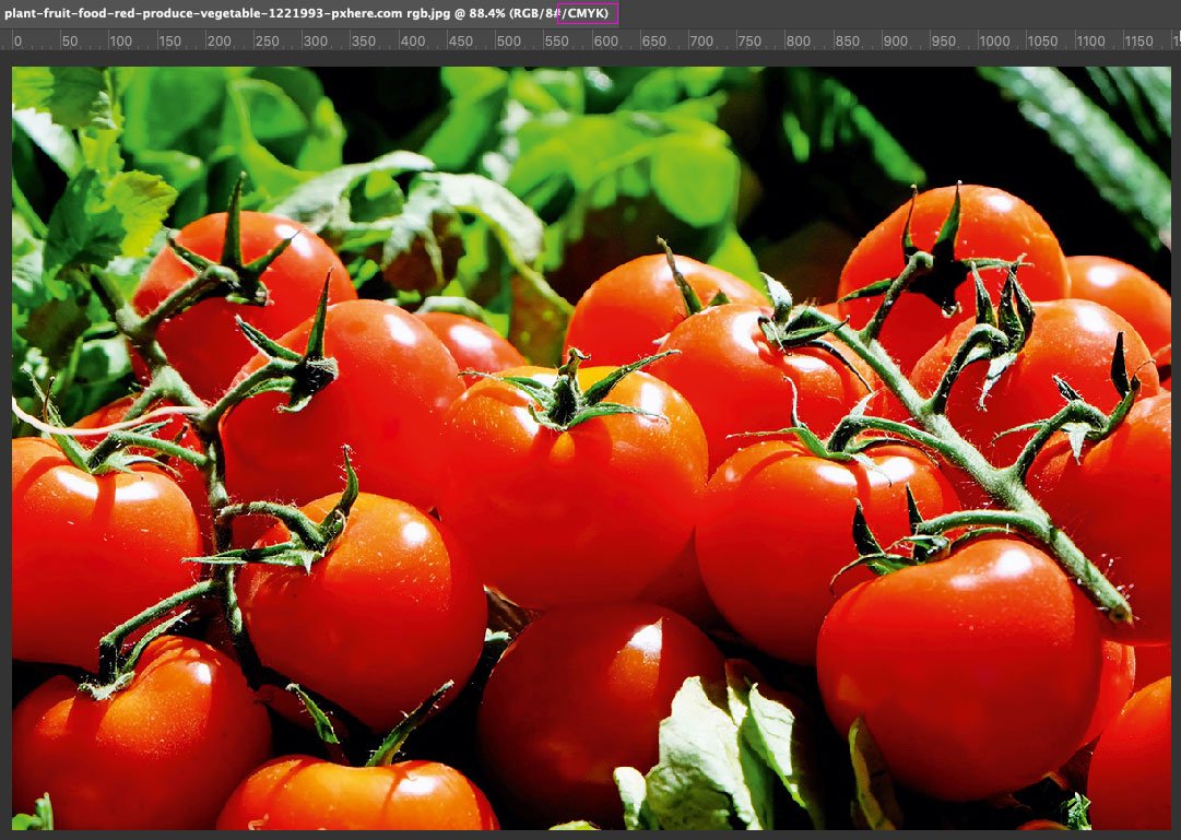
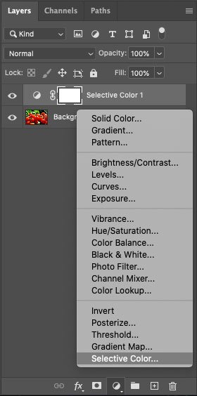
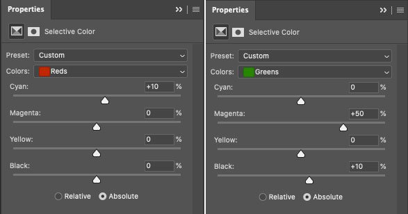
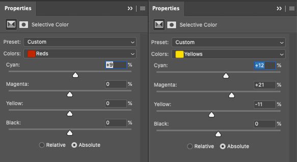
Reminder: work in RGB. To get rid of the unprintable colour, create a Selective Colour adjustment layer:
We have two unprintable colours — red and green, so it’s these that we will “pollute”. And we do it with opposite colours — for red, we raise Cyan, and in green, we increase Magenta:
Let’s compare the three pictures now:
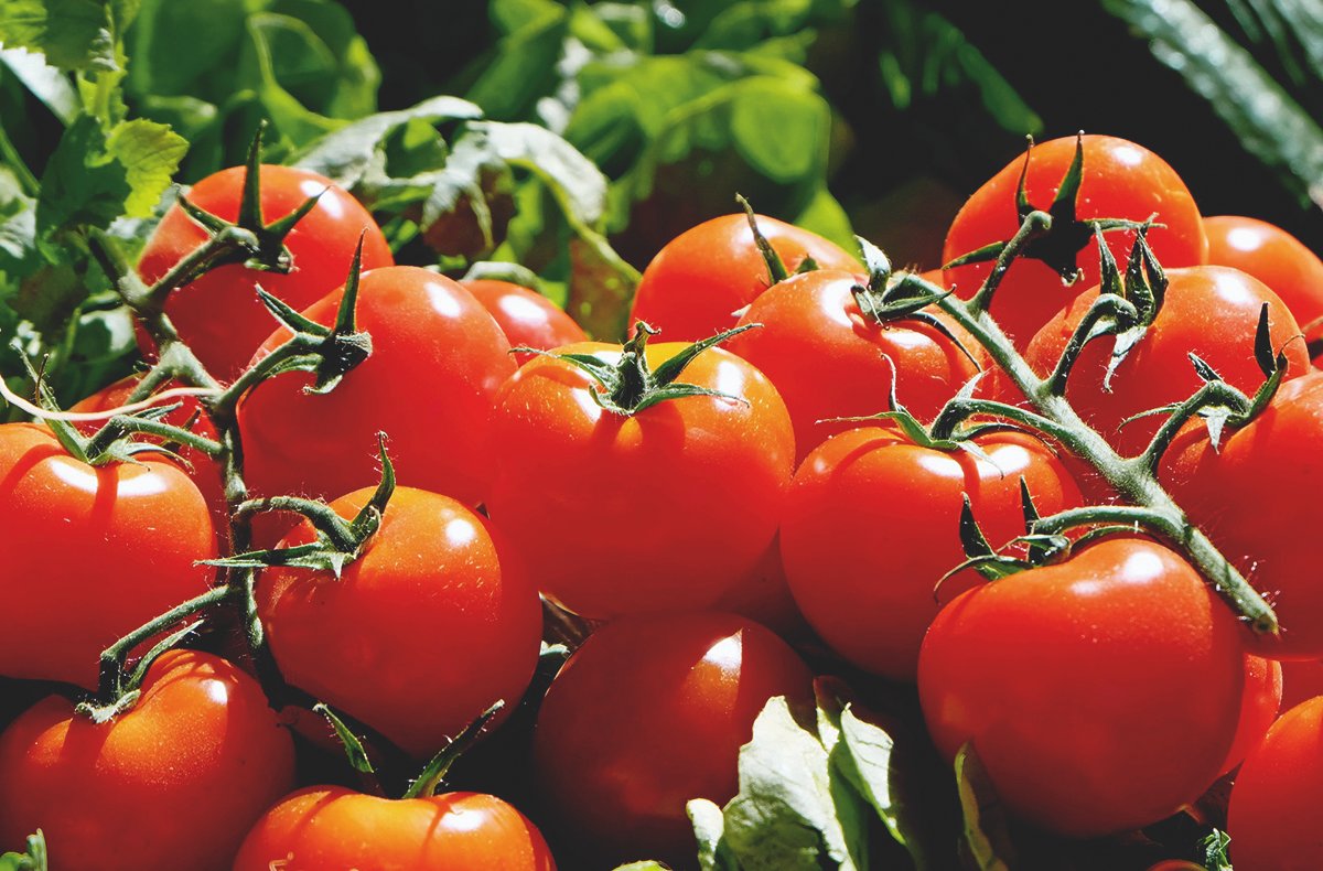
The first picture is RGB.
The second is direct conversion to CMYK.
The third one is converted to CMYK with an adjustment layer Selective Colour. Our picture is a bit darker, you can fix it if you want, but the tomatoes are still rich, and the leaves show details.
Let’s look at another example:


This is where I contaminated yellow and red:
The first picture is the original.
The second picture is the Proof Colours view. You can see how the brightest areas get soapy, and the smallest details disappear.
The third picture is corrected. It’s not as colourful and bright now, but printing such colours is impossible. I think it’s more critical to preserve details.
Feature of offset printing
The sharpness of offset printing decreases quite dramatically, which means it should be compensated technically. This is done in Photoshop with Unsharp Mask and must be done in several steps — separately in the Lab Lightness and CMYK Black channels.
I’ve taken a rather dark picture with a black object to show the impact of the sharpening more clearly.

So, open the picture in Photoshop and create two duplicate layers:
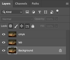
Convert the image from RGB to Lab without merging layers. Go to the Lightness channel, apply the Unsharp Mask filter with an impact strength of 100, radius 3 px:
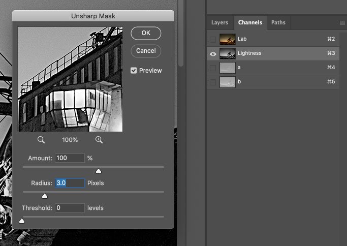
This is what we see:

Next, convert the image from Lab to CMYK without merging the layers again. Go to the Black channel and apply the Unsharp Mask filter with a value of 300% and a radius of 1 px:
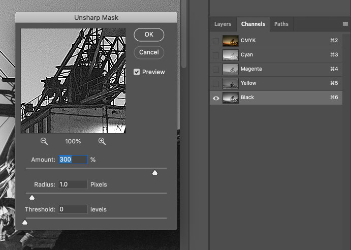
The values for Unsharp Mask in the Lightness and Black channels may differ. I have taken the average as an example.
The picture looks like this:
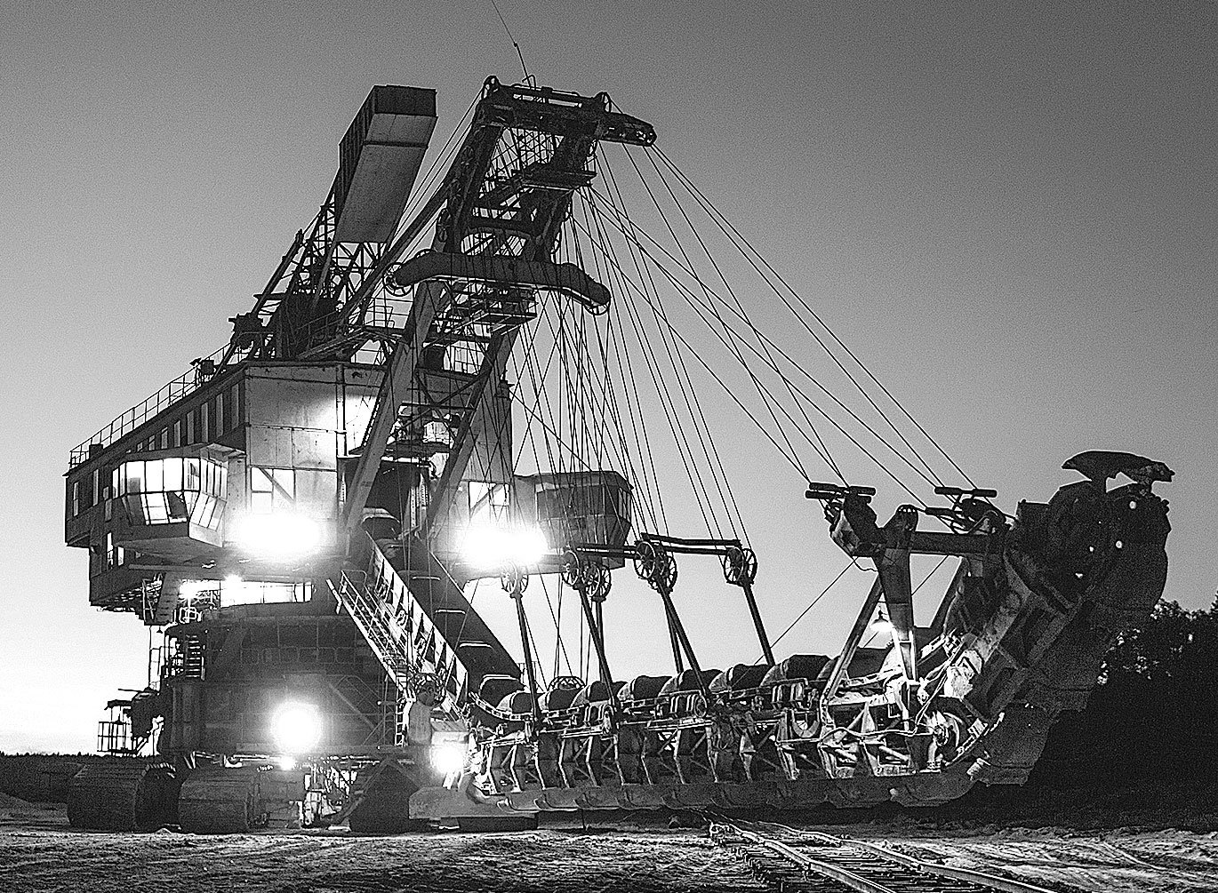
A bright white border surrounds the black details, but you don’t have to be afraid to sharpen the black channel. The triad colours will underlie this white border, and the result will be a soft glow that will accentuate the darker objects:


You can optionally enable the display for Lab layers in triad only and CMYK in black only:
You may think the picture is heavily sharpened, but in offset printing, the sharpness will drop a lot, and this sharpening will make the picture clear. Also, remember that on the screen, we see an image at 300 dpi, in reality, it will be three times smaller. You can move away from the screen by 1.5–2 metres and look at the image. Everything will be okay in print if it looks good from a distance.
I’ll show you an example of a magazine photo that I processed. Here’s a sharpened photo:

And this is the photo in the magazine:

As another example, I’ll show you a piece of advertising that was sent in ready to print, and I can’t intrude on it:
On the left is a fragment of advertising layout, and on the right is a photo from a magazine. As you can see, the layout was not sharpened, and the output was blurred.
Do not sharpen an RGB image. Otherwise, you risk having white ghosting around dark objects, which will not disappear when printed because there is no triadic backing:

Another thing I want to point out is the exposure. The printed image will always be darker than what we see on the screen. So if the picture seems dark, you need to lighten it up a bit. Otherwise, it might turn out to be a completely black nothing. For example, I sent the picture above to print like this:

It’s darker in the magazine, but the grasses are still visible:
This is all about the basics of image preparation. There are nuances in converting monochrome images from RGB to CMYK, but we don’t see those in our magazine, so I’ve written about that separate post.
Stages of work and their automation
Now, point by point, what and in which order I do when I get the original photos from the photo editor, and the layout is approved.
1. Resolution and processing
I open my first image in Photoshop, check its resolution, correct it if needed and start processing. Processing can include anything: clipping, cleaning of unnecessary elements, sometimes I make a collage of several photos or changing the background, somewhere you want to pull the black point and correct the ragged horizon — in general, there are all the necessary aesthetics.
2. Unprintable Colours and Exposure
I use Proof Colours to check my image for unprintable colours and correct it with Selective Colours if necessary. I lighten the image a little. In my experience with our print shop, I prefer to lighten almost all images. Otherwise, even light images in print come out darker than the screen.
I save the Photoshop file in a PSD RGB folder when I am visually happy with everything. Now I have a finished image in full size that I can return to at any time.
3. Image size
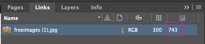
In Indesign, I look at the actual size of the previously processed image within the layout:
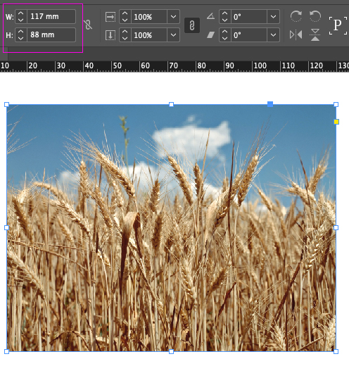
I go to Photoshop, crop the image and resize it according to the layout:
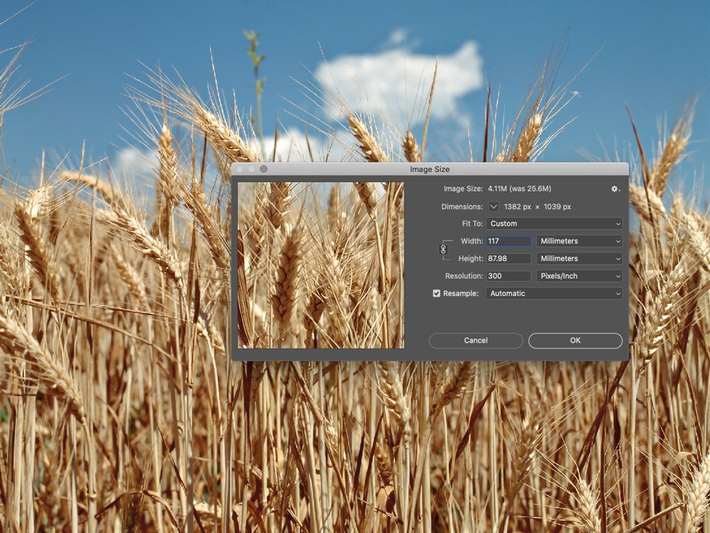
All the images in the print-ready file must be at 100% scale, and the effective resolution is 300 dpi. Right now, the effective resolution of my picture in Indesign is twice as high:
If you skip that step and leave the images at their original size, the resulting file will weigh a lot. It will be hard to work with, and the print shop will scold you :-)
And here is an important point, when the image size fits the layout, I create a new action in Photoshop and call it Sharp:
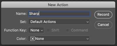
Now all my actions are recorded. I converted the picture from RGB to Lab, merged all the layers, and saved the file in TIF format in the TIF Lab folder.
4. Sharpness
I go to the Lab Lightness channel and sharpen the picture. Convert from Lab to CMYK, sharpen the black channel, and save the image in TIF format to the TIF CMYK folder. I closed the file and stopped the action recording. Now I have action, which I apply to all further images after their initial processing.
When all the images are ready, I go to Indesign and replace all the images with those in the TIF CMYK folder. At this stage, I review each image, and if I don’t like something, I can always go back to any stage of its processing and correct it. That’s why I save files separately in additional folders.
And this is what the linked files look like after their preparation for printing:
If you have any questions, let me know, I’ll try to help :-)

Pre-press in InDesign
Preparing a design correctly for printing is a time-consuming task. You need to check fonts, images, colours, and format, consider transparent elements, and adjust exports so that the print shop accepts the file for printing. Let me tell you what I do for the periodical Agroinvestor and how I do it.
Bleed parameter
The Bleed parameter must be set when creating a new document. The value can be obtained from the print shop, usually 3–5 mm:
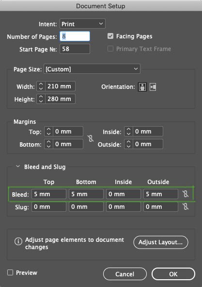
This is to control the elements that go under the crop. In the document, Bleed is shown with a red border around the outline of the workspace. In the image below, you can see that the line in the header extends beyond the sheet and reaches the red border:
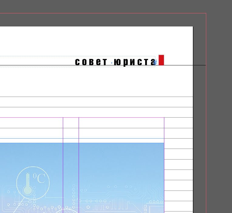
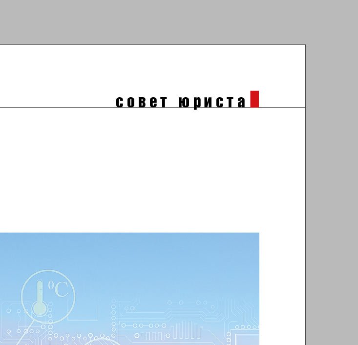
This means that in printed form, the page will look like this:
If the line is not brought to the red frame but left at the edge of the sheet:
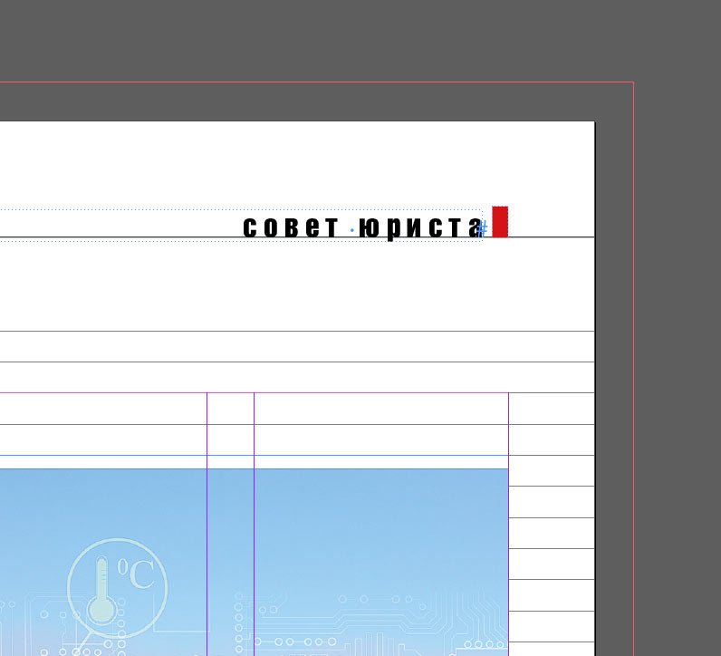
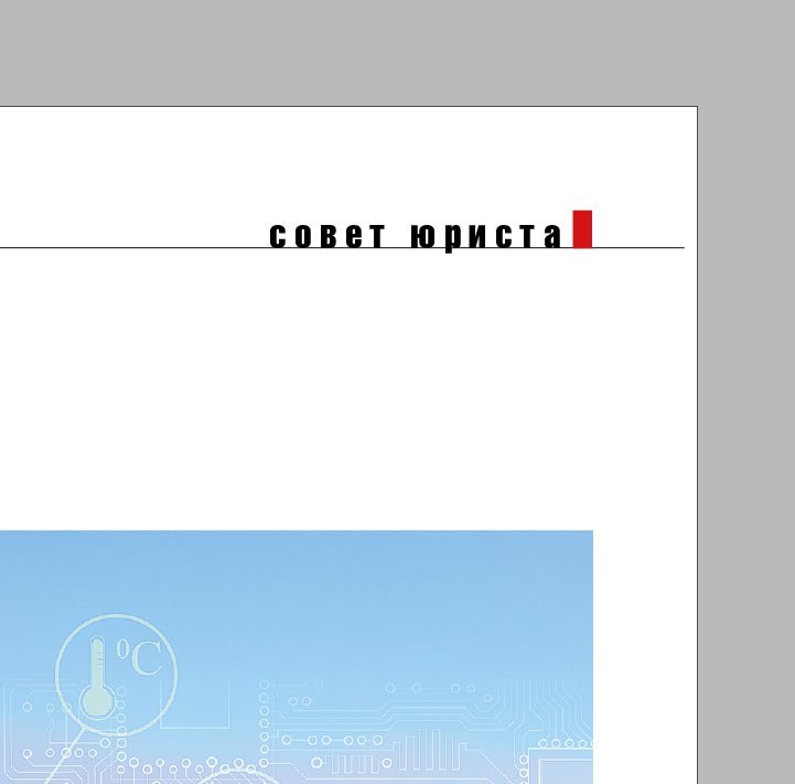
In print, we run the risk of getting this result:
The fact is that there is always an error of 2–3 mm when printing undercuts, both in and outside the working area. The Bleed parameter helps to eliminate it.
Preview mode
During the layout process, I always switch between Normal and Preview modes. Preview mode helps to ensure that all the trim lines are trimmed and that the relevant elements stay within the printable area. In the images below, you can see that the lines in the header and footer extend beyond the printable area, which means they will be cropped correctly. The Preview shows how the finished spread will look in print:
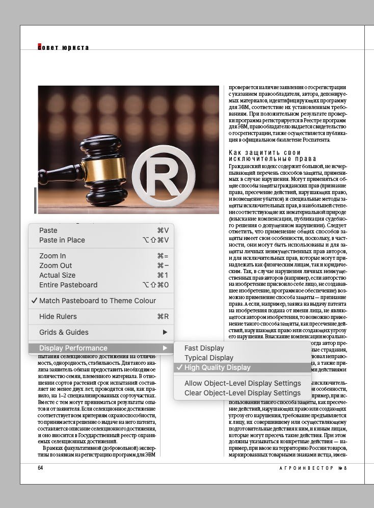
High-Quality Display mode
To control the resolution of images, I work in High-Quality Display mode. If an image is blurry or pixelated, you must pay attention to it. I’ll talk about more precise control of images below, but for the layout phase, High-Quality Display mode is sufficient:

Text and spelling
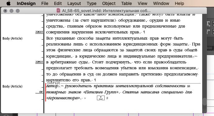
During the layout process, I always check the tails of text boxes. The red plus sign in the bottom right corner means that there is hidden text inside the box — this should be corrected:
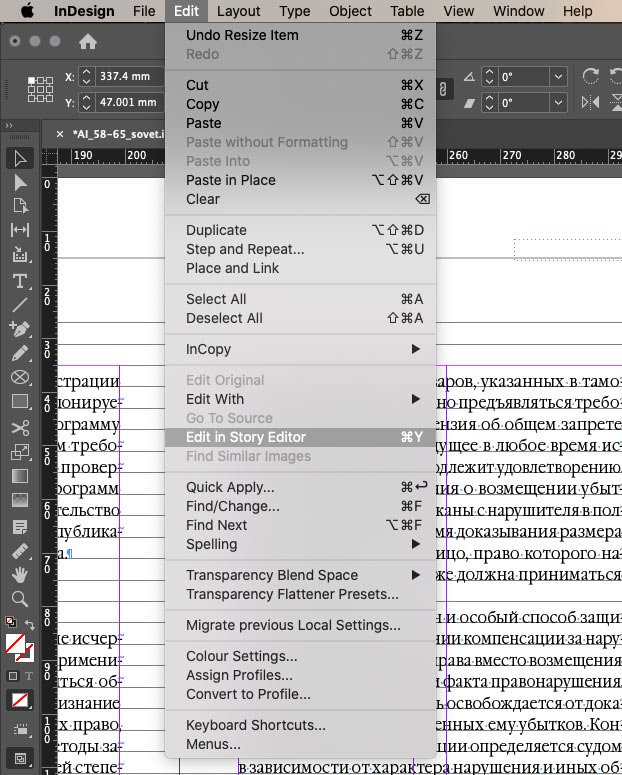
To see how much text is hanging by the tail, you can click on the plus sign to create another text box, and you can also turn on the Story Editor:
A window will open with all the text in the frame. The grey horizontal Overset line and the red vertical line indicate a piece of text that is not displayed:
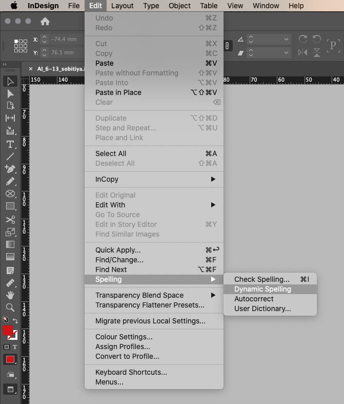
To control spelling, I switch on Dynamic Spelling mode:
It automatically underlines unfamiliar words and words that may contain an error, just like a text editor:
A red underline indicates a grammatical error. A green underline indicates that the word is preceded by a full stop, meaning it should start with a capital letter. In my case, it’s not considered a mistake :-)
If you select Check Spelling, you can manually go through all underlined words and replace them if necessary.
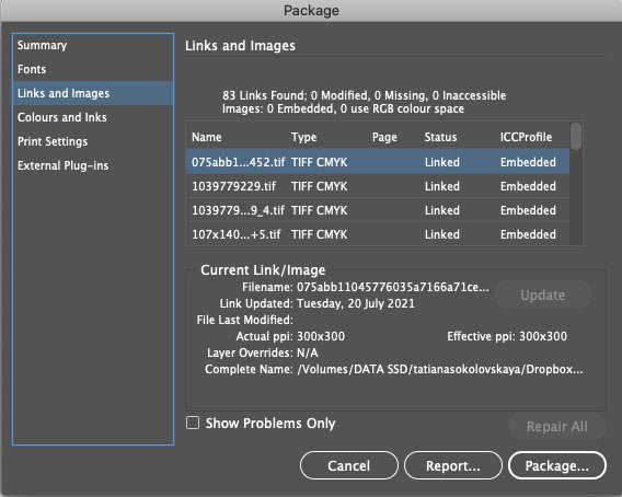
Image check
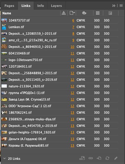
The High-Quality Display mode allows you to monitor the quality of images visually. I have a Links panel set up for more accurate monitoring:
I am comfortable seeing the following values:
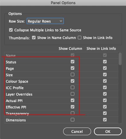
This is how it appears in the working document:

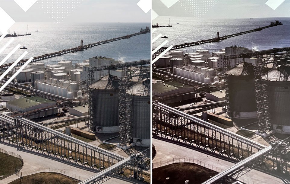
You can see that the colour schemes of the images are RGB, and the quality is poor, so you can’t print them. After preparing the images for printing (there is a post about it), the values look like this:

I can now see that all the document’s images are ready to print.
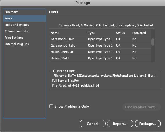
Checking fonts
When I work on a periodical, I use text styles. I wrote about them in a post about optimizing for a magazine, so I always keep my fonts in order. But if the project is new, I always check which fonts are used in the document before sending it to the print shop. This is to avoid accidentally printing any incorrect font without the appropriate license. You can see the fonts in the document itself:
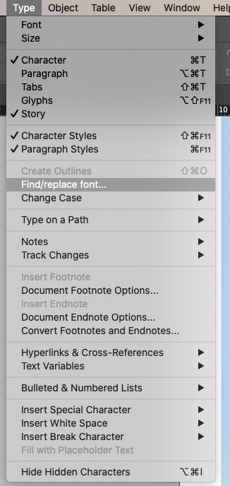
And if necessary, immediately replace the random font:
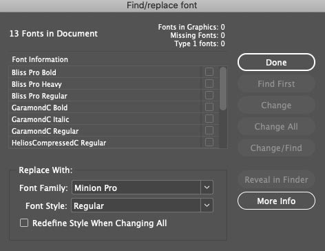
You can also view all the fonts just before exporting the file to print, which I will explain further.
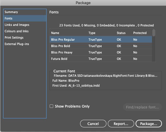
You should also check whether the fonts are OpenType or TrueType. Some print shops may not accept a layout if it contains TrueType fonts, for example. Such fonts can be converted to curves.
Checking for errors
I keep track of errors in the file in the bar at the bottom left:
If I can’t find an error visually, the Preflight panel rescues me. It’s also handy to use if there are a lot of errors:
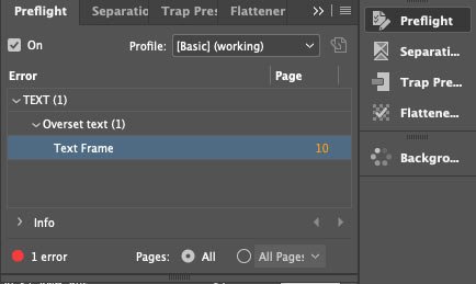
It’s OK when the indicator light in the bottom panel glows green:
The Preflight panel can be adjusted for each new project, but the basic settings are generally sufficient.
Errors can also be tracked right at the stage of packing files for printing, as I will discuss next.
Black control
The print shop requires that the ink sum for the black colour in the images should not exceed 300%. You can check this with the Separations Preview panel. I have set the Ink Limit to 300%. This is how I can see parts of the image that exceed the Ink Limit — they are highlighted in red:
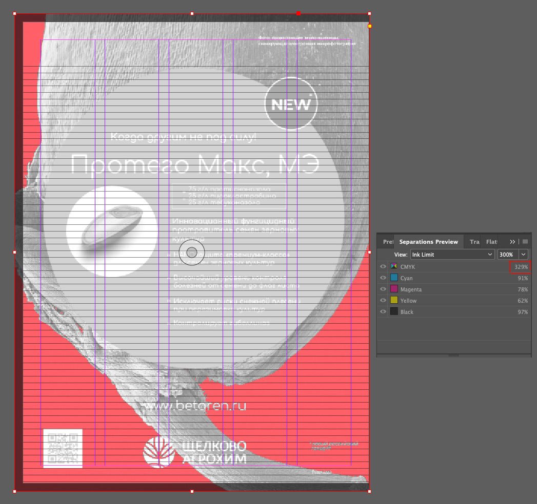
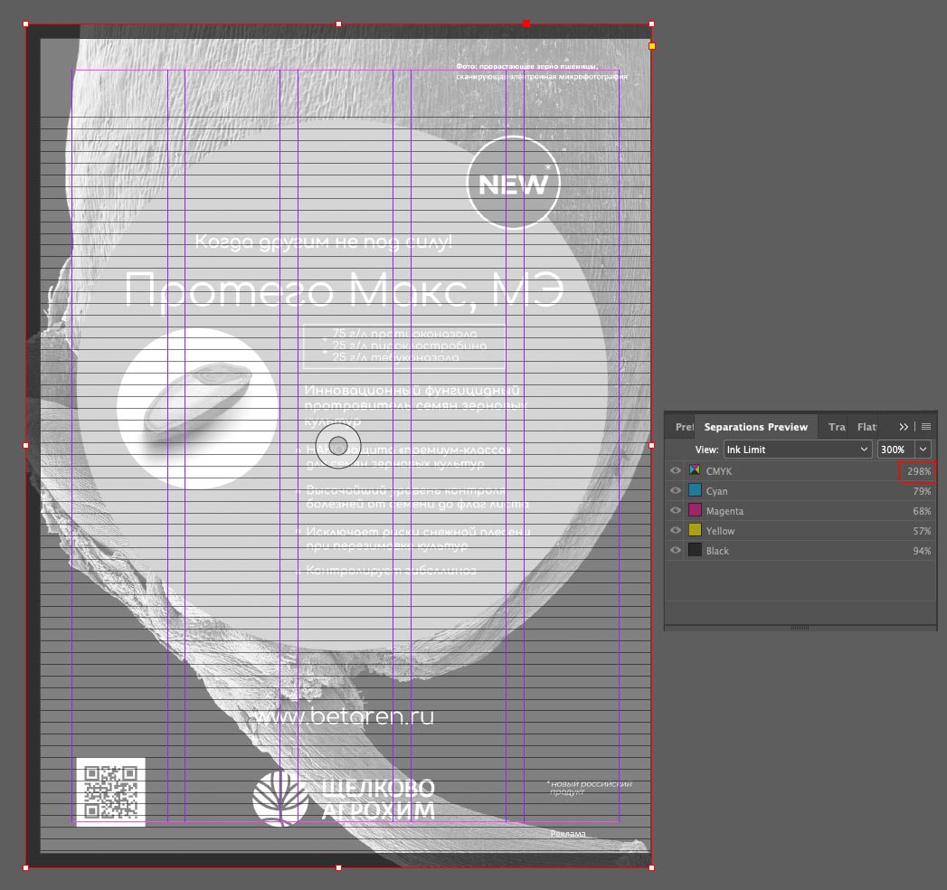
To fix this, I saved the image in the ISO Coated v2 300 (ECI) colour profile, which our print shop uses. I’ll talk more about colour profiles in a separate post. I refreshed the image and looked again with Separations Preview:
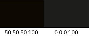
If you have a solid black somewhere, it’s important to remember to make it composite, e. g. 50 50 50 100 (CMYK). If you take black with a composition of 0 0 0 100, i.e. 100% black ink only, you risk getting a poor colour in printing:
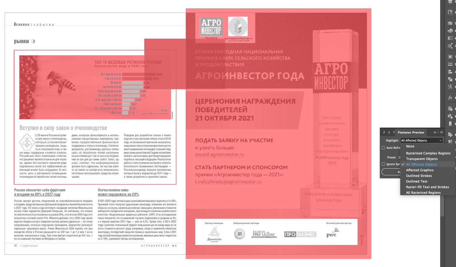
Transparency
Another point is to check the layout for transparent objects. This ensures that all transparent objects and the elements they affect are printed correctly — as the design intends. For example, I added a transparent rectangle to the layout. In Flattener Preview mode, all transparency is highlighted in red:
There you can also see all the transparent elements, i.e. those that are touched by the transparent rectangle:
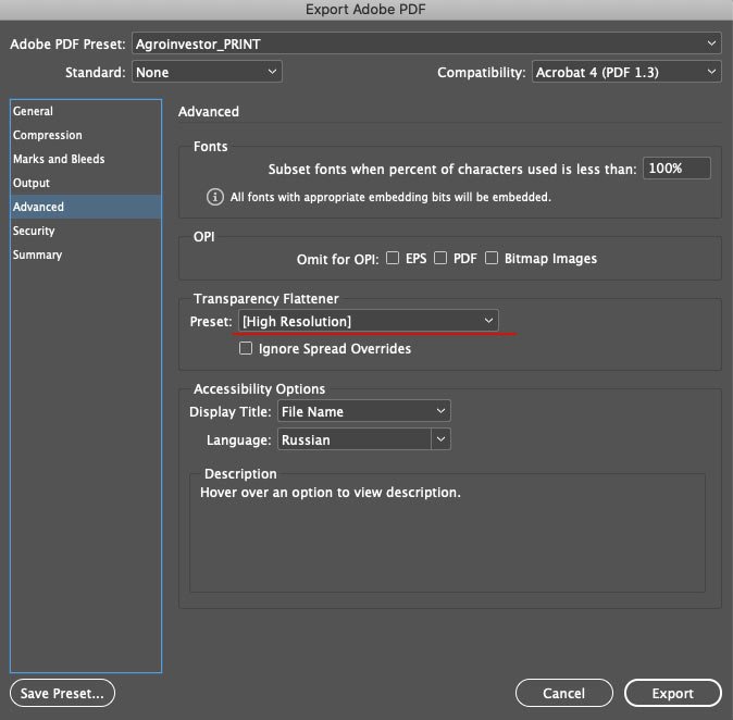
It’s crucial to check transparency if the print shop requires a file compatible with Acrobat 4 (PDF 1.3), as this version does not support transparent objects. All transparency will be rasterized when exported, and you must set export parameters. This can be done in the Flattener Preview panel:
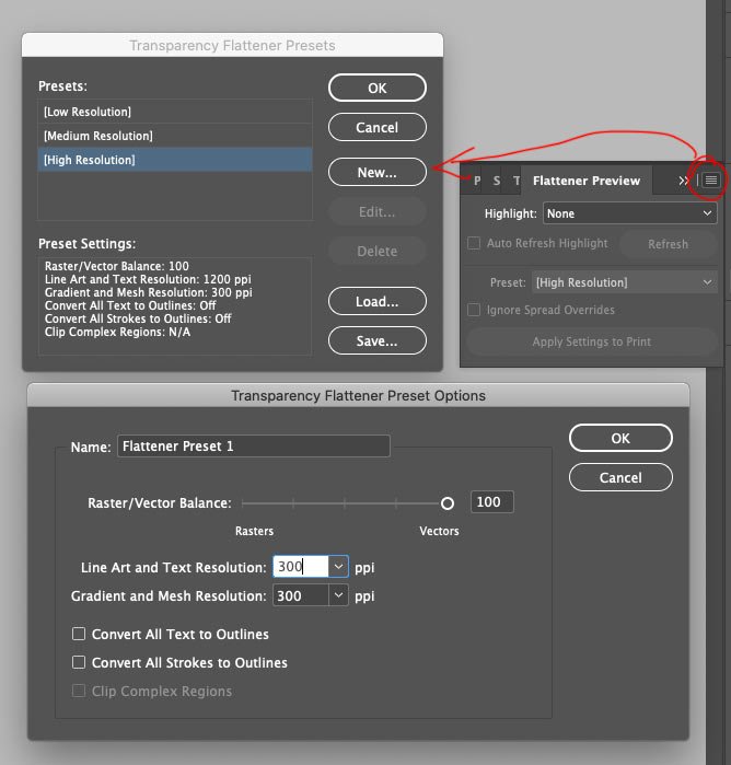
This is how to create a preset with the right settings and use it when exporting. I know that “Agroinvestor” magazine has no transparency in its layout, so I don’t bother with the preset but use the built-in High Resolution preset:
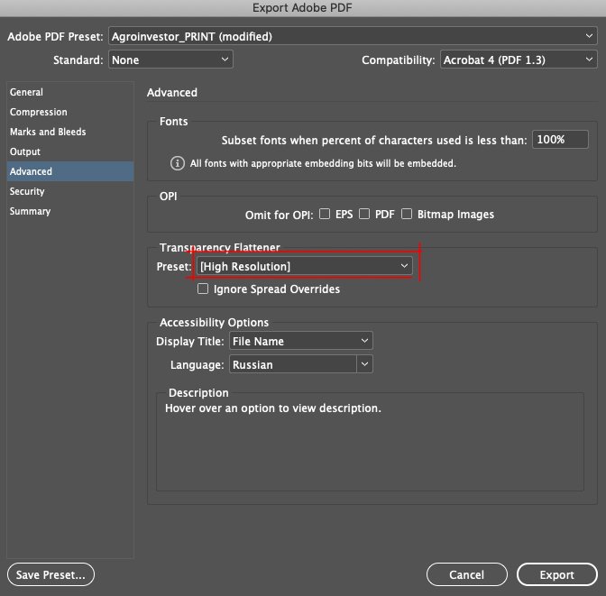
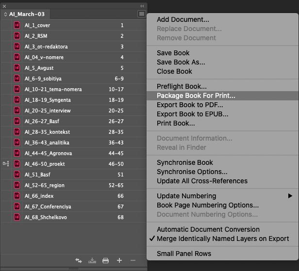
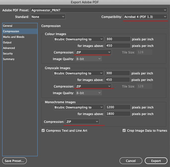
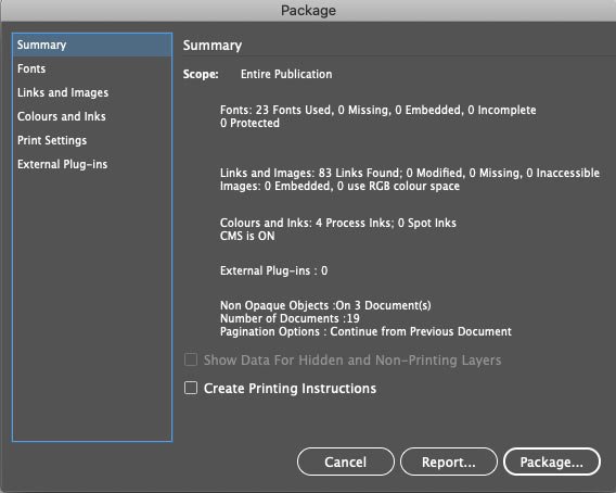
Export
I use the Book format in InDesign in my periodical work (I’ll talk about it in a separate post), so I use the Package Book For Print command to export the file to print. A window pops up where I can tick all the checkboxes I want to get into the export package — I only want the PDF file, and I also select a pre-saved export preset for Agroinvestor:
The preset settings are like this:

Use the blends installed in the layout.
Export images in the desired colour profile (this setting is just in case, all images I prepare in advance.
Use High Resolution preset for transparent objects.
And finally, a final check for errors:
I get the file and send it to the print shop :-)
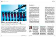
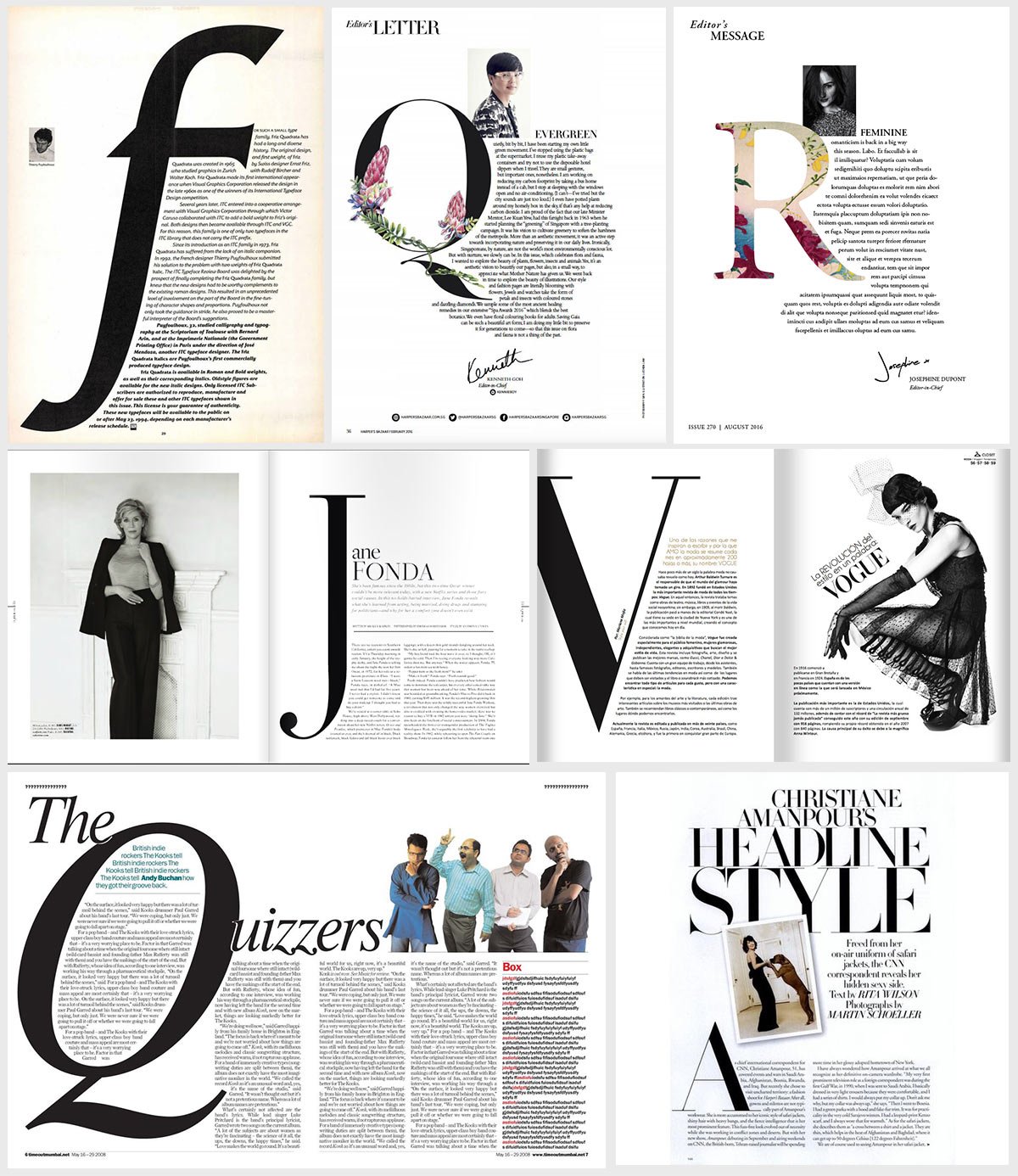
Magazine layout. Spread
The magazine spread is a single entity. Even if the left and right pages are very different in content, it’s essential to “connect’ them visually. This can be achieved by repeating a font, colour or some graphic element. For example, yellow bars are on this spread’s left and right pages. They are the ones who give the impression of cohesion:

Today I will talk about the elements found in a magazine spread. Three main elements in the centrefold influence the reader’s attention: the image, the composition of the layout, and the headline. In addition, there may be a kicker, an intro, an author line, an article body and, of course, a header. Let’s look at each of these elements in more detail.
Image
The main image usually occupies an entire page or almost a whole page. It’s the first thing that catches the reader’s eye and hints at what the article is about.
Header
The header is the largest text element. It can be located anywhere in the spread. It makes sense to use the left-hand page, as we are used to reading from left to right, but not necessarily so. In the example above, the image occupies the left-hand page, while the header and everything else are on the right. The header must stand out from the rest of the elements. You can do this by using a larger size, a different font, a different colour, or even expanding it vertically.
Kicker
The kicker is the header. It’s not always used. It’s usually printed in smaller font sizes. It can point to a heading or directly relate to the article’s subject.
Intro
An intro is an introductory paragraph connecting the title and the article. It’s usually typed in a different typeface and/or font than the main text.
Article body
A two or three-column layout is most common in magazines, depending on the format. I’ve written about the optimum line length in a typography tip for the layout.
Subheadings
Subheadings are used in the body of the article, and there can be several subheadings. They control the reader’s attention and help them find the information they want.
Quotes
Like subheadings, quotes control the reader’s attention. Typically, quotations highlight some exciting fact or meaningful phrase that can ‘get’ the reader to explore the article.
Page header
A header is an information block that is attached to some edge of the spread. It may include the title of the section, the heading, the name of the magazine, the issue number and the page numbering.