House of Weddings printed materials for the wedding expo
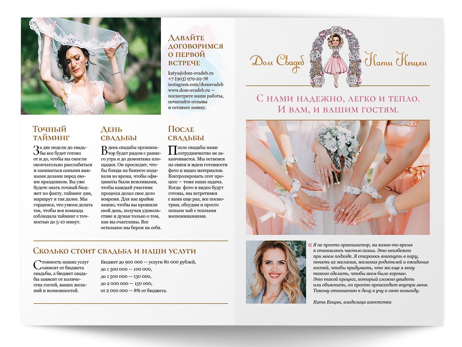
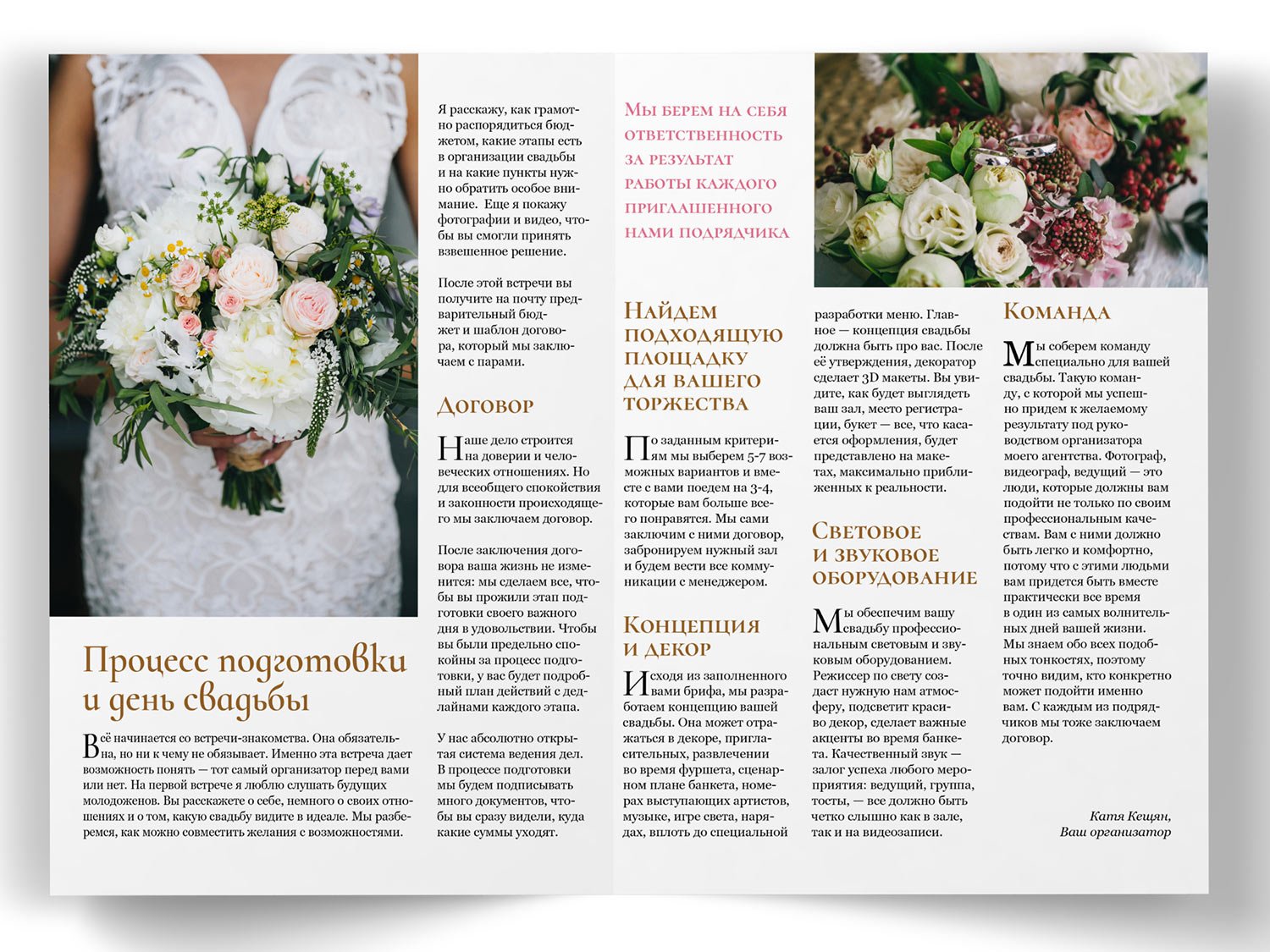
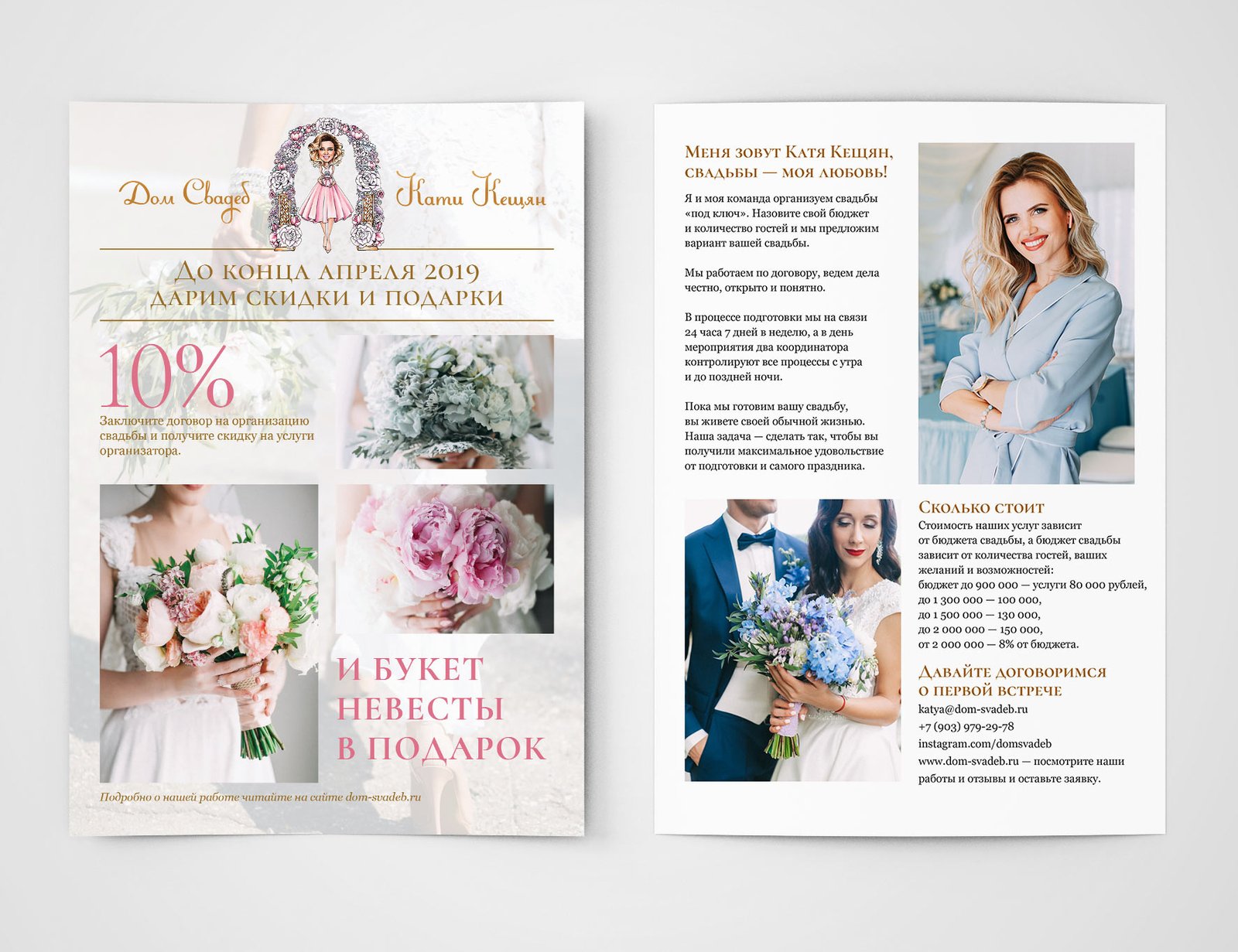
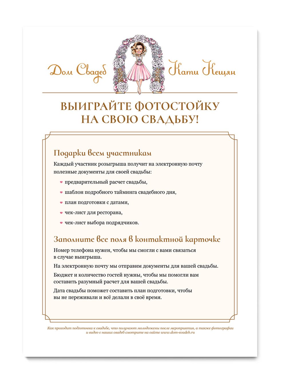
I created handouts for participation in a wedding expo.
Booklet:
Flyer:
Poster:

Certifications:


Instructions for entering the lottery:
On editorial design
and behind-the-scenes of my work
tsokolovskaya.com
I created handouts for participation in a wedding expo.
Booklet:


Flyer:

Poster:

Certifications:


Instructions for entering the lottery:

Maria decided to update her business cards and wanted to add some gold to them. I suggested painting the sides of the business cards gold and highlighting some parts of the ornament. Here’s how it turned out:
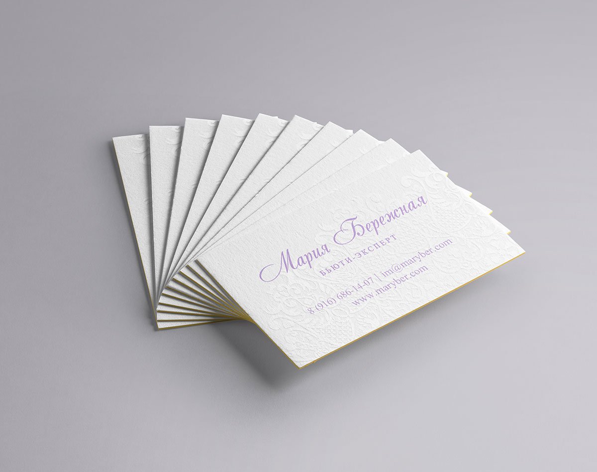

And this is how business cards look in real life:

Task
To refresh the logo while maintaining its recognisability.

The main element of the logo is the DL abbreviation combined into a single sign. This sign is responsible for recognisability, so it should be preserved.
The logo is often used on posters, flyers, album covers and other materials full of colour and elements. That’s why I decided to use only capital letters. Then the logo will be well read. I choose a font that suits the “D” as much as possible:

There is a second letter “D” in the name. I immediately try to insert a sign in its place while cutting the serif tail:

Right now, the “D” is too wide compared to the other letters. Correcting this:

I also softened the ponytail and made it a little shorter:

Looking at the result:

Experimenting with letter spaces:

Adding ligature and spaces to other letters:
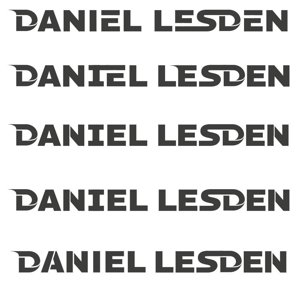
I’m putting together a vertical version:

The words do not match in width — bad. I add horizontal strokes to the letter “I” and lengthen the horizontal stroke “L”:

I don’t like it that way. I am expanding the letter “A”.
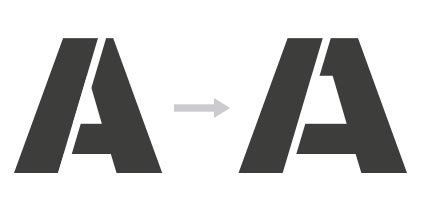
I align the spaces in the letters and take the “E” with a tail, as without it, a hole is formed between the “LE”:


I colour the logo in the company orange colour and sent it to the client:

Work accepted :-)
Task
Musician Daniel Lesden came up with an idea to make a little psytrance music guide and asked for help with the design. I did!
psytranceguide.com
Psytrance Guide is a site with overviews of the main sub-styles of psytrance. There you can read about each style, listen to examples, and learn typical tempo. It’s an educational and entertaining resource.
Since this site is a single page and assumes identical blocks, I sketched out the design partially and finalised it in the course of the layout. The work was done in one breath, even did not have time to save the evolution of design :-)
For the headlines, I found a cool techno font, it fits perfectly into the atmosphere, and I matched the font of the main text to it. Look at them:
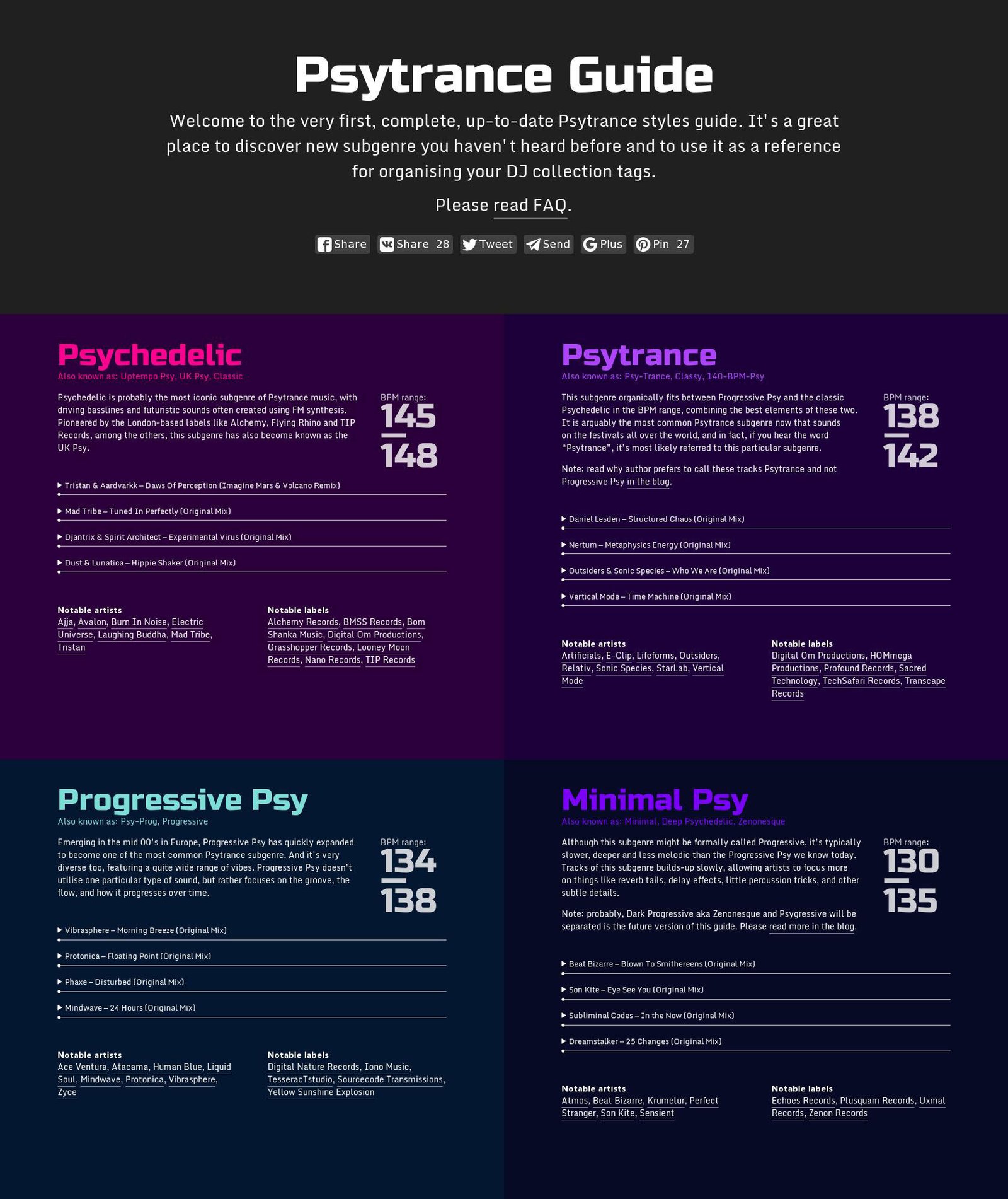
The colours are dark, but with bright saturated headlines, which fits perfectly into the world of psytrance.

The site is adapted for mobile devices as well:

Members of the project
| Design Tanya Sokolovskaya |
Layout Daniel Sokolovskiy |

Task
Revise the structure of the site, get rid of empty sections, rewrite the text information from the point of view of usefulness for a potential client and update the design.
maryber.com
Two years have passed since the launch of Maria Berezhnaya’s website. Now I look at the old site and realise that I made a big mistake back then — I “stuck” a lot of unnecessary things because “the client wanted it that way”. In addition, at that time I handed over the site without content, and it was assumed that Maria herself would be engaged in filling — this was the second big mistake. For two years the site had not been updated at all, and some of the sections were hanging dead weight.
So, after chatting with Maria, we decided to completely redesign the site. Maria told me about her career progress, what she is doing now and how she plans to develop further, and I started to work.
First I defined the structure of the new site:
Maria also wanted to add a “Blog” section, but after chatting we decided that she doesn’t need it for now. We also put aside the “Feedbacks” section for later.
The sections with articles, partners and events were not moved from the old site — they turned out to be unnecessary.
Since Maria’s sphere of activity is connected with the beauty industry, I decided to make the design “like in glossy magazines”. This is how the main page has lettering, and the design of individual blocks resembles a printed layout.

For the photo catalogue in the portfolio, I made a grid in which the accents shift from one photo to the others. As the grid fills up, the grid is duplicated, so there’s a rhythm to flipping through and there’s always something for the eye to grab onto. Works can be filtered by basic tags.
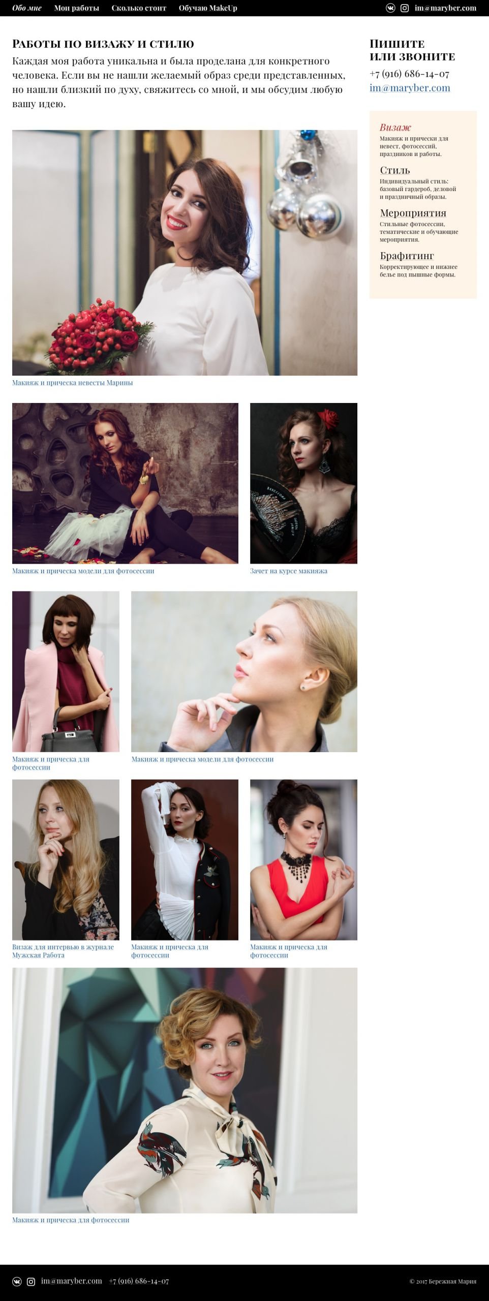
The inner page is a gallery of project photos. You can also add colleagues who participated in the project and write a detailed description.
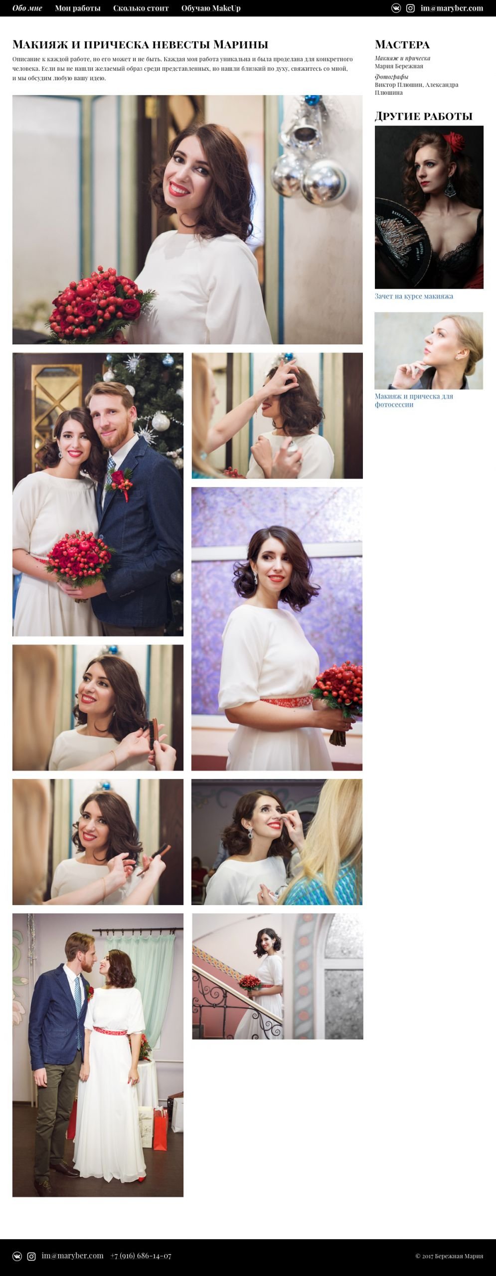
I decided to make the pages with prices and services with a free layout because Maria’s services often change and it’s impossible to fit them into a template.
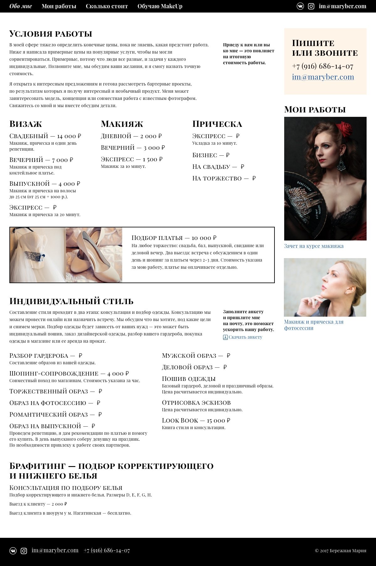
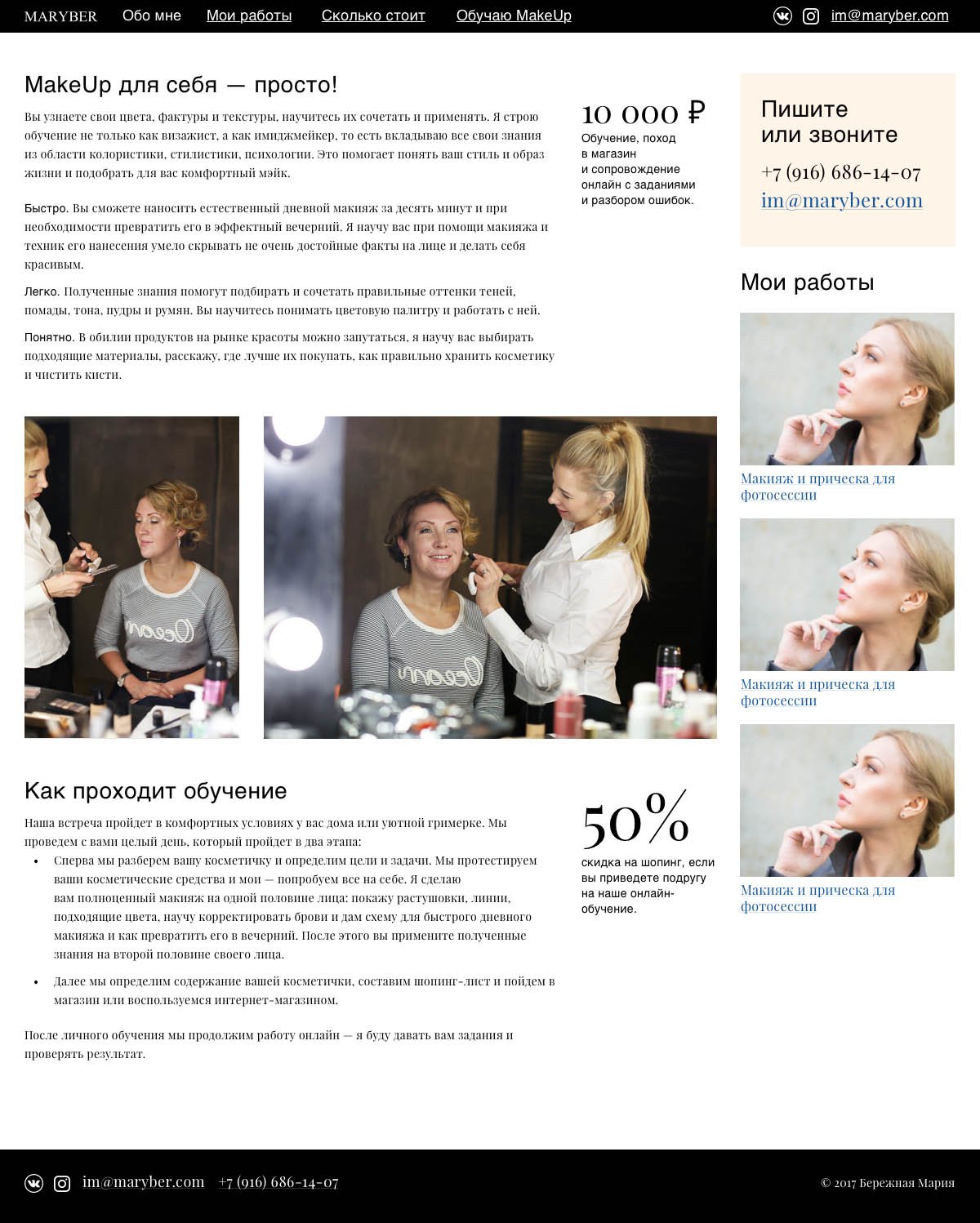
The “About Me” page is also a partially free layout to be able to make quick updates.
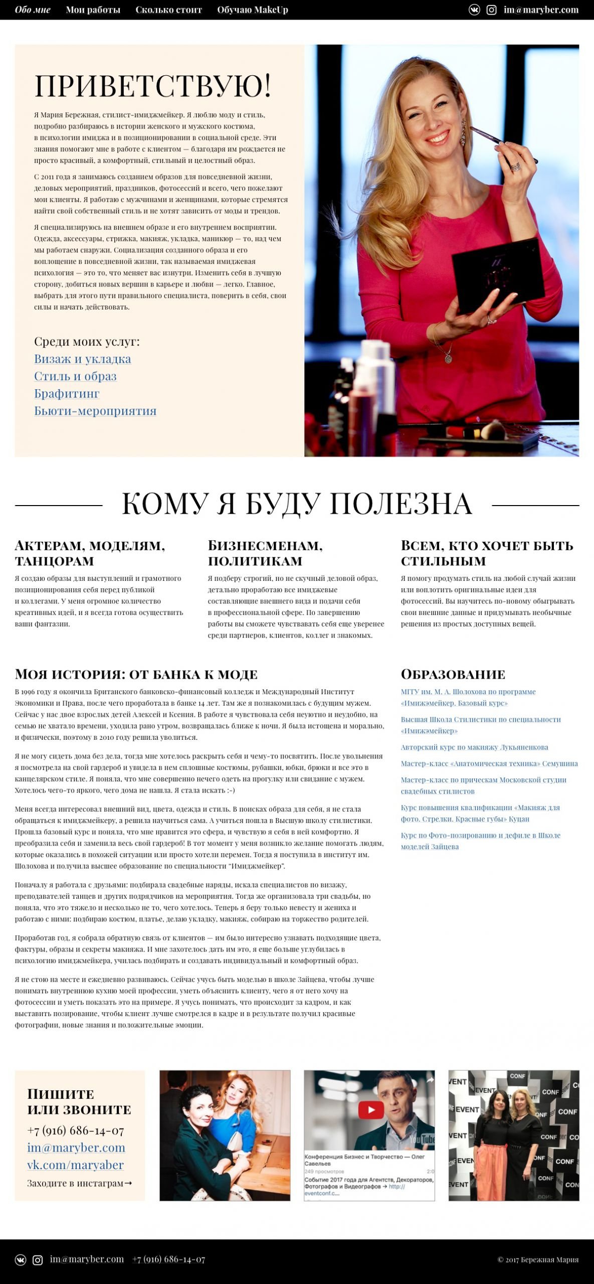
The result is a compact website that maximises Maria’s expertise and adapts to all screen resolutions.
Project participants
| Designer Tanya Sokolovskaya |
Layout and developer Tony Realovich |


If the first stage can be called a study, the second stage is more like a job, because it takes time equal to the real projects. I had to sacrifice something, I didn’t like it. No lectures, no tests. The grading system changed — we got points individually, not for the fact of submitting on time. Also, there were supposed to be teacher reviews, but my idea of reviews is different from the bureau one, I would call them small comments.
Read also about first grade.
The pattern was as follows:
If you break the deadline — minus two points out of five per iteration, and for the next failure you are excluded.
To get a review of the work, you have to have time to sketch something in the first two days of the week and send it to the teacher, and ... either get a response or not. If you wait until Wednesday or Thursday, you probably won’t get a response.
We put together the “About Me” page. We didn’t need to come up with anything super-cool. The main thing is to stick to all layout principles.
We negotiated with the client and wrote an understanding of the task. Perhaps this was the most interesting task. In the first week, we made a list of questions for the client, Ilya was in the role. He held a video broadcast with us: we asked questions in a general chat, and Ilya answered them enthusiastically.
In the second week, we wrote a letter to the client with an understanding of the task.
We wrote informational text for the website and made a page with it. This was the most nervous task for me, especially in the first week. At the same time, there was a work jam, so I left the first iteration of the task for the end of the week, and it was a big mistake.
Never leave anything for the last days.
Maxim offered two topics to choose from — coffee and personal trainer. Interestingly, most of the students chose the first option — coffee with Malysheva, they found it simpler. The rest, and I with them, preferred to talk about a personal trainer. I’ll give you a hint: it was much harder to write about coffee.
All Thursday I wrote the text — this is the most difficult part for me. I left the layout for Friday. Well, on Friday there was a force majeure — in the middle of the day there was a storm and the electricity was cut off in the whole neighbourhood. The work was half done and I couldn’t continue. After a few hours, I had already given up hope that the electricity would come back on and resigned myself to losing the grades.
But the lights came back on an hour before the deadline, and I had a couple of hours’ worth of work to do. I sketched the whole layout and uploaded it two minutes before the deadline. I am very emotional, so there were a lot of nerves and tears lost :-) I wasn’t satisfied with the work — I didn’t have time to make the layout properly, nor to go over the text again.

As I expected, I got one of the lowest scores. But Maxim recorded a video dissection of my work and pointed out the main mistakes. Then I decided to completely rewrite the text and make the layout again. This is what I got:

According to the results, I got almost maximum points for this work, and it and two other works were singled out by Maxim.
A complex document — a Beeline contract. The contract is just huge, it is suicidal to layout it in graphic programmes. Ideally — html and css. It’s enough just to make a neat layout.
In the second week, a new assignment was to be opened — Birman’s valenki and I dropped out. Several factors influenced the decision — a heavy workload that I couldn’t afford, further assignments I didn’t think were productive for me with the feedback we were getting from faculty, plus personal reasons.
I was in the middle of the ranking table at the time of admission and dismissal.
For myself, I decided that the first stage — a treasure trove of structured knowledge, is worth going for. The second — is necessary for designers-beginners who have not yet worked and have not collected a starting portfolio.
That’s it!

Finished the first stage of Designers School. Yay! I want to tell you what it was like, what I liked, what I didn’t, and some advice for incoming students.
I wrote about the second stage.
The Gorbunov Bureau Designers School trains designers in six disciplines: typography and layout, interface and information, negotiation and relationships, design and law, text and editorial, and management and results.
1*T5i73fspnSvqdnV4DxqqQfQ.png
The school is different from other educational institutions: in the first stage, students learn lectures, and take assignments and tests by themselves — teachers do not control the process. No one kicks, demands or leads them by the handle. This approach fosters self-discipline.
On the second stage pass the first 30 students out of 100 according to the rating. If you don’t get enough points, you have to go through the first stage again. Bonus: if you finish the first stage and are not in the top 30, you can take the course again, for a fee, but without the entrance task.
Every year the assignment is different: a page for a doctor’s appointment, a page for a car service appointment, and an interface for a pizza-ordering gadget.
Our stream was doing a self-check-in terminal at the airport. I scored 27.78 points and took 54th place in the rating. Now I realise my mistake: I didn’t understand the task completely, I went too deep into details and proposed an improved version of a standard terminal. To get a high score, you need to understand the problem, move away from the existing standards and offer a solution, not an improved design.

The process of studying is a race and striving to rise in the rankings. Every week you get a portion of lectures, study, take tests, and do assignments. If you fail to meet the deadline three times, you are expelled.
During four months of study, we took 39 tests, 11 practical assignments and a term paper.
Lectures in Google Docs. I counted 1092 pages in 10 pins, and most of them are in video format. The volumes are large, and incoming students are advised to read all bureau advice and the required reading book list on the school page before studying.
Additionally, read:
Out of 84 students, 15 were expelled — someone failed to meet the deadline three times, and someone did not manage the volumes and left on his own.
It’s hard to combine work and study.
I liked that all lectures are based on real examples. The lecturers give the theory and immediately show the application.
Tests among students caused a lot of resentment. The questions are generally based on the lectures, but some break your brain. Often you come across the subjective opinion of the teacher, with which you do not always agree. It has happened that you are sure of the correct answer, but as a result, the question is not valid. You can ask the teacher to point out mistakes, but they will only guide you — they will not tell you the right answer, and may not even answer the letter at all. Students are not allowed to discuss tests among themselves. Everyone was digging to the extent of their interest.
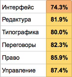
I took the tests in two stages: I took the test the first time, then studied the lecture and took it again a day or two later, after which I took the test. I advise you to check the third time too. Sometimes I made silly mistakes due to inattention.
I liked the fact that the tests are different from the usual ones, which I took in lectures and forgot. They are constructed in such a way that I had to reread lectures and books, think and analyse, after which the material was absorbed into my brain with a dead grip.
I did not like that there was no feedback at all. Sometimes I wanted to discuss, ask questions and get answers.
We drew knowledge octopus, made a growth plan for the year and kept a diary of tasks. Edited finished text, wrote the text for a promotional page and prepared an article for print. Improved forms, tables and graphs. Conducted negotiations.
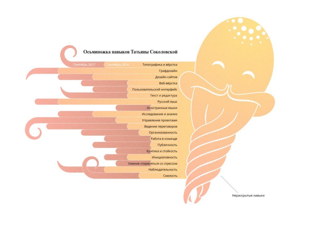


Now I look at my octopus and realise that I underestimated in some places and overestimated in others :-) I’ll have to make a new one
And here is the editing task — I had to choose one of the proposed articles, edit it and prepare it for printing:


Negotiation seemed to be the most difficult assignment for me. We were divided into pairs and given roles.
Prepare for the negotiation in advance, think through all possible scenarios and prepare a couple of proposals to solve the problem. Rehearse a few times, write down the questions and follow Camp’s “commandments”: be out of order, in the client’s world, show care, weed the fishing line and don’t be needy. I watched all the clips of fellow students — you can immediately see who prepared for the negotiation and who didn’t.
Negotiations get 50 points. In our stream, no one got the maximum. Three students got 47.5 points, I got 46.7 points, others got 45.8 and below. A renegotiation is a real chance to move up in the rankings.
Failure is negotiation without resolution or being taken to court. Be prepared for anything from your partner — there have been cases when your partner shouted and threw paper at the camera. Of course, such behaviour is a failure, but the right reaction and response can save your grade.
In fact, it didn’t go as badly as I thought it would :-))
The assignments were graded by deadline: if you were on time, you got a full grade, if you were not on time, you got half a grade. One of the assignments on editing and negotiation was graded by the students themselves — they checked each other, and the instructor adjusted the score if he/she thought it was necessary.
Take the assignments seriously, even if the instructor does not grade the work, it is a great experience. Study the work of previous streams, and learn from their mistakes.
Liked that designers have enough editing assignments as well.
Didn’t like that the papers were graded by a deadline. It didn’t matter how much time you spent and how you did the work, everyone was evaluated the same way — if you made it on time, you got the maximum. There was a lack of practical assignments. I understand that the second stage is focused on practice and feedback from the teacher, but after the theory, I wanted assignments in addition to tests. Assignments with grades and comments at least from fellow students would have been even more useful.
Coursework gives 150 points — this is a lot, for tests 3–5 times less. Therefore, coursework can greatly affect the position in the ranking.
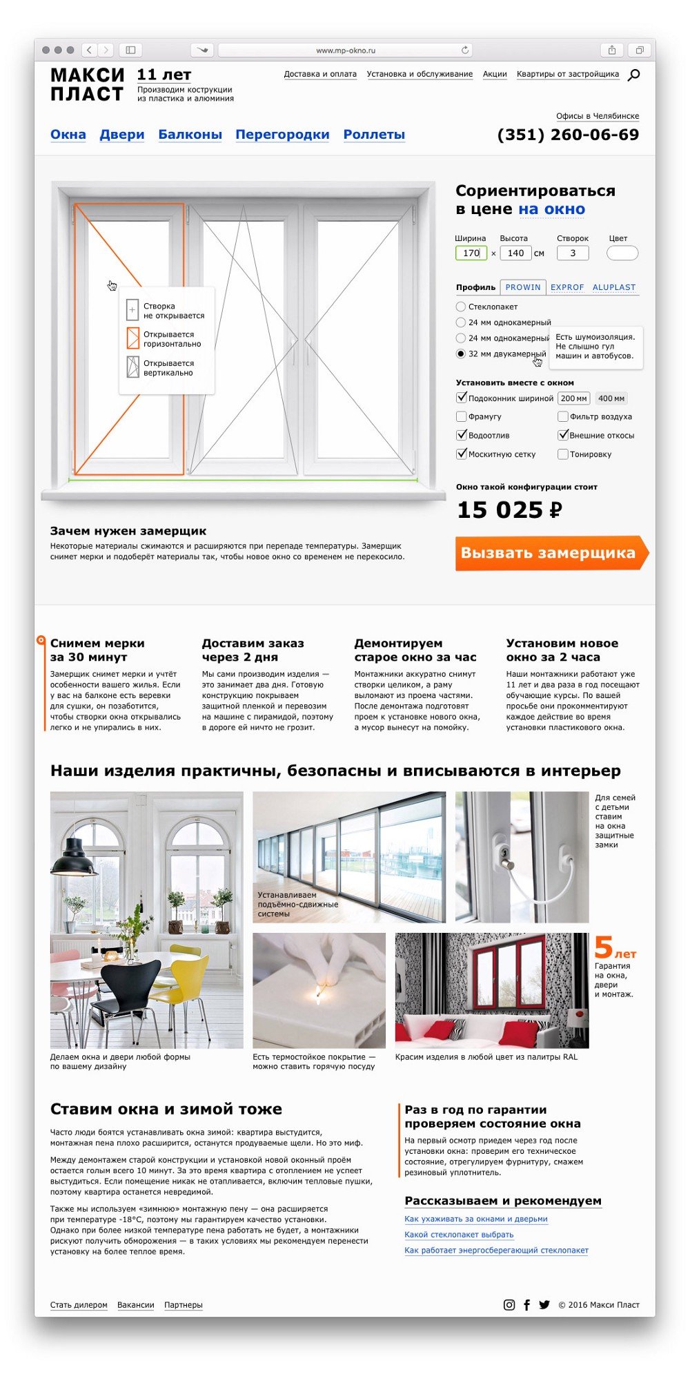
In a fortnight you need to draw the main page of the site of plastic windows. Without inventing anything, just draw a strong layout. Assignment on the discipline “Interfaces and information”, but also take into account other subjects: texts in infostyle, layout on lectures. Remember usefulness and convenience.
I won’t say exactly how much time I spent on the assignment, I think about 12–15 hours. I started working on the layout in the second week, my eye quickly became blurry, but I didn’t have time to put the layout aside. Now I see mistakes I didn’t see before. So don’t put it off until the last week. Start doing the coursework right away so that you have a chance to rest from it and finish it with new strength and fresh eyes.
I liked that they gave a real project as a basis and I didn’t have to invent anything.
Disliked, that there was no opportunity to discuss details and ask questions about the work, as it would be with a real client.
I started the study at 54th place and climbed into the top 2 after the first week. I floated between 16th place and 28th for 3.5 months and graduated in 17th place.
If you want to continue studying, the main thing is not to fall out of the top 30 — it will be harder to get back in every week. If you pass the tests with an average of 75–85%, you can get ahead only in negotiations and coursework.
I like this rating system. It encourages you to study and get ahead. Some think otherwise, there were comments and dissatisfied students.
I saw the benefits for me already in the first month of the course:
The school is for those who want to learn.
And I will continue in the second step :-)
1*bzaDZHXOmw1K3PmTmSgQrA.png.
The second stage starts on the 9th of January
Thanks to Artyom Gorbunov, Ilya Birman, Maxim Ilyakhov, Ilya Sinelnikov, Nikolay Toverovsky, and Vladimir Belyaev for their love of their work, and for the desire to develop and share knowledge.
Task
To tell brides why they need a wedding planner and why it’s better to turn to one than to do the wedding themselves.
dom-svadeb.ru
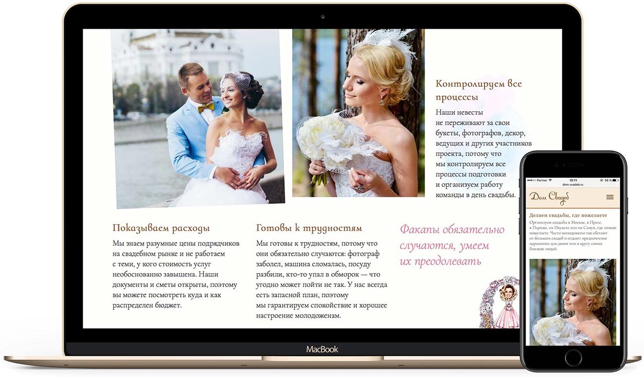
In developing the website, I paid special attention to informativeness: I told about the advantages of contacting an organiser, the process of preparing for the wedding, the difficulties of organising and the wedding day itself. Now brides can get a clear idea of the agency, and services and order the organisation of their wedding.

The site adapts to all screen resolutions:
Project members
| Designer Tanya Sokolovskaya |
Layout Daniel Sokolovskiy |
Developer Kodelnaya |
Many designers build layouts according to the modular grid, but this approach gives a bad result — pages turn out boring and difficult to perceive. The modular grid consists of rectangular modules. To make clear layouts, first of all, it is worth distributing the elements within the modules, and then with the help of the grid systematise them. The modular grid organises the objects within the space, creates an impression of unity, and gives order and clarity to the layout. And sometimes the grid is not necessary at all.
The modular grid is a tool that must be used correctly and on time. After all, you can not take a ruler and immediately draw a house in perspective, first you need to take a pencil and outline the main lines and points, after which the ruler will help to align the lines and composition.
In this post, I’ll explain how to organise the objects within the module so that the layout doesn’t fall apart and is easy to read.

The role of objects inside a module is played by illustrations, titles, logos, quotes, factoids, text blocks, captions, footnotes, in short — everything that is located in the module.
To prevent the module from falling apart visually, significant objects within it should gravitate towards corners, sides or the visual centre

Rectangular objects are subject to the rule. If we talk about a circle, it can occupy any position inside the module. Circle is pleasant to the eye and easy to perceive, it contrasts with rectangles and attracts the viewer’s attention earlier.
Following this rule, the composition will always be balanced and easy to perceive. It is important that on the free sides, the object breathes. If the header stretches to the upper left corner, then there should be air to the right of it and below.
Air is negative space. The perception of the composition depends not only on the objects but also on the correct organisation of the air around them. In a layout you should try to minimise the amount of negative space, the less there is, the easier the composition is to perceive.
Take a look at the picture below:

There are two mistakes here:
1) There is unused space at the top and bottom — the сomposition is unstable:

2) The objects are scattered chaotically, as a consequence there are many blocks of negative space. The composition is falling apart:
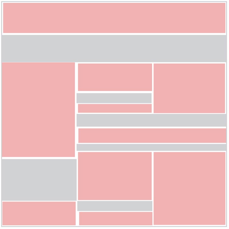
To improve the module, we need to get rid of the first and minimise the second. This is where the rule of arrangement of objects in the module helps.

Objects are organised into rectangles and gravitate towards the corners and sides of the module. The negative space has taken a simpler form:

The composition has become organised, stable and easy to see.
Let’s add a circle to the module. Remember, it can occupy any position. A circle primarily attracts attention, so it can be used to direct the viewer’s gaze:

A circle is a very selfish figure, it should be one. If there are two or more of them in the layout, the viewer’s attention will be scattered, it will be hard for the eye to catch. It is undesirable to do it this way:

Let’s assume that all the objects in the module are equal:

Now we are looking at the layout and there is nothing to grab our attention. We can attract attention by using colour or lettering:

You can also use a different font or increase its size:

Add a meaningful object and air around it:

It is customary to divide objects in a module by importance. The first place is always occupied by an illustration. It is it that the eye on the page clings to. Then we look at the headline, move our eyes to quotes or factoids, and if we are interested in all this, we pay attention to the text block.
In order to look at the page comfortably, the collection of the layout should always begin with the most significant objects and lead the reader’s eye from one to another. People tend to read information in the course of writing: from left to right, from top to bottom. In a Hebrew-speaking environment, the direction is reversed — right to left, top to bottom.

If the text is typed in two columns, we will start reading from the left column (or right column in Hebrew) from top to bottom, and continue at the top of the second column.

If there are more columns and rows, the distances between the objects by proximity rule will help to direct the eye:

The fact that the gaze moves from top to bottom remains unchanged. Therefore, objects should also be arranged in the module from top to bottom in descending order, starting with the most significant ones.
Let’s break down an example:

The layout consists of a module, with another module inside it: the page itself and the white rectangle in it. See how the objects inside their modules behave:

There are two significant objects in the main module:
The second module is a white rectangle, with a text block of a large headline and subheading playing the role of a meaningful object. This block stretches to the left side of its module, with white space to its right to compensate for the unilateral gravity.
This free space around the objects allows them to breathe, increases their importance among other objects, and balances the composition.
Another example:

We see three key objects: large red characters in the upper right corner, a human figure along the left side of the module, and a text block on a black-grass patch at the bottom. All of them are located at the corners or sides.
Or here:

Significant objects are distributed at the corners and sides of their blocks, and the illustrations look harmonious.
Analyse the magazine spread:

The spread consists of two modules: the left page and the right page.
On the left page, a large headline rests in the upper left corner, while a column of text flows along the right side of the module. The headline, as the most significant object of the module, breathes on the right and below, the negative space giving it significance.
On the right page, the man in the black jacket is centred and gravitates downwards. If we consider the spread as a single unit, the headline and the figure, as the two brightest spots, pull towards the corners and balance the overall module. Note: the first thing we see on the spread is a face, i.e. a circle.
Another example with a circle:

Although in the layout there are two dark spots at the upper border of the module and the bottom left, first of all, we look at the circle, i.e. the girl’s face.
Often the circle is used for special offers, discounts, and promotions:

See how cleverly Jan Tschichold wields the composition:


He masterfully directs the reader’s eye from one object to another.
Here’s an example of a bad distribution of objects in a module:

Firstly, there are two circles here. Remember, a circle is selfish and should be one. Secondly — meaningful objects are arranged randomly. The layout is falling apart.
Another bad example:

Comments are unnecessary.
Placing meaningful objects at the top and bottom is common in operating systems:

Menus on many sites are tied to the top:
And here’s an example of a centre position:
But this kind of symmetry is good once, otherwise, you can’t avoid chaos:

Now let’s look at how modules interact with each other on website pages.
The layout should be present in the main objects and additional objects so that the reader’s eye follows from one to another. If you build a layout monotonous blocks, the view will be nothing to catch on, to look at such a page is uninteresting and tedious. Information sites often suffer from this:
See how the BBC designers solved the problem. There’s an alternating rhythm along the page: different sizes of modules, illustrations and headlines. The reader’s attention is not scattered and it is interesting to explore the page:
As a rule, all layouts are built according to the “sandwich” principle, i.e. rectangular modules are arranged on floors one after another. Designers like to separate the floors by background colour, but this technique is dangerous, especially if the objects within the floor are equivalent and follow symmetry:
In layout, dynamics are important. At first glance, it may seem that the example above is very dynamic, but it isn’t. This pseudo-effect is obtained due to a large number of different shapes and styles: there are squares, circles, schemes, tables, lists, and many icons, each floor has its background colour, plus about ten different font solutions. The layout is heavily overloaded, with objects in modules arguing with each other.
The simpler the layout, the easier it is to read. Dynamics is achieved by alternating rhythms. See how Apple handles a long page:
We see the floors: there’s both symmetry and asymmetry, and they alternate between them. Each module has a large illustration. The design of the floors is very simple, so we easily glide our eyes over them, and the long page is easily perceived.
Task
Tell potential partners about the authorisation programme.
partners.epson.ru
Epson is a Japanese manufacturer of equipment and a world leader in projection equipment and printing technology. For the company’s Moscow representative office, the client’s team and I made a website with a story about the partner programme.
Any design starts with understanding the problem. To understand the problem and possible solution, I ask clients questions about their business. So the process of working on Epson’s affiliate website started with a conversation with a manager where I learnt a lot.
Usually, machinery manufacturers either trade directly through their affiliates and online shops or through partner networks. Epson works according to the second scheme.
The company created an Affiliate Zone for partners — a closed site with special programmes and media materials. The problem was that there was no information about the partner programme on Epson’s sites. Interested companies had to first look for contact information and then write to managers. The managers, in turn, had to tell everyone in detail about the authorisation procedure.
Thus, my manager and I formed the mission of the project: “to help potential partners learn about the Epson authorisation programme and decide whether to join”. For this purpose, we decided to make a one-page website with a step-by-step story.
Studying presentations and documentation to understand the process:
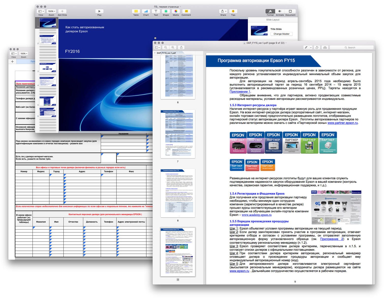
There is a lot of information, but I have an advantage: since I have not encountered the terms of the affiliate programme before, this allowed me to look at it through a beginner’s eyes.
Structuring everything learnt into a coherent narrative:
Assembling the first “floor”. I show the authorisation categories for which companies become partners visually in the form of photos of devices in this category. Here I also decide to add social proof in the form of a factoid: 500 companies have already become Epson partners.

Next, I answer the question “Why authorisation is needed” and talk about the benefits of being a partner.
At first, I thought to illustrate each point with icons like fashionable landings, but then I realised that becoming a partner should be a balanced decision based on facts, not emotions. So let’s write honestly and without tinsel.

Next is the most important part: how to become a partner. Here is the key useful action, so I highlight this block with a coloured background.

Next is the contact information of regional managers. Usually in presentations and on company websites, this information is shown in a long list or table.
Studying, seeing what can be improved:

The name, position and region of the manager will be called a contact card. I notice that there is a lot of verbal repetition in the cards:
“Sokolov Vasily (Partner Relations Manager) — working with dealers, corporate partners and customers of St. Petersburg, as well as Murmansk, Arkhangelsk, Vologda and Novgorod regions, and the Republic of Karelia.”
“Petrov Ivan (Partner Relations Manager) — working with dealers, corporate partners and customers of the Central Federal District – Belgorod, Bryansk, Voronezh, Kaluga, Kursk, Lipetsk, Orel, Ryazan, Tambov and Tula regions.”
First, I removed the posts because the word “manager” is in the title, and the fact that they work with partners is clear from the context.
↓
“Sokolov Vasily — working with dealers, corporate partners and customers of St. Petersburg, as well as Murmansk, Arkhangelsk, Vologda and Novgorod regions, and the Republic of Karelia.”
“Petrov Ivan — working with dealers, corporate partners and customers of the Central Federal District — Belgorod, Bryansk, Voronezh, Kaluga, Kursk, Lipetsk, Orel, Ryazan, Tambov and Tula regions.”
Then I remove the repeated phrase “working with dealers, corporate partners and customers” because it is an obvious entity. At the same time, I change the first and last names, because in Russian it is customary to address people by their first name.
↓
“Vasily Sokolov — St. Petersburg, Murmansk, Arkhangelsk, Vologda and Novgorod regions, Republic of Karelia.”
“Ivan Petrov — Belgorod, Bryansk, Voronezh, Kaluga, Kursk, Lipetsk, Orel, Ryazan, Tambov and Tula regions.”
It became twice as compact and informative.
From further communication with the company representative, I learnt that the Epson partner network has been so successful thanks in large part to regional managers — they promptly and expertly help partners in any situation and together think of ways to develop their business.
Based on this knowledge, I decided to make contact information of all managers with photos — to show the company’s face, literally.
It is easier for current partners to navigate through the list with photos because they know their managers by sight, and for potential partners, it is a way to increase trust.

Preparing a presentation and showing everything to the client. The client accepted the work.
We layout the site, adapt it for all screen resolutions, and test and launch it. Done!

Project members
| Designer Tanya Sokolovskaya |
Designer and layout Daniel Sokolovskiy |
Developer client-side team |