On editorial design
and behind-the-scenes of my work
tsokolovskaya.com

Later Ctrl + ↑

Typography and book layout. Part 1
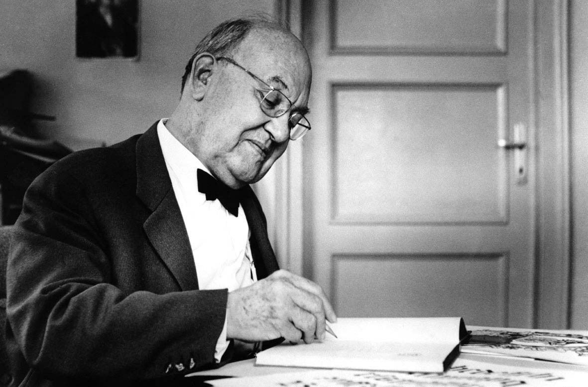
Jan Tschichold

I recently had the opportunity to work on a book for the first time. Initially, I was confident in my skills and knowledge, so I started working without delving into the details of the book layout. However, as I progressed, I realized I had overestimated myself and needed help.
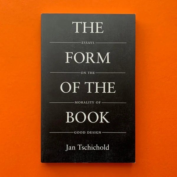
“The Form of the Book” by Jan Tschichold became a panacea for me. I read the book in one breath. Below, I will try to highlight the thoughts and advice of Tschichold that were most useful in my work.

Read the continuation in the second part.


Introduction

Perfect typography is more a science than an art. Mastery of the craft is not enough; it gradually evolves into expertise.

It’s crucial to understand that the work of a book artist differs significantly from that of a graphic artist. The latter’s goal is self-expression, while a book designer aims for self-effacement. The centuries-old methods and rules for creating perfect books don’t need improvement but revival and application. The more significant the book, the less the artist should emphasize their individuality and style, by which they can be immediately identified. They are not the master of the text but their servants.

In typographic work, complete harmony in relationships and proportions is essential: in the size of margins, the ratio of the four margins on a page, the relation between the width of the text block and the book page, the distance from the text block to the page number, the spacing in lines set in uppercase letters compared to solid text, and the size of word spaces — both as a whole and in each element individually.

The supreme principle of any typography is readability, which depends on the choice of font and typesetting method. The best fonts are either originals of classic fonts, their later versions, or new fonts close to the classics. The less conspicuous the font, the more noble it is.

Thoughtful proportions of the page and typesetting strip

The format of the book depends on its purpose, for example, children’s books should not be printed in folio format because it’s inconvenient for children to hold them in their hands.

The book should be very convenient or at least sufficiently convenient

Books can be divided into two main groups: those that we lay on the table to study, and those that we read while sitting back in a chair, an armchair, or on a train, i.e., those that are convenient to read while holding in our hands. Such books are of all kinds of octavo formats. They are narrow and can be held in the hands for hours without effort.

There are many proportions of the page, i.e., ratios of its width to height. Everyone has heard at least once about the “Golden Ratio” proportion: exactly 1:1.618. The 5:8 proportion is close to the “Golden Ratio”. A little further from it is the 2:3 proportion. In addition to the proportions of 1:1.618, 5:8, 2:3, for books, 1:1732 (1:√3) and 1:1.414 (1:√2) are most often used. See Pic. 1.
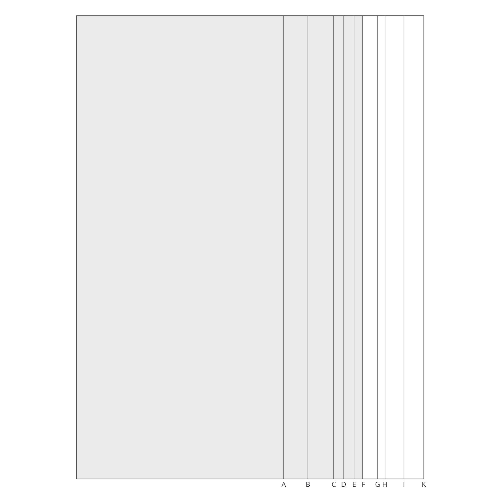
Pic. 1. Comparative width of various rectangles: A 1:2.236 (1:√5), B 1:2 (1:√4), C 5:9, D 1:1.732 (1:√3), E 3:5, F 1:1.618 (21:34) — “Golden Ratio”, G 1:1.538 — see Pic. 2, H 2:3, I 1:1.414 (1:√2), K 3:4

Pic. 2 shows a beautiful, but not very well-known rectangle, constructed based on a pentagon; proportion 1:1.538

Pic. 2. Rectangle constructed from a pentagon. Proportion 1:1.538 (irrational)

Geometrically defined irrational proportions of sides 1:1.618 (the “Golden Ratio”), 1:√2, 1:√3, 1:√5, 1:1538 (Image 2) and simple rational proportions 1:2, 2:3, 5:8, 5:9 are clear, thoughtful, and definite. All else are arbitrary, random relationships. The difference between a clear and a random proportion is noticeable, though often insignificant. Although it’s difficult to explain, it has been proven that people find geometrically clear, thoughtful proportions more pleasing or beautiful than arbitrary, unthoughtful relationships.

An ugly format makes a book ugly

Small books should be narrow, while large ones can be wide; small ones are convenient to hold in hands, and large ones lie on a table.

However, not only the format is important, but also the text column. Harmony between the page format and the text column is achieved by matching proportions.

There are three simple ways to design harmonious, logically structured text columns.

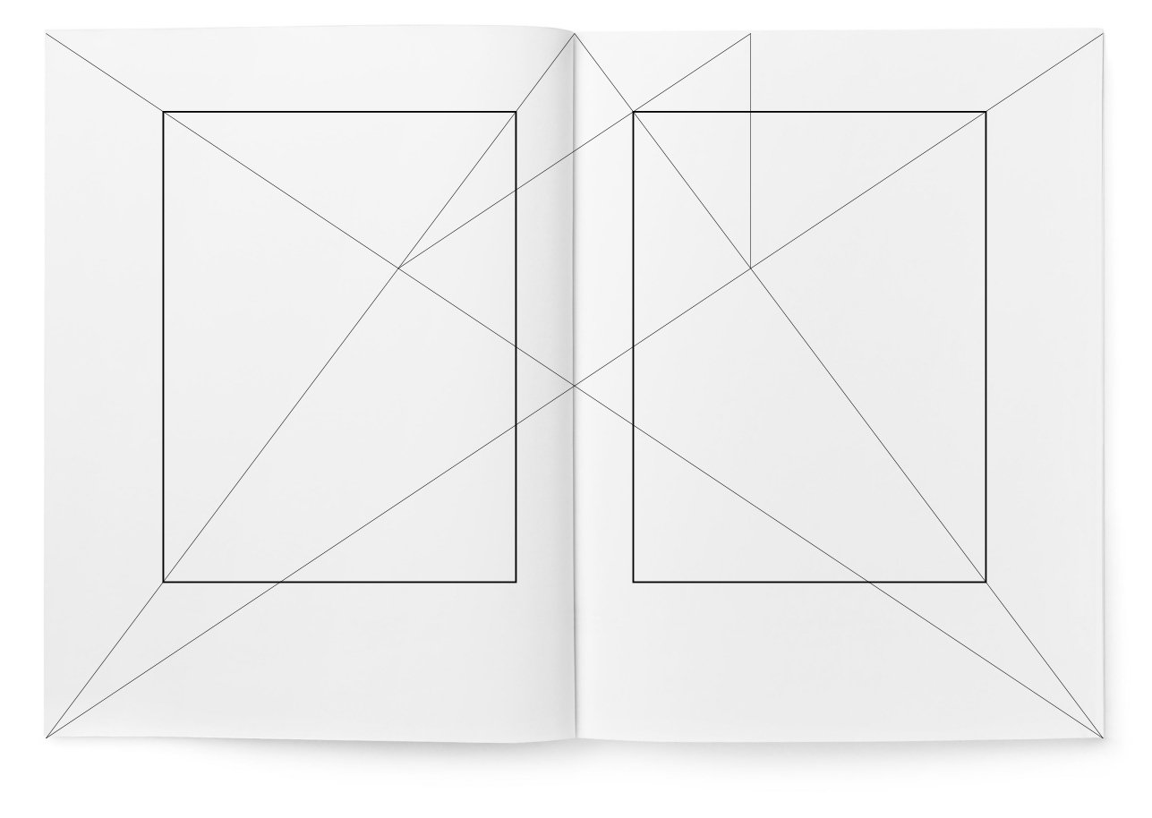
The Raoul Rozarivo Canon (1903—1966, Argentine typographer, artist, illustrator). The size and placement of the text strip are determined by dividing the page’s diagonal into nine parts (Pic. 3).
Pic. 3. Dividing the height and width of the page into nine parts according to the Rozarivo principle. The paper ratio is 2:3

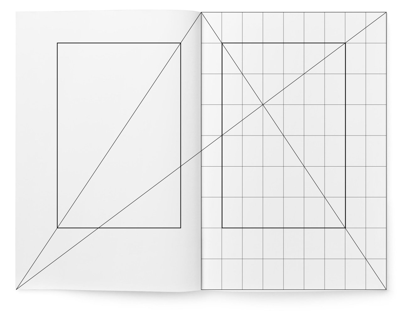
The Method of Jan van de Graaf (Dutch typographer). A simple construction method where geometry replaces calculations in millimetres (Pic. 4).
Pic. 4. Division into nine parts according to the van de Graaf principle, shown on a page with a 2:3 ratio

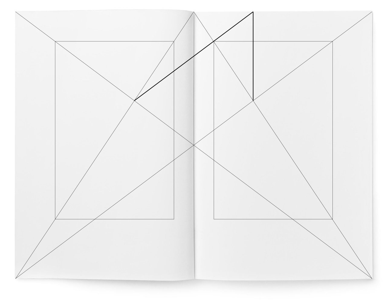
The Villard de Honnecourt Canon (French architect). This lesser-known but exquisite Gothic canon allows for harmonious partitioning and can be used in any rectangle. With it, one can precisely divide a segment into any number of equal parts without a scale ruler (Pic. 5).

Pic. 5. Villard’s drawing. With this canon, shown in bold lines, it is possible to divide a segment into any number of equal parts without a scale ruler

In Pic. 6, Villard’s drawing is depicted by itself, without a book page.
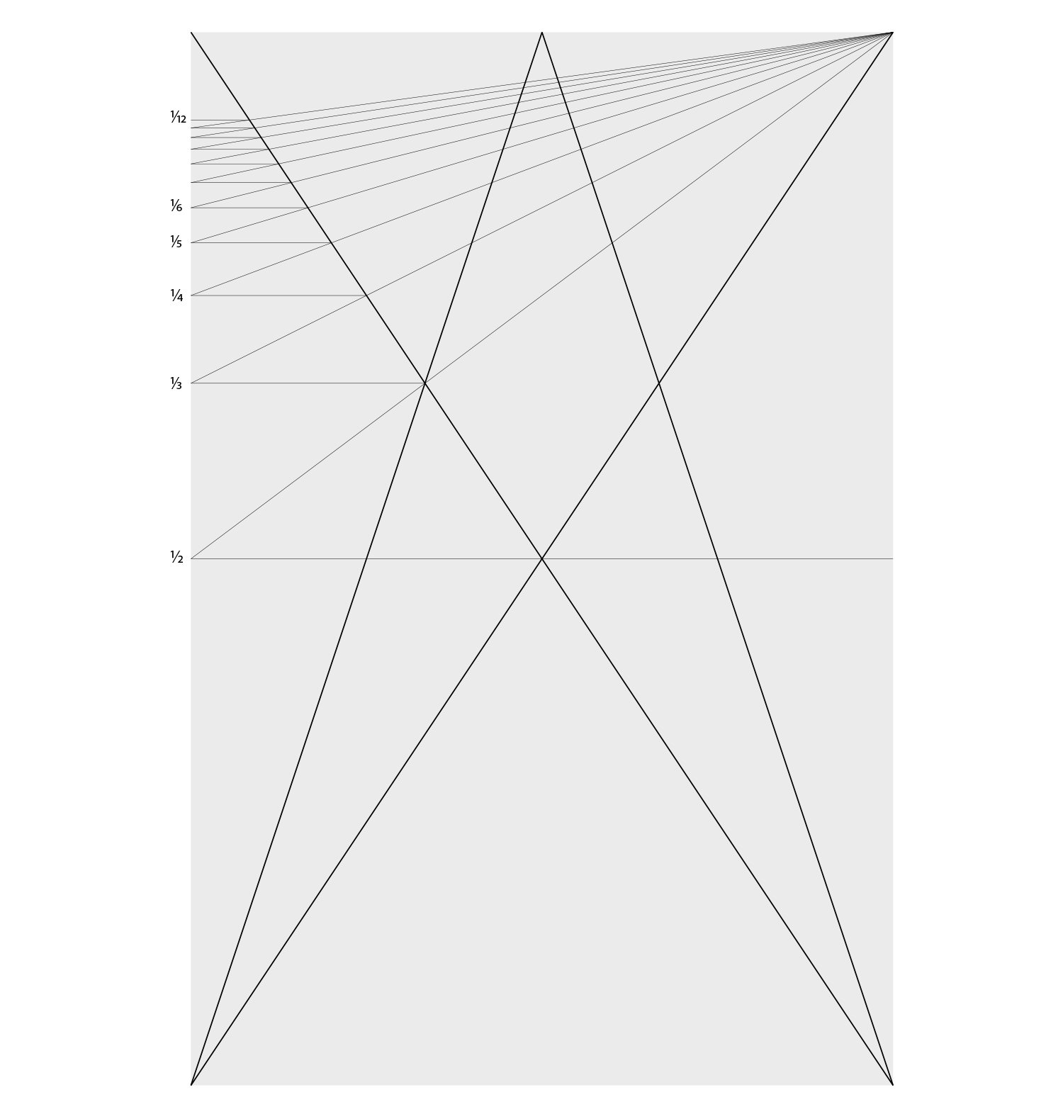
Pic. 6. Villard’s division canon, inscribed in a 2:3 rectangle. The long side of the page is divided into parts up to the twelfth fraction

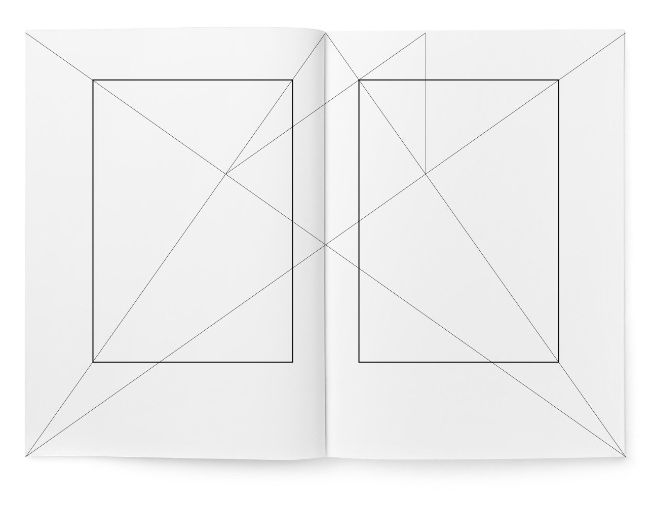
So, for example, let’s consider book formats with proportions 1:√3, 1:√2, and in-quarto (3:4), using a nine-part division with the use of Villard’s diagram, as it is suitable for any rectangle (Pic. 7—9). So, for example, let’s consider book formats with proportions 1:√3, 1:√2, and in-quarto (3:4), using a nine-part division with the use of Villard’s diagram, as it is suitable for any rectangle (Pic. 7—9).

Pic. 7. Page proportion 1:√3 (1:1.732). Division of the height and width of the page into nine parts

Pic. 8. Page proportion 1:√2 (the so-called “normal” format). Division of the height and width of the page into nine parts

Pic. 9. Page proportions 3:4 (in-quarto). Division of the height and width of the page into nine parts. Here too, the typeset strip should correspond to the page proportions
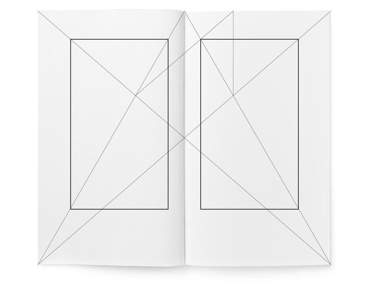
Pic. 7. Page proportion 1:√3 (1:1.732). Dividing the height and width of the page into nine parts
Pic. 8. Page proportion 1:√2 (the so-called “standard” format). Dividing the height and width of the page into nine parts
Pic. 9. Page proportions 3:4 (in-quarto). Dividing the height and width of the page into nine parts. Here too, the typeset strip should correspond to the proportions of the page

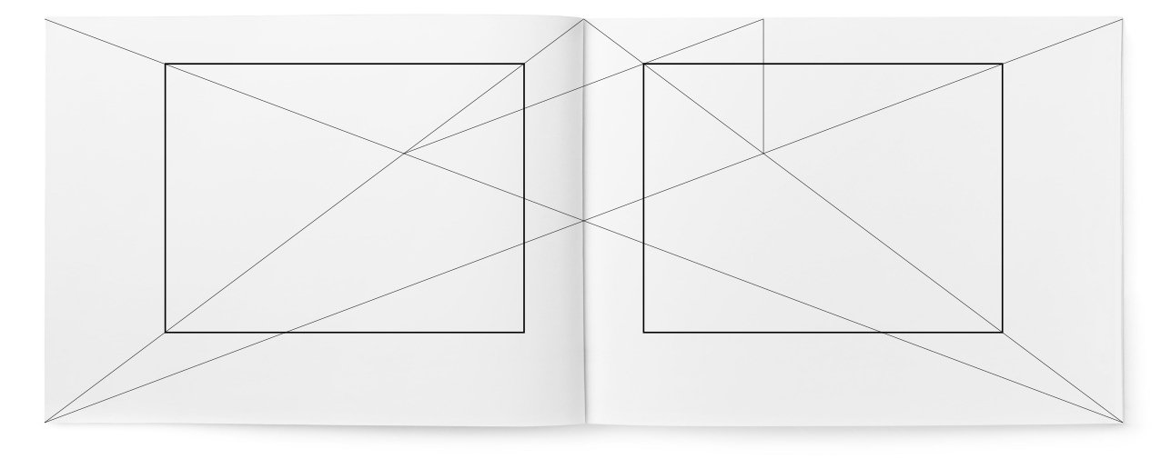
Using this method, harmonious typeset strips can be designed even for unusual formats — square (Pic. 10) and horizontal (Pic. 11)

Pic. 10. Page proportion 1:1. Dividing the height and width of the page into nine parts
Pic. 9. Page proportion of 3:4 (in-quarto). Dividing the height and width of the page into nine parts. Here too, the text block should correspond to the page proportions
Using this method, harmonious text blocks can be designed even for unusual formats — square (Pic. 10) and horizontal (Pic. 11).
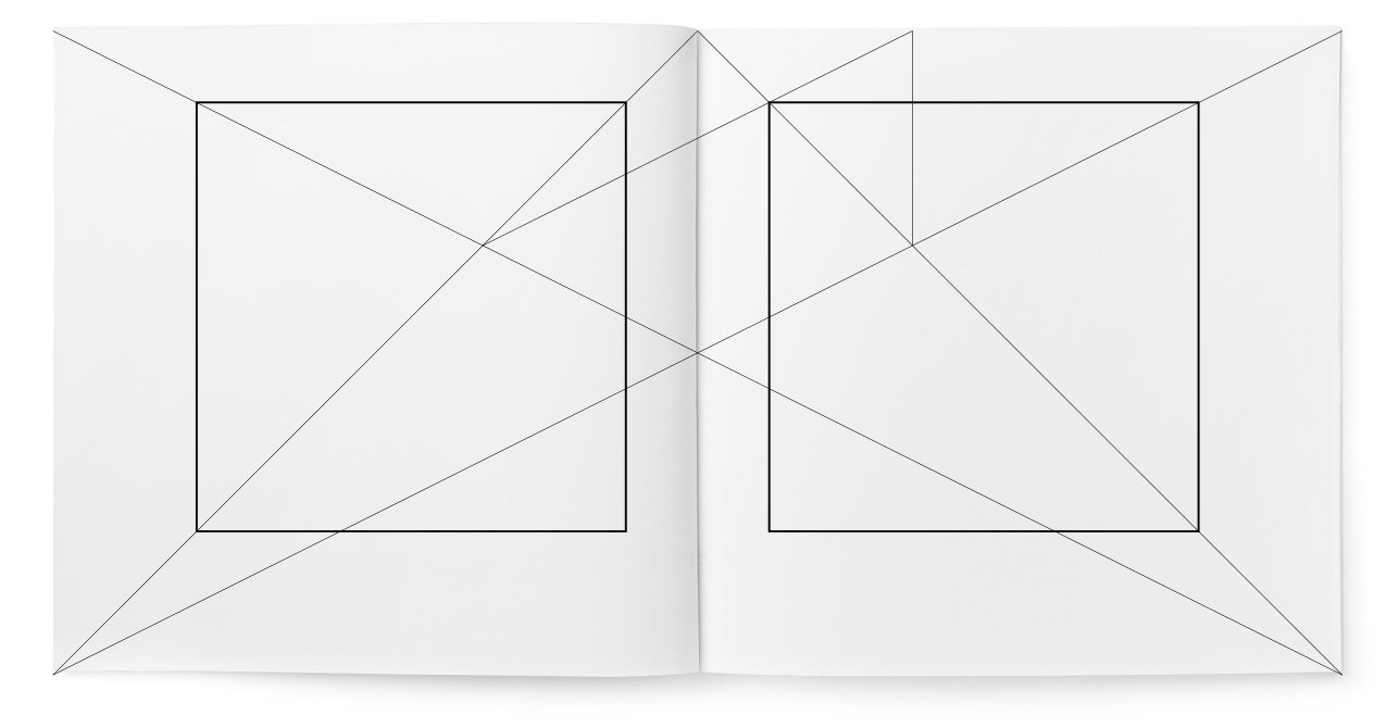
Pic. 10. Page proportion of 1:1. Dividing the height and width of the page into nine parts
Pic. 11. Page proportion of 4:3. Dividing the height and width of the page into nine parts

Dividing the page into nine parts is not the only correct way. If we divide the page into twelve parts, as seen in Pic. 12, the text block becomes larger.

Pic. 12. Page proportion of 2:3. Dividing the height and width of the page into twelve parts using the Villard diagram (Fig. 6)

Pic. 13 shows the division into six parts in height and width of the page with a proportion of 2:3.
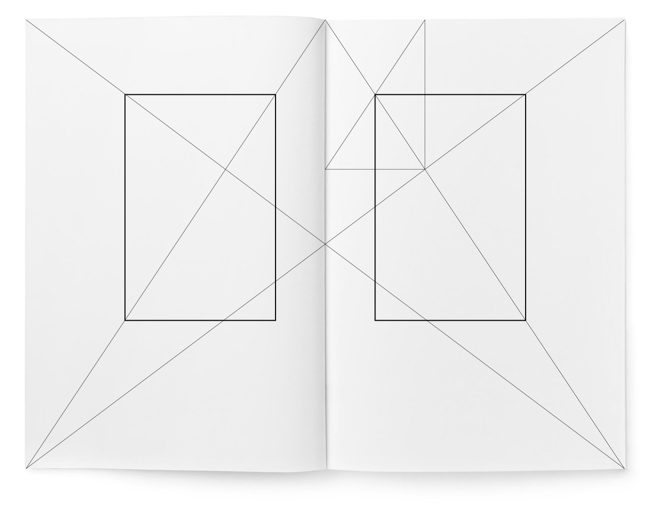
Pic. 13. Page proportion of 2:3. Dividing the height and width of the page into six parts. Composition of a small prayer book, written at the end of the fifteenth century by Marques Vincentinus

If necessary, the height of the page can be divided into any number of parts. Even narrower margins than in Pic. 13 can be made. But the text block must be connected with the diagonals of each page and spread, as only in this way its placement will be harmonious.

Font size and leading

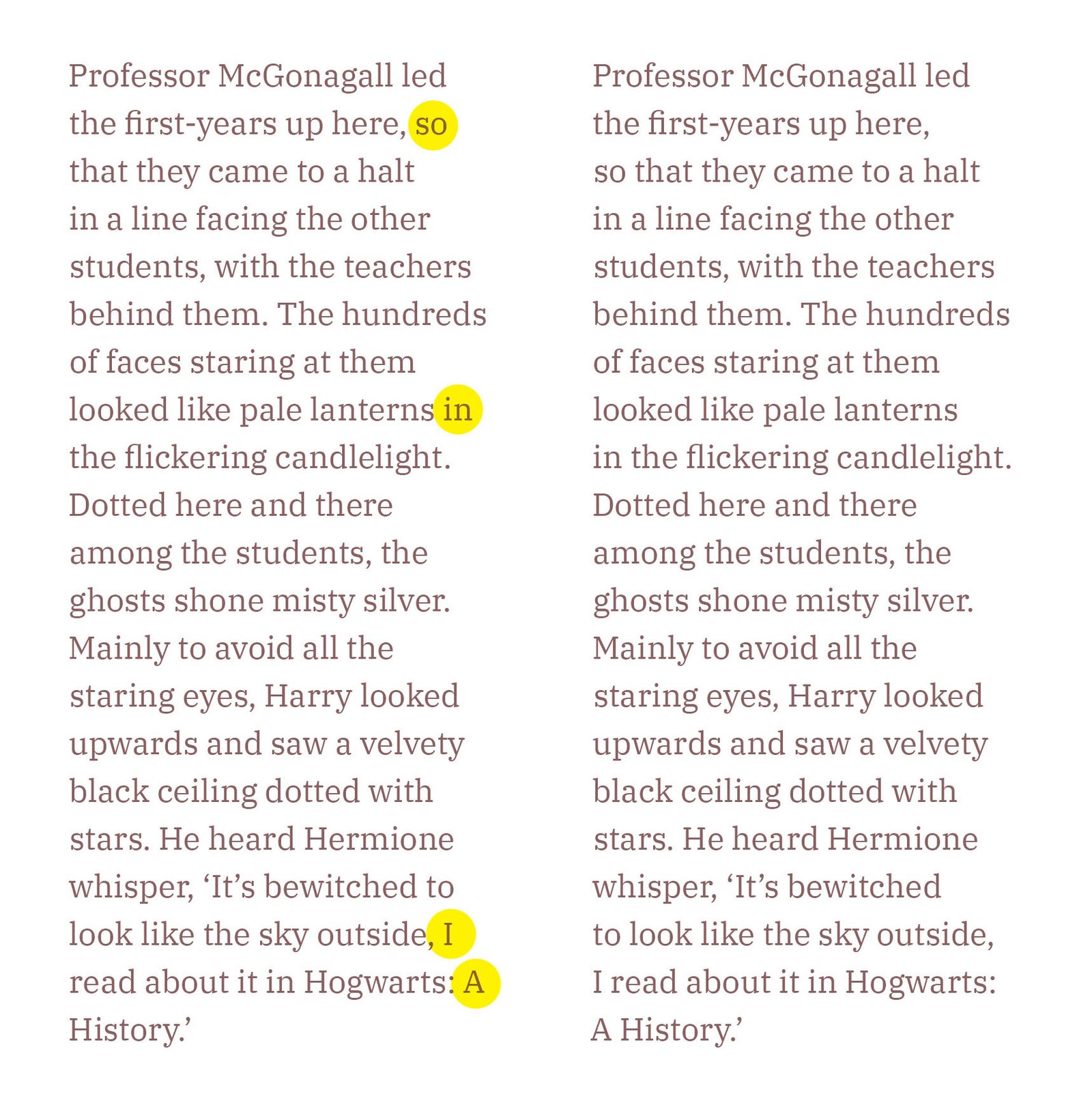
The choice of font size and leading is also essential for the beauty of the book. There should be eight to twelve words per line; more is unnecessary. Wide margins, which are obtained by dividing the page into nine parts, allow for the use of a larger font size than when dividing it into twelve parts. Lines containing more than twelve words require greater leading.

The relationship between the proportions of the font and the proportions of the page is important. A square format, not the best for a book, requires a font with a wide set, where the shapes of the letters ‘o’ and ‘n’ somewhat correspond to it. For the usual elongated formats, fonts of standard proportions are suitable, in which the shape of ‘o’ and ‘n’ fully corresponds to the proportions of the book page.

Page numbering

The page numbering does not belong to the typesetting stripe; it stands separately. The best and at the same time the simplest composition is to place the page numbering centrally in the lower field. However, if necessary, the page numbering can be placed at the bottom under the outer edge of the text with an indent of one em or more, because otherwise, it will interfere with the last line.

Typography of the traditional title page

The title page, in its typographic form, is a part of the book and should correspond to the rest of the book’s design.

The title — the herald of the text

It must be in excellent shape, have a fresh look, and not fade into a whisper.

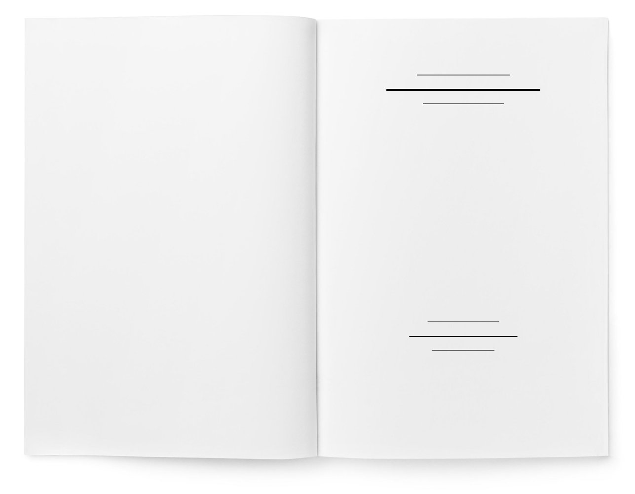
A good title can only be created based on the parameters of the book page. Therefore, the proportions of the book page’s margins and the placement of the text block are very important for it (Pic. 1): it is not advisable to place the title in the middle of the width of the book page (Pic. 2), as is unfortunately often done. In this case, it loses connection with the book. The lines of the title should never extend beyond the text block. Almost always, it is better if the main line of the title is noticeably shorter than the width of the block. Many titles do not fill the entire height of the block; this is especially common when the book has very narrow margins.
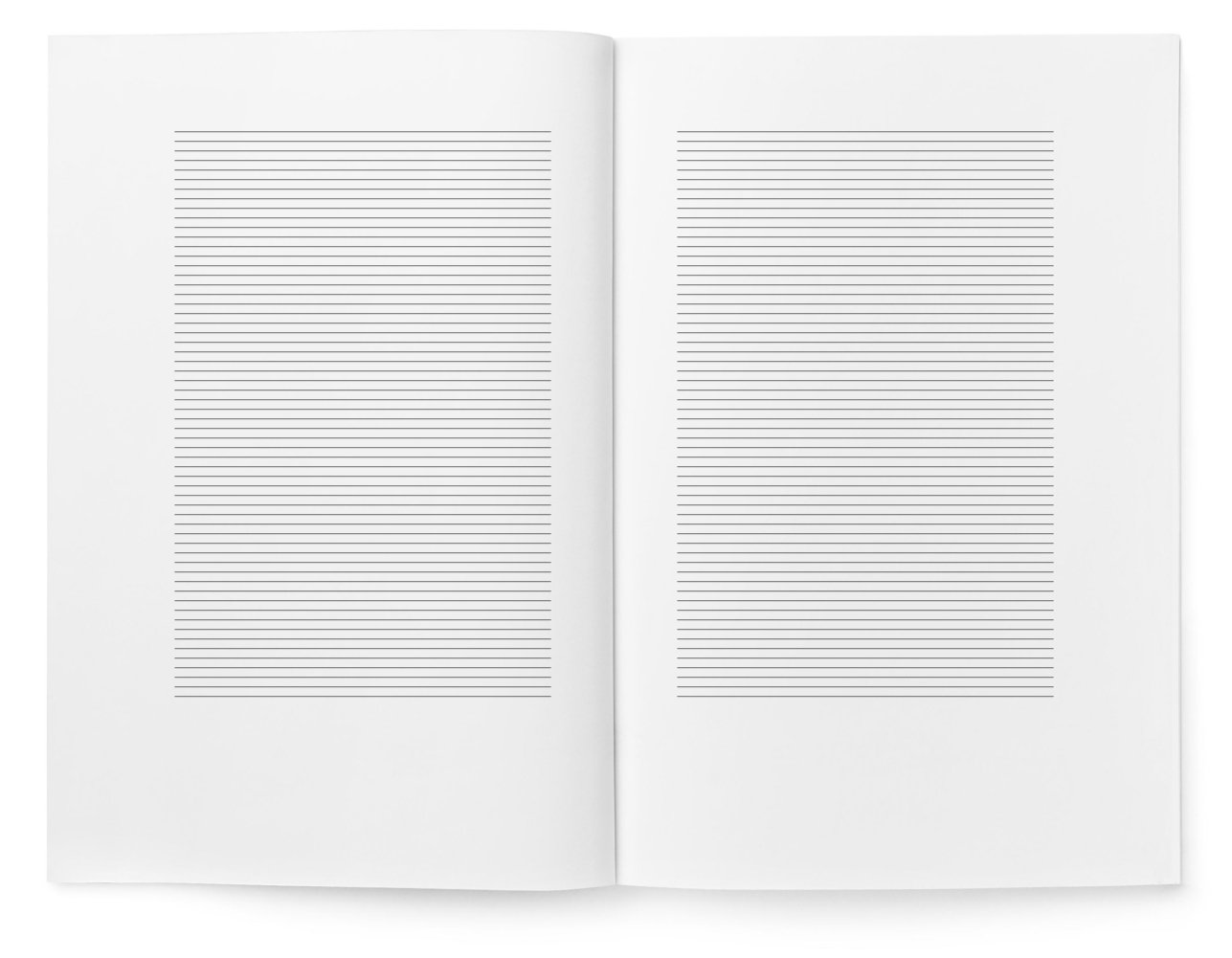
Pic. 1. A spread scheme for comparison with the incorrect composition of the title page in Pic. 2. The title should not shift horizontally from the centre of the typesetting strip
Pic. 2. If the book margins are not too small, then the top and bottom lines of the title are correctly positioned. However, the error is that this title is positioned in the middle of the page width

Even a short title should fill the book page. This means that it should be of sufficient size. However, it seems that designers often fear using large-sized fonts. The main line should be at least two sizes larger than the book’s primary font. However, there are no strict rules here, as the main thing in typesetting a title is a sense of form. Even a short title, set in not very large font, can fill the page if it is well composed.

The space between the title lines and the publishing data should not seem empty and random. The tension of the white space should participate in the overall impression. A good publishing mark (Pic. 3) would be appropriate here, but it is not mandatory.
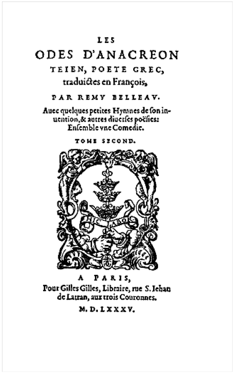
Pic. 3. A beautiful French title page from the Renaissance era with a large publisher’s mark. Paris, 1585
For the title, a cup-shaped layout is best suited (see Pic. 4), if possible
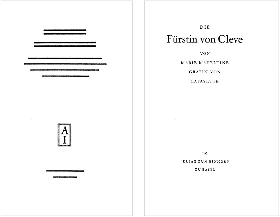
Pic. 4. The title is set in the shape of a cup

To create a good title, it is important to understand the relationships between letters. Lines of uppercase letters should always be set with spacing and carefully aligned inter-letter spaces.

Lines of uppercase letters without spacing or with insufficient spacing are always unsightly

On the title page, it is never appropriate to use letter spacing with lowercase serif or italic fonts. If there is letter spacing with uppercase letters on the title page, this does not mean that it should be done in lines set with lowercase letters.

Numbers in the text of the title (e. g., “with 240 illustrations”) should be spelt out (e. g., “with two hundred and forty illustrations”, “eighteenth century”); only years should be in Arabic numerals (1958).

The fewer font sizes on the title page, the better. It is difficult to properly place four or five font sizes. More than three font sizes should only be used in exceptional cases, and sometimes even two font sizes are sufficient (see Pic. 5).

Mixing too many types of oil can spoil the porridge, and too many font sizes can spoil the title
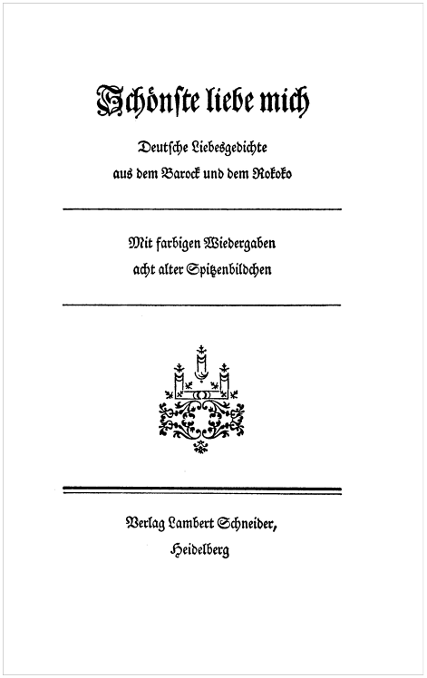
Pic. 5. Title page of the author’s work. In the style of German Rococo. 1957

The author’s name is always more important than the publisher’s, and therefore the publisher’s name should be set in a type size no larger than that used for the author’s name. Too often this order is violated and the author’s name is set in a smaller type size than the publisher’s!

A good title, even if it is smaller than the set area both vertically and horizontally, should in its composition correspond to the proportions of the book page. Otherwise, it will not harmonize with the entire book.

The spacing between lines should not only correspond to the meaning but also participate in the overall composition — just as the lines themselves do. As a rule, most of the page remains blank, so lines with small leading are perceived as foreign. The white background should flow through them. In most cases, the title should be transparent enough (Pic. 6). Otherwise, the lines do not combine with the background, and unity is not achieved.
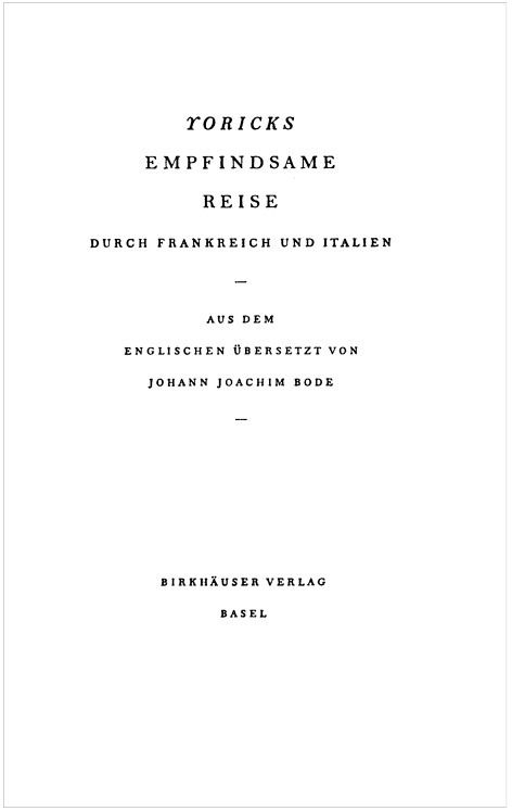
Pic. 6. Author’s work title page. Set in Monotype Bell typeface. 1954

On the back of the title page, various details are almost always printed, if not about the editor, then about the print run and the printing house. The text of the publication details should be as short as possible. These lines usually show through to the title page, so they should be positioned in such a way that they align with text groups and individual lines of the title wherever possible, and do not disrupt its composition.

The reader is not concerned with the minutest details about those who worked on the publication of the book. All information about printing, print run, and even the names of the editor and translator is better placed at the end of the book.

The last two pages of a well-made book should remain completely empty, as should the first two. The best place for information about the editor, typesetter, etc., is the third or fourth page from the end, where the year of publication should also be printed if it is not on the title page.


This is only half of the book. If you found the material interesting and useful, I highly recommend reading the entire book.

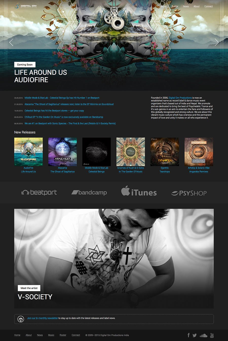
Creating a website for the Digital Om Productions label

Digital Om Production — is a music label based in India and Nepal. The label releases contemporary electronic dance music in the styles of Progressive and Psychedelic Trance and also works as a booking agency for its artists.

The project was worked on together with a colleague. After communicating with the client, we clarified the task that the site should solve. Its goal is to help music fans buy music released by the label, as well as to introduce them to the artists. At the same time, for the musicians themselves, the site should become a “home page” with discographies, biographies and press kits.

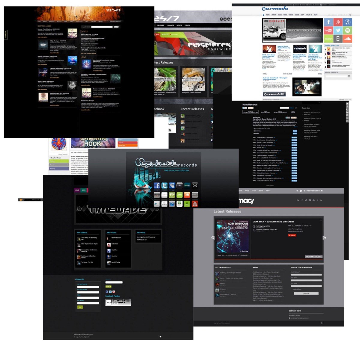
We study the market, we look at the websites of other labels:

Other labels’ websites

The overall situation in the industry is sad: other labels’ websites are full of half-empty sections, unnecessary pages and terrible social plugins. We definitely don’t want that kind of thing. Instead, we offer the client to start small — only the basic and really necessary sections and functions, namely the release catalogue and artist roster.

We lay the foundation — we think over the structure of the future site, breaking the development into several interactions. The following scheme emerges:

Site layout

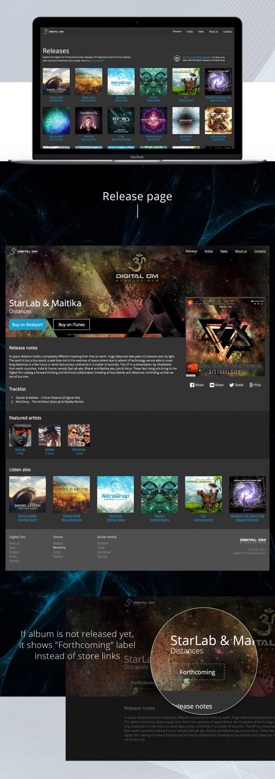
Instead of the home page, which is traditionally where the work starts, we started with the internal page of the music release — most likely, visitors will more often go to these pages via direct links than to the home page.

Let’s think: “before buying music, listeners will want to familiarise themselves with a fragment. So you need to be able to post samples”.

Instead of writing our audio player, which would have taken a lot of time, we decided to use the API of SoundCloud, the leader in cloud music storage. For the client, this option turned out to be convenient — the label actively uses SoundCloud, and its page has more than six thousand subscribers.

Let’s get down to the design. We make a dark colour scheme to match the music genre but dilute it with colourful album covers and bright buttons.

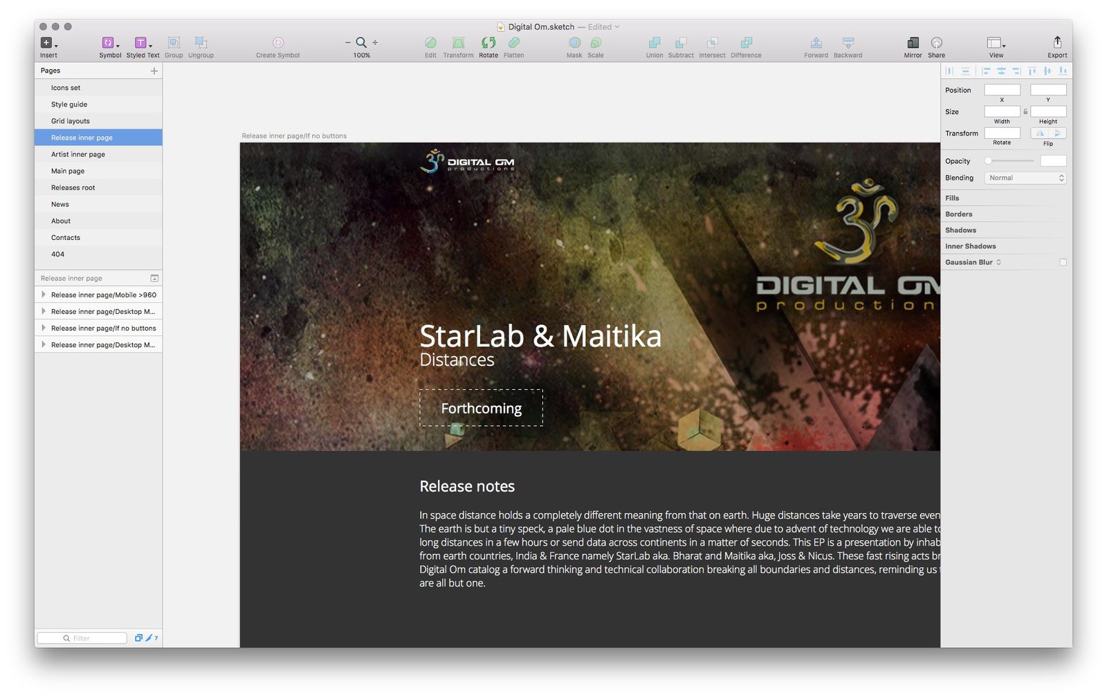
Pondering: “Okay, so there are big, brightly coloured buttons at the top, links to shops where music is sold. But what if you add an album to the site that hasn’t been released yet? What would be in place of the buttons?”.

We decided to make a dotted outline with the word “Forthcoming” on it. This inscription will be automatically displayed if the album release date is a future date, so the site manager will not have to change it manually.

To avoid “dead ends” on the site, link all pages of the site with each other with the benefit for visitors: from the album or compilation page you can get to the page of related artists or other releases; on the artist’s page, you can see all albums or compilations in which he participates.

While thinking about these little things, in the meantime, draw the rest of the pages and sections: main page, artists, contact information and others.

Don’t forget about the 404 error page (this is when the user accidentally gets to a non-existent page, for example, when he makes a mistake in writing the address): so that the user who came here would not be bored, we place a small story about what “Om” is.

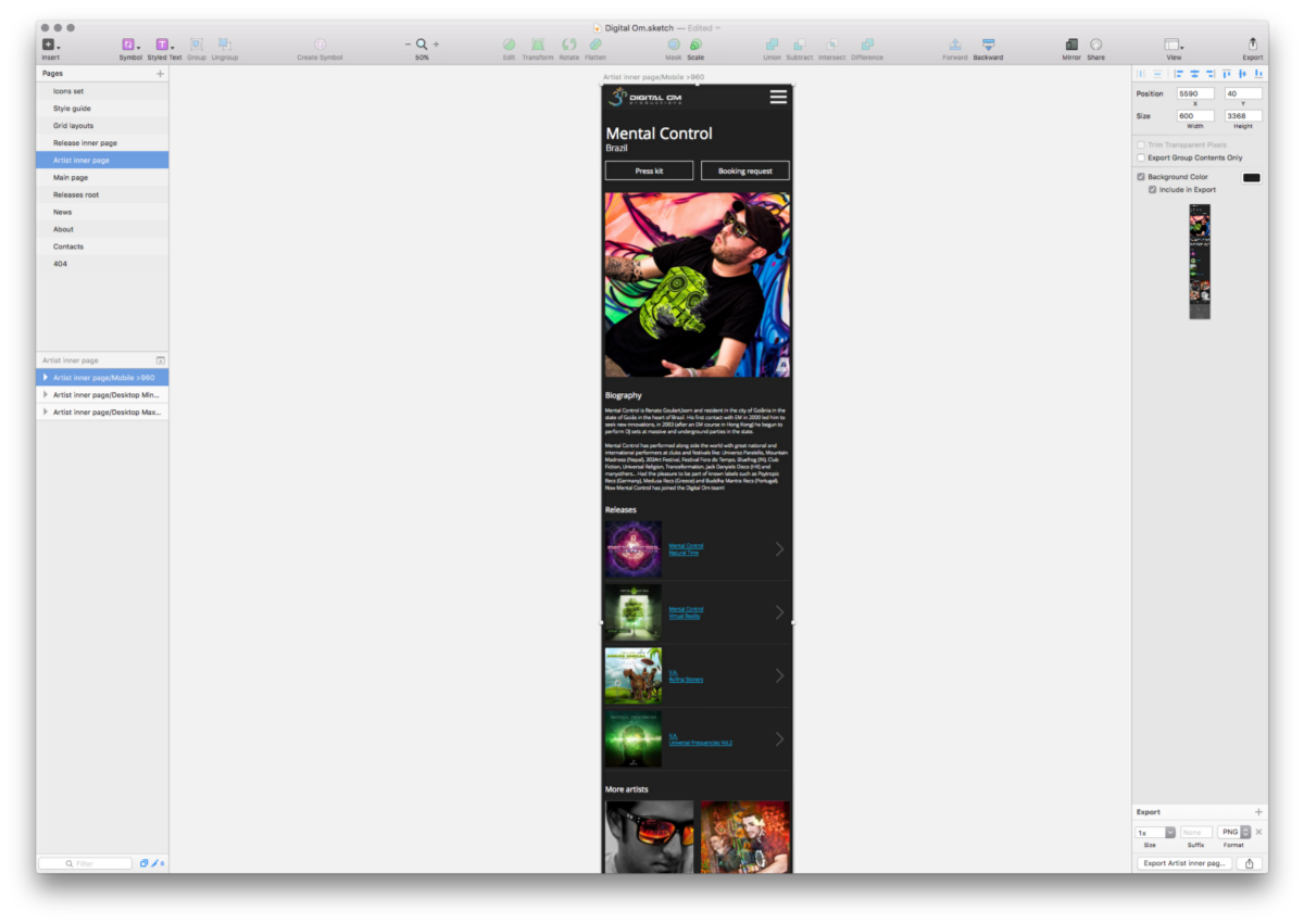
We make separate layouts for the mobile version of the site:

We collect all the layouts, prepare a presentation and show it to the client:

The client likes everything very much. We get down to layout, programming, scripts, setting up the administration panel, in short — putting together a working website from pictures.

The owner of the label is a real music lover, so he is also very enthusiastic about the site, constantly suggesting new additions. However, most of these ideas are not on the site.

The site was done in 4 weeks. It is maintained and filled by the label’s staff.


Project members

Lead Designer
Tanya Sokolovskaya
Designer
Daniel Sokolovskiy
Developer and layout
Maksim Silnov

The process of working on the logo of the children’s shop “Tutupki”

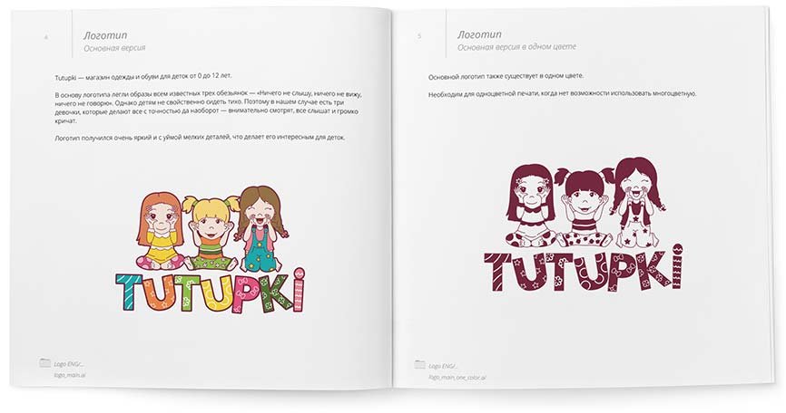
Interesting name for a children’s clothing shop — Tutupki! Isn’t it? :-) I was surprised too, but as it turned out, the name has a history. The shop belongs to a married couple. The eldest daughter named her twin sisters Tutupki for the characteristic shape of their spouts when she saw them for the first time. When choosing a name for the shop, the owners decided to settle on this funny word.

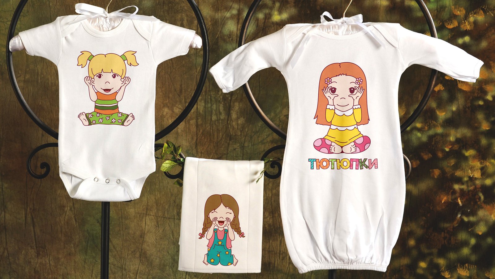
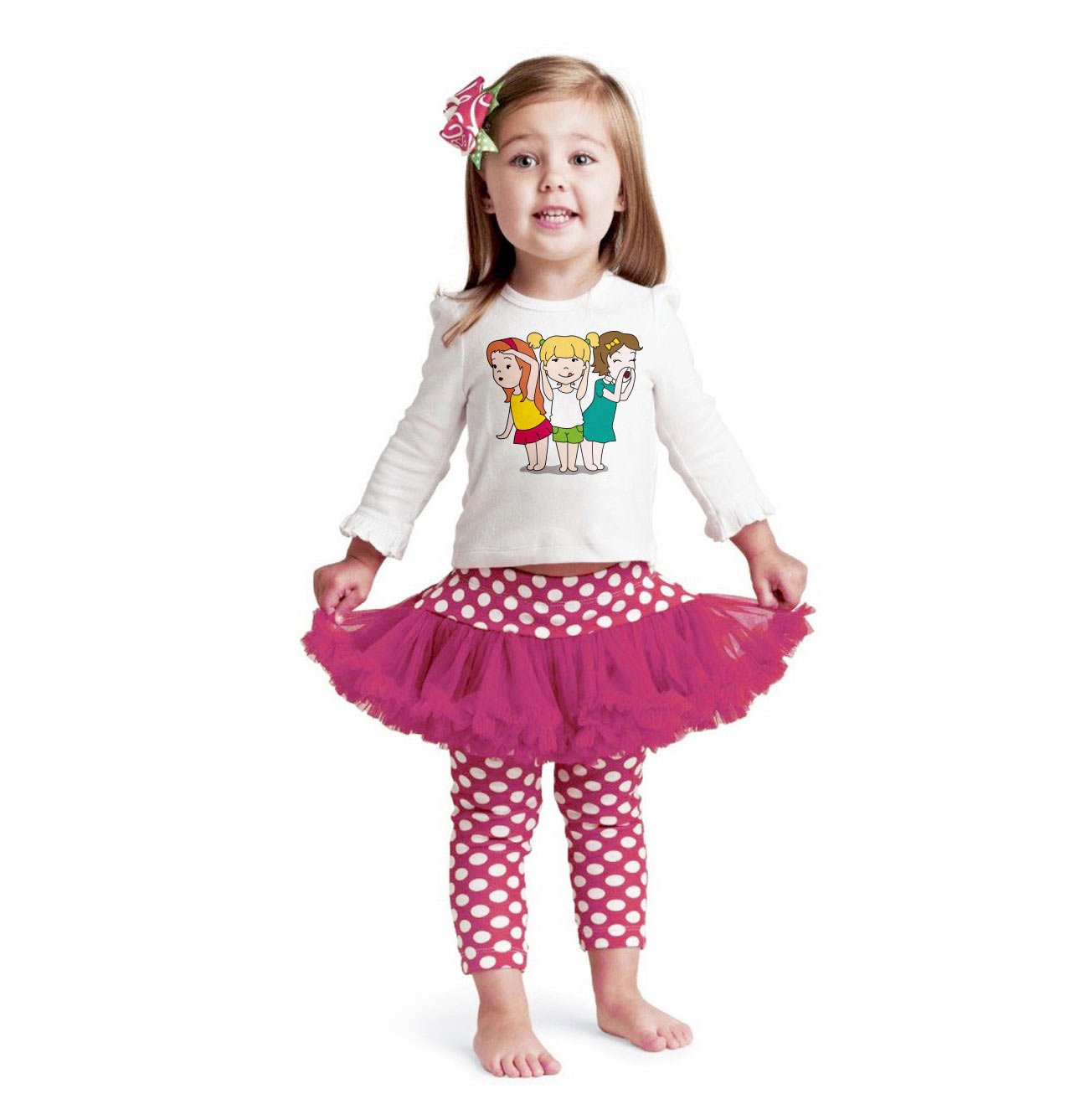
The concept for the logo was determined at once — it should be three girls or some funny animals. The characters will also be printed on clothes, so they should be bright and detailed to please both children and their parents.

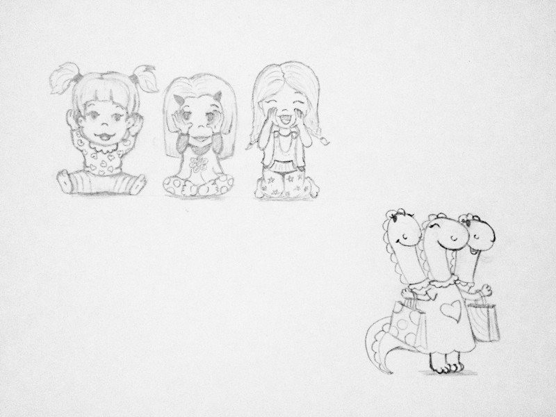
I got the idea to put the famous three monkeys “hear nothing, see nothing, say nothing” in the image of the girls. Only in our case, three girls do everything exactly the opposite — look carefully, hear everything and shout loudly. After all, babies do not like to sit quietly in place :-)

Thinking about animals, came up with the idea of a three-headed dragon that likes to shop. I started sketching.

First sketches

For clarity, I drew both versions and showed them to the client.

Monkey girls
Sister dragons

The client decided on the girls. I started to finalise it, having drawn another version of the girls, more mature.

The second variant of three girls

But I liked the first girls more.

I added clothes and decorated the letters.

Before — After

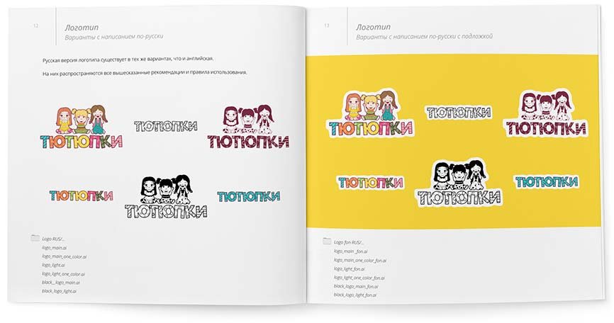
I showed the finalised version and wrote the inscription in Russian.

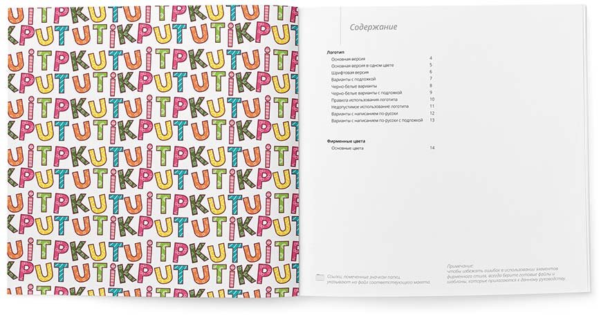
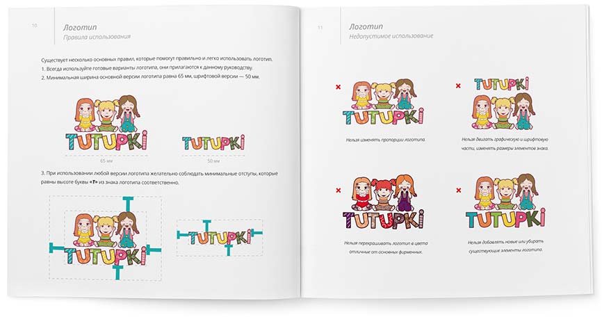
The rules and recommendations for using the logo are collected in the guidelines:

The final version of the logo

Logo and business cards for Oz Minasov

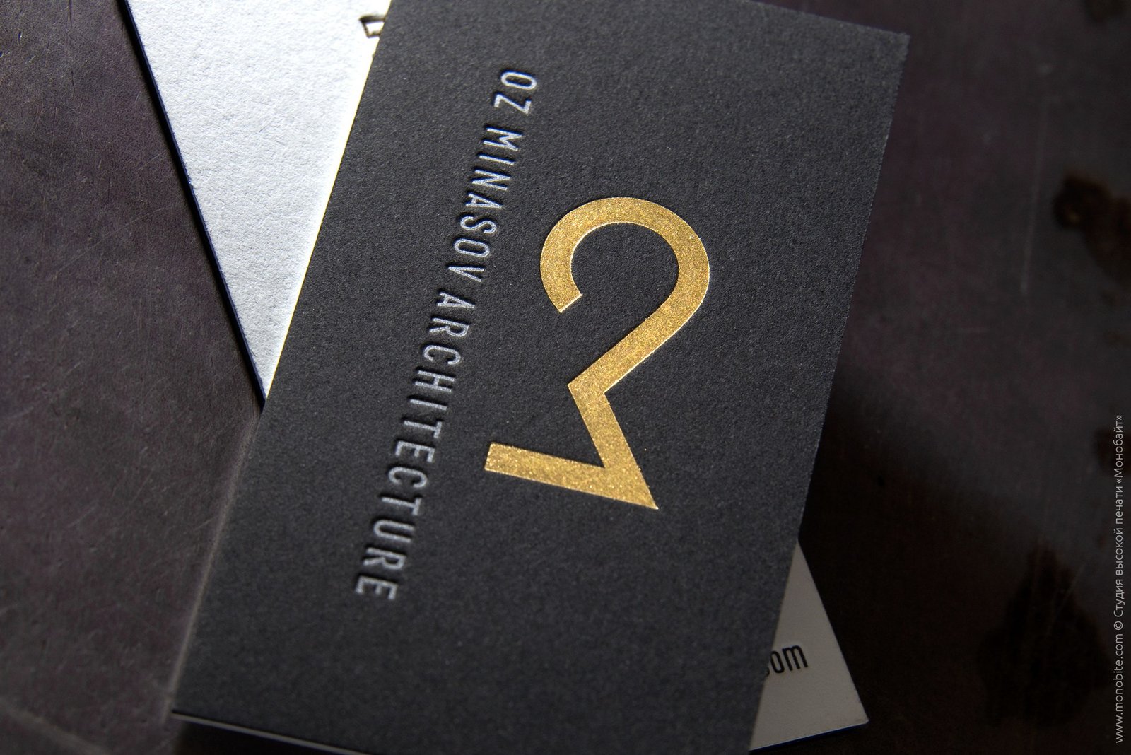
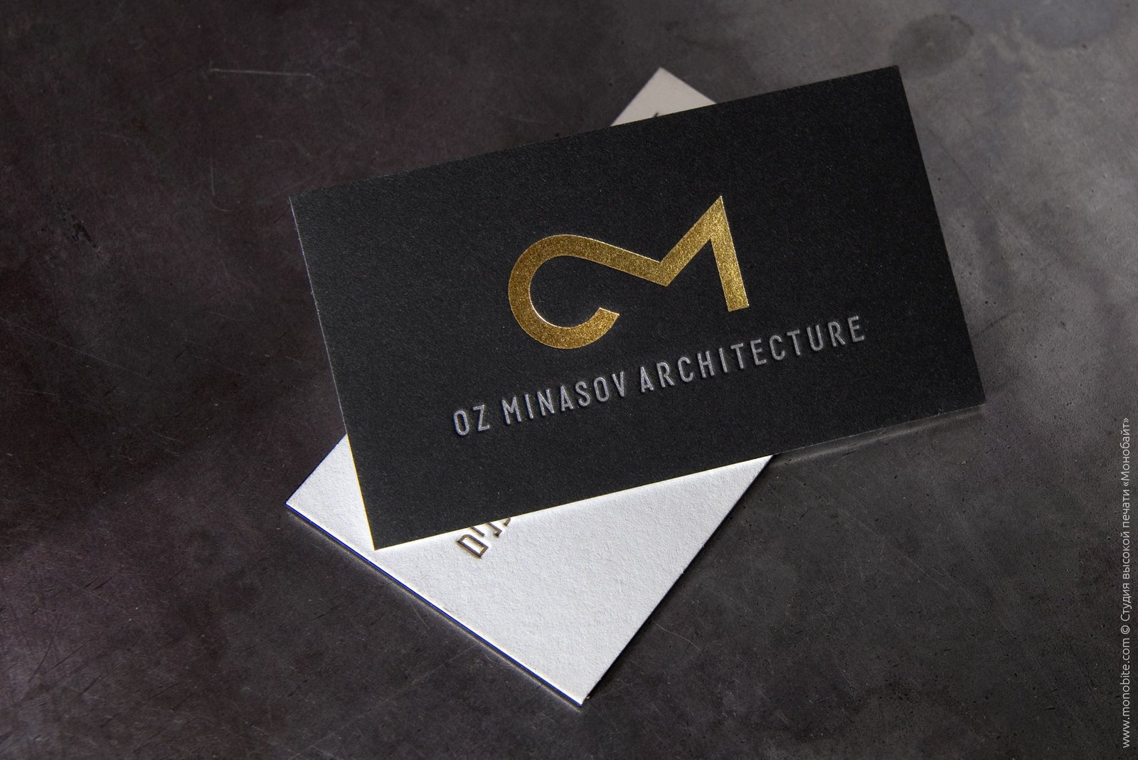
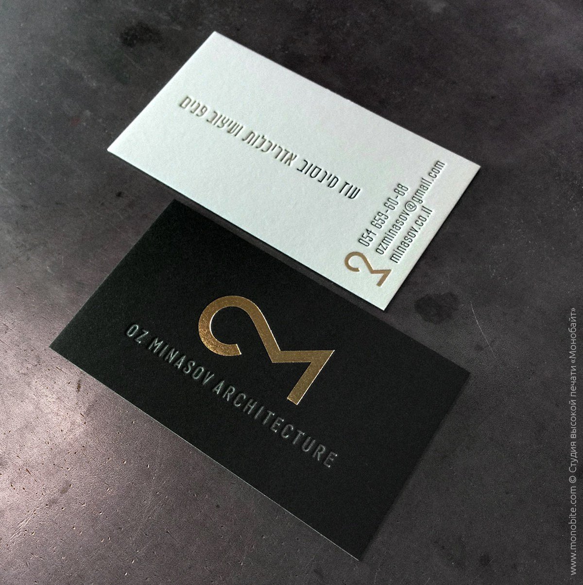
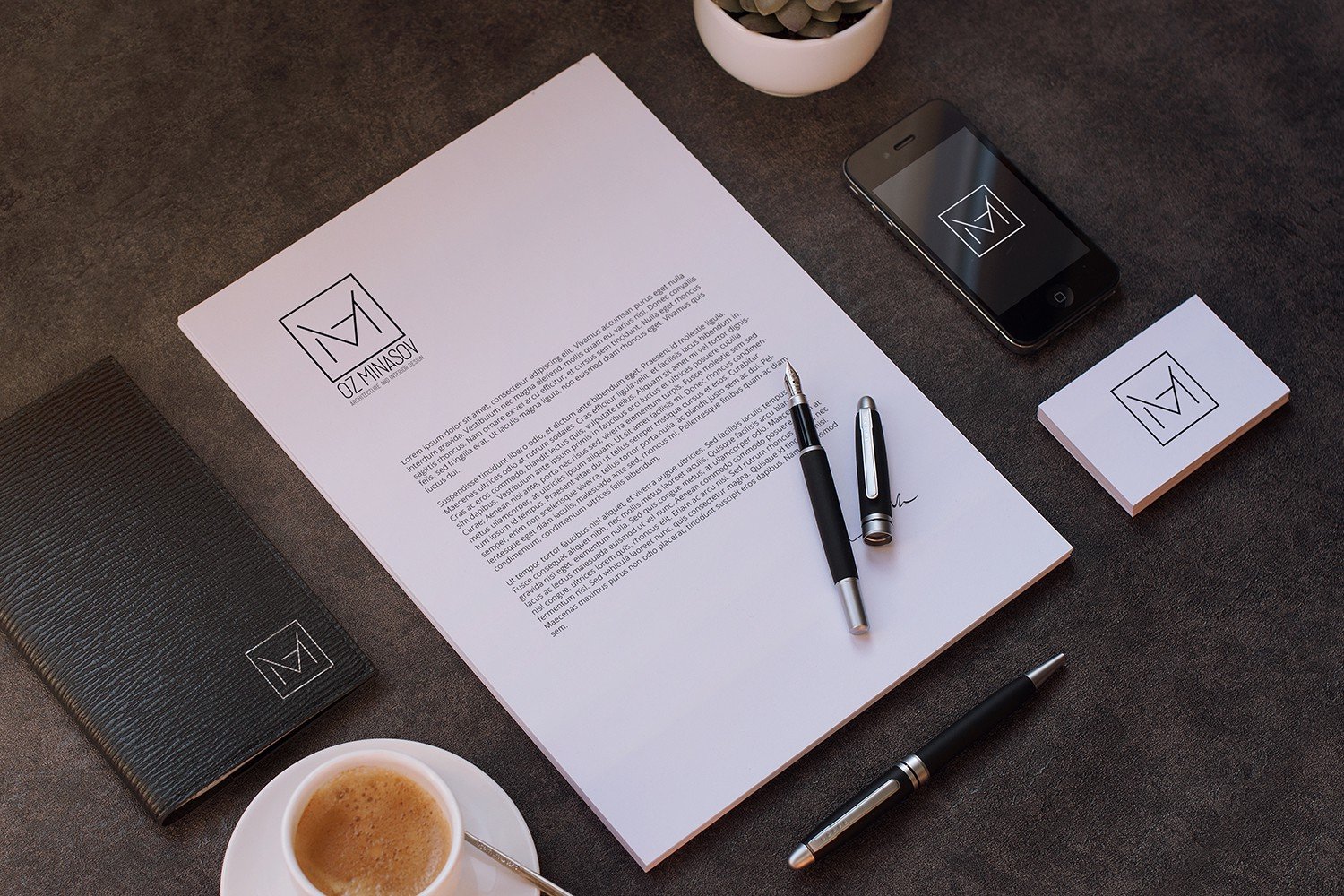
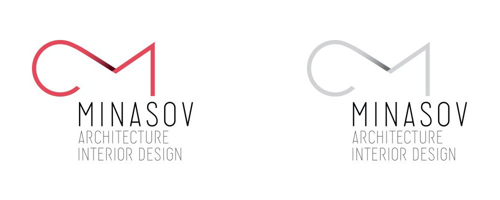
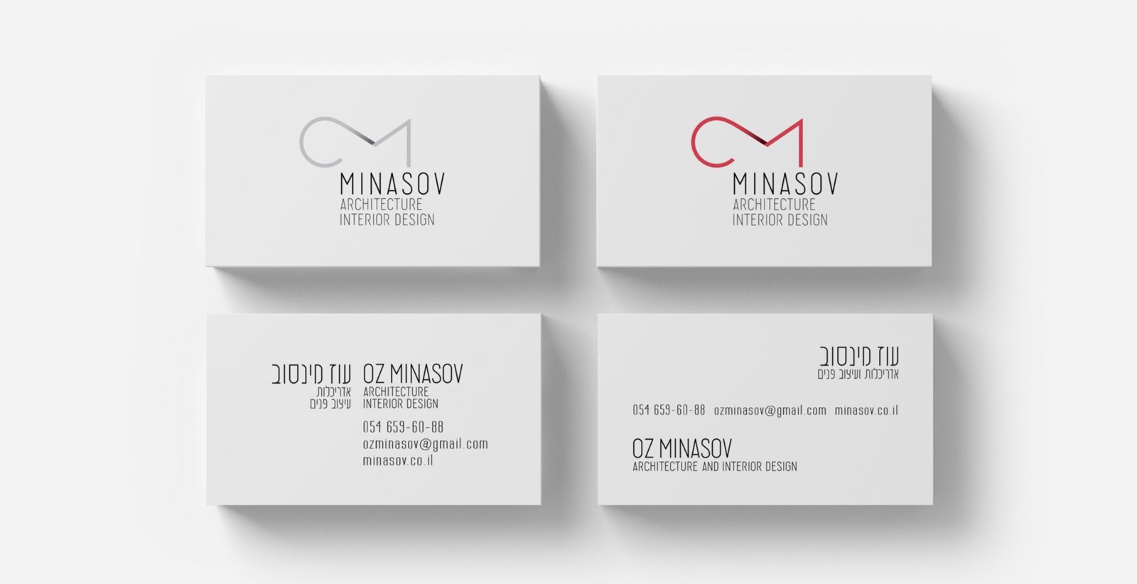
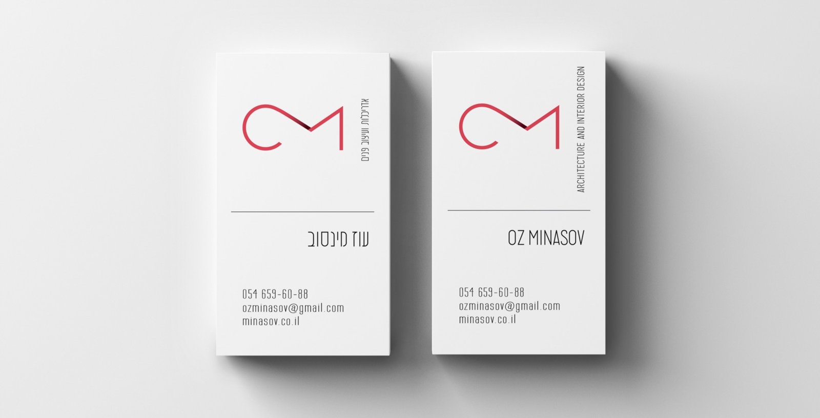
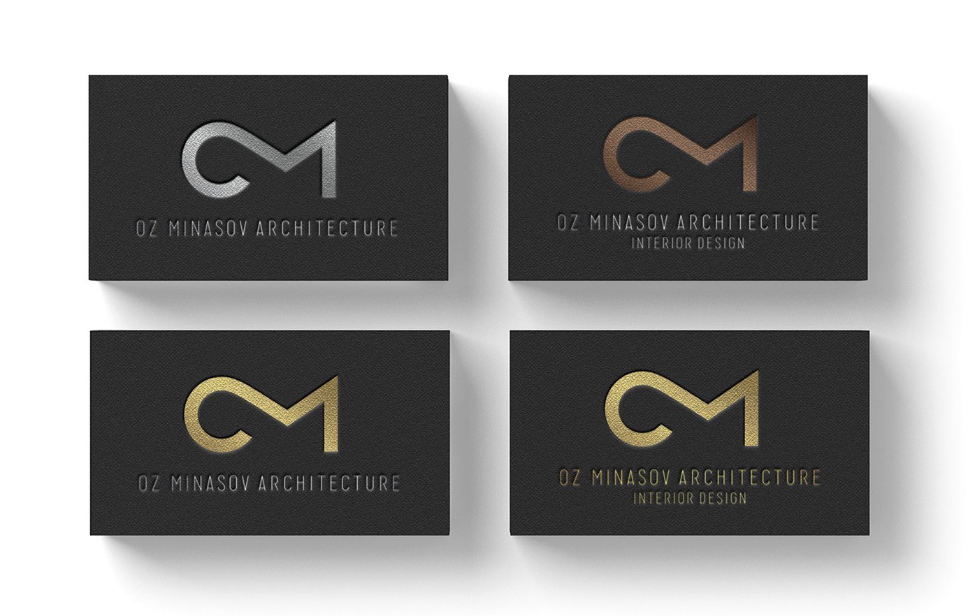
Oz Minasov is an architect and interior designer from Israel. Oz’s work is truly concise and modern. I made a logo consisting of the client’s initials and a business card.

Read also about the logo design process.

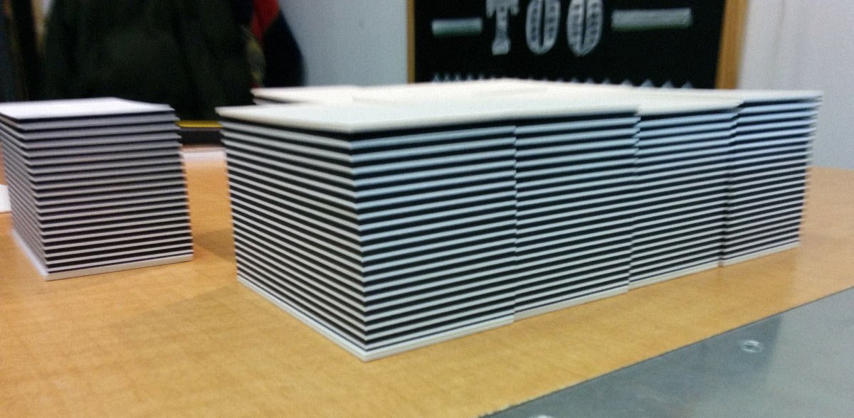
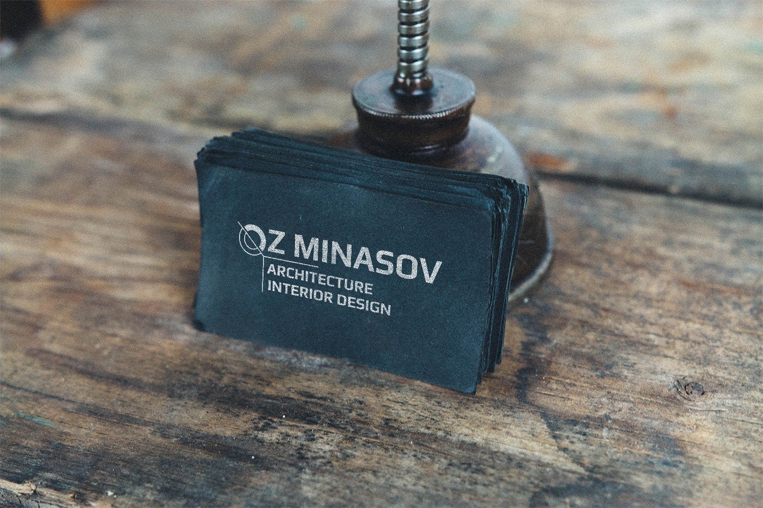
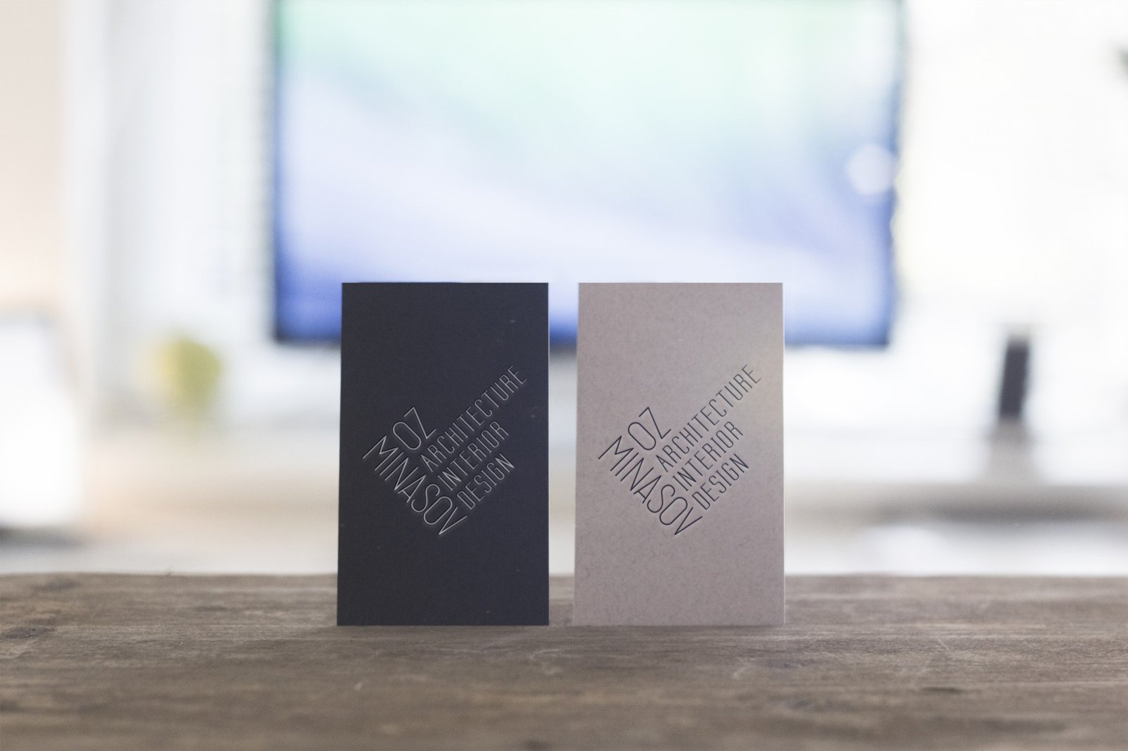
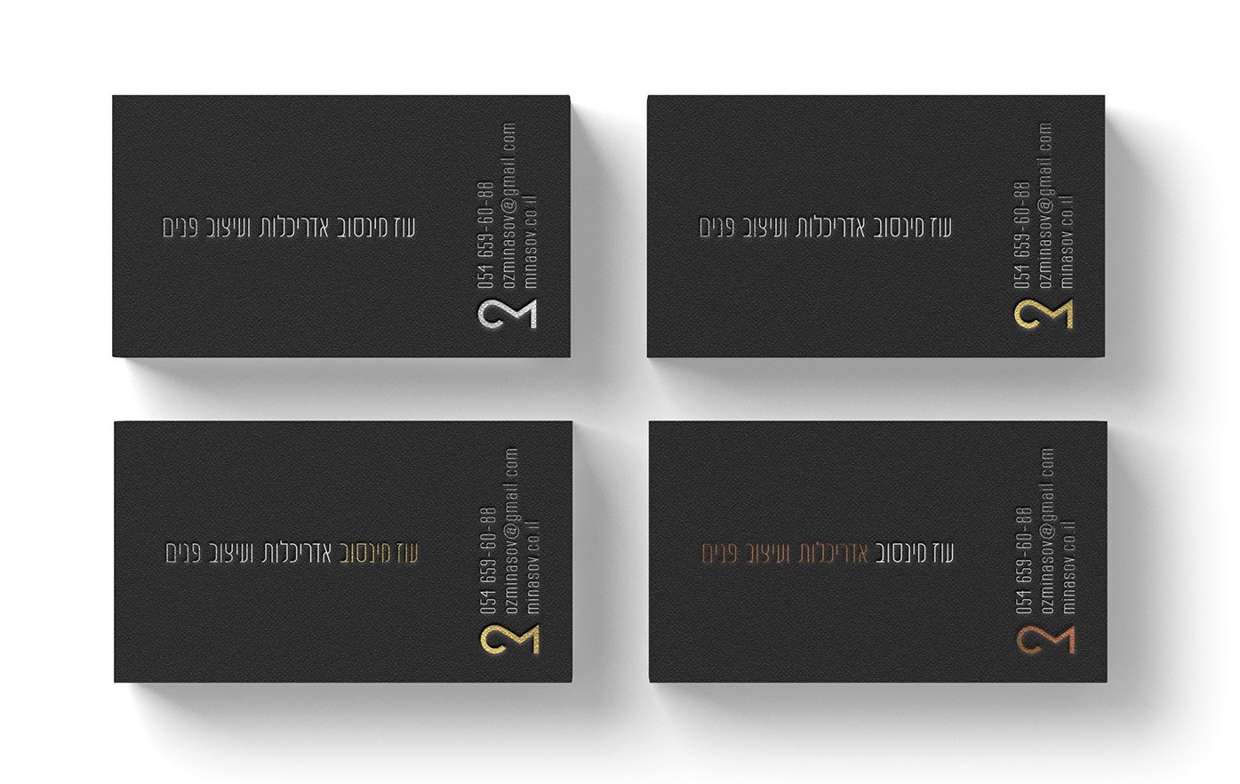
The business cards were made by letterpress printing and foil stamping on black and white cotton paper, and then both sides were glued together.

Business cards in life (photo by Monobyte Print Studio):

By glueing the white and black paper together, the cut resulted in a striped pattern

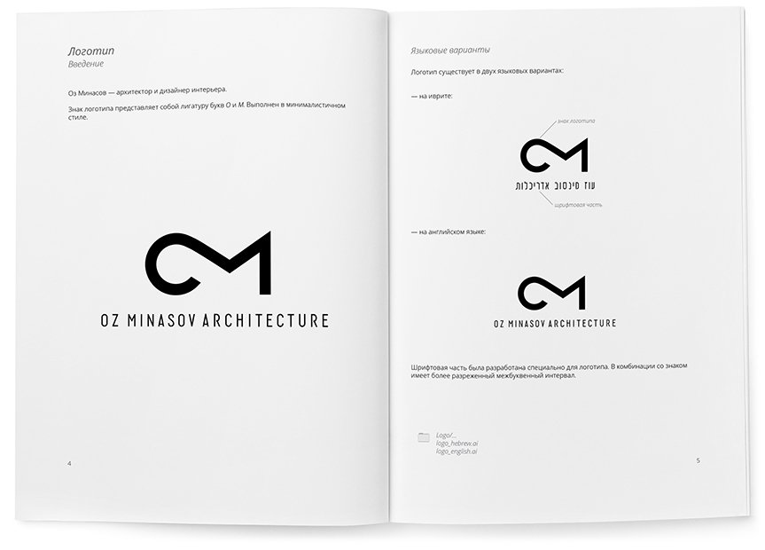
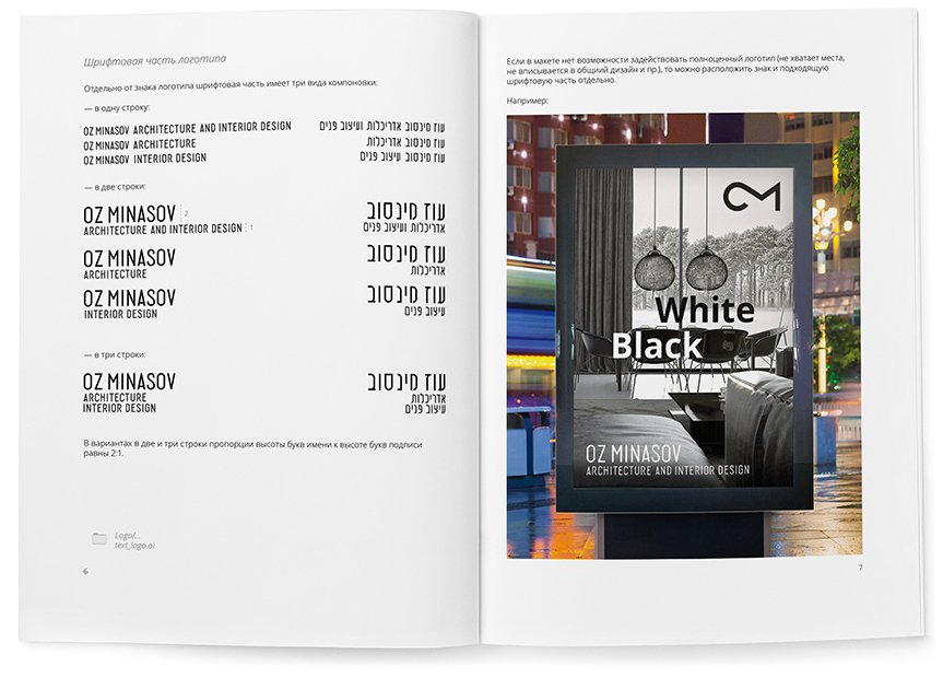
The rules and guidelines for using the logo are collected in a guideline:

How I created an architect’s logo

Today I’m going to tell you about an interesting logo that I worked on for two months. This is quite a long time, but the client and I were satisfied with the result.

The client is Oz Minasov, an Israeli architect and interior designer. Oz works with both countryside and urban properties. Also, he is not limited to the country of residence and works with the whole world.

I started the work by looking through Oz’s portfolio, and almost immediately the idea for the logo appeared.

Searching for an idea

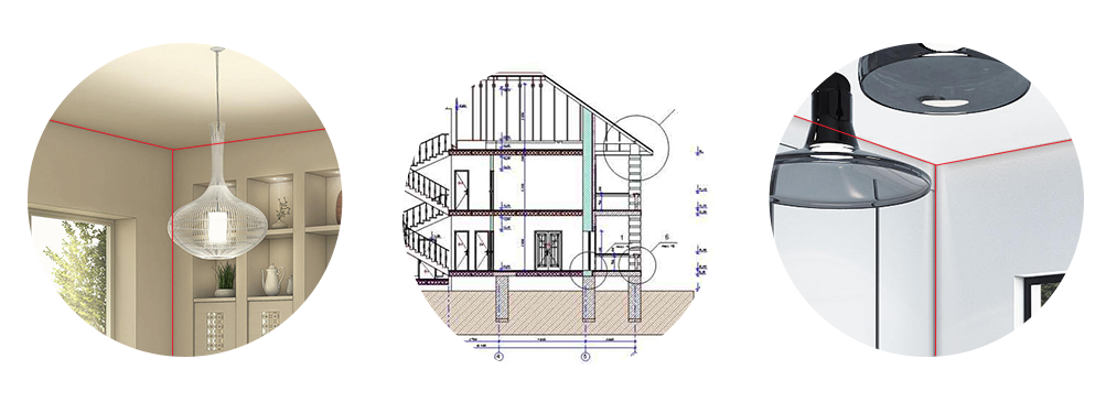
I combined the three axes of the interior corner of the room with the architectural drawing, thus emphasizing both architecture and interiors.

om-2.jpeg.
First sketches

I sketched the idea on paper and started to realise it.

First version of the logo

In the logo, one of the axes divides the letter O diagonally — the lower half of the letter is made as a drawing, while the upper half remains a letter. The other two axes formed a right angle into which the signature fits.

The logo turned out to be not simple, but dynamic — its axes can move apart, thus giving space to work on the style.

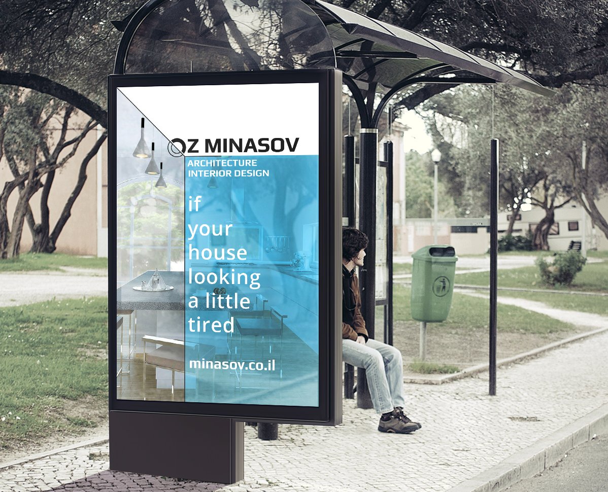
Example of using a logo in an advert

Presented the result of the work to the client, but were rejected. Such a logo did not suit Oz.

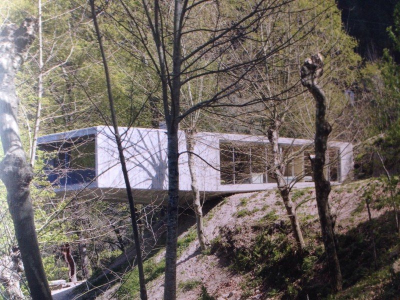
After talking to him, we came up with a new solution — to use a house in the sign and emphasise architecture. As a prototype of the idea, Oz sent photos of a designer’s house, which he liked very much.

Correia/Ragazzi Arquitectos

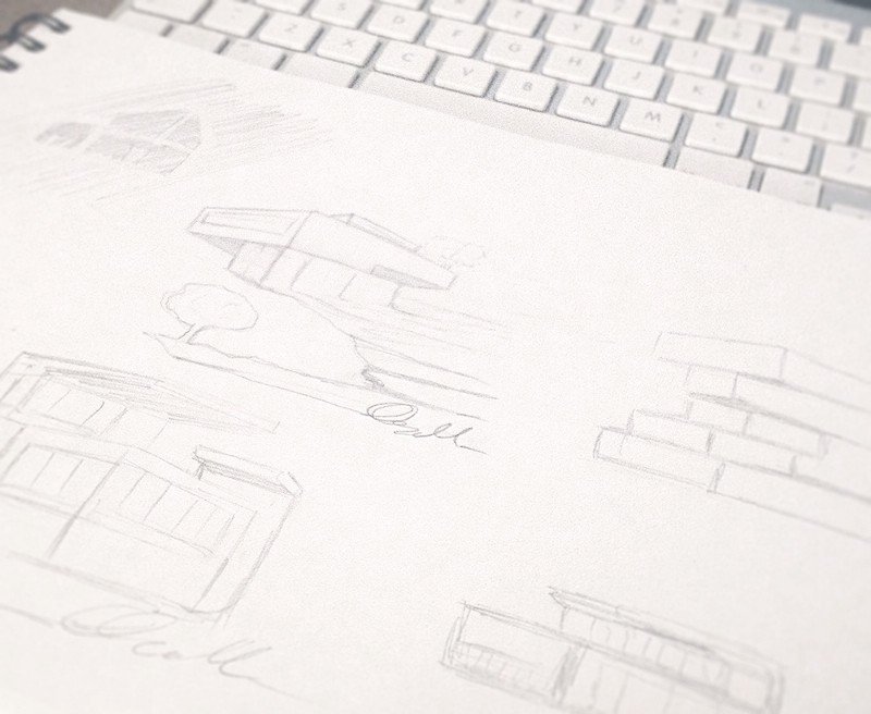
I started new sketches. This time I wanted to show the unity of architecture and nature.

I chose one of the sketches and started to realise it.
House in perspective

To the house on the cliff, I added a signature of the first name and the first letter of the surname to give an artistic touch and authorship. Below is the result:

Showed it to the client. He liked the idea of the signature, but the shape of the house was still to be worked on. Oz also asked to remove the black bold lines and simulate a pencil sketch, and to make the font part more elongated.

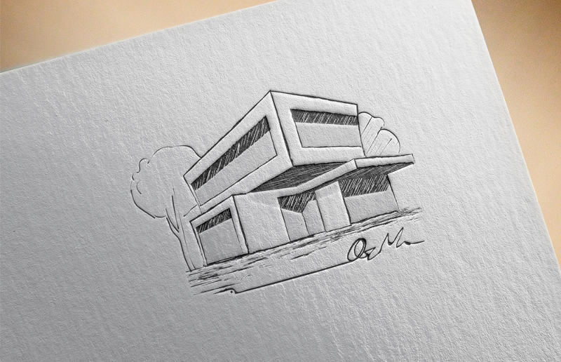
I decided to tackle the house first and sketched a new version:

However, we didn’t like it in this form and after discussing the details with the client, we gave up the idea of the sketch.

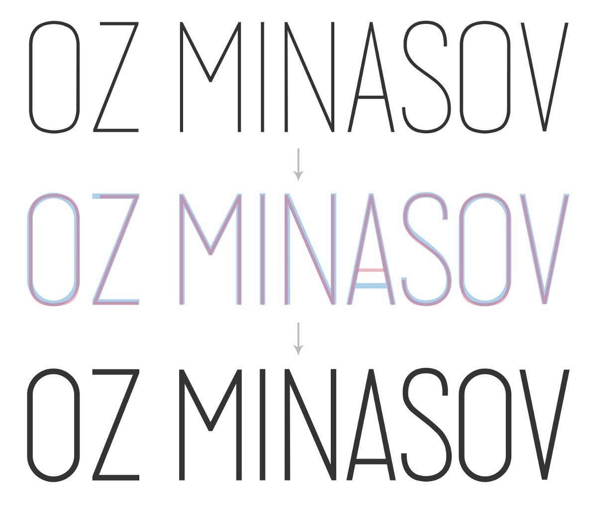
At the same time, we started working on the font and developed the font part based on the chosen typeface:

At this stage, Oz asked to work on a fully typographic version of the logo, without the house. Similar to the first and last name, I designed the signature “Architecture And Interior Design”.

I combined everything into a sign shaped like a building:

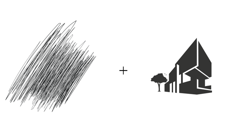
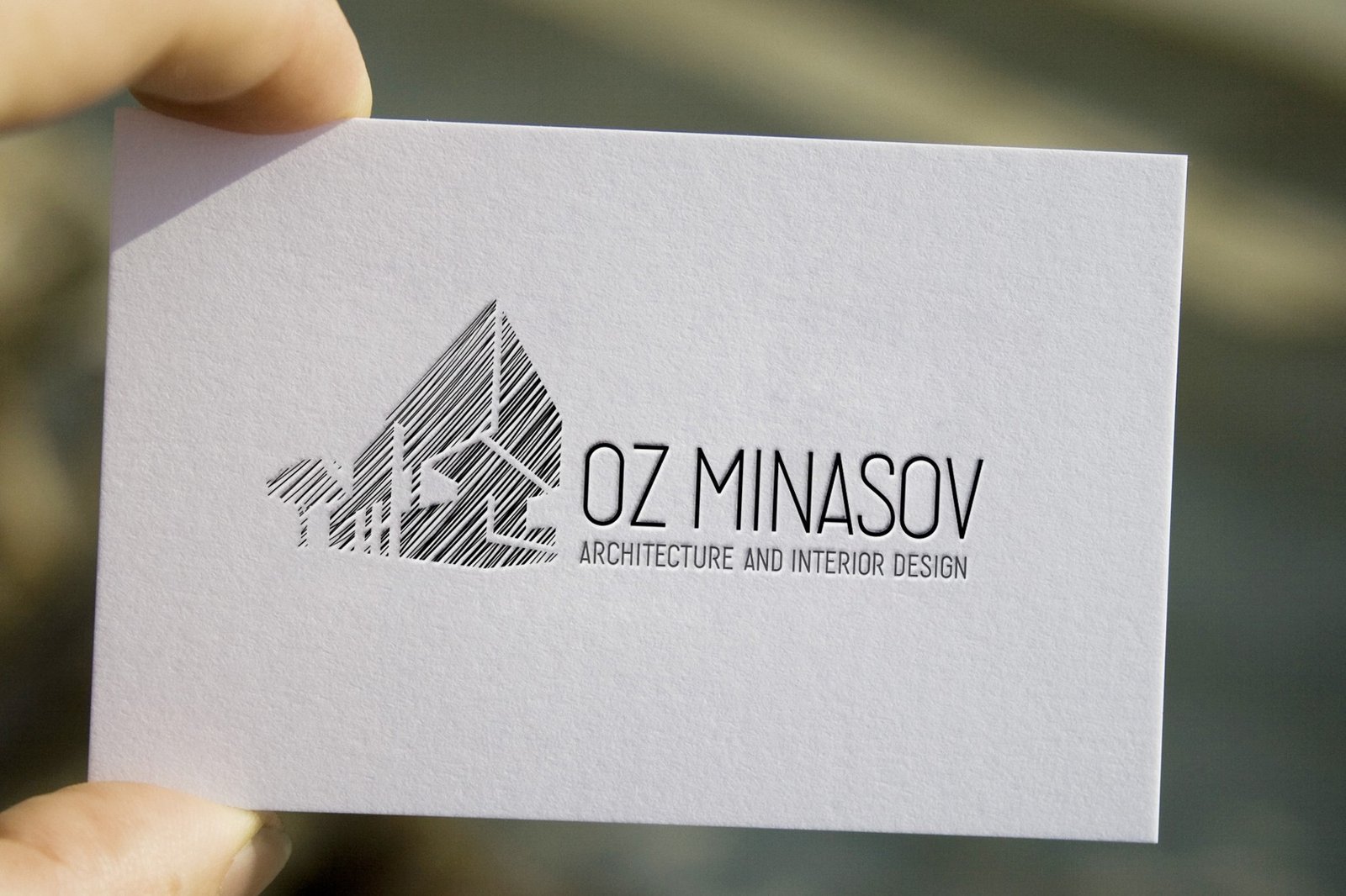
While I was working on the typeface, I came up with another idea for the house — to combine the pencil shading and the silhouette of the house.

Clinet liked this idea. We concluded that it would be great to use a house in the sign, which Oz would design himself. However, in the process, the client suddenly decided to completely change the concept of the logo, abandoning the house symbol.

Back to the sketches again. This time the work was on the symbol from OM’s initials.

Sketches with initials

I chose two ideas and started to realise them.

The first variant — ligature of O and M
The second variant — a sign based on M with A (from Architecture)

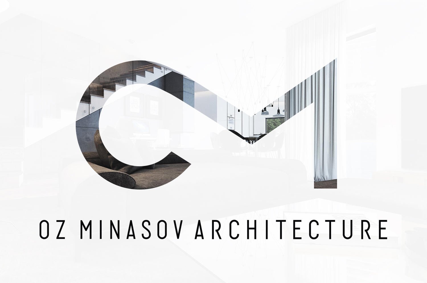
From the proposed variants the client chose the first one — the ligature of O and M. He liked very much that the sign contains not only initials but also traces the silhouette of a fish. I continued working on it. As a result, the sign underwent a small transformation.

Transformation of the sign

The next task was to put together the graphic part and the font part. Since the sign is rounded and wide, and the letters are elongated, together they did not look very harmonious. So I abandoned the first name in the logo and defused the letters in the surname. This helped get rid of the flaw.

om-19.jpeg.

I started colouring the sign. With a gradient, I strengthened the letter O.

Colour version and in grayscale

When the sign was ready, I began work on Oz’s business card. For it, I developed a text part in Hebrew to match the style of English writing.

I made two types of business cards and sent them to the client.

Information in Hebrew and English on one side and the logo on the back
Information in Hebrew and English on different sides

The client did not like the business cards in this form. He shared his new wishes — to make the sign more massive and the business cards black.
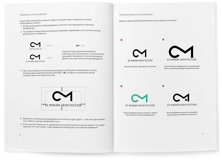
On black paper, it is preferable to print with metallic inks (gold, silver, bronze), so I have shown new variations in different colour schemes.
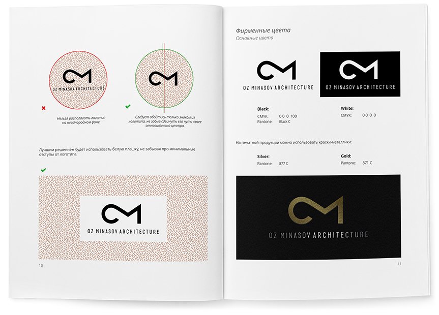
Back side
Front side

The client approved the logo and chose their favourite business card options.

I finalised the fonts — made them a bit bolder and presented the final version to the client.

Result of work

The character of the Duck House Agency

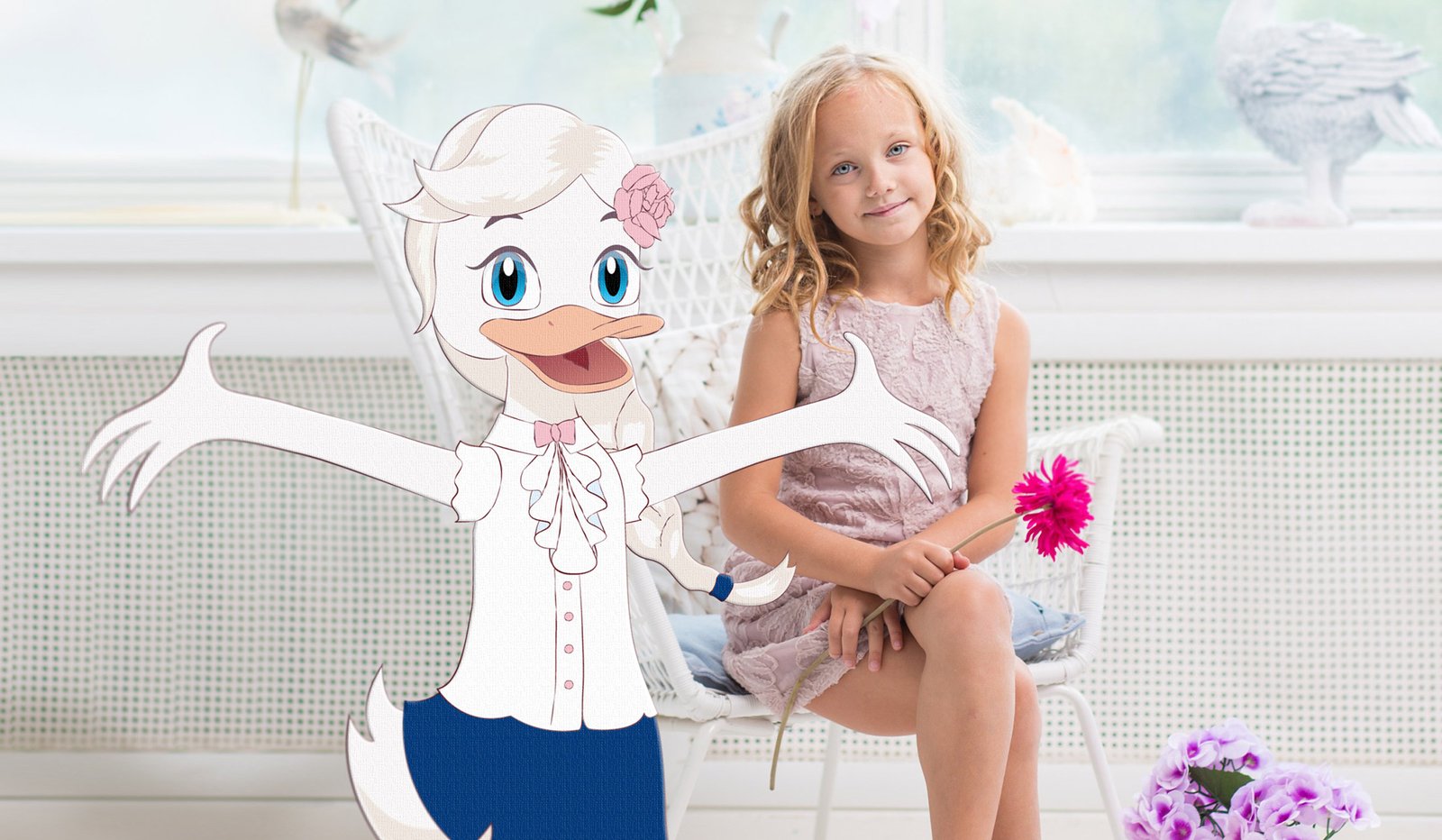
Last year I created a logo and style for Katya Keshchyan’s family holiday agency The Duck House. In this post, I will tell you about the process of working on an interesting feature of the style — the brand character.

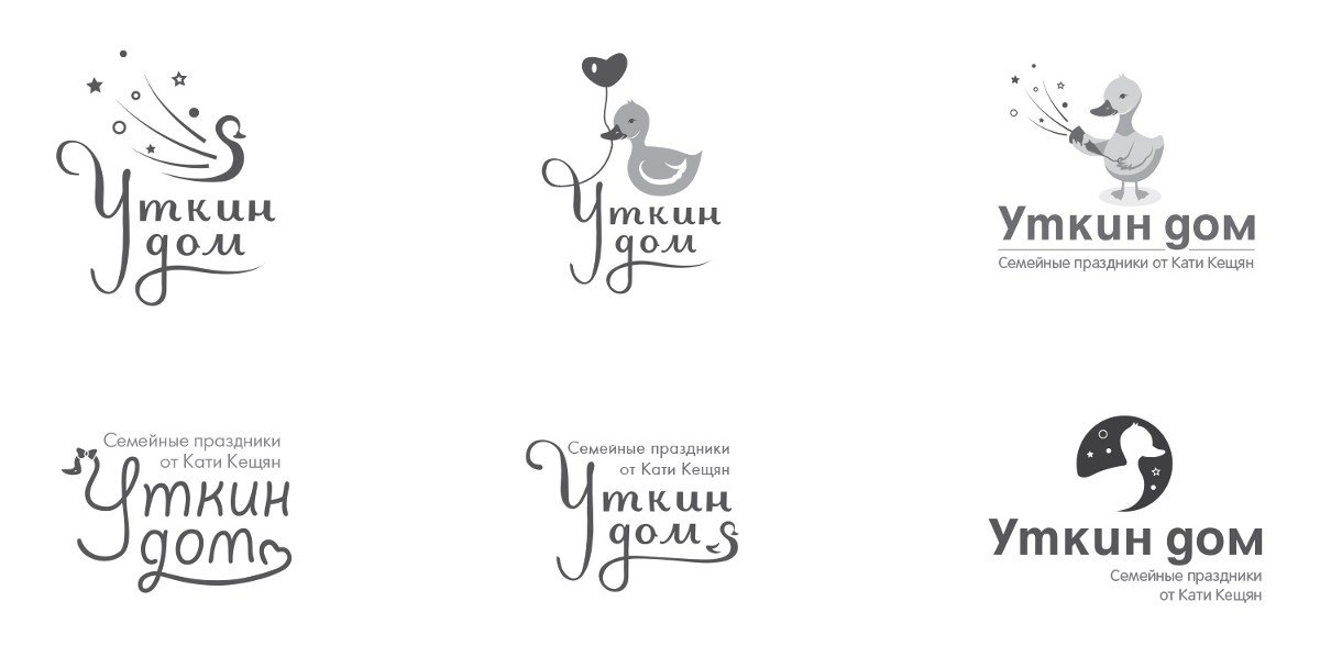
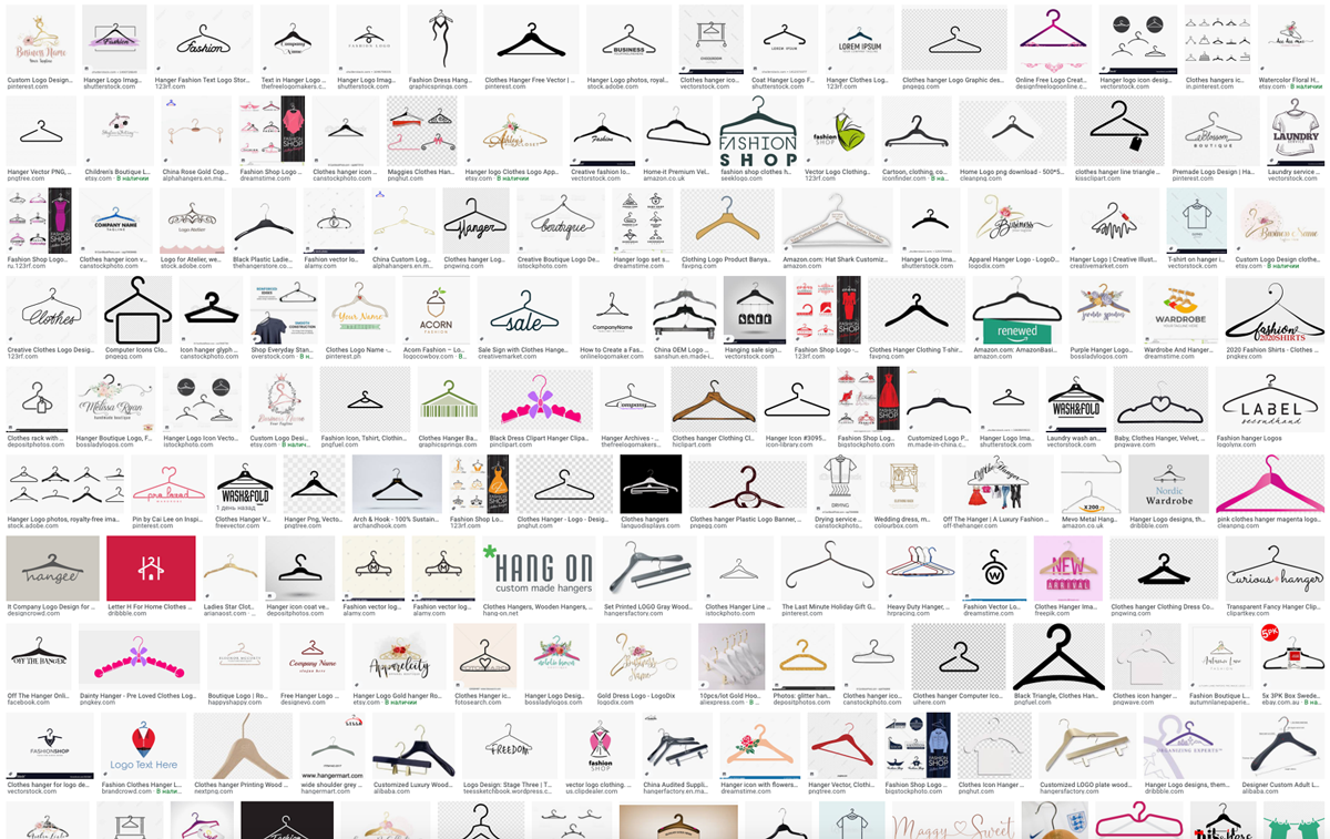
According to the owner of the agency, the duck is a symbol of family cosiness, hence the unusual name of the agency. That’s why I started my work by looking for the image of a festive duck in the logo.

Image search

From the received variants Katya and I decided that the logo with a duck looks childish. That’s why we rejected the duck in the sign but invented a new role for it: as a character of the agency in the form of an independent element.

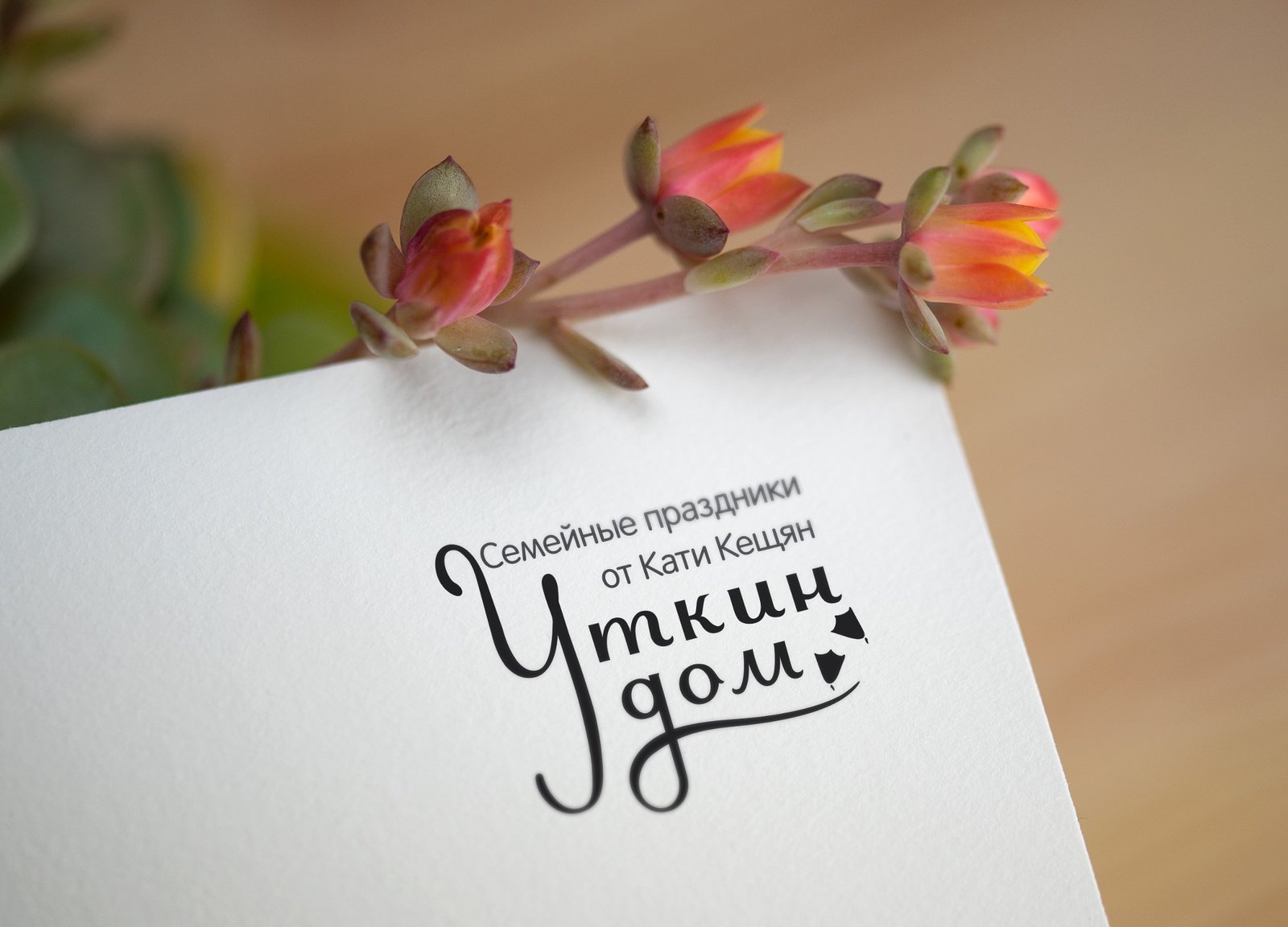
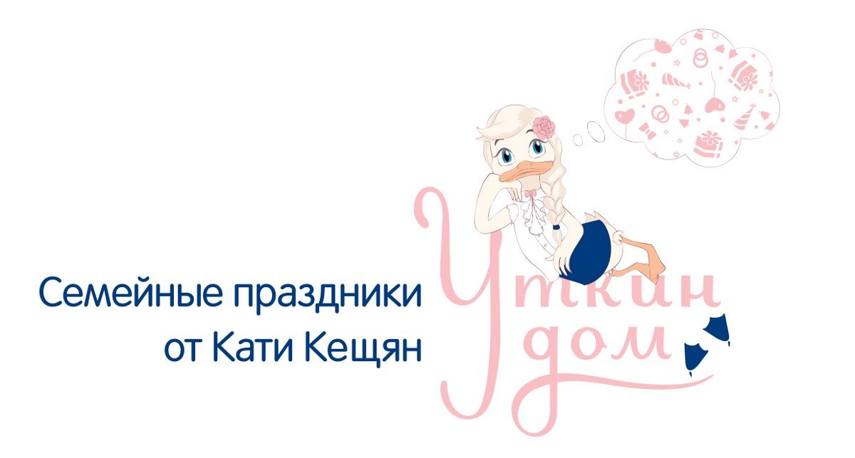
In the meantime, I continued working on the logo — I chose and finalised the font lettering. And in order not to deprive the sign of graphic elements, I added duck feet to it. The logo was approved quickly, so I continued working on the character.

Ready-made logo

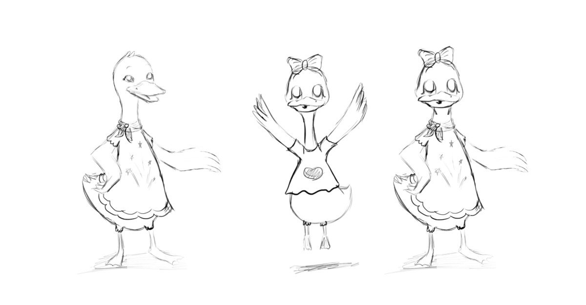
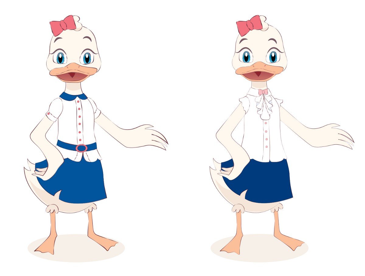
Katya specified that she did not want a “rubber” duckling, but a cartoon character, and so the first sketches were born:

Sketches of the duck

I got “permission” for the sketches and started working out the details digitally.

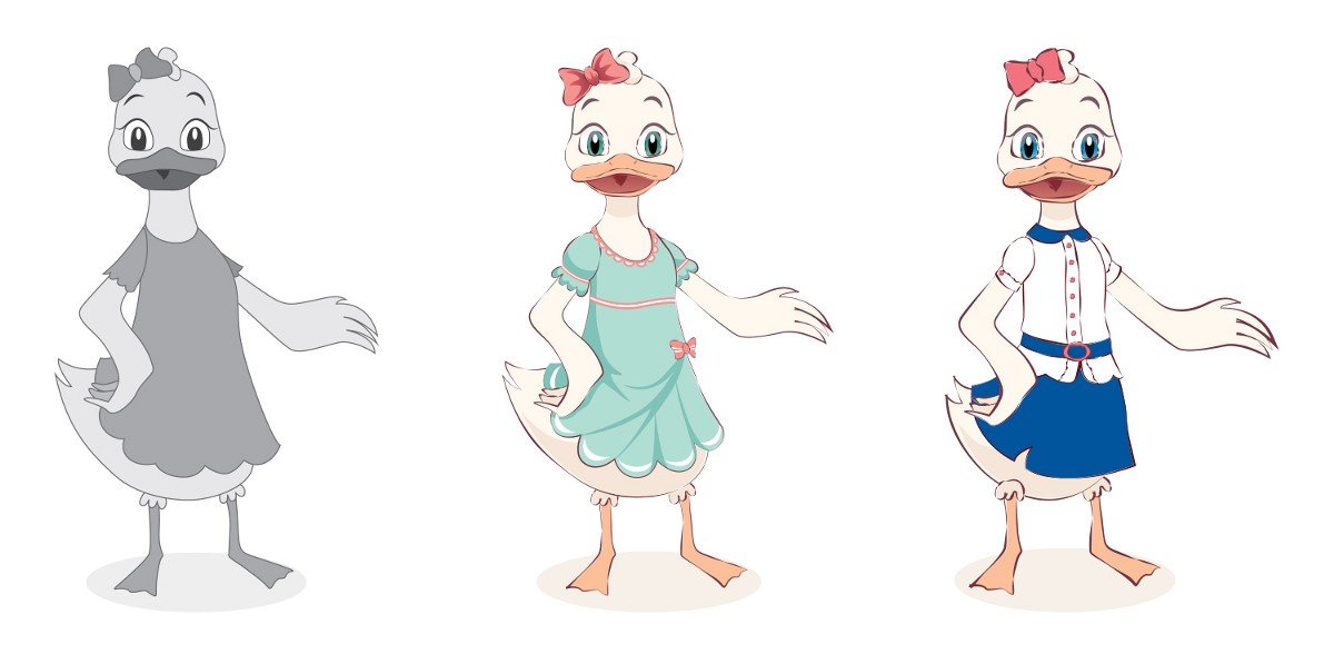
“Digital duck and its evolution

I am finalising the third variant.

Costume change

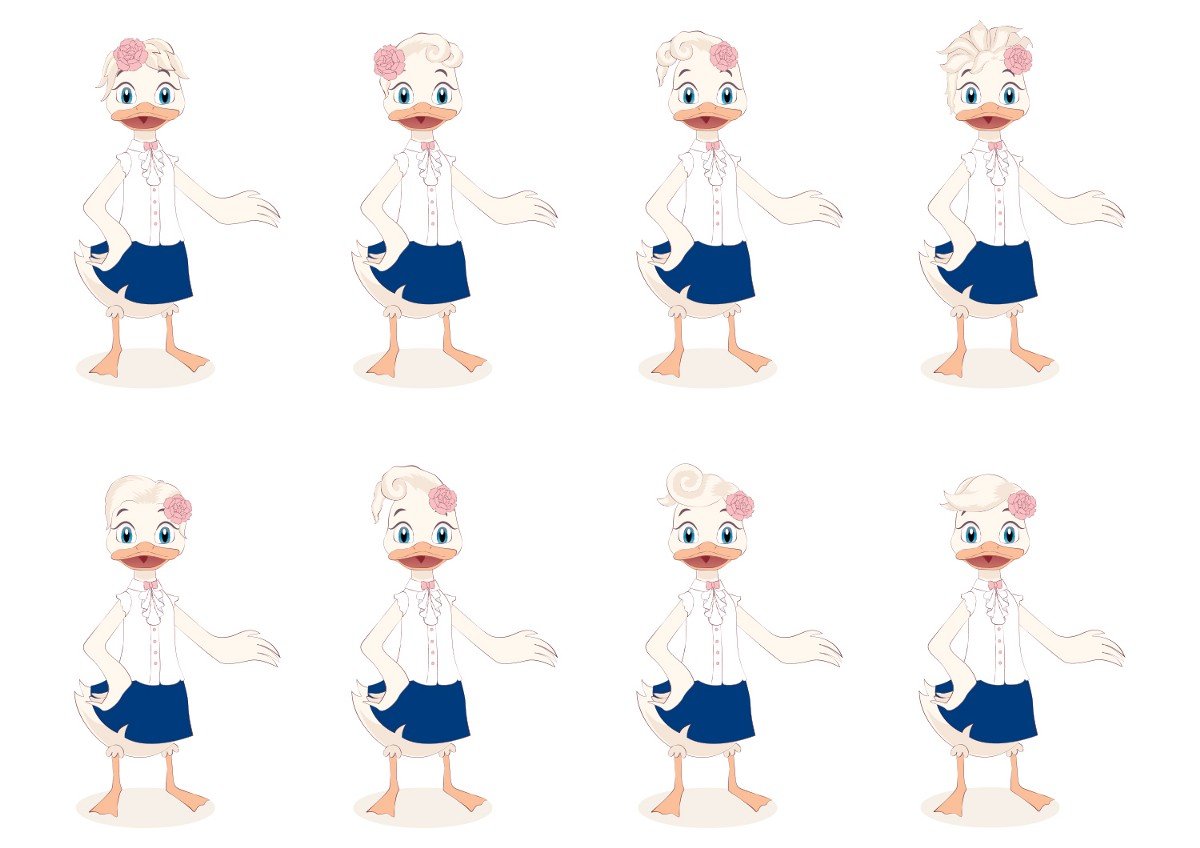
At first, the duck looked a bit brutal because of its ‘shaved’ head :-) So I did her hair:

It was not easy to choose, but in the end, my client and I decided on the last option, adding a long braid to the fringes:

Final variant

This is how the duckling became a real girl!

Next, I designed three more additional positions for the character and added colour to the logo:

ud-9.jpeg.
Duckling variations

Character in life

Having finished the project, I follow it with pleasure: it is important for me that the work ‘lives’ and not just remain a picture in the portfolio.

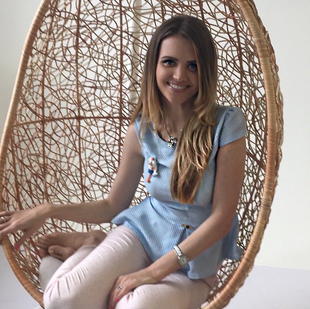
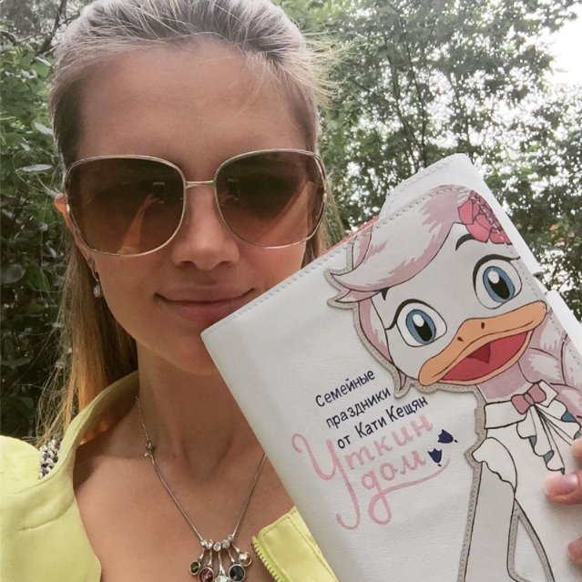
Katya decided to bring the duck to life in a very original way and ordered wonderful brooches based on her image:

Master of brooches — Yulia Druzhinina
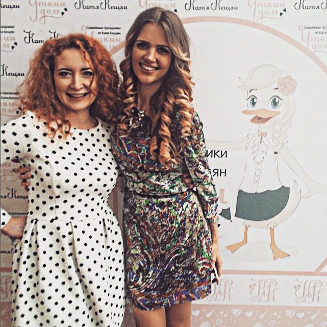
Brooch on Katya
Duck on a notebook
Duck on the press wall

Ah, yes! We had one more duck, but it was left out of the picture, as it turned out to be too ‘dreamy’ :-)

The dreamy duckling was left out of the picture

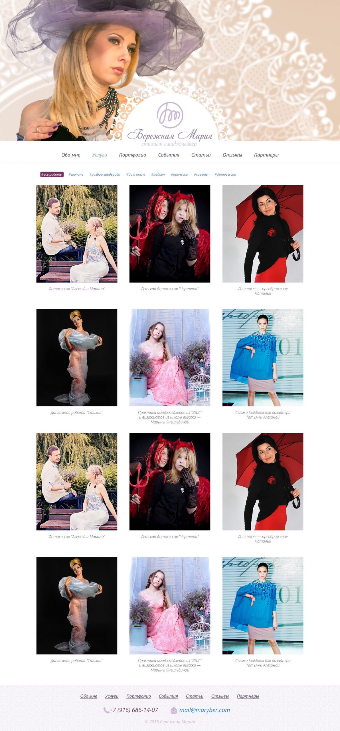
Launched maryber.com

Task
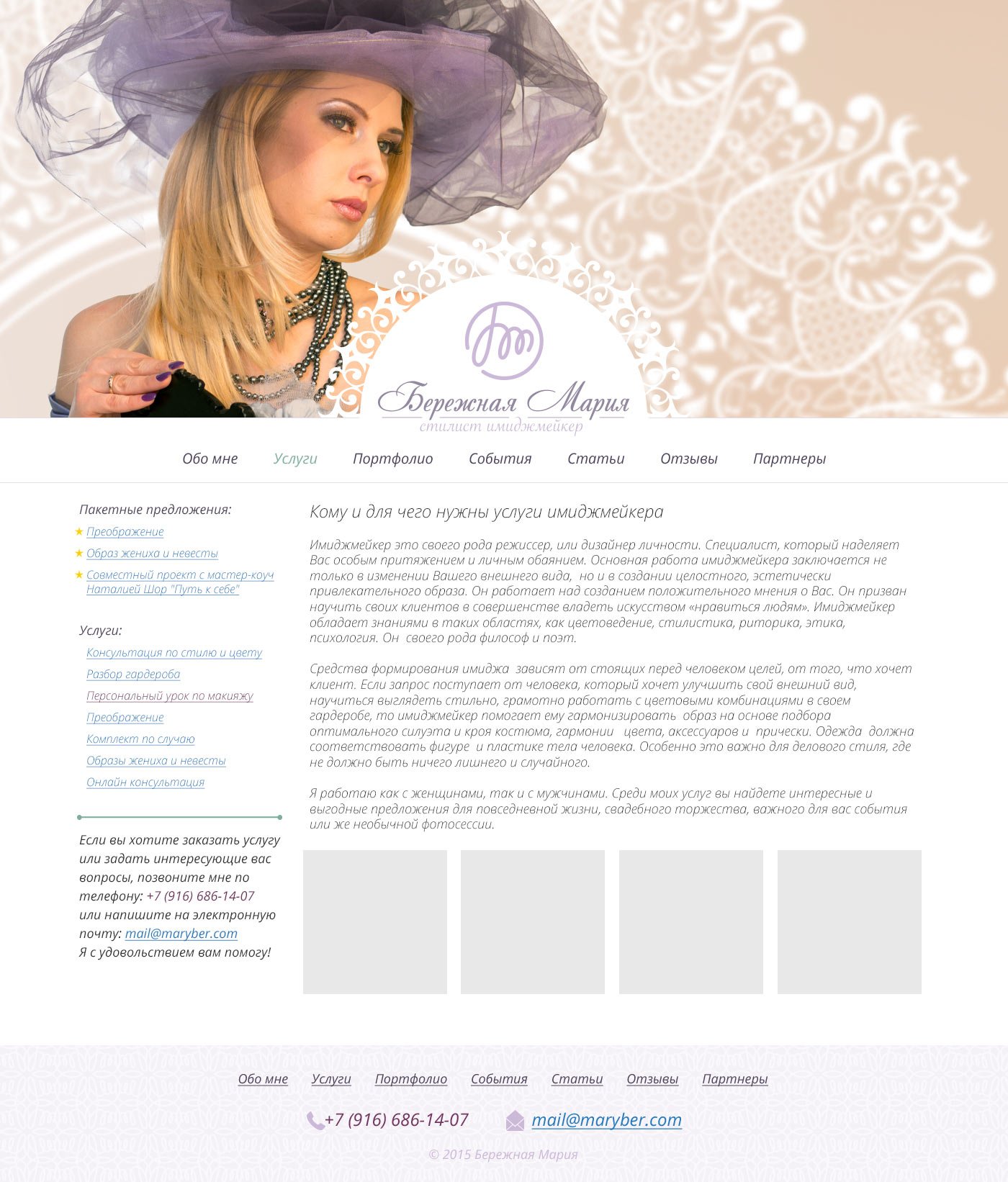
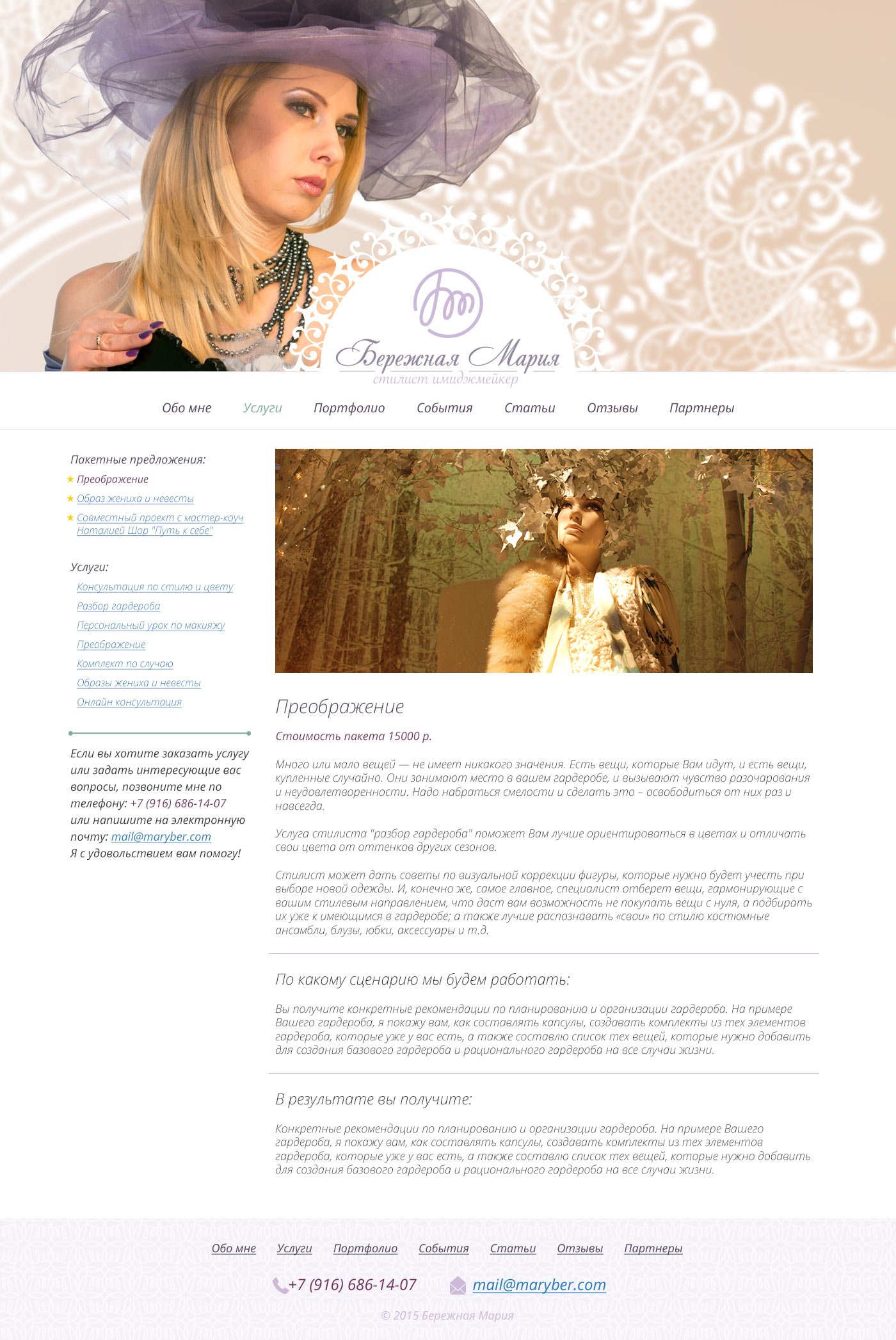
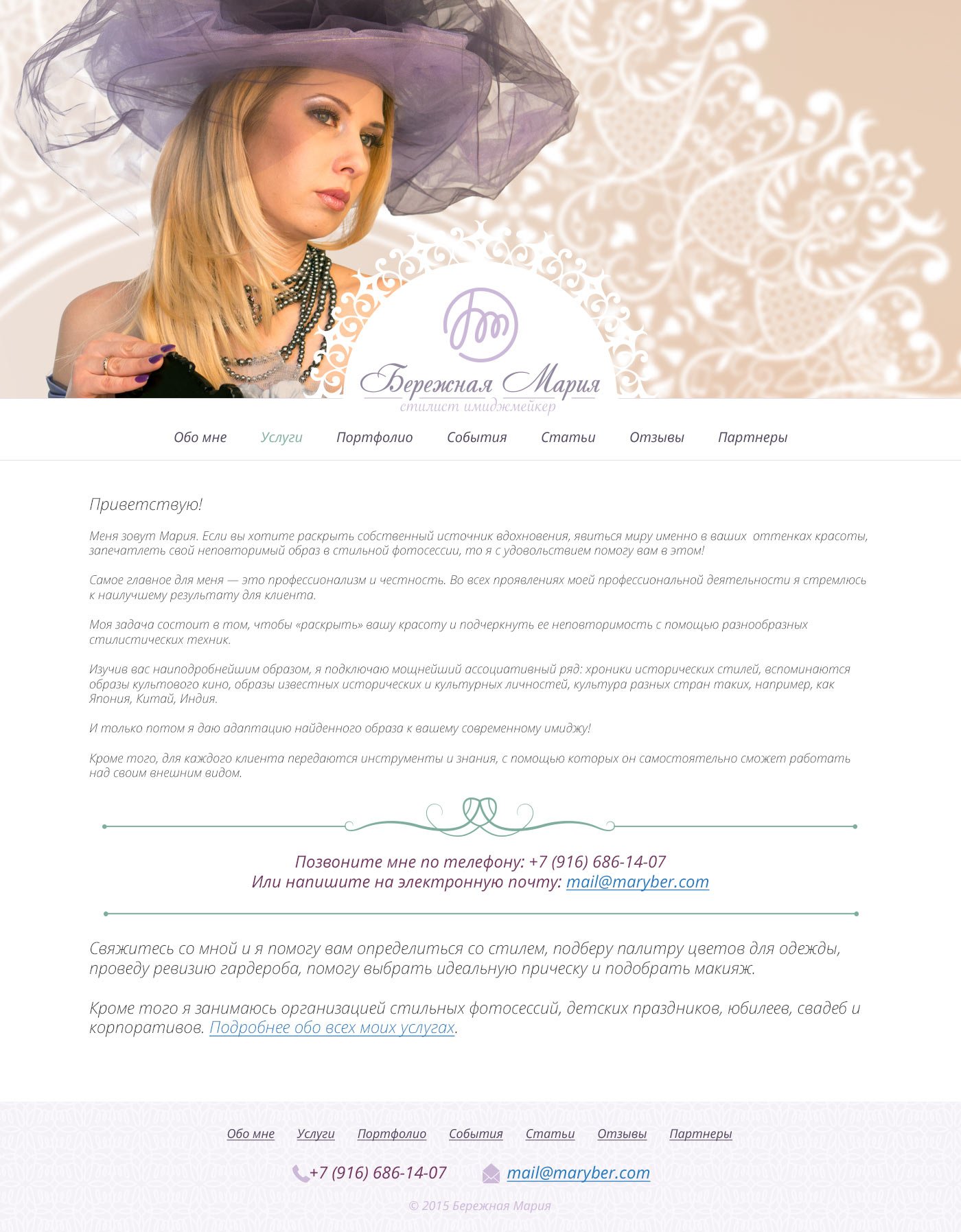
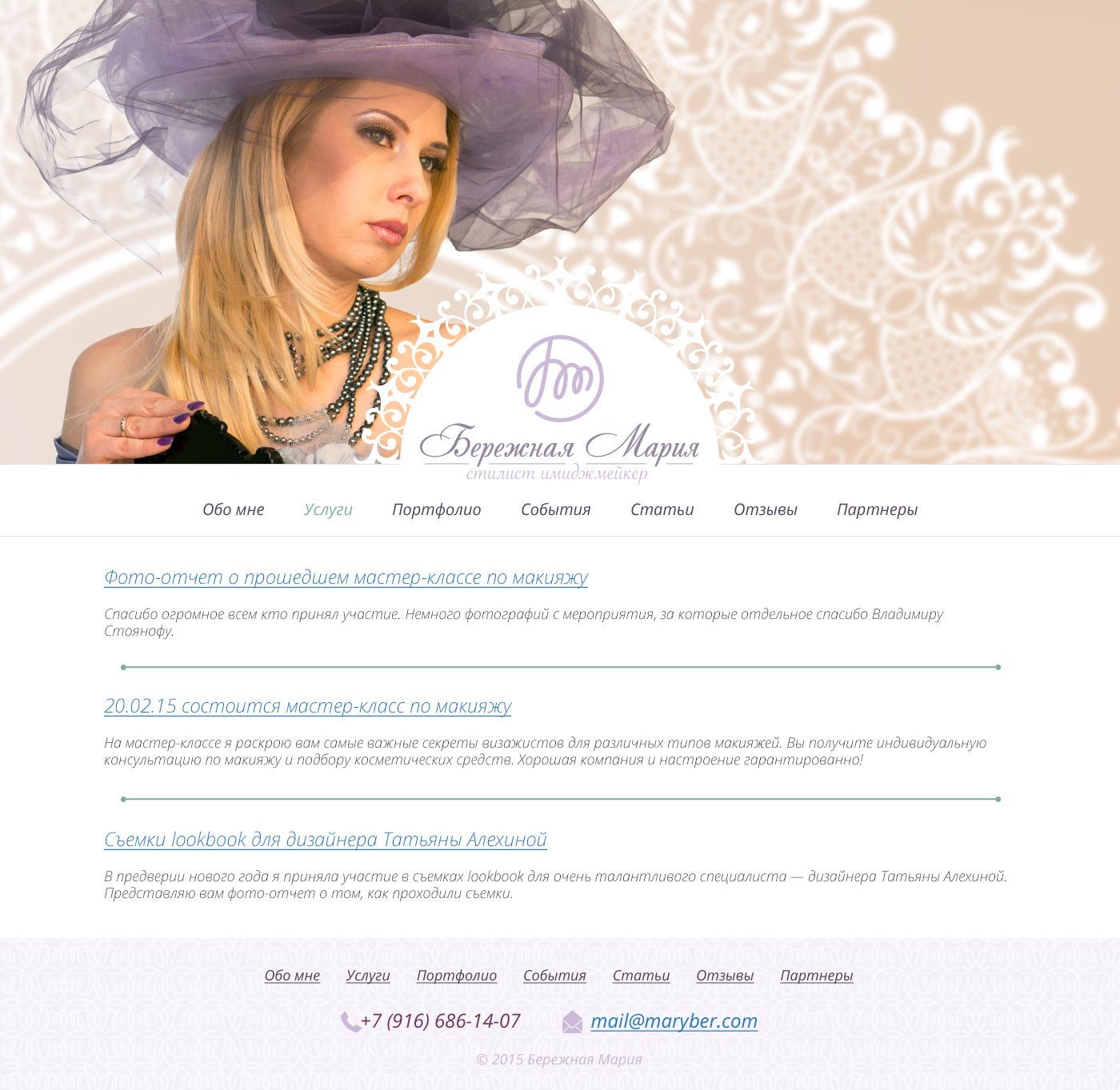
Make a portfolio website for stylist-image-maker Maria Berezhnaya. To tell what Maria does and to whom she can be useful. Provide for the possibility of publishing thematic articles on the site.
maryber.com

The main section of the site is a gallery with works:

Section with a description of Mary’s services:

A page with information about Mary herself:

Maria is also involved in organising beauty events:

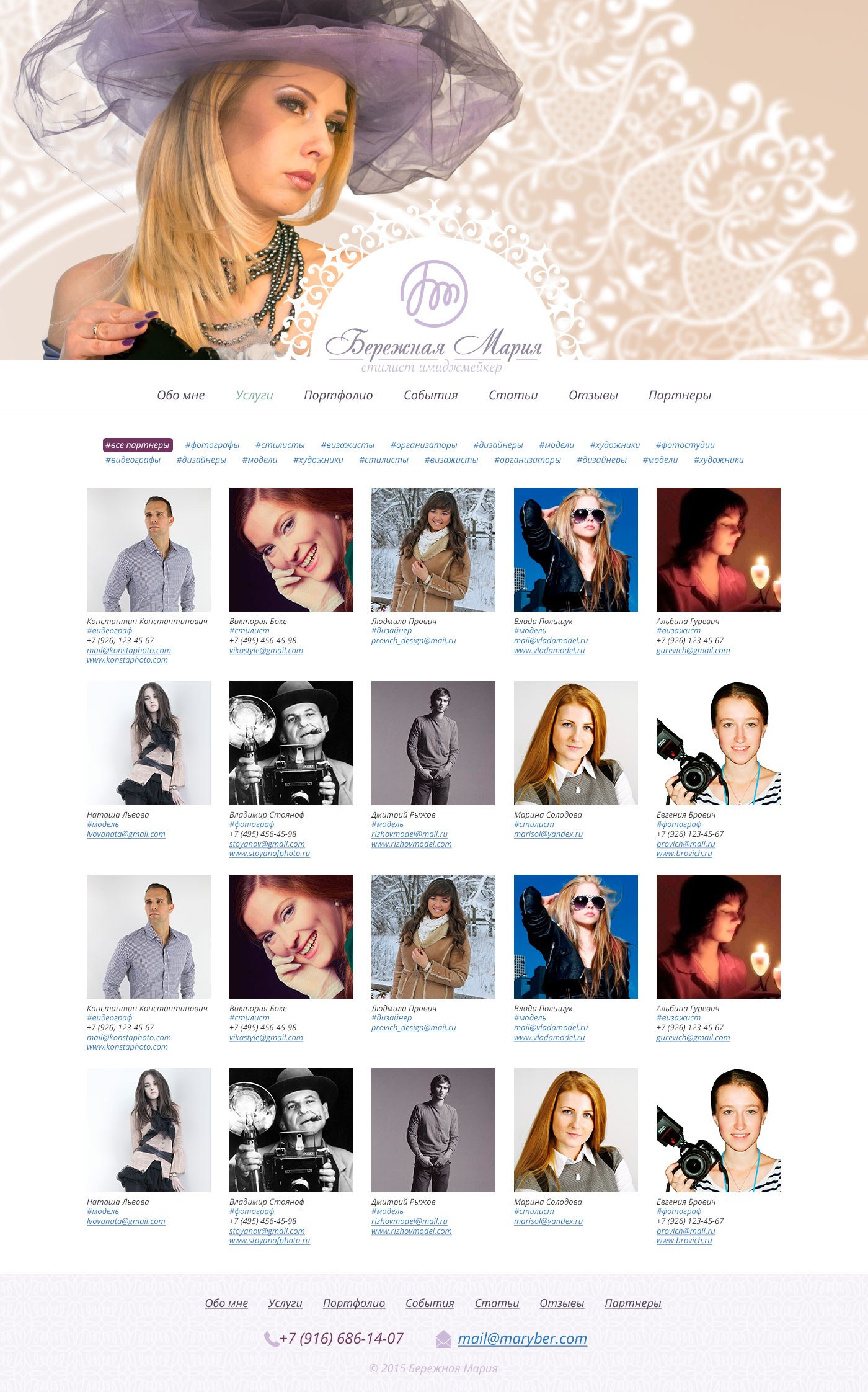
Separate page for partners with photos and contact details:

For convenience there are tags

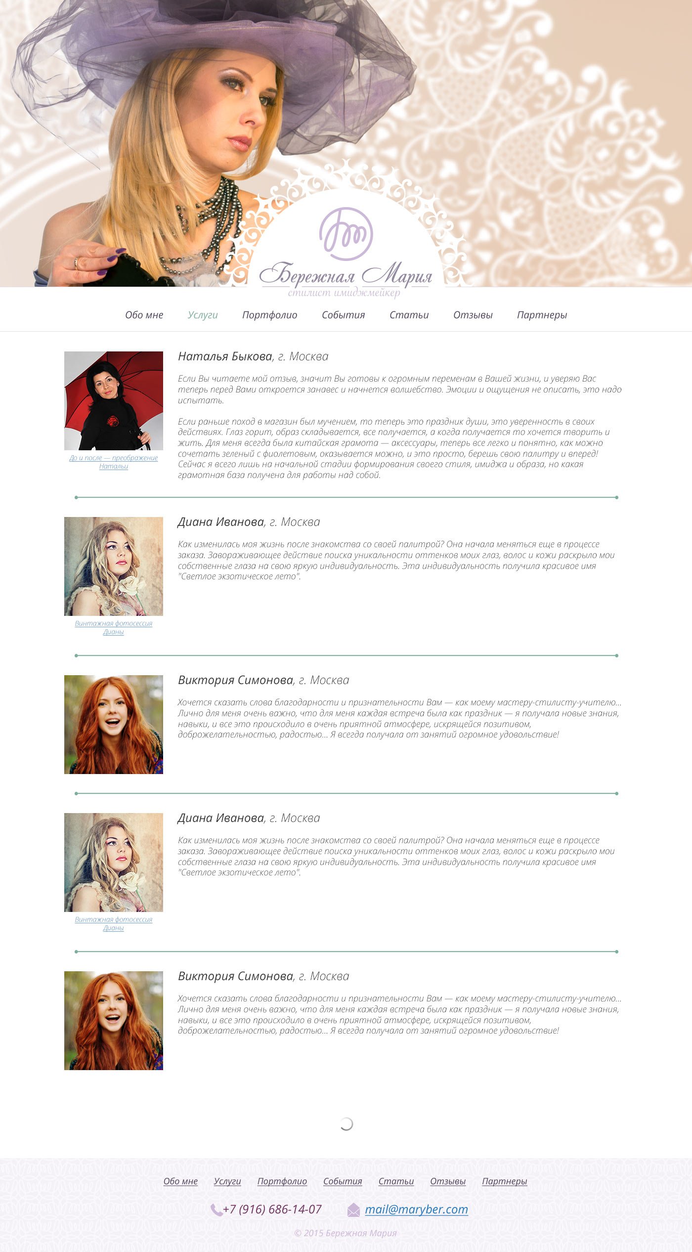
Review page:

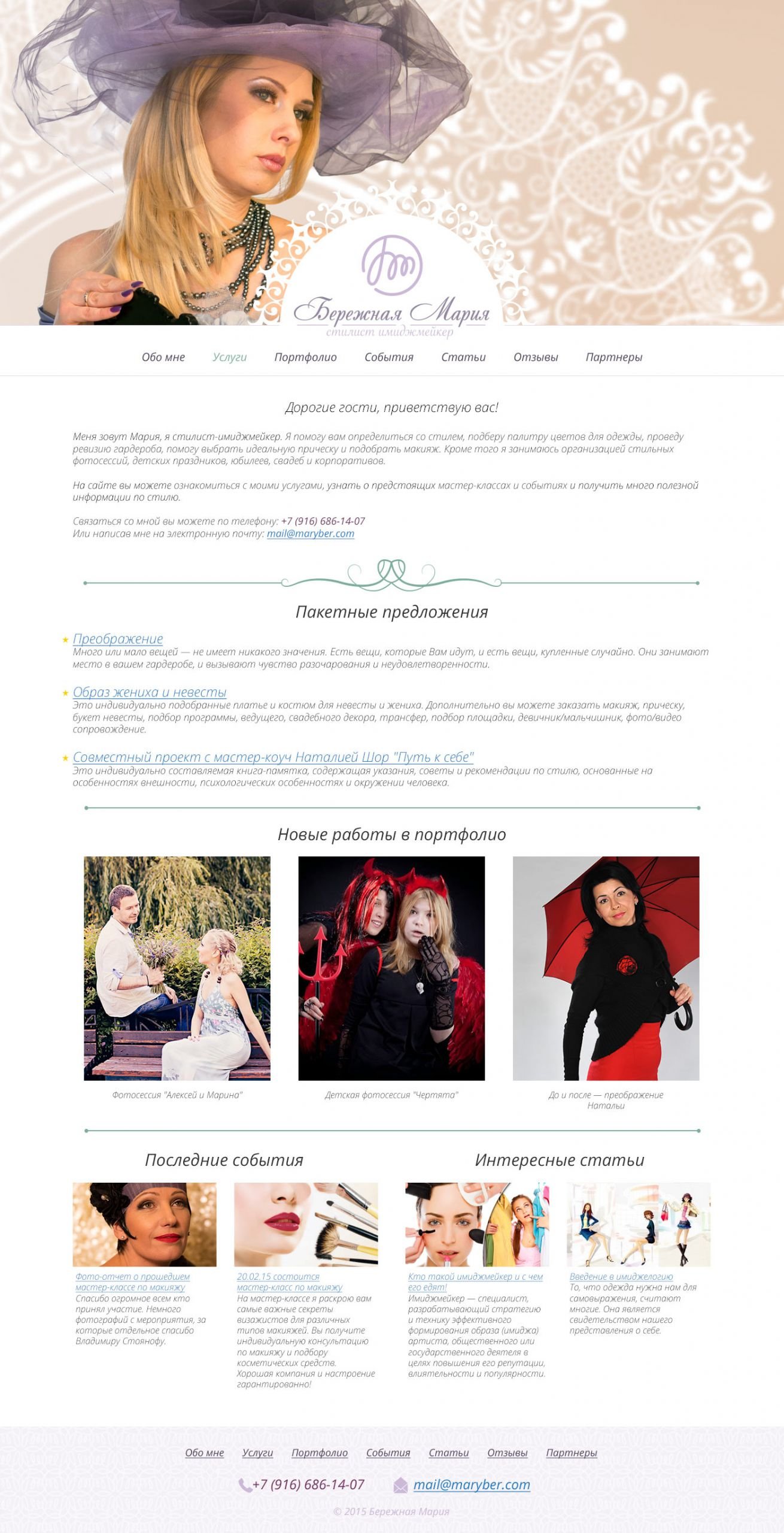
And the main became a rubric and collected all the updates that happen on the site:


Project members

Designer
Tanya Sokolovskaya
Manager
Daniel Sokolovskiy
Developer
Maksim Silnov

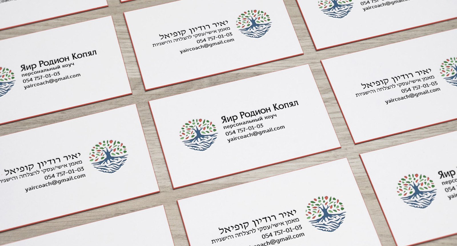
The process of creating a logo for a coach

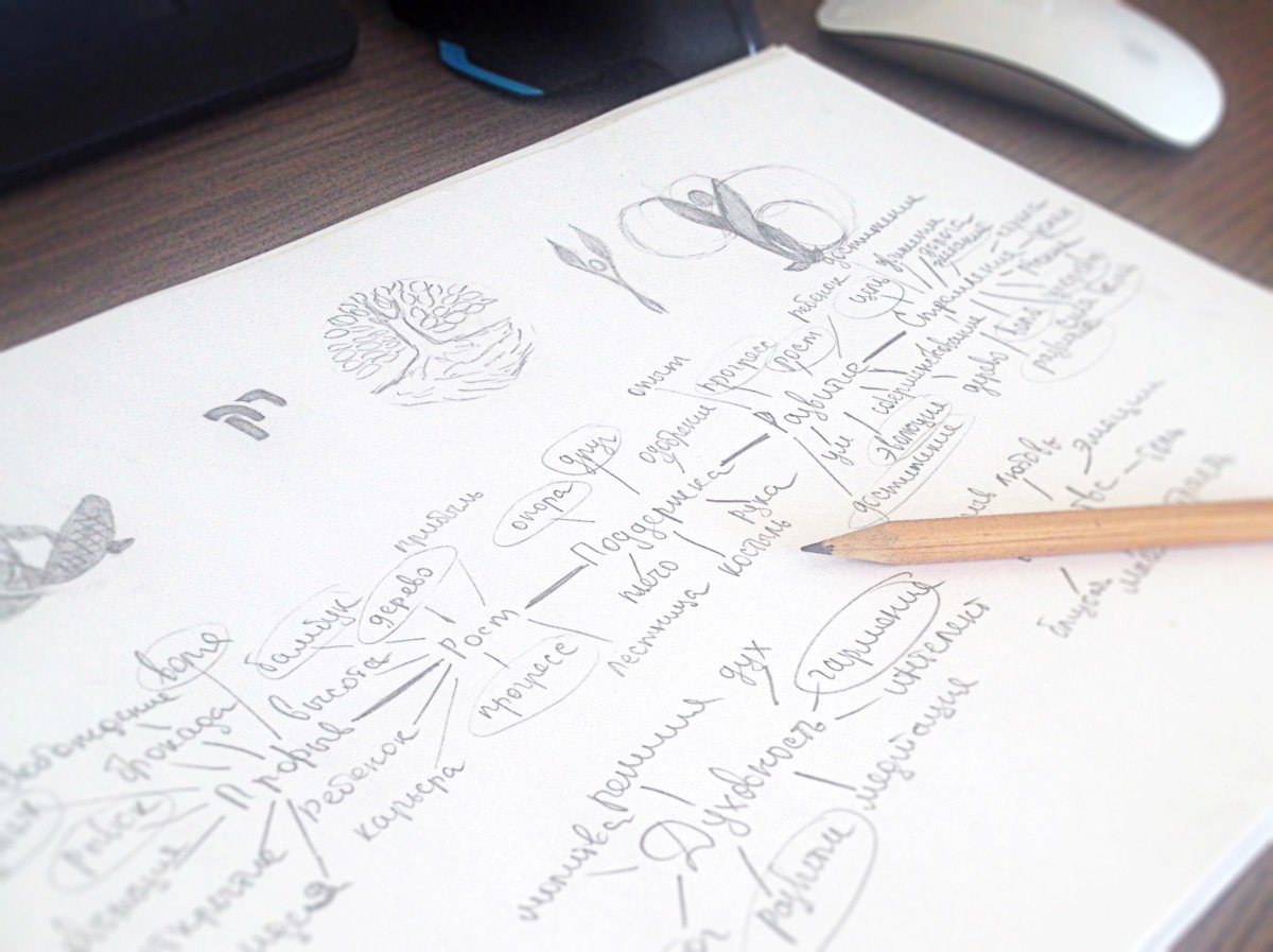
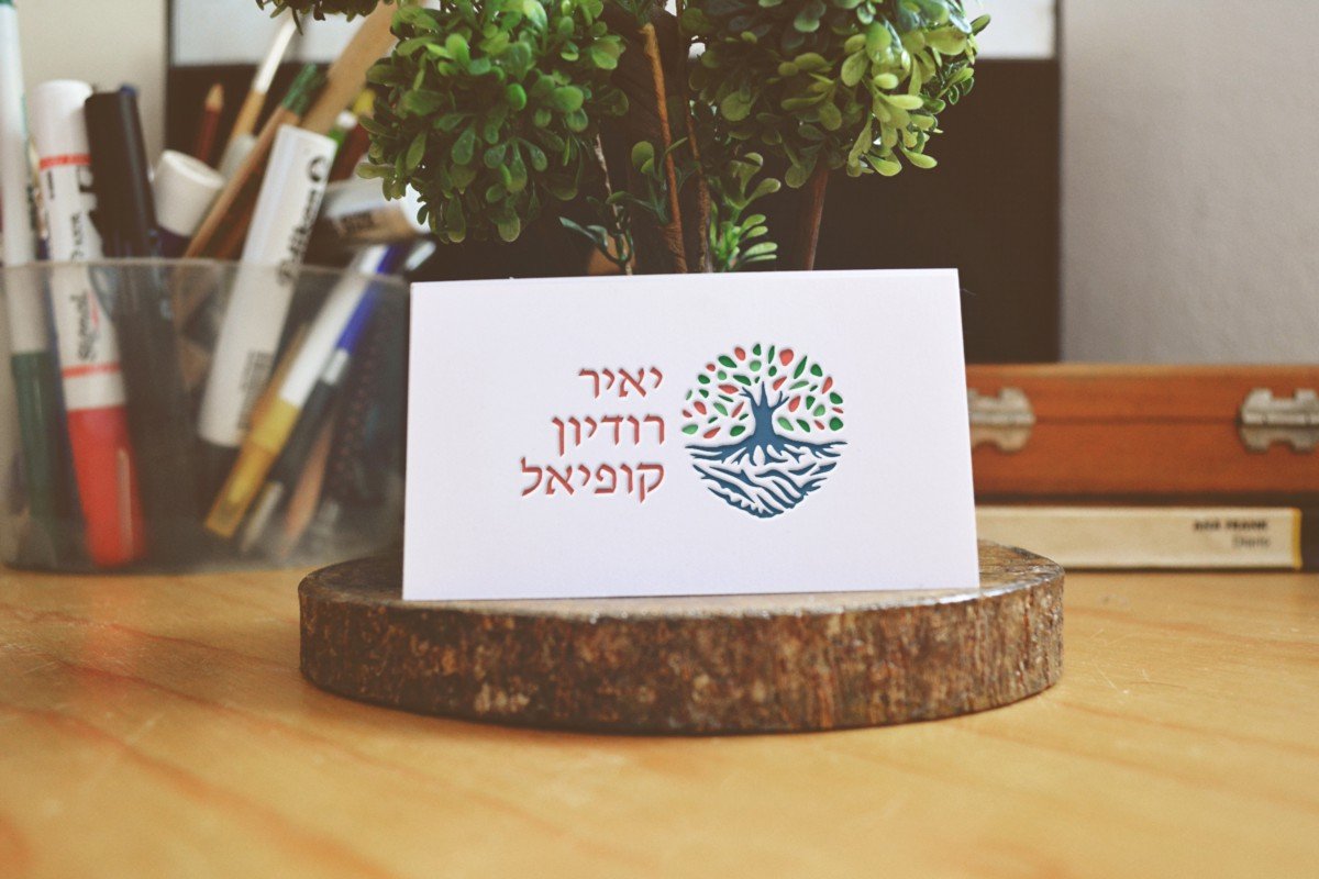
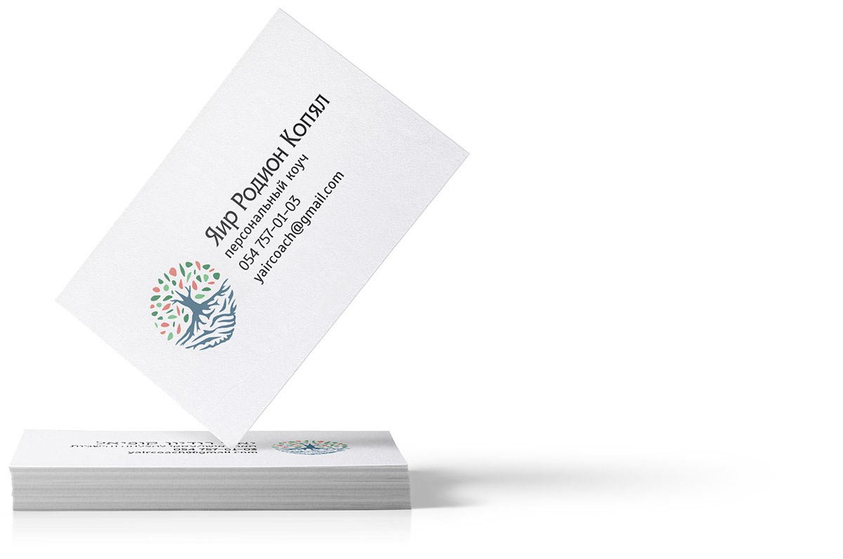
Logo for personal and business coach Rodion Kopyal. At the beginning of the work, Rodion voiced his associative wishes for the future logo: growth, support, development, aspiration, finding a way, breakthrough, search for oneself, purpose, and spirituality. That’s why I started the development of the logo with a tree of associations.

As a result of my search, I got hold of a few basic concepts — tree, obstacle, development, harmony, friend and support. And on their basis, I started sketches.

I chose the concept of a tree with roots from the resulting variants and translated it into vector format.

The sign went through six stages of transformation:

  • in the first stage I used a pendulum instead of a tree trunk, which indicates the way through rocks, i.e. obstacles;
  • added a handshake in the role of friendship and support to the rocks;
  • realised that the petals didn’t fit in that way, so I gave them the shape of splinters and the tree the traditional look;
  • corrected the roots of the tree;
  • at the client’s request, I gave the petals the shape of jigsaw puzzles;
  • together we gave up puzzles and went back to splinter petals, but rounded them to make them look friendlier.

rk-3.jpeg.
Logo transformation

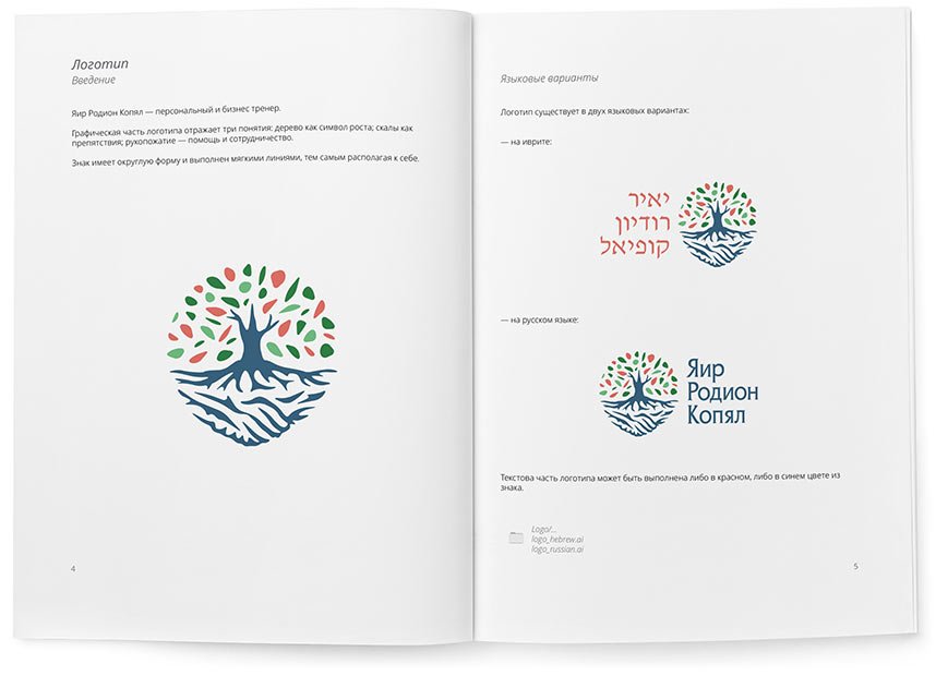
The result is a sign that combines everything we wanted to show: a tree as a symbol of growth and development; rocks as obstacles; a handshake — help and cooperation. We then picked a colour scheme for the sign and added the client’s name.

The text part of the logo is in Russian and Hebrew, as Rodion works in Israel.

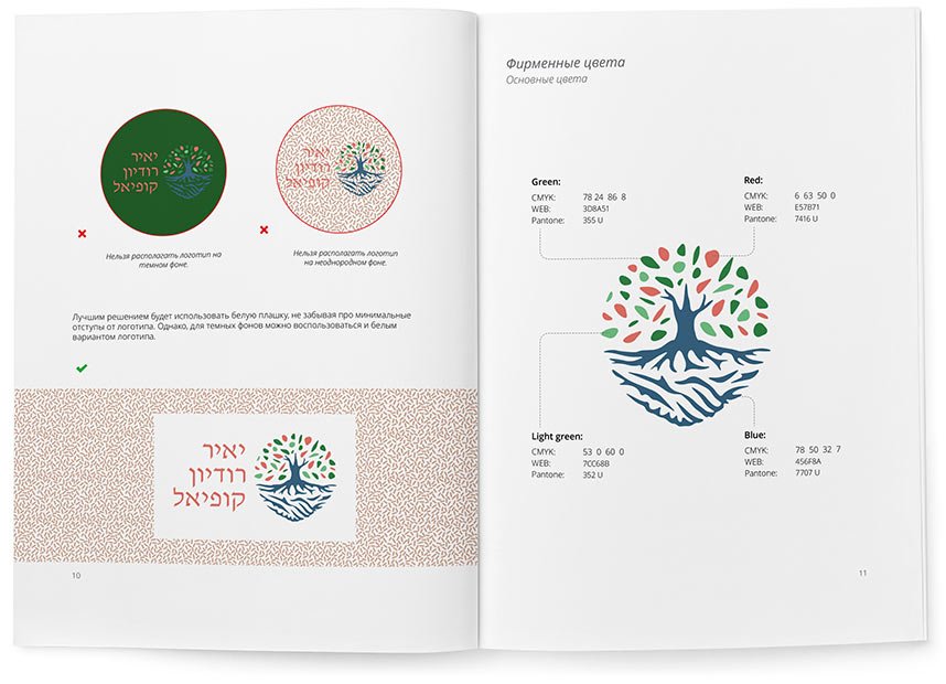
The rules and recommendations for using the logo are collected in a guideline:

When nothing fits

Logo creation is a special process. Its result depends more on the client’s taste and aesthetic preferences than on formal characteristics or the tasks to be solved. Sometimes no option is suitable. I once had such a case: the client accepted only half of the work.
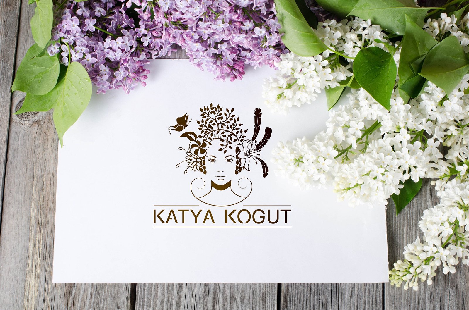
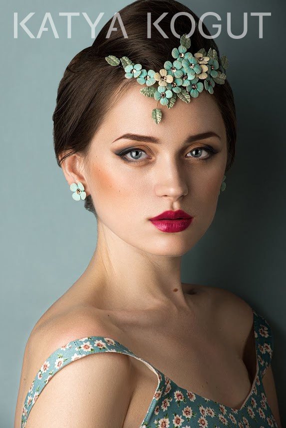
I was making a logo for jewellery designer Ekaterina Kogut. She creates delightful products from polymer clay, which earned her the nickname “Flower Fairy”.
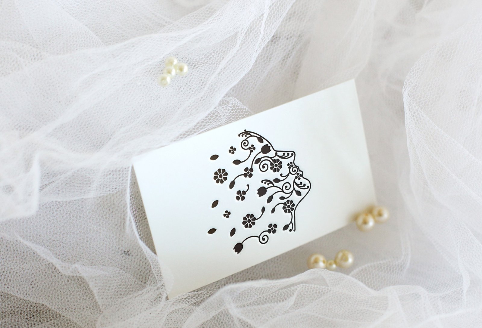
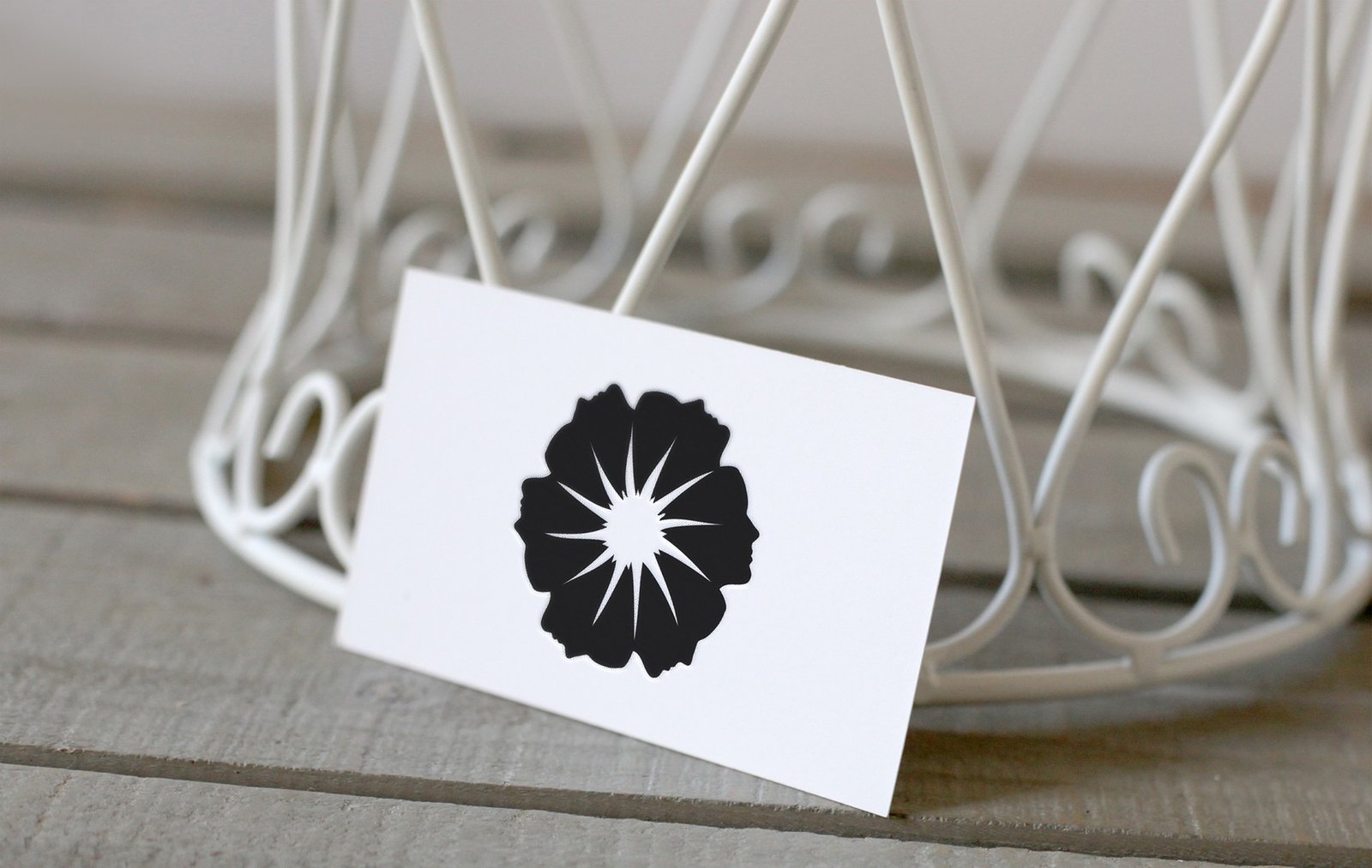
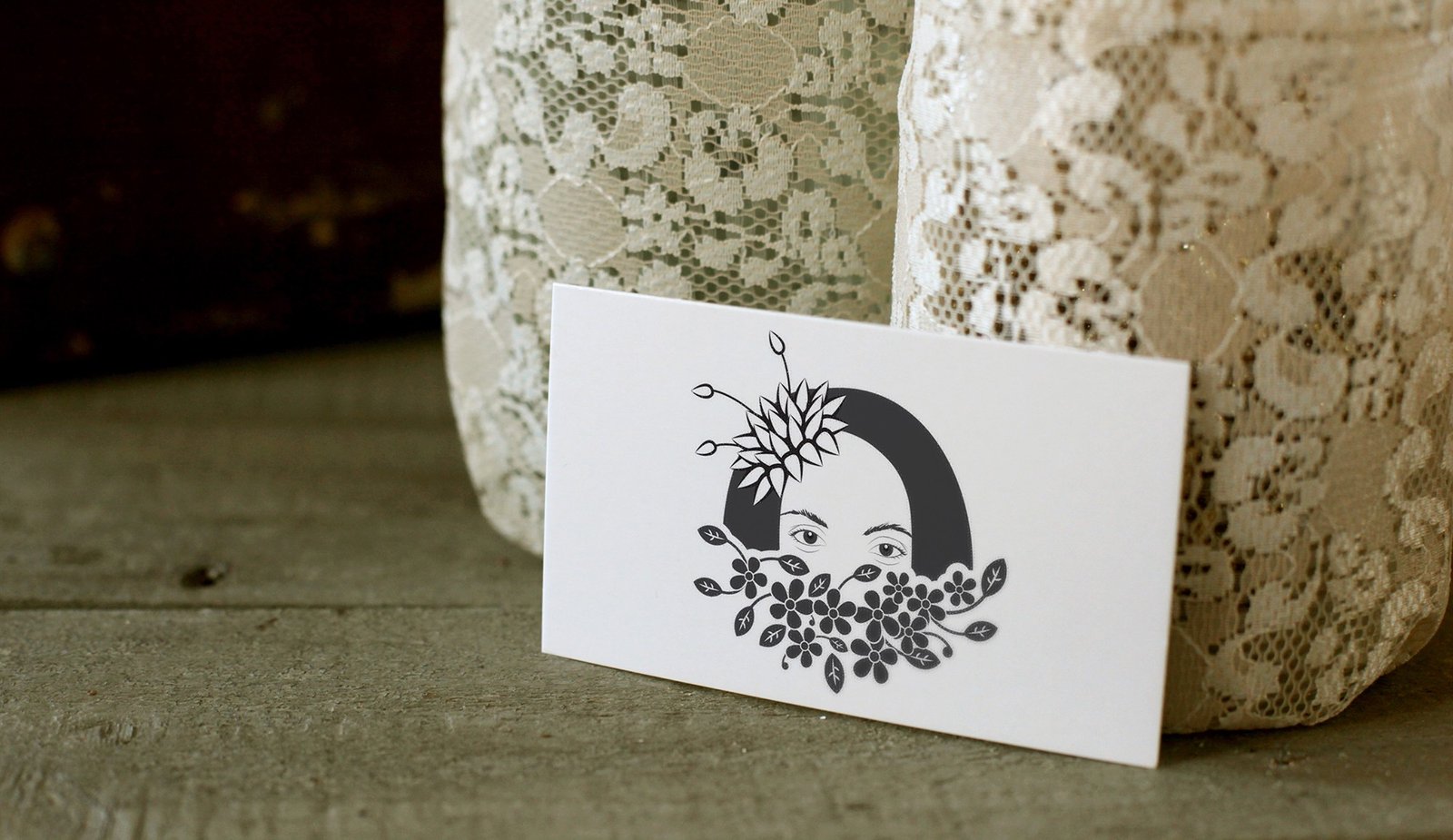
Our joint work lasted almost three months. Having gone through several “floral” variants, we emphasize the individuality of the jewellery maker. This is how the variants with the silhouette of her profile appeared.

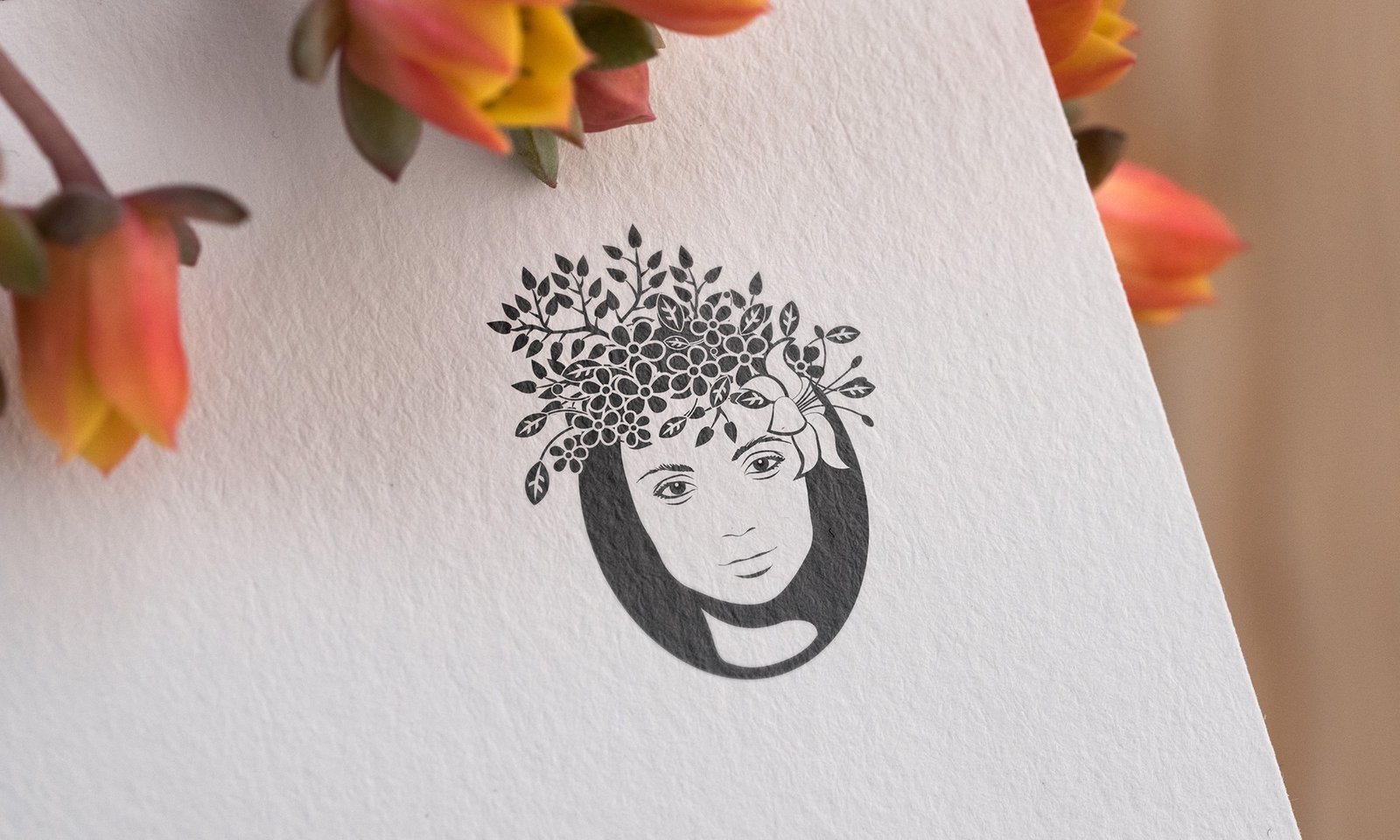
The direction is interesting. I went further and used a whole portrait. This is what came out:

Alas, in the process of searching, Katya decided to abandon graphic elements in the logo mark altogether and use only the font part as a watermark on the photos.

How the logo of The Word of Life literary project came into being

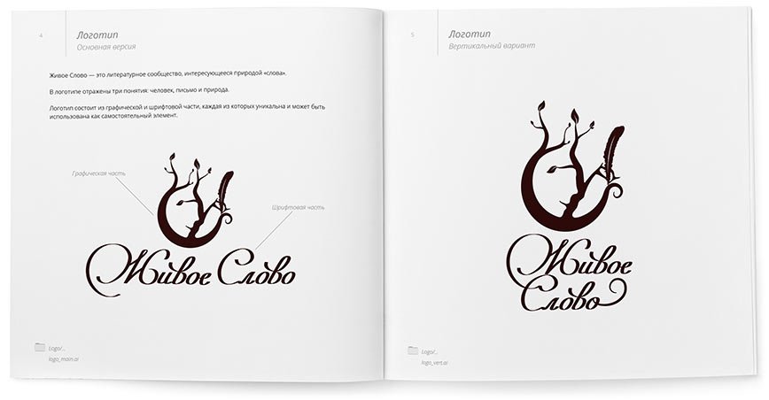
One of the latest works is a logo for the literary community “The Word of Life” in Israel, run by psychologist Lea Wedensky. The project is designed to develop a culture of self-expression, thinking and speech.

94-8.jpg.

At the beginning of the work on The Word of Life, we had a little mishap. The first discussions I had about the work to be done were not with the project manager but with his assistant. From him, we received an already existing graphic image of The Word of Life project together with wishes for the future logo.

The visual image of the project The Word of Life. Artist Masha Roitman

After working on the first sketch, we set up a general meeting, with Lea already present. It was there that we realised that we had been wrong. Her vision of the logo was completely different. Accordingly, our sketch “failed”.

The first sketch

By the way, I have a principle — to work directly with the person who makes the final decision on the project. If you don’t follow it, the result runs the risk of being far from the desired one, the project not being accepted, and the work starting all over again. It is good that this mishap became clear at the beginning of the work.

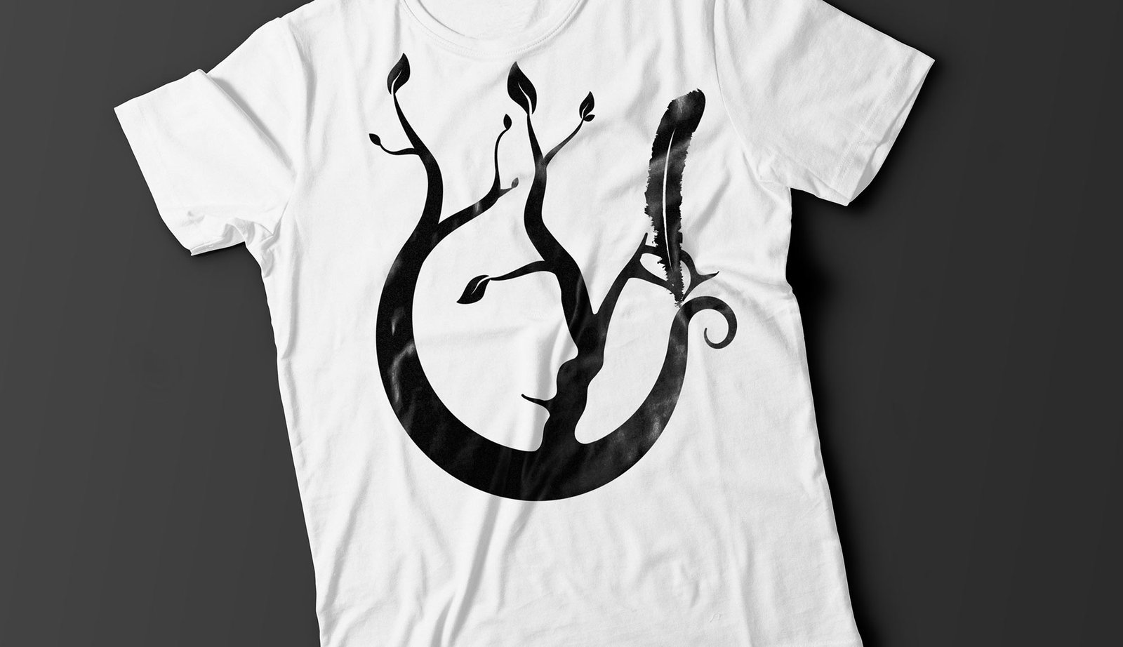
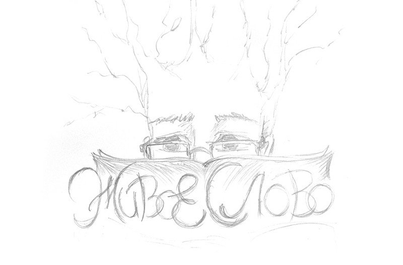
Having communicated with Lea, I got the exact wishes — the sign should be laconic, and reflect the person, letter and nature, i.e. the visual image of the project.

zs-3.jpeg.
The second sketch, which I continued to work on

I finalised the sign, practically without deviating from the sketch, and tried to make the font part “alive” by simulating writing with a pen. Below is the result:

By the way, in the finished logo, we also saw the shape of a pomegranate, and the pomegranate is a symbol of fertility in Israel. This finding especially pleased Lea :-)

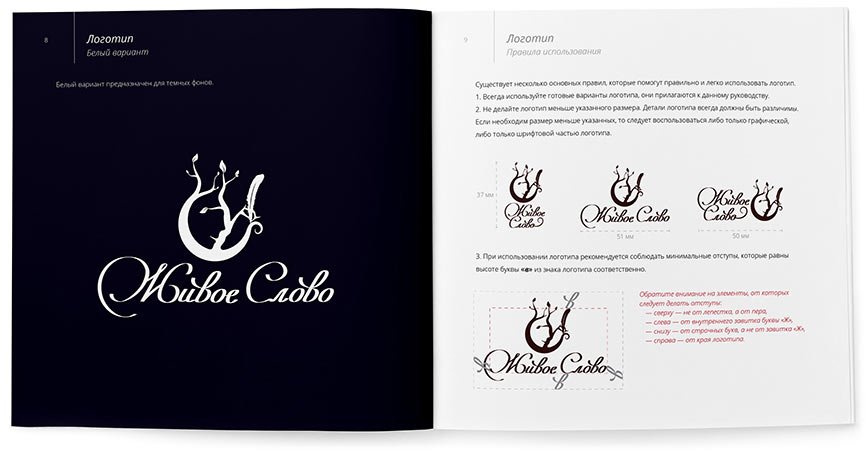
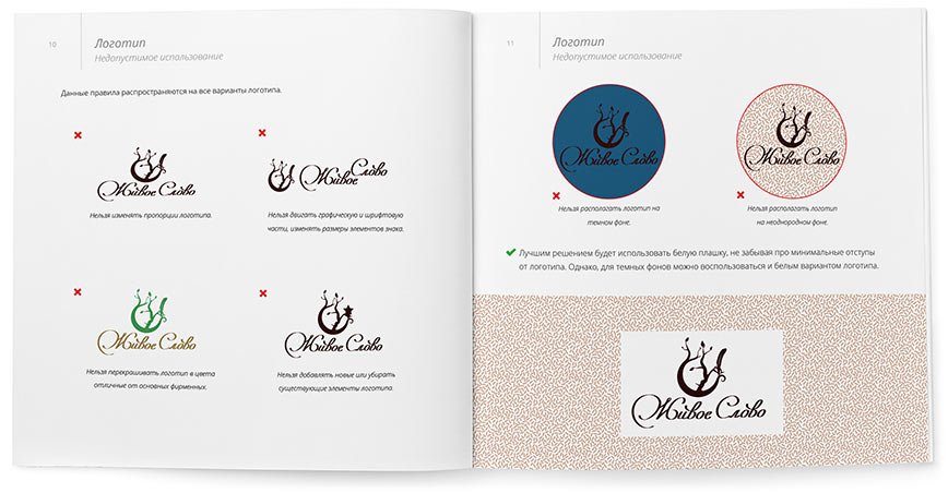
The rules and guidelines for using the logo are collected in a guideline:

Earlier Ctrl + ↓