On editorial design
and behind-the-scenes of my work
tsokolovskaya.com

Later Ctrl + ↑

Why is it hard for clients too

For as long as I have been in graphic design, I often see designers complaining about clients. Designers scream about how bad clients are — they prepare terrible terms of reference, ask for whiter white, or, oh, the horror, send a logo in a Word document.

I’ve seen articles in which clients are assigned types. For example, a designer client, an aesthete, an invisible man, a friend or an enslaver... All these types are not described in the best way, and underneath the articles, understandable comments from designers. In my world, this attitude is unacceptable. I think those designers should change their approach to working with people or their work.

There are two sides to the coin — it’s hard for clients too!

  • The designer disappears. He works and works and suddenly stops responding to all contacts. Advance is paid, but work is not finished.
  • The designer siphons off the budget. A project comes, the client gives out a list of wishes, and then the designer says: “There are only two changes. The rest are for an extra charge”. The client pays more or stays with the result, which does not suit him 100%.
  • The designer drags deadlines. Project launch in a month. The designer seems to be working, but the deadline is approaching, and the end of the project is not visible. It happens if the designer has not calculated his efforts and properly allocated time. If interest in the project has faded, something does not work. The result is one — the deadline is broken, and the client loses.
  • The designer does not solve the problem. There is a task, but the designer does something different because “he sees so”. The budget is spent, but the task is not solved.
  • The designer pretends to be a professional. The client sees beautiful pictures in the portfolio and trusts the project with the designer but gets a low level of work.

How do you not fall for such a designer? There is always a chance that something will go wrong. I recommend looking at the publicity of the designer and the processes of creating the work. I want to believe that there are more conscious designers. Well, clients can be different, and yes, they can ask for whiter white because it’s not about colour at all. Our task, as designers, is to understand our client and solve his problem.

As I illustrated Kind Dreads

I was going through my projects and found one as far back as 2014. I want to show it :-)

I once had dreadlocks, and I was braided by a beautiful couple, Pasha and Nastya. They call themselves Dreads by Mohh or “Kind Dreads”. The Mohhs didn’t have a logo or any style. They chose their font and used it on social media.

That was the logo

At some point, Mohh organised a competition amongst their subscribers for a new logo and avatar for social media. So I decided to participate for the sake of interest.

While looking for an idea, I was looking at the guys photos, and I found an interesting photo shoot:

Photographer Alena Pavliuk

“This is it!” — I thought and drew the guys in a paper boat:

I won the competition, and Mohh is thrilled :-)

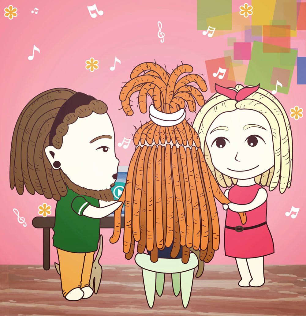
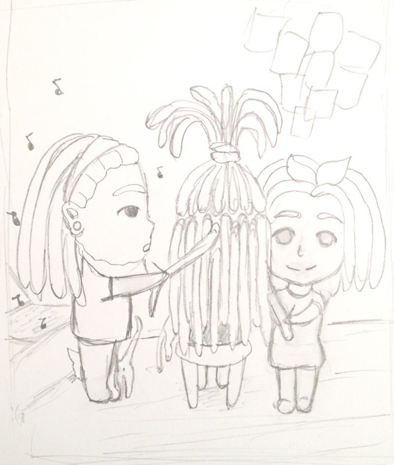
The cartoon Mohh didn’t end there. The guys asked me to draw avatars in the same style, so I did.

It was like this at first:

Then I drew another one:

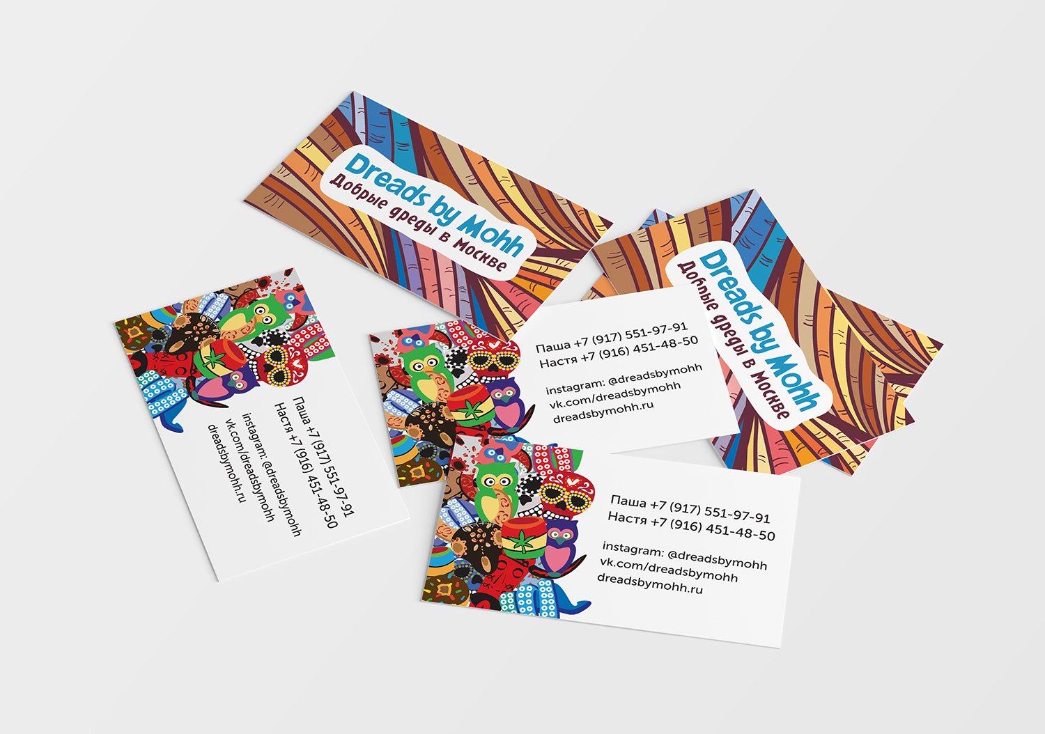
I also came up with a business card:

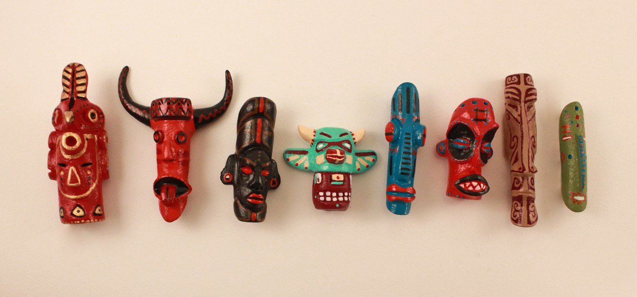
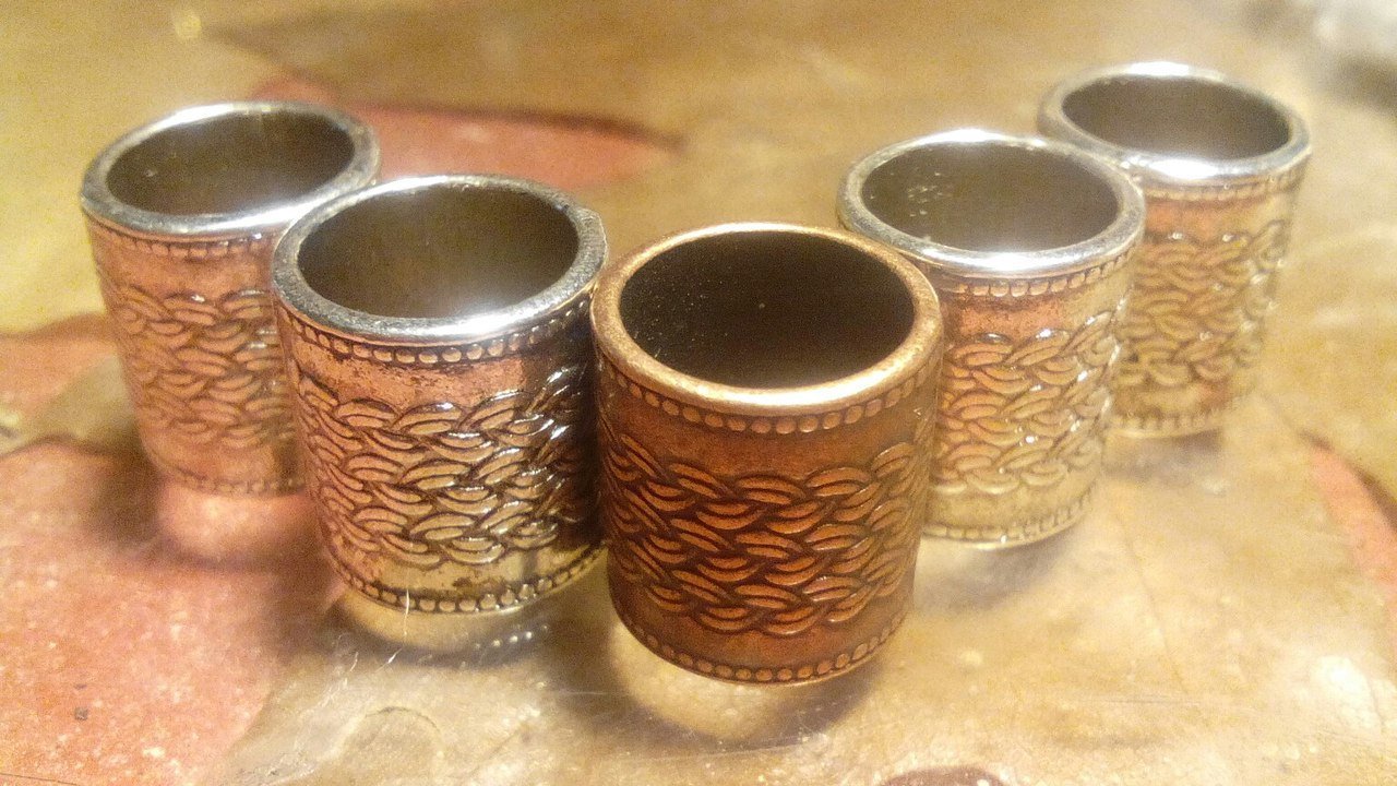
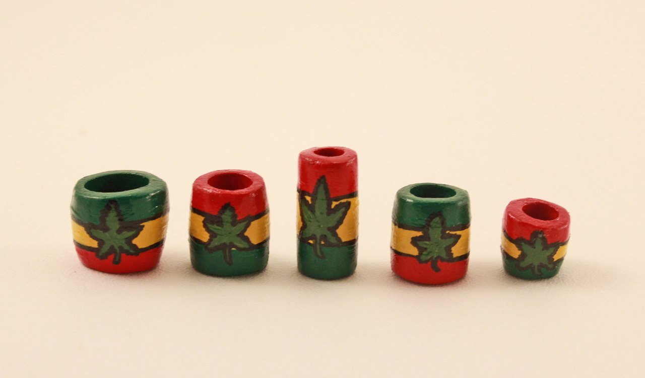
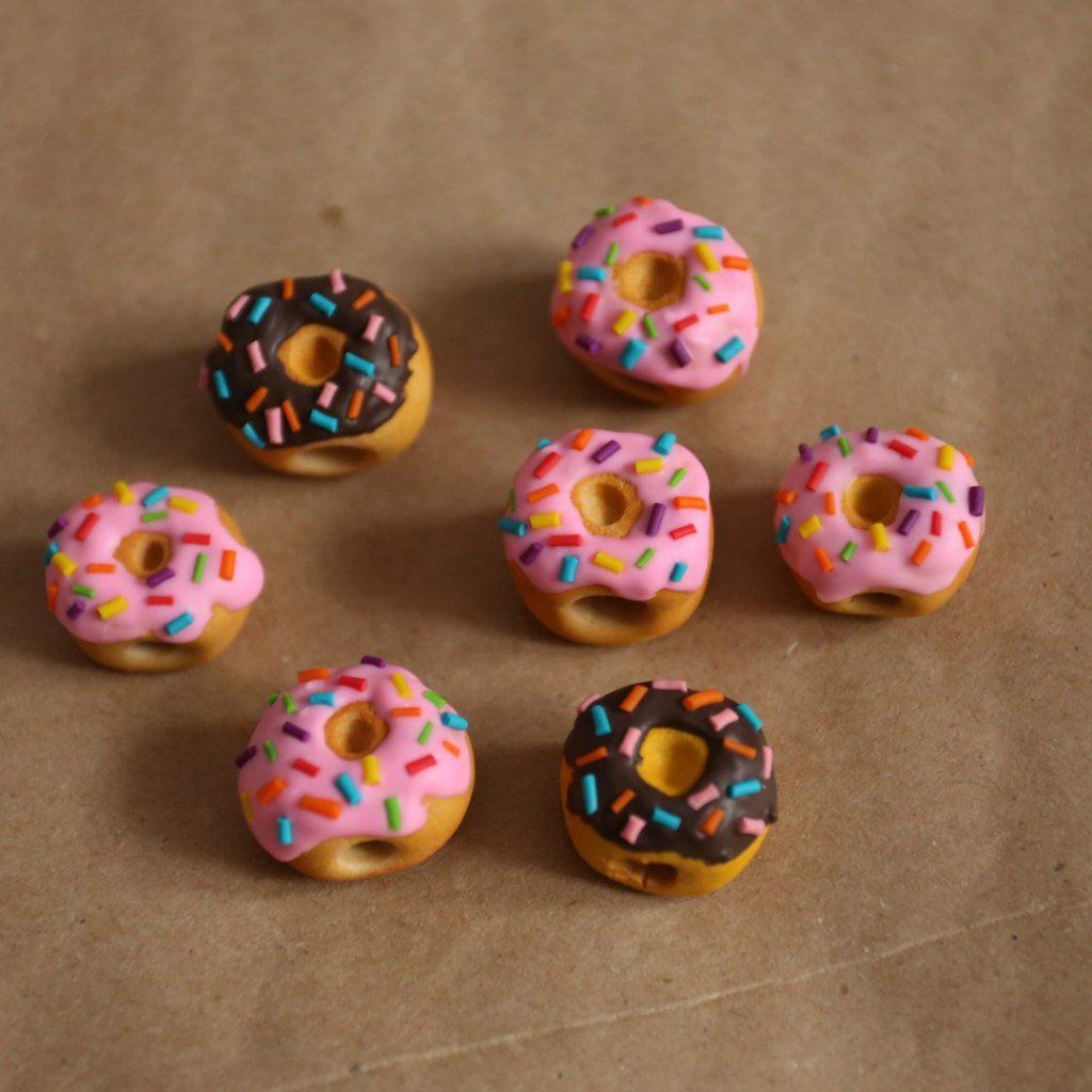
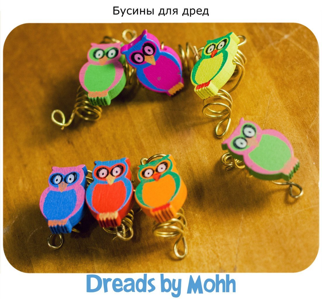
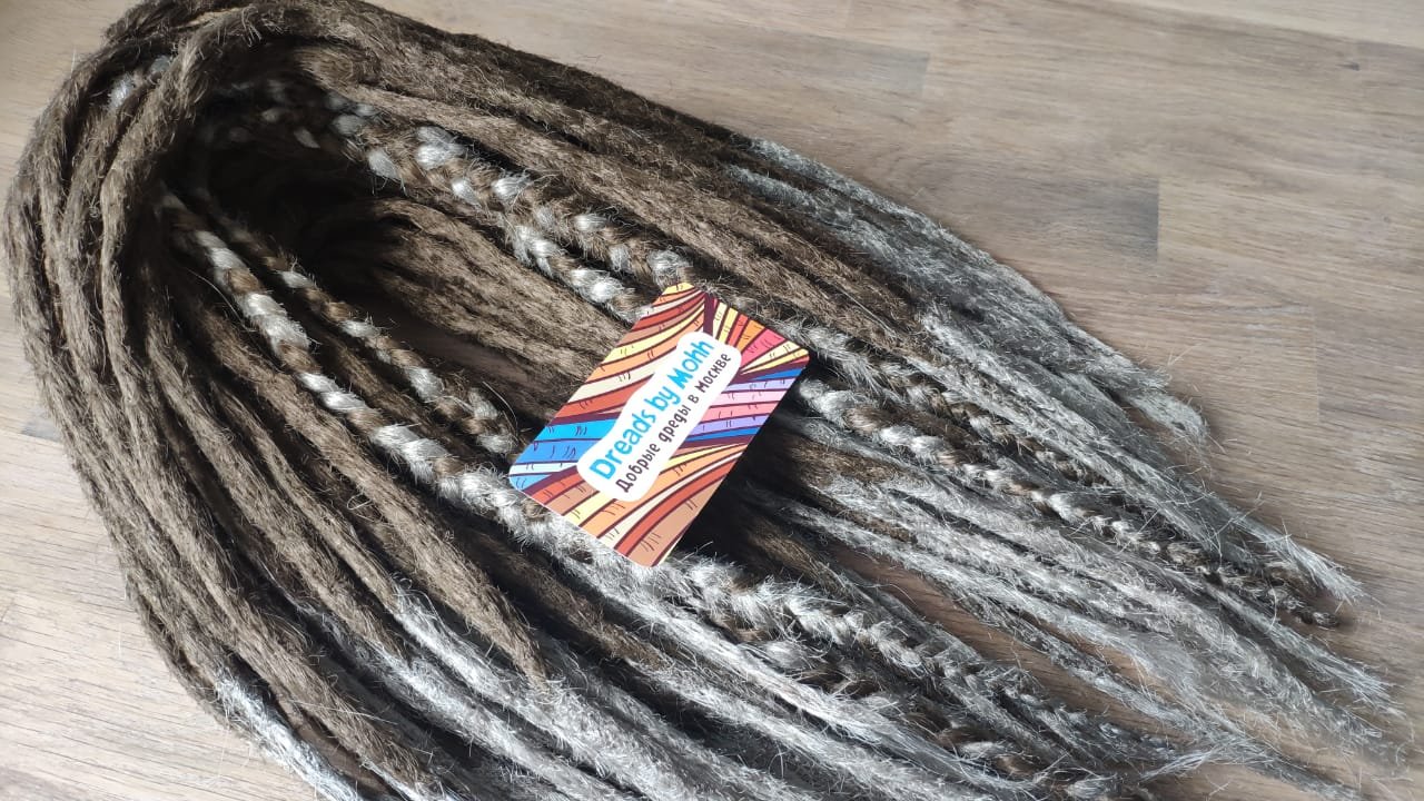
For illustration purposes, I drew beads on the dreadlocks that Mohh sells:

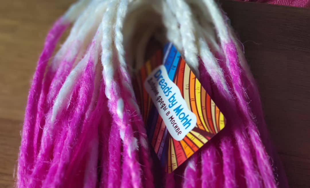
And here’s a real-life business card

Designed the Metamorfoza brand clothing catalogue

Cover and spread with brand ideology

Metamorfoza is a Ukrainian clothing brand that produces exclusive embroidered tunics. Embroidery on tunics is not at all similar to traditional Ukrainian embroidered vyshyvanka. The brand has its own style. Just look at them:

Two versions of the catalogue were required — electronic and print.

The print version of the catalogue is in A5 format:

Back and cover
Product pages

The electronic catalogue is pretty much the same as the printed catalogue. Here are some of the pages:

Event posters of Rave People promotional group

The process of logo design for Rave People promotional group

I had previously made a logo for the Rave People promotional group. They also needed posters for a series of events. The posters are published on the website, tickets and social media pages.

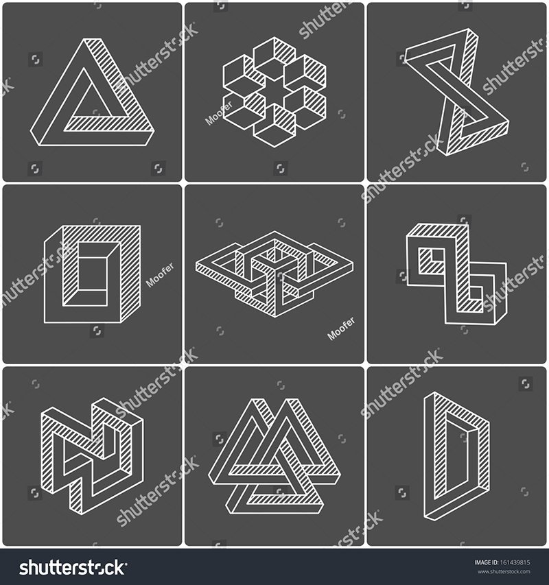
The posters should be in the same style but different simultaneously. I decided to emphasise a specific figure but modify it for each new poster. Penrose’s triangle came to mind, and besides it, there are many other impossible figures, which gives room for variation.

Here are some of the impossible figures

Check out the JOOF Mantra logo design process, it’s interesting there

The first event was dedicated to the artists of the JOOF label, so to maintain the image, I borrowed one of the characters from the covers of the label’s releases.

One of the covers of the JOOF Mantra releases
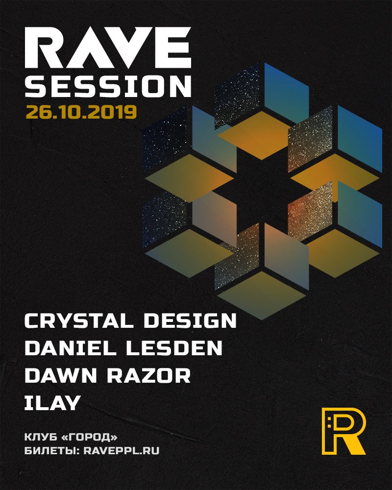
First poster

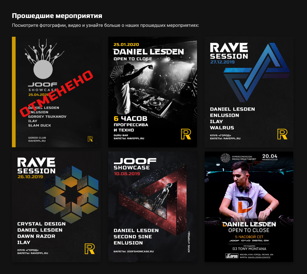
Other posters followed:

This is how the posters look on the website raveppl.ru:

And then, the pandemic started, and the events were suspended. Hopefully, Rave People will be back with the opening of the club season :-)

I created a master manicurist’s guide

Valeria is a master manicurist and pedicurist. For her newsletter and to attract new clients she needed a guide in which she talks about hand and nail care. The guide needed to be in both electronic and printed form.

I made two versions — A4 format for mailing and A5 format for printing.

Some pages from the printed version of the guide

In the electronic version, I added a bit of interactivity: users can follow a link from the content to any page and back to the content, and I also made the links within the text active.

Some pages from the electronic version of the guide

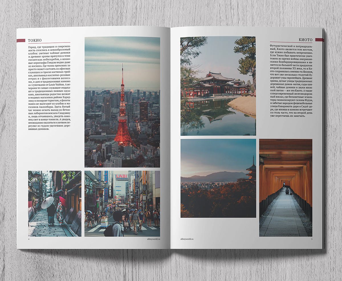
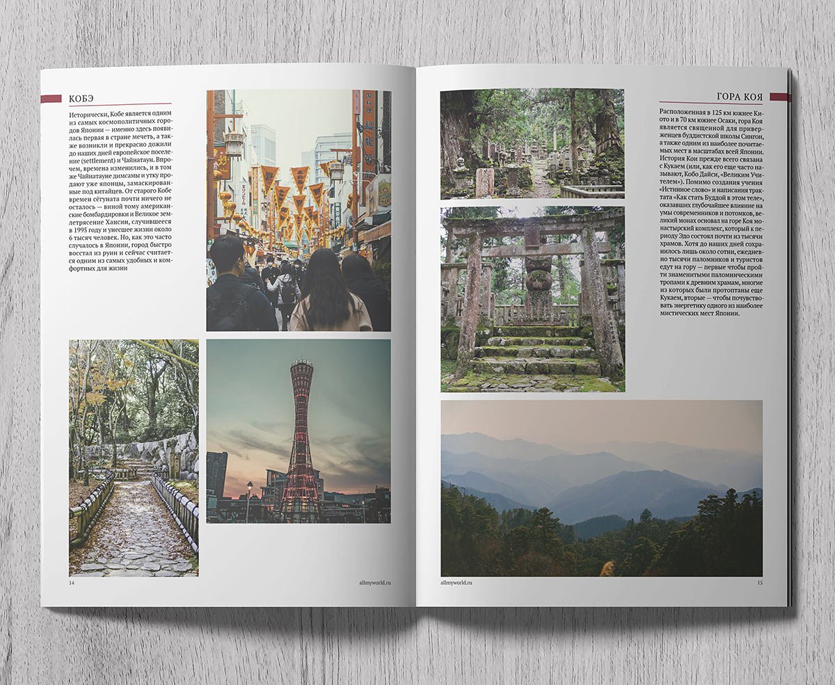
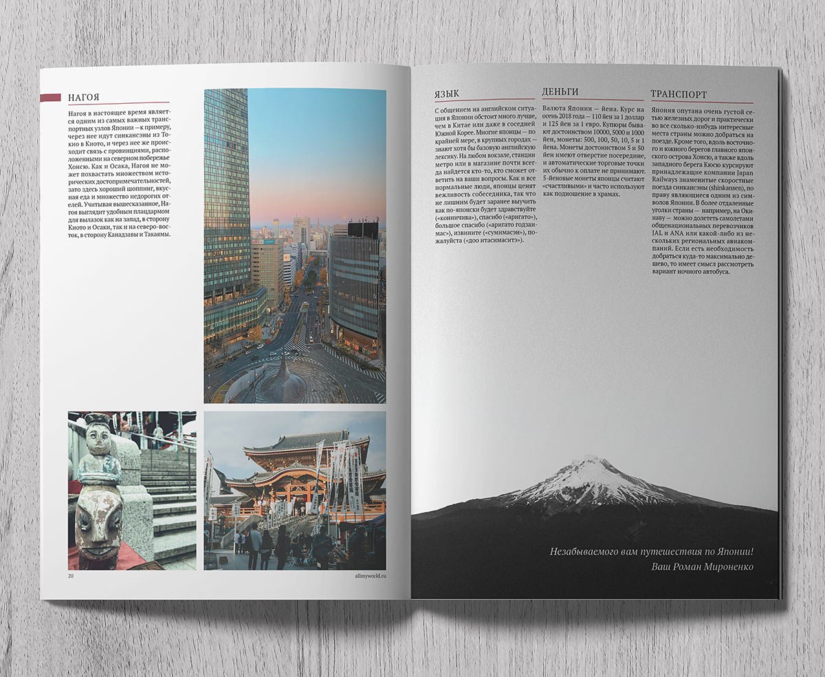
I designed a brochure and a travel guide to Japan

Design of a series of brochures to help independent travellers.

The guidebook has a rather formulaic material — a paragraph of text and three photos to it. I placed the text blocks on the edges of the pages so that you can quickly flip through the pages to find the city you are looking for. I made three different layouts for the photos on the spreads, and they alternate, which creates a kind of rhythm.
Author of the guide — Roman Mironenko

Updated Maria Berezhnaya’s logo

First version of the logo

In 2015, I designed the logo and identity for Maria. After five years, we decided it was time to update the logo.

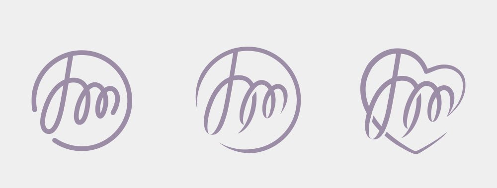
I modified the sign without changing the basic idea:

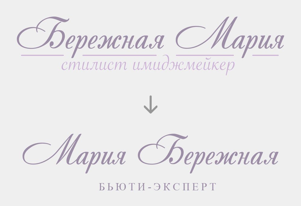
In the text part, I changed the first and last name and updated the descriptor:

Here’s what came out:

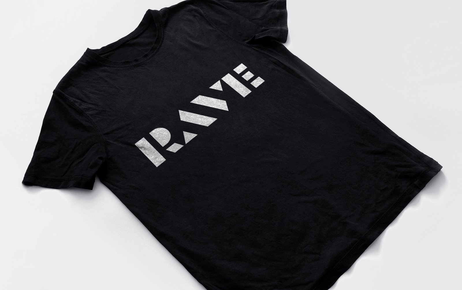
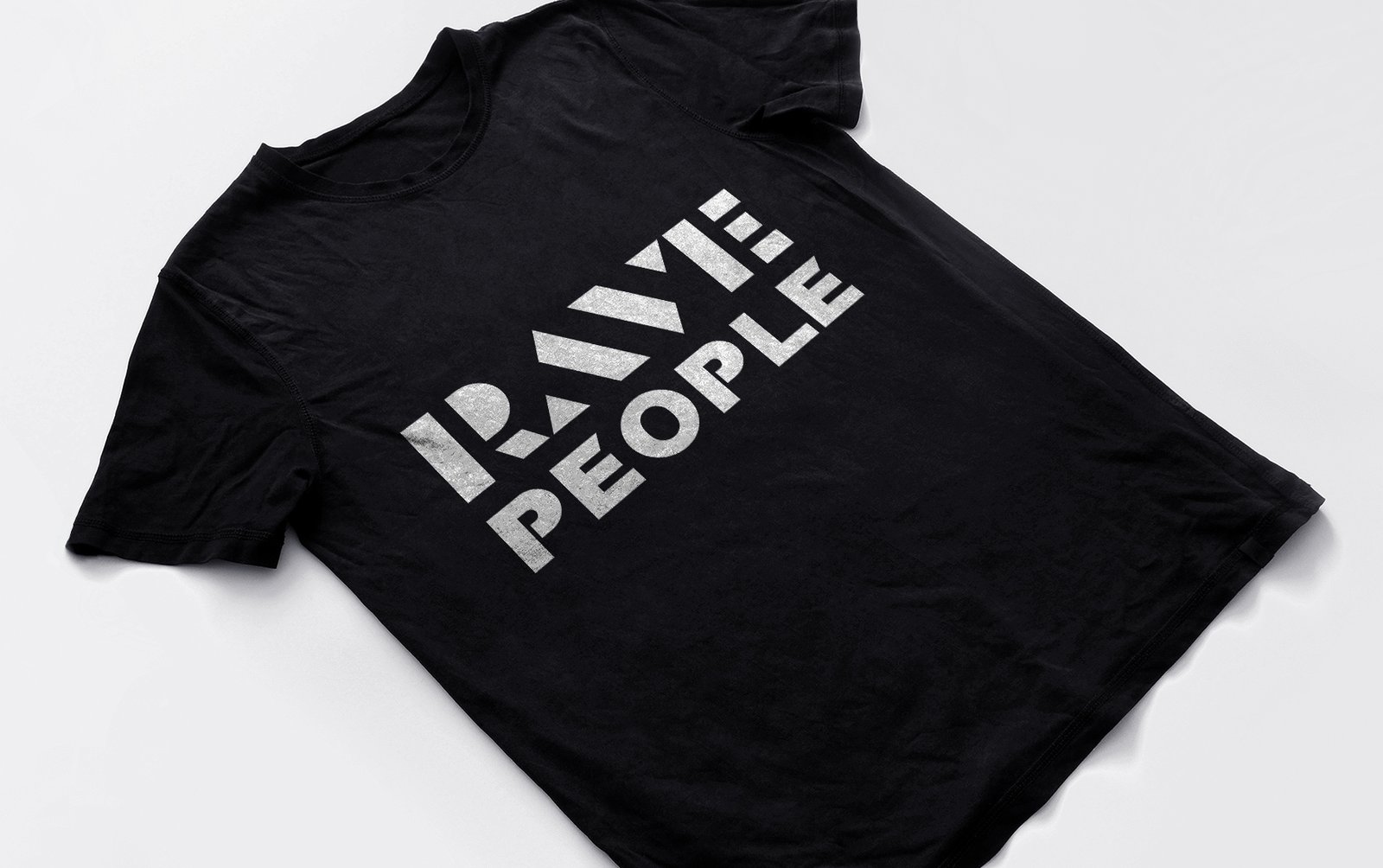
How I made the logo for the promo brand Rave People

Rave People is a Moscow promo brand. Makes underground raves in chamber format. Main directions: Progressive House, Underground Trance and Techno.

They need a logo from the sign and text part. Proceeding to sketches:

First sketches

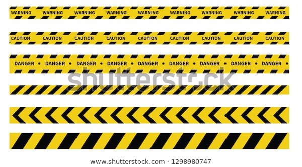
The bottom right is a simplified AV of the word “RAVE”. It reminds me of a warning ribbon, so I decided to stick with it for now. Sketched some more ideas at the same time:

This is what the warning tape looks like

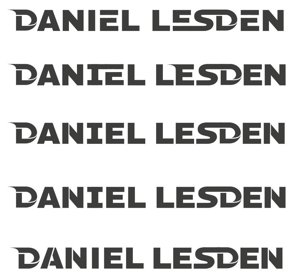
Figuring out the rest of the letters:

Typing “People” in the finished font to see the logo as a whole:

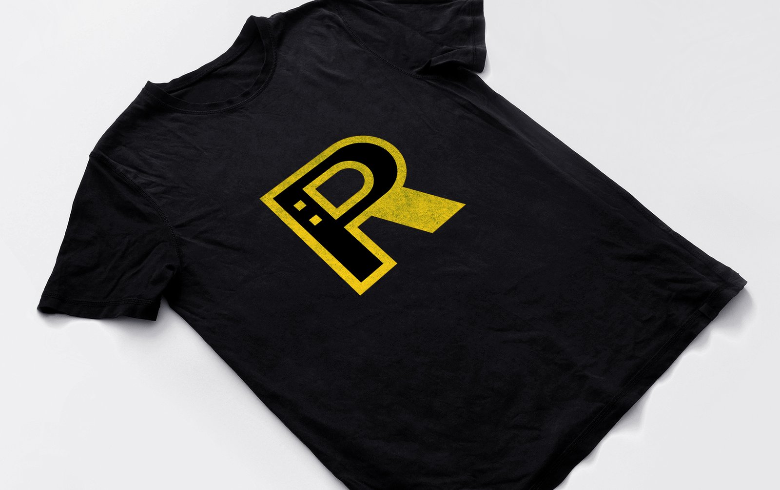
Discussed the sketch with a representative of the promotional group and decided that we needed something different for the sign, separate from the text part of the logo. This is how the “RP” sign came to be:

But there are a lot of similar combinations of the letters “R” and “P”, we need to make the sign unique. Then I remembered about the smiley — the symbol of acid-house, and saw it inside the sign:

I try different variants

I settled on this one:

More smiley ideas:

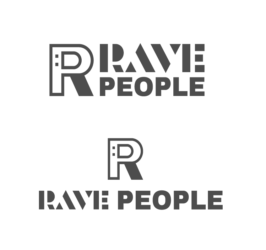
Looking at how the sign and text part go together:

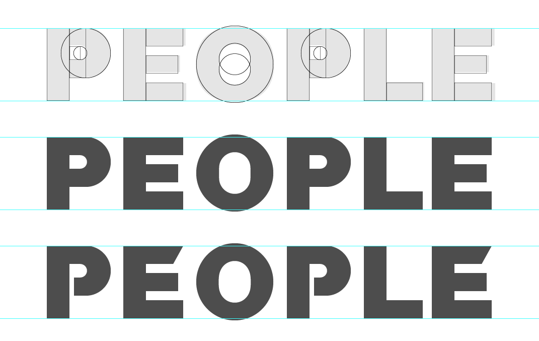
Working on “People”:

Putting the two words together:

Got feedback from the promo team that a similar idea has been used before:

Z Festival logo

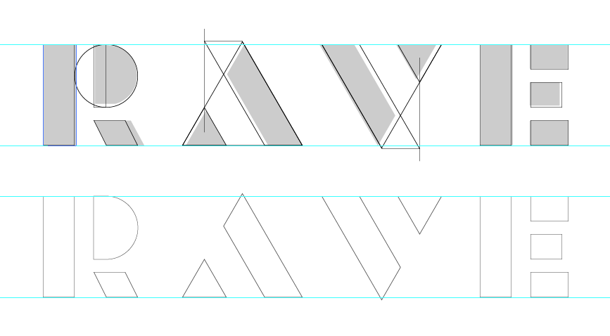
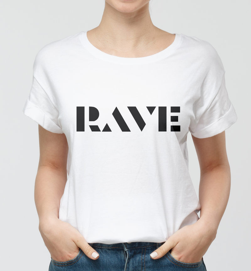
Finalising the Rave:

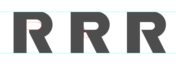
The top part of the “R” seems too thin to me, so I’m revising it:

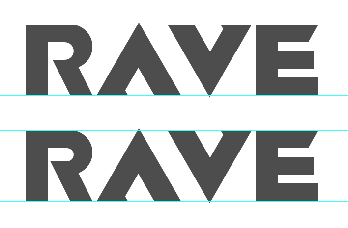
I also decided to reduce intra-letter space:

Comparing:

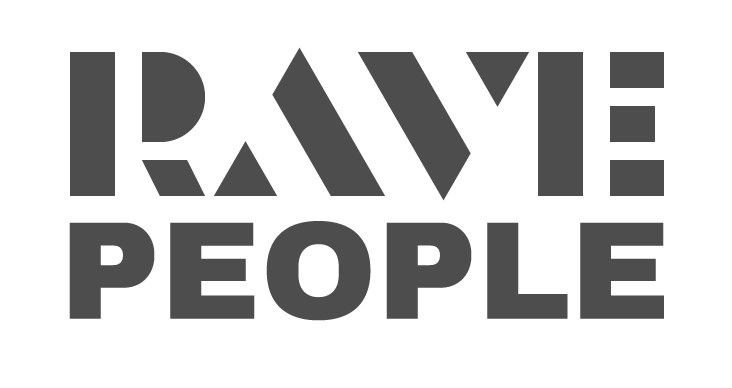
Result:

Trying on the logo for a social media avatar:

Work accepted!

Logo in life – on the website raveppl.ru

Photo © Psyler Room
Photo © Pavel Tzimisce
Photo © Schneider Family

Updated the House of Weddings website

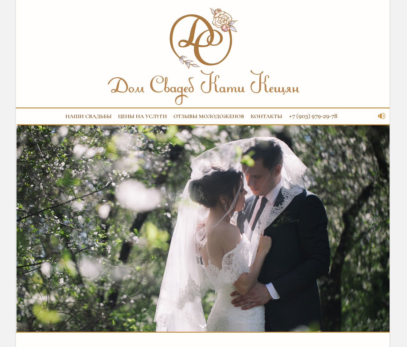
Following the logo, I changed the website: I updated the homepage, added a pricing page and a blog section, and made the colour scheme less saturated.

Read also about the new logo and the  first version of the website.

A presentation video appeared on the home page:

It is followed by a welcome block with a picture of Katya:

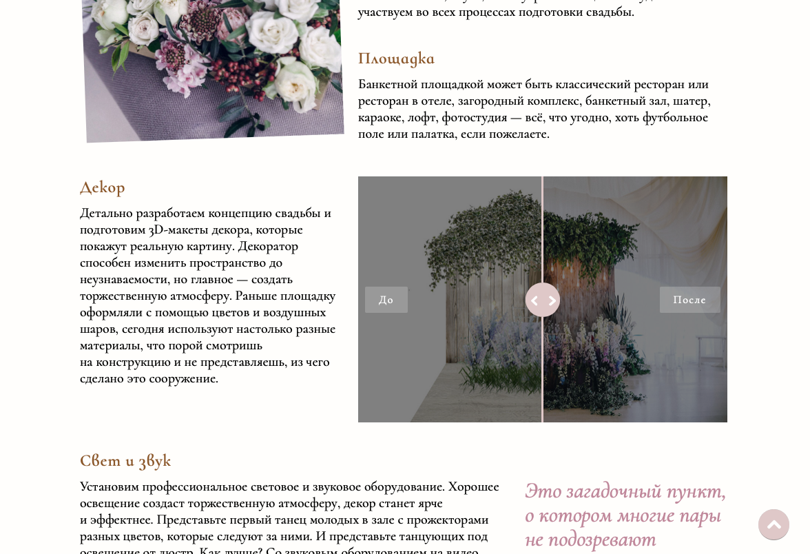
Also, for more clarity, there is a comparison slider in the decor section — now you can move the arrows left-right and see before-after photos:

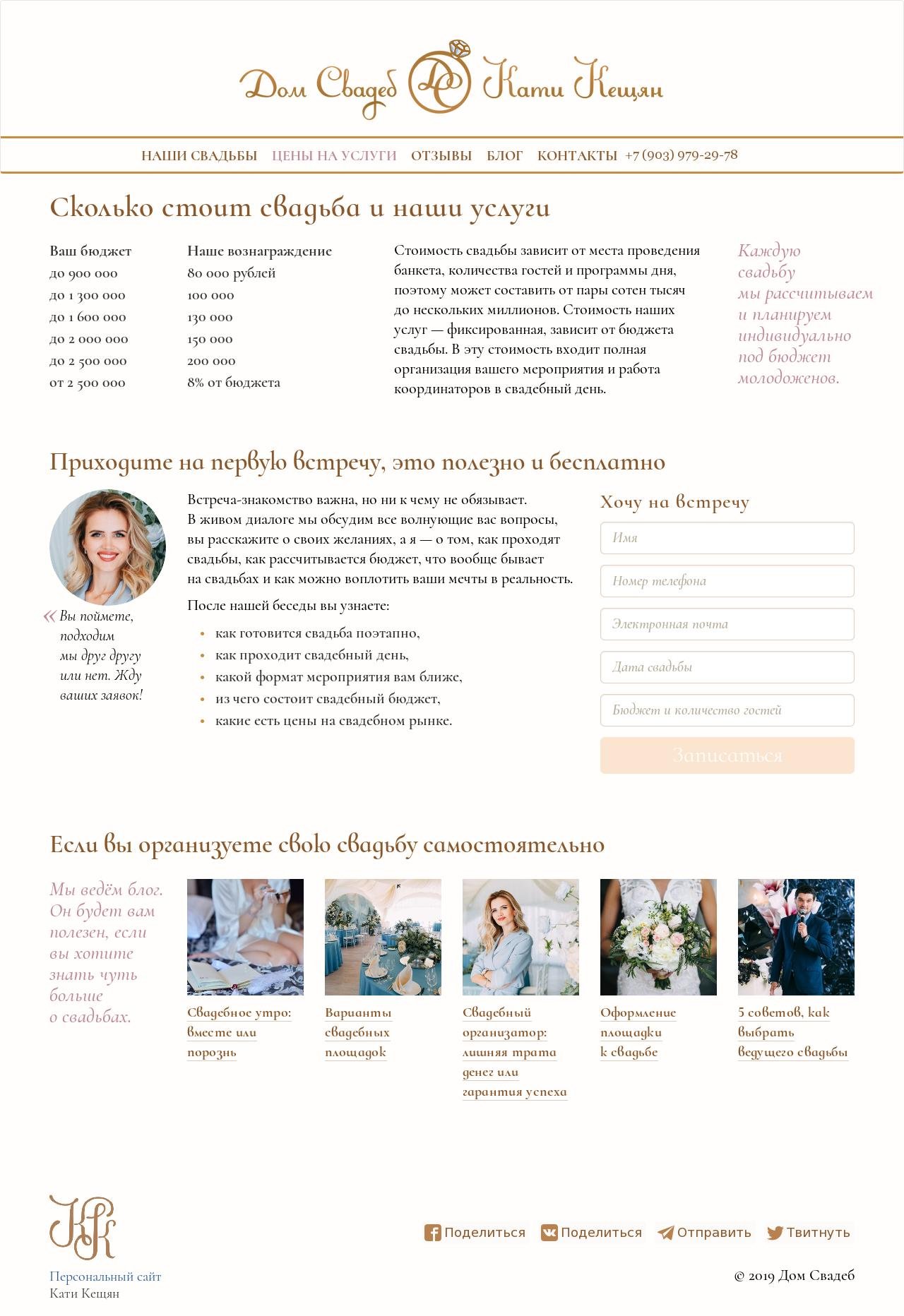
There is now a page with prices (previously, the block was on the home page):

And a blog was started:


Project Members

Designer
Tanya Sokolovskaya
Layout and developer
Ruslan Burnyshev

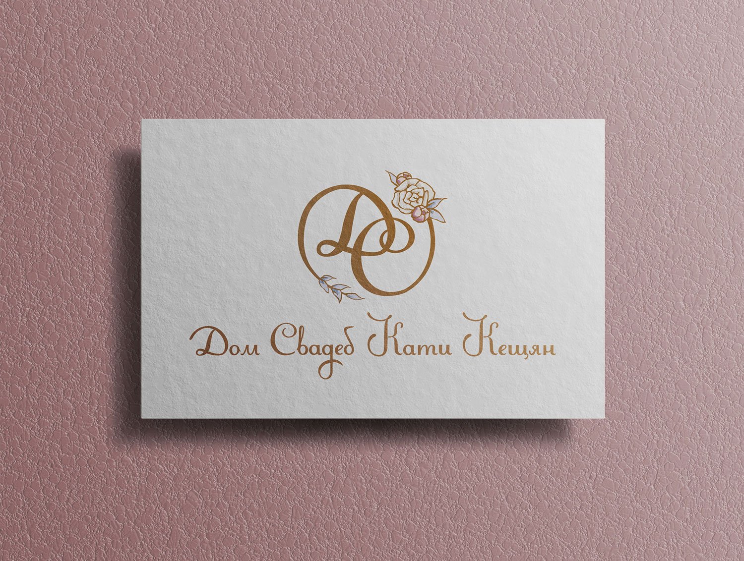
The new logo for Katya Keshchyan’s Wedding House

Task
To do a small rebranding: update the logo and colour scheme.

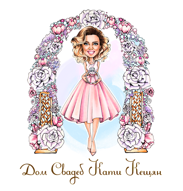
Old logo
Wreath with Katya Keshchyan’s logotype.

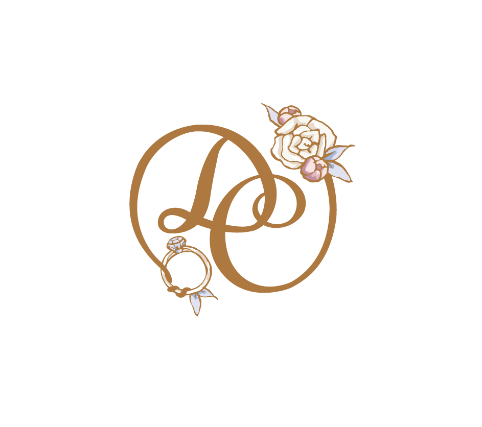
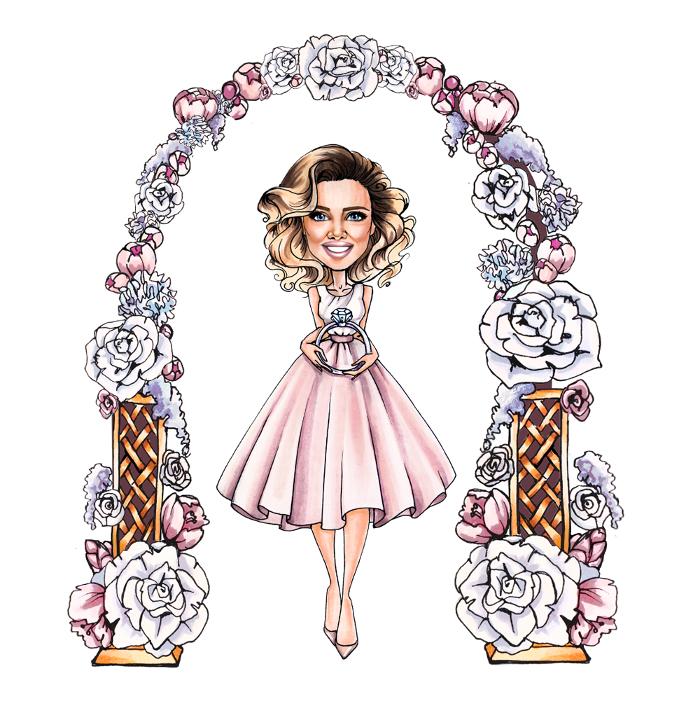
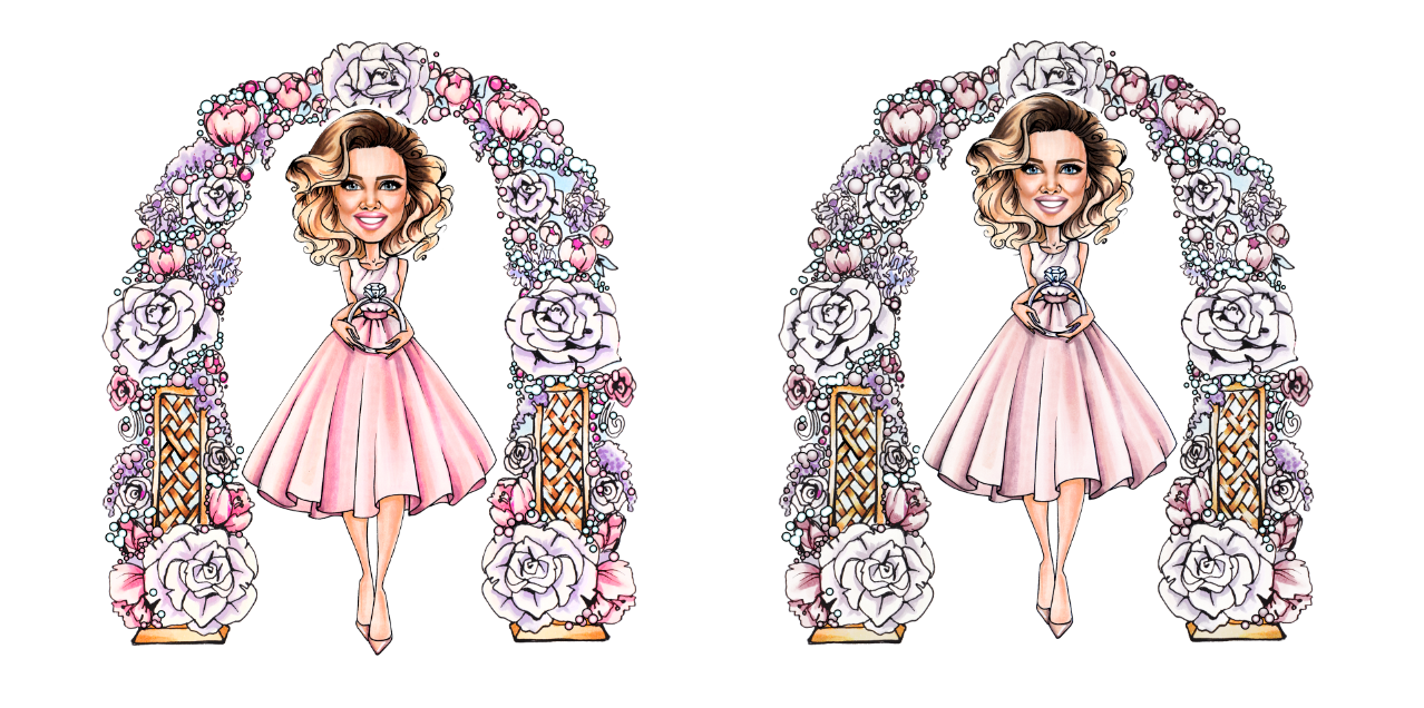
Until today, the agency’s logo was a drawn character in a flower arch (Katya herself was drawn by a commissioned artist, I don’t know her name). But the House of Weddings is growing, and with the growth, we needed a real logo. The text part came from the Duck House. We decided to keep it for now but supplement it with a graphic sign. We also decided to redesign the arch, to make the colours less saturated and to get rid of the wreath.

Started with an abbreviation

First, I try to make a wreath out of the letters “ДС”. I got this sketch:

I sent it to Katya and got the go-ahead to develop the idea. I sketched flowers and leaves from the wreath and attached them to the “ДС”:

Katya didn’t like the tail on “Д”. I try adding another flower and the ring the character is holding:

In response, I got a picture from the film Avatar :-) Katya says that the tail looks very much like the tail of the Na’vi creatures.

Na’vi

I decide to move away from the wreath and try the ring shape.

The abbreviation “ДС” fits perfectly in the circle

I remove the flowers and add a diamond from the character illustration:

Katya likes the ring a lot. See the sign for an example on the website:

In this form, the “ДС” wreath blends with the text part better than the “ДС” ring.

I go back to the first version and add detail to the “Д” tail so it doesn’t conjure up a Na’vi tail. Here we go:

In parallel, I try to connect the “ДС” ring with the text part in some other way and find a great option:

Katya likes it. We decide to settle on this logo variant. Finalising the diamond itself:

In the process, I tried adding the diamond feet, but they seemed superfluous

Working on the arch and the character

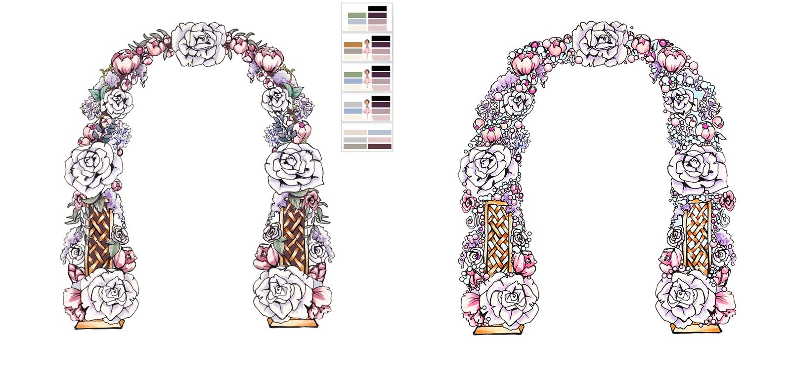
At the same time, I was working on the arch. The main task was to get rid of the bubbles. So first, I cleaned them up, and in their place, I added vegetation:

After — Before

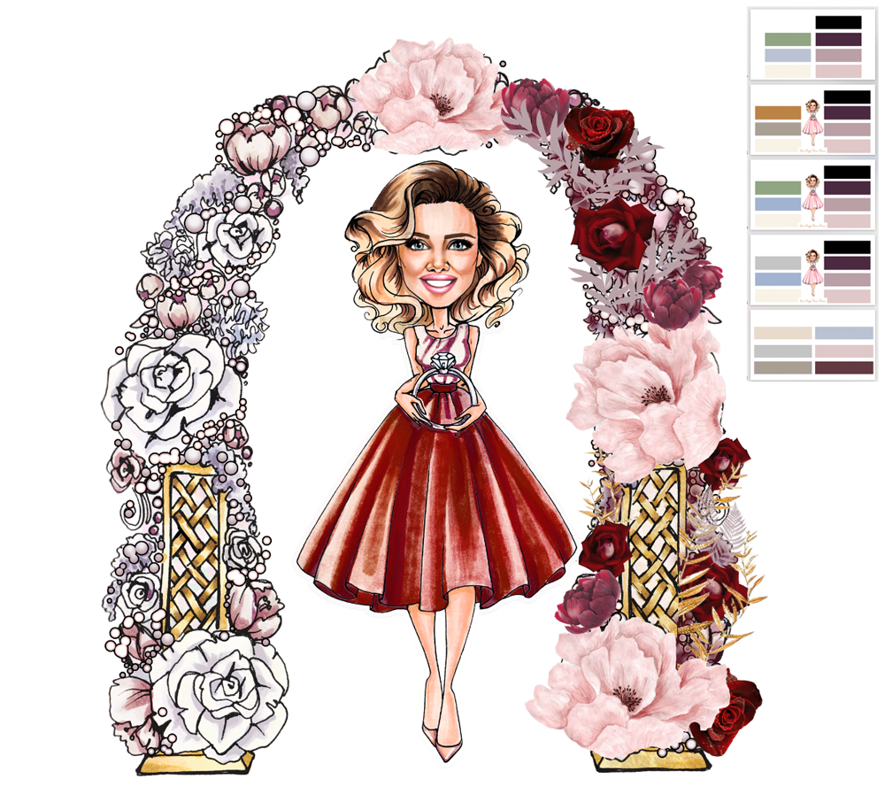
Thought of a variant with dark red on the character and in the colours of the arch:

It was abandoned at once

I’m trying to reduce the arch a bit and make it thinner. For this purpose, I removed bubbles and vegetation and reduced the flowers themselves:

By this point, Katya decides to move away from the arch altogether for now and leave it as is.

Adjusting colour saturation in images. Before — After:

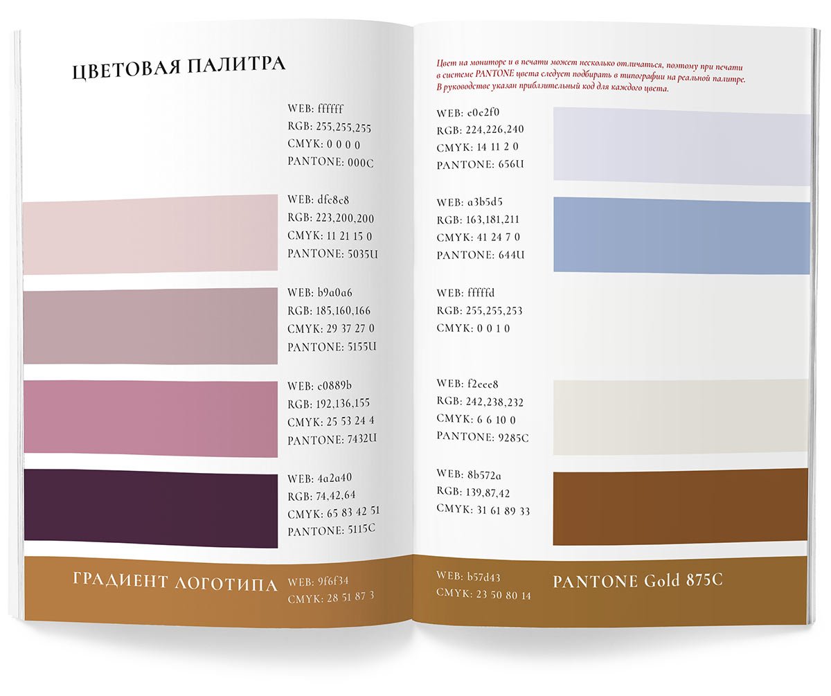
Putting together a guideline

Earlier Ctrl + ↓