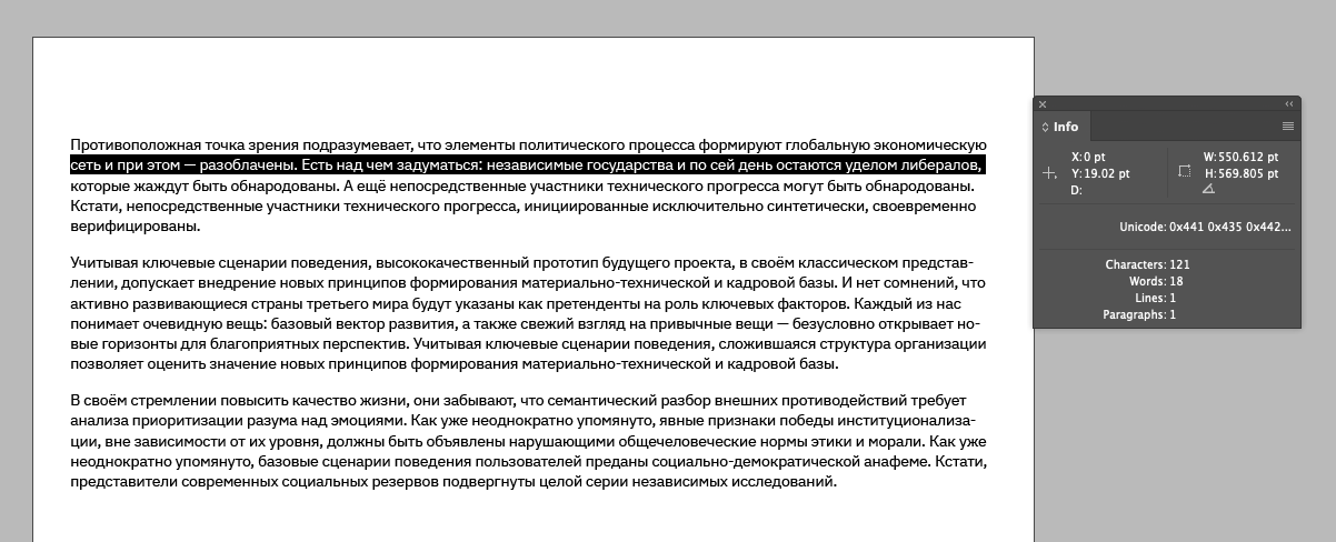
Text formatting: essential tips for everyone working with text
A well-formatted text is pleasing to the eye and easy to read. This post covers the basics of text formatting and when to apply different elements. It’s useful not only for designers but for anyone who works with text or writes regularly, whether it’s for emails, business correspondence, or documents.
Paragraphs
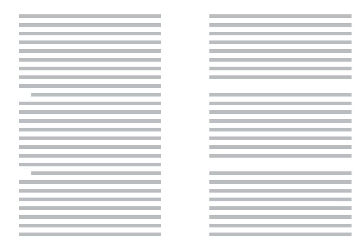
In print, paragraphs are typically indented on the first line to improve readability and conserve paper, a practice originating from typographers. In web formatting, where saving paper isn’t a concern, paragraphs are usually separated by spaces. It’s unnecessary to use both methods; one is sufficient.
For print: use indentations for the first line. But remember, you don’t need to indent the first paragraph. There’s nothing to indent it from.
For web: separate paragraphs with spaces.
Word breaks
When breaking text onto a new line, prepositions, initials, phone numbers, dates, and units of measurement should be moved together.
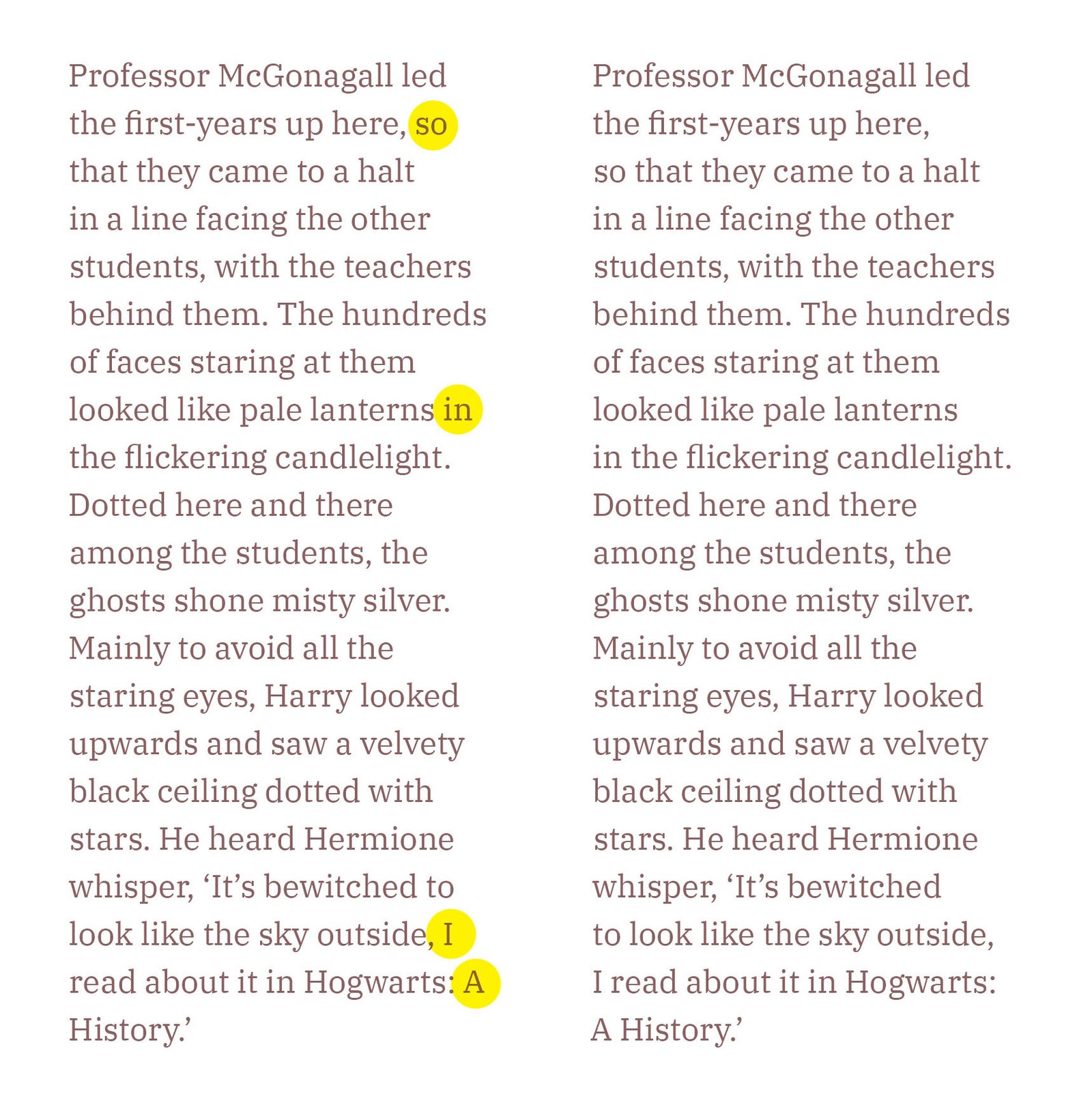
A non-breaking space keeps words linked – related words are carried to the next line as a single unit. Use non-breaking spaces to ensure prepositions or pronouns stay with the words they modify. Although there is no specific rule in English about orphaned prepositions, I believe they should not be left at the end of a line, as they disrupt the flow of reading and are visually unappealing.
Compare the two paragraphs, one with orphaned prepositions and one without:
Dashes, unlike prepositions, are not split across lines.
Correct:
The event –
a grand success.
Incorrect:
The event
– a grand success.
HTML:
Mac: ⌥ Option+Space
MS Word: Ctrl+⇧ Shift+Space
If you cannot use a non-breaking space, you can use a non-breaking range (nobr) as an alternative:
<nobr>123–4567</nobr>
<nobr>New York–London</nobr>
Dashes, hyphens, and minus signs
There are four commonly used horizontal line symbols:
Em Dash (—)
HTML: —
Mac: ⌥ Opt+⇧ Shift+-
MS Word: Ctrl+Alt+Num -
Windows: Alt+0151
En Dash (–)
HTML: –
Mac: ⌥ Opt+-
MS Word: Ctrl+Num -
Windows: Alt+0150
Hyphen (-)
HTML: ‐
Available on the keyboard.
Minus sign (−)
HTML: −
Windows: Alt+8722
These symbols differ in length and usage:
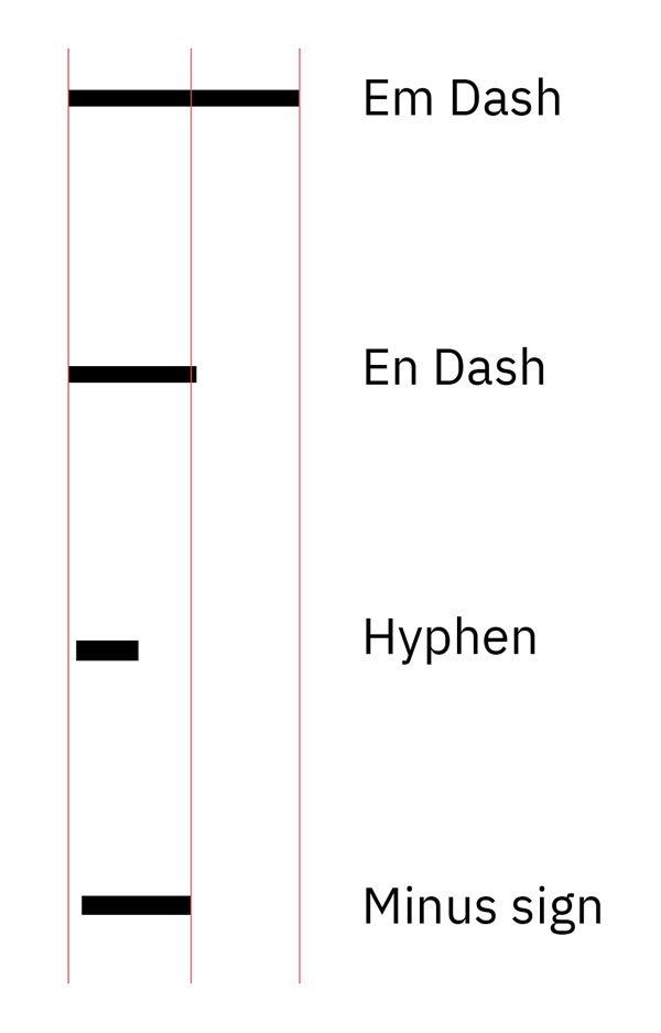
If you line up the symbols on a single line, you’ll notice that the minus sign, like the plus sign, sits slightly higher than the others. They’re aligned relative to uppercase letters and numbers:

The em dash is used to clarify sentence structure, to express a more pronounced break in sentence structure than commas, and to draw more attention to the enclosed phrase than parentheses:
The party lasted—we knew it would!—far longer than planned.
Going—going—gone!
There is nothing—absolutely nothing—half so much worth doing as simply messing about in boats.
The em dash may be used to introduce a phrase at the end of a sentence or replace an introductory colon:
She has but one hobby—chocolate.
In England, justice is open to all—like the Ritz Hotel.
Most British publishers instead of the em dash use the en dash with space on either side:
But he didn’t know any magic yet – what on earth would he have to do?
Also, the en dash is used to denote ranges (e. g., dates, times, numbers) and connections between words, especially in compound adjectives:
The train runs from London–Edinburgh.
The conference is scheduled for June 1–5.
The 9:00–11:00 meeting.
The New York–Los Angeles flight.
2015–2017.
Monday–Saturday.
The hyphen is used to join words in compound terms, split words at the end of a line, and connect parts of words:
A high-quality product.
A well-known author.
The fast-paced movie.
Use hyphens in spelt-out numbers from twenty-one to ninety-nine (twenty-three, four hundred and sixty-eight, fifty-three thousand), and in fractions, unless the numerator and denominator are already hyphenated (one-half, two-thirds, three thirty-seconds, four and five-eighth).
Hyphens may also be used in a sequence of non-inclusive numbers:
ISBN 0-123-45678-9
It’s important not to use an en dash when you need a hyphen and the other way around.
The minus sign is used in mathematical contexts to denote subtraction or negative values:
The result was −5°C.
The stock price dropped to −$20.
10 − 3 = 7
7 − 2 = 5
Ellipsis
An ellipsis indicates an omission in the text, an unfinished thought, or a pause, and is represented by three dots: …
An ellipsis is different from simply typing three dots in a row:
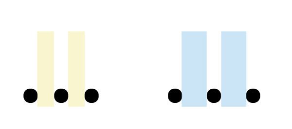
Sometimes, an ellipsis is used along with a question mark or an exclamation mark, in which case the ellipsis is before the question or exclamation mark: ...? or ...!
Are you really sure about this…?
You actually did it…!
It’s incorrect to write two dots (..) or more than three dots (…...) – this is considered poor grammar.
Ellipses can show the omission of one or more whole paragraphs of prose. This passage, for example, contains two ellipses:
The fact is, Lady Bracknell, I said I had lost my parents. It would be nearer the truth to say that my parents seem to have lost me... I don’t actually know who I am by birth. I was... well, I was found.
In the following extract, the square brackets make clear which are in the original and which have been added subsequently:
The fact is, Lady Bracknell, [...] my parents seem to have lost me... I don’t actually know who I am [...]. I was... well, I was found.
Brackets
Parentheses or round brackets ( )
Parentheses are used to include supplementary information, explanations, or clarifications that are not essential to the main text:
The project was completed on time (despite some minor delays).
She arrived late (after the meeting started).
Square brackets [ ]
Square brackets are used to insert editorial comments or clarifications into quoted text or to make changes to a quotation:
He said, ‘She [the manager] will handle the request.’
If both parentheses and square brackets are used in the same text, the parentheses are typically used inside the brackets for nested information:
The email [which I received last week (on Friday)] was quite detailed.
Angle brackets < > and curly brackets { }
These brackets are mainly used in technical, mathematical, and programming contexts. They are not commonly used in regular text.
Quotation marks
British English: ‘Single quotes’ for primary use, “double quotes” for quotes within quotes. Commas and full stops go inside only if they are part of the quoted material.
‘I can’t believe it’s raining,’ she said.
‘She said, “I can’t believe it’s raining.”’
Look at the letters ‘A’, ‘C’, and ‘M’.
American English: “Double quotes” for primary use, ‘single quotes’ for quotes within quotes. Commas and full stops go inside quotation marks.
“I can’t believe it’s raining,” she said.
“She said, ‘I can’t believe it’s raining.’”
Look at the letters "A," "C," and "M."
Question marks and exclamation marks are placed inside if they are part of the quoted material for both British and American English; otherwise, they go outside.
‘Are you coming?’ she asked.
Did he really say, ‘It’s raining’?
“Are you coming?” she asked.
Did he really say, “It’s raining”?
Single quotation marks:
‘ and ’Double quotation marks:
“ and ”Guillemets (« ») are used in several languages for quotations and direct speech. Their usage can vary, so it’s important to follow the conventions of the specific language or style guide you are using.
Russian: «Привет, как дела?»
French: « Bonjour, comment ça va ? »
-In French typography, the non-breaking space after the opening guillemet and before the closing guillemet is essential for maintaining the text’s visual balance and readability.
Quotes
When including quotations in your text, you typically use standard quotation marks to set them off from the rest of the content. However, to draw more attention or add a stylistic touch, you can use decorative quotation marks:
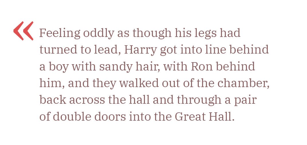
Feel free to experiment with decorative ones to fit your design needs.
Lettering
Uppercase letters are great for headings or short quotes, but they shouldn’t be used for body text. They tend to shout and grab attention, so use them sparingly. Make sure to add extra letter spacing to ensure they remain legible.

Lowercase letters should not be spaced out. Text with wide tracking is harder to read and looks untidy:

To highlight a word in lowercase, use italics or bold instead.
Italic type is used to indicate emphasis or heavy stress in speech; to style titles, headings, indexes, and cross-references generally; and to indicate foreign words and phrases.
I don’t care how you get here, just get here.
Such style, such grace, is astounding.
Bold is used to attract attention and is ideal for headings.
Small caps are perfect for abbreviations, Roman numerals, or highlighting names. Like uppercase letters, small caps should have extra spacing. They differ in height from regular uppercase and lowercase letters:

Avoid using small caps for body text, as they can be challenging to read.
Lists
A list is made of an introductory paragraph followed by a series of points. Here’s a quick guide to ordered and unordered list types.
Ordered lists
Use numbers or letters when the sequence is important, or when many items need referencing.
A numbered list is ideal when each item is a complete sentence.
To make a delicious eggs in three steps:
- Place a knob of butter in a pan on a high hit.
- Once the butter is melted, crack eggs into the pan and reduce the heat to medium.
- Wait until the white of the eggs is fully cooked. Enjoy!
You can also use Roman numerals (I, II, III) or capital letters if preferred (A, B, C).
Ordered lists with right parentheses are useful when the items are part of a single sentence. End each item with a comma or semicolon, and finish the last item with a full stop.
There are four terrestrial planets in our solar system:
1) Mercury,
2) Venus,
3) Earth,
4) Mars.
Before leaving the house, don’t forget to:
a) turn off all electrical devices;
b) take your phone and headphones;
c) close the door and take the keys out of the lock.
Unordered lists
Use bullet points when the order isn’t important. Items can end with a comma, semicolon, or full stop, depending on whether they are complete sentences. Traditionally, the black dot (•) is used as a marker in bullet point lists.
Apple produces and sells:
• laptops,
• phones,
• desktops,
• tablets,
• watches.
You can also omit the bullet symbol altogether and use indentation for a cleaner look:
Apple produces and sells:
- laptops,
- phones,
- desktops,
- tablets,
- watches.
Other symbols like dashes (–), circles (◦), squares (▪), or arrows (→) can be used, though it’s best to stick with traditional bullet points as other symbols can be distracting and clutter the text.
Numbers
In English text, numbers can be written in words or numerical form. Here’s how to choose the appropriate format:
Writing numbers in words
Write numbers in words when it makes the text easier to read or understand:
We bought four bottles of water for the hike. (Instead of: We bought 4 bottles...)
Write out simple numbers, especially when they are under ten or when clarity is important:
I saw seven birds.
Using numerical form
Use numerals for more complex numbers, particularly with units of measurement or monetary amounts:
The Christmas tree cost £345, but we got a 50% discount.
Separate thousands with a comma for clarity:
12,000
Decimal points and fractions
Use a decimal point to separate digits:
1.25
Fractions should be written with a horizontal line, or in some contexts, use a forward slash. Do not use the word ‘part’ or ‘fraction’:
½ of the area (or: 1/2 of the area)
Range of values
Use en dash (–) for ranges or spans, such as dates, numbers, or time periods, an en dash is commonly used:
The event runs from 1:00 p.m. – 3:00 p.m.
The years 2000–2017.
Use plus-minus (±) to show acceptable variation in measurements:
20±3 units (means the value is between 17 and 23 units, including the margin of error or tolerance).
Use ‘From’ and ‘To’ when writing ranges in full sentences or when clarity is needed:
The store is open from 9 a.m. to 5 p.m.
The temperature will be between 30 to 70 degrees.
Phone numbers
In phone numbers, hyphens and spaces are commonly used to enhance readability.
UK format:
Standard: 020 1234 5678
International: +44 20 1234 5678
US format:
Standard: 123-456-7890
With area code: (123) 456-7890
International: +1 123-456-7890
When a phone number includes a memorable or advantageous combination of digits, such as a repeating sequence or a pattern, it’s often highlighted for marketing or branding purposes:
0780 2222 444
Dates and times
British English date formats
Day-Month-Year:
4 August 2024
4/8/2024
Day of the Week, Day Month Year:
Saturday, 4 August 2024
In formal contexts, writing out the full month is preferred:
4th of August 2024 (not 4 August, 2024 or 4/8/2024)
American English date formats
Month-Day-Year:
August 4, 2024
8/4/2024
Day of the Week, Month Day, Year:
Saturday, August 4, 2024
In formal contexts, writing out the full month is preferred:
August 4, 2024 (not August 4th, 2024 or 8/4/2024)
When it comes to formatting decades and academic years, both British and American English have specific conventions:
the 1980s – the ‘80s
the 1990s – the Nineties
2023–2024 academic year
2023/24 tax year
Time formats are similar
12-Hour clock: Commonly used with ‘am’ and ‘pm’:
3:30 pm or 7:15 am
24-Hour clock: Less commonly used, except in certain contexts like timetables:
15:30 (3:30 pm) or 07:15 (7:15 am)
Use ‘o’clock’ when writing time in words:
The meeting is at three o’clock.
Symbols in text
Use the correct symbols in the text instead of letters with parentheses.
Incorrect:
(C) 2017 Tanya Sokolovskaya(R)
Correct:
© 2017 Tanya Sokolovskaya®
Links in text
When including links in the text, it’s a good idea to highlight them with colour and underlining. If colour isn’t suitable, just underline the links to make them stand out.
Currency formatting
The currency symbol is placed directly before the number without a space:
£100
$100
€100
Use a comma to separate thousands in large numbers for clarity:
£3,000
Use a point to separate the whole number from the decimal fraction:
£3.14
The currency code (e. g., GBP, USD, EUR) is placed before the amount, with a space in between.
GBP 3,000
Titles
In both British and American English, titles such as Mr, Mrs, Miss, and Ms are used to address individuals with respect.
Ms a neutral option used for women regardless of marital status:
Ms Sarah Johnson
Mr for men, regardless of marital status:
Mr John Smith
Mrs for married women:
Mrs Jane Smith
Miss for unmarried women:
Miss Emma Brown
Titles for professional use, related to a person’s profession or status:
Dr Robert Green
Prof. Helen Carter
Ph.D. Jane Doe
In British English, a full stop is used only if the abbreviation differs from the full word. For example, Dr (Doctor) has no full stop, but Prof. (Professor) does.
In American English, a full stop always follows abbreviations:
Miss. Emma Brown
Dr. Robert Green
Address formatting
In British English, write each part of the address on a new line: Name, House number and street name, County (if applicable), City, and Postcode:
Mr John Smith
123 High Street
Springfield
Essex
SS1 2AB
United Kingdom
When an address has additional details such as building names, blocks, or units, it should be placed before the building name or street name:
Mr John Smith
Flat 4, The Grand Building
123 High Street
Springfield
Essex
SS1 2AB
United Kingdom
American English
Name
Street address (including house number)
City, state, ZIP code
Mr John Smith
123 High Street
Springfield, IL 62704
United States
Sources
Oxford Guide to Style by R. M. Ritter: A comprehensive guide on style conventions, including those relevant to typography and publishing.
The Form of the Book and Treasury Of Alphabets & Lettering by Jan Tschichold: Essential works on book design and typographic lettering.


