On editorial design
and behind-the-scenes of my work
tsokolovskaya.com

Later Ctrl + ↑

Good free photo banks

Sometimes you need beautiful high-resolution photos for work. Where to get them? Definitely in photobanks. Except that their prices are biting, especially if you need 1-2 photos per month, or even less often. Free photobanks come to the rescue, but not all of them can boast high-quality photos.

I offer ten proven sites where you can download excellent high-quality photos for free.

  1. Unsplash — excellent artistic photos. You can sign up for updates – 10 new photos every 10 days.
  2. Picjumbo — Not a very large selection, but the photos are very good and there is sorting by category.
  3. Gratisography — lots of creative photos.
  4. Imcreator — lots and lots of categorised photos.
  5. Get refer — paid photo bank, but there is a section with free photos in high resolution. By the way, you can buy photos piece by piece for only $5.
  6. New Old Stock — wonderful vintage photos.
  7. Splitshire — quality photos sorted by category.
  8. Superfamous — photos with incredible views!
  9. Pixabay — is a very rich bank. Besides photos, you can find various art, including vectors.
  10. Freepik — Where without it. Almost one and a half million baseplate photos and vectors. In commercial use, it is necessary to indicate their authorship.

In fact, it is better to specify the authorship always. And don’t forget about donations for the banks you use regularly. A small thing, but the creators are pleased!

Hobby & Profi logo. See the elephant!

Today I’m going to tell you about a fun logo for the Hobby & Profi shop.

The shop sells goods for baking and candy bars. The main wish of its owners was that the logo should be stylish and associated with quality and fashionable baking supplies.

Having discussed the details, I started working with sketches of ideas.

Some of the ideas

Then I selected the most successful variants in my opinion and digitised them.

The variants I showed to the client

I show all ideas only in black and white, as colour is often confusing. And even a very successful variant can be rejected because the client didn’t like the chosen colour.

So, the owners of Hobby & Profi really liked both options, but there was a big “BUT”. In the course of discussions, it became clear that in the future the shop would be expanded. As a result, it will become a market not only for confectioners but also for any kind of creativity and handmade goods.

Having considered the new information, I went on with my work and started new sketches.

This is how three more ideas came about.

One of the previous variants I reworked and, imagined a shop with all kinds of goods, made it in the form of a kibitka.

In another variant, I decided to combine different kinds of creativity, which resulted in a logo in the form of an emblem.

And the third option is my favourite. I was looking for an image that would reveal the phrase “made with my own hands”. I twisted and turned my hands until I saw that the silhouette of a hand in the sign “Cool!” resembled an elephant.

Thus was born an elephant made by hands

The client really liked the new options but loved the elephant the most, as I expected. It was love at first sight :-)

Now that I had the basic idea, I finalised the graphic and font part of the logo and selected colours for it.

I decided to colour the elephant by the method of elimination. First of all, I removed shades of grey, blue and pink, as these are the most popular colours for painted elephants. Then I excluded shades of green and violet — the elephant looked painful. Also, red colours made our elephant aggressive.

As a result, I stopped at sunny yellow — it made the elephant cheerful and positive. For contrast, I chose a muted blue with a turquoise shade for the font part.

Now the Hobby & Profi shop has a great logo and its cheerful elephant.

The rules and guidelines for the logo are collected in a guideline:

89-4.jpg.

A pattern was also developed that changes with the seasons:

Second version of www.daniellesden.com

Task
Finalise all sections of the site and move the site to a new platform.
www.daniellesden.com

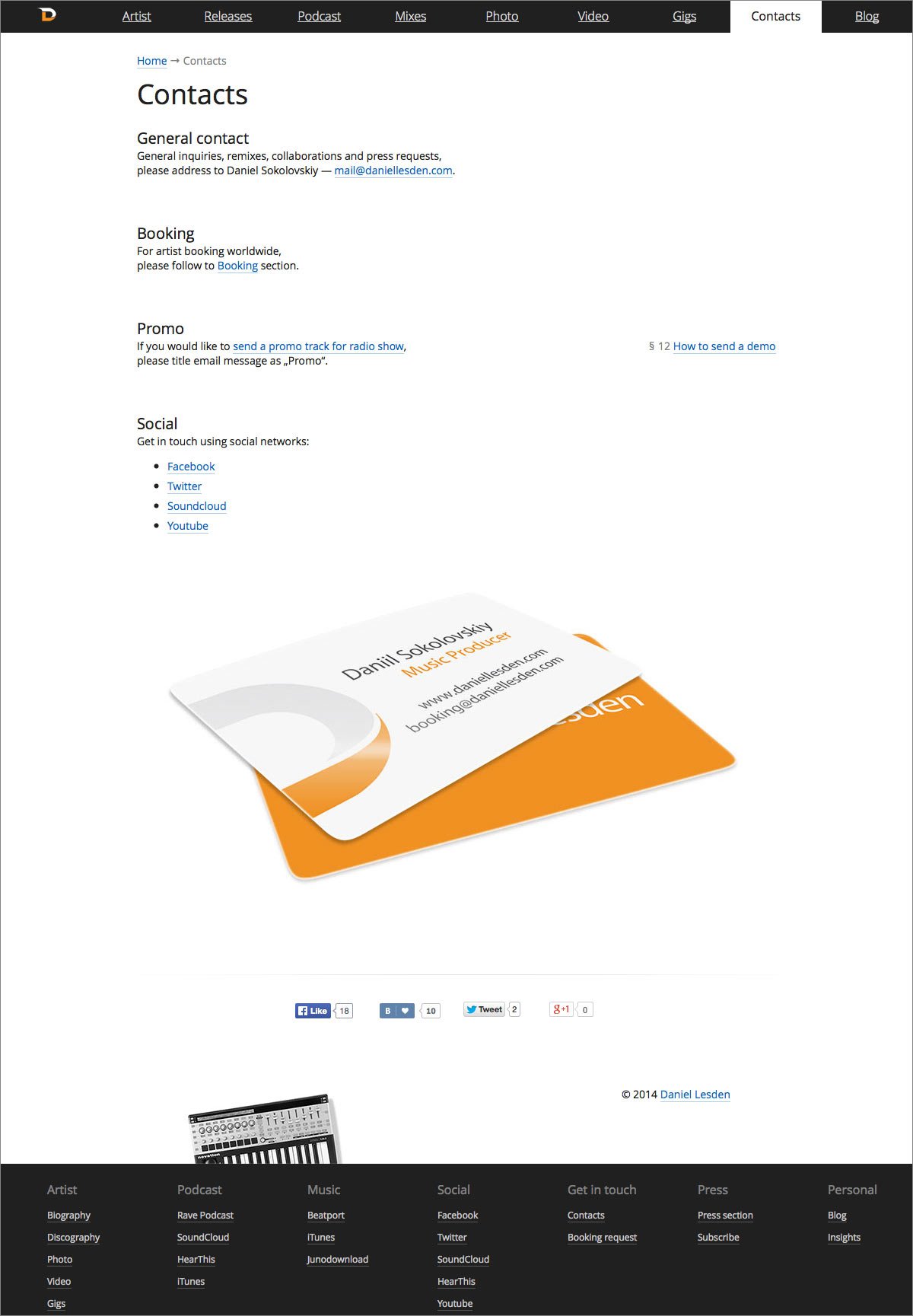
Daniel Lesden is a musician and DJ. As his popularity grew, so did the amount of content on the site, so it became necessary to expand the existing functionality. In total, more than 30 different changes were made, including a new platform for more convenient site management — in fact, we had to build the site from scratch.

First version
Second version
Third version
Adaptive version

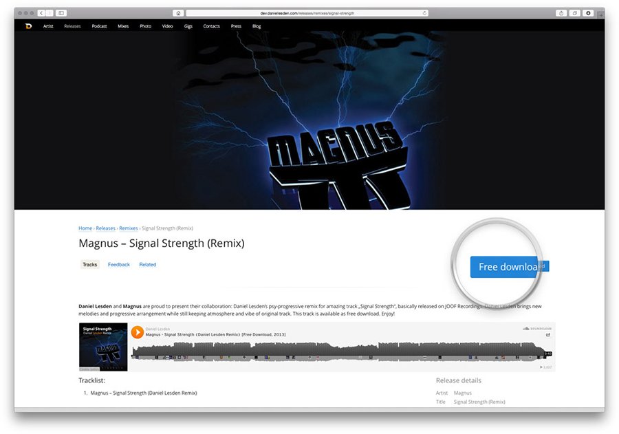
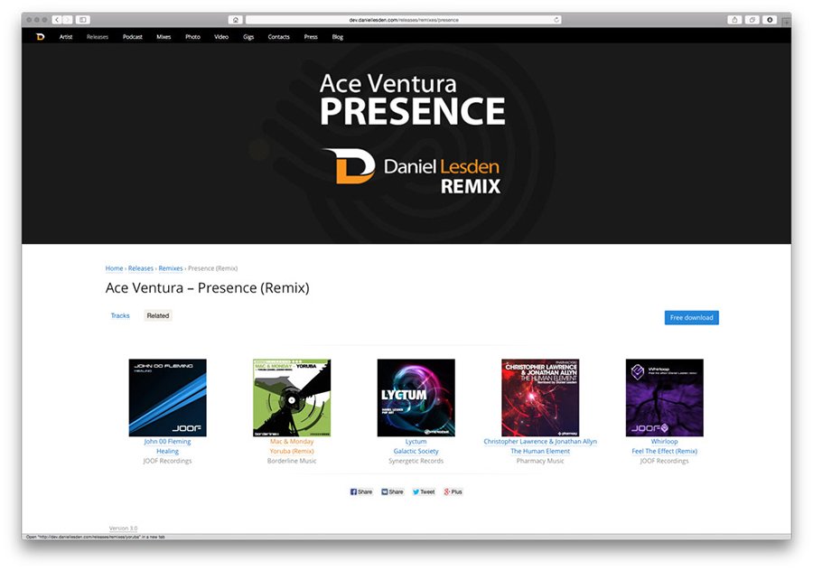
Prominent call-to-action buttons appear on music release pages
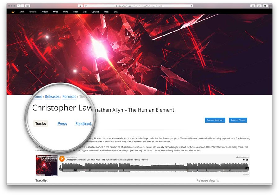
There are also tabs for press, reviews and similar content
Press quotes right on the music release page
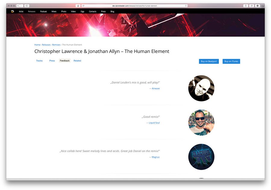
Testimonials from famous musicians
Materials from this category, such as remixes
The main page of the radio programme has also been updated
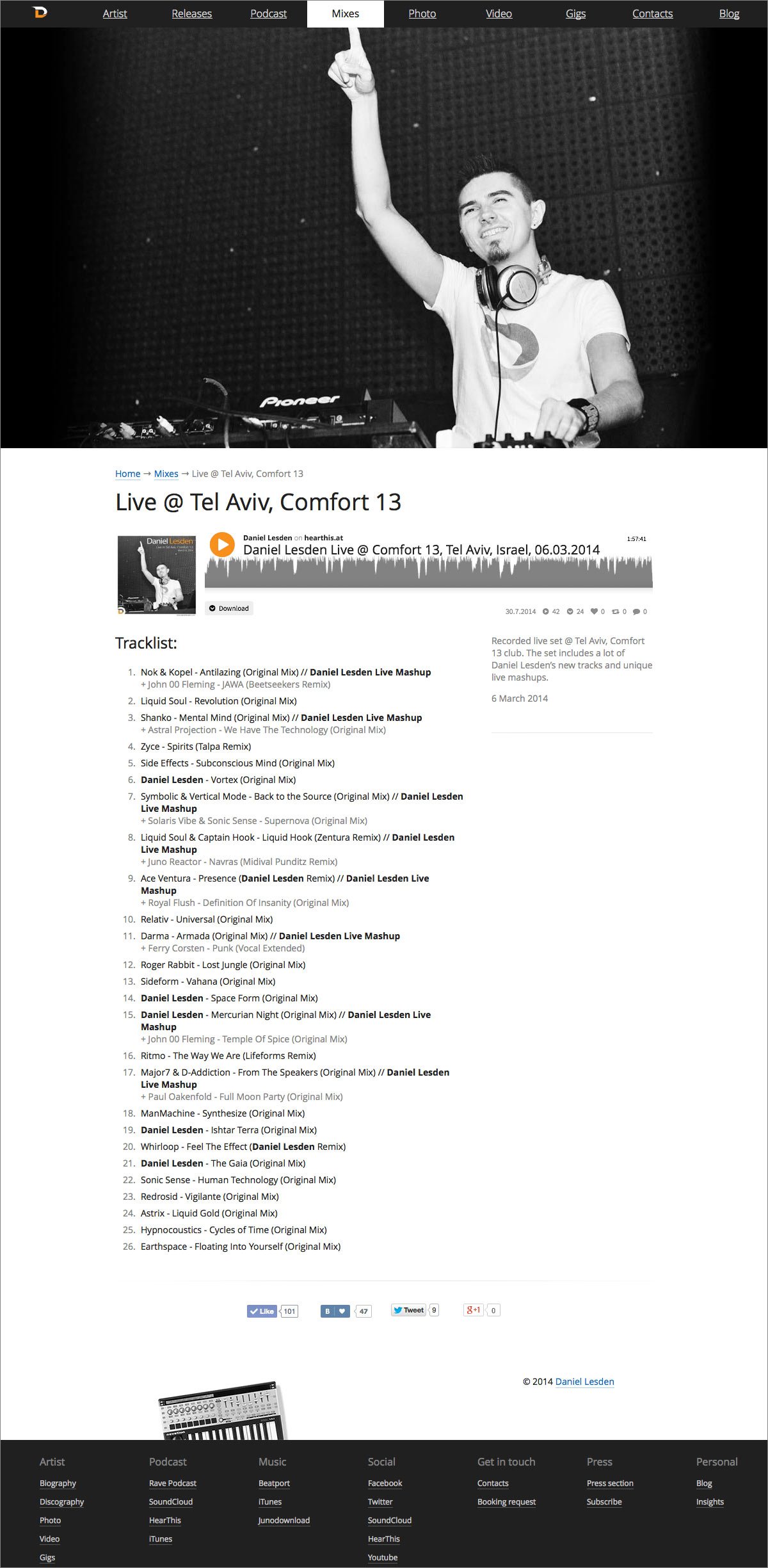
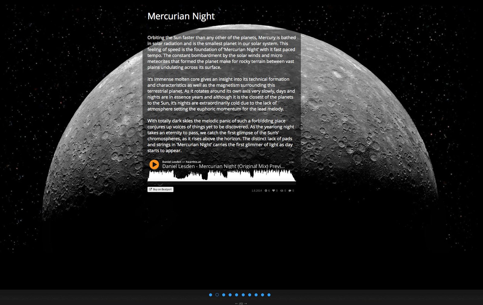
The mix pages now have attractive parallax images.
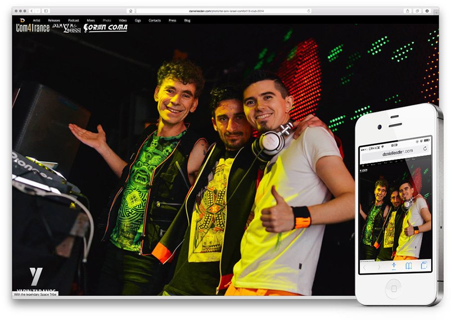
Photo albums are a new section on the website. Works and looks great on mobile phones too!
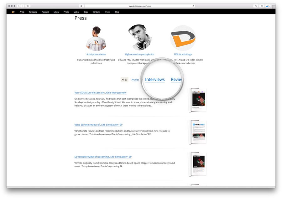
The press section can now be filtered by type of material: reviews, interviews and articles.
Interesting “404” page: typed 404 parameters on the midi controller display and Star Wars-inspired lettering :-)

Project members

Lead designer
Tanya Sokolovskaya
Designer
Daniil Sokolovskiy
Developer and layout
Maxim Silnov

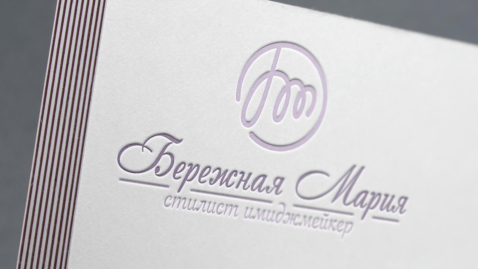
Logo and style for image-maker Maria Berezhnaya

Maria Berezhnaya is an image stylist. She creates stunning images for everyday life and celebrations.

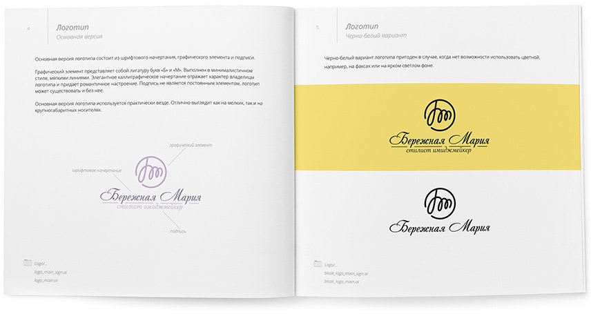
I created a laconic and stylish logo for Maria — its main element is the ligature of the letters “B” and “M”. The mark turned out to be soft, but at the same time durable.

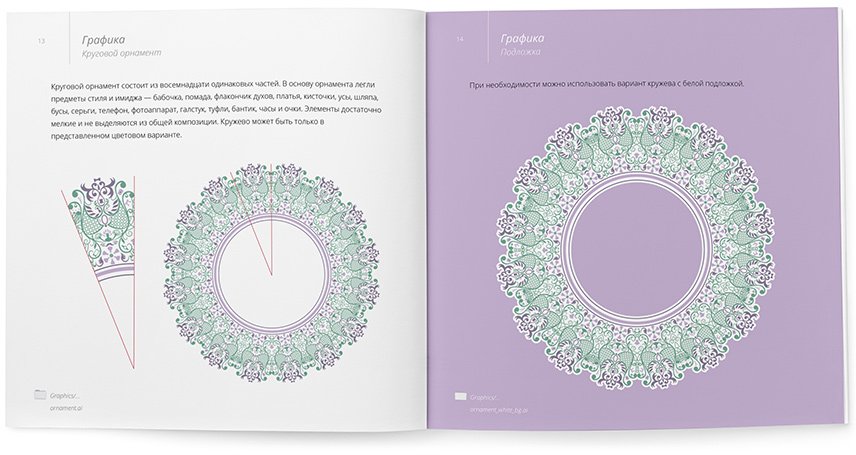
Lace ornament became an element of the corporate style. At first glance, it seems ordinary, but there is a zest in it — looking at the pattern, one can see various elements of the style: tie, dresses, glasses, beads, hats, perfume bottles, lipstick and many others.

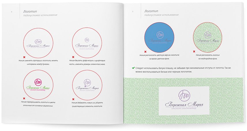
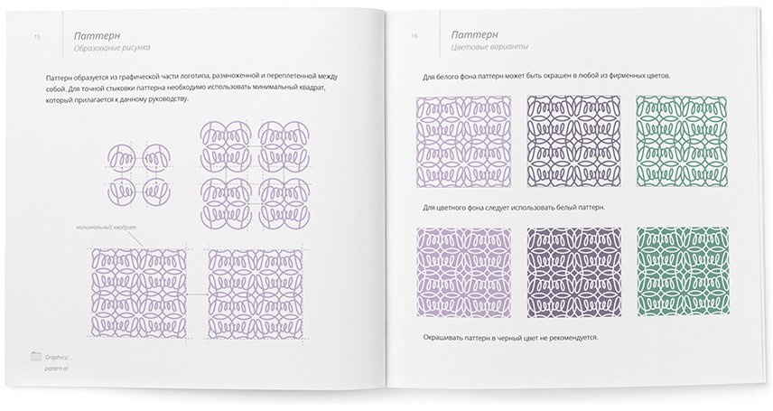
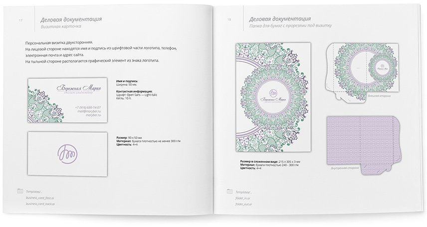
Style guidelines and rules are collected in a brand book:

Logo and style of the Duck House event agency

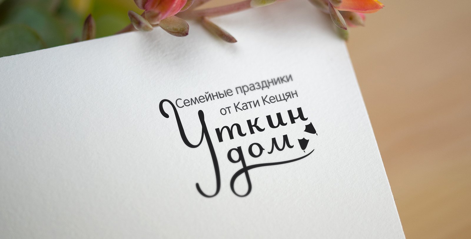
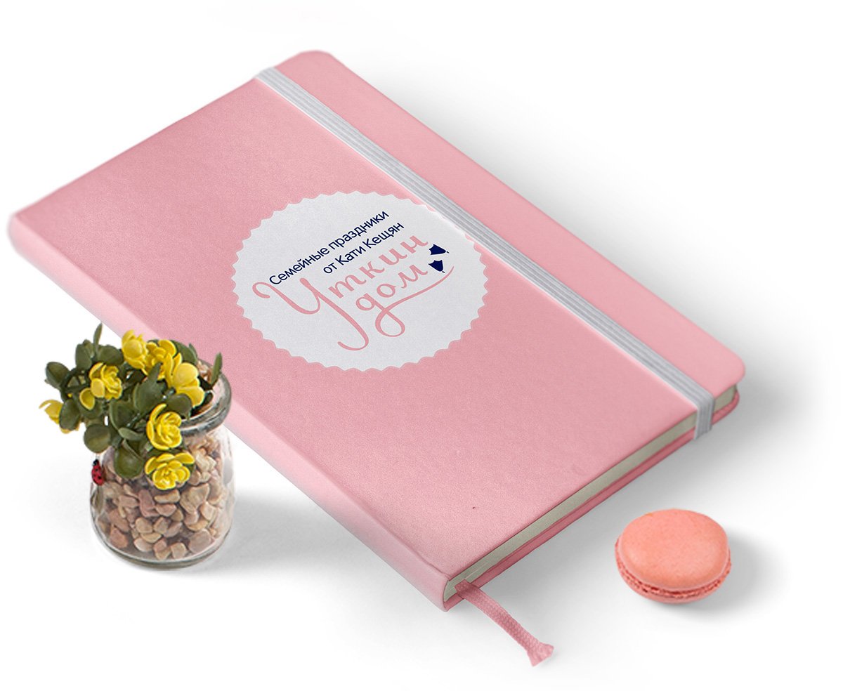
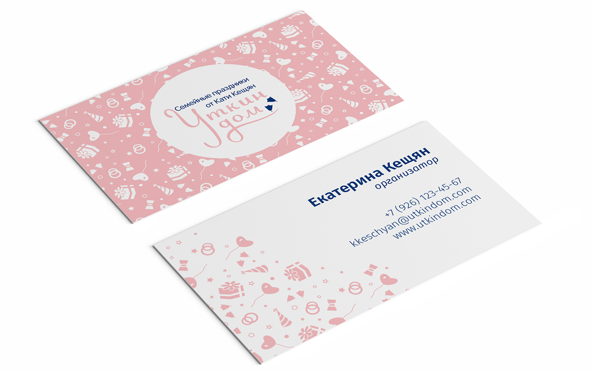
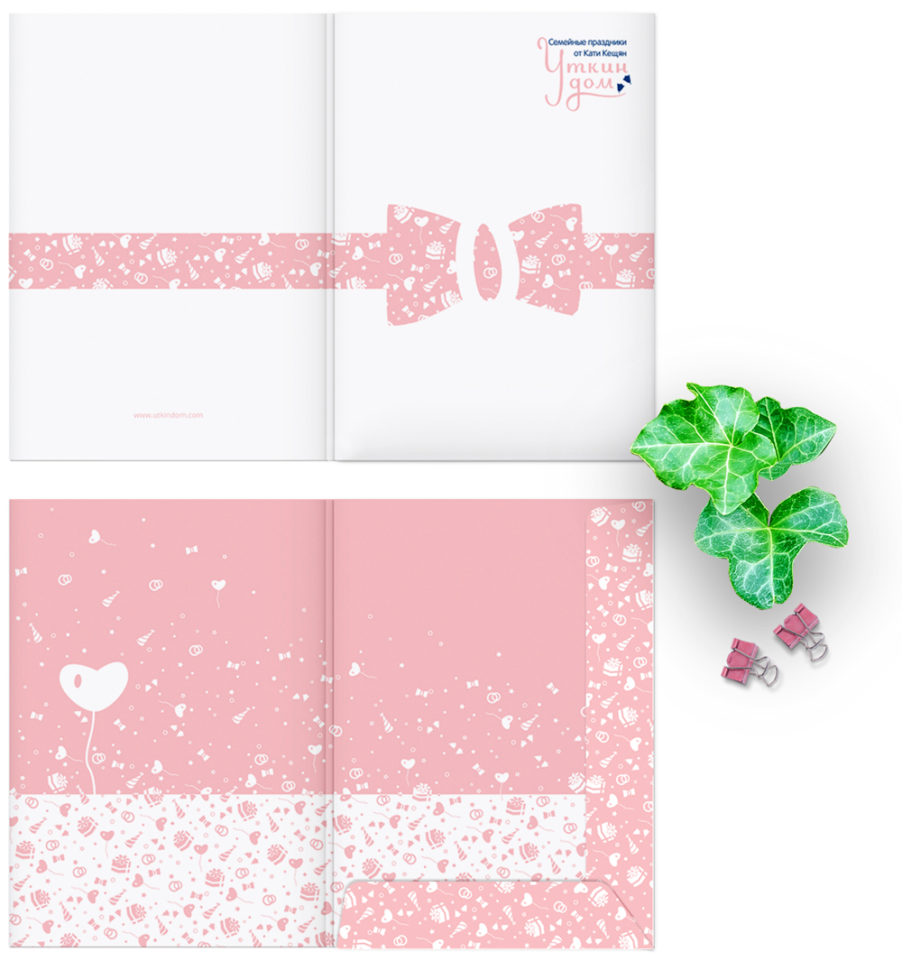
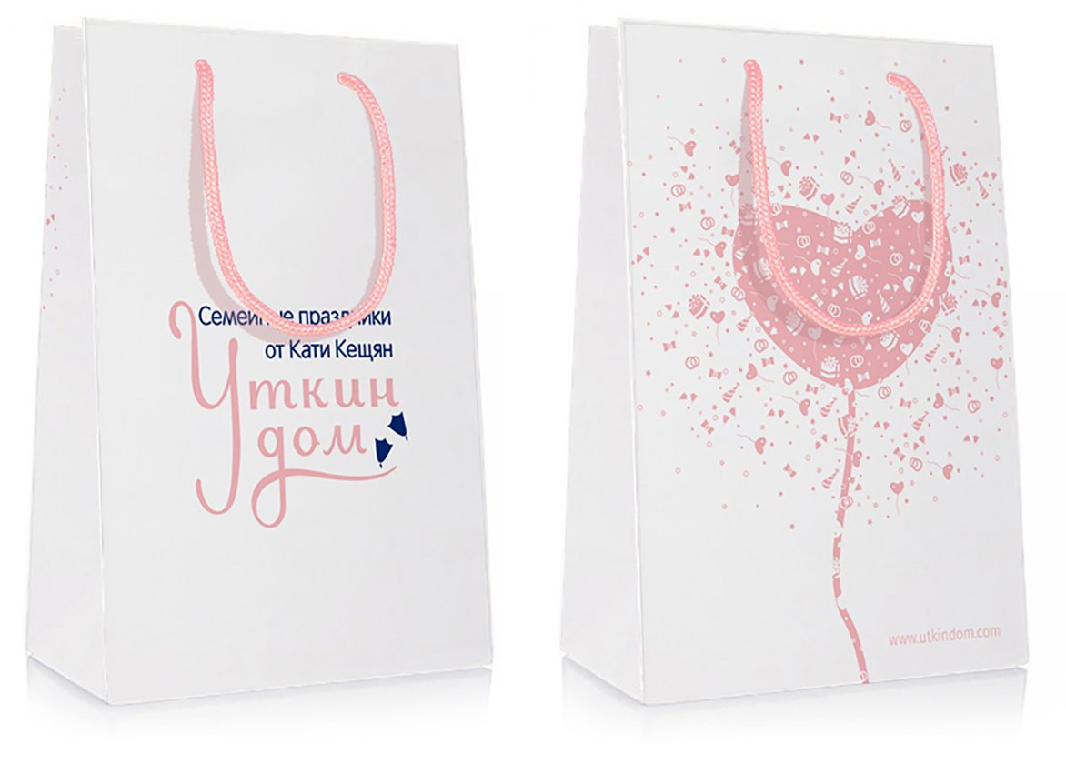
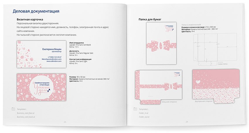
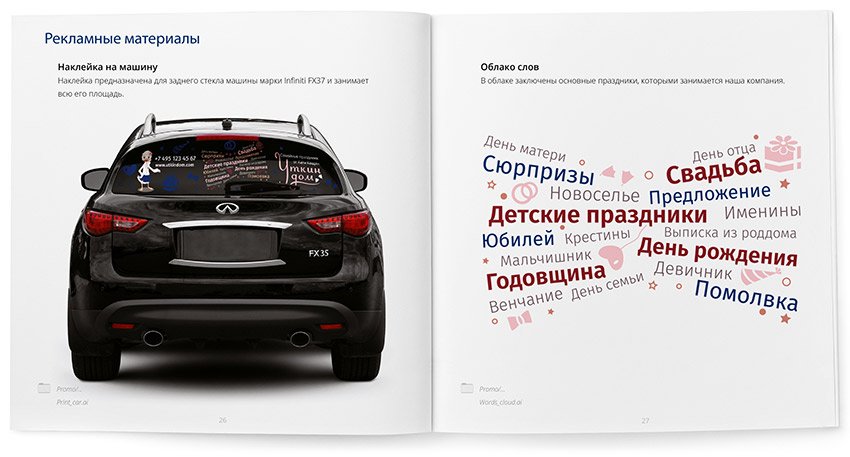
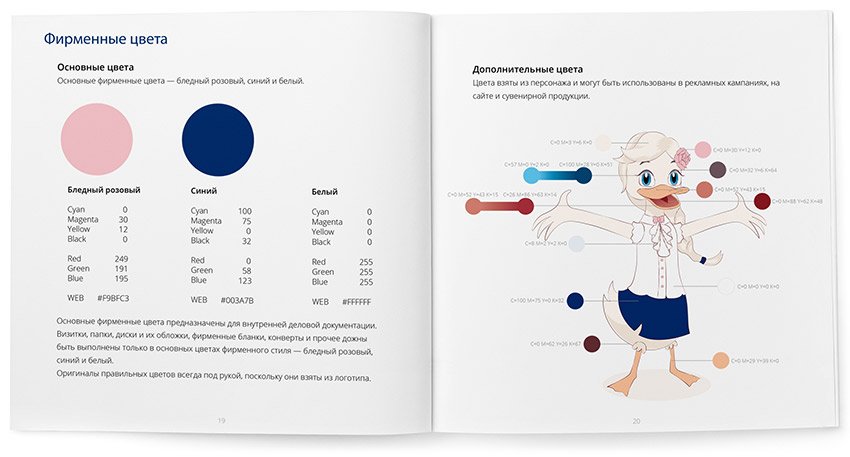
The Duck House event agency is engaged in the organisation of family celebrations: from weddings to birthdays. The owner of the agency Ekaterina Keshchyan knew exactly that the visual style of the company should be soft, homely, cute and attractive to both adults and children.
Katya is that rare client who actively participates in the work, so the result fully reflects her inner world. Together we developed a corporate identity and a character based on a soft pink colour and slightly cartoonish details.

Logo and style

The main element of the corporate identity of the Duck House event agency was a pattern consisting of festive attributes. The result is a flexible style that looks great on any media and in various forms:

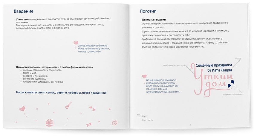
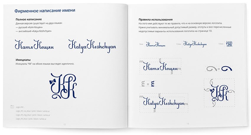
The rules and guidelines for using the logo are collected in a brand book:

Character

As the name “Duck House” suggests, the company’s character is a duck. The duck is not simple, it represents Katherine’s positive attitude and friendliness and is a reflection of her.

Read also about the process of developing the character

Logo of Jewelry Stories jewellery shop

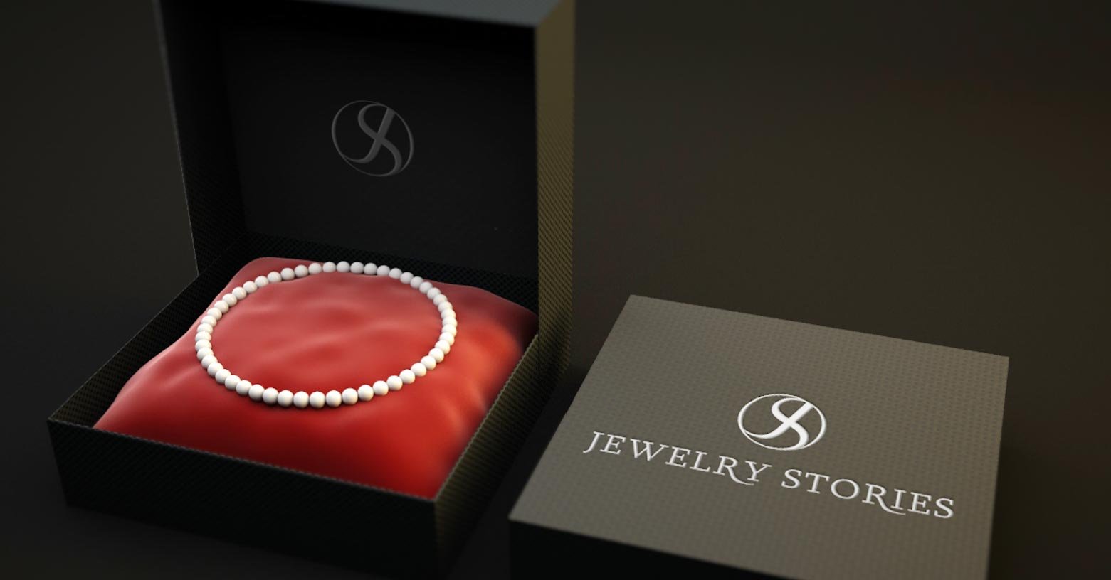
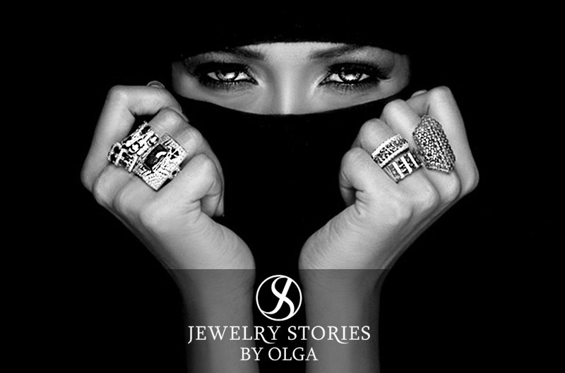
“Jewelry Stories” is the trademark of jewellery designer Olga. I designed a logo for her, based on the abbreviation JS in the form of an infinity sign.

Options that came up during the process

Logo for musician Psytellite

Psytellite is a musician and DJ. His creative pseudonym is formed from two English words: “Psy” (Psychedelic Trance music) and “satellite”. Designed for him a logo symbolising the flight of a satellite over the planet’s orbit.

About the Process

These were the first variations to appear:

But the client didn’t like them, so he asked me to pay special attention to the font. I continued the work:

Liked the option with the satellite above the sphere. Continued working on this variant:

Looking for a suitable font solution:

Like the first option, we decided to refine it.

The most difficult part was working on the sphere with the letter Y. I’m sending you the work in progress:

The client asks to try to correct the Y according to his sketch:

Sending him variants with explanations:

In the first variant, the arc is flat (from the circle), and you can draw a Y from it, but then you get a big distance between the arc and the letters.

In the second variant, I lowered the arc below, and deformed it to reduce the distance, together with the arc deformed and Y and the letter T became quite cramped.

In the third case, I left the arc at the desired height but raised a little leg Y, it is now at the base became more straight, allowing me to breathe T, but at the same time lost the circumference, although it also lost in the second case, there is formed an oval, and in the third variant is already a “baton”.

As variant four, it would be possible to glue Y above the centre of the sphere, then keep its circumference, and the distance between it and the letters is not so big. But in this case, Y becomes under a strong inclination, unlike the rest of the letters, and there is a hole between it and T, and psy is separated from tellite.

I’m sending out a few more variations for comparison:

The client decided to stop at the first one and sketched another sketch with wishes:
I’m finalising the logo with the wishes and putting together a guideline.

A spread from the guidelines about colour and logo
A spread about the rules of using the logo

Designing a website for musician Daniel Lesden

Task
Develop a musician’s website.
daniellesden.com

Daniel Lesden is a musician, DJ, and radio presenter. I developed a flexible and concise website design, allowing me to arrange all information about the artist: discography, radio programmes, mixes and recordings of live performances, news, photos, tours, press publications and much more.

First version
Second version
Third version
Adaptive version

Also made cosmic promo pages for the artiste’s album.


Project members

Lead designer
Tanya Sokolovskaya
Designer
Daniil Sokolovskiy
Development team leader
Maxim Silnov