How the logo of The Word of Life literary project came into being
One of the latest works is a logo for the literary community “The Word of Life” in Israel, run by psychologist Lea Wedensky. The project is designed to develop a culture of self-expression, thinking and speech.
94-8.jpg.
At the beginning of the work on The Word of Life, we had a little mishap. The first discussions I had about the work to be done were not with the project manager but with his assistant. From him, we received an already existing graphic image of The Word of Life project together with wishes for the future logo.

After working on the first sketch, we set up a general meeting, with Lea already present. It was there that we realised that we had been wrong. Her vision of the logo was completely different. Accordingly, our sketch “failed”.
By the way, I have a principle — to work directly with the person who makes the final decision on the project. If you don’t follow it, the result runs the risk of being far from the desired one, the project not being accepted, and the work starting all over again. It is good that this mishap became clear at the beginning of the work.
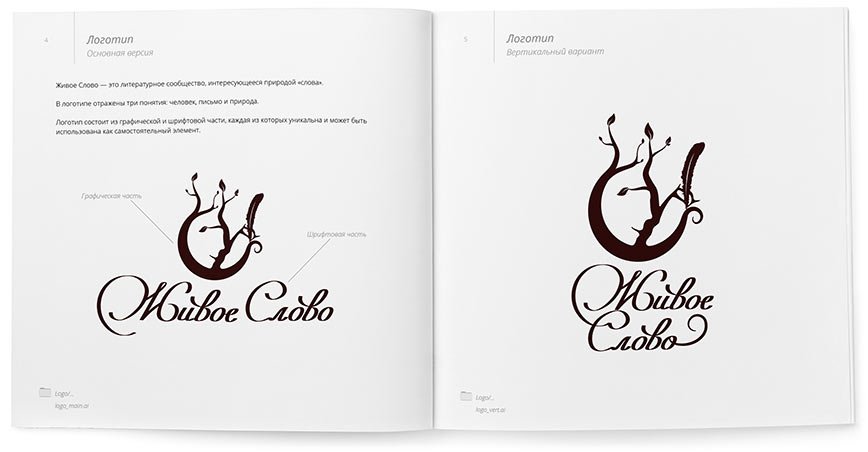
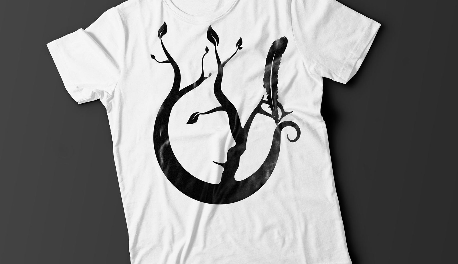
Having communicated with Lea, I got the exact wishes — the sign should be laconic, and reflect the person, letter and nature, i.e. the visual image of the project.
zs-3.jpeg.
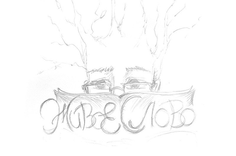
The second sketch, which I continued to work on
I finalised the sign, practically without deviating from the sketch, and tried to make the font part “alive” by simulating writing with a pen. Below is the result:

By the way, in the finished logo, we also saw the shape of a pomegranate, and the pomegranate is a symbol of fertility in Israel. This finding especially pleased Lea :-)
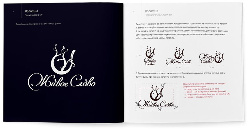
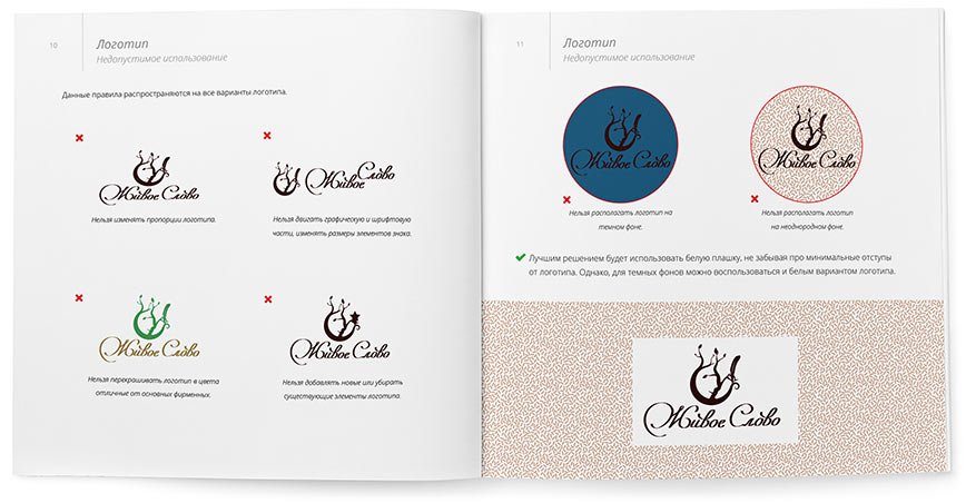
The rules and guidelines for using the logo are collected in a guideline: