Site maryber.com — second version
Task
Revise the structure of the site, get rid of empty sections, rewrite the text information from the point of view of usefulness for a potential client and update the design.
maryber.com
Two years have passed since the launch of Maria Berezhnaya’s website. Now I look at the old site and realise that I made a big mistake back then — I “stuck” a lot of unnecessary things because “the client wanted it that way”. In addition, at that time I handed over the site without content, and it was assumed that Maria herself would be engaged in filling — this was the second big mistake. For two years the site had not been updated at all, and some of the sections were hanging dead weight.
Getting Started
So, after chatting with Maria, we decided to completely redesign the site. Maria told me about her career progress, what she is doing now and how she plans to develop further, and I started to work.
First I defined the structure of the new site:
- Main. Here I decided to tell at once what Maria does and show the main services.
- Portfolio → inner page. General photo catalogue and inner page for each work.
- About Me. This is where I put Maria’s story about her career path and who she can be useful to.
- How much it costs. A page with prices for services.
- Teaching MakeUp. This is one of the services Maria wants to emphasise, so there is a separate page for it.
Maria also wanted to add a “Blog” section, but after chatting we decided that she doesn’t need it for now. We also put aside the “Feedbacks” section for later.
The sections with articles, partners and events were not moved from the old site — they turned out to be unnecessary.
Design
Since Maria’s sphere of activity is connected with the beauty industry, I decided to make the design “like in glossy magazines”. This is how the main page has lettering, and the design of individual blocks resembles a printed layout.

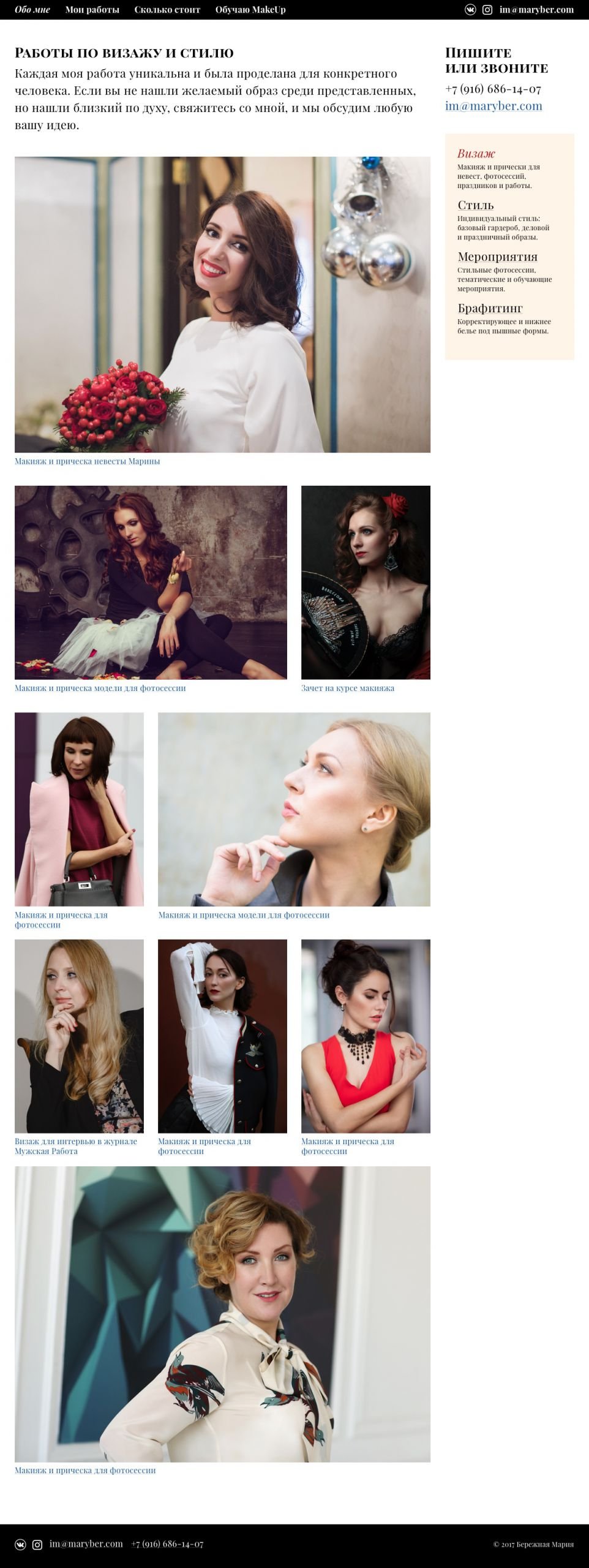
For the photo catalogue in the portfolio, I made a grid in which the accents shift from one photo to the others. As the grid fills up, the grid is duplicated, so there’s a rhythm to flipping through and there’s always something for the eye to grab onto. Works can be filtered by basic tags.
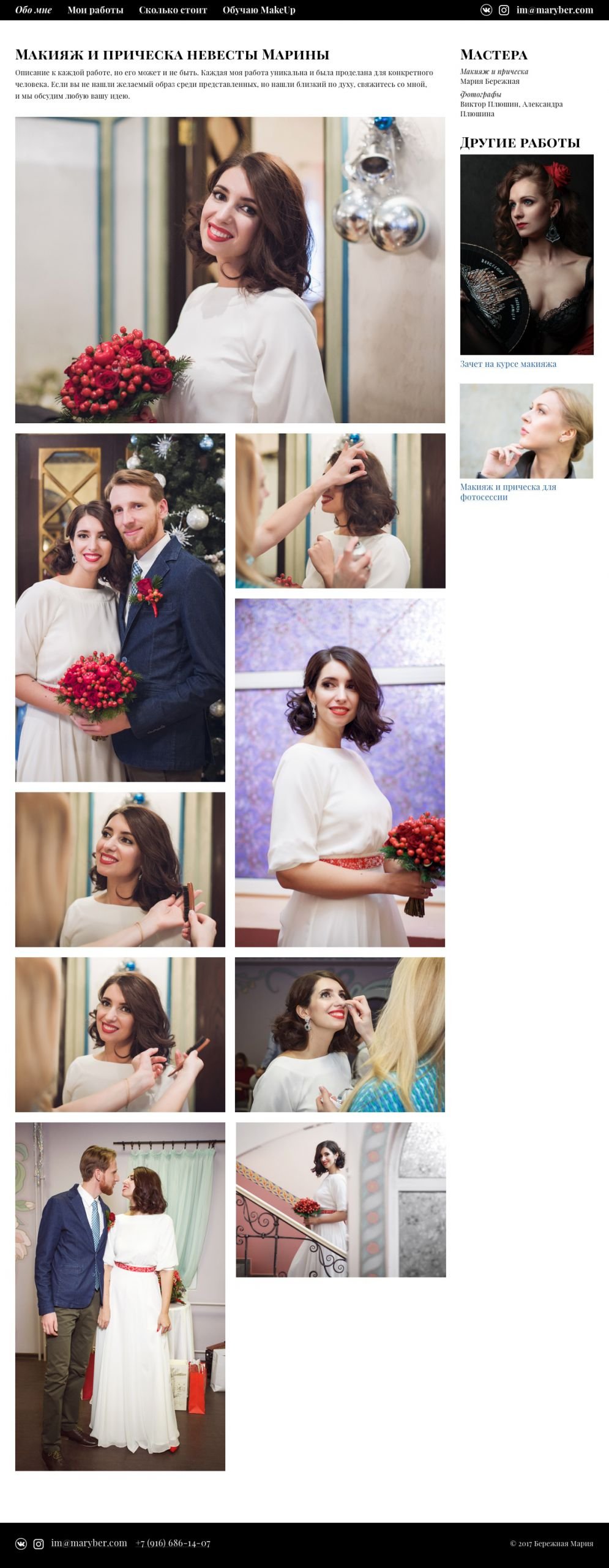
The inner page is a gallery of project photos. You can also add colleagues who participated in the project and write a detailed description.
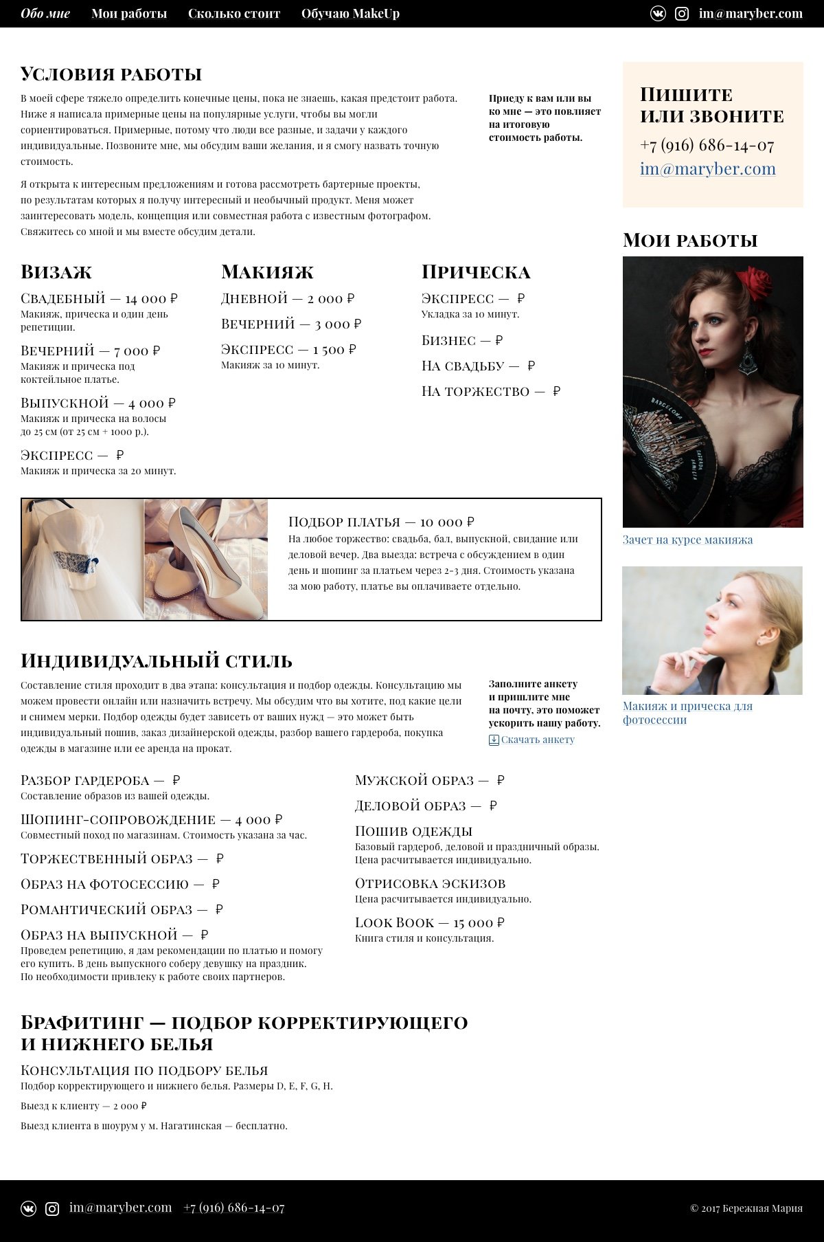
I decided to make the pages with prices and services with a free layout because Maria’s services often change and it’s impossible to fit them into a template.
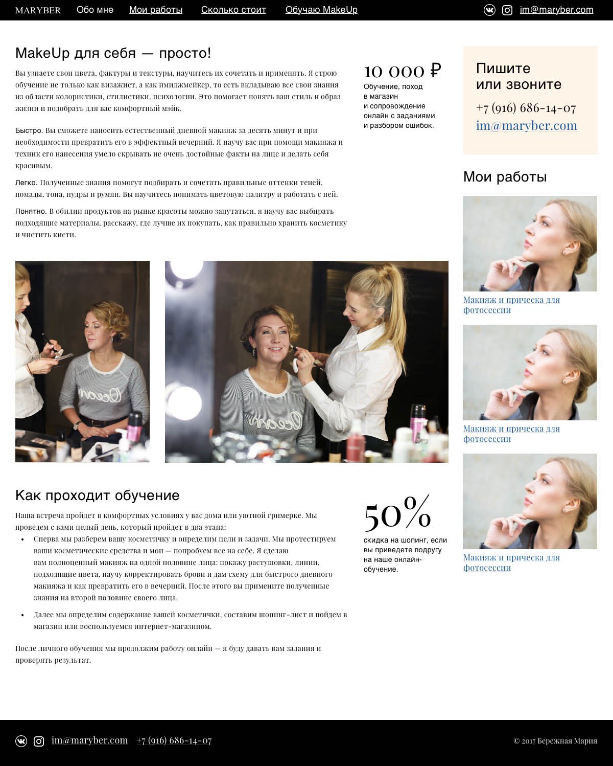
The “About Me” page is also a partially free layout to be able to make quick updates.
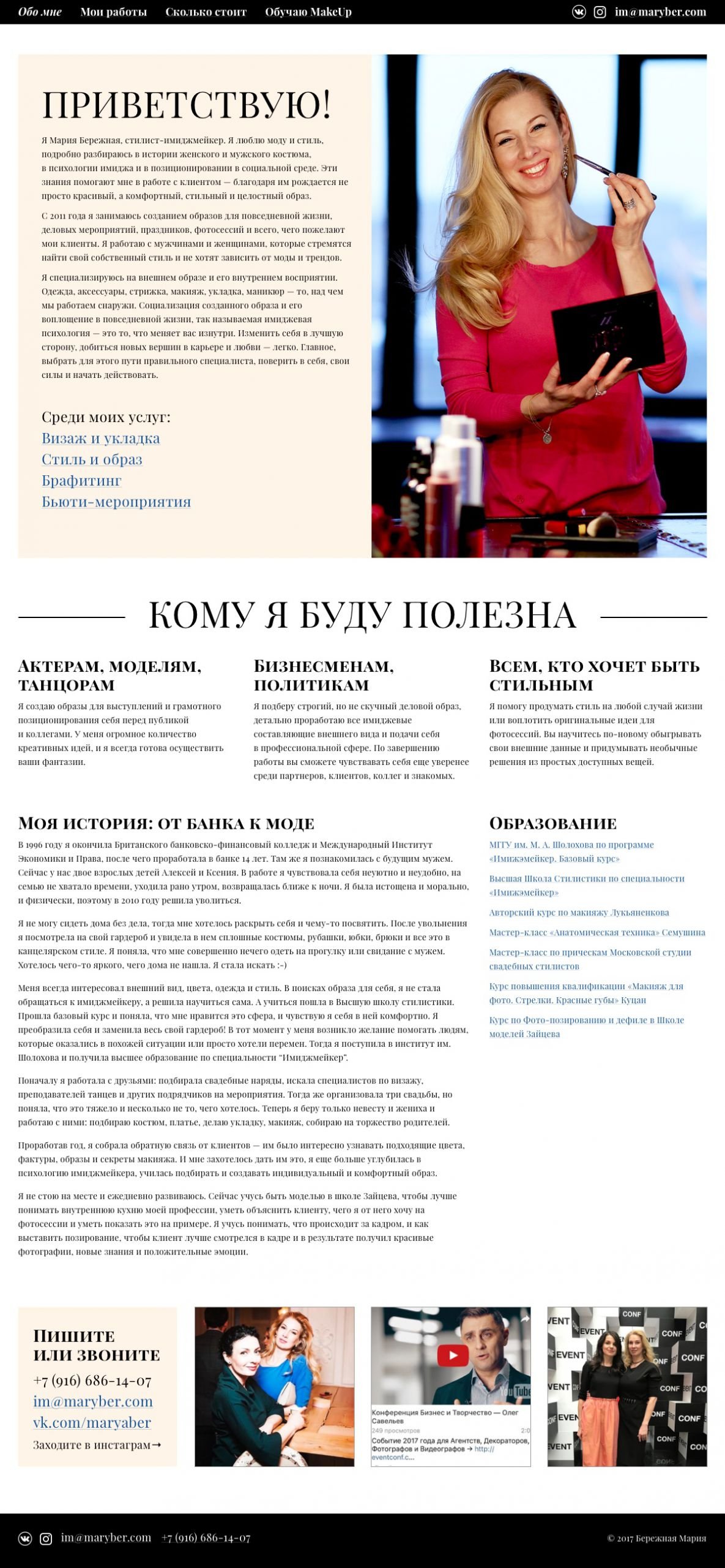
The result is a compact website that maximises Maria’s expertise and adapts to all screen resolutions.
Project participants
| Designer Tanya Sokolovskaya |
Layout and developer Tony Realovich |

