Magazine layout. Cover page
I’m exploring a new direction in layout for me — magazines. My love for them was sparked by the book “Editing by Design” by Ian V. White, which I read in one breath back in 2016.
At that time, I was working more on web projects and identity, so the book settled on the shelf, and I had never read any magazines. Now I realise that the magazine layout appeals to me the most. And I will begin my journey by drawing up a structure using examples from real magazines.
I have studied the covers of 27 different publications and identified the 16 elements that are most often found in them. I do not claim to be correct — these are my observations. I will go into more detail about each element.
Journal name
The name is always at the top and occupies either the full width of the format or the left-hand corner if it’s short. Let’s look at some examples:
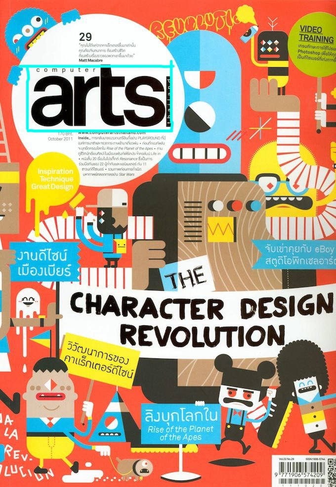

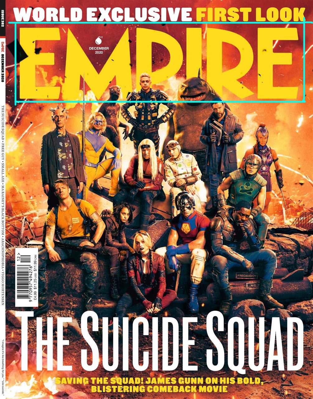


The magazine name’s font and style do not change from issue to issue like the classic logo. However, the layout in the header area or the colour may change slightly to match the style of the main image. For example:

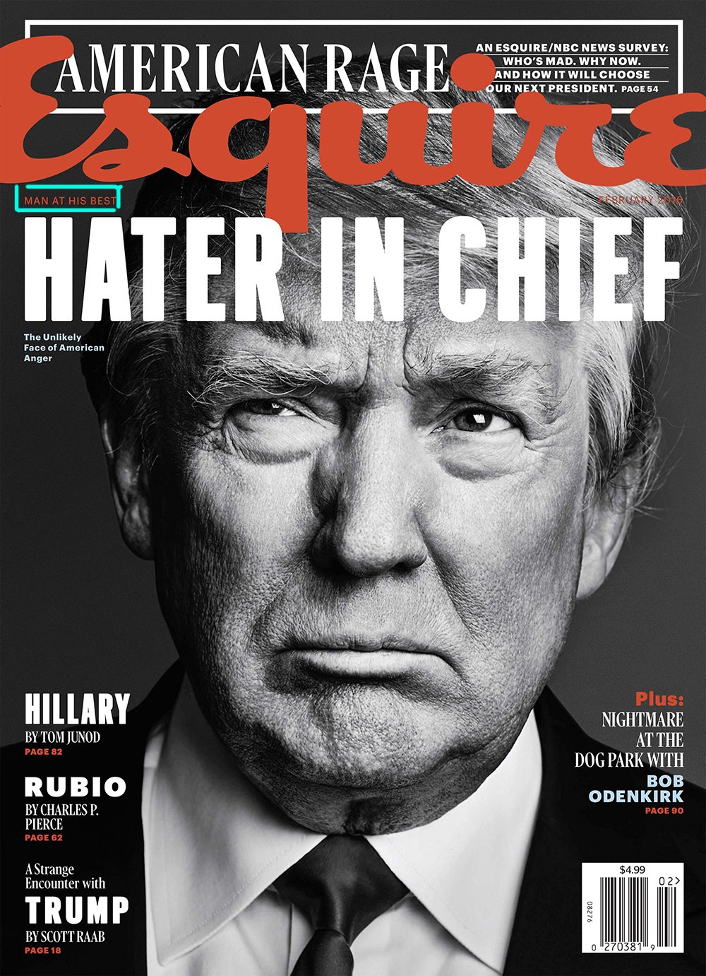
Slogan
Not all magazines have a slogan, but if one is present, it’s next to the magazine name:

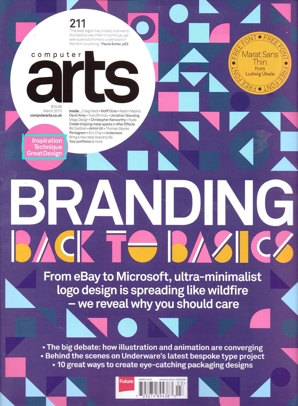
Issue information
The issue information includes the date, price and issue number. All information may be present at once, but most often, only the date or date and cost are given. It’s usually located next to the name of the magazine:

Sometimes they are indicated in the barcode area:

Or separate — for example, the date stays near the name and the price in the barcode area:

This information may also be at the bottom of the page:
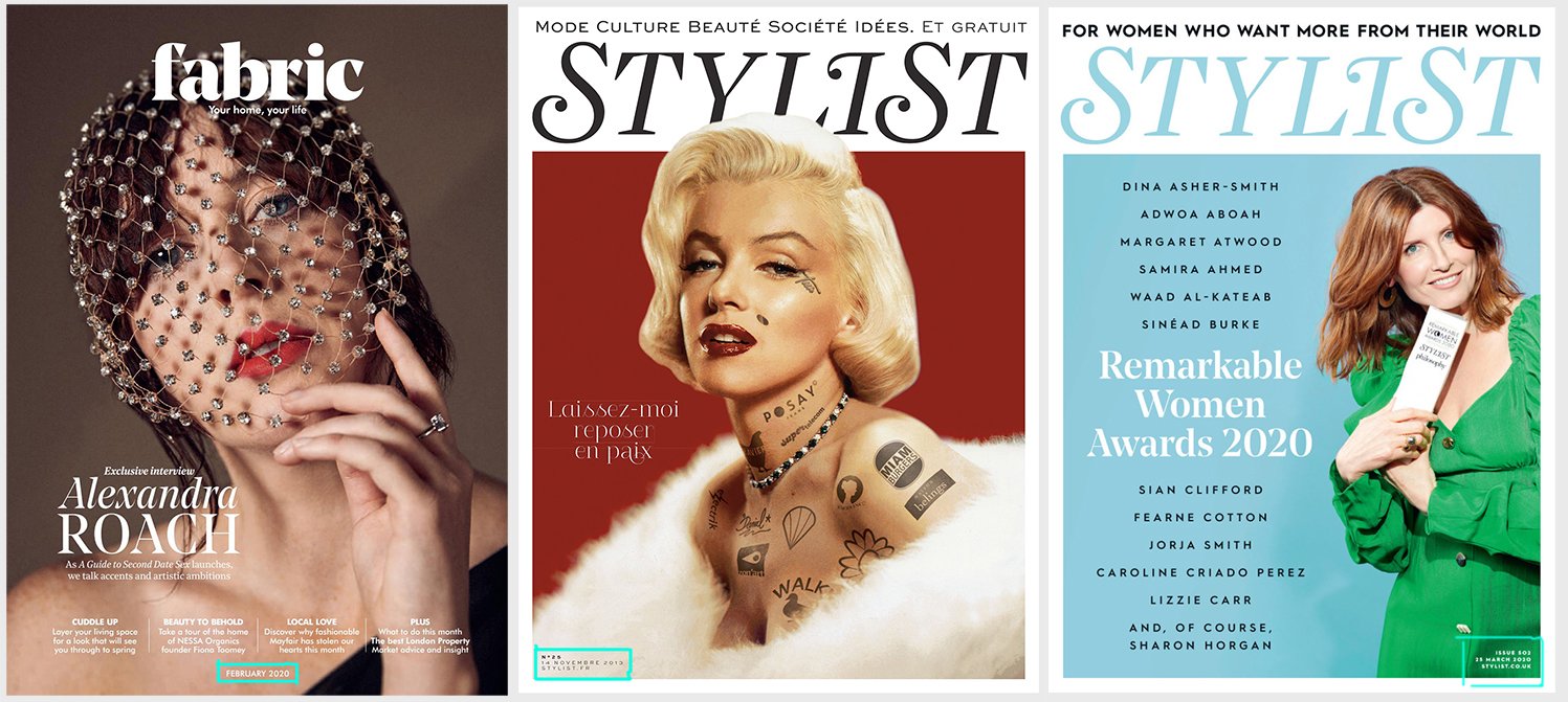
And vertically near the left or right edge:

Barcode
There may or may not be a barcode on the cover. Usually located somewhere on the bottom horizontally or vertically:
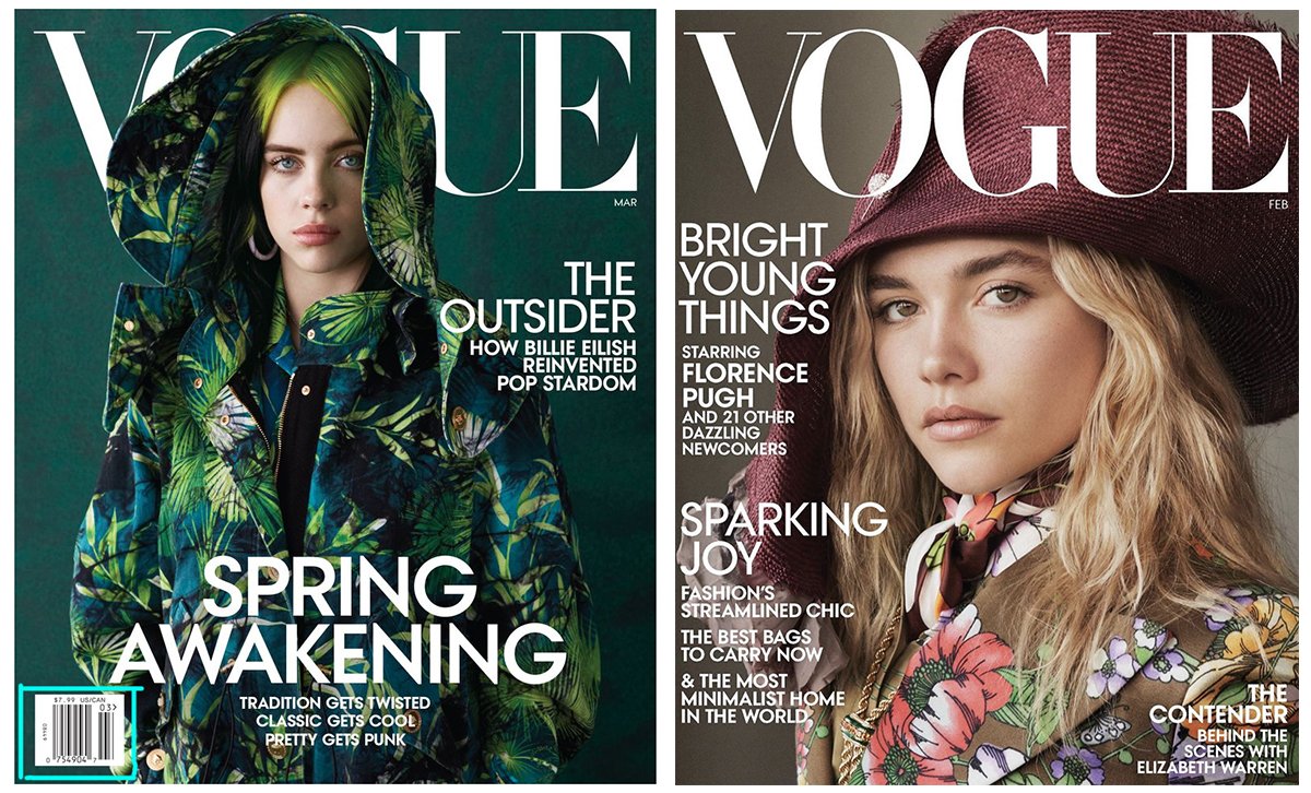
Link to the publication’s website
The link is not present in all magazines. It’s usually located next to the title but can also be at the bottom of the page or vertically on the side:
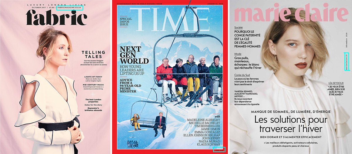
Banner
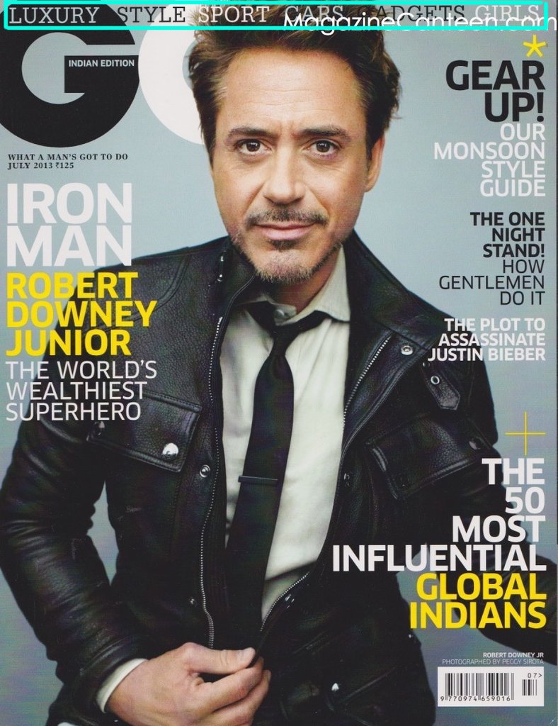
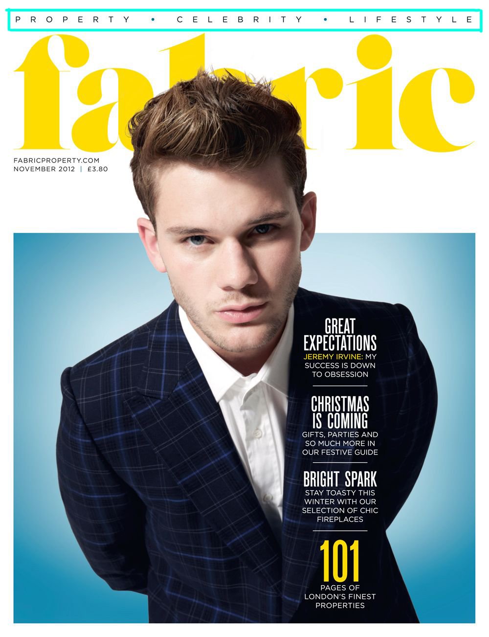
A banner briefly explains what the magazine is about, something similar to the content. The banner, like the slogan, is not always present. It may include the magazine’s main themes or the theme of a particular issue. It’s usually placed at the top or bottom of the page:

Label
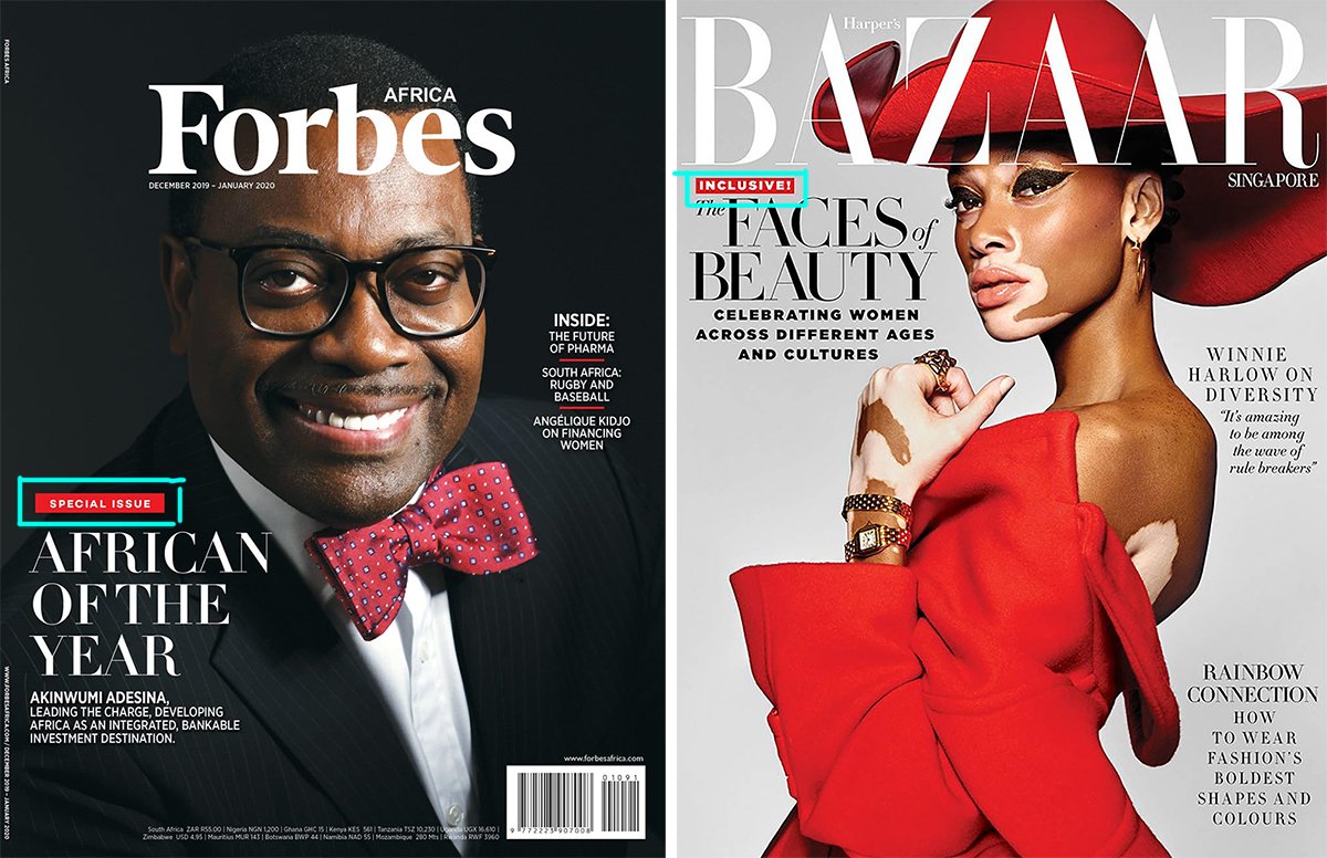
The label is a contrasting rectangle designed to attract attention and stand out from the background. It’s usually placed in the upper left-hand corner. This element indicates some features of the magazine. For example, it may indicate that the magazine is free:

Or the magazine issue includes the juiciest of the past year:

The tag can also be attached to the main heading:
Sticker
The sticker has about the same function as the plaque. Practically never used in expensive editions, but if so, it’s used in a single copy:

The sticker can also be in the form of a simple text block with an asterisk (*). It looks more elegant this way:

Main theme of the issue
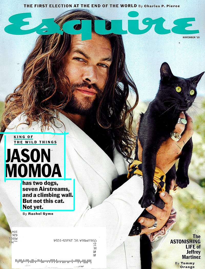
The block with the issue’s main theme includes a header and a small intro. If it is about a person, the block will include their name:
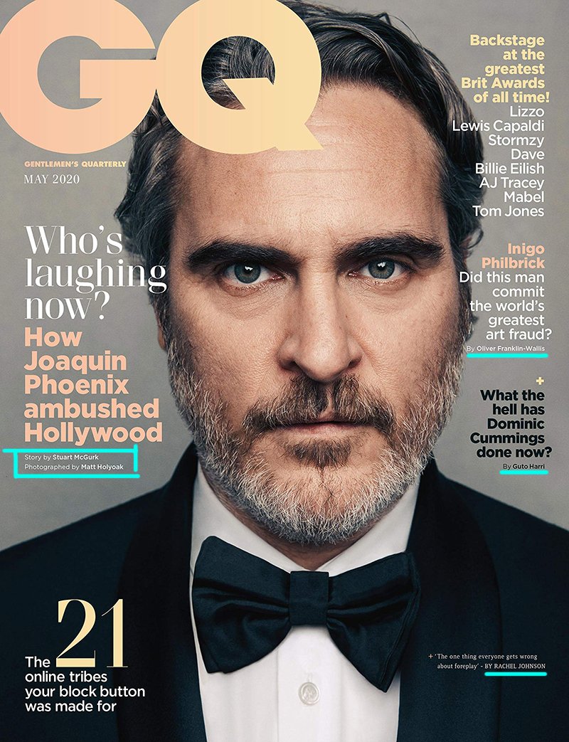
Authorship
This may include the article’s author or the cover photo’s photographer. Authorship is not always indicated.
Bonus
A bonus block is usually unrelated to the magazine’s general theme. It may include some exclusive, special reportage or just something interesting:

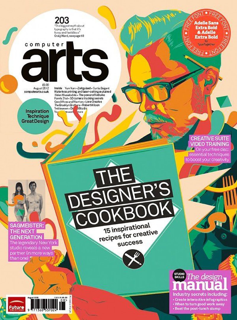
Main image
The main image can be a photo:

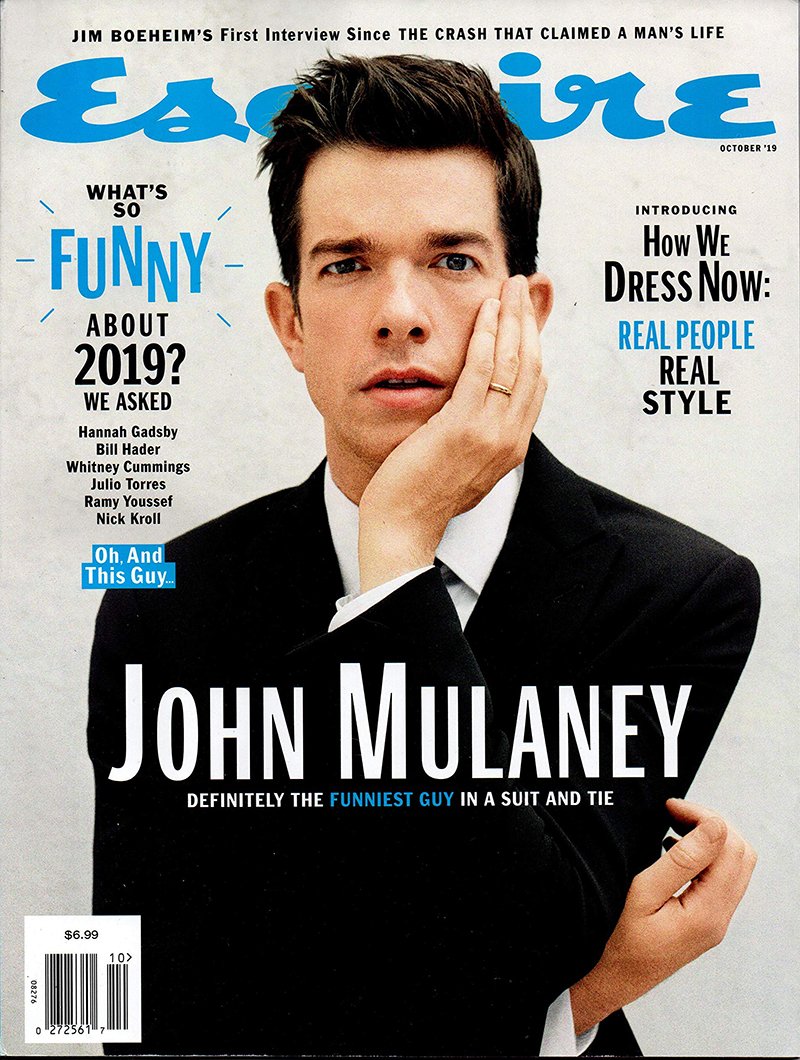

Illustration:

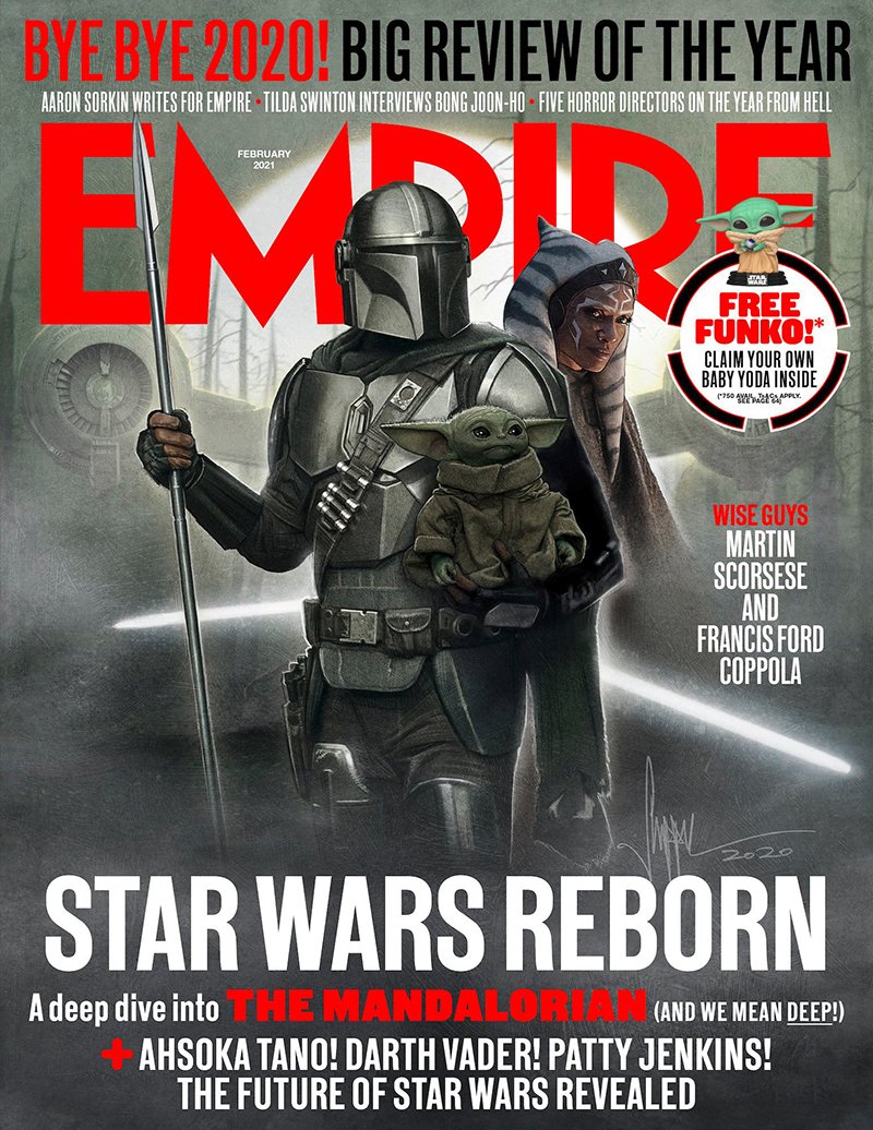
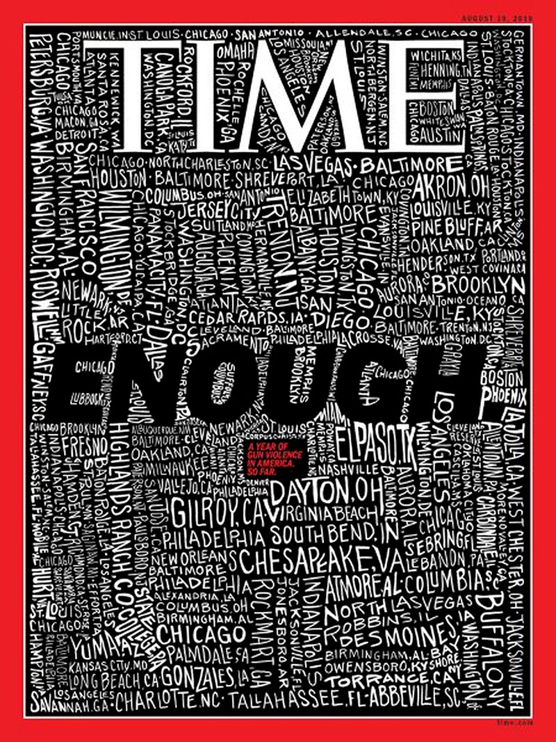
Typography:


Air
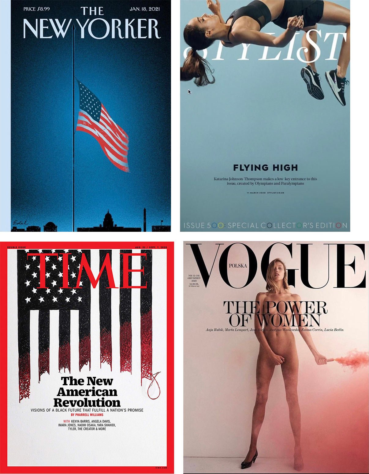
Air is the kind of empty space that reinforces the main theme, putting even more focus on it. You don’t often see empty space on the cover of a magazine — there’s not much space, but quite a lot of information. Let’s look at some examples:
Additional images
Additional images are pretty rare, at least amongst respected publications.
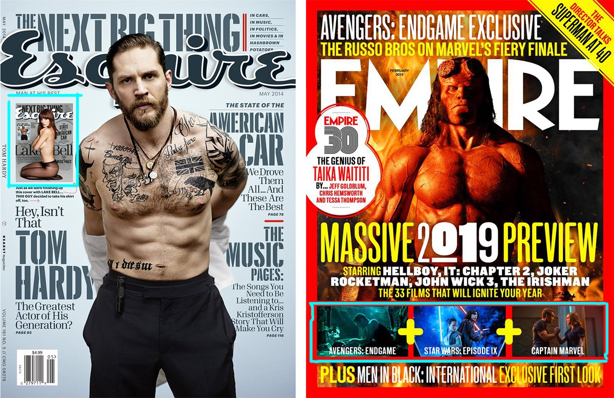
The more images on the cover, the cheaper the magazine looks:

Frame
Sometimes a frame is present in the design, which surrounds the cover. It highlights the content while making it slightly smaller:
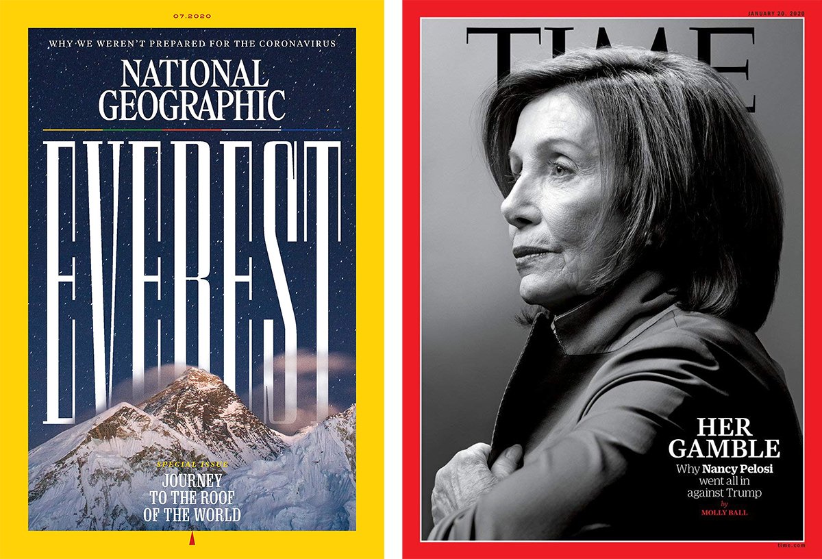
The frame helps to make the magazine stand out when it is on the same shelf as the others as if to cover each other:

Original photo: iStockphoto
Country
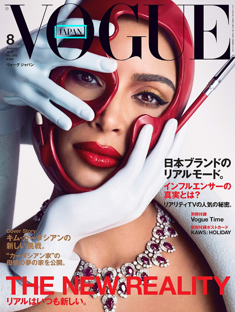
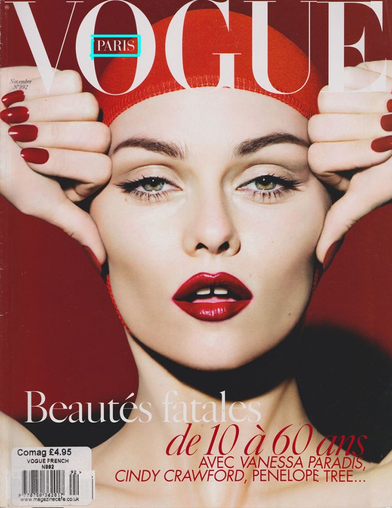
If the magazine is published in different countries, the cover indicates which country the particular edition belongs to. It is usually located somewhere near the name of the magazine:



In conclusion, I would like to say that I have madly enjoyed exploring the journals. Many new topics for posts have matured in the process. It will be interesting :-)

