How I made the logo for the music label JOOF Mantra

Mantra is the new division of JOOF Recordings, a record label founded in Brighton in 1998. Under the new brand, the label will publish progressive electronic music in the Progressive and Psytrance genres.
The challenge was to develop a logo for JOOF Mantra, but to keep the JOOF Recordings logo, i.e. the word “JOOF” should remain unchanged.

Before I started, I looked at the search results for the query “mantra logo”.
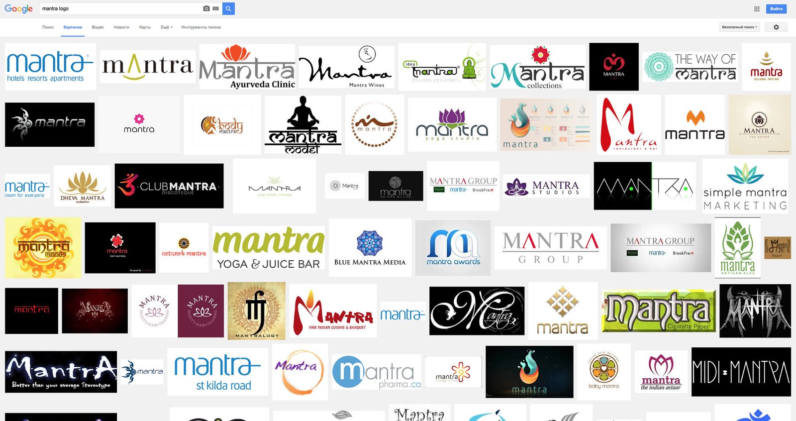
Mantra is associated with India, so most logos are related to it in one way or another. The most common choices are imitating the Hindi language, the Aum (Om) sign, a lotus and a meditating person. Despite this, I also wanted to link the logo to India in some way, but without using the typical clichés.
The search for an idea started with a study of the Hindi alphabet:

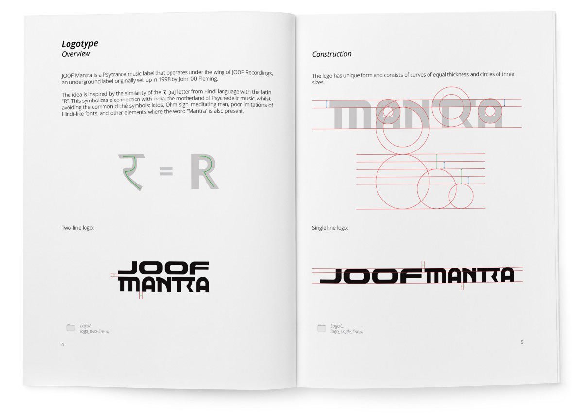
Here I found the similarity of the letter R with the letter र [ra] and took it as a basis for the future logo.
mantra-4.png.
Sketches:
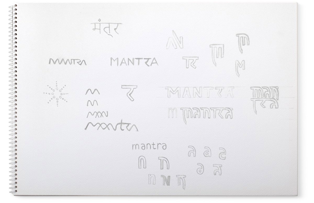
I started drawing.
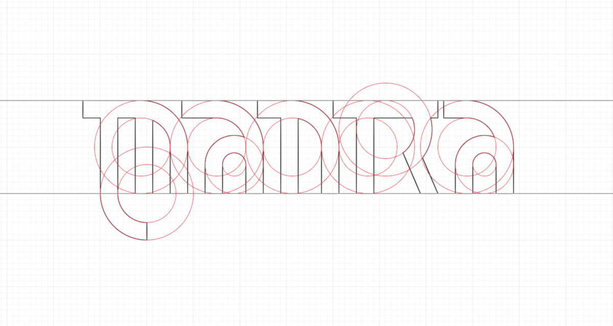
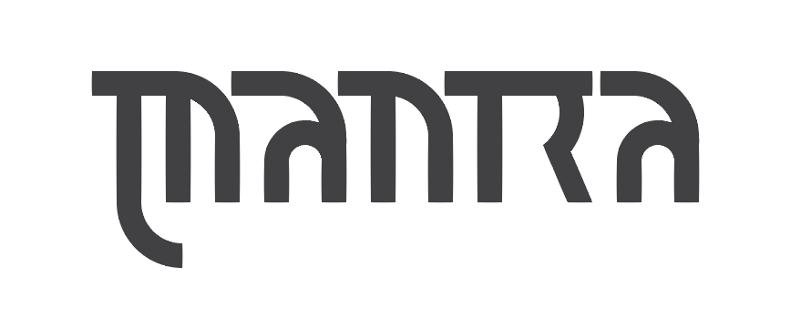
I didn’t like the word in this form. I work further — I change the construction of “A”, try to round the ends of letters, experiment with “M”, change the height of letters — I get a lot of variants:
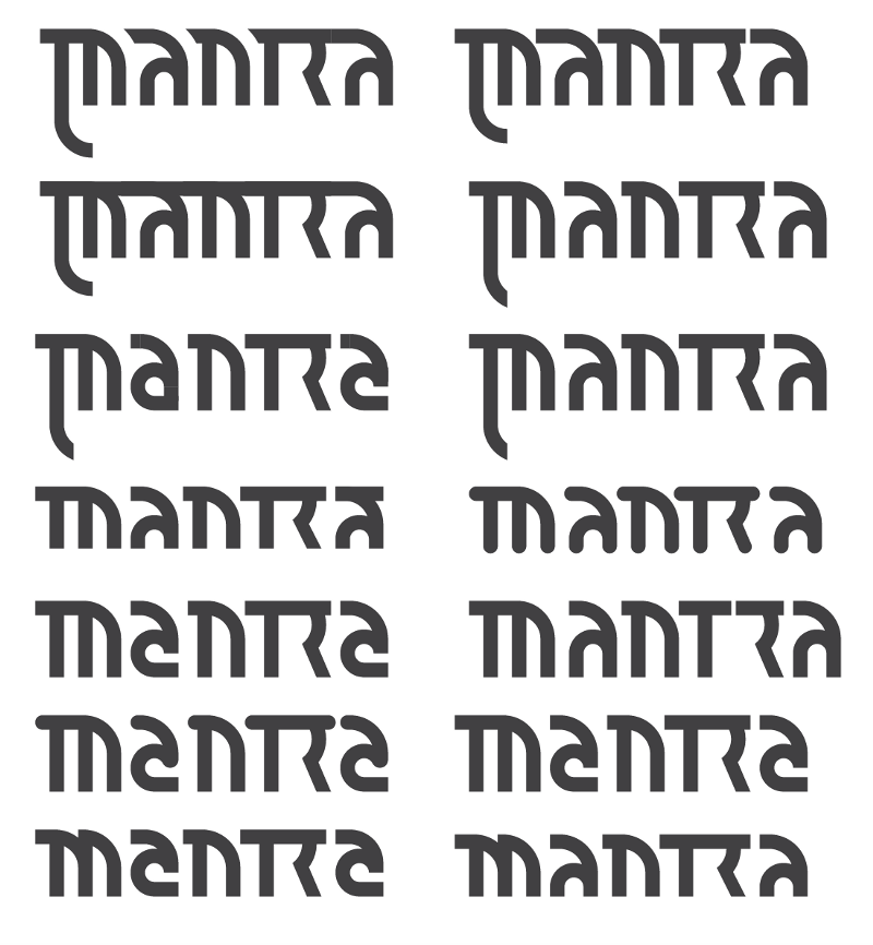
I chose the most successful variant:

At the same time, I am working on another idea:
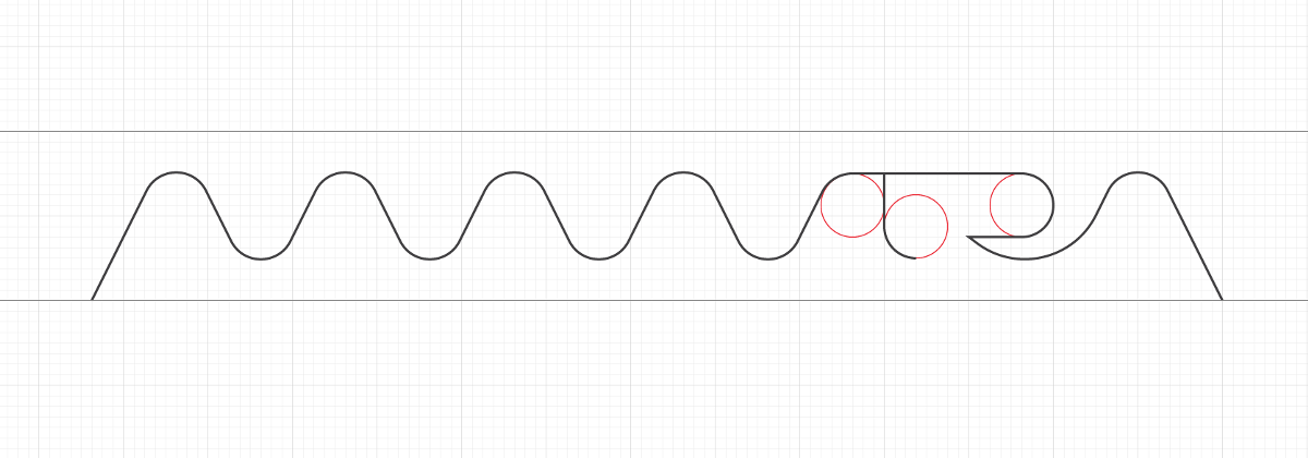
Here I have depicted the word “Mantra” in the form of a sound wave.
Increased the thickness of the lines, I’m watching the result:

Trying both variants on the basic JOOF logo:
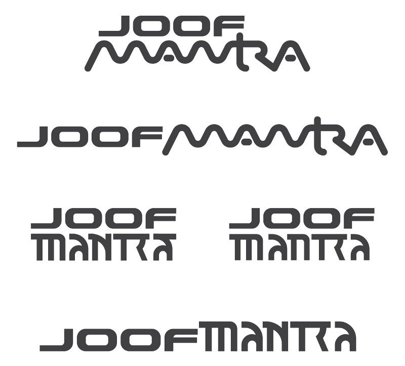
The wavy variant does not give rest, I checked the idea on the Internet and found a similar solution from other companies:

I go back to the first variant and try to change the letters “M” and “N”:
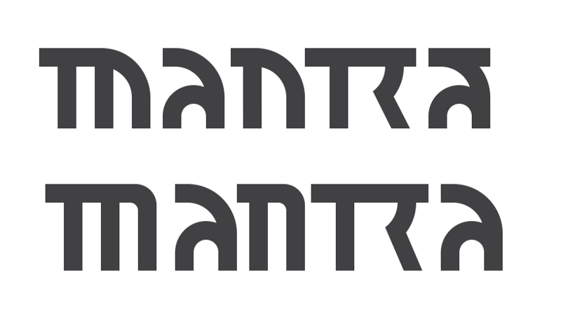
I decided to make the letter “N” closer to uppercase, so that the word is perceived as Latin, and draw a new “N”:

I compare the variants:
mantra-16.png.
Definitely, the new “N” looks better. But now I don’t like the letter “A”. I decided to make it uppercase to match the rest of the letters. Drawing options:

Trying it out:
mantra-18.png.
I chose the classic rounded shape, but refused the serif at the final “A”. I increase the height of the letter so that it does not visually appear smaller than the other letters:

I try the result on the JOOF Recordings logo:

In this form, JOOF dominates a lot. Aligning the thickness of the letters:
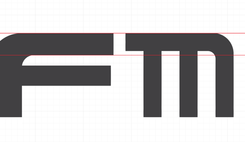
Looking at the result:

Now I’m confused by the different heights. I cut off the legs of the mantra and shorten the serif of the “M”:

I try on both logos horizontally and vertically:
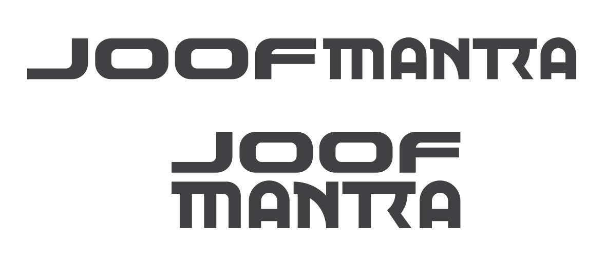
I like the result! Showing it to the client:
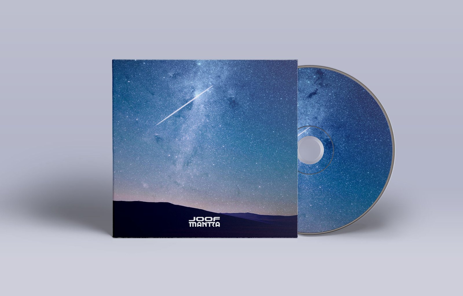
The client is delighted — he likes the logo very much.
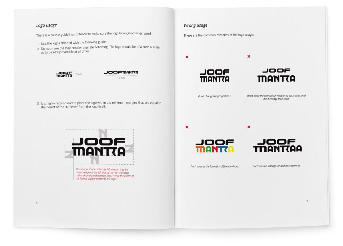
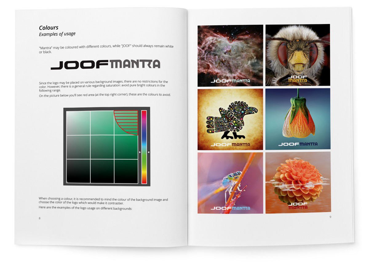
I prepared a guide on how to use the logo and handed over all the materials.
