Made a new Daniel Lesden logo
Task
To refresh the logo while maintaining its recognisability.

The main element of the logo is the DL abbreviation combined into a single sign. This sign is responsible for recognisability, so it should be preserved.
The logo is often used on posters, flyers, album covers and other materials full of colour and elements. That’s why I decided to use only capital letters. Then the logo will be well read. I choose a font that suits the “D” as much as possible:

There is a second letter “D” in the name. I immediately try to insert a sign in its place while cutting the serif tail:

Right now, the “D” is too wide compared to the other letters. Correcting this:
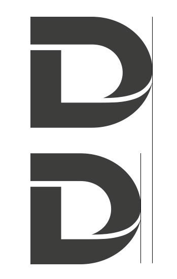
I also softened the ponytail and made it a little shorter:
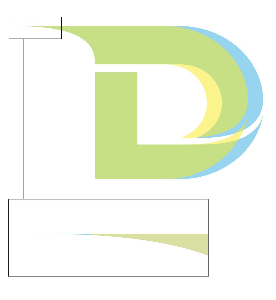
Looking at the result:

Experimenting with letter spaces:

Adding ligature and spaces to other letters:
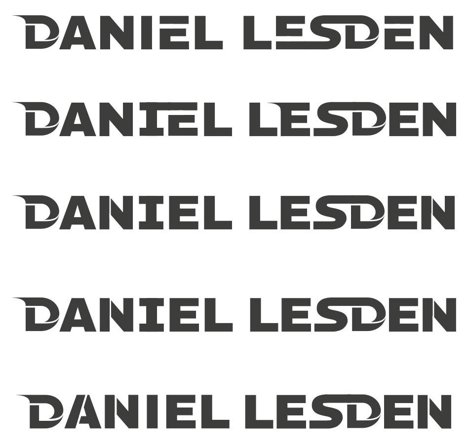
I’m putting together a vertical version:

The words do not match in width — bad. I add horizontal strokes to the letter “I” and lengthen the horizontal stroke “L”:
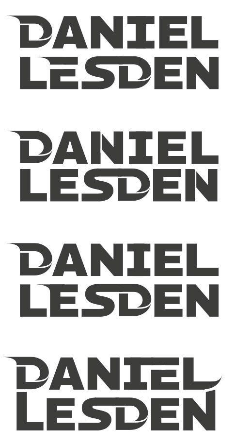
I don’t like it that way. I am expanding the letter “A”.
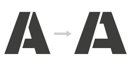
I align the spaces in the letters and take the “E” with a tail, as without it, a hole is formed between the “LE”:


I colour the logo in the company orange colour and sent it to the client:
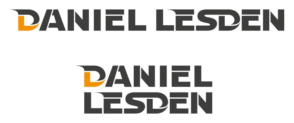
Work accepted :-)


