Logo and style of the Duck House event agency
The Duck House event agency is engaged in the organisation of family celebrations: from weddings to birthdays. The owner of the agency Ekaterina Keshchyan knew exactly that the visual style of the company should be soft, homely, cute and attractive to both adults and children.
Katya is that rare client who actively participates in the work, so the result fully reflects her inner world. Together we developed a corporate identity and a character based on a soft pink colour and slightly cartoonish details.
Logo and style
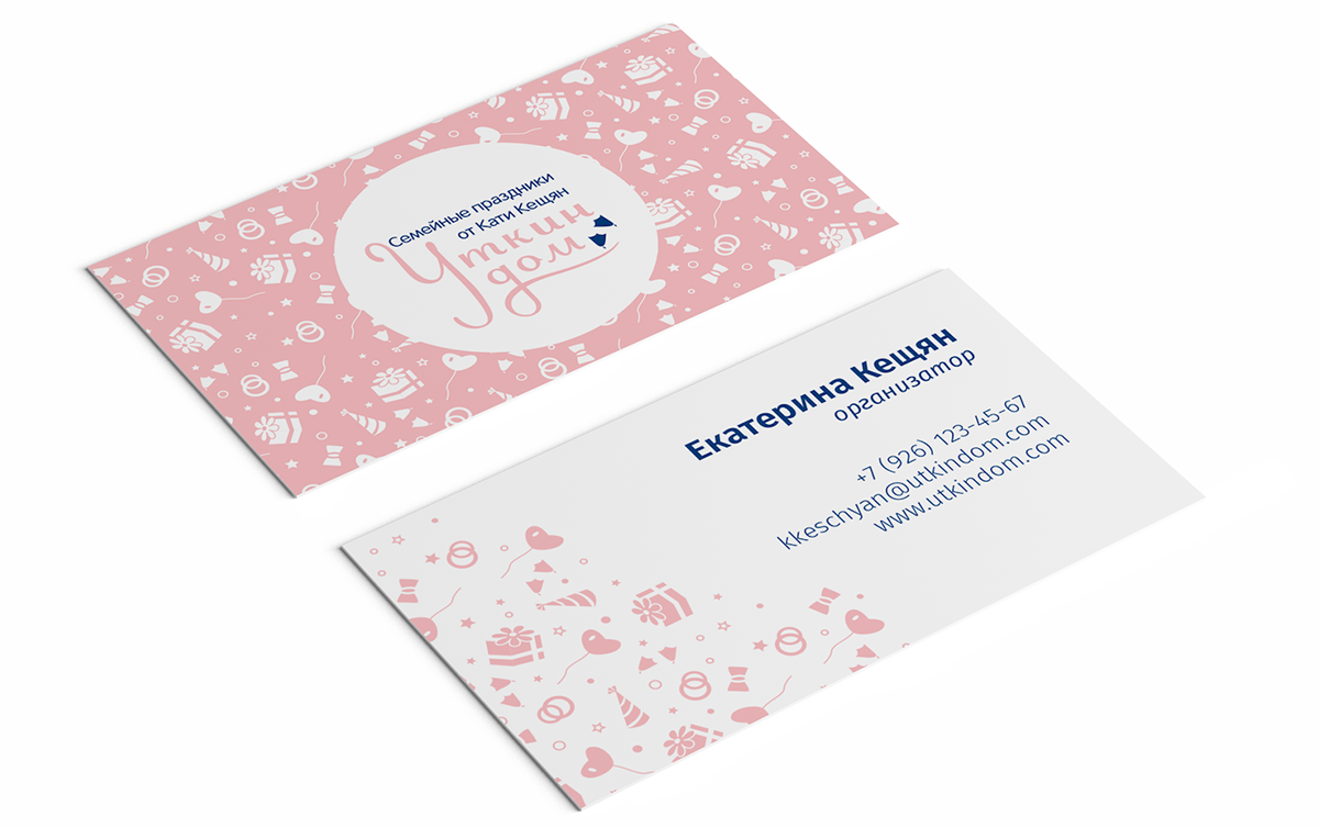
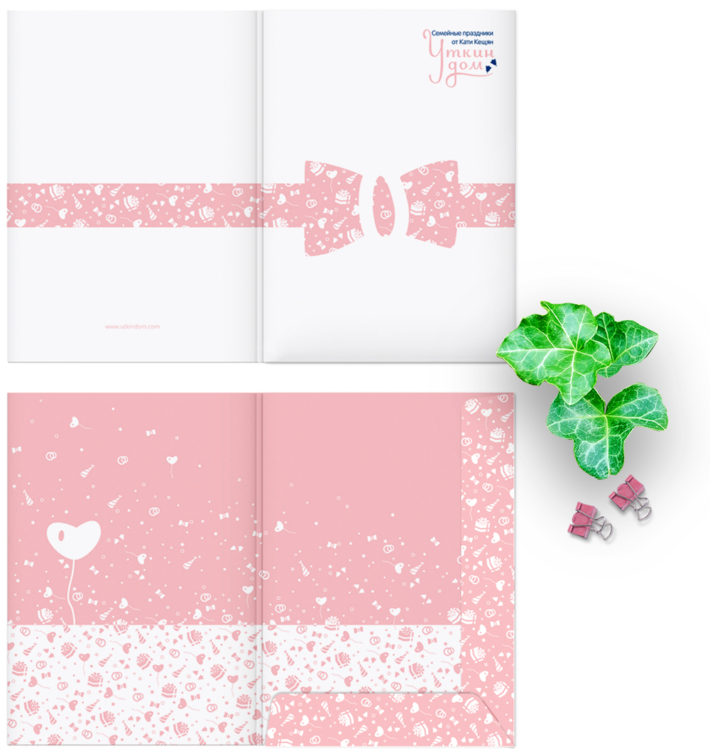
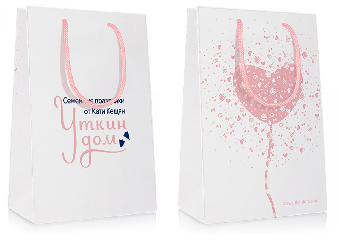
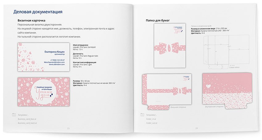
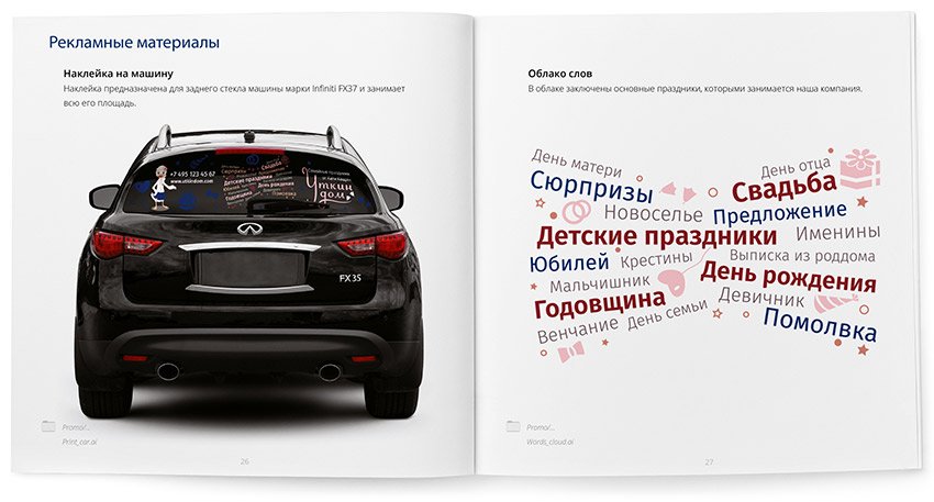
The main element of the corporate identity of the Duck House event agency was a pattern consisting of festive attributes. The result is a flexible style that looks great on any media and in various forms:
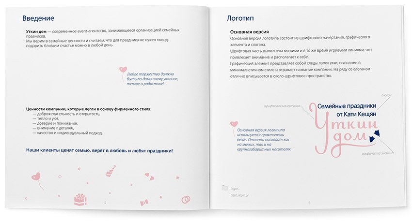
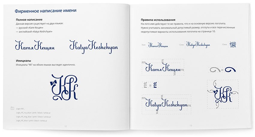
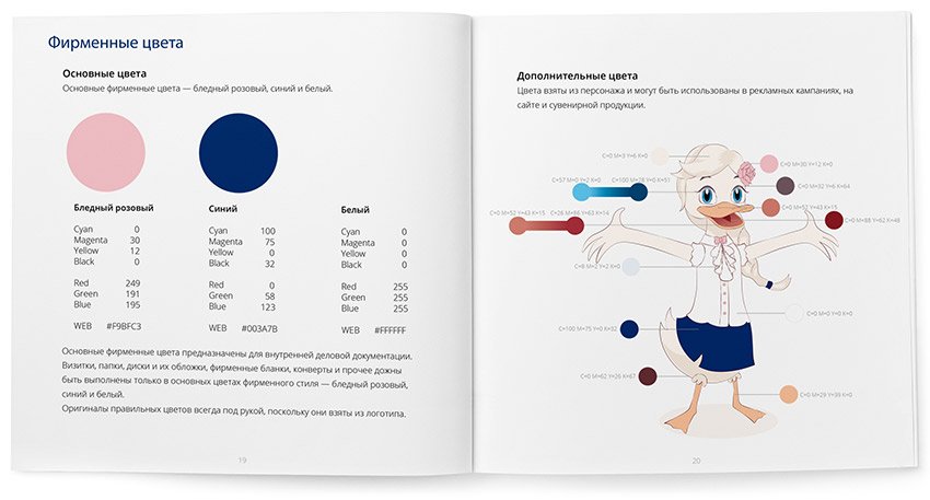
The rules and guidelines for using the logo are collected in a brand book:


Character
As the name “Duck House” suggests, the company’s character is a duck. The duck is not simple, it represents Katherine’s positive attitude and friendliness and is a reflection of her.
Read also about the process of developing the character


