How I design and layout the book

А тут электронная версия книги
Introducing my first book publication! I am very happy that I had the chance to discover this new direction in design. Working on the design of the book was not easy, but interesting. Here I will show you the process of work and all the behind-the-scenes details.
The task: to layout, design and help publish a fiction book by Israeli author and psychologist Lea Wedensky. The book is called “Of Life, Death and Love”.
From the conversation with the author, I learnt that the book will be bilingual — in Russian and in Hebrew, and according to the idea the text should be divided into two columns. Therefore, for greater convenience, I chose a square format for the book.
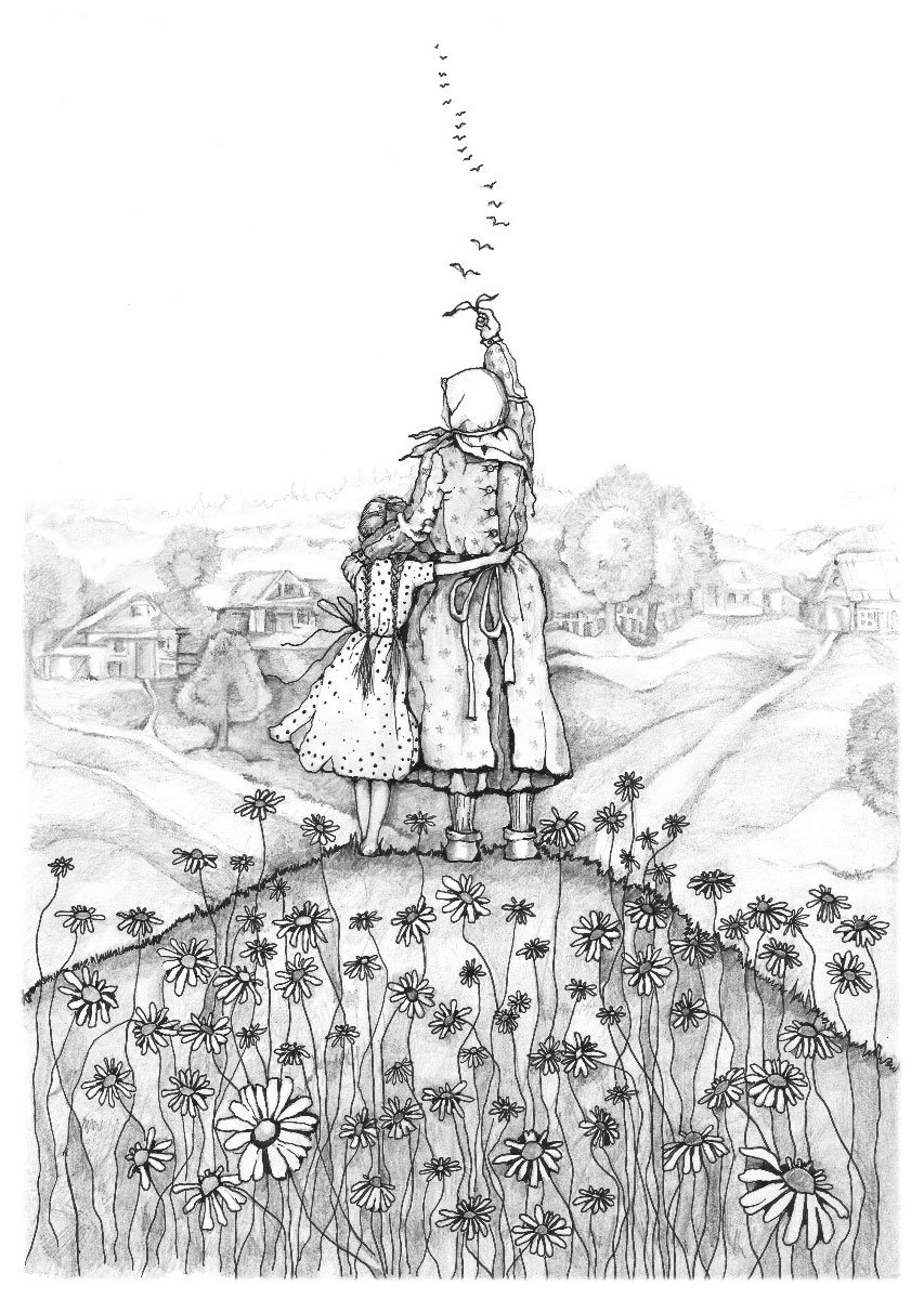
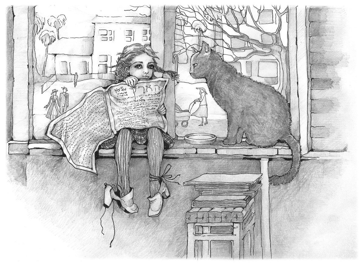
The stories were illustrated by artist Masha Roitman. The illustrations are stunning and lively, made in graphic style with pencil on paper:

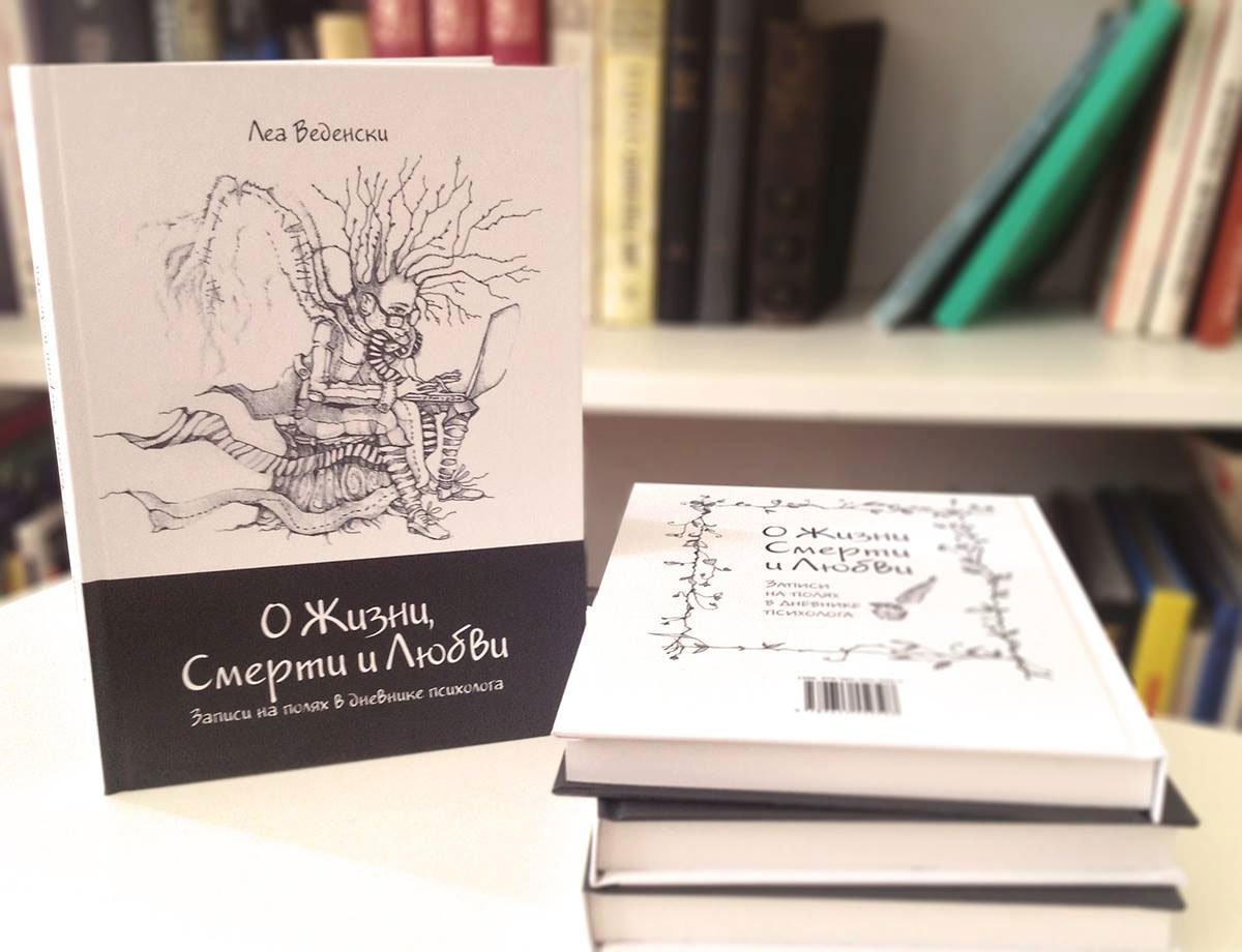
Almost immediately I had an image of a book with an association on the theme of life and death — a white-coloured cover with dark margins.

At this point, I put the cover aside and proceeded to the book block. Here things turned out to be a bit more complicated. Hebrew is a right-handed writing, so the book opens from left to right. It means that Russian texts will be read backwards, which is not quite convenient.
The first version of the book page was like this:
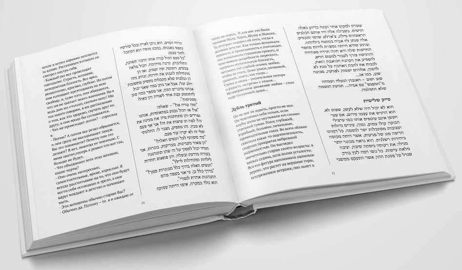
It didn’t seem bad. But the more I got into the book design, the more I realised the unfitness of the first version. In addition, in the process there was a conflict with the illustrations — they are both horizontal and vertical. If you limit them to the typing strip, you get large margins that are disharmonious with the text block. I decided to place the illustrations “under the crop”, but this worked for the vertical illustrations, the horizontal ones continued to “cut the eye”.
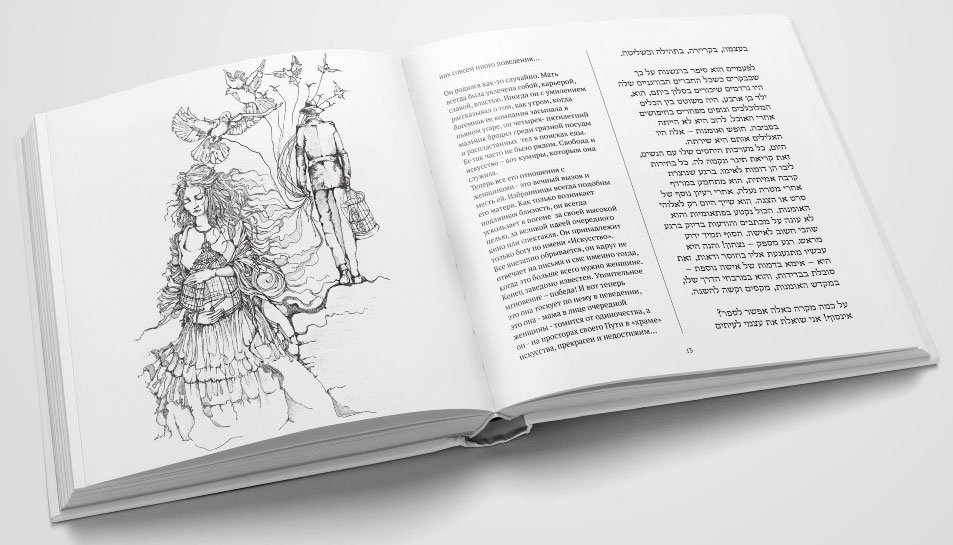
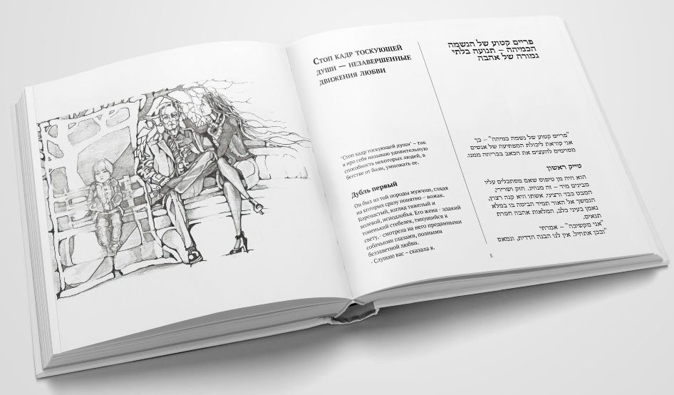
At this stage, the author refused to combine Hebrew and Russian in one book — it was the best solution.
I went ahead and removed the Hebrew-language text. Now the text blocks seem too massive and the lines too long. It is uncomfortable to read such text, your eyes get tired quickly. The font size cannot be increased, it is already large enough.

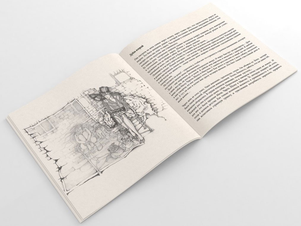
I’m thinking of a solution:
— Since we no longer require a two-column layout, there’s no longer a need to stick to the square format. Why not change it?
Taking into account that all the illustrations are drawn on A4 paper, I chose the proportional format — A5 — for full harmony.
When working on the square version I relied only on my aesthetic taste, but with the A5 format I had difficulties. In my search for a harmonious proportion of strip sets, I discovered Jan Tschichold and his “The Form of the Book” — a delightful “textbook” about book layout and design.
Following the Van de Graaf’s canon, the strip set began to look like this:


Harmony for text blocks and illustrations has been found. There was no need for a large font, so for ease of reading, I reduced it from 12 to 11 pt, now a line holds an average of 5–7 words.
I chose two fonts for the text: Newton for the main text (combines high readability and features of old-style fonts, under the eternal themes touched upon in the narrative) and Jakob for the headings (handwritten font, perfectly harmonises with the graphic illustrations).
Working on the text, I also followed Tschichold’s recommendations.
I centred the headline, typed it in capitals with a small spacing of letters, and separated it from the main text with an indent. Therefore, the first paragraph is not indented to the left:
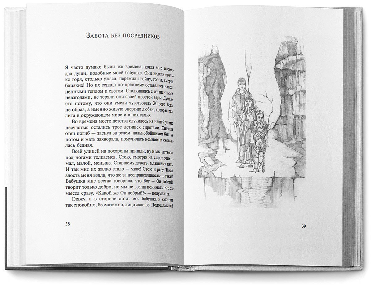
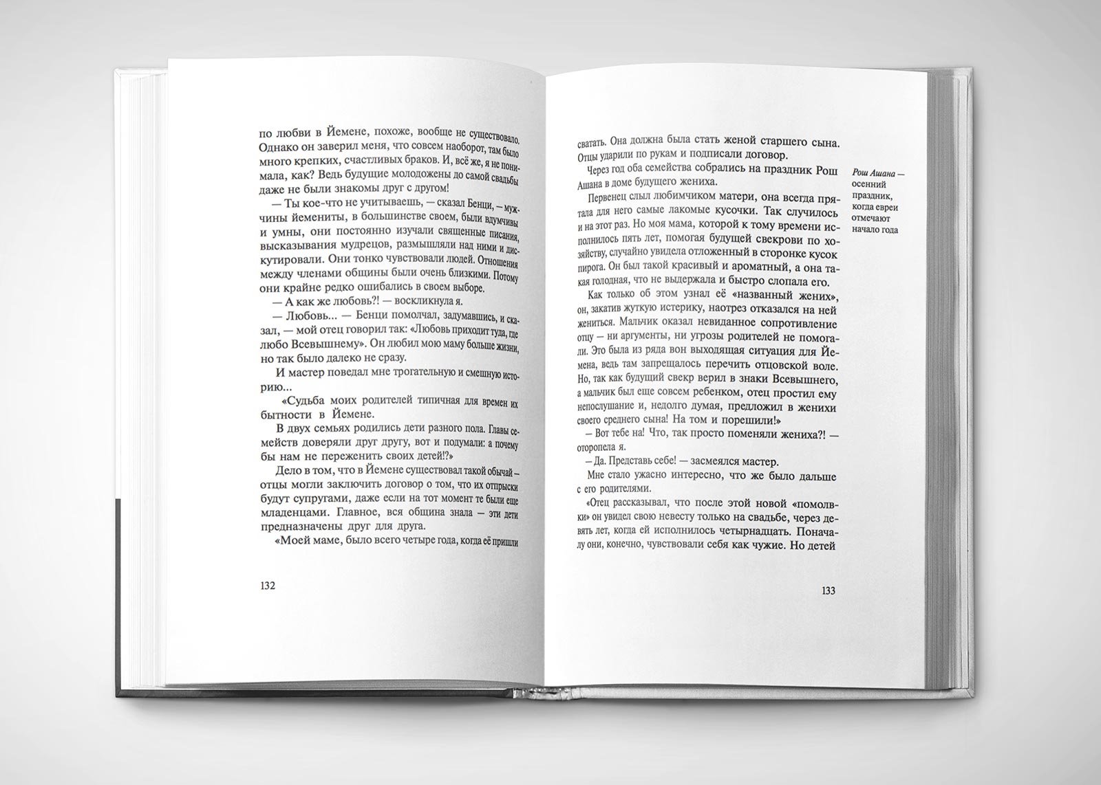
The wide margins allowed for greater leading spacing, which added air and harmony to the typographic plane. In addition, I was able to keep the typing strip intact and place all the footnotes in the margins:
13.jpg.
To visually equalise the border of the text block, I partially moved the punctuation marks beyond it:

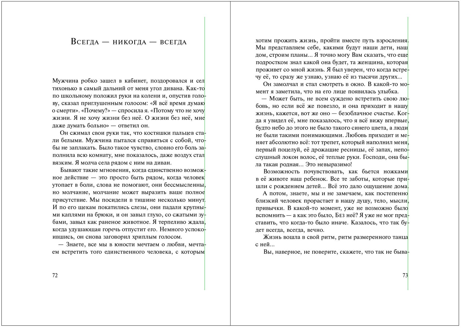
When punctuation marks are inside the block, geometrically the border is flat, but visually it is floating and curved. If the signs are partially taken out, then visually the border is levelled and looks nicer. For clarity:
5.gif.
Separately I would like to talk about “hanging” prepositions. It is correct to move them together with the related word to a new line, but I often encounter neglect of this rule. Most likely this is due to unwillingness to transfer them manually or not knowing how to automate this process. That’s why below I’ve described how to do it in InDesign.
Removing “hanging” prepositions in InDesign
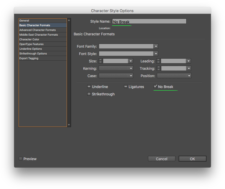
Open the document and create a Character Style with the only setting “No Break”, and give it the same name:
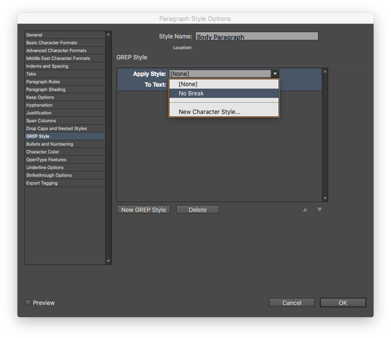
Next, create a Paragraph Style for the main text and go to the GREP Style tab. There we click the “New GREP Style” button and in the drop-down list “Apply Style” choose our previously created “No Break”:

In the “To Text” field, type all prepositions:
(?<= )((в|на|под|с|со|во|без|то|ли|бы|или|да|но|что|а|и|у|уж|так|как|для|перед|через|над|при|по|до|от|о|об|про|к|ко|не|за|из|ни|нас|я|он|она|оно|они|мы|ее|её|его|вас|ты|вы|все|всё)( |\. |, ))+
Next, create a new GREP Style by analogy with the first one, but for capitalised prepositions:
((?<= )|(?<=^))((В|На|Под|С|Со|Во|Без|То|Ли|Бы|Или|Да|Но|Что|А|И|У|Уж|Так|Как|Для|Перед|Через|Над|При|По|До|От|О|Об|Про|К|Ко|Не|За|Из|Ни|Нас|Я|Он|Она|Оно|Они|Мы|Ее|Её|Его|Вас|Ты|Вы|Все|Всё) )+
To make it clear:
- The condition (?<= ) means: only if there is a space before the preposition;
(?<=^) means: only if the preposition is at the beginning of the paragraph; - (в|на|под|с|со|во|...|вы|все|всё) — a list of all prepositions, pronouns and conjunctions that should not be left at the end of a line;
- ( |\. |, ) — signs after prepositions: space, dot+space, comma+space. The \ symbol indicates that the dot after it is treated as a dot, not as a GREP metacharacter);
- + indicates that the condition also applies to consecutive prepositions, pronouns and conjunctions, e. g. “but we thought it was interesting”.
Read more about GREP metacharacters and principles of operation in the GREP manual.
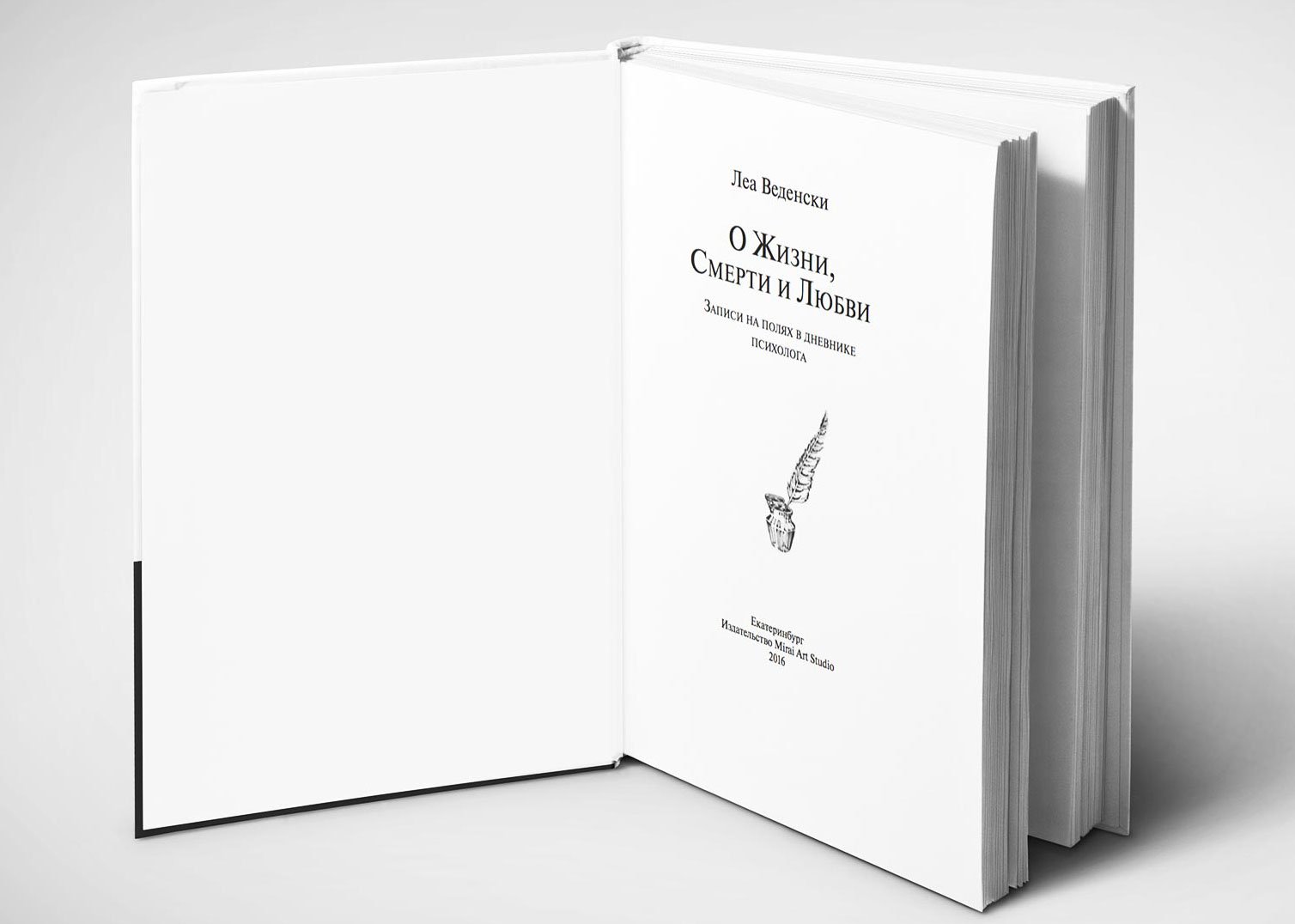
Result of work:




Project members
| Designer Tanya Sokolovskaya |
Author Lea Wedensky |
Illustrator Masha Roitman |
Literary editor Gulnara Sabrekova |

