How I created an architect’s logo
Today I’m going to tell you about an interesting logo that I worked on for two months. This is quite a long time, but the client and I were satisfied with the result.
The client is Oz Minasov, an Israeli architect and interior designer. Oz works with both countryside and urban properties. Also, he is not limited to the country of residence and works with the whole world.
I started the work by looking through Oz’s portfolio, and almost immediately the idea for the logo appeared.
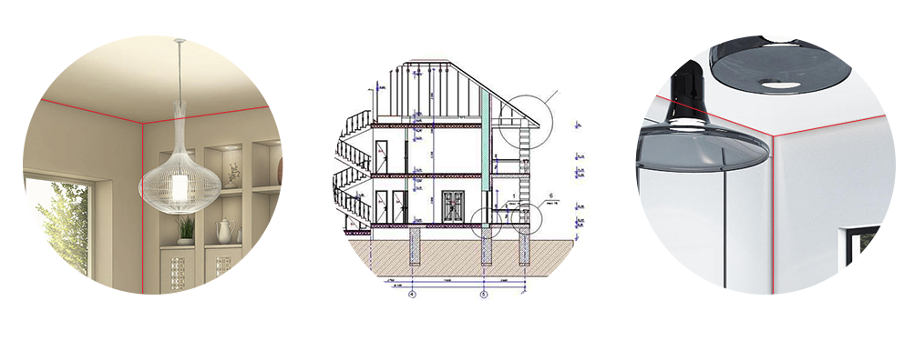
I combined the three axes of the interior corner of the room with the architectural drawing, thus emphasizing both architecture and interiors.
om-2.jpeg.
First sketches
I sketched the idea on paper and started to realise it.
In the logo, one of the axes divides the letter O diagonally — the lower half of the letter is made as a drawing, while the upper half remains a letter. The other two axes formed a right angle into which the signature fits.
The logo turned out to be not simple, but dynamic — its axes can move apart, thus giving space to work on the style.
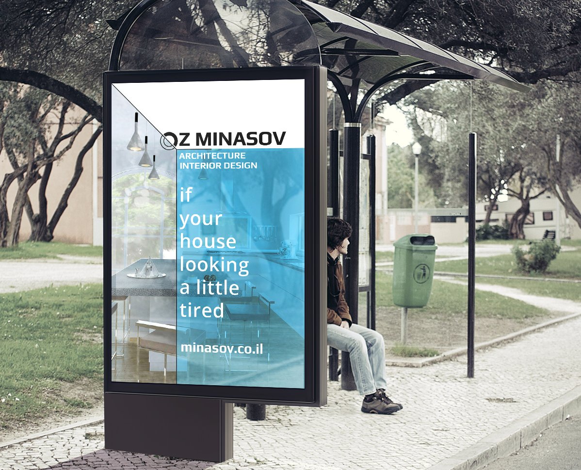
Presented the result of the work to the client, but were rejected. Such a logo did not suit Oz.
After talking to him, we came up with a new solution — to use a house in the sign and emphasise architecture. As a prototype of the idea, Oz sent photos of a designer’s house, which he liked very much.
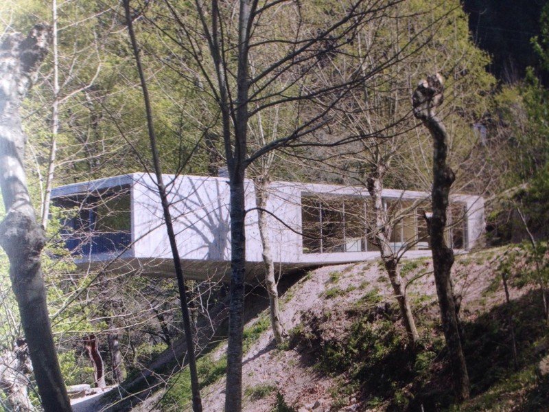
I started new sketches. This time I wanted to show the unity of architecture and nature.
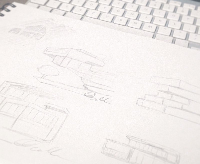

To the house on the cliff, I added a signature of the first name and the first letter of the surname to give an artistic touch and authorship. Below is the result:
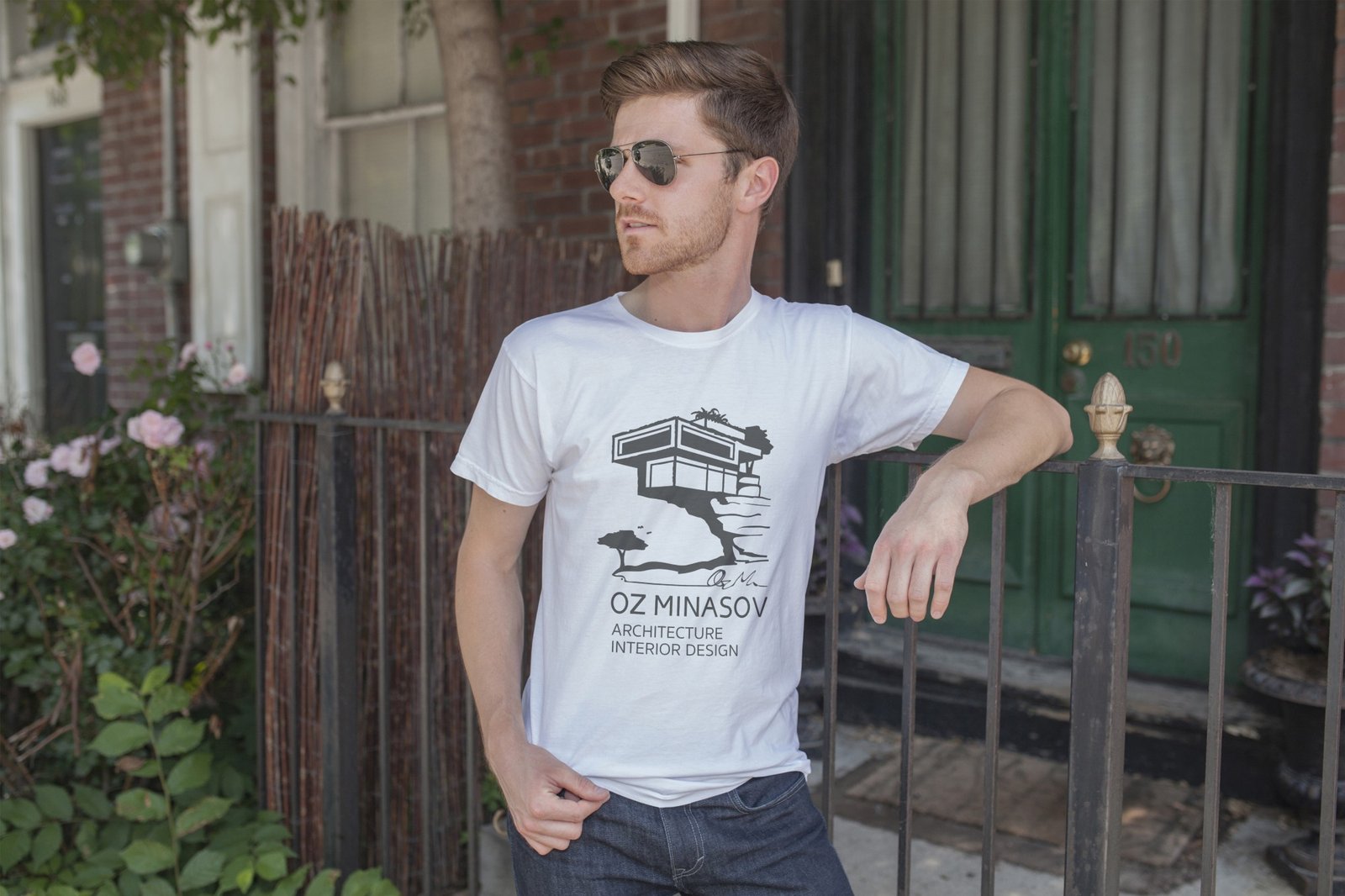
Showed it to the client. He liked the idea of the signature, but the shape of the house was still to be worked on. Oz also asked to remove the black bold lines and simulate a pencil sketch, and to make the font part more elongated.
I decided to tackle the house first and sketched a new version:
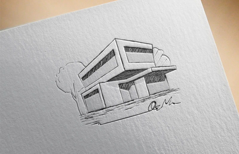
However, we didn’t like it in this form and after discussing the details with the client, we gave up the idea of the sketch.
At the same time, we started working on the font and developed the font part based on the chosen typeface:
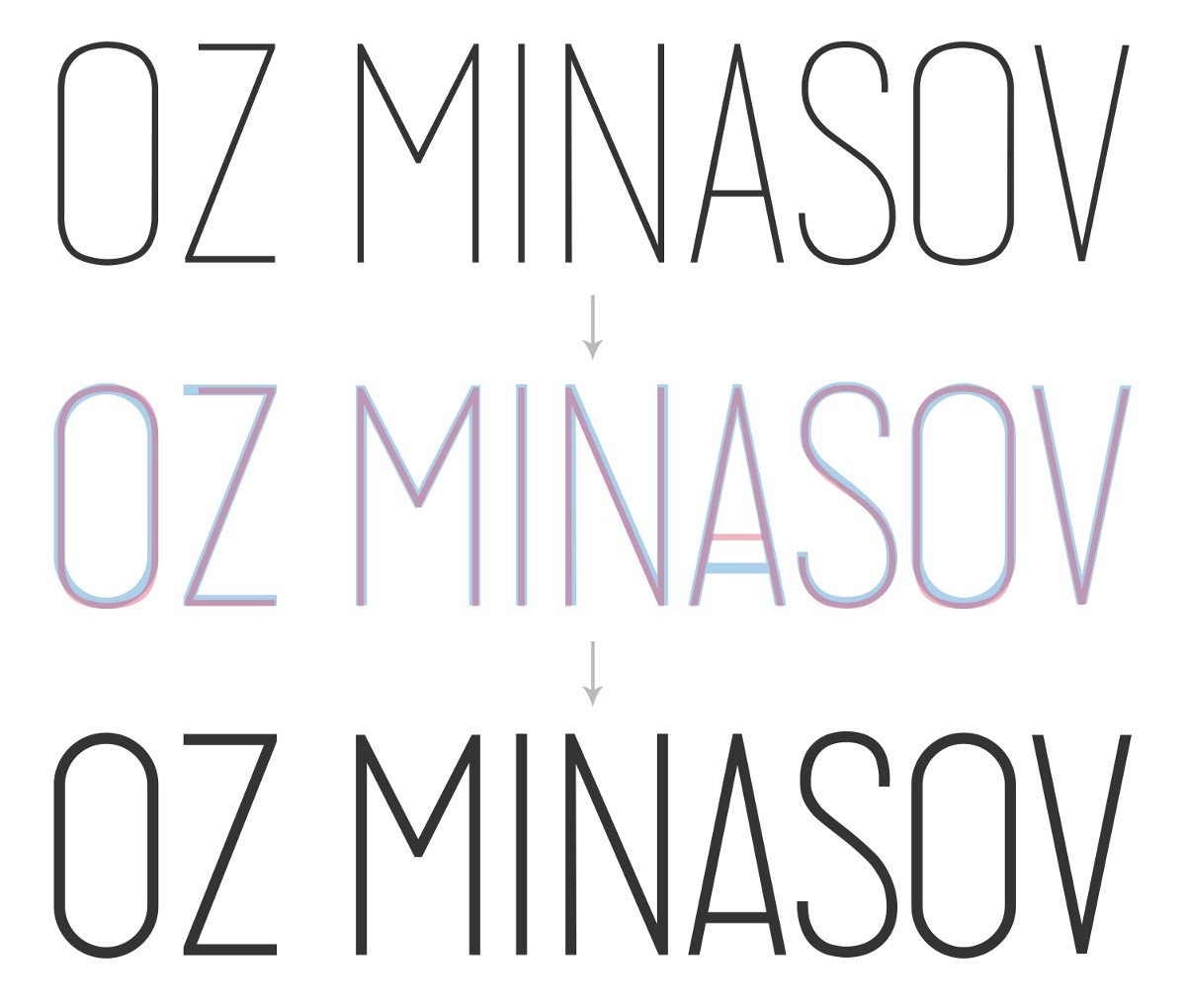
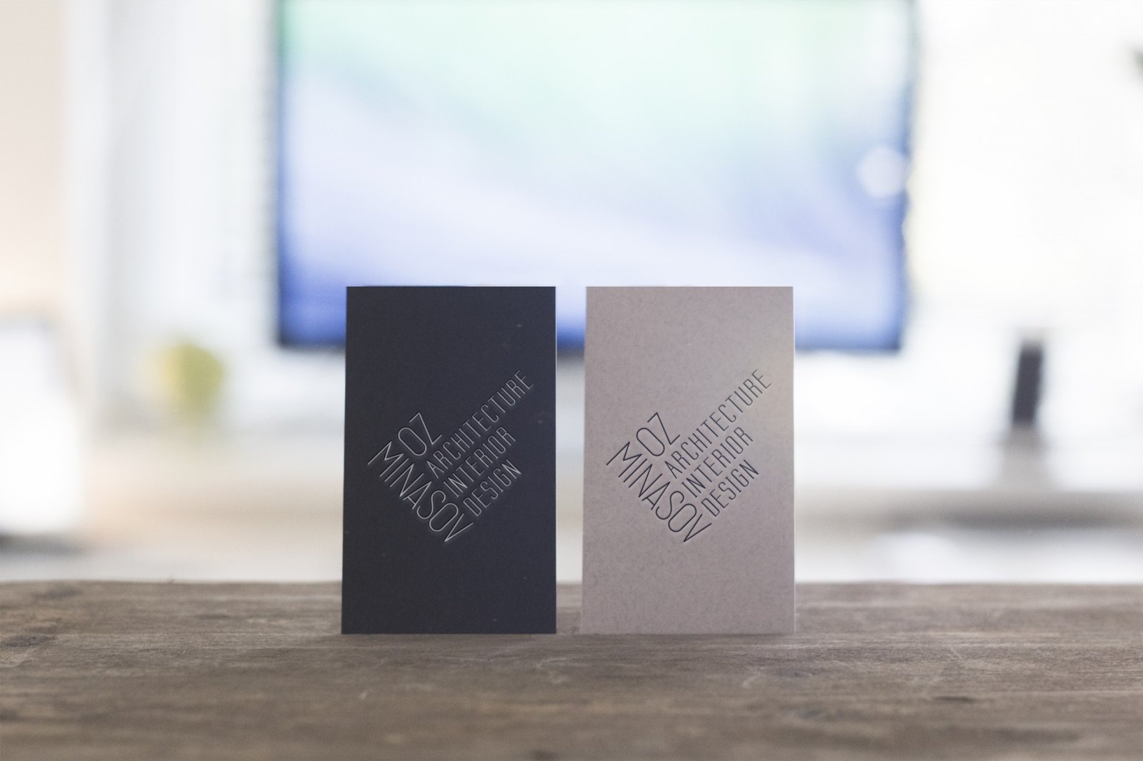
At this stage, Oz asked to work on a fully typographic version of the logo, without the house. Similar to the first and last name, I designed the signature “Architecture And Interior Design”.

I combined everything into a sign shaped like a building:
While I was working on the typeface, I came up with another idea for the house — to combine the pencil shading and the silhouette of the house.
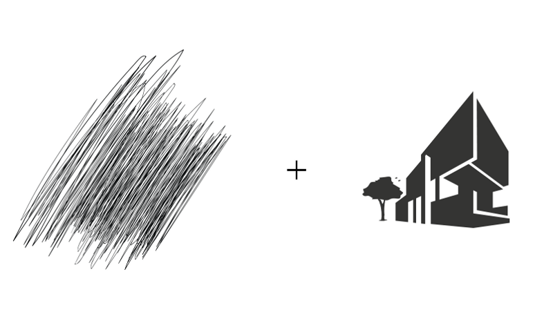
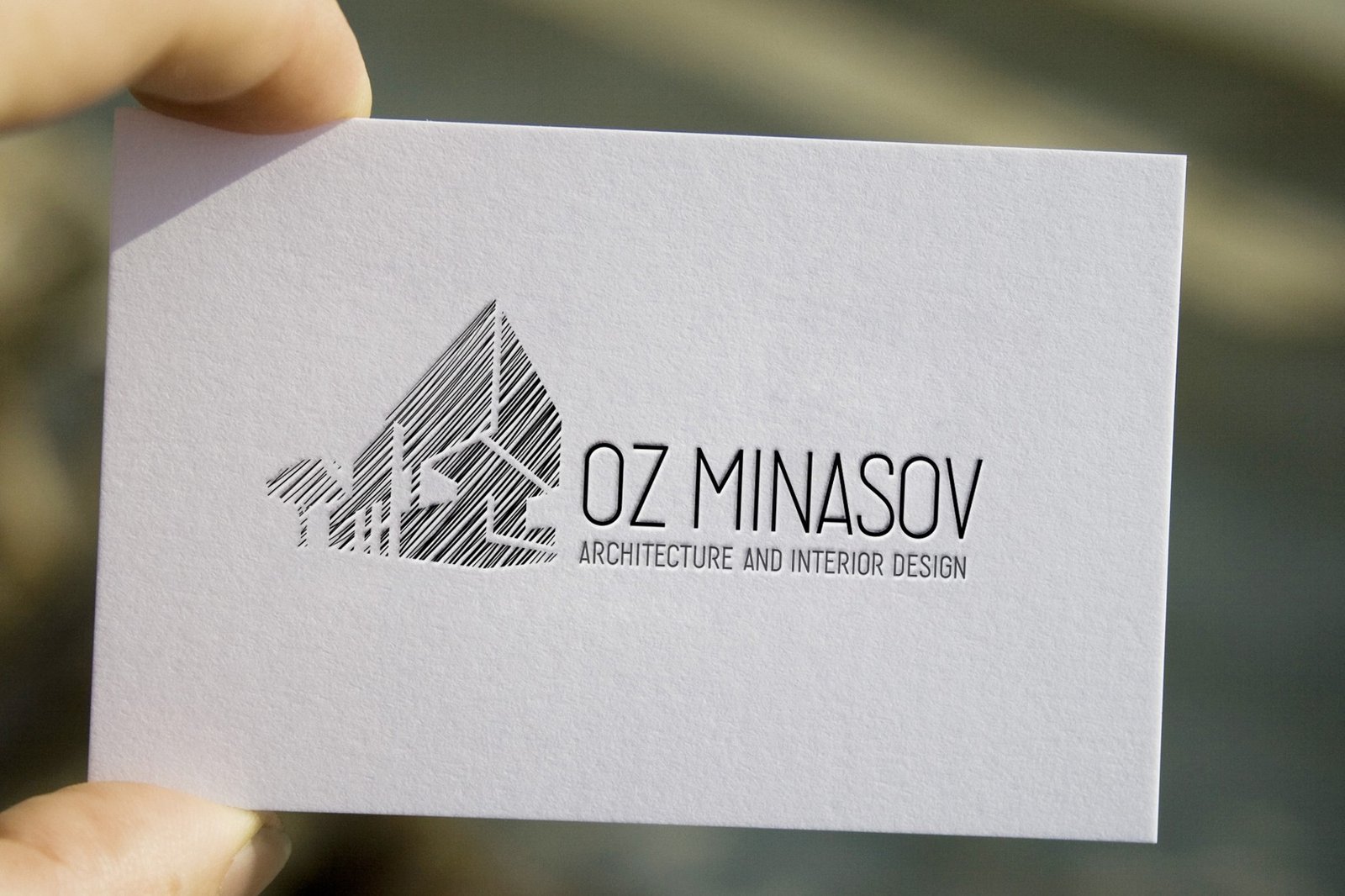
Clinet liked this idea. We concluded that it would be great to use a house in the sign, which Oz would design himself. However, in the process, the client suddenly decided to completely change the concept of the logo, abandoning the house symbol.
Back to the sketches again. This time the work was on the symbol from OM’s initials.

I chose two ideas and started to realise them.

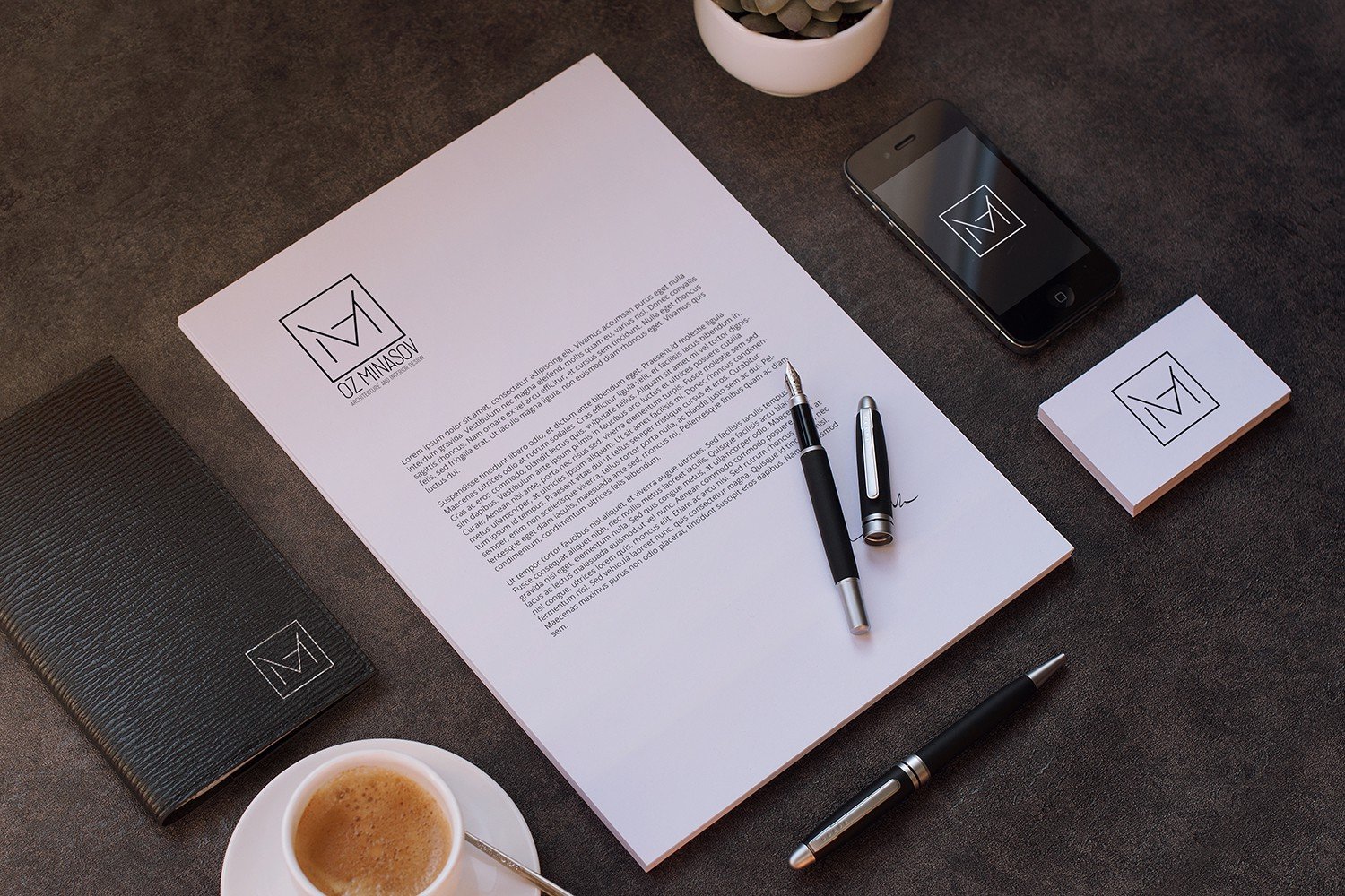
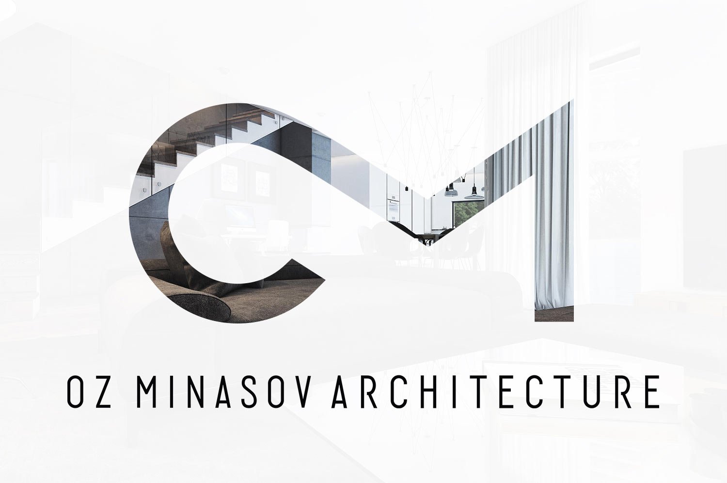
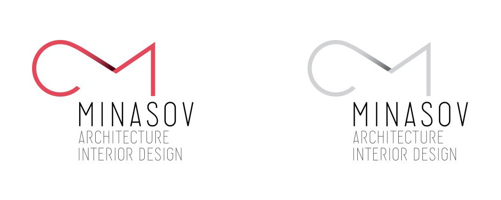
From the proposed variants the client chose the first one — the ligature of O and M. He liked very much that the sign contains not only initials but also traces the silhouette of a fish. I continued working on it. As a result, the sign underwent a small transformation.

The next task was to put together the graphic part and the font part. Since the sign is rounded and wide, and the letters are elongated, together they did not look very harmonious. So I abandoned the first name in the logo and defused the letters in the surname. This helped get rid of the flaw.
om-19.jpeg.
I started colouring the sign. With a gradient, I strengthened the letter O.
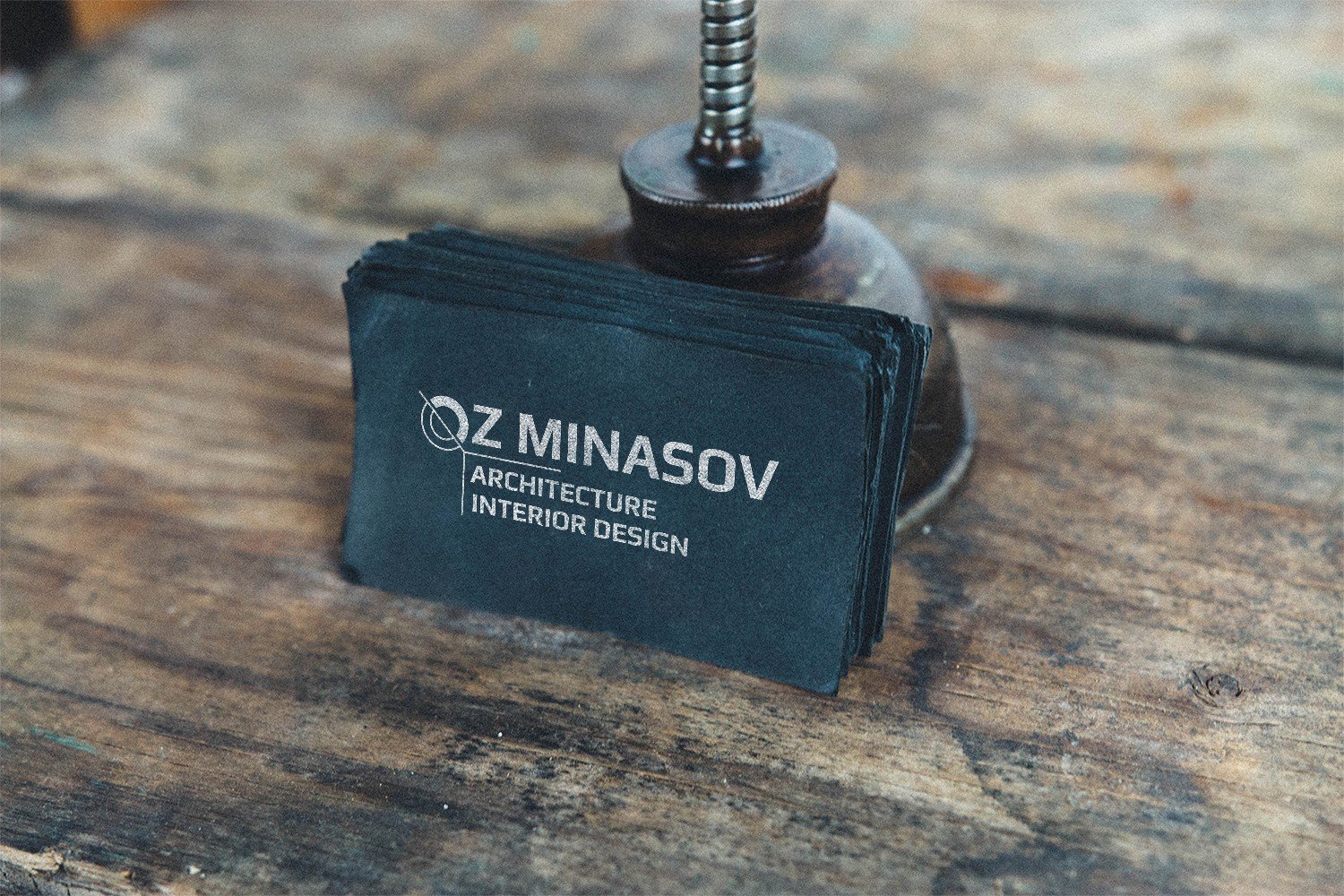
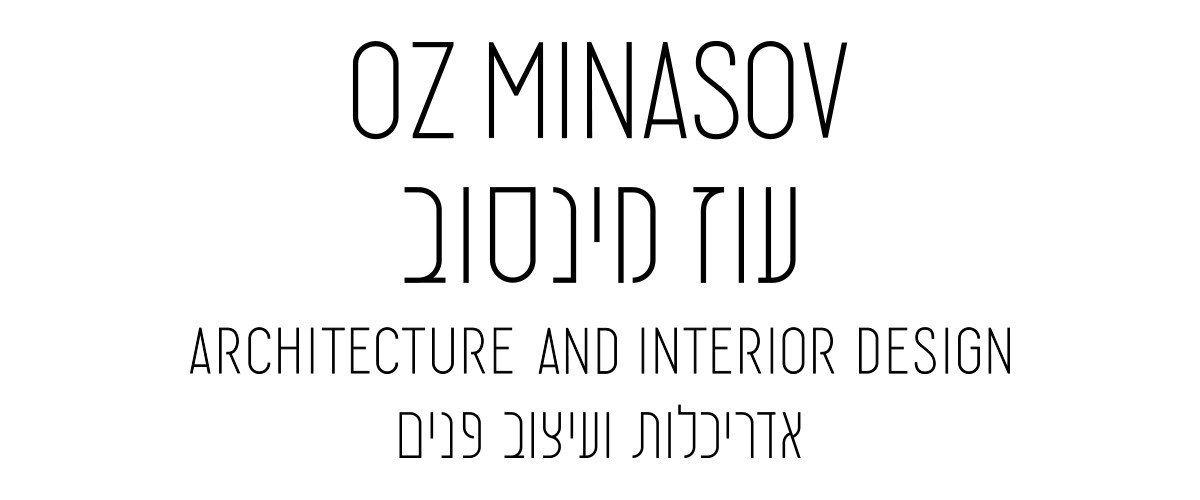
When the sign was ready, I began work on Oz’s business card. For it, I developed a text part in Hebrew to match the style of English writing.
I made two types of business cards and sent them to the client.
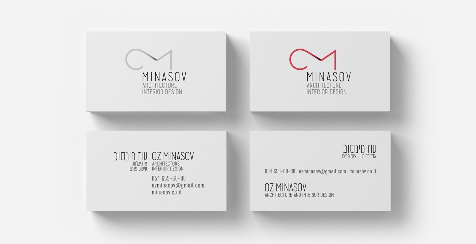
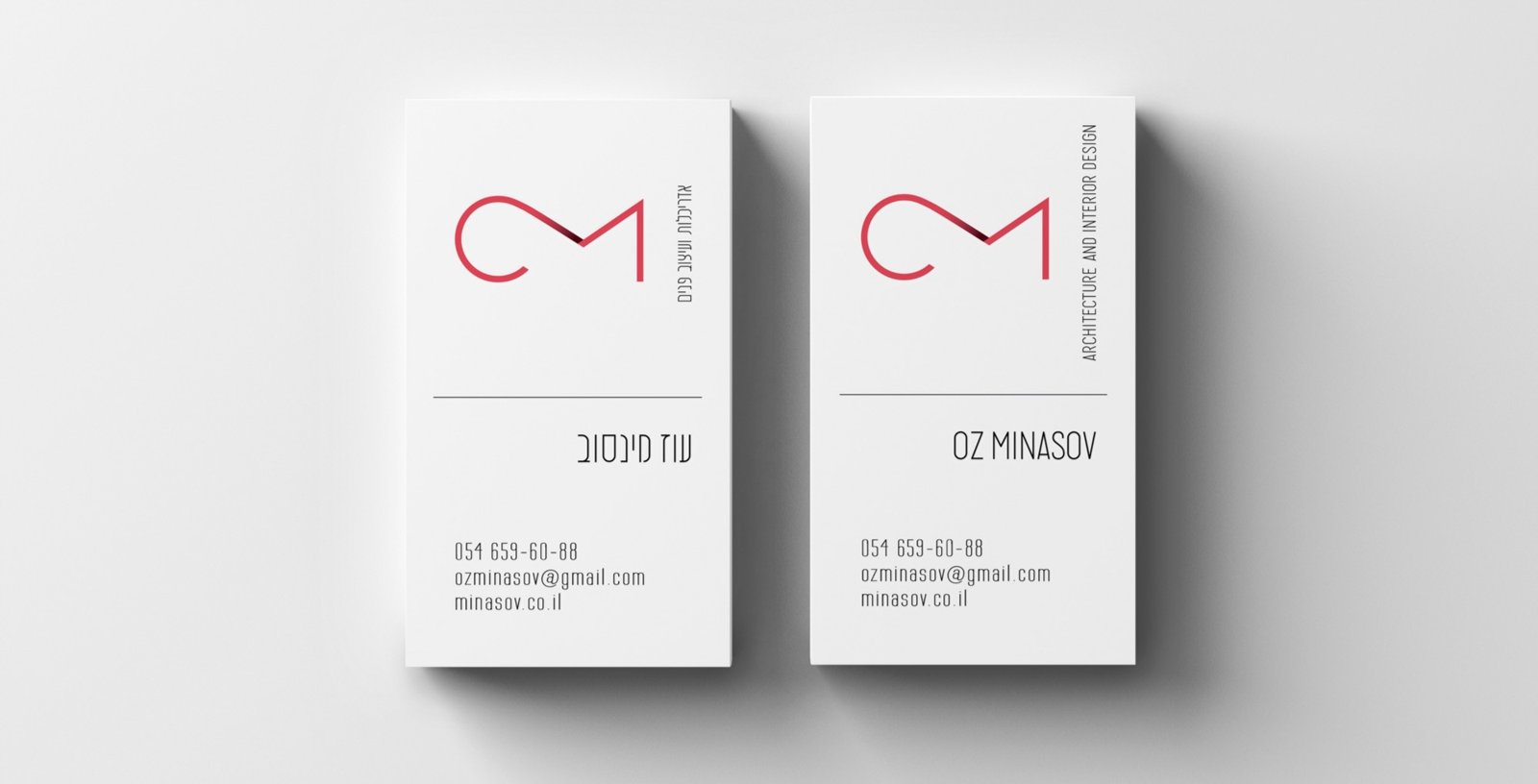
The client did not like the business cards in this form. He shared his new wishes — to make the sign more massive and the business cards black.

On black paper, it is preferable to print with metallic inks (gold, silver, bronze), so I have shown new variations in different colour schemes.
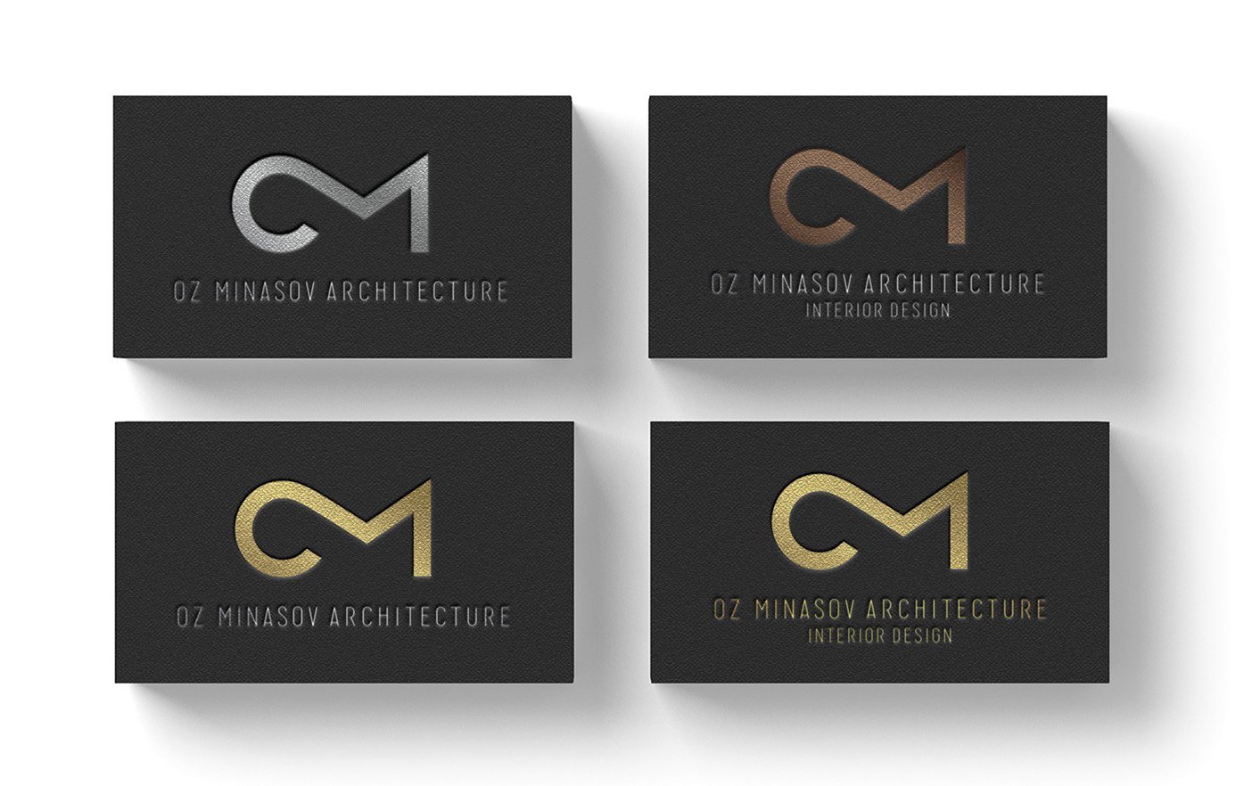
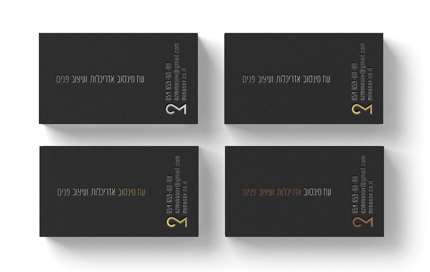
The client approved the logo and chose their favourite business card options.
I finalised the fonts — made them a bit bolder and presented the final version to the client.


