Magazine layout. Rhythm
Continuing magazine theme :-) I first discovered rhythmic layout in 2016 in the book “Editing by Design” by Jan V. White. It was a revelation because I wasn’t familiar with multi-page layouts. Now I look through the magazines and realise how the rhythm makes the publication interesting and contributes to the study of the magazine.
Composing a publication is like making a movie storyboard — the dynamics and changes of plans are important. The magazine should not be seen as separate pages but as a single organism. If you take a magazine and hang its pages on the wall, preferably in a single line, stand back and look at that line, you can see the overall dynamics.
Elements that influence dynamics
A good dynamic is when the illustrations alternate with text blocks when large elements alternate with small, dark elements alternate with light, and so on. This creates a contrast that prevents the reader from getting bored. Here are some of the elements:
Speed
Movement in the left-to-right direction is faster than in the opposite direction. This is because, as children, we learn to read from left to right. You can control the speed of the movement by alignment and spacing. The closer the elements are to each other, the faster the flow of these elements moves. If the elements overlap each other, the movement becomes even faster and easier:

Shade
Shades allow you to manipulate the distance, how close or far away the objects are. The darker the element, the closer it appears, and vice versa:

Shape
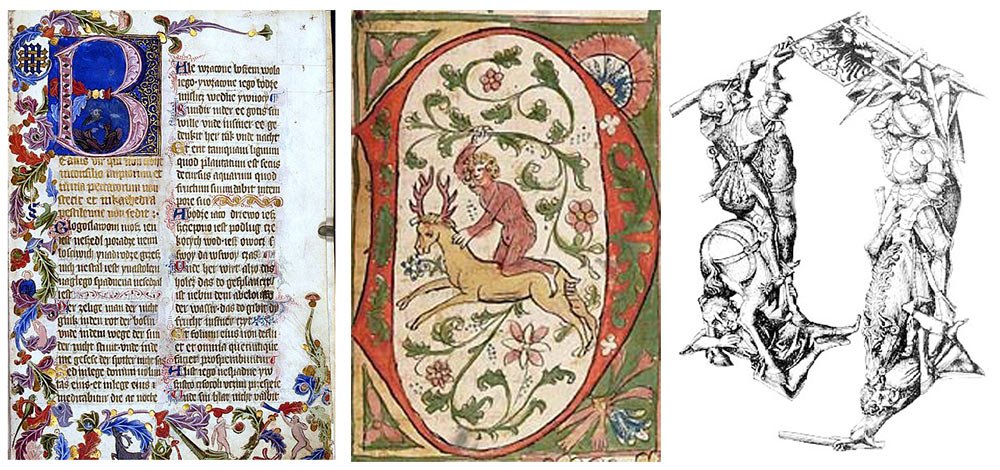
The shapes of the repeating elements can be changed slightly and shifted up or down — this will add dynamics and enhance the impression:

Size
Manipulating size can lead to a decline or, conversely, to growth, to show decay and improvement:

Repetition
The frequency of repetition of elements indicates acceleration or deceleration:

Direction
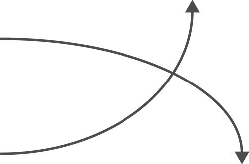
Upwards direction means improvement and downward direction means decline:

How and where to apply
Dynamic elements can be used in magazines and any publication with more than two pages. They also fit perfectly into web design — websites and applications will become more dynamic and exciting. You can use a single element or several elements at once. The combinations create an amplified rhythmic effect.
Parsing the magazine
I became interested in tracing the rhythm of a real magazine. I chose to research National Geographic magazine and paged it:

The main elements of dynamism in this magazine were shade and size.
Shades. The shades set the main dynamic of the magazine. Light and dark pages alternate throughout the publication. Text pages alternate with photographs and vice versa. This quick change of contrasts keeps the reader interested.
Size. Close-up photos of birds alternate with medium and long-range shots of birds in full size or with more than one bird in the photo. The type of people’s photos changes — large portraits alternate with full-length silhouettes. The photos of buildings also alternate — from afar and inside details of the building.
I’m so passionate about magazine layout that I got a job at a publishing house and designed my first magazine. I’ll tell you and show you all about it soon! :-)


