The process of creating a logo for the music project JOOF

JOOF Live is a new music project by British artist John ‘00’ Fleming.
John Fleming is an electronic music pioneer, DJ, producer, radio host and label owner of JOOF Recordings. In a career spanning over twenty years, John has reached unimaginable heights and is widely recognised as an engine of progress and one of the most respected artists in the underground music scene.
In the “JOOF Live” project John emphasises live performances that will unlock his potential as a musician and bring a new sound.
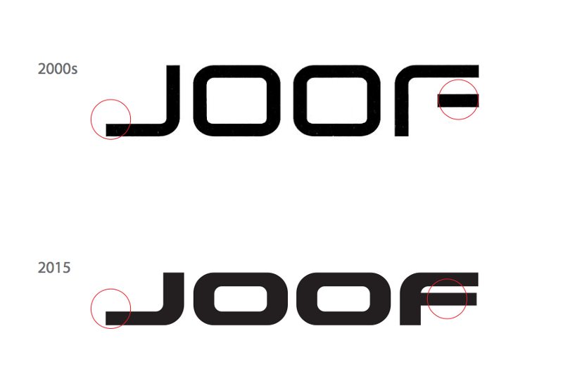
The logo of the “JOOF Live” project should be different from the logo of the JOOF Recordings label so that fans don’t confuse the names of the label and the musician. That’s why I look at the label logo before starting work:

The focus is on the two centre letters OO — they are static and rectangular. The wide font makes the logo look massive like it’s under a press. I will avoid all of this in the JOOF Live logo move from the opposite, and add ligature for more uniqueness. The client also wished to reflect sci-fi, and futurism and make the logo “spacey”.
I am drawing sketches, paying attention mainly to the word “JOOF”, I will leave “Live” for later:
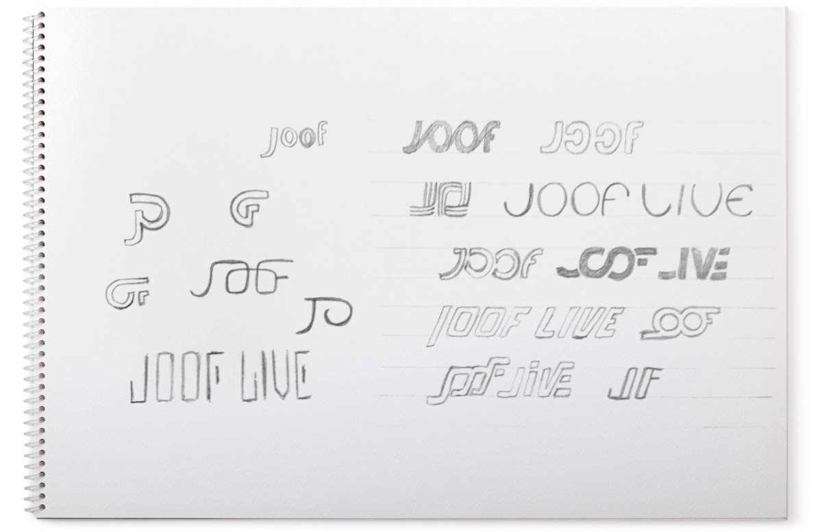
I chose the most successful one in my opinion and drew it:
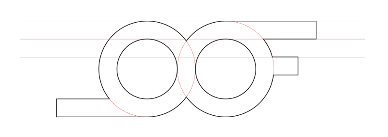
I added and changed details:
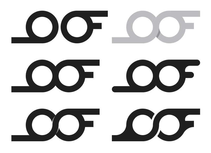
But in the end, I stayed in the original form:
joof_5.png.
Now it’s hard to read the word JOOF, so I change the “J” until it’s recognisable:
joof_6.png.
I put “JOOF” aside and start “Live”. To emphasise the forward motion, I use italics:
joof_7.png.
I trim the “J” and “F” on the slant of “Live”:

Showing the client:


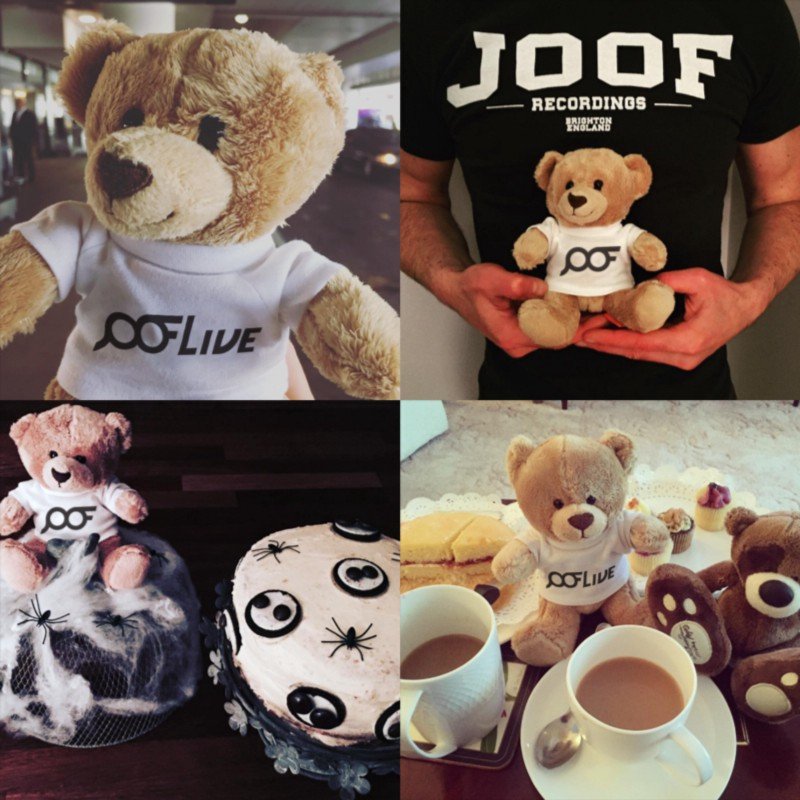
The client likes the logo and the idea itself, but asks to improve the readability of the word JOOF, specifically the letter “J”.
Working:
joof_12.png.
I choose the bottom right variant, correct the letter “V” in the word Live and show it to the client:
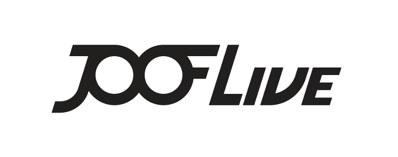
Something still bothers me in this variant, so the client asks to show another variant of the logo — in two lines, placing the word Live under JOOF.
I’m building this variant:

I don’t like the intersection of “J” and “L”, and the number “00” turned out to be too narrow. I’m working on the intersection:
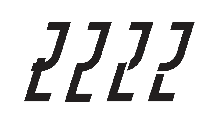
I chose the last option and moved the letter “F” outside the form, which allows expanding “00”:
Sending the work to the client:
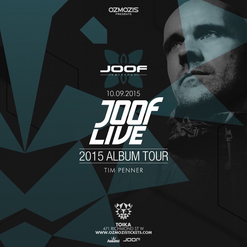
After some discussion, we concluded that the two-line variant is cumbersome and limited in use. We decided to go back to the previous variant and work on readability.
I change the letter “F”:

Comparing:
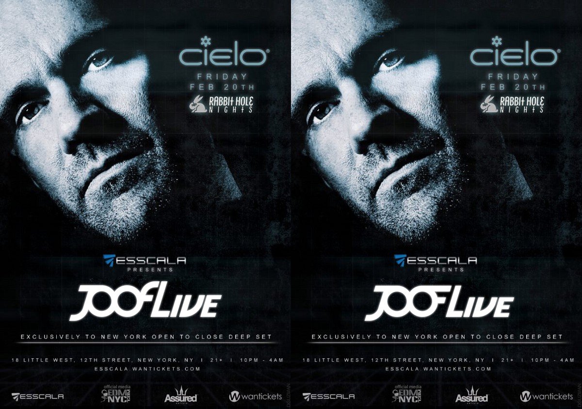
In this form, the logo loses all its compactness and minimalism in detail. I put this variant aside and started a new one.
The task remains the same — to create a JOOF Live logo, where the word JOOF will be different from the label logo.
Trying out a new ligature variant between “JO” and “OF”:
joof_20.png.
In this form, the ligatures reminded us of a meander ornament:

I change the “OF” connection and add the word Live:

Showing it to the client:

This variant did not fit, the client slightly changed his wishes: to make the logo stately, elegant, strong and with classic letters.
I continue working. I take one of the ideas that appeared at the beginning:
joof_23.jpg.
The idea is based on the main features of the JOOF label logo: elongated upward letters, a bent upward tail in the horizontal stroke of the “J” and a vertically unfolded middle stroke of the “F”. If you look at the old and new label logos, they don’t have all that in them:
Figuring out options:
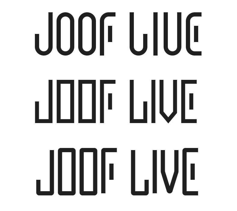
I discarded the angular logo (the middle one in the picture above) and worked on the other two.
Building a variant based on circles:
joof_26.png.
It looks bad, JOOF and Live conflict, the letters are thin, and the expanded middle stroke in the letter “E” seems overdone. I’m building a second version taking into account previous mistakes:

I like the logo in this form, I show it to the client:
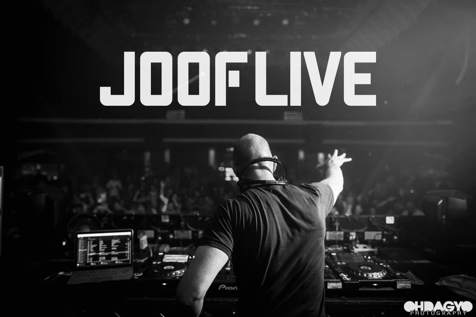
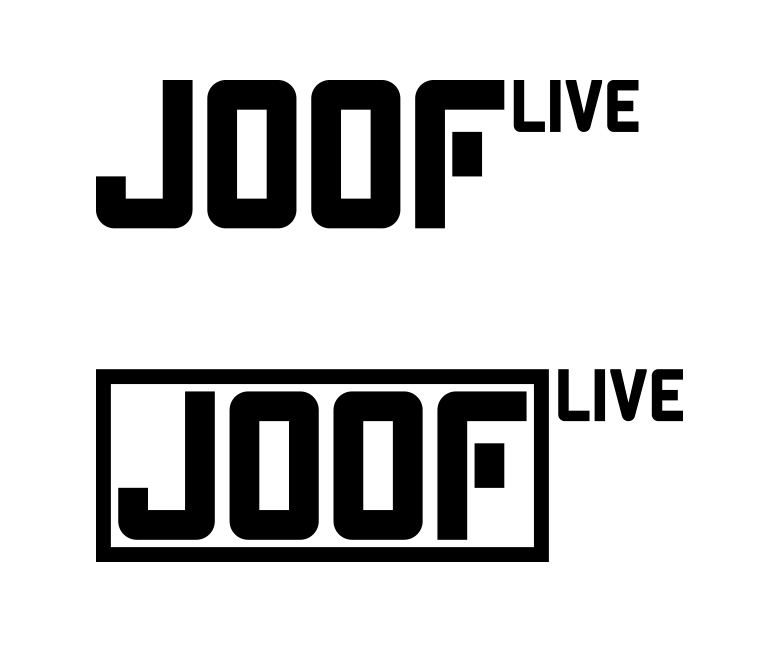
The client liked the word JOOF so much that he decided to drop “Live” as part of the project name and logo respectively, but to keep it as a small note for posters and posters that this is a live performance of the musician.
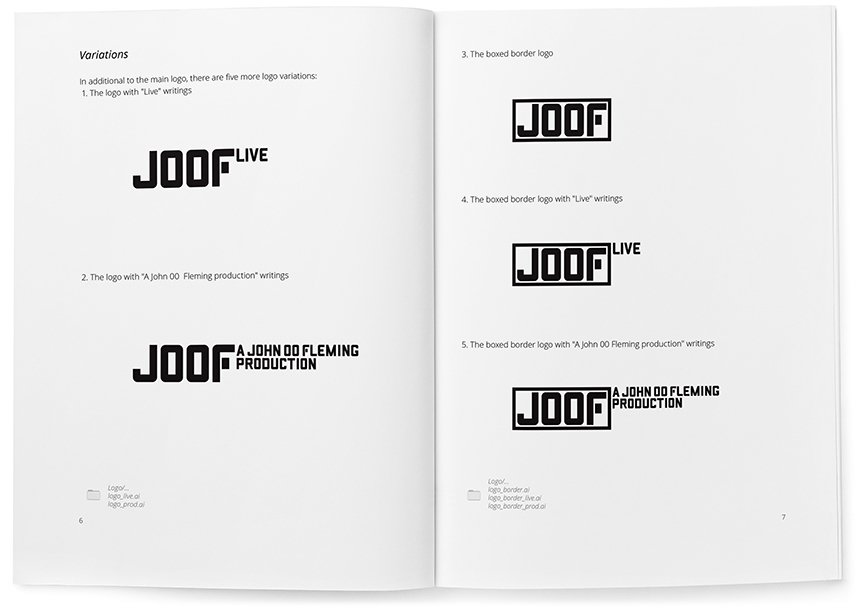
At the client’s request, I developed additional variants of the logo, where JOOF is in a frame and with the captions “Live” and “A John 00 Fleming production”.
I select the frame:
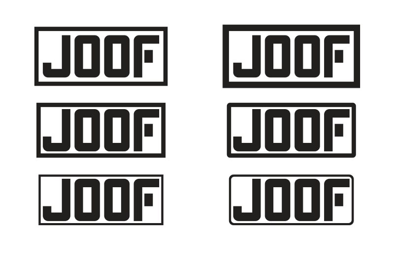
Stopping at the middle left. Looking for the location of Live’s signature:
joof_30.png.
I chose the first option and increased the letter spacing in Live:
I design the signature “A John 00 Fleming production” in the style of the logo:

Trying it on the logo in the same position as “Live” for general styling:

The client approves all options and accepts the work!
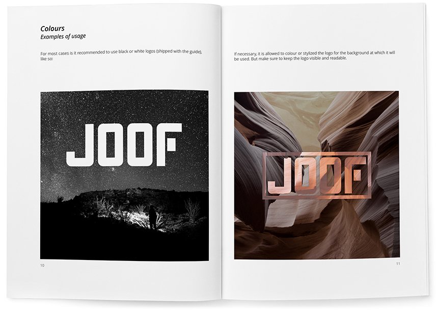
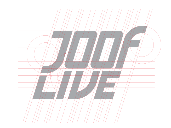
Rules and guidelines for the logo are collected in a guideline:

