Creating a website for the Digital Om Productions label
Digital Om Production — is a music label based in India and Nepal. The label releases contemporary electronic dance music in the styles of Progressive and Psychedelic Trance and also works as a booking agency for its artists.
The project was worked on together with a colleague. After communicating with the client, we clarified the task that the site should solve. Its goal is to help music fans buy music released by the label, as well as to introduce them to the artists. At the same time, for the musicians themselves, the site should become a “home page” with discographies, biographies and press kits.
We study the market, we look at the websites of other labels:
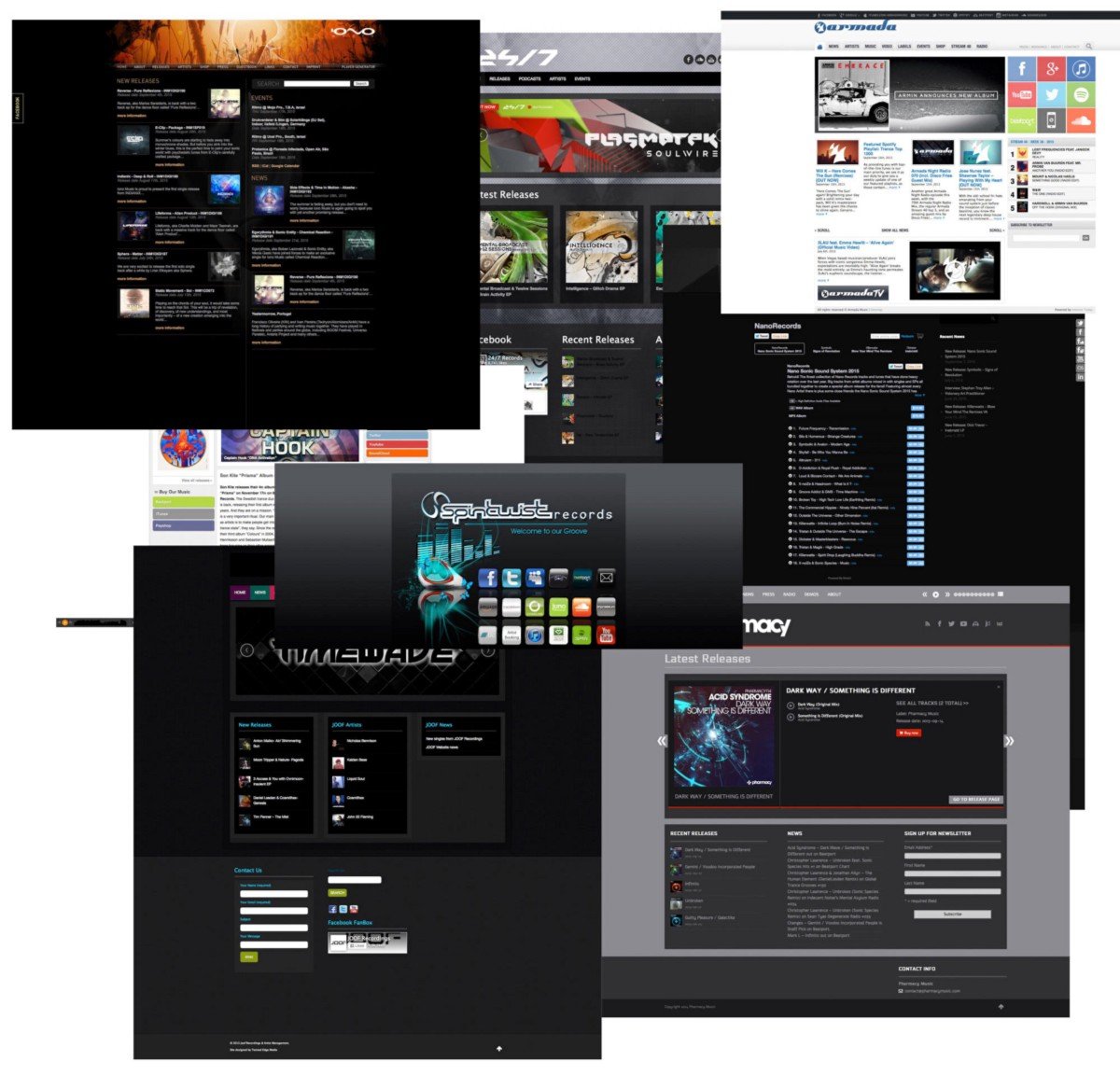
The overall situation in the industry is sad: other labels’ websites are full of half-empty sections, unnecessary pages and terrible social plugins. We definitely don’t want that kind of thing. Instead, we offer the client to start small — only the basic and really necessary sections and functions, namely the release catalogue and artist roster.
We lay the foundation — we think over the structure of the future site, breaking the development into several interactions. The following scheme emerges:

Instead of the home page, which is traditionally where the work starts, we started with the internal page of the music release — most likely, visitors will more often go to these pages via direct links than to the home page.
Let’s think: “before buying music, listeners will want to familiarise themselves with a fragment. So you need to be able to post samples”.
Instead of writing our audio player, which would have taken a lot of time, we decided to use the API of SoundCloud, the leader in cloud music storage. For the client, this option turned out to be convenient — the label actively uses SoundCloud, and its page has more than six thousand subscribers.
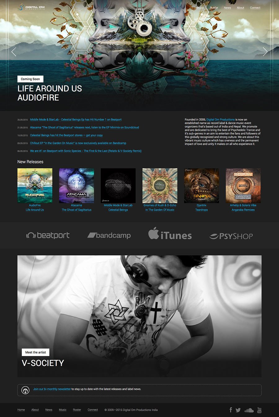
Let’s get down to the design. We make a dark colour scheme to match the music genre but dilute it with colourful album covers and bright buttons.

Pondering: “Okay, so there are big, brightly coloured buttons at the top, links to shops where music is sold. But what if you add an album to the site that hasn’t been released yet? What would be in place of the buttons?”.
We decided to make a dotted outline with the word “Forthcoming” on it. This inscription will be automatically displayed if the album release date is a future date, so the site manager will not have to change it manually.
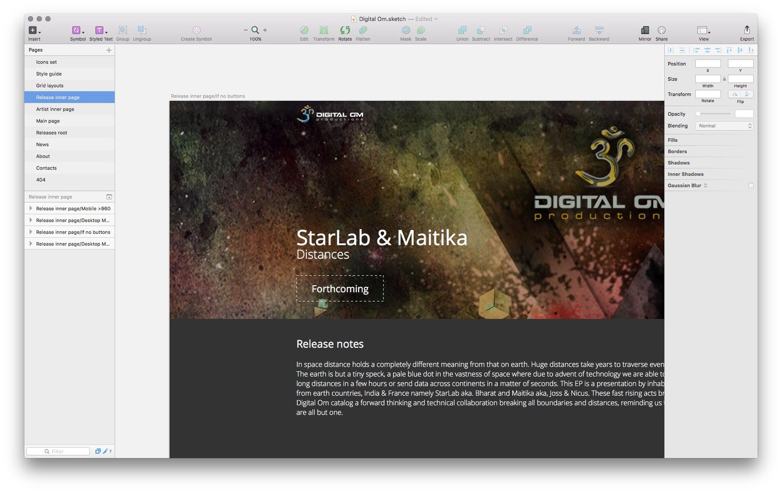
To avoid “dead ends” on the site, link all pages of the site with each other with the benefit for visitors: from the album or compilation page you can get to the page of related artists or other releases; on the artist’s page, you can see all albums or compilations in which he participates.
While thinking about these little things, in the meantime, draw the rest of the pages and sections: main page, artists, contact information and others.
Don’t forget about the 404 error page (this is when the user accidentally gets to a non-existent page, for example, when he makes a mistake in writing the address): so that the user who came here would not be bored, we place a small story about what “Om” is.

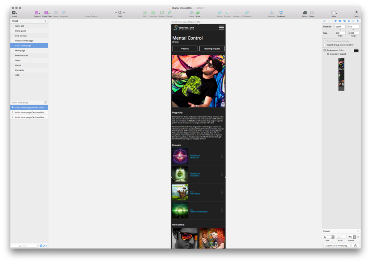
We make separate layouts for the mobile version of the site:
We collect all the layouts, prepare a presentation and show it to the client:

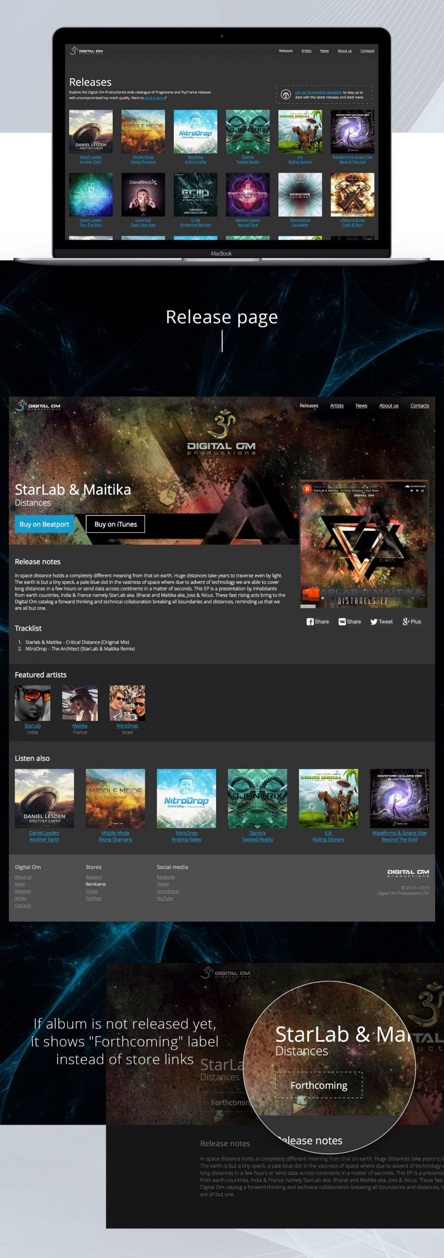
The client likes everything very much. We get down to layout, programming, scripts, setting up the administration panel, in short — putting together a working website from pictures.
The owner of the label is a real music lover, so he is also very enthusiastic about the site, constantly suggesting new additions. However, most of these ideas are not on the site.
The site was done in 4 weeks. It is maintained and filled by the label’s staff.


Project members
| Lead Designer Tanya Sokolovskaya |
Designer Daniel Sokolovskiy |
Developer and layout Maksim Silnov |


