Updating daniellesden.com
Task
Adapt the site to any screens.
www.daniellesden.com

Last November the third version of musician and DJ Daniel Lasden’s website was released. It was a big update, in which my team and I overhauled the structure and updated the style of all the pages on the site.
First version
Second version
Third version
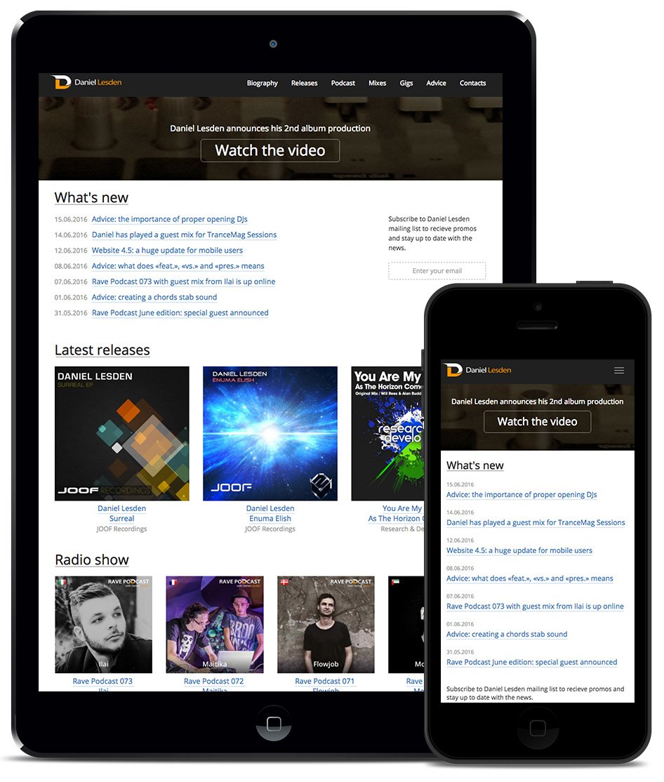
Adaptive version
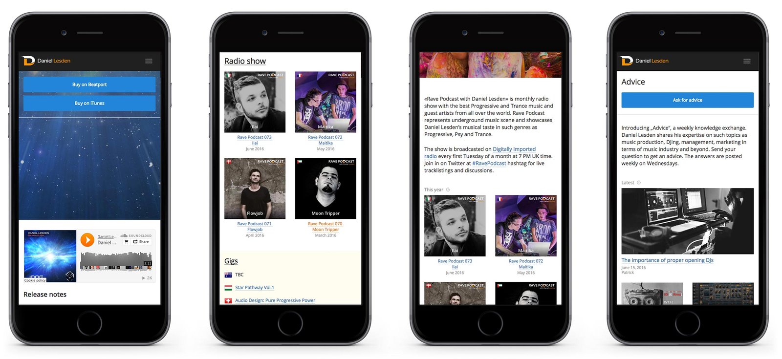
Still, the site had a drawback: its size was fixed, so mobile phone and tablet users could not enjoy it to the fullest. This feature had to be sacrificed for a while to launch the site on time.
Today I’m pleased to present an update of the site specifically for mobile users. Now the site smoothly adapts to any screen: phone, tablet, laptop or desktop computer.
Separately, I would like to tell you about the innovations in the “Tips” section. Listeners and site visitors send the author questions on DJing, music writing and other music industry issues, and he shares his experience — that’s how the advice section works.
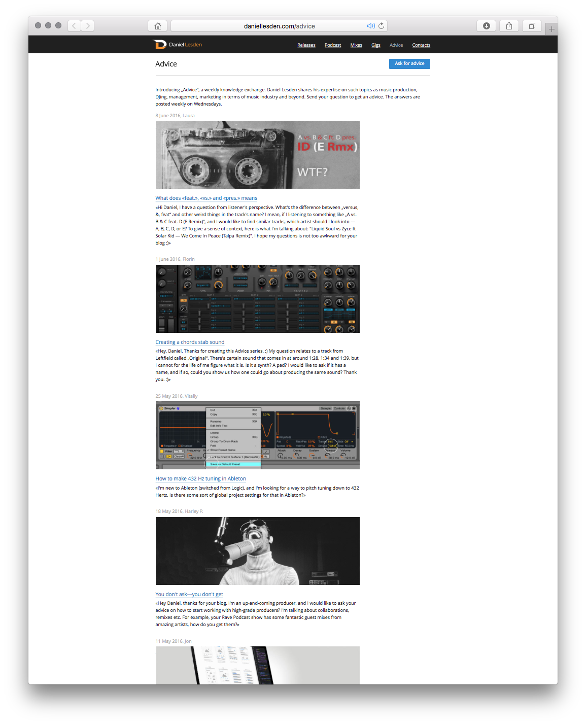
Initially, the design of the section was in the form of a news feed — new tips appeared at the top, and old ones went down. Everything seemed logical. But the fact is that the author writes useful articles that do not lose relevance even a year later — it is pleasant to return to them again and again. And new users may not have seen some previously published articles, because they went far down.

At first, we thought to make a search on the page, but this solution didn’t fit — often new users don’t know what to look for yet, so they need help.
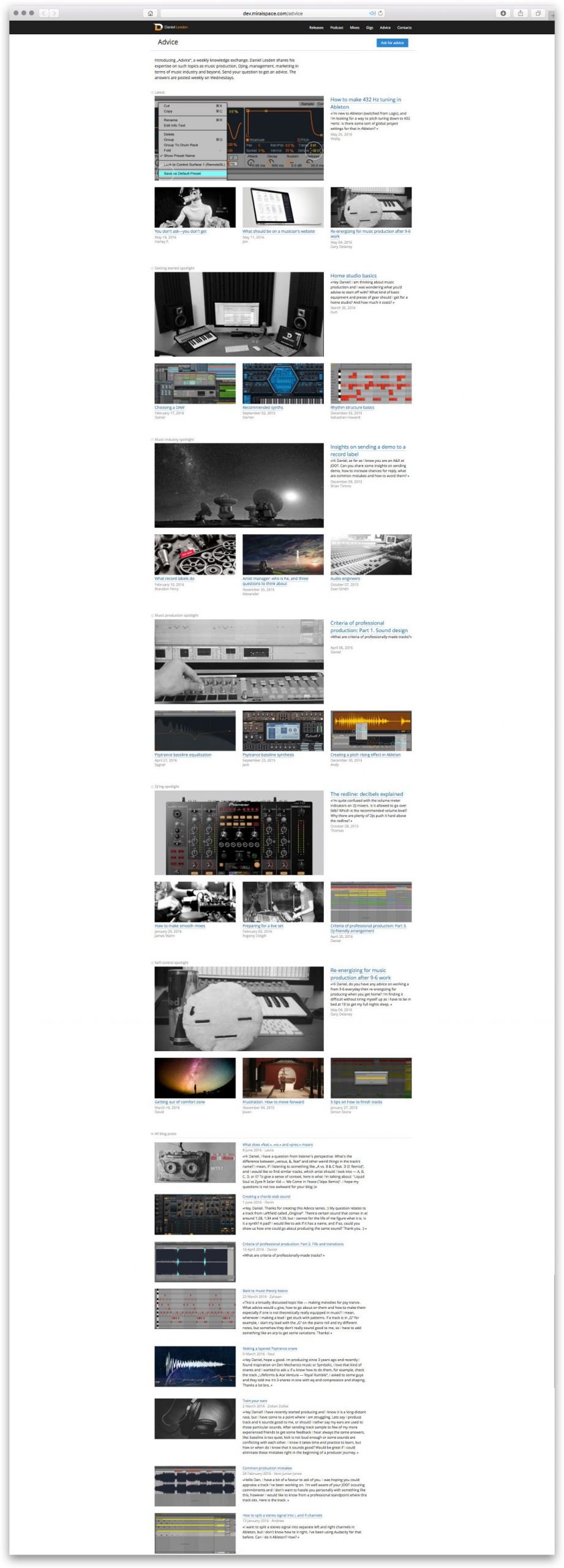
We split all tips by topics: music writing, DJing, management, marketing, and business.
But on what principle to display tips — alphabetically, by date? And the most important thing — will it help new users? And will not harm the regular readers? The direction with grouping seems right to us, but we continue to think over the implementation.

Thinking:
— What if in the groupings by topic, not all tips are displayed, but only the important ones at the author’s discretion? And show them in a beautiful magazine layout with large pictures?
— And how does that help?
— Very simple: this is how we help new users to orientate themselves in the rubric. Instead of flipping through dozens, and soon hundreds, of tips, it’s as if we’re saying “Here, start reading with this one”. The articles themselves are tagged and linked inside so that if the user likes it, he will go on reading.
— Where will the rest of the articles live besides these important ones?
— All other tips will be at the bottom of the feed, no change with this one.
— So regular readers will have to scroll down to this feed every time to see if new tips have come out??
— No: at the very top we will show some new tips first, this will be convenient for both new and regular readers. Next will be useful articles by topic, and even further on will be feeds of all the other tips.
Sounds great. Let’s get to it:

Watching, evaluating and continuing to reason:
— Good overall, but the right-most element in these blocks is confusing — it feels like the large headline refers to it, not the large illustration.
— How about we solve this with a loading animation? The three lower tips in the blocks will appear a little later, helping to set the visual emphasis.
— How’s that??
— It’s like this:
This decision is what went into the final version of the site.

Project members
| Lead designer Tanya Sokolovskaya |
Designer and layout Daniel Sokolovskiy |
Developer Maxim Silnov |


