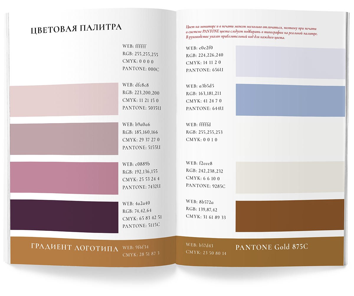
The new logo for Katya Keshchyan’s Wedding House
Task
To do a small rebranding: update the logo and colour scheme.
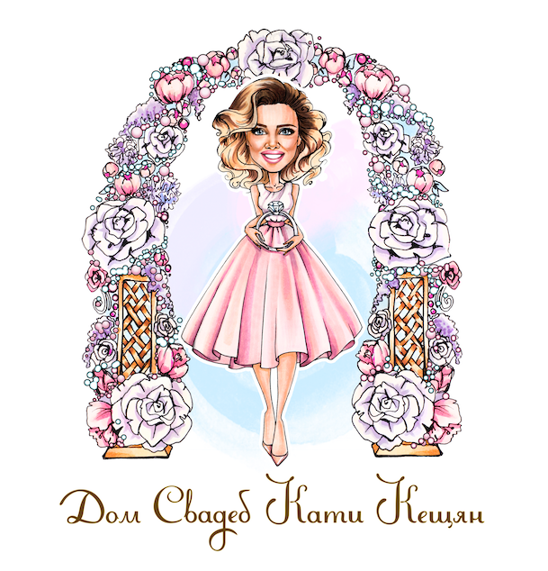

Until today, the agency’s logo was a drawn character in a flower arch (Katya herself was drawn by a commissioned artist, I don’t know her name). But the House of Weddings is growing, and with the growth, we needed a real logo. The text part came from the Duck House. We decided to keep it for now but supplement it with a graphic sign. We also decided to redesign the arch, to make the colours less saturated and to get rid of the wreath.
Started with an abbreviation
First, I try to make a wreath out of the letters “ДС”. I got this sketch:

I sent it to Katya and got the go-ahead to develop the idea. I sketched flowers and leaves from the wreath and attached them to the “ДС”:
Katya didn’t like the tail on “Д”. I try adding another flower and the ring the character is holding:

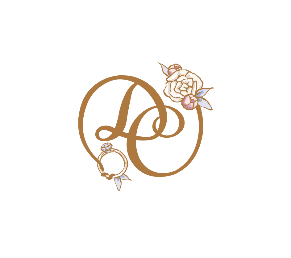
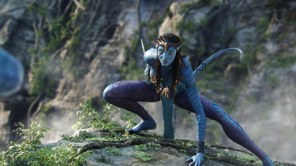
In response, I got a picture from the film Avatar :-) Katya says that the tail looks very much like the tail of the Na’vi creatures.
I decide to move away from the wreath and try the ring shape.
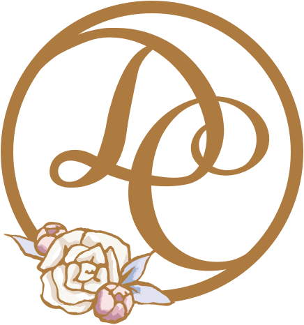
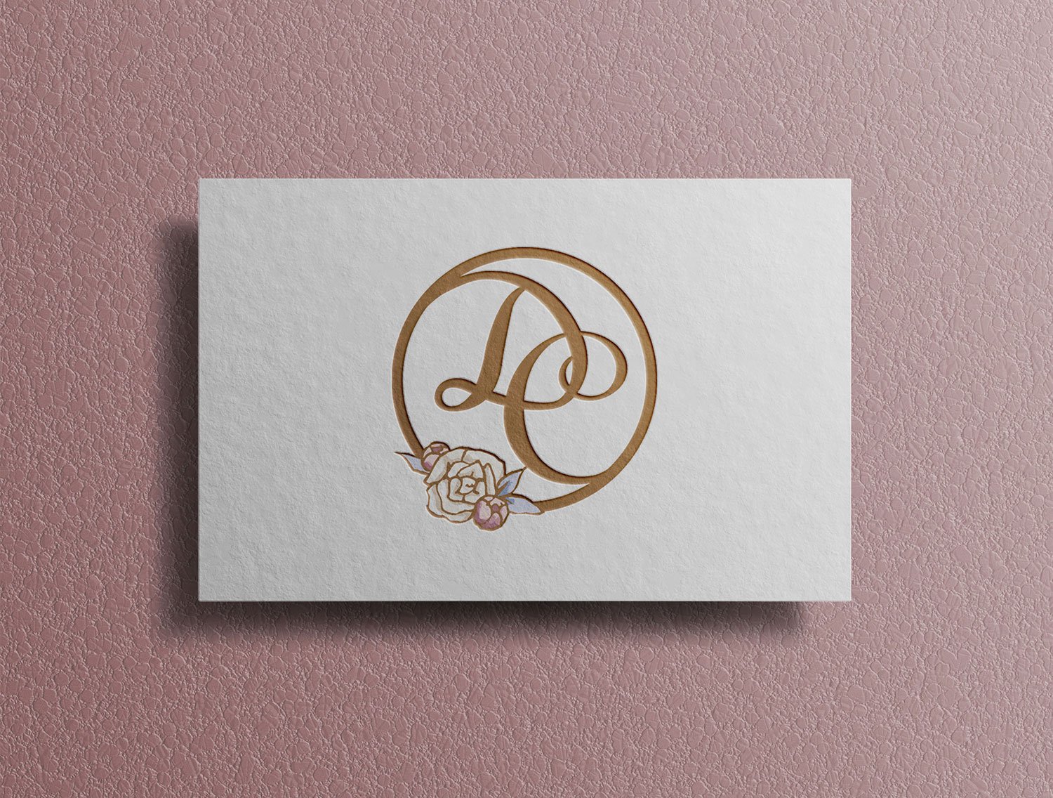
I remove the flowers and add a diamond from the character illustration:

Katya likes the ring a lot. See the sign for an example on the website:

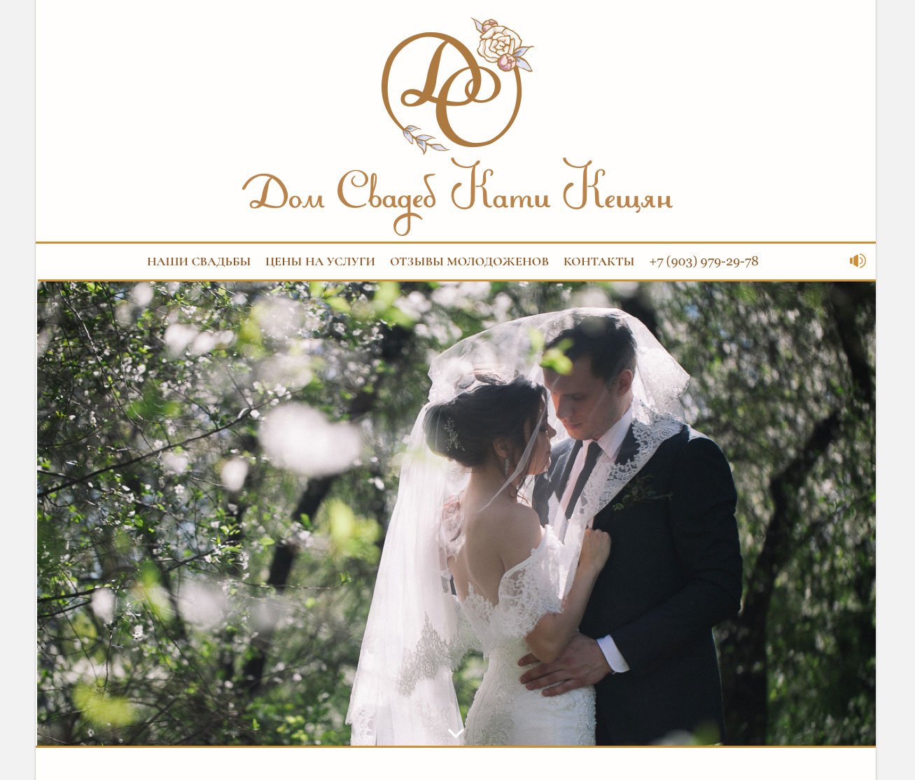
In this form, the “ДС” wreath blends with the text part better than the “ДС” ring.
I go back to the first version and add detail to the “Д” tail so it doesn’t conjure up a Na’vi tail. Here we go:

In parallel, I try to connect the “ДС” ring with the text part in some other way and find a great option:
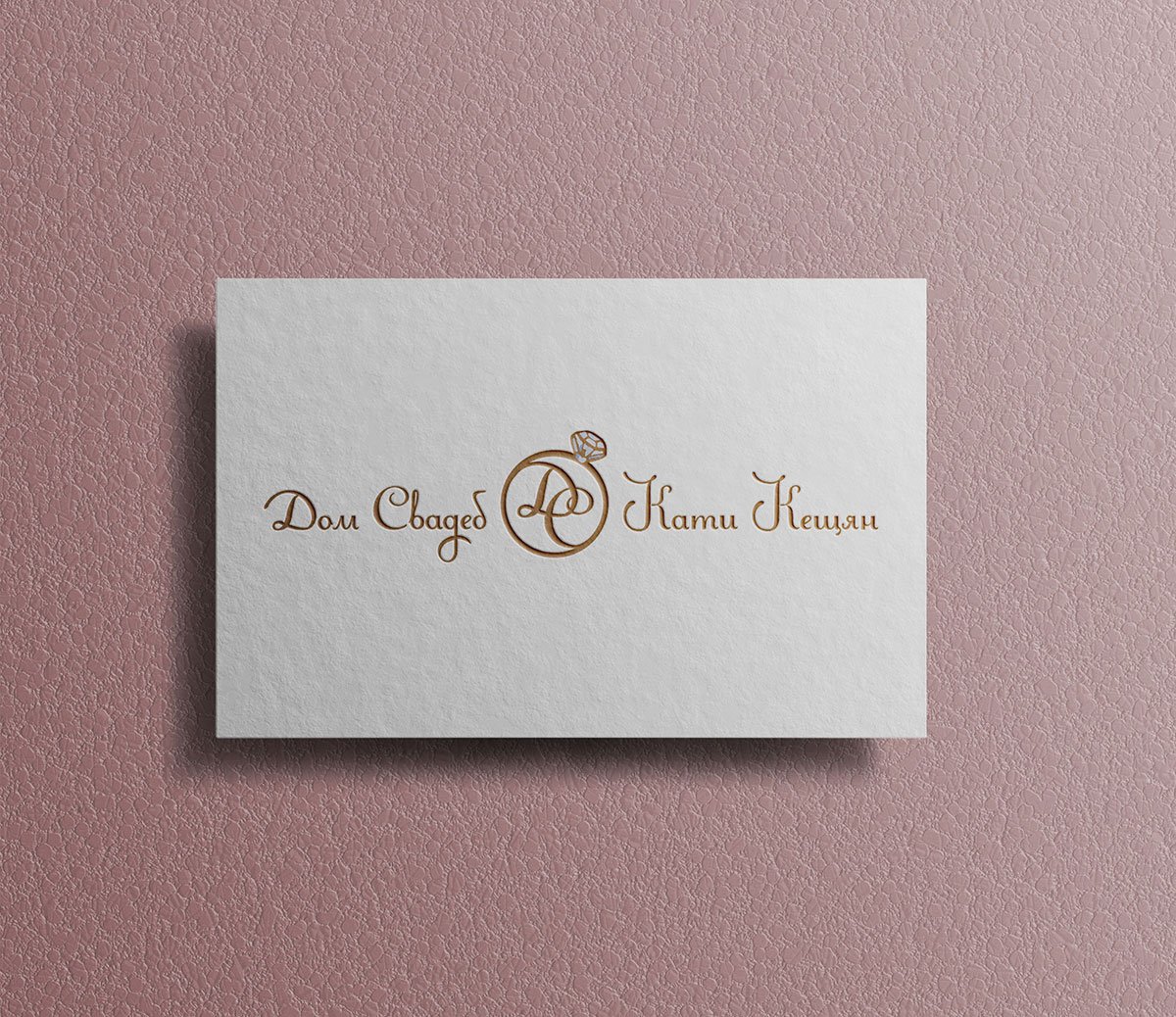
Katya likes it. We decide to settle on this logo variant. Finalising the diamond itself:

Working on the arch and the character
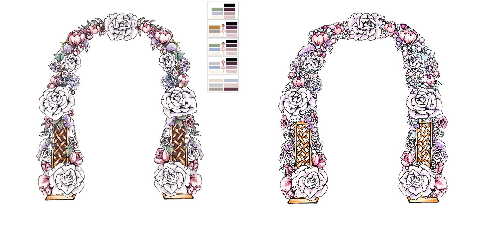
At the same time, I was working on the arch. The main task was to get rid of the bubbles. So first, I cleaned them up, and in their place, I added vegetation:
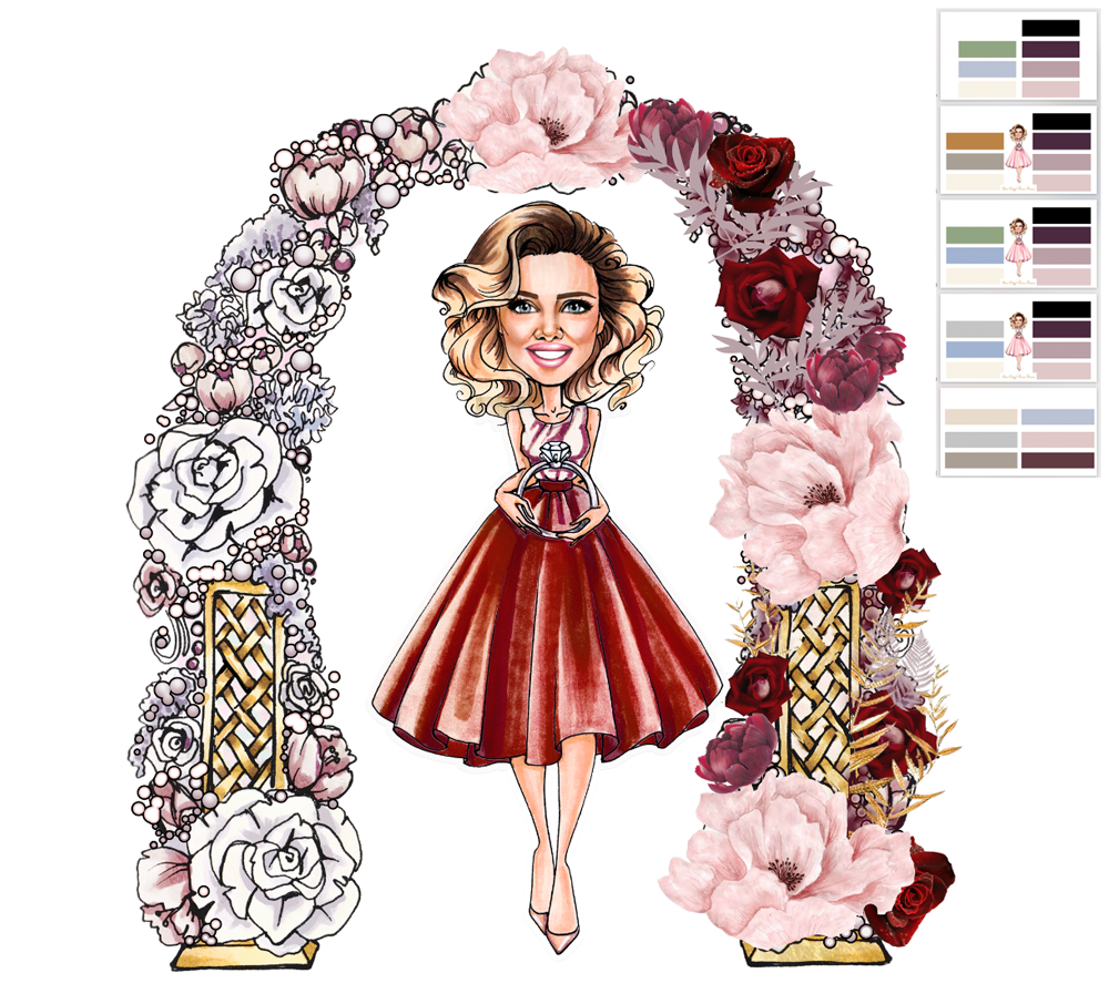
Thought of a variant with dark red on the character and in the colours of the arch:
I’m trying to reduce the arch a bit and make it thinner. For this purpose, I removed bubbles and vegetation and reduced the flowers themselves:
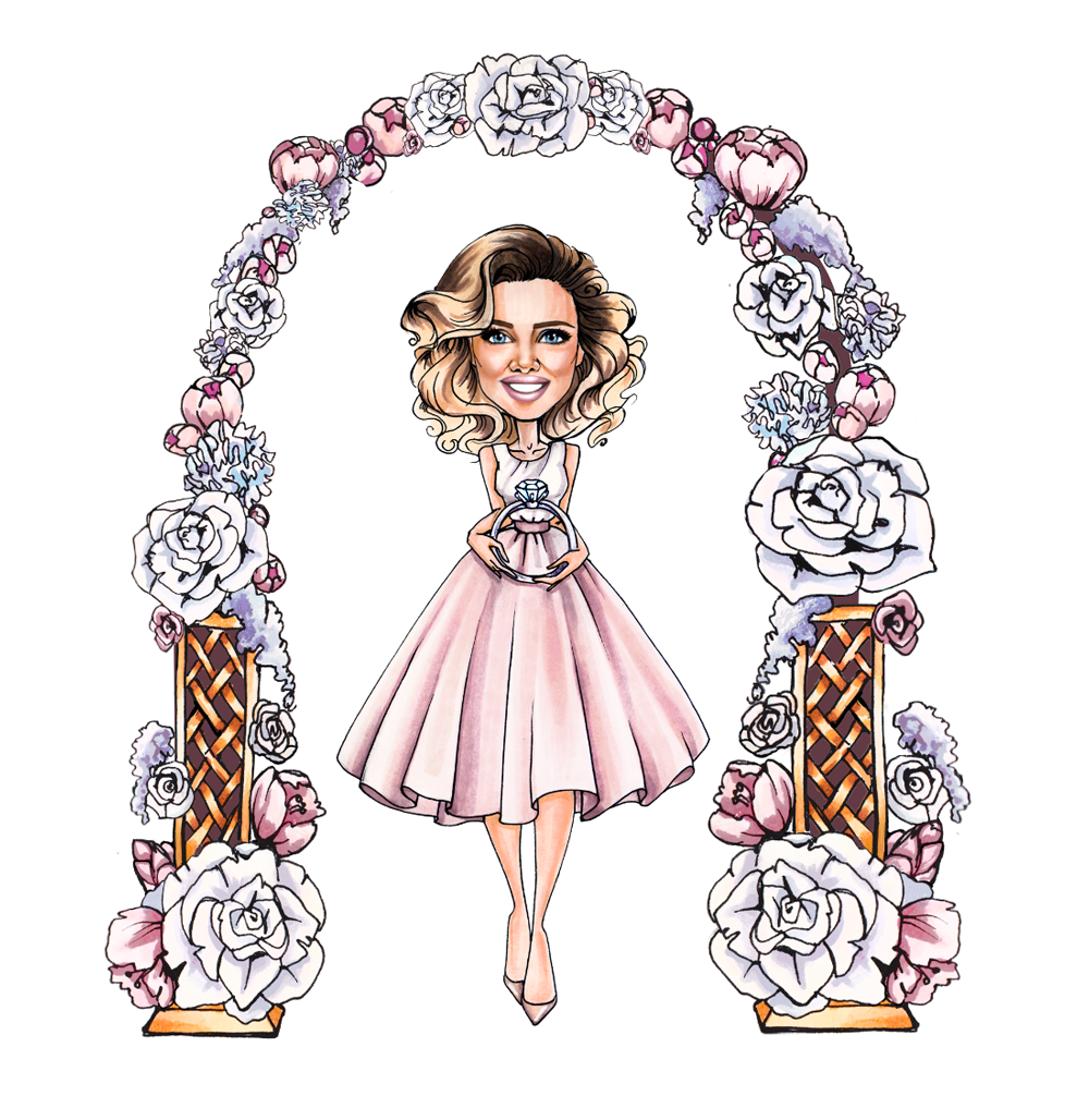
By this point, Katya decides to move away from the arch altogether for now and leave it as is.
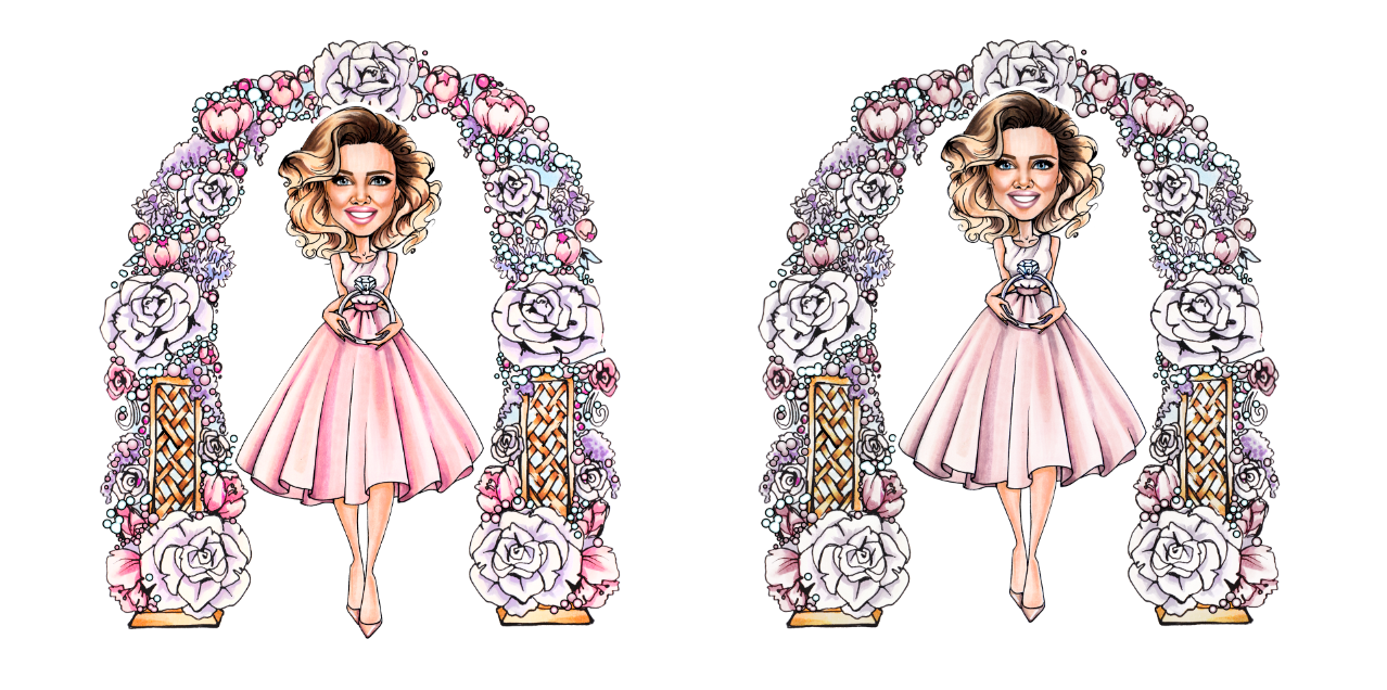
Adjusting colour saturation in images. Before — After:
Putting together a guideline


