The character of the Duck House Agency
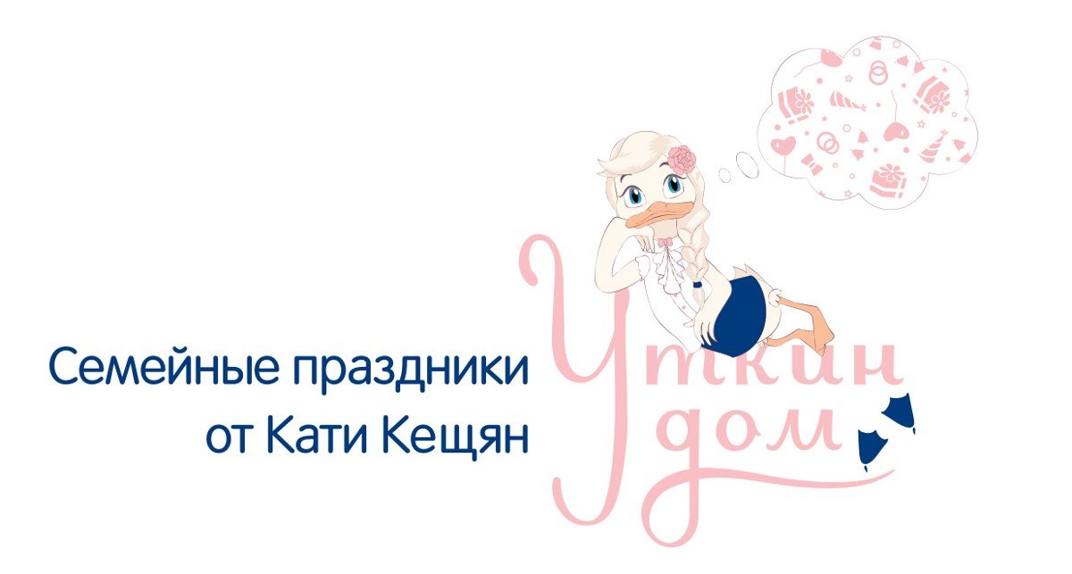
Last year I created a logo and style for Katya Keshchyan’s family holiday agency The Duck House. In this post, I will tell you about the process of working on an interesting feature of the style — the brand character.
According to the owner of the agency, the duck is a symbol of family cosiness, hence the unusual name of the agency. That’s why I started my work by looking for the image of a festive duck in the logo.
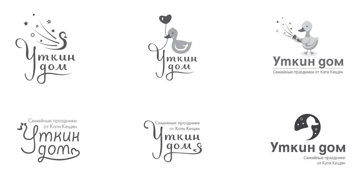
From the received variants Katya and I decided that the logo with a duck looks childish. That’s why we rejected the duck in the sign but invented a new role for it: as a character of the agency in the form of an independent element.
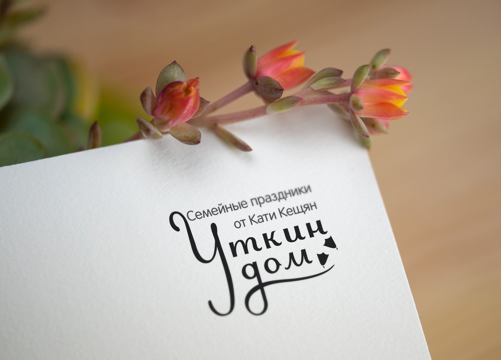
In the meantime, I continued working on the logo — I chose and finalised the font lettering. And in order not to deprive the sign of graphic elements, I added duck feet to it. The logo was approved quickly, so I continued working on the character.
Katya specified that she did not want a “rubber” duckling, but a cartoon character, and so the first sketches were born:
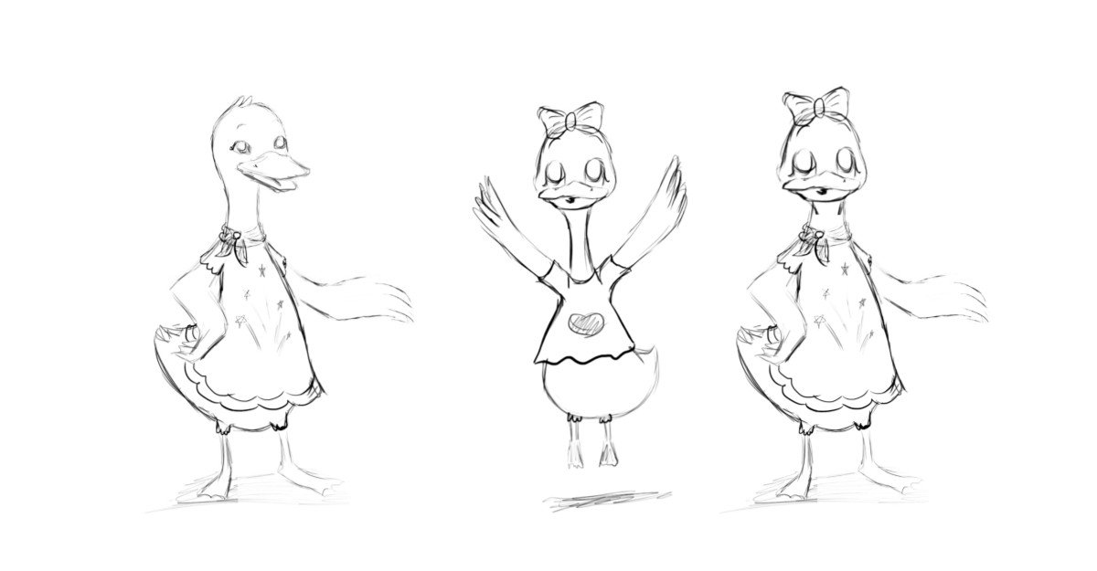
I got “permission” for the sketches and started working out the details digitally.
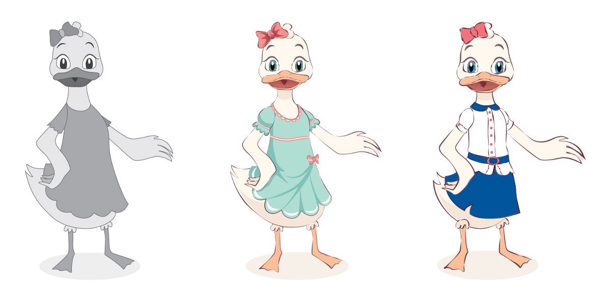
I am finalising the third variant.
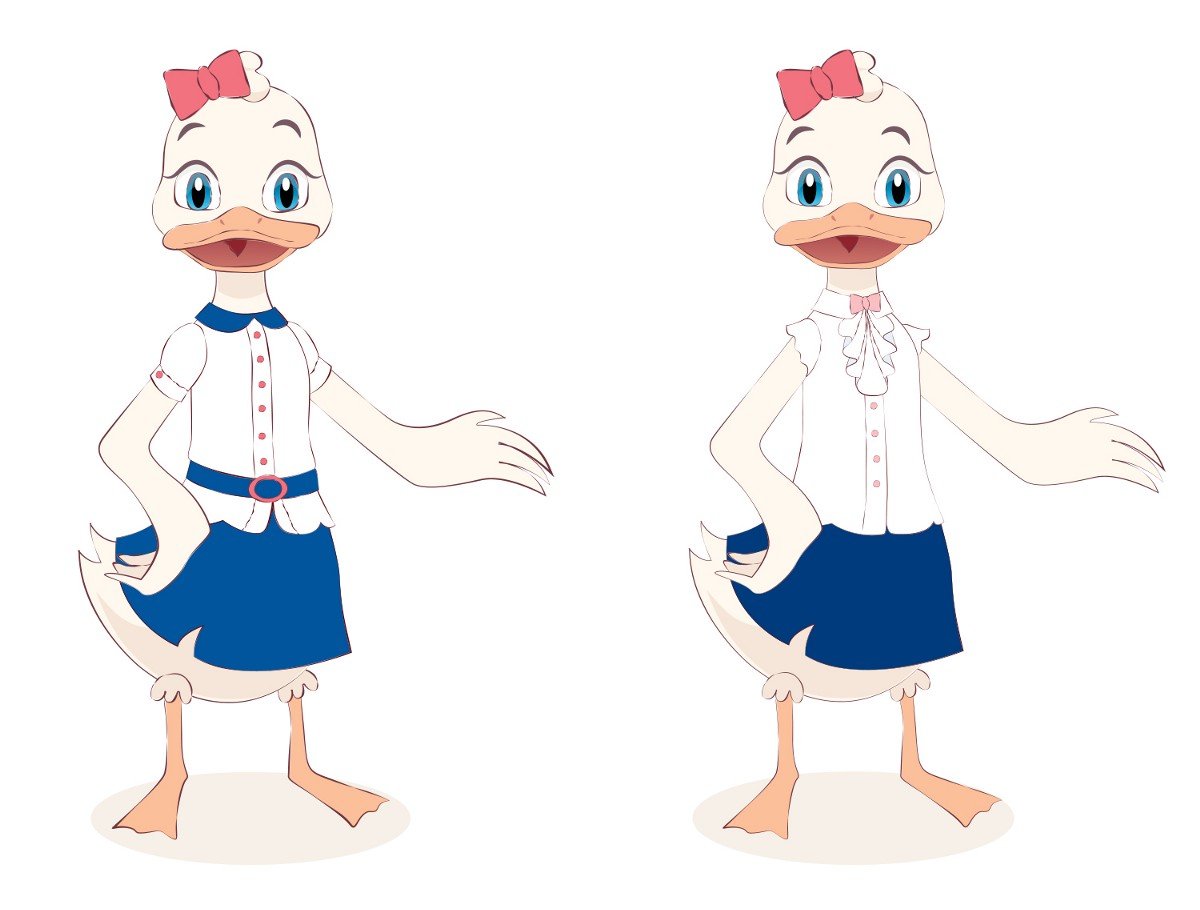
At first, the duck looked a bit brutal because of its ‘shaved’ head :-) So I did her hair:
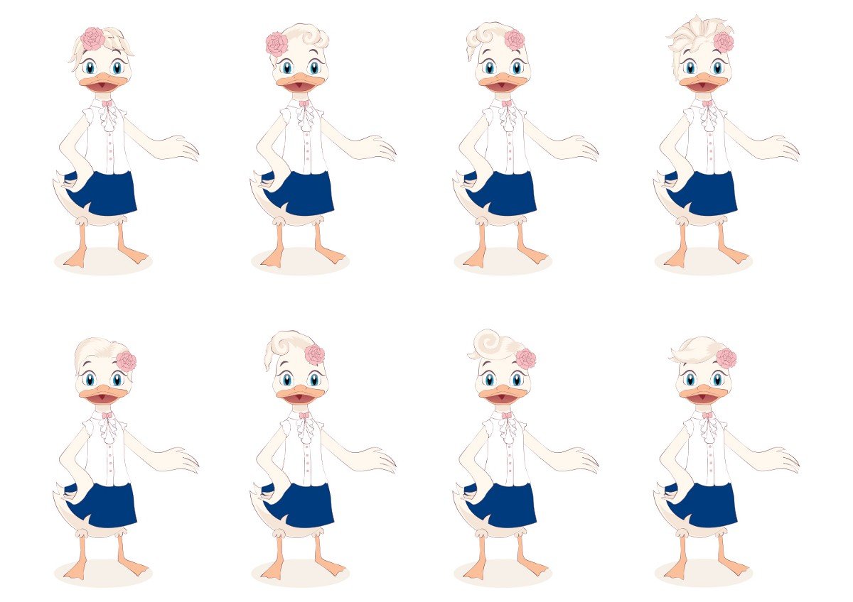
It was not easy to choose, but in the end, my client and I decided on the last option, adding a long braid to the fringes:

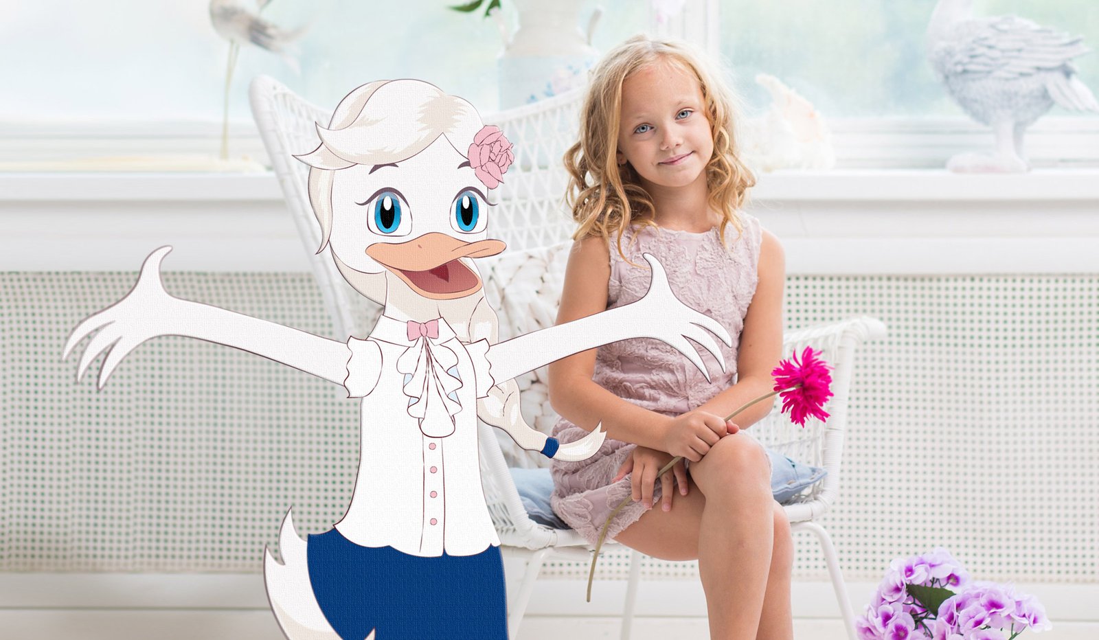
This is how the duckling became a real girl!
Next, I designed three more additional positions for the character and added colour to the logo:
ud-9.jpeg.
Duckling variations
Character in life
Having finished the project, I follow it with pleasure: it is important for me that the work ‘lives’ and not just remain a picture in the portfolio.
Katya decided to bring the duck to life in a very original way and ordered wonderful brooches based on her image:

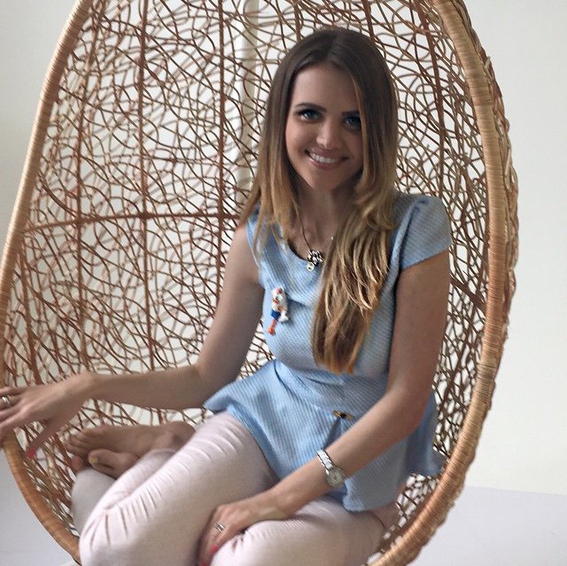
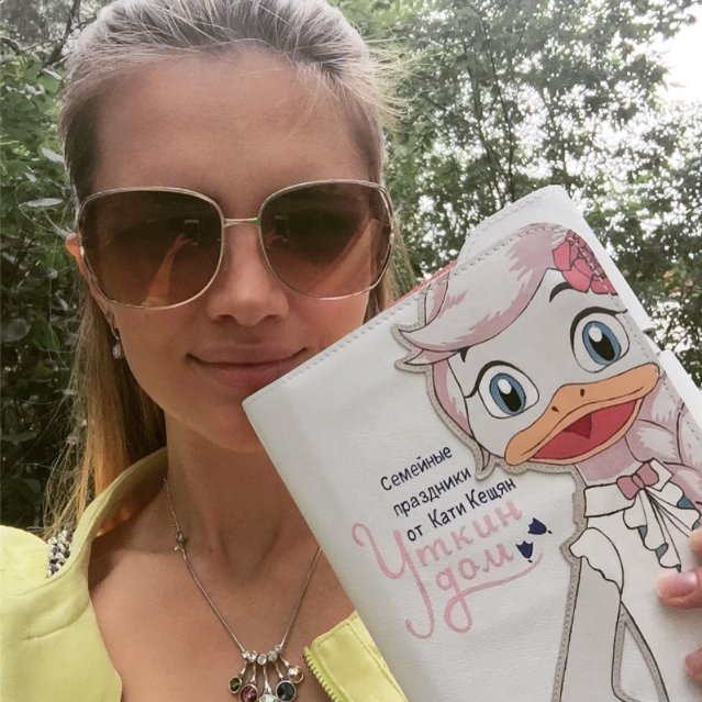
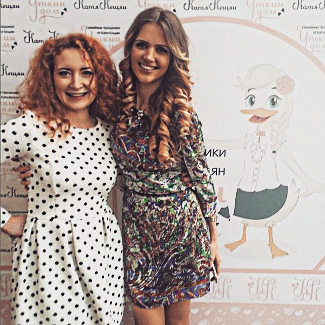
Ah, yes! We had one more duck, but it was left out of the picture, as it turned out to be too ‘dreamy’ :-)
