How I made the logo for the promo brand Rave People

Rave People is a Moscow promo brand. Makes underground raves in chamber format. Main directions: Progressive House, Underground Trance and Techno.
They need a logo from the sign and text part. Proceeding to sketches:

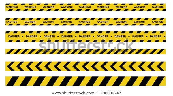
The bottom right is a simplified AV of the word “RAVE”. It reminds me of a warning ribbon, so I decided to stick with it for now. Sketched some more ideas at the same time:

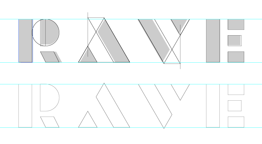
Figuring out the rest of the letters:
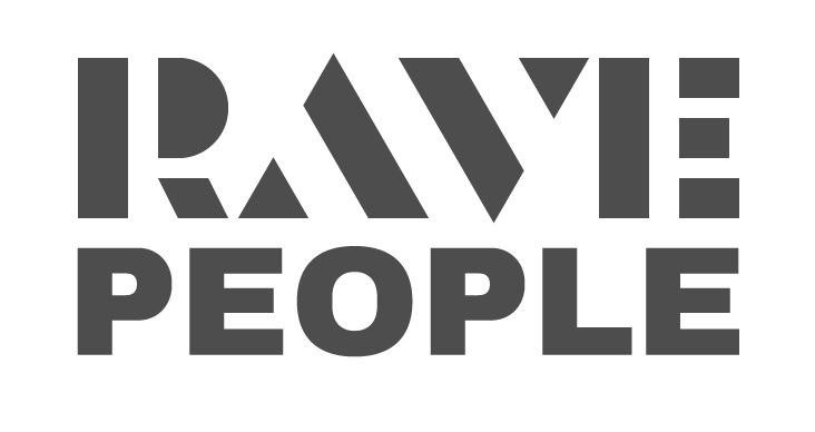
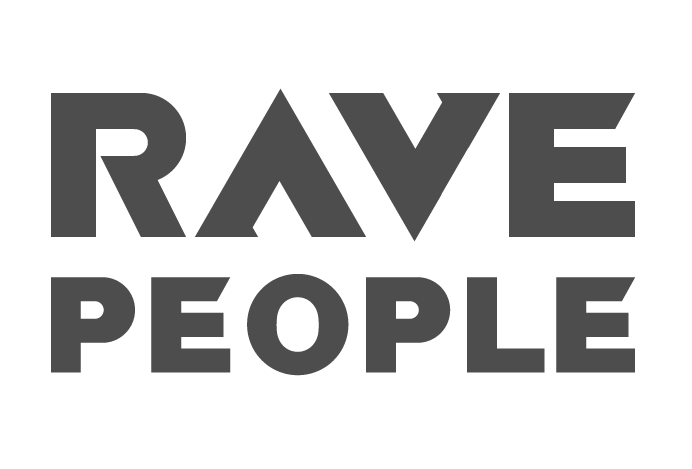
Typing “People” in the finished font to see the logo as a whole:
Discussed the sketch with a representative of the promotional group and decided that we needed something different for the sign, separate from the text part of the logo. This is how the “RP” sign came to be:
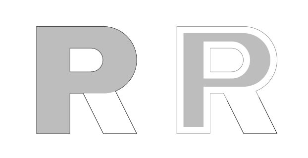
But there are a lot of similar combinations of the letters “R” and “P”, we need to make the sign unique. Then I remembered about the smiley — the symbol of acid-house, and saw it inside the sign:
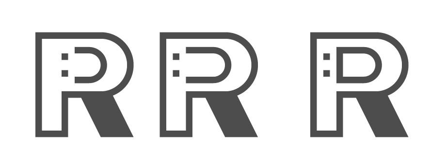
I settled on this one:
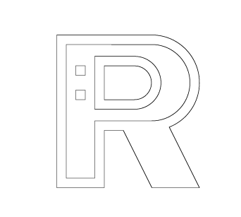
More smiley ideas:

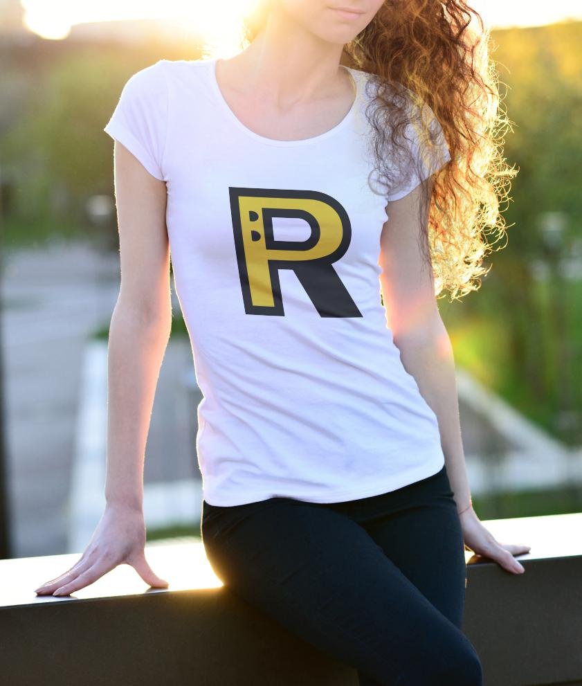
Looking at how the sign and text part go together:
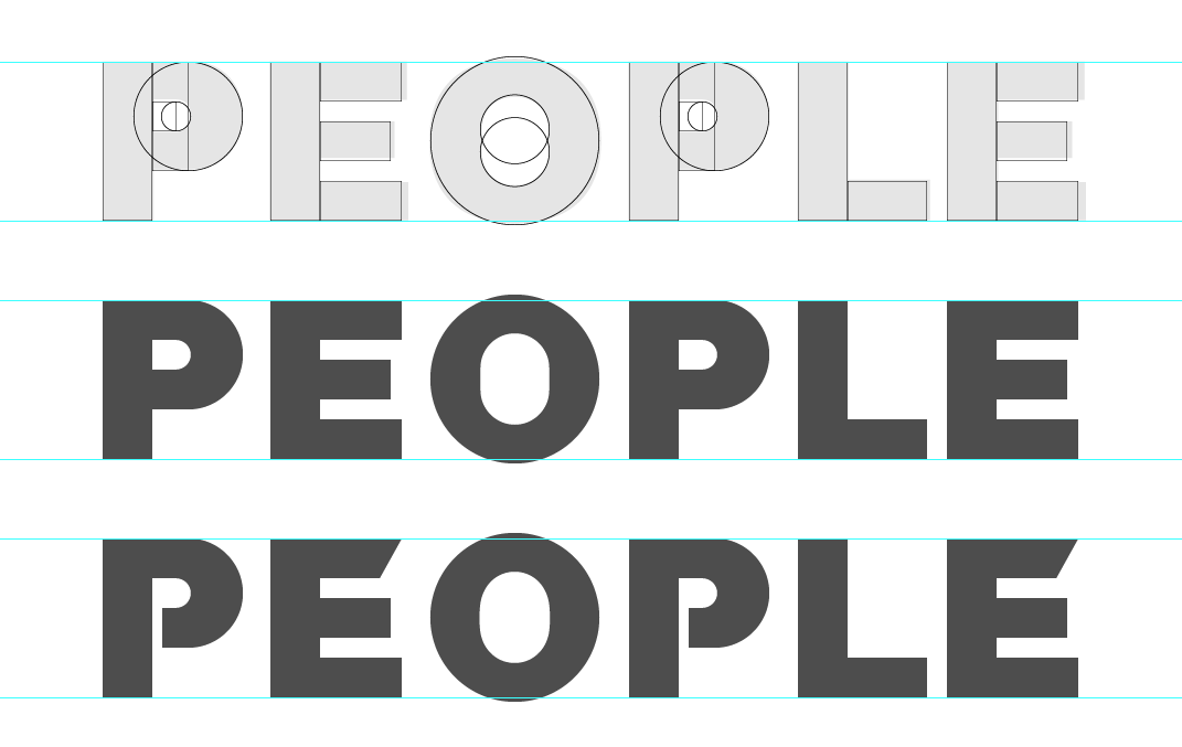
Working on “People”:
Putting the two words together:

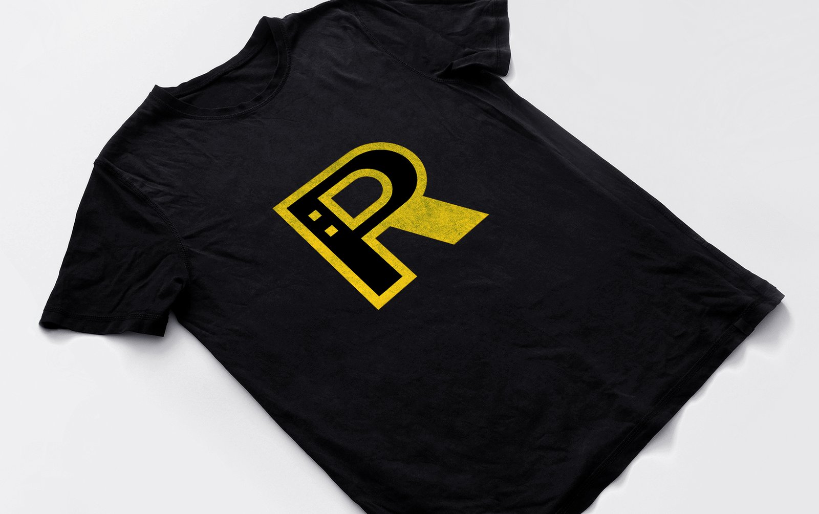
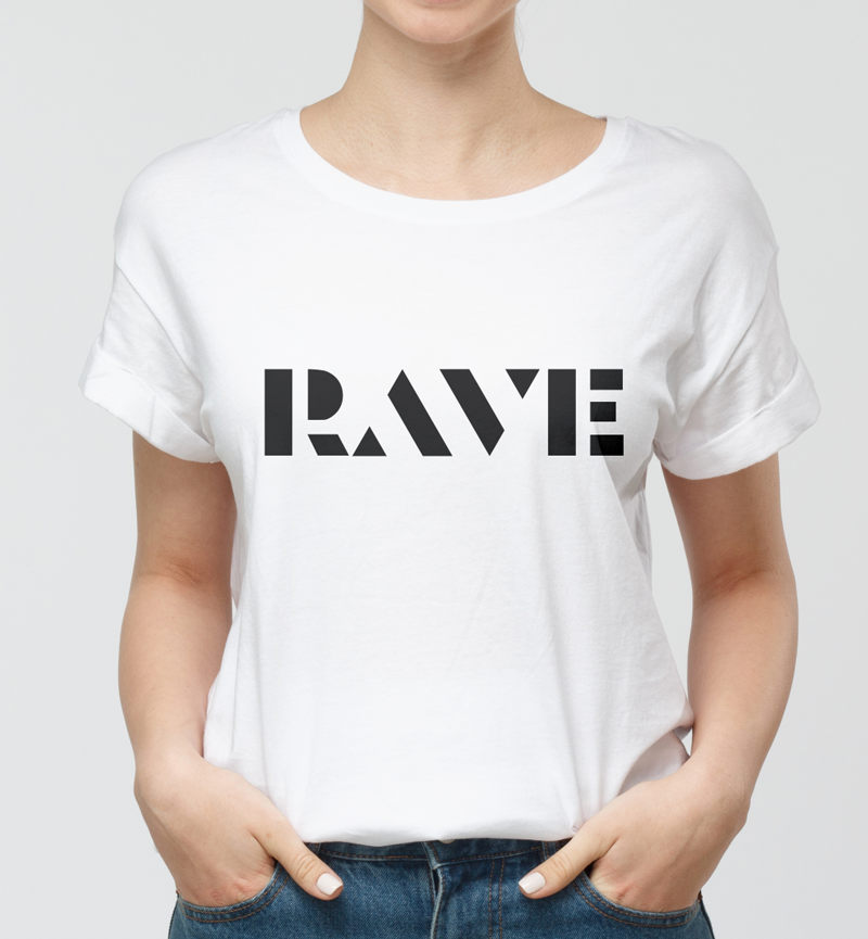
Got feedback from the promo team that a similar idea has been used before:
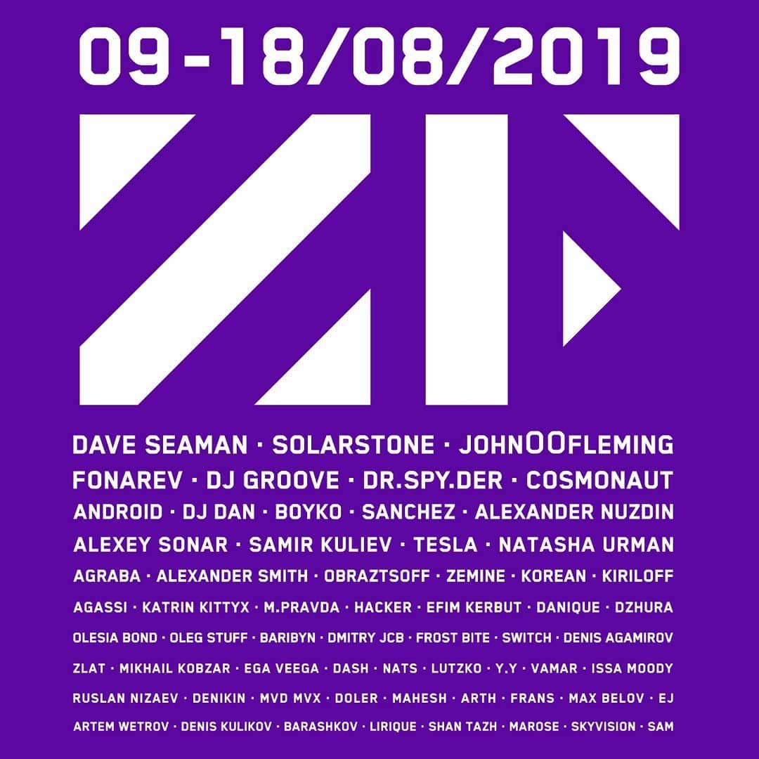
Finalising the Rave:

The top part of the “R” seems too thin to me, so I’m revising it:

I also decided to reduce intra-letter space:
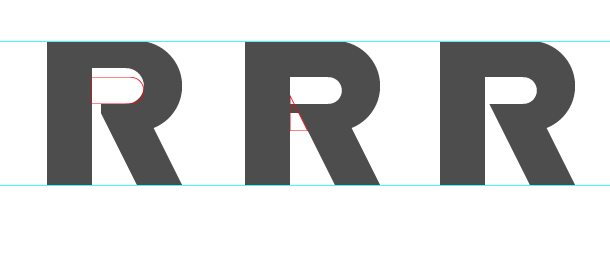
Comparing:
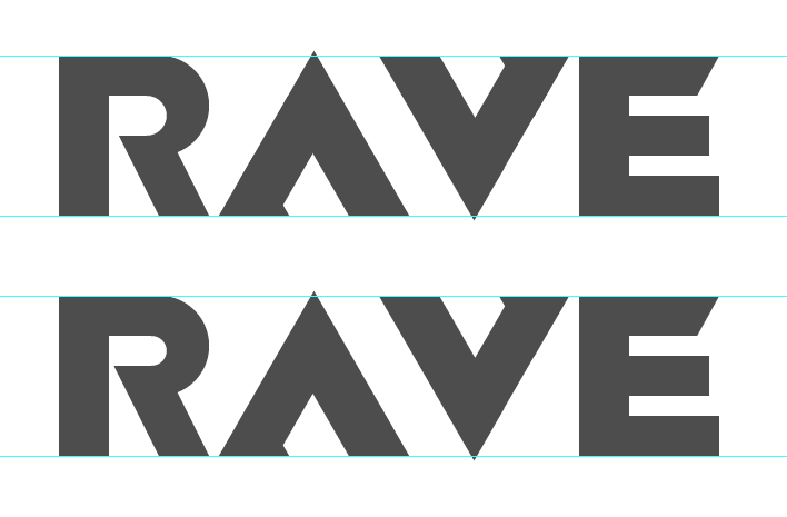
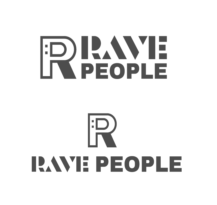
Result:

Trying on the logo for a social media avatar:

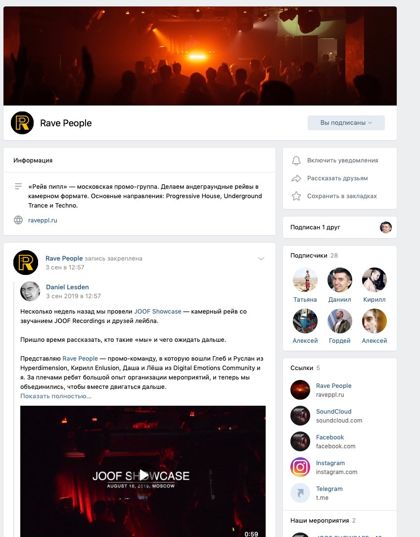
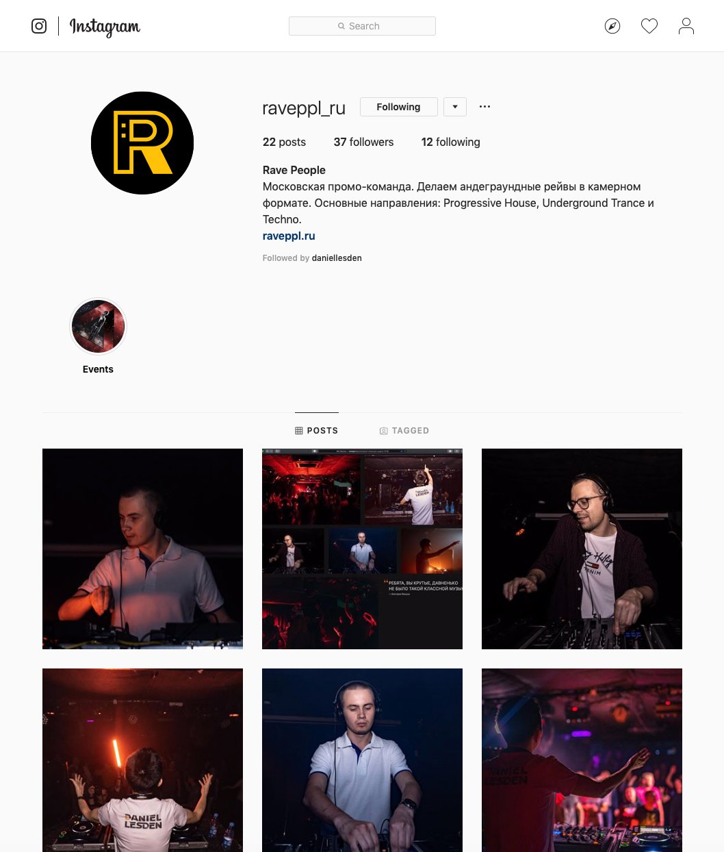
Work accepted!
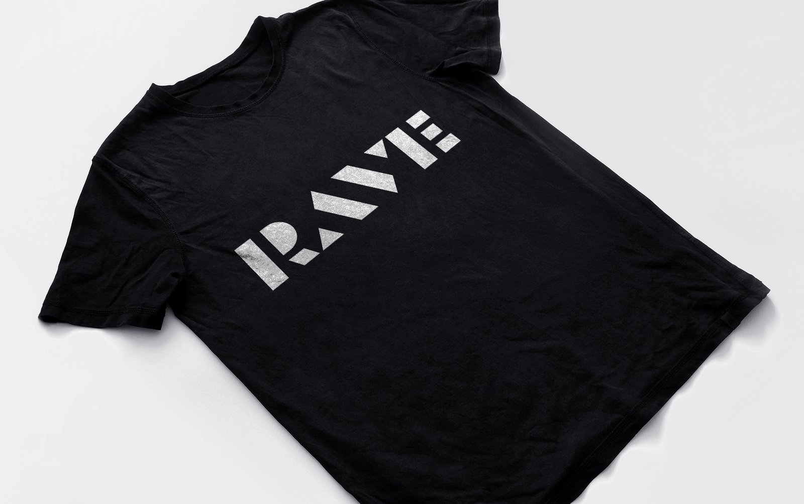
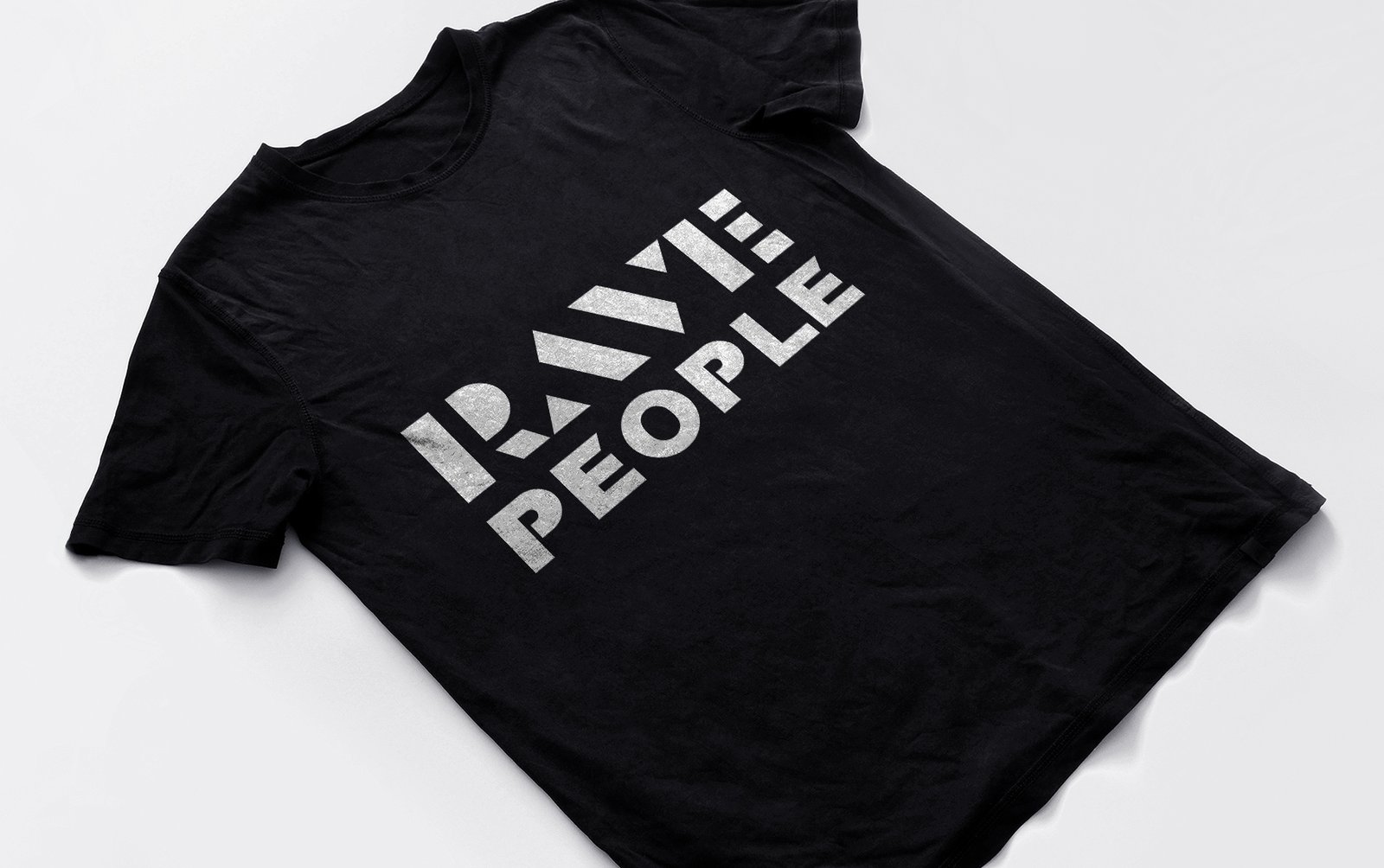
Logo in life – on the website raveppl.ru

.jpg)
.jpg)

