How I created a stylist’s logo
Natasha came to me with the task of designing a personal logo. She tailors her clients’ style of clothing and plans entire dressing rooms. There is more to her work than just changing clothes. Each client changes from the inside out and works through specific challenges and fears through the image. One day I would like to see such a specialist too :-)
I started the job with a conversation, of course. Natasha talked about herself, her work, her values, her plans and wishes, and the process began.
When working on a personal logo, it’s difficult to get an idea right the first time; it depends a lot on the client’s inner feelings. That’s why, more often than not, the first choice is like a finger in the sky. In this case, I took as my image the first association with a wardrobe — a coat rack.
Google showed me dozens of hangers-on and logos with them:
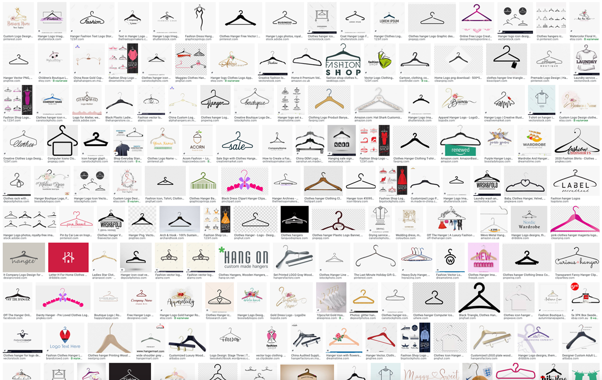
I noticed that the hangers were all at the same angle. Then I found a photo like this:
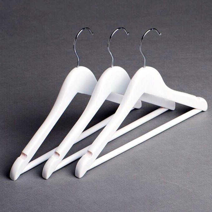
That’s the angle I decided to work with.

I’ve made a video of sketching the logo: Watch this on YouTube.
I drew one hanger:
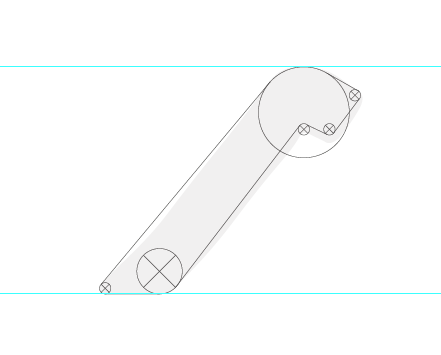
Put the three together in a row as if they were hanging on a bar but didn’t like the way they stuck together:
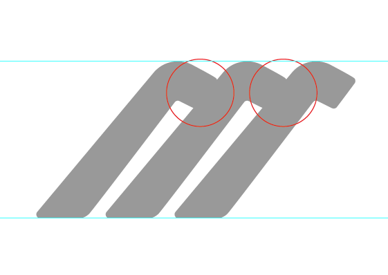
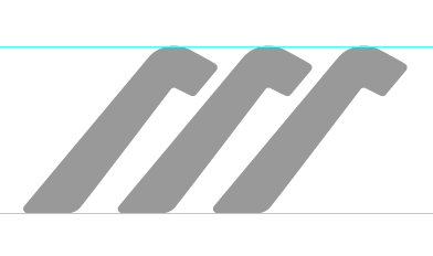
Separated the hangers:
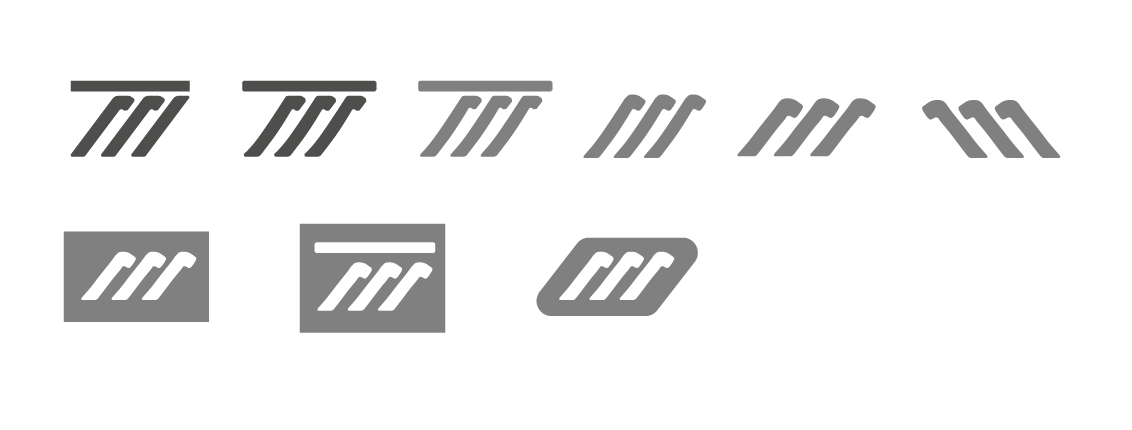
I’m trying different variations — with a bar, thinner, thicker, reflected on the left, on slats:
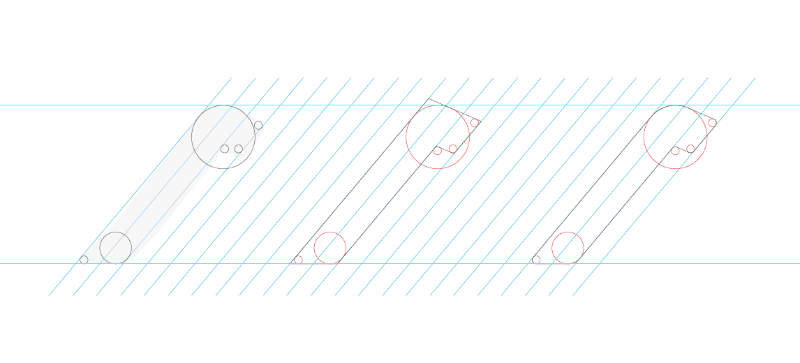
Drawing a hanger with parallel lines:
Putting together three hangers on a bar:
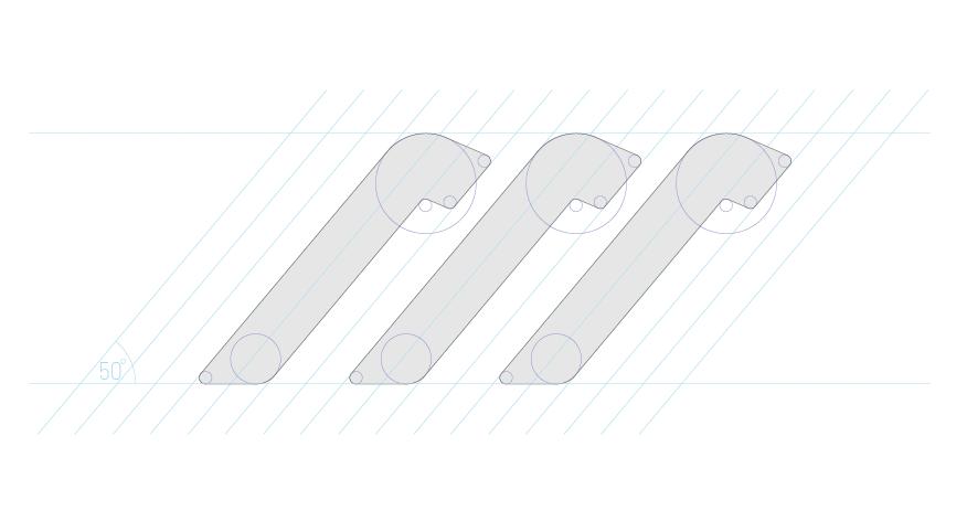
I also saw this connection:

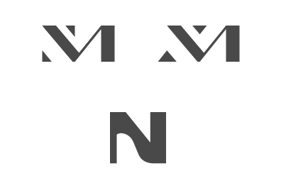
At the same time, I’m considering a couple of options with initials, but I don’t like them:
I go back to the hangers and assemble the logo with different fonts:
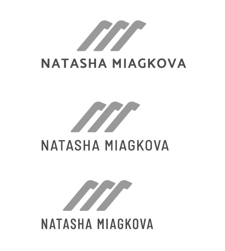
I choose the middle option and put together a presentation:
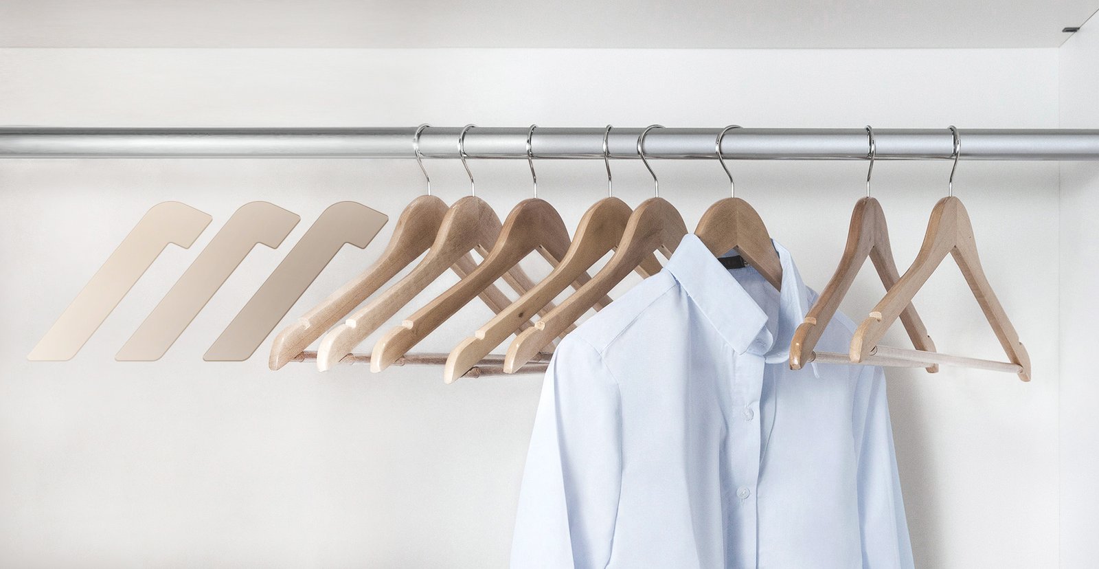
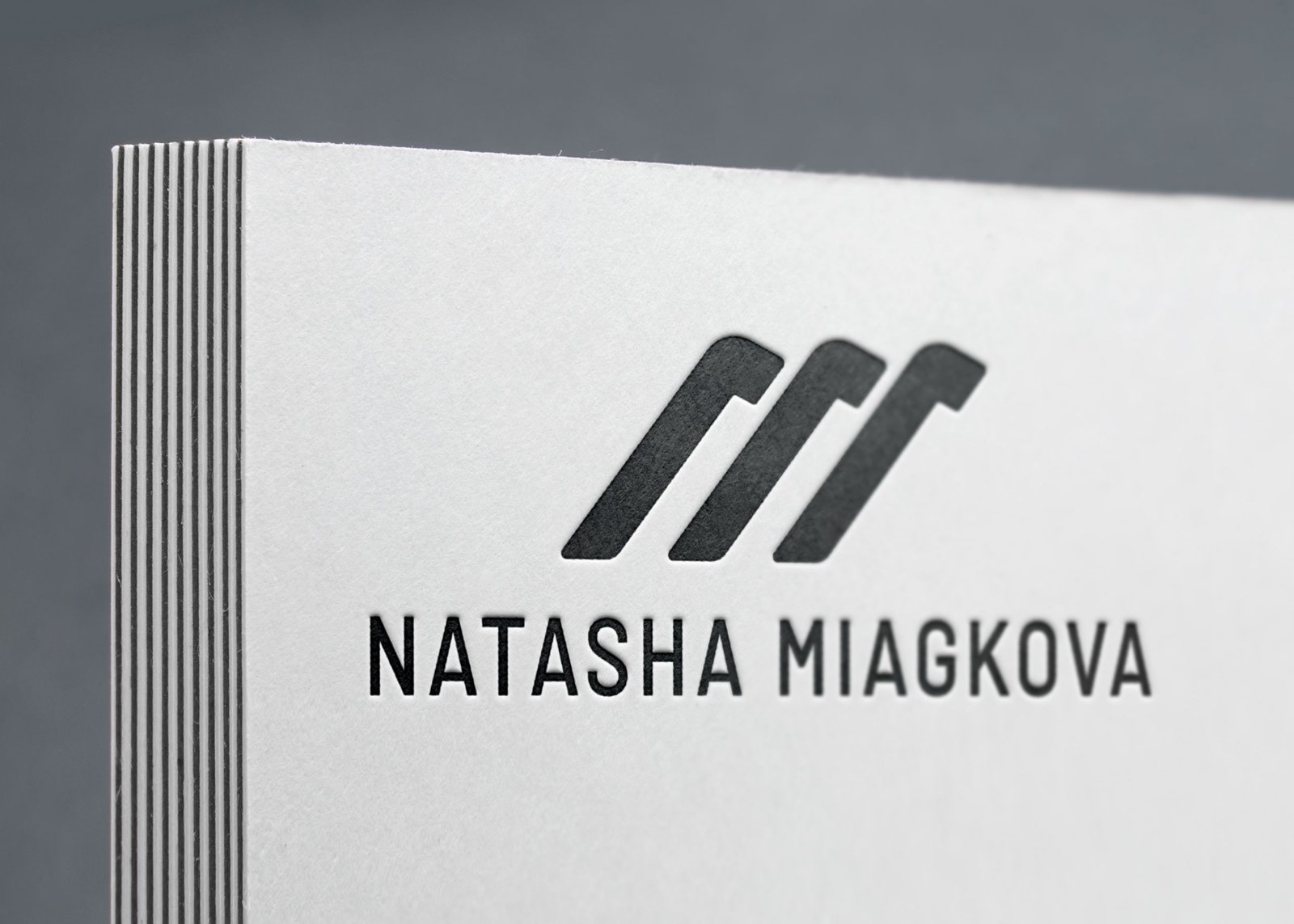
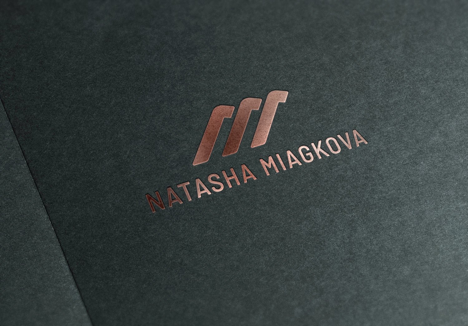


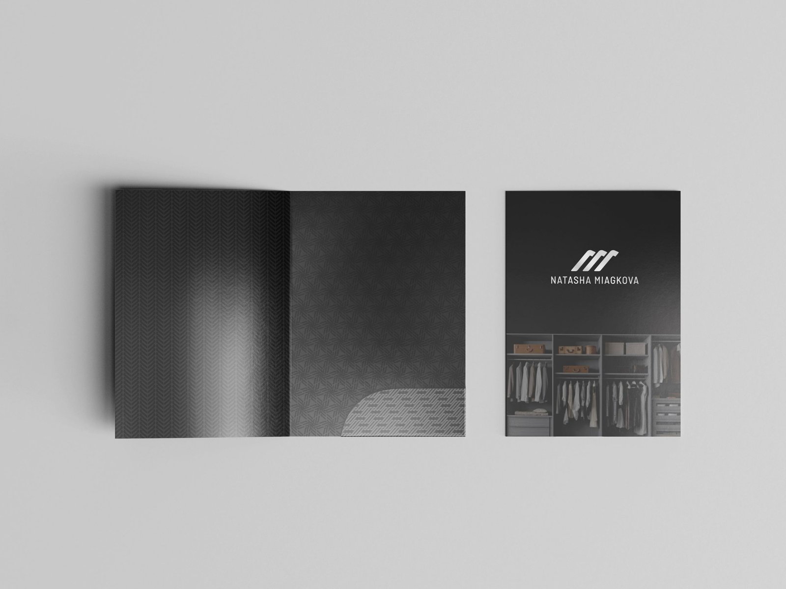
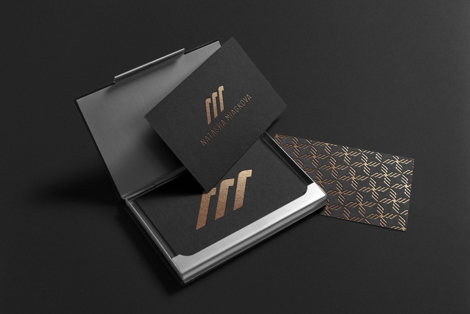
I get comments from Natasha — the image doesn’t fit and seems harsh. Natasha also asks for a font where all the letters “A” would be without a horizontal stroke. I show her:

Natasha is the type of client I love the most! She is involved in the process and works with me while subtly respecting the boundaries while remaining precisely a client :-)
We discuss where we are going next. Natasha is also active, which helps the process a lot. She has found images and logo options that she likes in some way, and we have identified three types of logos that we will try to make:
- A variant with handwritten initials or last name.
- A logo with a monogram sign.
- A variant with a sign consisting of two images — a lotus and a corset. The lotus image she likes and the corset is an attributes of a woman’s wardrobe.
I decided to start with options two and three, but first, I google what monograms already exist. There are, of course, a great many of them:
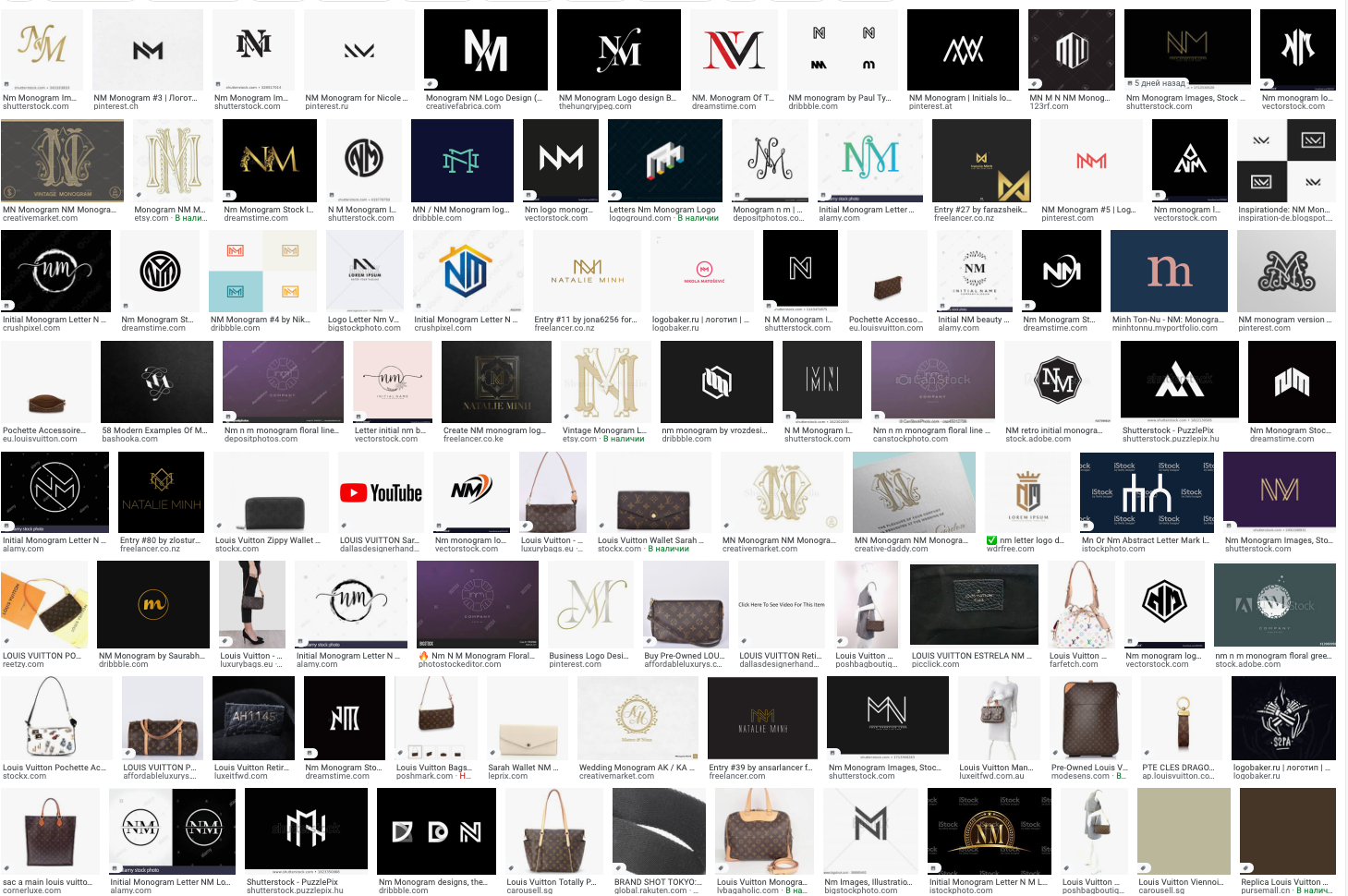

Sketched out a new batch of sketches:

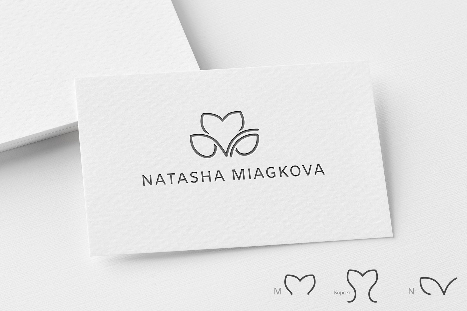
Drawing a monogram and a lotus corset in a vector:


And there are three images hidden in the lotus:

These options don’t work for us because the lotus has a different association than we need, and there’s probably already a monogram like that somewhere :-) I decide to show the options to the client but not to use them:

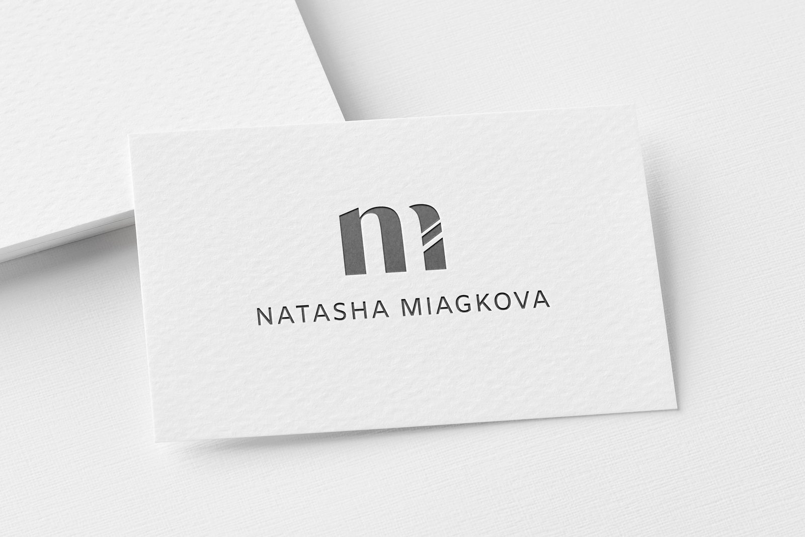
Parallel drawing of a variant with initials in the lines, but rejected:

I finally got around to the handwritten options. Found a font for an example:
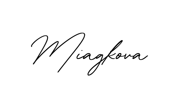
I’m trying to combine it with the name:
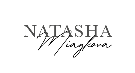
I want M to complement the first letter A in the name, drawing my M:
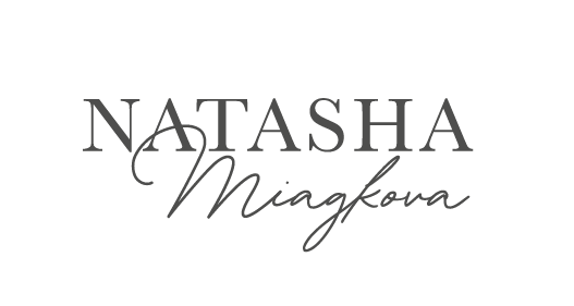
I’ll leave this one for now and proceed with the handwritten initials:
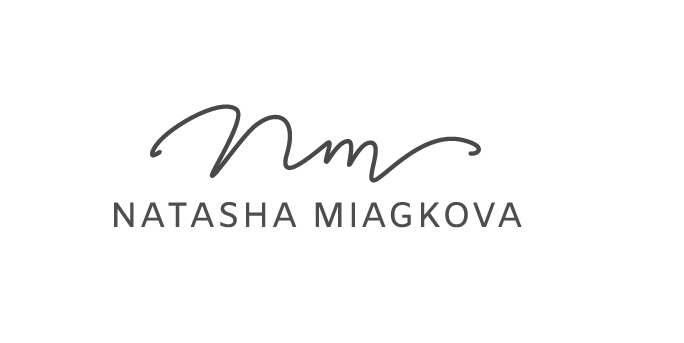
In the process, a different version in the shape of a circle was formed:

I compile the options into a presentation and show them to the client:

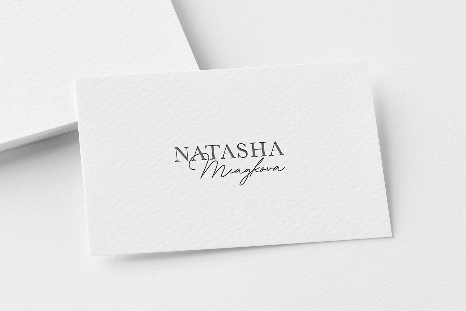
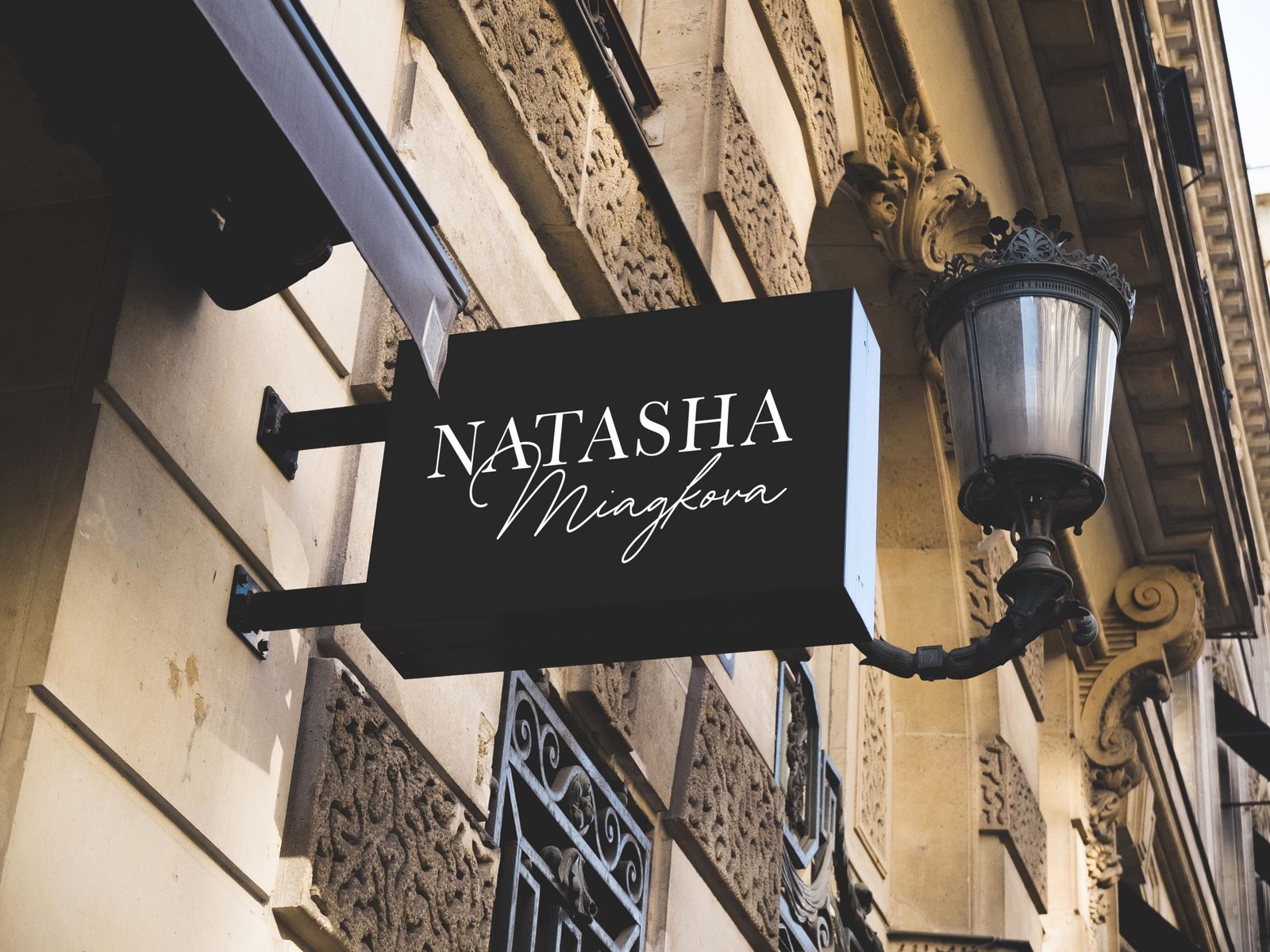
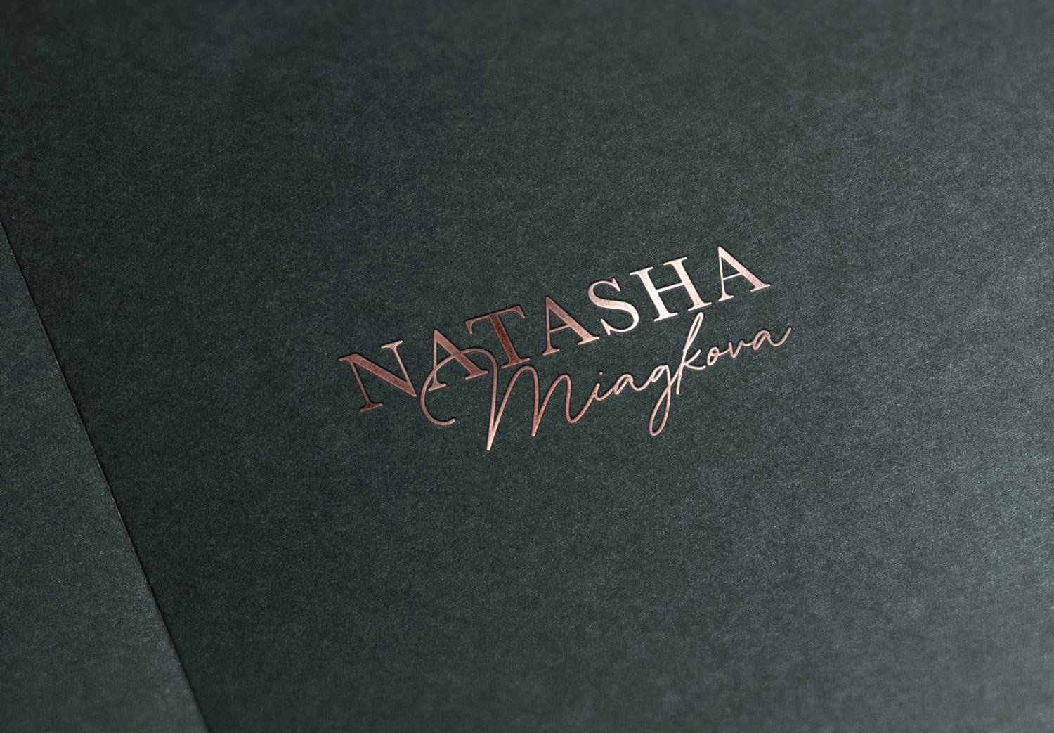
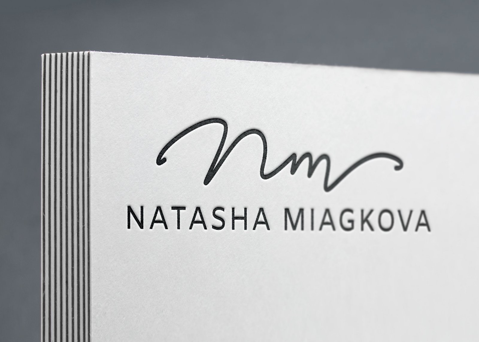
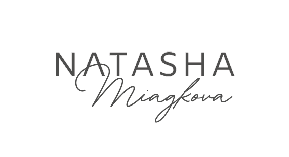
Natalia asks to see the first version with a sans-serif font. I show her:
I liked the version with the additional circle-shaped sign better. I am continuing to work on it.
At this stage, I draw the letters:

I add the accent, the diacritical mark and the descriptor to the surname. The diacritical mark is taken from the Ukrainian language — Ї, Natasha lives and works in Kyiv. Looking at different positions:

Trying to insert the font part in the initials:
I’m also looking at framed options:
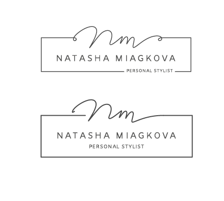
I decided to flatten the handwritten part a bit:

Drawing letters for the descriptor:

Putting together a version of the logo in a round shape:
But that’s not the end :-)
I decided to add “life” to the initials by imitating writing with a nib, as the lines flow from thin to thicker and then back to thin again:
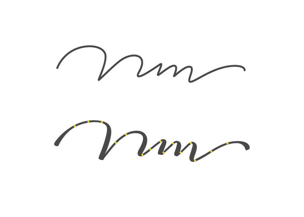
I like it much better that way:
Transforming the handwritten part a bit:

Looking at the logo in different forms:


Putting together a presentation. I tell the client that I have decided to revive the thin line in the handwritten part and imitate writing with a nib. This way, the sign looks more confident, and we can continue to work with it. I present all the options for clarity:

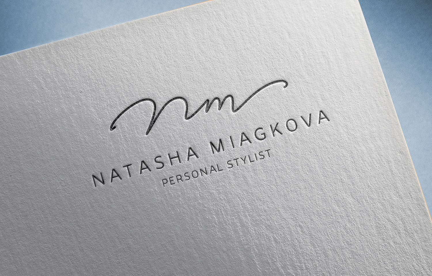




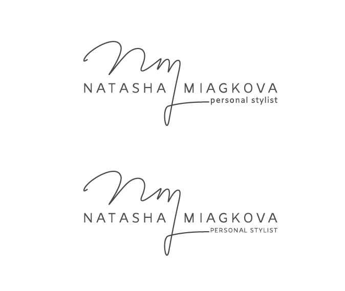
Natalia decided on a version where the handwritten part is linked to the typographic part:
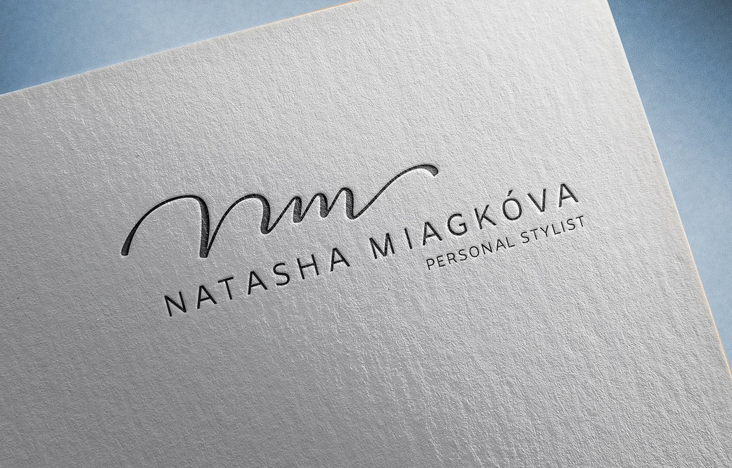
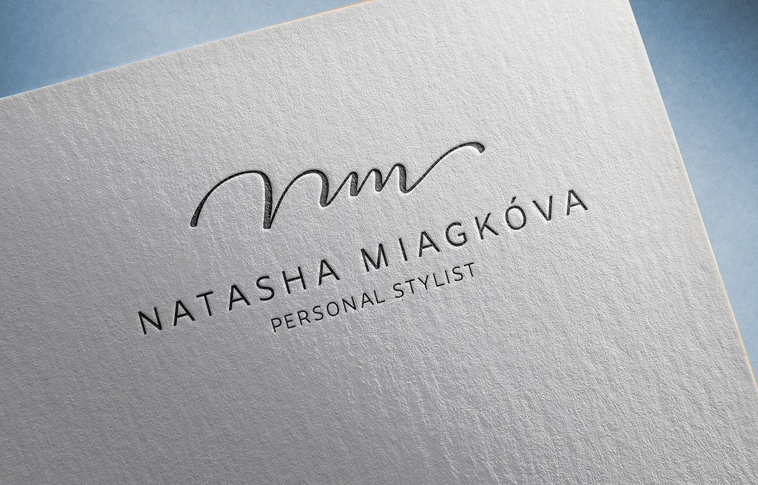
However, after living with this variation for a couple of days, we saw that the vertical line with the tail, which divides the typographic part in half, was too massive and took on a lot of emphases. I went ahead and made three new variants of this ponytail:

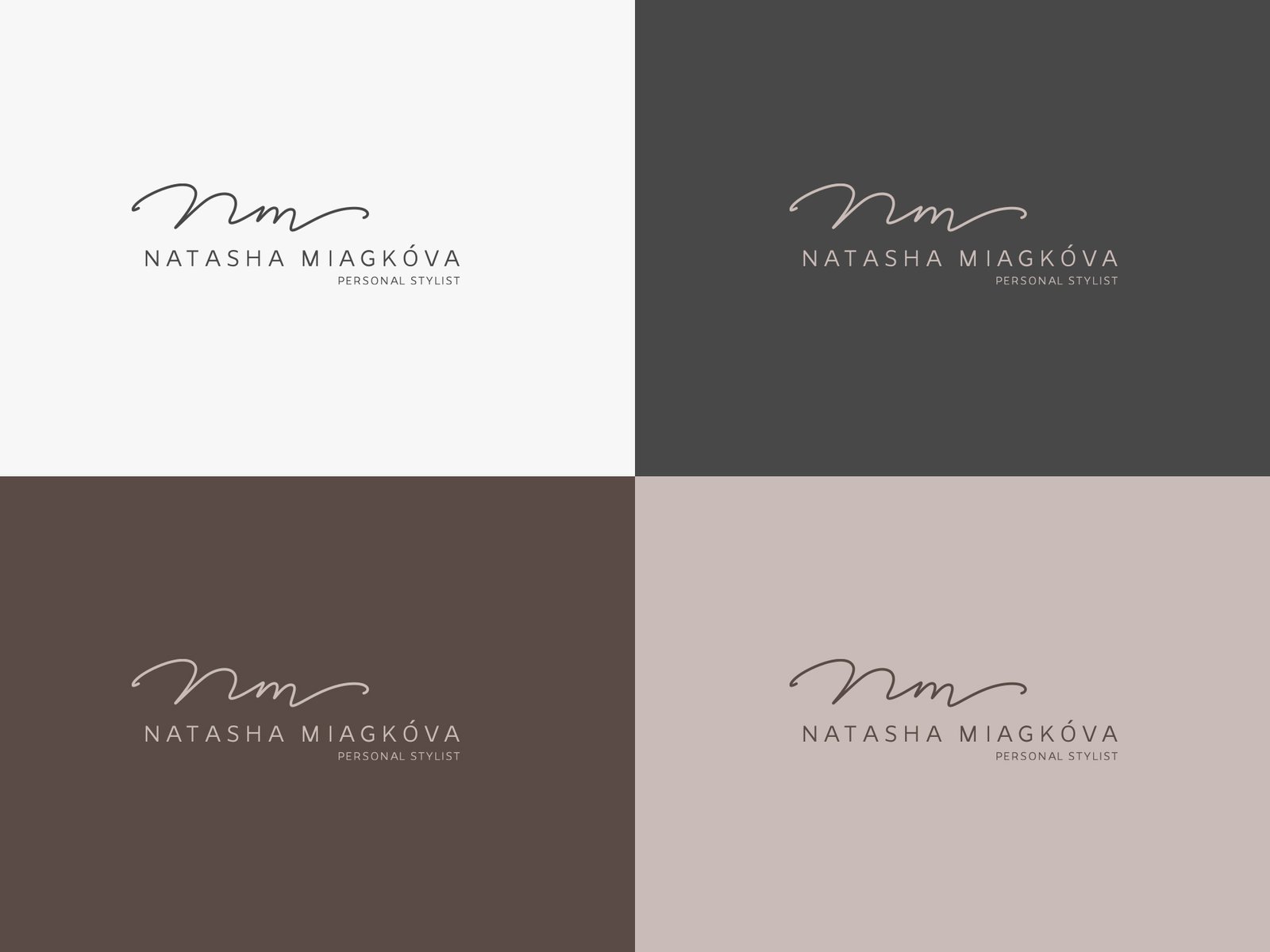
Stop at the first option and see it in colour:

Changing the letters in the descriptor from lowercase to uppercase so the logo is more harmonious:
Trying on an additional round version of the logo with the modified handwritten part, but it doesn’t fit:

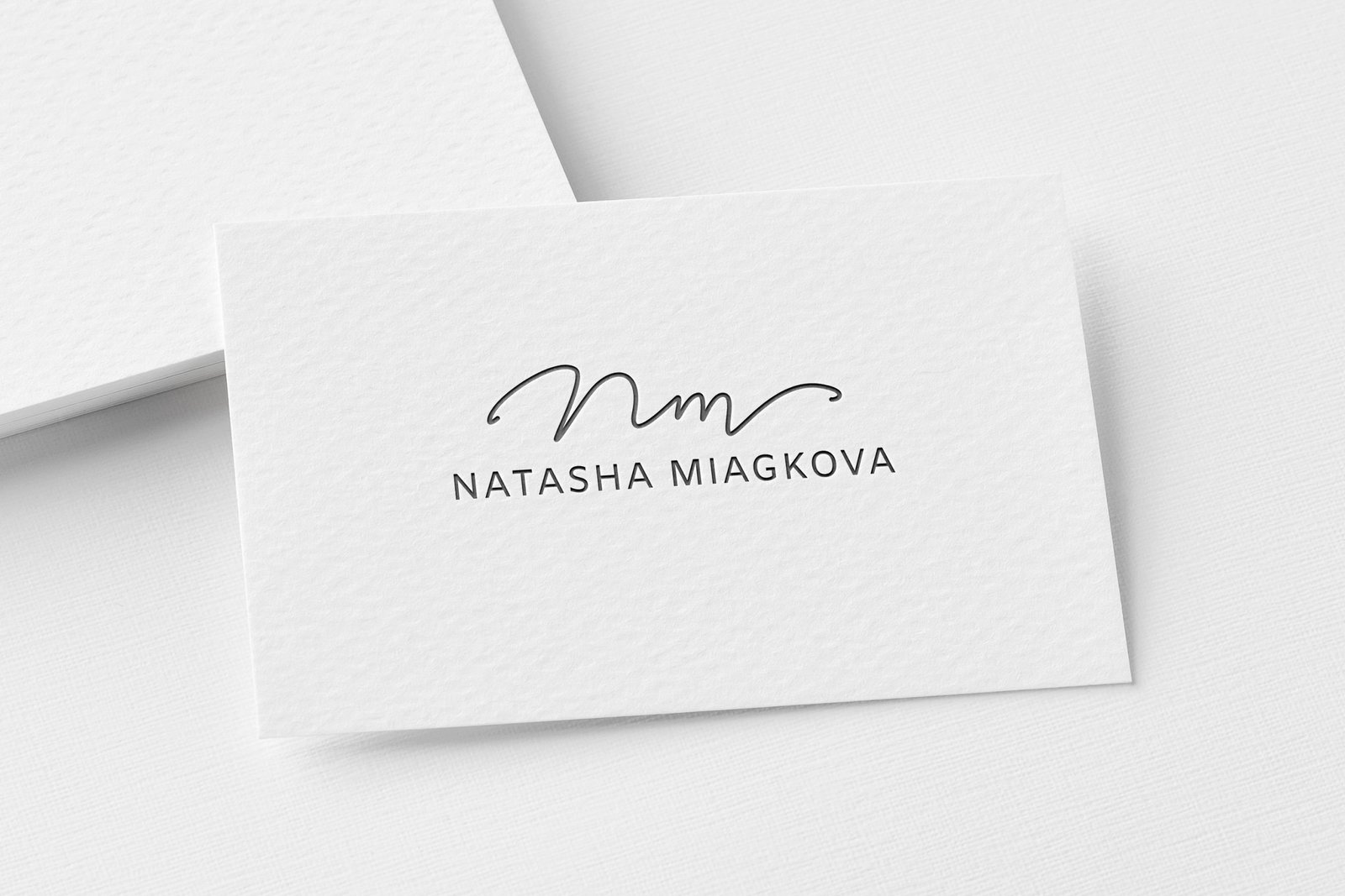
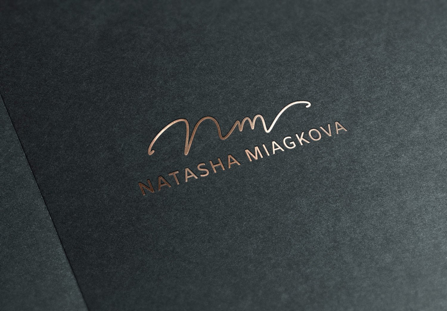
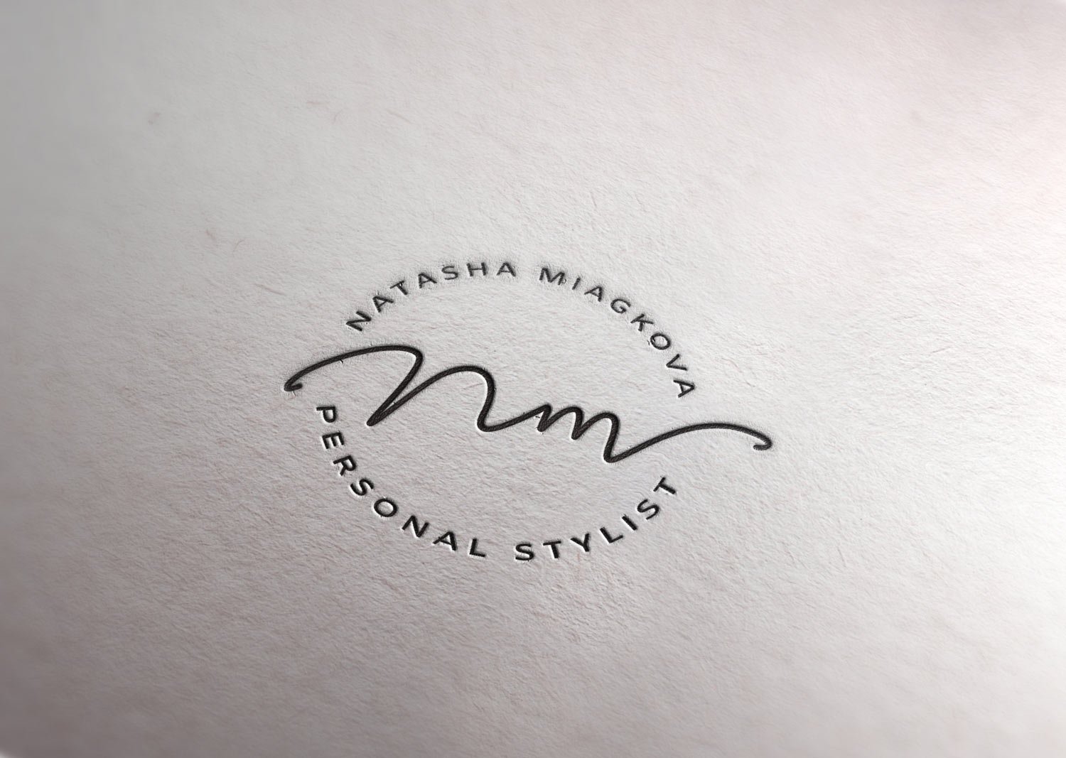
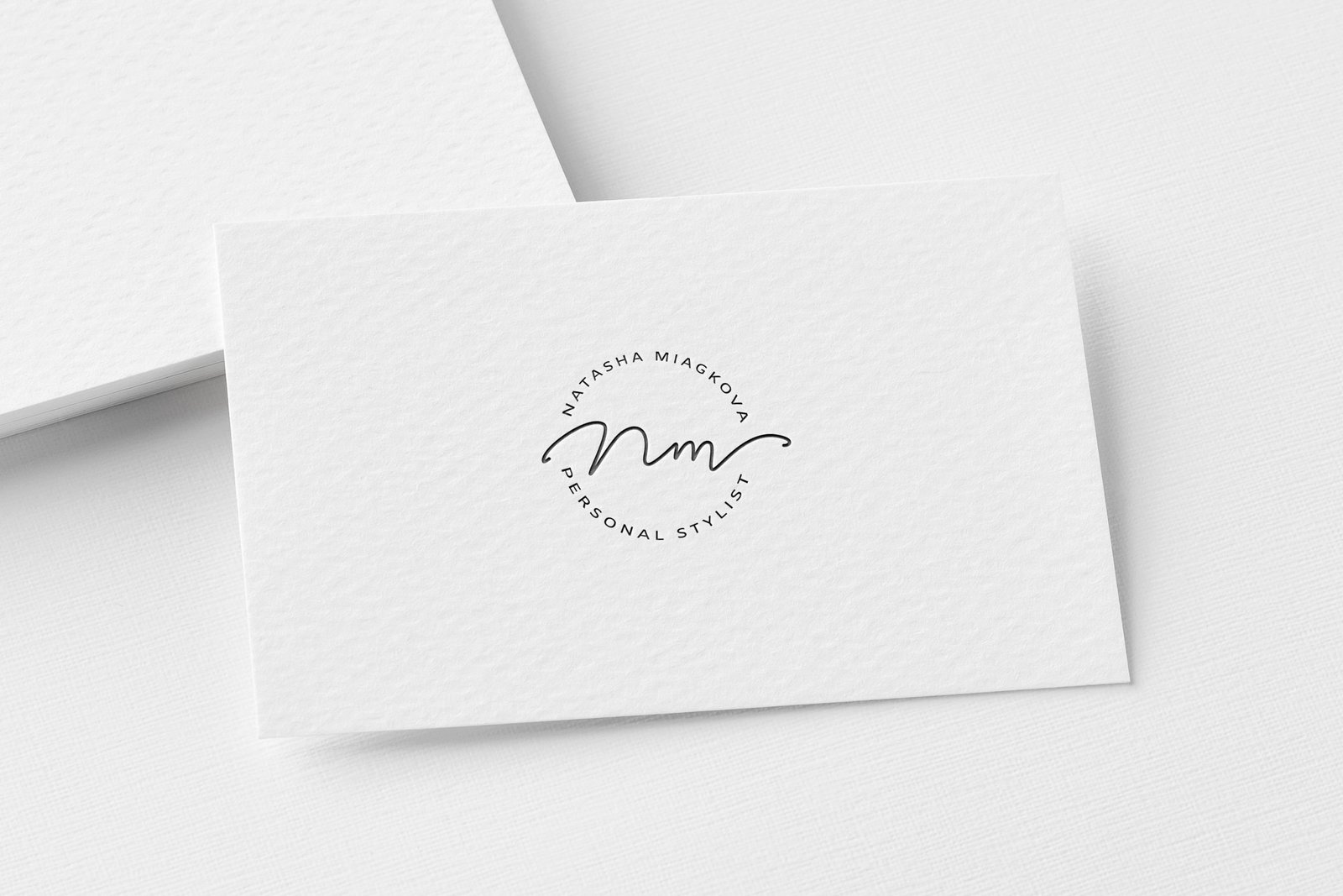
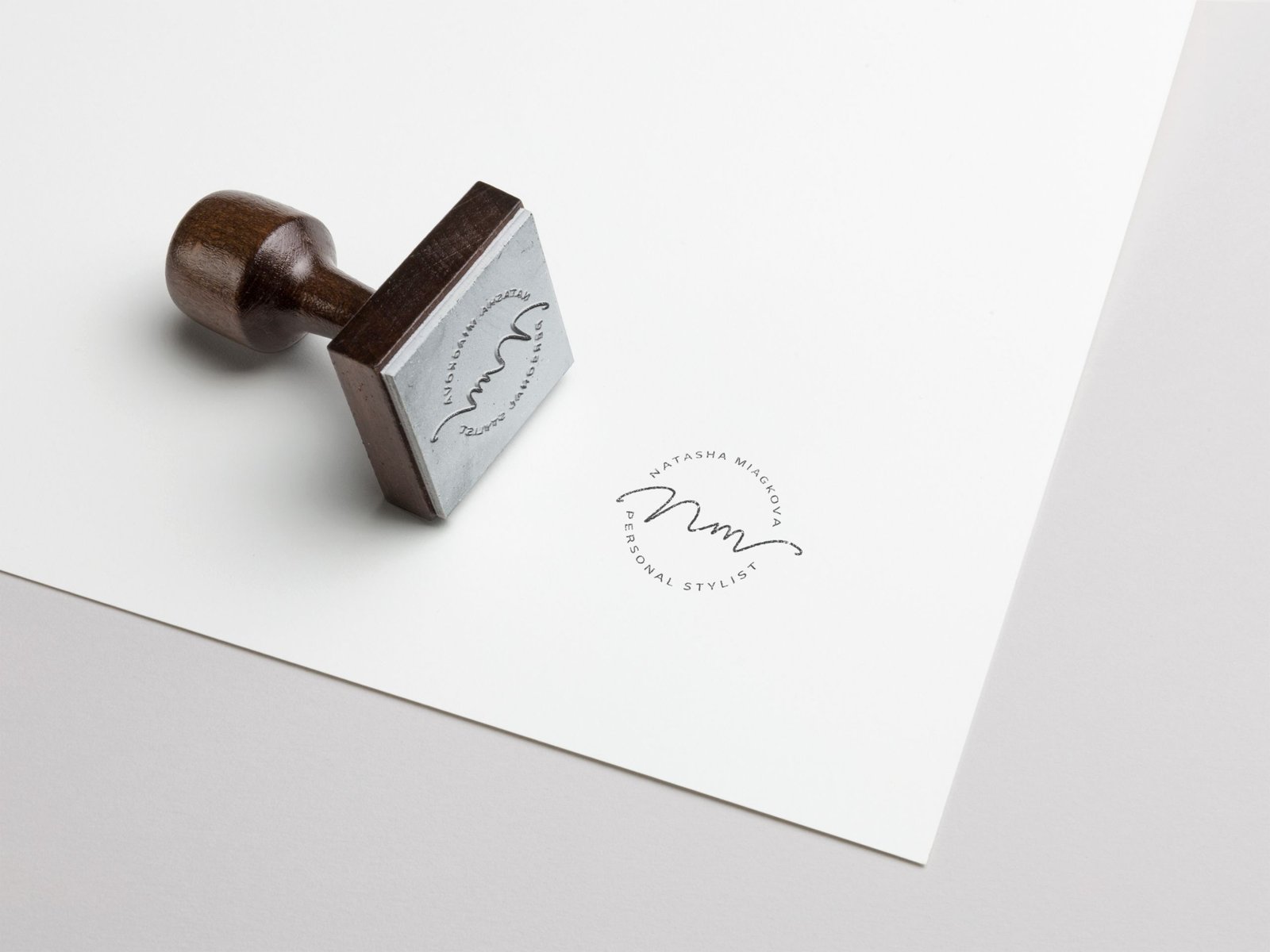
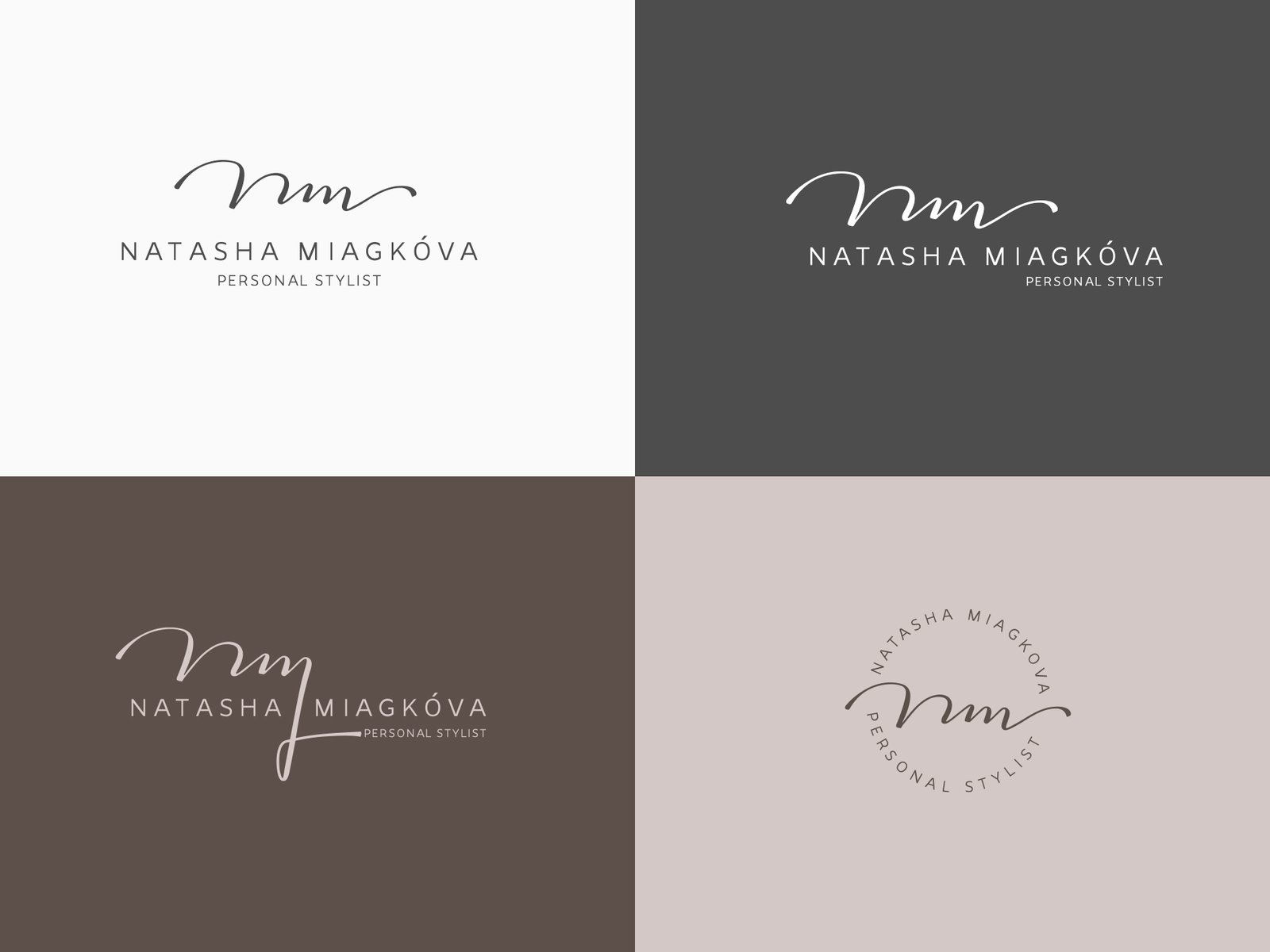
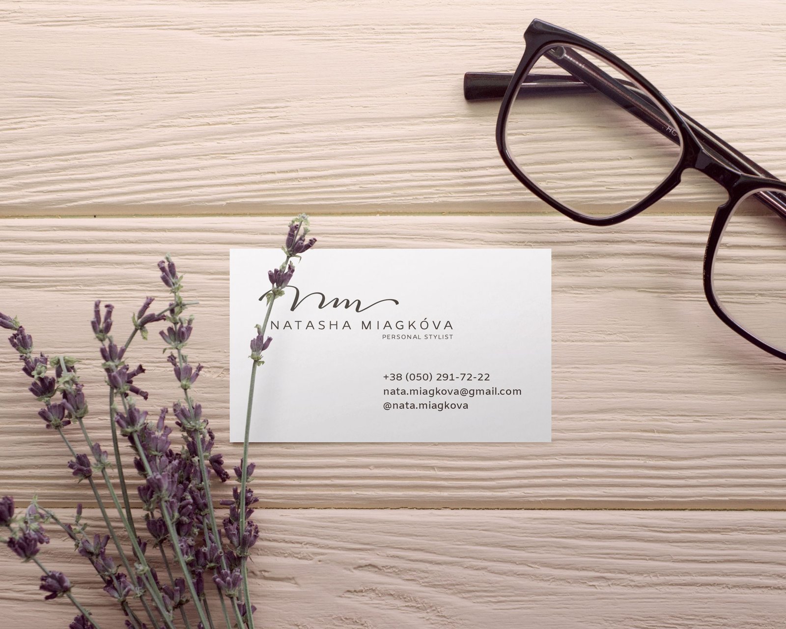
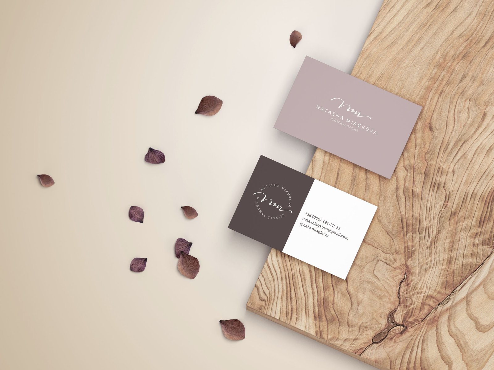
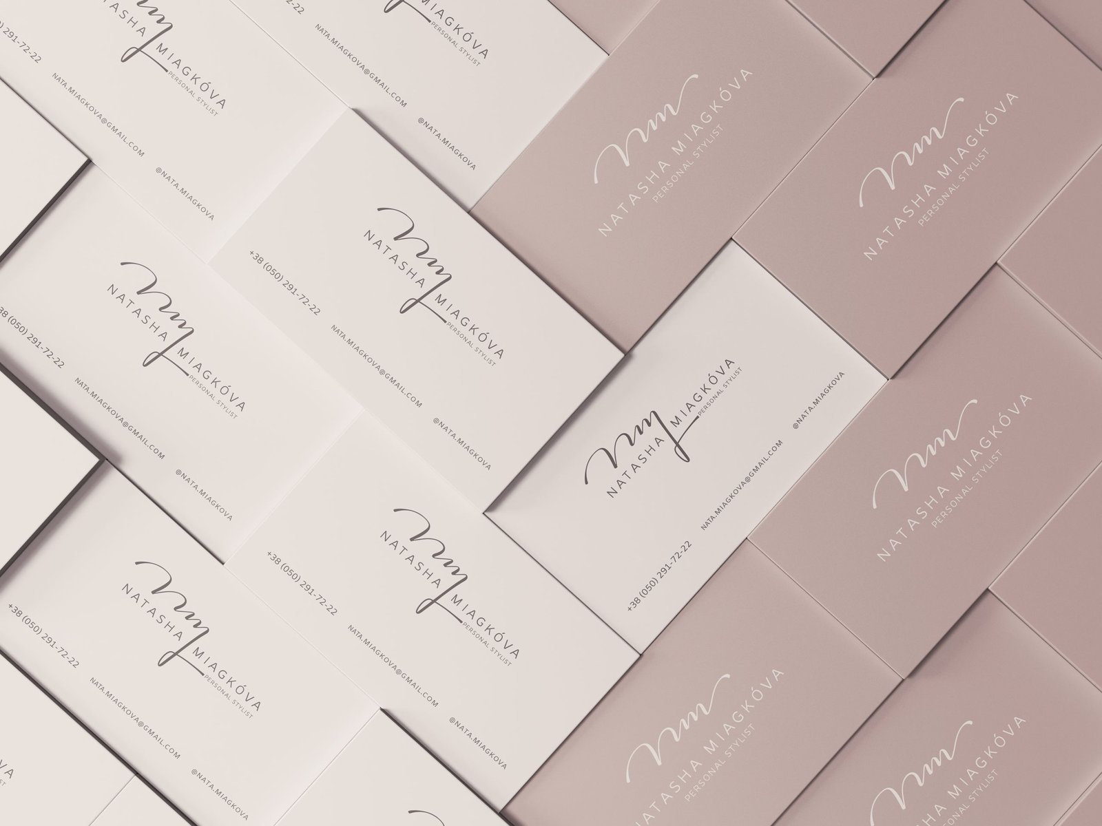
Done. Natasha accepts the job! The final result is the basic logo, the other round version and the version without the descriptor:


