Magazine layout. Initial
Continuing the theme of journals, I will tell you about the initials. An initial is the large first letter of a chapter or section of a book. It originally appeared in books. At that time, they were handwritten and decorated with different ornaments and miniatures:
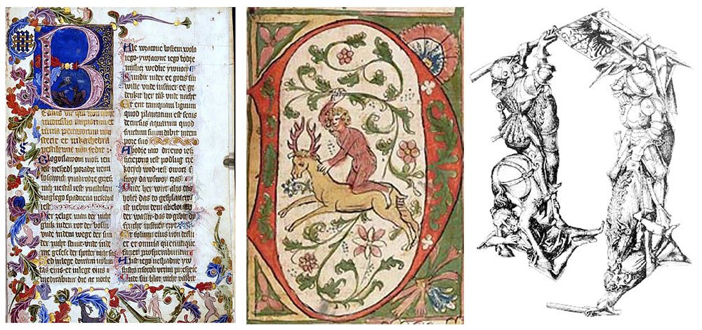
Today the chance of finding a drop cap in a book tends to be zero, but you can see them in magazines and newspapers. A drop cap in an article grabs the reader’s attention and invites them to study the material. Externally modern initial, of course, differs from its predecessor. I looked through different magazines and identified five types of lettering in the design of articles — I will talk about them.
Enlarged letter size
An enlarged first letter is probably the most common variant. It’s usually the same font as the typesetting but can be different. The letter can remain inside the text block and seem to shift a few lines to the side:
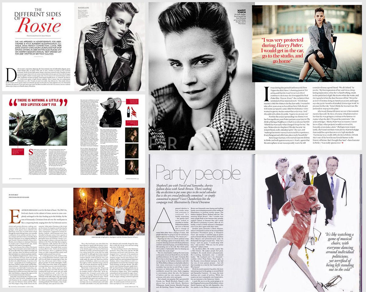
Or it can extend beyond the text block:

Overlapped letter
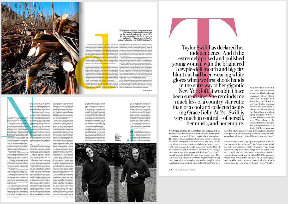
The first letter of an article is duplicated and enlarged, and the text overlaps it. The letter is usually a bright accent colour:
Text envelopes the letter
The first letter of an article is enlarged, most often to the full height of the page, and the text canvas envelopes it in shape:
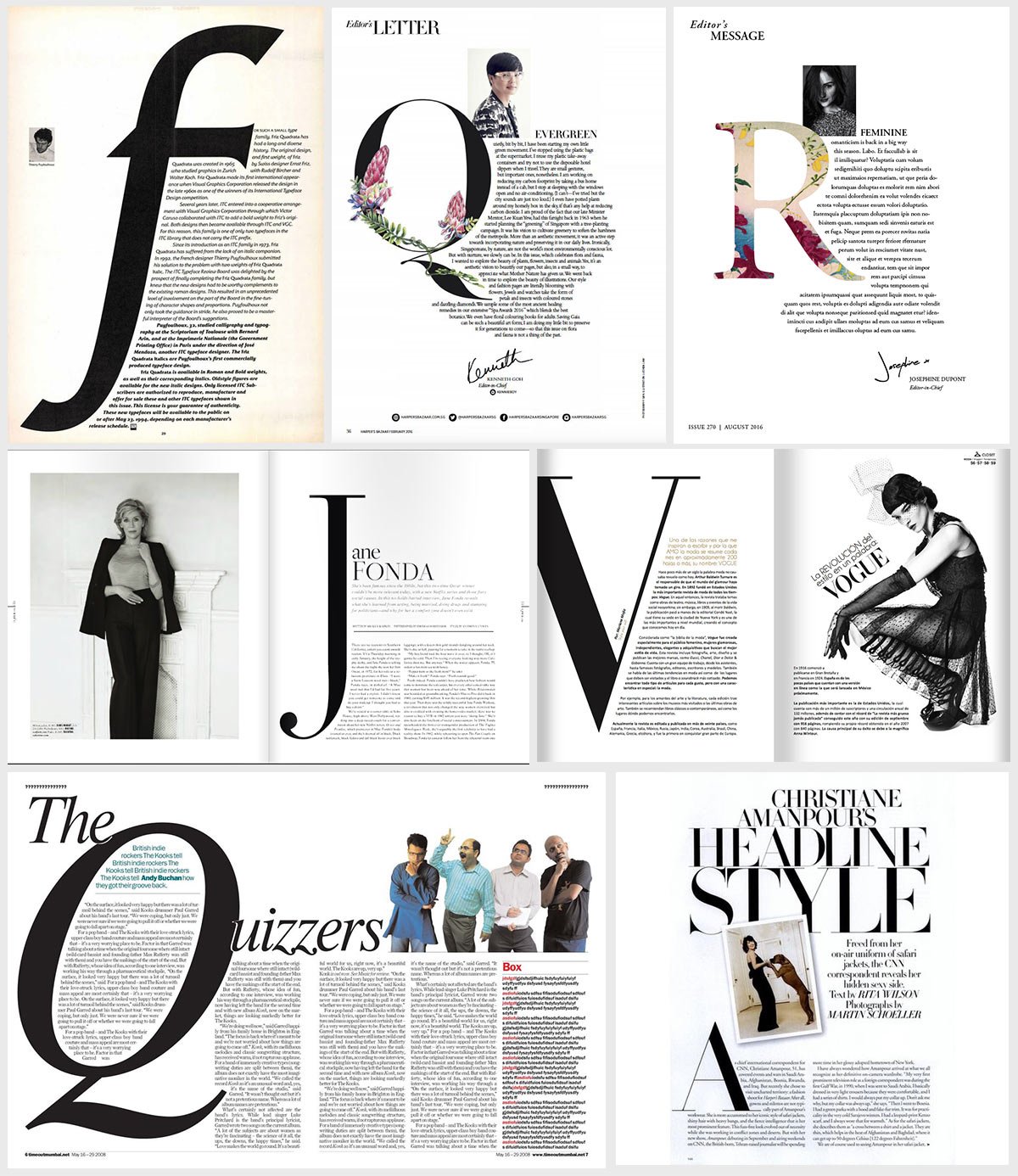
Large initial
The first letter is duplicated and greatly enlarged, positioned beside or above the text block:

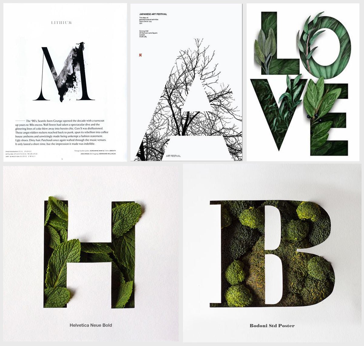
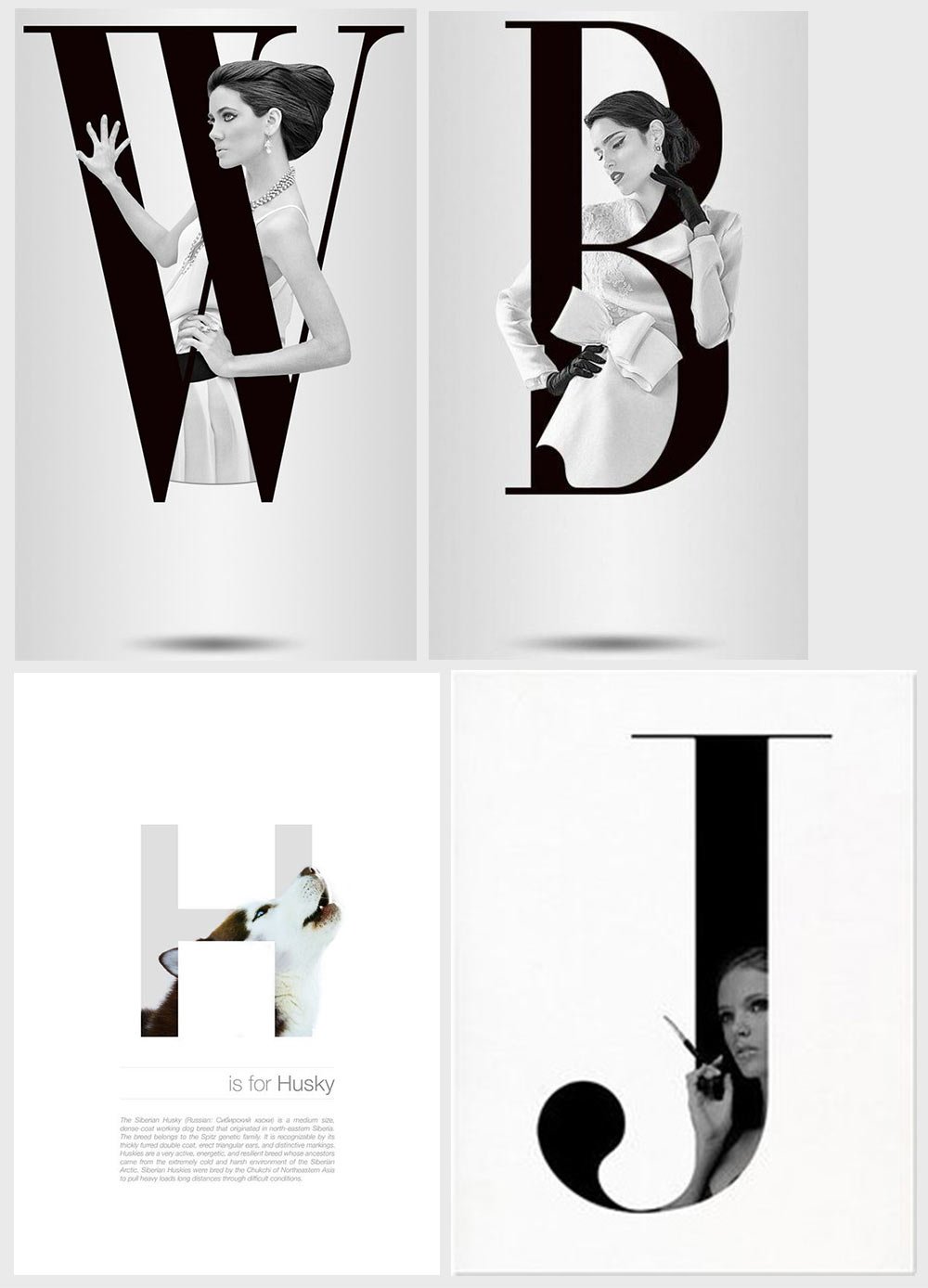
In my opinion, large initial looks quite effective. It can be classic lettering or combined with an illustration. I like these ideas:
Letter-shaped text
The first letter is duplicated and enlarged as much as possible. The text is aligned to it and follows the shape of one of its strokes:

This is a creative layout option, but not all publications can afford to waste space like that. Speaking of page layout, I found some pretty interesting variations. I’ll show them next time :-)


