The process of creating a logo for a coach
Logo for personal and business coach Rodion Kopyal. At the beginning of the work, Rodion voiced his associative wishes for the future logo: growth, support, development, aspiration, finding a way, breakthrough, search for oneself, purpose, and spirituality. That’s why I started the development of the logo with a tree of associations.
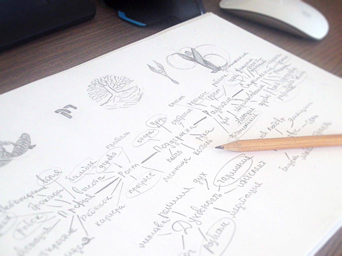
As a result of my search, I got hold of a few basic concepts — tree, obstacle, development, harmony, friend and support. And on their basis, I started sketches.

I chose the concept of a tree with roots from the resulting variants and translated it into vector format.
The sign went through six stages of transformation:
- in the first stage I used a pendulum instead of a tree trunk, which indicates the way through rocks, i.e. obstacles;
- added a handshake in the role of friendship and support to the rocks;
- realised that the petals didn’t fit in that way, so I gave them the shape of splinters and the tree the traditional look;
- corrected the roots of the tree;
- at the client’s request, I gave the petals the shape of jigsaw puzzles;
- together we gave up puzzles and went back to splinter petals, but rounded them to make them look friendlier.
rk-3.jpeg.
Logo transformation
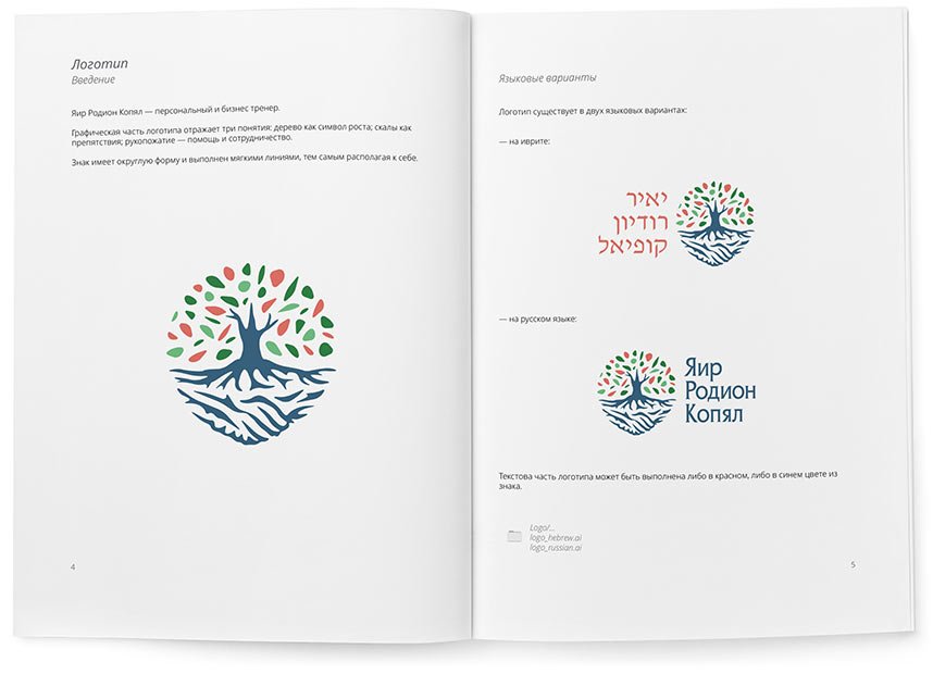
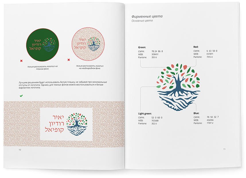
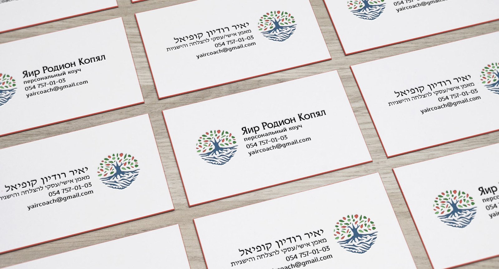
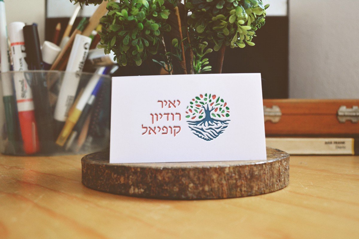
The result is a sign that combines everything we wanted to show: a tree as a symbol of growth and development; rocks as obstacles; a handshake — help and cooperation. We then picked a colour scheme for the sign and added the client’s name.
The rules and recommendations for using the logo are collected in a guideline:
