Created the logo for the ISONscope space project
ISONscope is a joint project of the United Nations for Outer Space Affairs (UNOOSA) and the Keldysh Institute of Applied Mathematics of the Russian Academy of Sciences. The project’s name comes from the acronym ISON (International Scientific Optical Network) and the word telescope. ISON is an existing initiative of the Institute’s staff to observe near-Earth space.
ISONscope will provide small telescopes and associated equipment on a competitive basis to scientific or educational institutions in developing countries. This will enable them to observe satellites and space debris in high Earth orbits, as well as asteroids and comets.
We have a very tight deadline — we have three weeks to do everything, so we must hit the mark the first time. The logo should be the face of ISONscope, part of the UNOOSA Access to Space for All initiative Access to Space for All initiative.
As usual, I started the work with questions. The project team explained everything to me in great detail. The logo must have a telescope, a name and objects that can be observed through the telescope. They need a so-called logo emblem. They also sent me pictures of the telescopes themselves:


I take up a pencil and sketch. The task is quite narrow, so I don’t experiment too much but try to incorporate the necessary elements from the discussion with the client. This is what came out:

I made a video of sketching for the logo: take a look on YouTube.
I also sketched the telescope itself, but in a vector:

I immediately knew the logo’s shape: I decided to make it in a circle and combine the letter I and the telescope into one element. At this stage, I took a ready-made IBM font:

Now I had to sketch additional objects that would be present in the logo – an asteroid, space debris and a satellite. I wanted to draw a complete picture of the Sun and the Earth to make it clearer:

Putting together a logo. Additional signatures need to be placed around the circle: United Nations Office for Outer Space Affairs and Keldysh Institute of Applied Mathematics. Here’s what I’ve got:
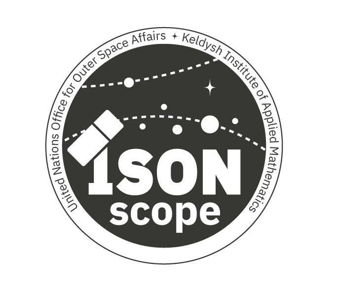
I like the result, so I continue working and painting the letters:

Here’s what came out when combining the telescope with the new letter I:

Updating the logo and changing the layout of the circular text:
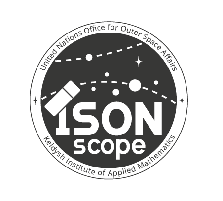
I try the result on a mock-up and send it to the client:
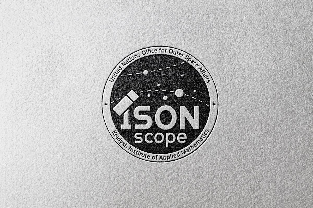
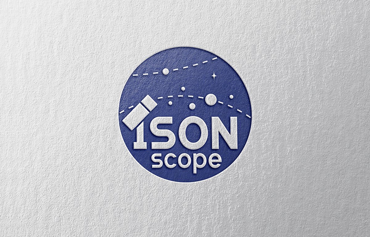
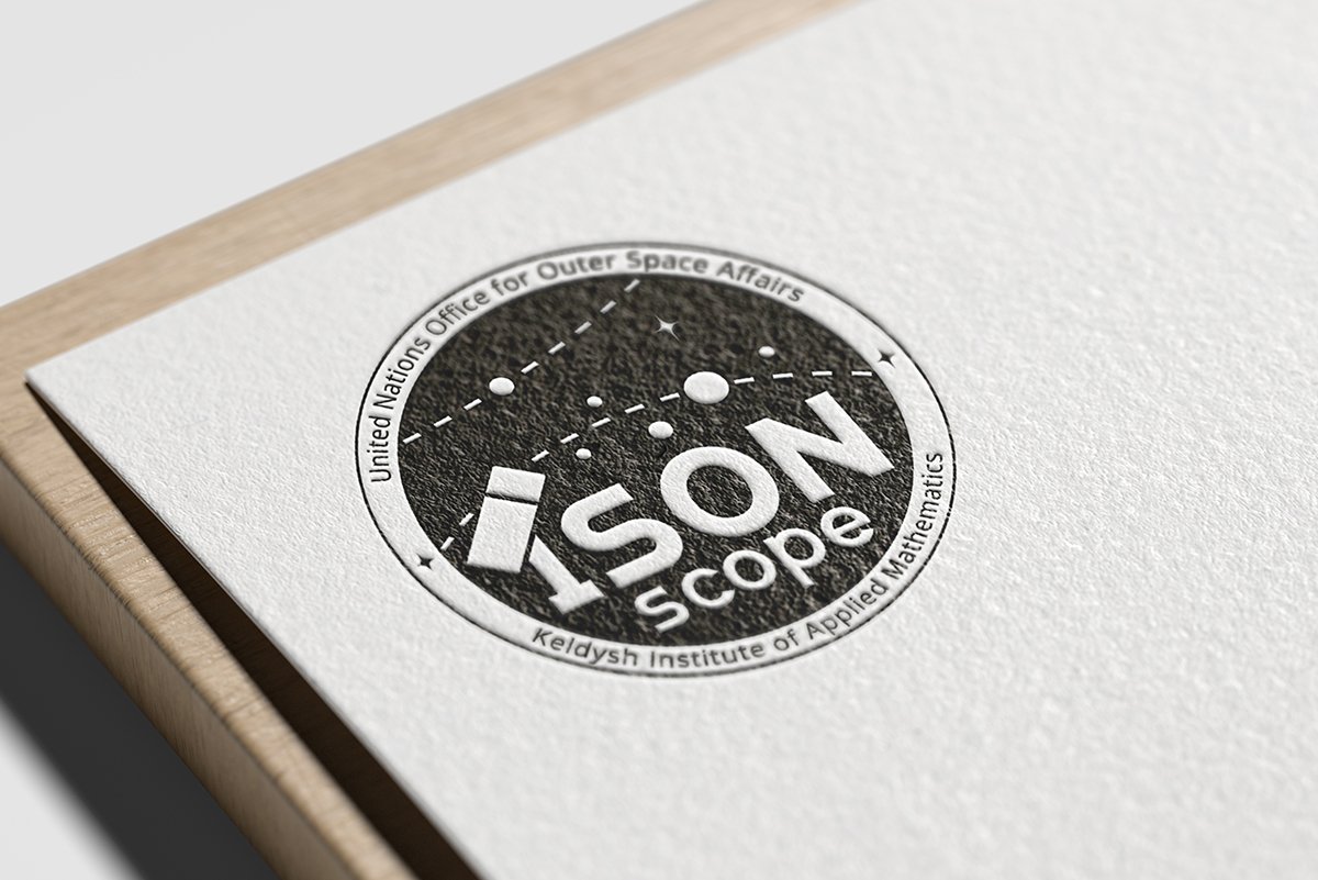
Testing the reverse logo on the media:
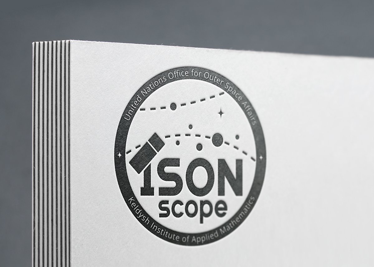


I got an answer — they like the logo, but they wanted to make the satellite more obvious, darken the colour and perhaps add a signal from the satellite.
Trying different shapes of satellites, moving elements slightly and adding a signal (it looks like a wifi icon), also updating the colour:
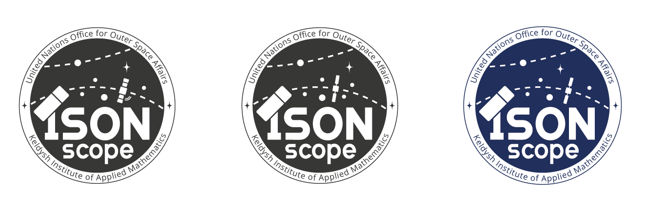
The signal is definitely not needed — too much detail. I chose a satellite with solar panels in the shape of paddles and sent it to the client again:
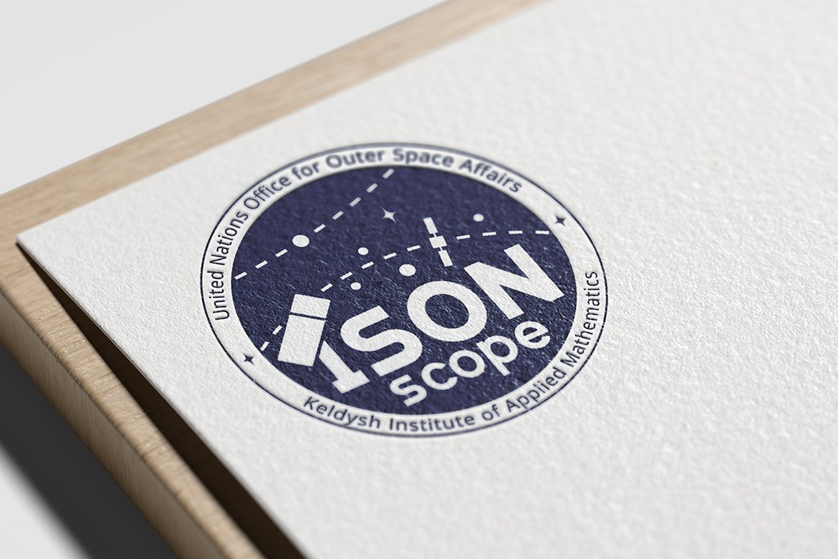


The logo is approved!
While we were working, UNOOSA presented the logo for the Access to Space for All initiative:
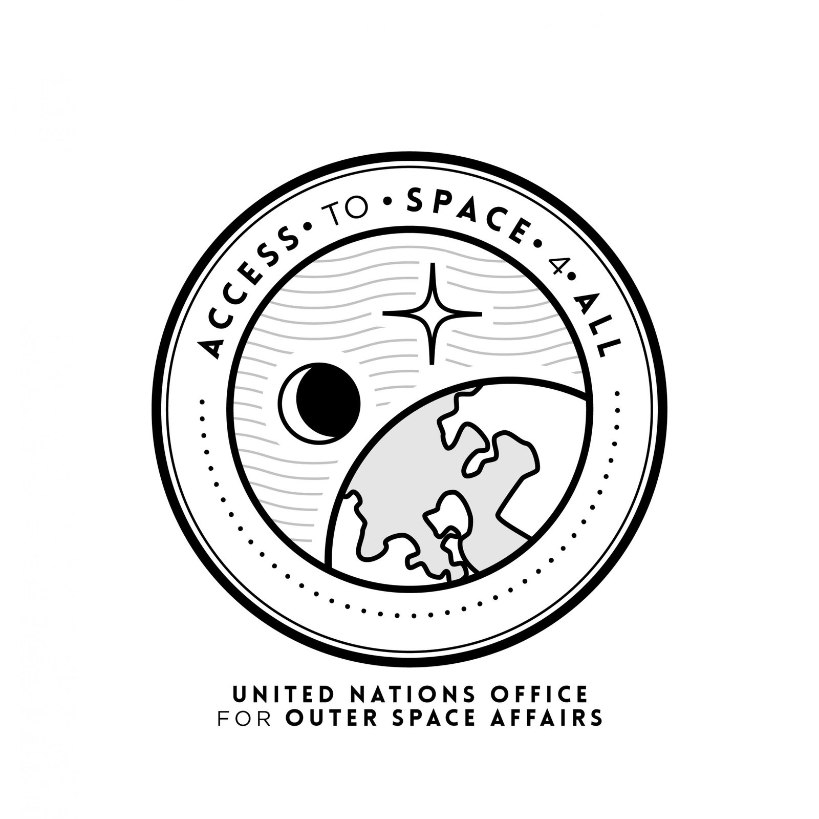
It turns out our logos are pretty similar, which was nice :-)
UNOOSA soon sent us their brand book, and we updated the circular signature font and colour to match their style more.
We replaced the font with Avenir. The colour is a bit harder, we liked our deep blue, and it wasn’t there. We looked at a few colour options:
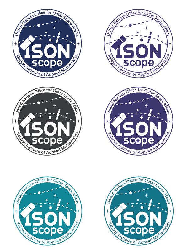
We decided on purple as the closest thing to our blue.
The logo is ready!

The competition starts on 27 January, and the results will not be announced until October. I’ll keep an eye out :-)
I was extremely excited to work on the project. Space is my love!
