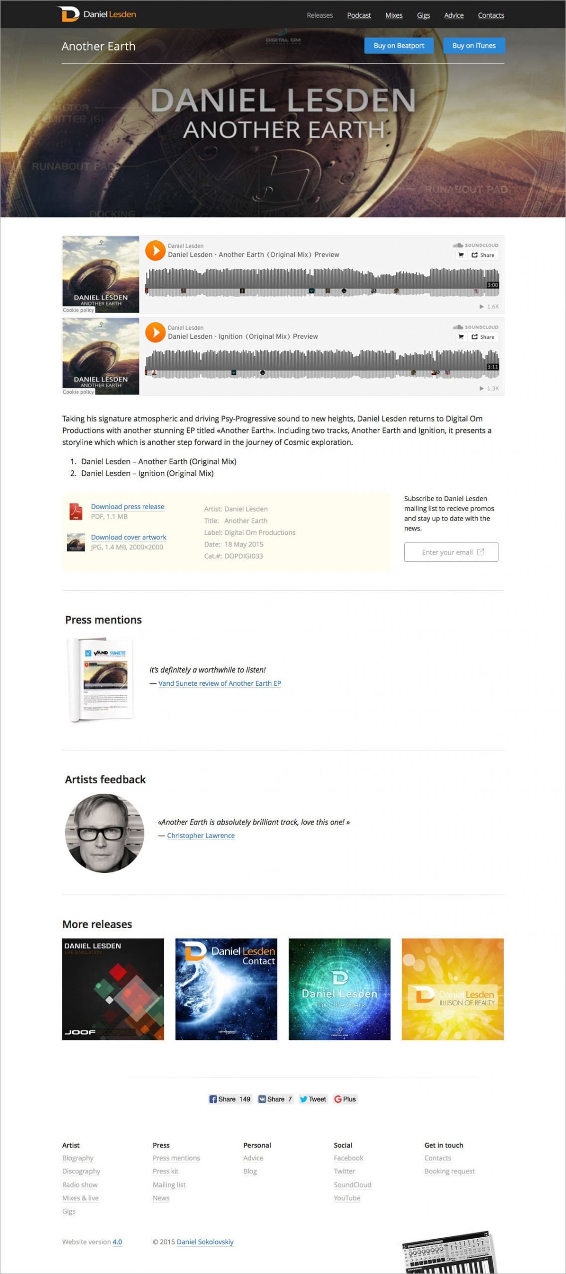
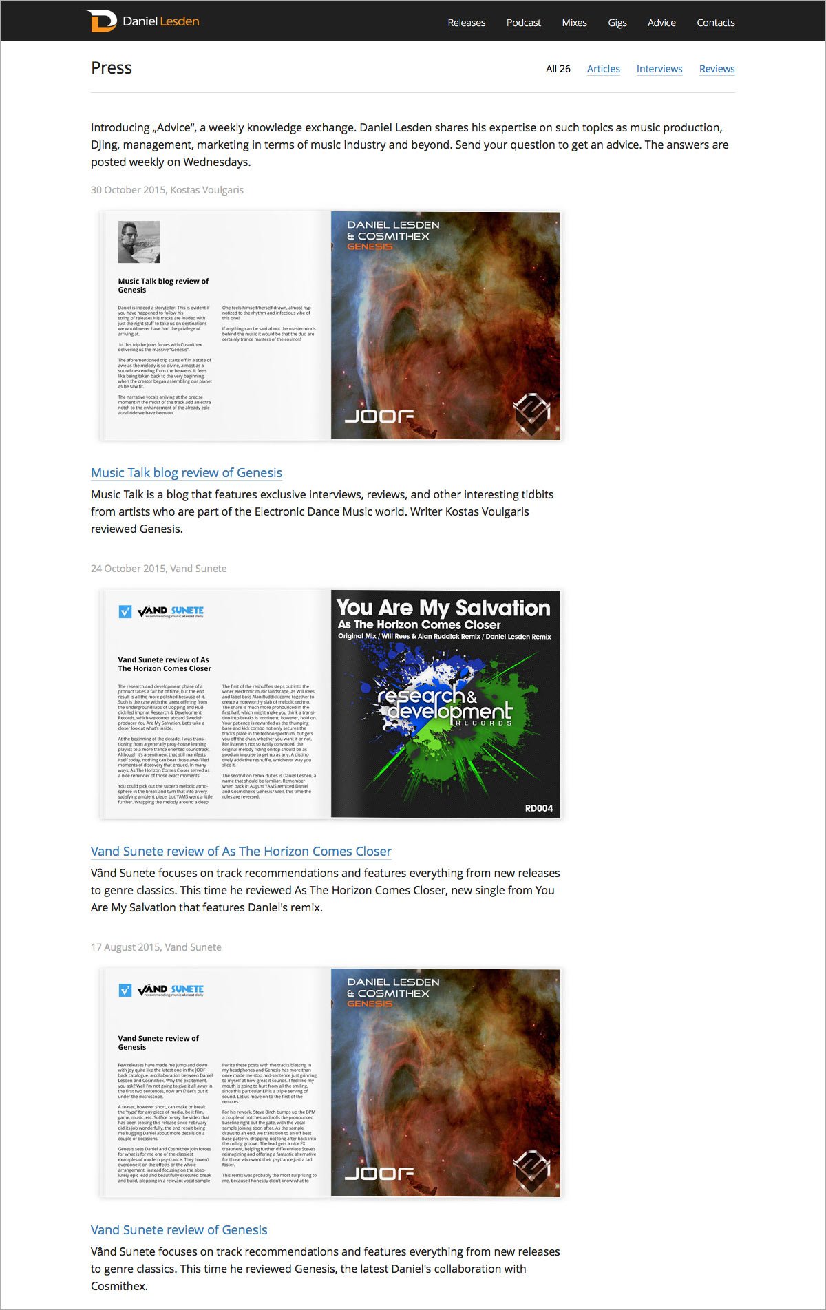
The third version of www.daniellesden.com
Task
Refresh and improve all sections of the website.
www.daniellesden.com
It is easy to break something and build a new one in its place. It is much more difficult to take an existing product and improve every aspect of it with almost surgical precision. This was exactly the task: to improve everything without changing the overall style and look of the site.
First version
Second version
Third version
Adaptive version
In the new version, the structure of the site has been updated and almost all pages of the site have got a unified look — now they are more predictable and orderly. The changes have affected absolutely all sections of the site: the main page, biography, discography, radio shows, mixes, performances, press mentions and others. There is also a new section “Advice” — it’s a weekly column in which the author answers questions and gives advice.
And also the top menu on the site now smoothly hides when scrolling down the pages, and also smoothly appears when scrolling up. It’s great! Try it yourself.


Project members
| Lead Designer Tanya Sokolovskaya |
Designer Daniel Sokolovskiy |
Developer and layout Maksim Silnov |
